Noted: New Logo and Packaging for K-Y by Design Bridge
“A Diamond in the Soft”
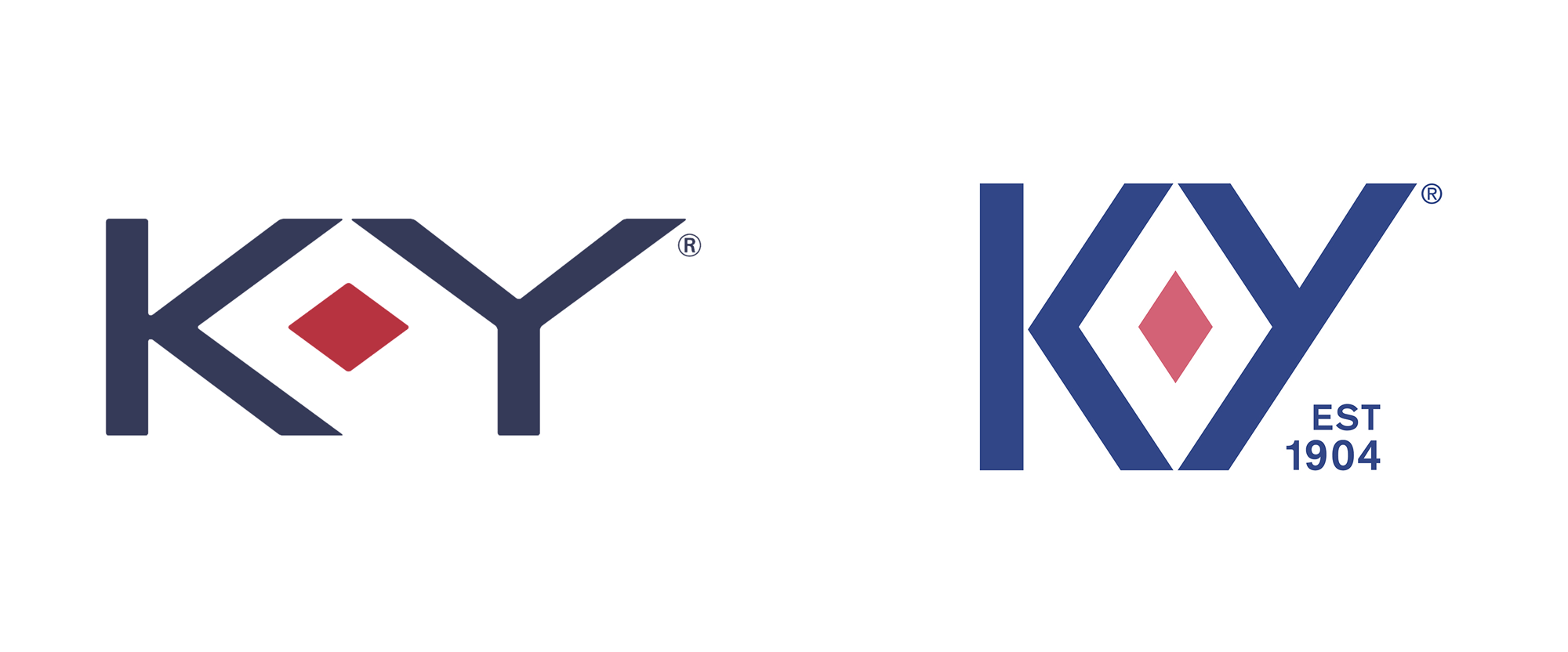
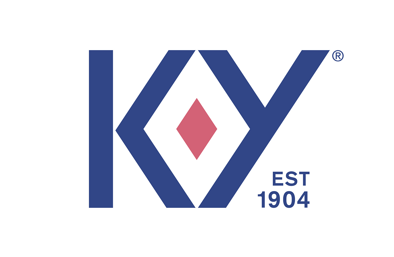
(Est. 1904) "K-Y started in a medical lab in New York City over a 100 years ago and since then, we have been committed to helping women have better sex. That's why we are America's #1 lubricant brand. We are here to make sexual pleasure for women a priority and bring equality into the bedroom. We believe enjoying sex is something to be proud of, not ashamed of. To feel good about, not judged for. Our mission is to empower women to have better sex, always."
Design by
Design Bridge (New York, NY office)
Related links
N/A
Relevant quote
A strong symbol of female sexual power was placed right at the heart of the new brand identity – the ruby. Framed perfectly by the newly crafted K & Y, the ruby is a celebration of the vulva and a symbol of uncompromising passion and enjoyment. This new, unapologetic distinctive asset transforms across touchpoints to talk to the different forms of sexual pleasure that the brand wants to encourage.
Claire Parker, Executive Creative Director at Design Bridge New York, explained, “We’ve unleashed a distinctive brand asset that was always there, it just never had any strength or purpose. By making it intentional, we’ve loaded it with meaning and brought a sensuality and confidence to the brand that was lacking before. An enormous step for a brand that was previously at best asexual, at worst clinical.”
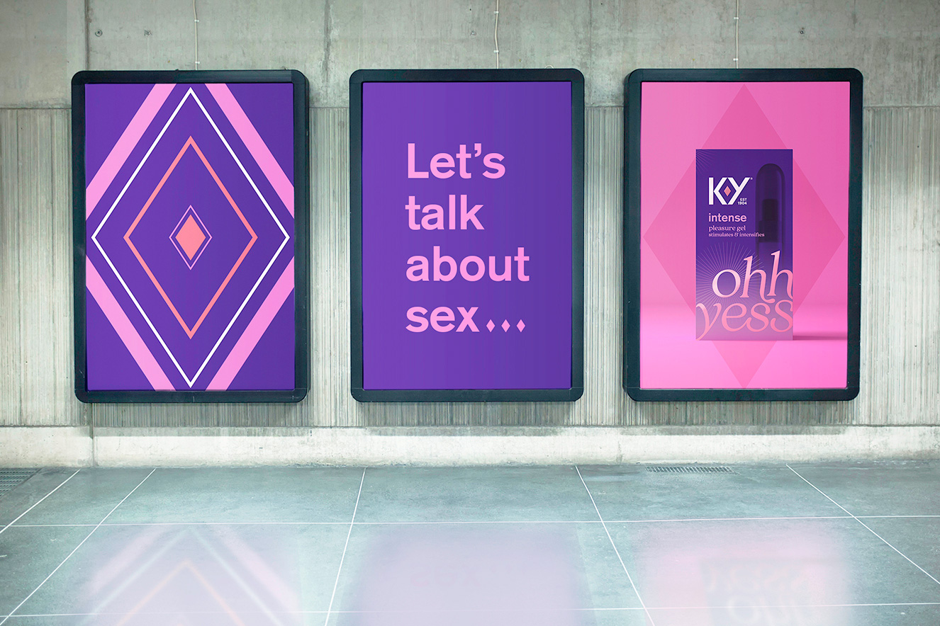
The Design Bridge team came up with the simple yet powerful creative idea of “Let’s talk about sex”, and were inspired by the brand’s curious and sensual, yet uncompromising and expert new personality. With the vulva now so clearly celebrated at the heart of the brand, the surrounding brand world and assets were developed to further normalize female pleasure and build confidence between the sheets.
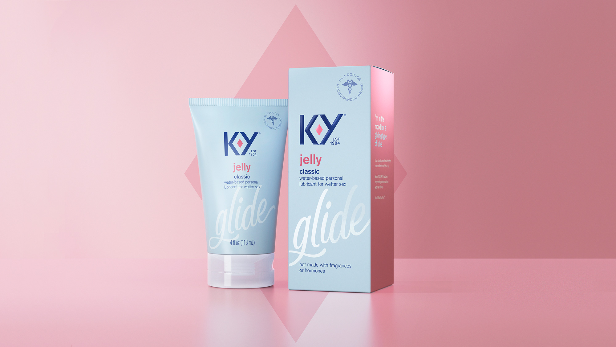
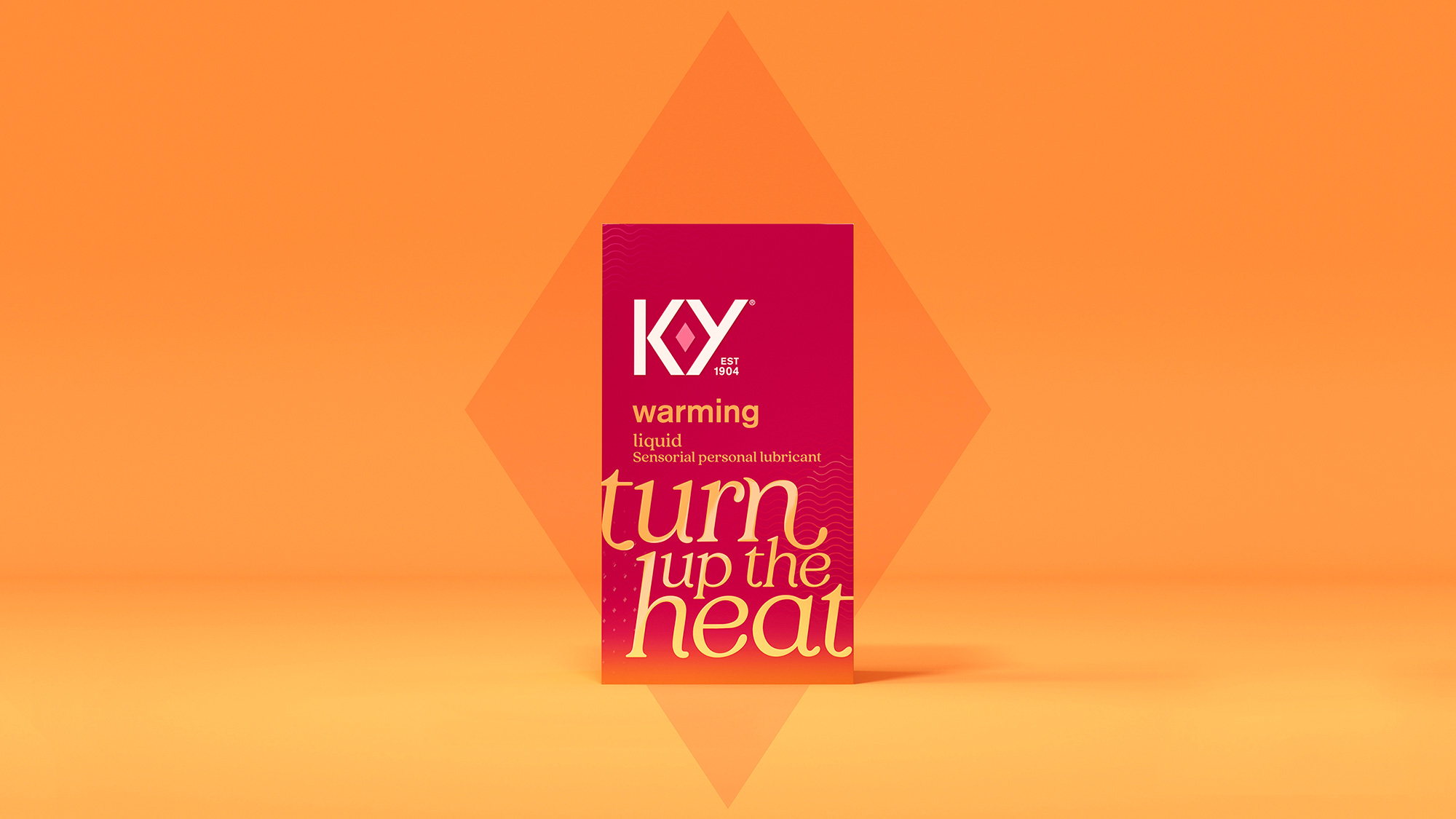
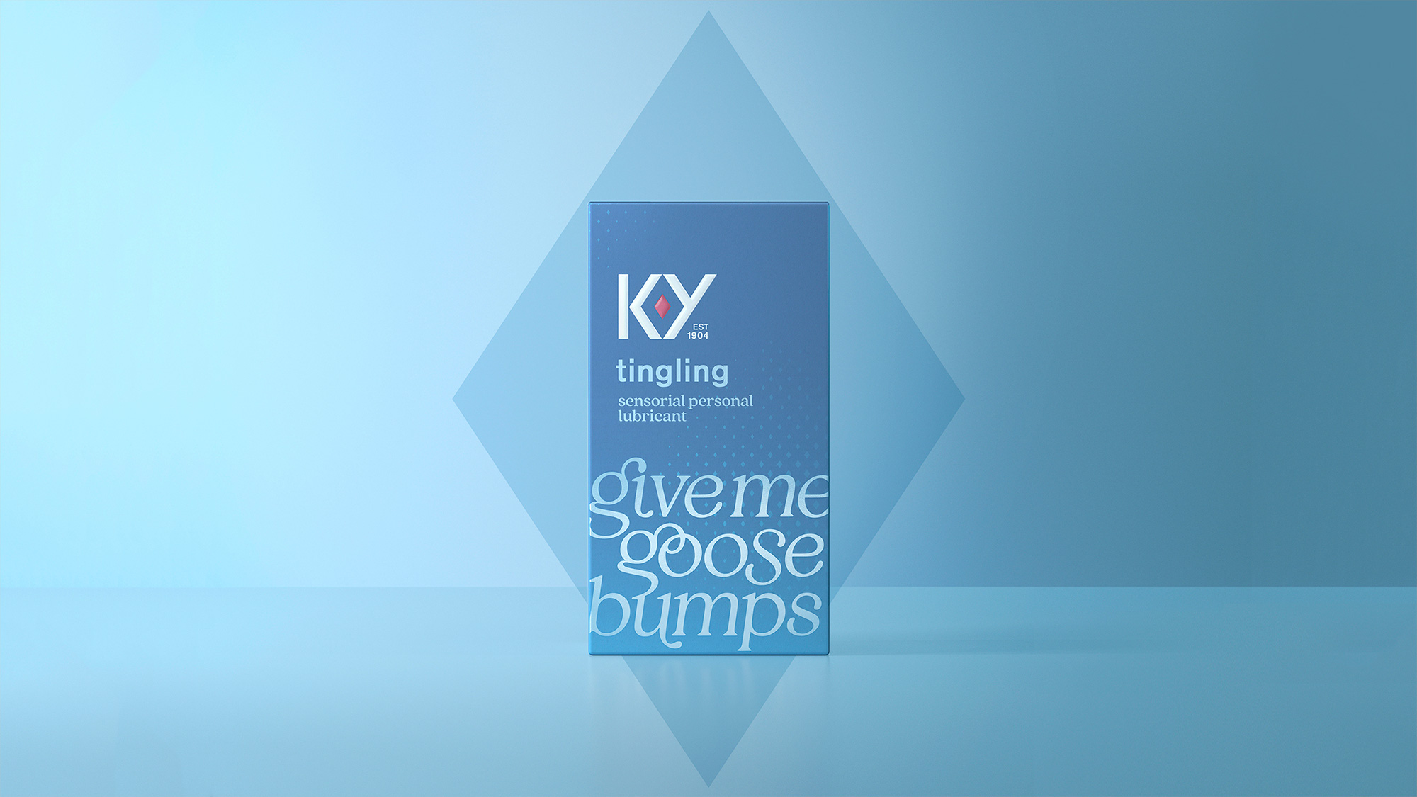
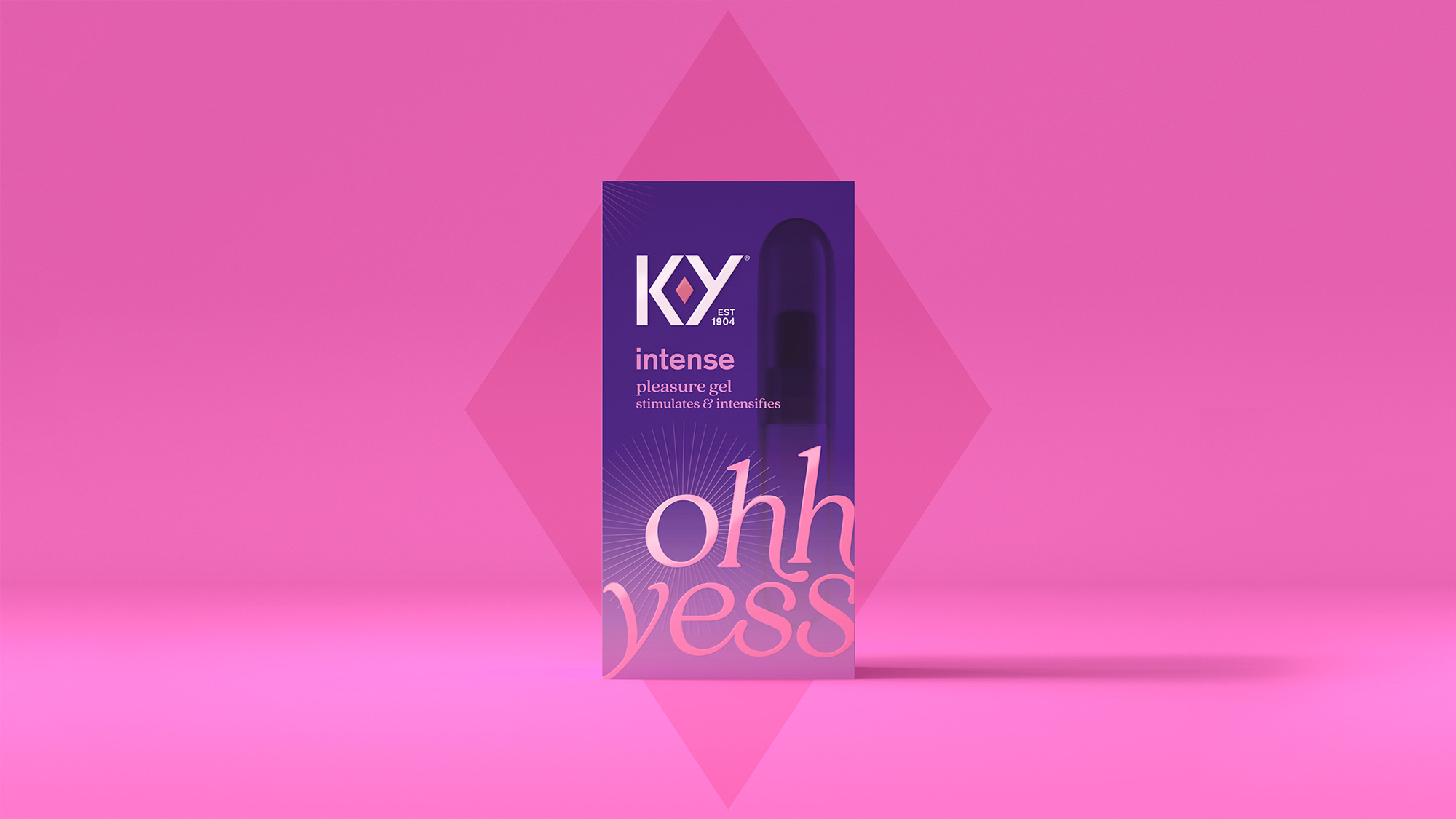
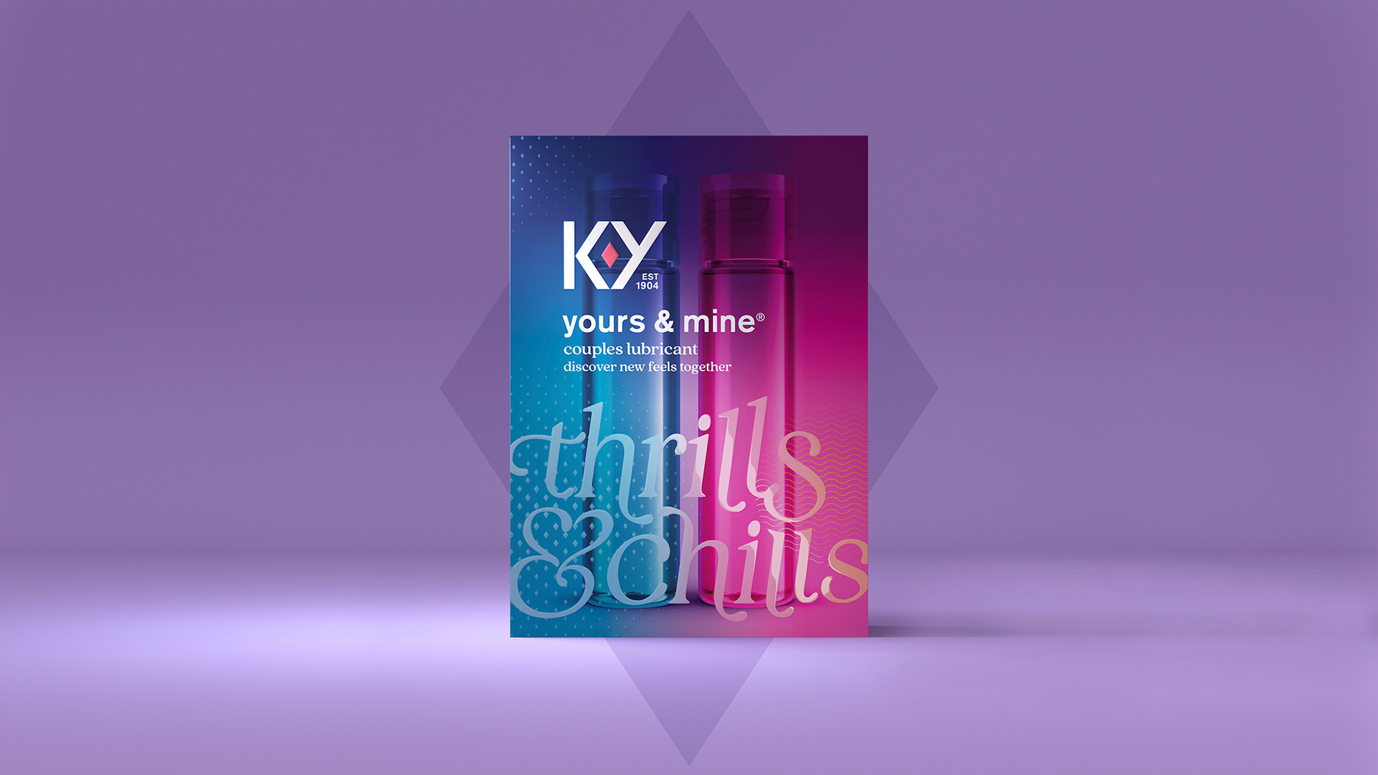
On pack, bespoke typography and iconography bring this creative idea and personality to life through playful, conversational messaging about each product, which in turn helps women to find the right product for them. The color palette has also been refined to improve navigation of the range, and the deep ruby red – a colour that universally represents love and passion – is now used consistently across the brand.
Images (opinion after)

Opinion
I had never thought twice about the old logo and figured the diamond was simply a fancy hyphen instead of all this time having been an attempt at representing a vulva. Aside from failing at it, it was a terrible design execution with an overly wide structure that made the letters feel gangly. It’s amazing what typography can do. The new logo is the kind of type-based solution that gives angels wings. Sure, it’s unnatural for an uppercase “Y” to be slanted like that but it doesn’t matter at all because the result is so, um, pleasing — revealing a clear, proud, unapologetic vulva. It’s important to acknowledge that 15, 10, or even 5 years ago a solution so “in your face” about it would have been impossible for a mainstream brand, even when said mainstream is applied in the place the logo is meant to represent. Long live progress! And long way of saying I really like the logo. The packaging evolution is nice… not as exciting as the logo evolution since the flagship product still has that mainstream package look to it but it’s definitely an improvement over the highly clinical version that existed before. The variants in the packaging are better, with the “warming”, “tingling”, and “intense” boxes being a lot more visual and the ligature-heavy serif concoctions are pretty good. Bonus points for doubling down on the diamond ruby — I do love that they call it something unique — and making it a central graphic of the whole identity but especially in the animation that starts to tickle the senses. Overall, a great and confident evolution.
In ấn Anpic In nhãn mác Anpic In brochure Anpic In card visit Anpic In catalogue Anpic In thiệp cưới Anpic In tờ rơi Anpic
In Ấn Anpic – Nổi Tiếng In Đẹp In Nhanh
Số 5 Ngõ 75 Nguyễn Xiển, Thanh Xuân, Hạ Đình, Hà Nội
0963223884
baogiainananh@gmail.com
https://anpic.vn
https://g.page/inananpic
In nhãn mác Anpic ✅ In brochure Anpic ✅ In card visit Anpic ✅ In catalogue Anpic ✅ In thiệp cưới Anpic ✅ In tờ rơi Anpic
https://anpic.vn/in-nhan-mac-dep
https://anpic.vn/in-brochure
https://anpic.vn/in-an
https://anpic.vn/in-voucher-in-phieu-giam-gia-khuyen-mai
#inananpic
Comments
Post a Comment