Noted: New Logo and Packaging for Seven Bro7hers by Creative Spark
“Stairway to Seven”
(Est. 2014) "Seven Bro7hers Brewing Co. is a new-age, craft beer, brewery, based in Salford, Manchester. We produce incredible tasting beers, backed by a real story. The business was founded by 7 brothers from various professional backgrounds, with one unified goal: to bring beers to market with soul and substance - made with passion and honesty. We are an ambitious, dynamic, imaginative, brewing company aimed at offering high-quality, innovative craft beers, using only natural ingredients. We view ourselves as partners with our customers, our community, and our environment. We're on a journey to become a nationally recognised brand name, by providing an alternative to the mass-produced, bland offerings on the market, by creating beers for people who think outside of the box."
Design by
Creative Spark (Manchester, UK)
Related links
Seven Bro7hers brand page
Creative Spark project page
Relevant quote
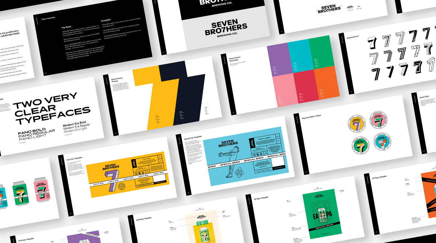
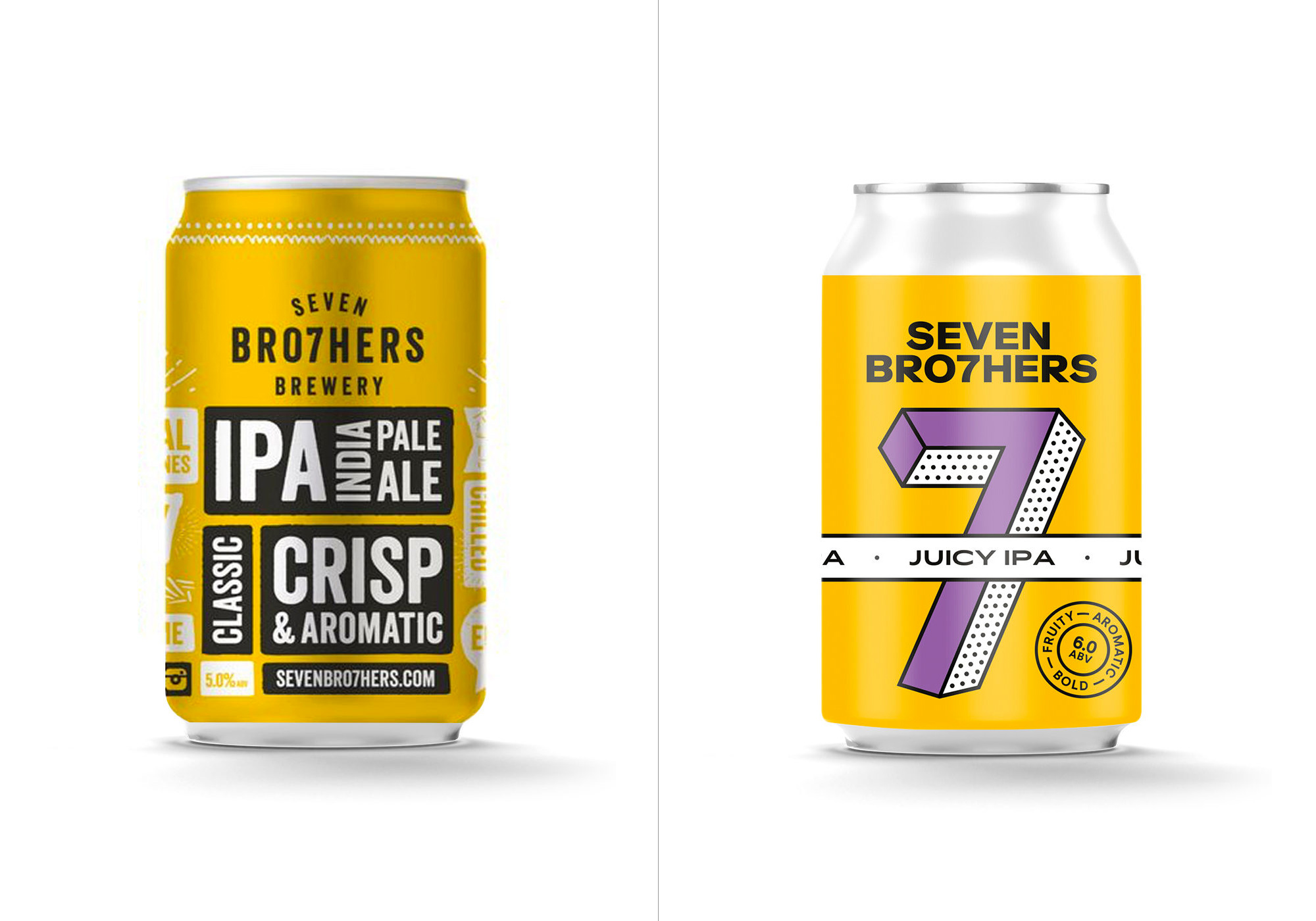
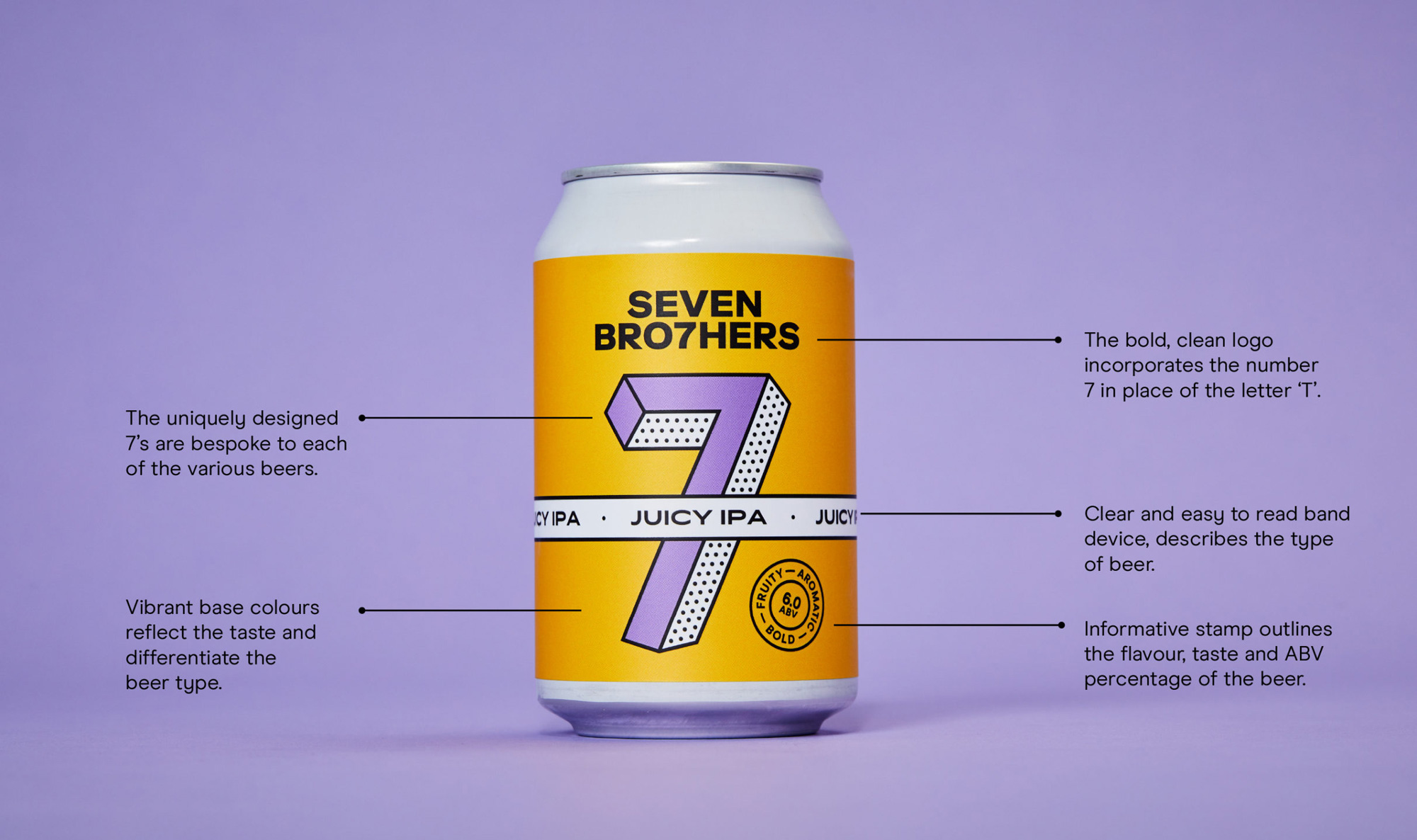
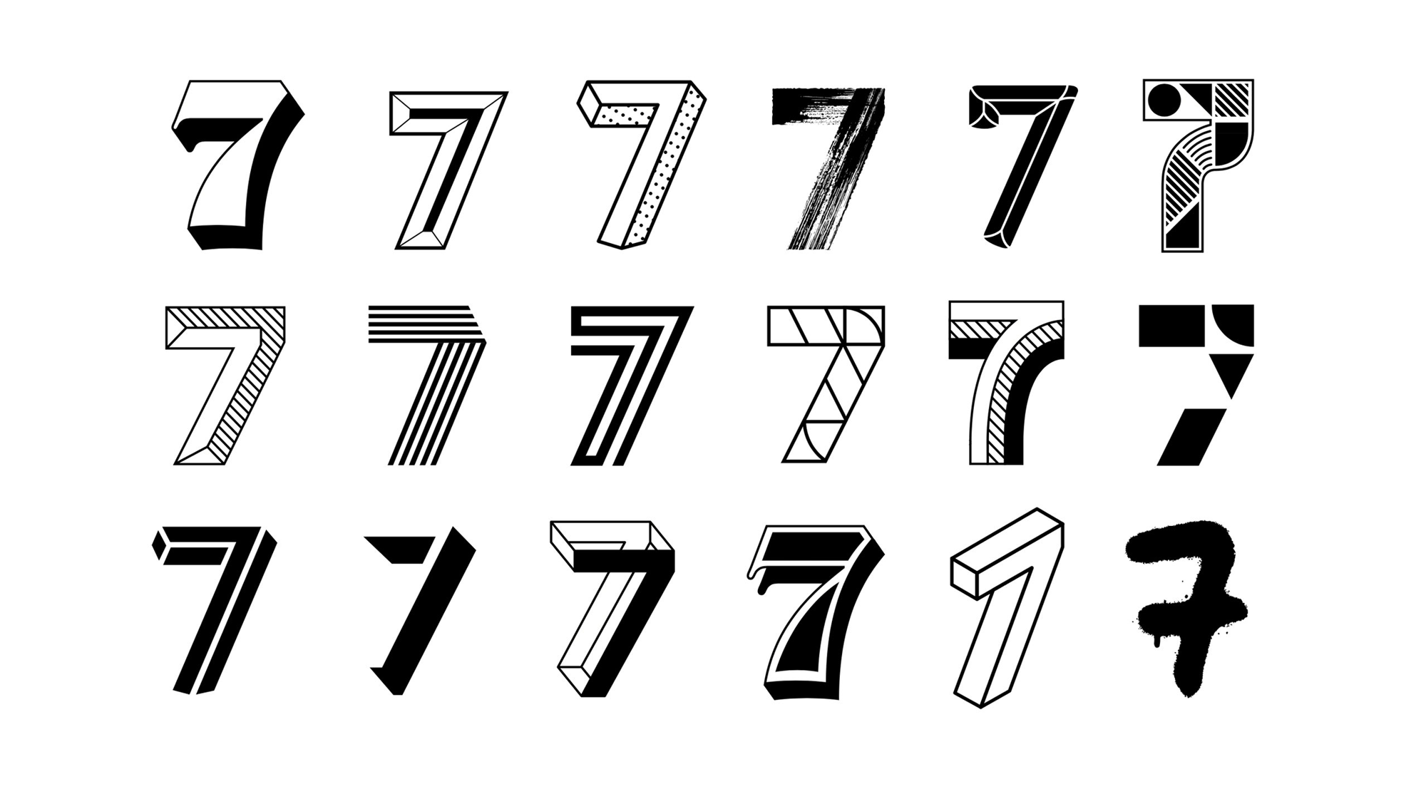
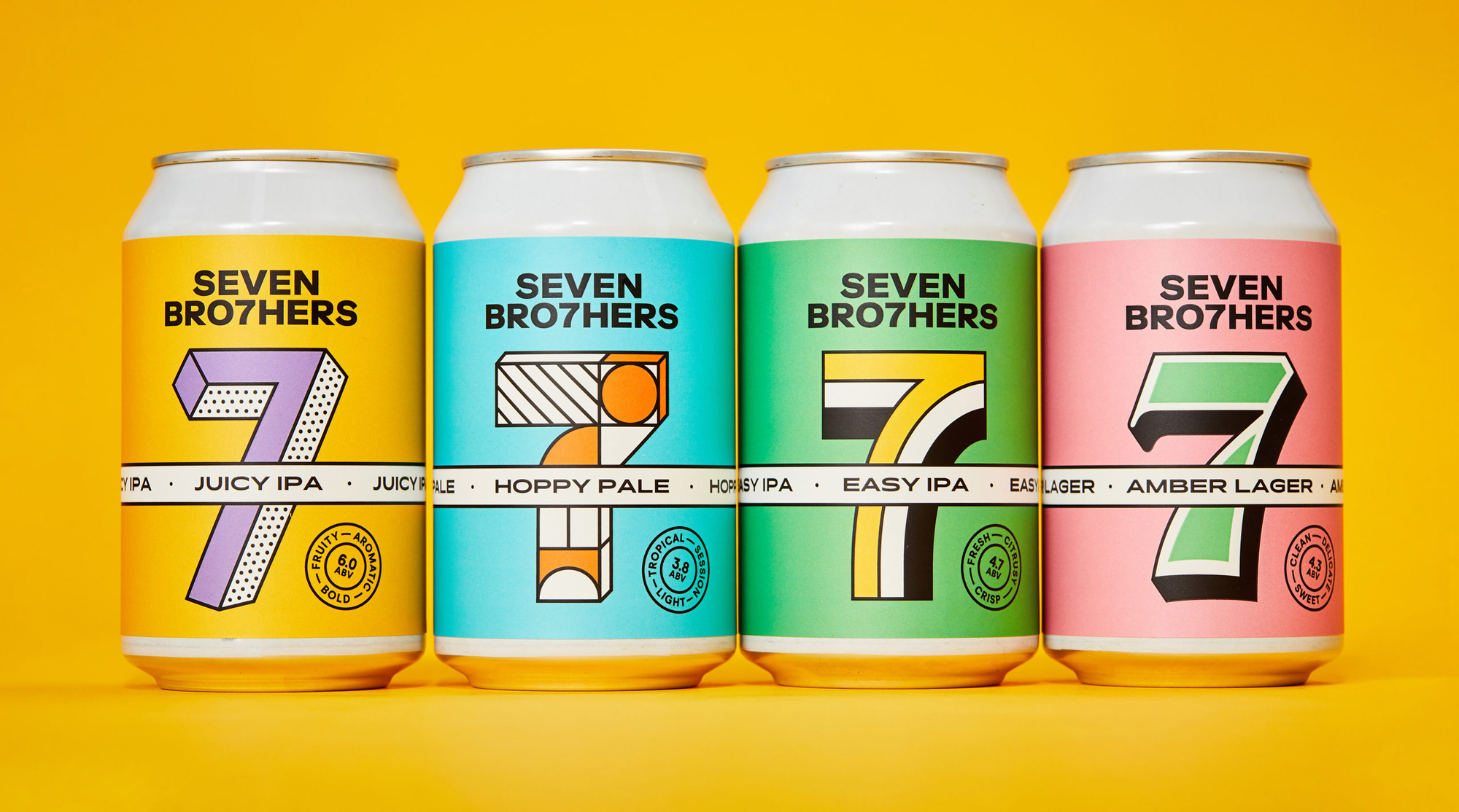
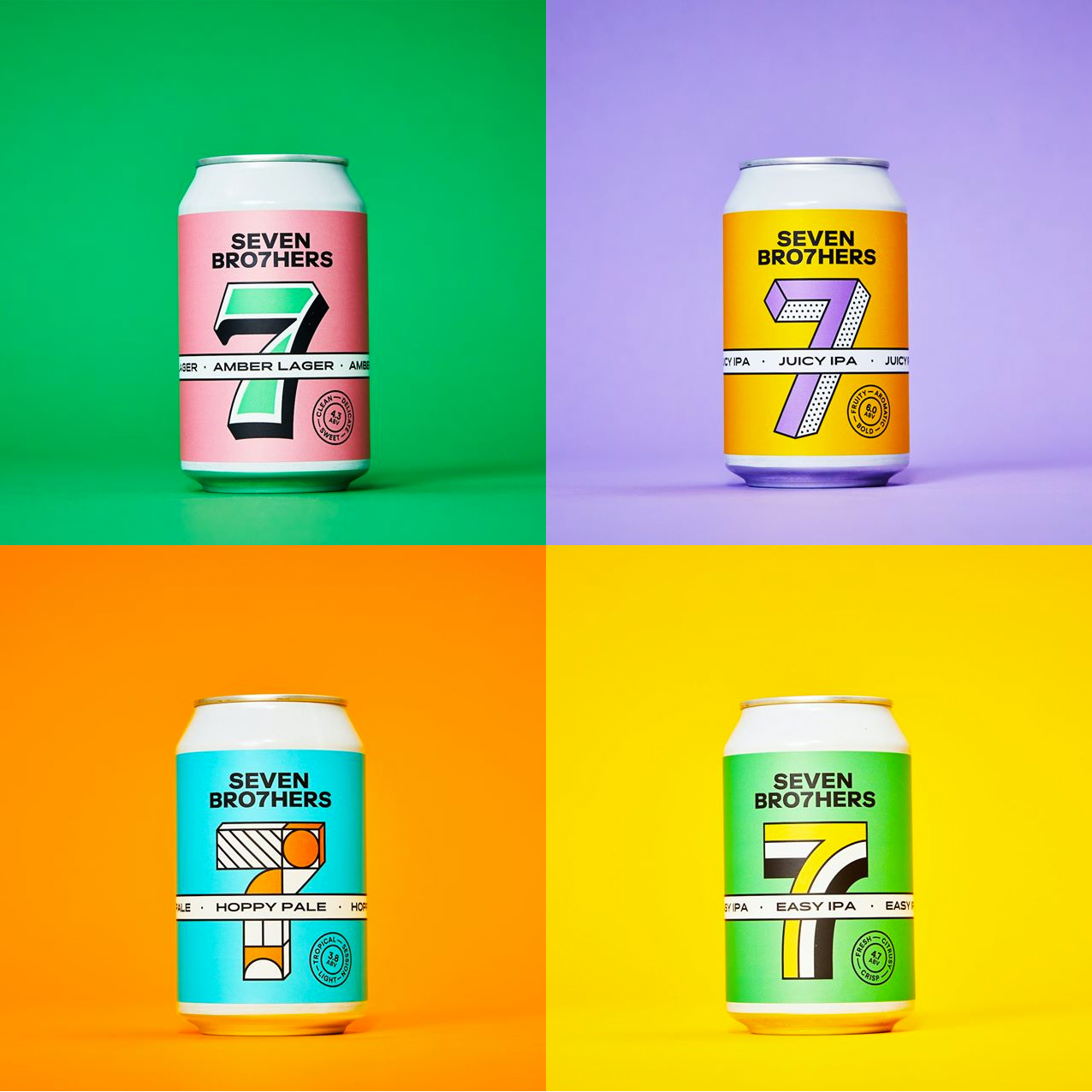
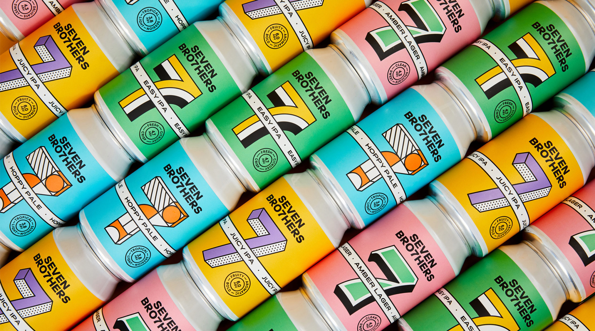
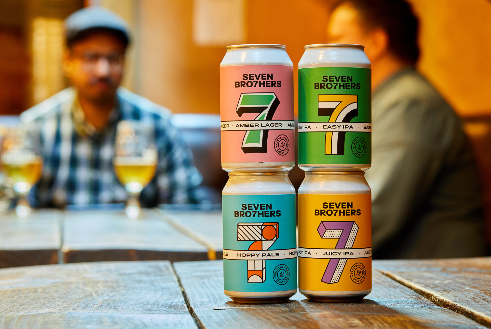
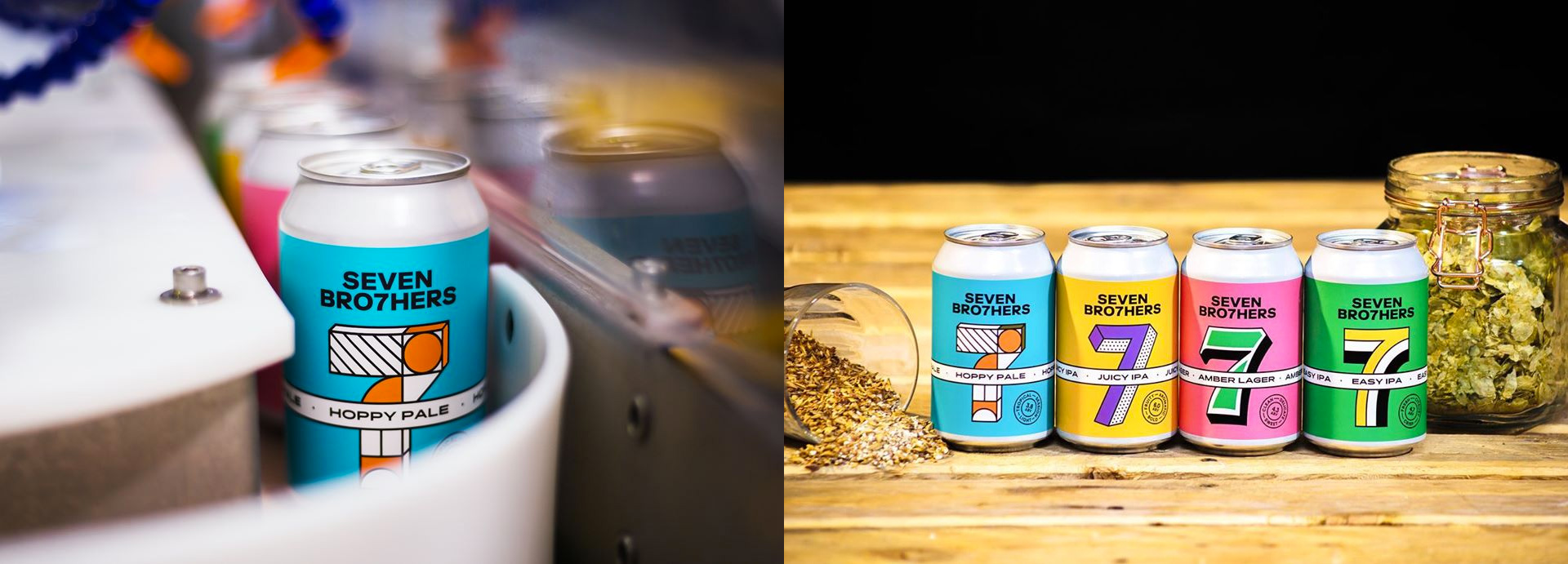
Their original proposition “Clear with Beer” was still relevant, but needed to be adapted to work within copy and tone. We evolved this so that it was not as literal as it was first used. Clear with Beer visually became cleaner and bolder with more emphasis on the “7” as a key feature of the cans. Bold colours, unique 7’s and clear flavour stamps allowed us to keep the fun, community / family side of the brand while also making the brands modern and keeping them eye-catching on the shelf.
Images (opinion after)
Opinion
The old logo was good, with a grungy aesthetic that hinted at the DIY, rough-and-tumble beginnings of the brand and established the “7” replacing the “T” in the name. The new logo is a grown-up evolution that keeps the hook of the logo in a new wordmark. I kind of liked how the old one played up the “BRO7HERS” part but I also like the equalizing of the two words. I think both solutions are acceptable. The cleaner logo, though, does provide more flexibility to do something in the packaging that doesn’t have to be grungy and they have introduced a fun range of “7”s that occupy the same real estate and follow the same general structure but can then contort to different executions in a variety of styles but all with big blocky colors, which helps unify them and blend in nicely with the rest of the layout on the packaging. I really like the white band cutting through the middle of the can and over the “7” as it gives the flat look some depth. Clean typography, fun colors, and the consistent layouts make for a great range of cans, a very distinguishable shelf presence, and a collect-them-all yearning.
In ấn Anpic In nhãn mác Anpic In brochure Anpic In card visit Anpic In catalogue Anpic In thiệp cưới Anpic In tờ rơi Anpic
In Ấn Anpic – Nổi Tiếng In Đẹp In Nhanh
Số 5 Ngõ 75 Nguyễn Xiển, Thanh Xuân, Hạ Đình, Hà Nội
0963223884
baogiainananh@gmail.com
https://anpic.vn
https://g.page/inananpic
In nhãn mác Anpic ✅ In brochure Anpic ✅ In card visit Anpic ✅ In catalogue Anpic ✅ In thiệp cưới Anpic ✅ In tờ rơi Anpic
https://anpic.vn/in-nhan-mac-dep
https://anpic.vn/in-brochure
https://anpic.vn/in-an
https://anpic.vn/in-voucher-in-phieu-giam-gia-khuyen-mai
#inananpic


Comments
Post a Comment