Noted: New Logo and Retail for Rite Aid
“Wrong a Rite”
(Est. 1968) "Rite Aid Corporation is one of the nation's leading drugstore chains with fiscal 2018 revenues from continuing operations of $21.5 billion. The Company also owns EnvisionRxOptions, a multi-faceted healthcare and pharmacy benefit management (PBM) company supporting a membership base of more than 22 million members; RediClinic, a convenient care clinic operator with locations in Delaware, New Jersey, Pennsylvania, Texas and Washington; and Health Dialog, a leading provider of population health management solutions including analytics, a multi-channel coaching platform and shared decision-making tools."
Design by
N/A
Related links
Rite Aid announcement page
Rite Aid press release
Relevant quote
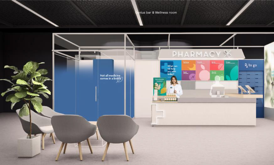
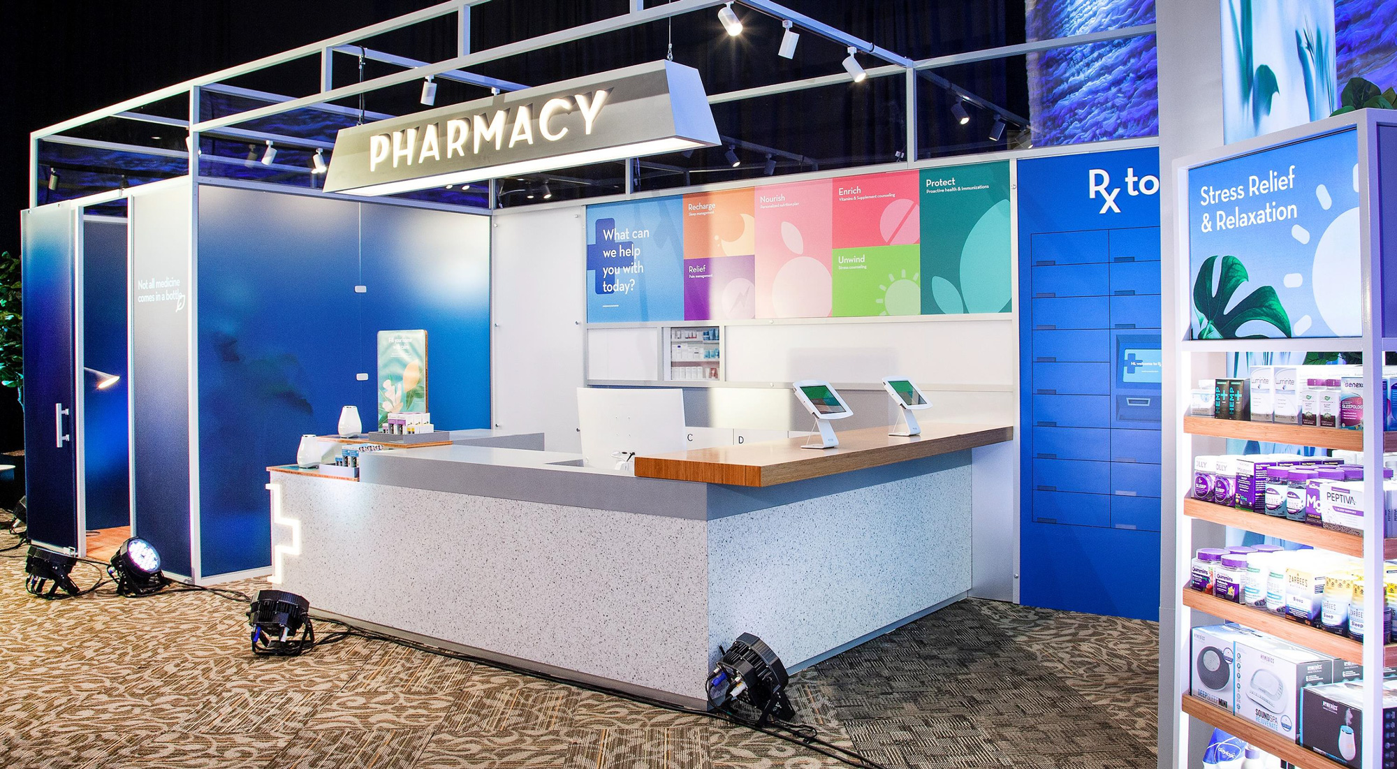
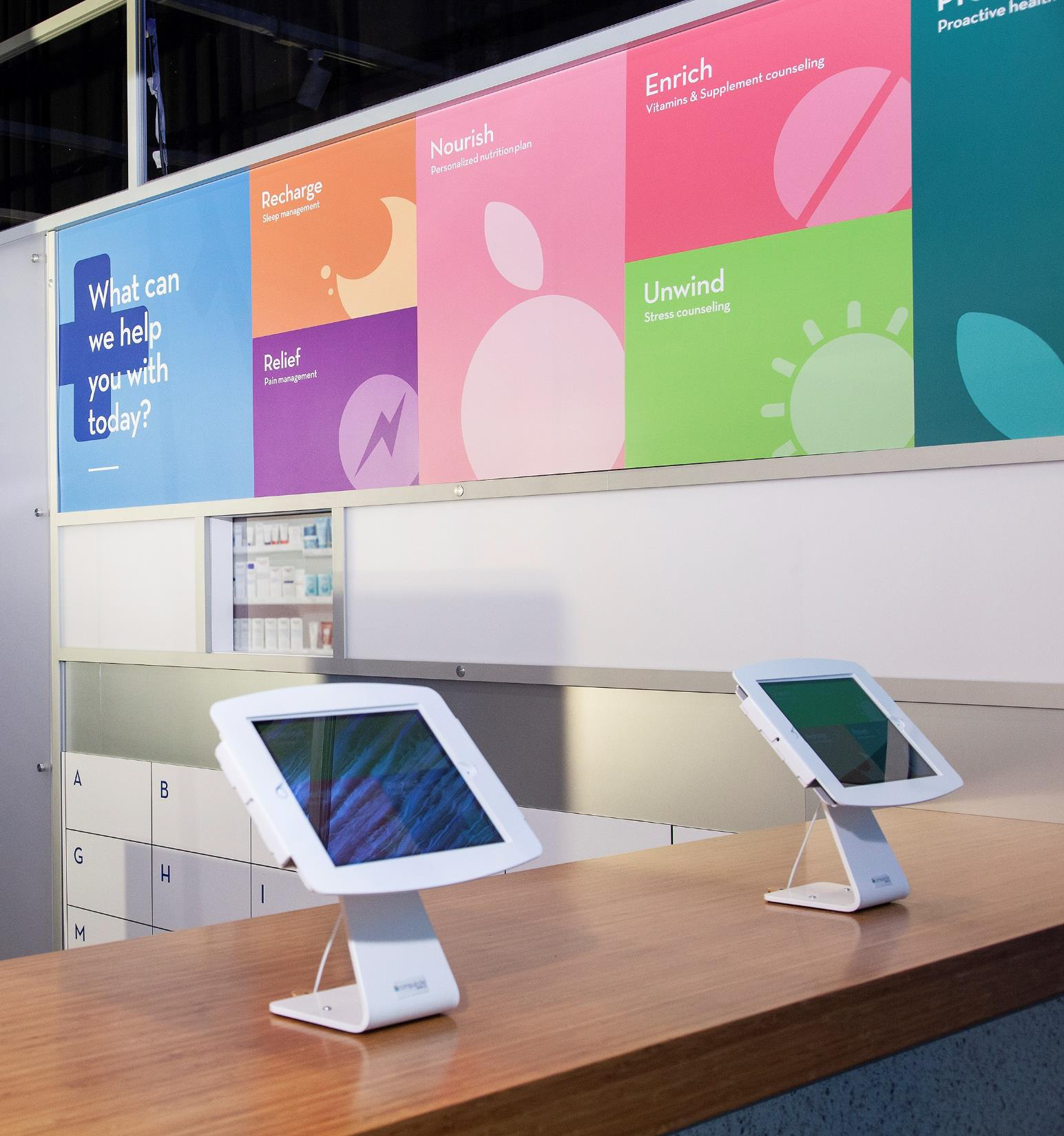
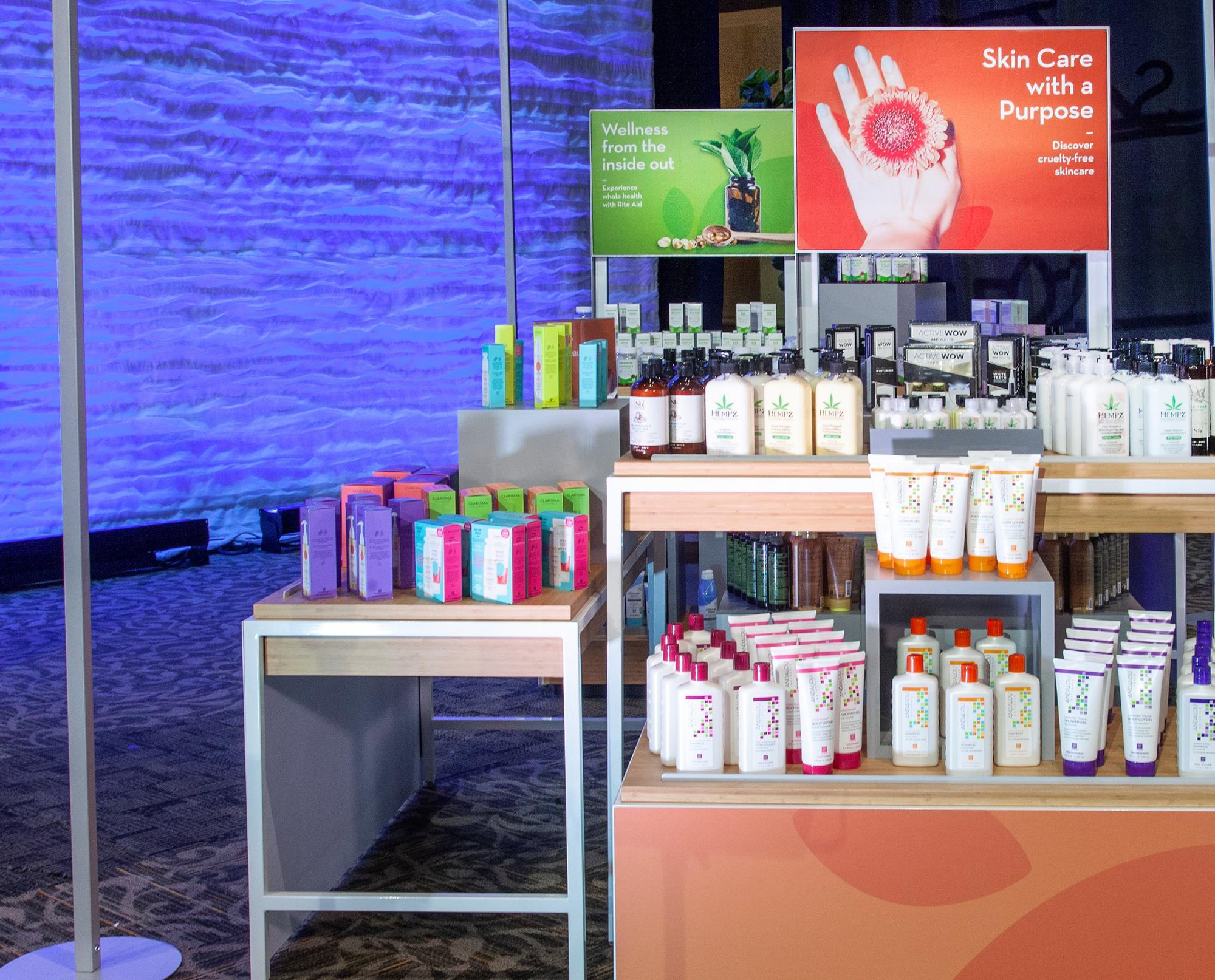
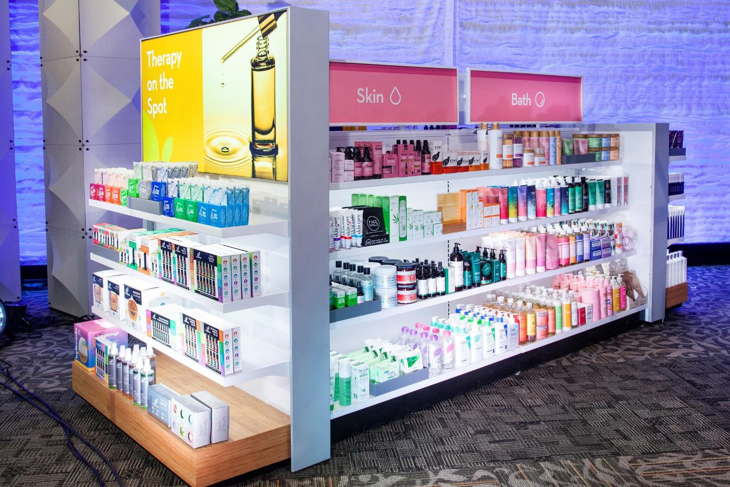
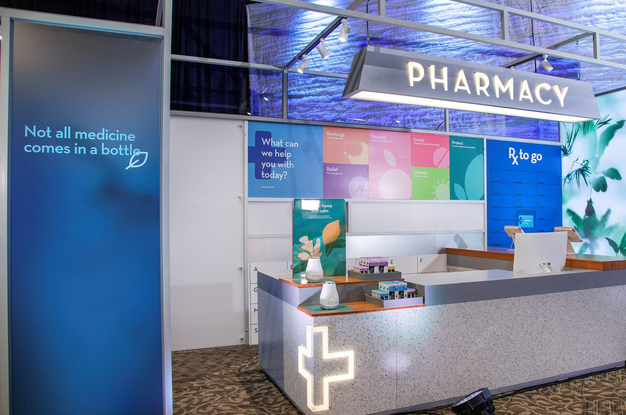
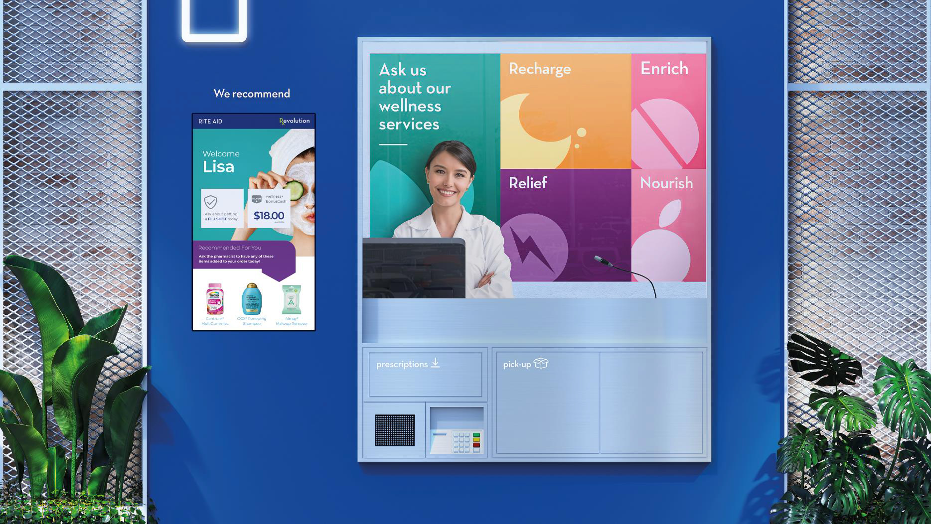
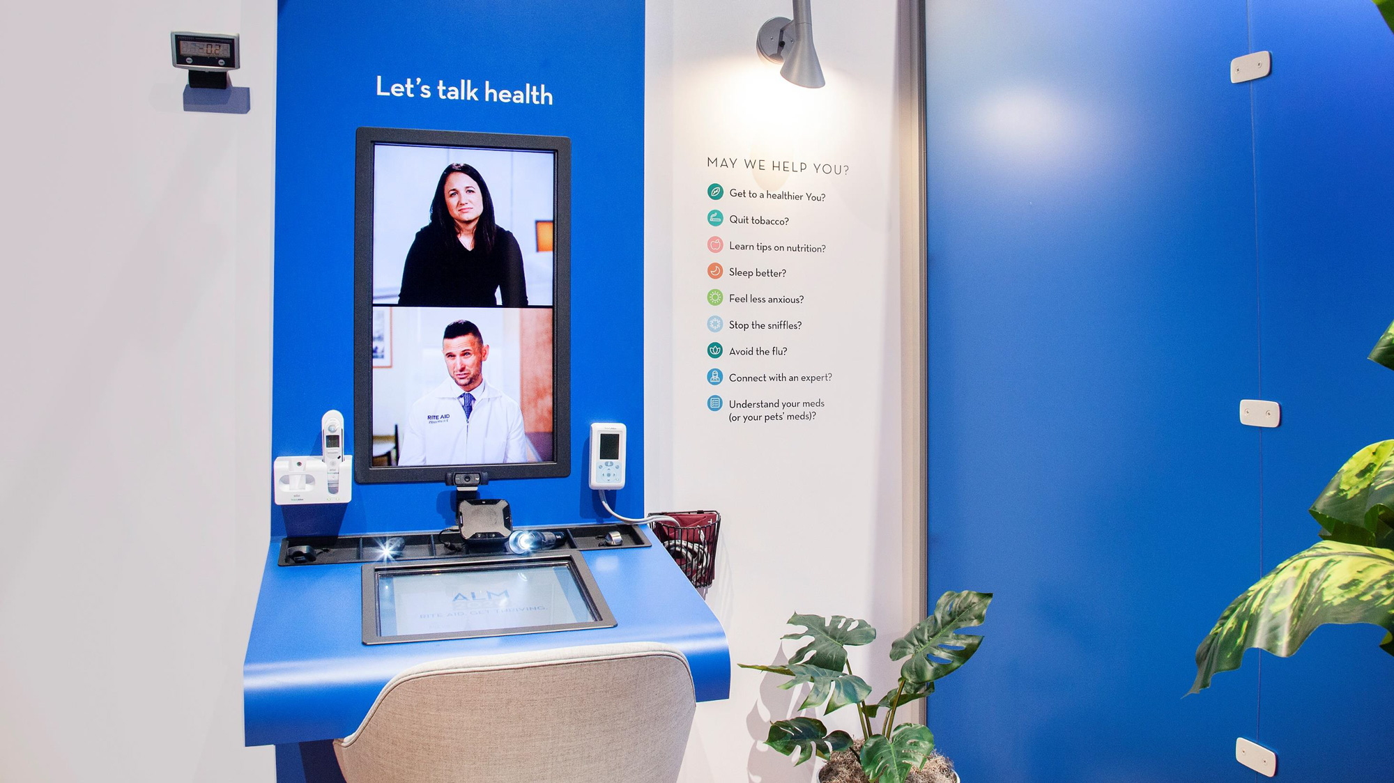
To introduce new generations to its iconic brand, Rite Aid is elevating its in-store experience, increasing personalized digital engagement, and refreshing merchandise to include a wide assortment of products with attributes that resonate with Millennial and Gen X consumers. Rite Aid will be re-branding with a new logo to signal this bold change in pharmacy and retail. Later this year, Rite Aid will introduce its Store of the Future, which will be a trusted whole-family wellness destination that helps consumers on the journey of care for parents, children and pets.
Images (opinion after)

Opinion
The old logo is one of those that are sort of lodged in my mind but wouldn’t be able to recall if pressed for it. It wasn’t great, it wasn’t bad and it could have been a cool evolution with the right typography, spacing, and proportions. Instead, the new logo introduces an old-fashioned pestle and mortar, which is a very questionable decision for two reasons: one, do we, in the year 2020, still associate pharmacies with pestle and mortars? I really don’t think so but I also understand that it’s an easy cliché to latch on to. The second reason is that another well-known pharmacy, Walgreens, has used a pestle and mortar graphic for years so it doesn’t make a lot of sense to try to compete with that. But let’s assume it was the right decision, the icon is fairly underwhelming in its execution. I do like the way the mortar sits on the shield but that’s about it. The bottom-alignment of the floating leaves and pestle drives me bonkers. Another odd choice is Neutraface for the wordmark, which is one of the loveliest Art Deco type families in the universe, but using it for this, makes Rite Aid look like a vintage pharmacy instead of setting it up for the next 50 years. At the very least, the two “I”s align, so that’s fine. In application, they double down on the Art Deco-ness and use the very tall ascender-ed Nobel, which, again, makes everything look dated. Based on the booth, the retail design experience looks as if it’s caught somewhere between The Jetsons and Black Mirror. Overall, an odd series of choices leading to a confusing range of design solutions that don’t clarify what brand territory Rite Aid wants to own.
In ấn Anpic In nhãn mác Anpic In brochure Anpic In card visit Anpic In catalogue Anpic In thiệp cưới Anpic In tờ rơi Anpic
In Ấn Anpic – Nổi Tiếng In Đẹp In Nhanh
Số 5 Ngõ 75 Nguyễn Xiển, Thanh Xuân, Hạ Đình, Hà Nội
0963223884
baogiainananh@gmail.com
https://anpic.vn
https://g.page/inananpic
In nhãn mác Anpic ✅ In brochure Anpic ✅ In card visit Anpic ✅ In catalogue Anpic ✅ In thiệp cưới Anpic ✅ In tờ rơi Anpic
https://anpic.vn/in-nhan-mac-dep
https://anpic.vn/in-brochure
https://anpic.vn/in-an
https://anpic.vn/in-voucher-in-phieu-giam-gia-khuyen-mai
#inananpic


Comments
Post a Comment