Noted: New Logo, Identity, and Packaging for Love Wellness by Lobster Phone
“Wellness Actually”
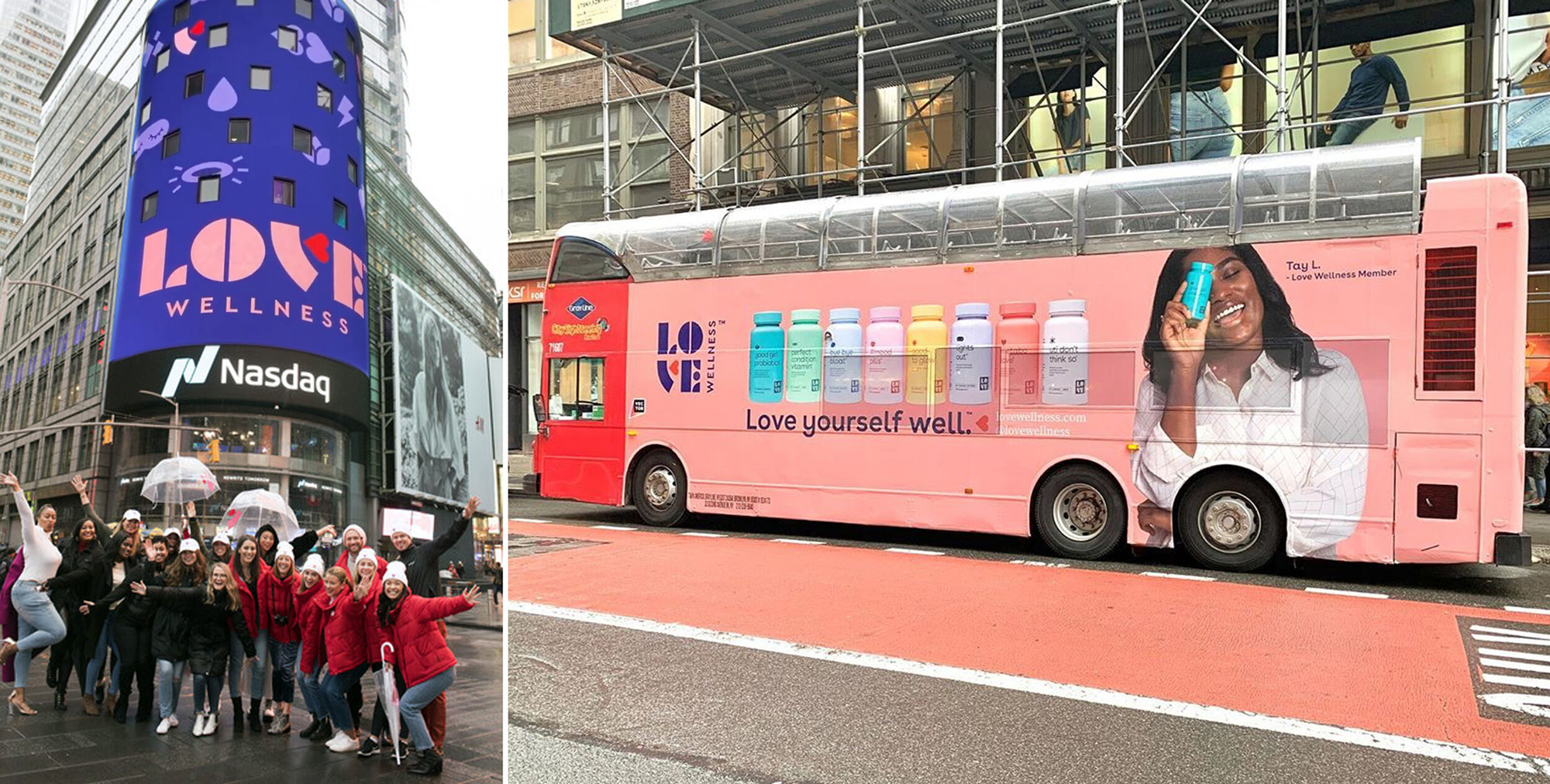
(Est. 2016) "Love Wellness sets the new standard for women's health. Our products are made with clean ingredients that range from fiber supplements, probiotics and digestive enzymes that optimize gut health, to personal cleansers, suppositories and lubricants that are made with women's unique biology in mind. Supported by our progressive approach to body-positive education, our products are accessible to and loved by all women."
Design by
Lobster Phone (San Francisco, CA)
Related links
Lobster Phone project page
Relevant quote
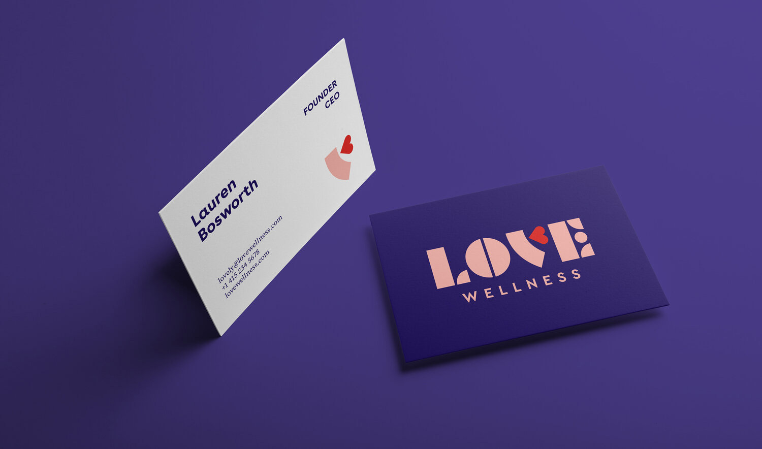
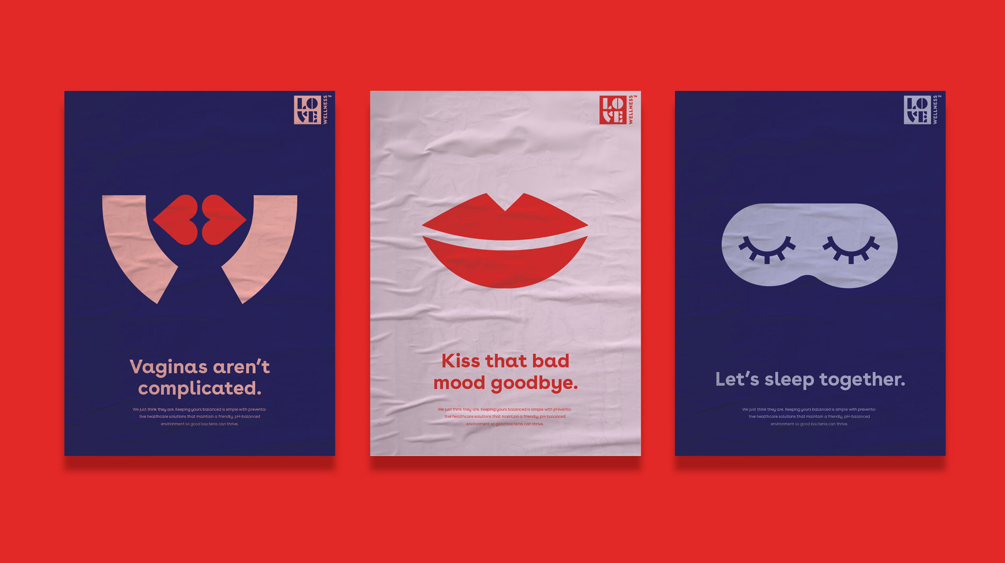
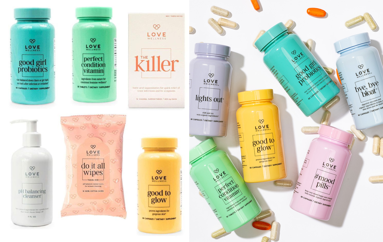
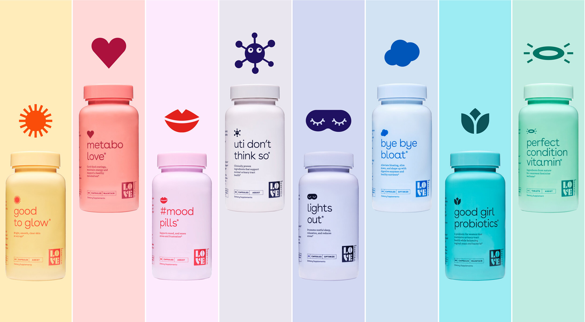
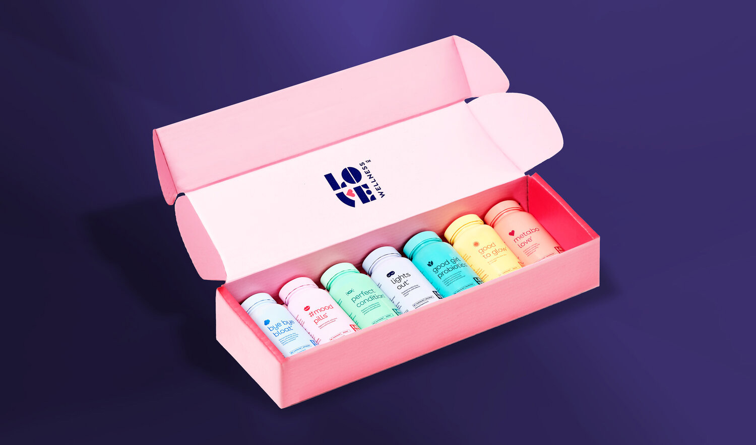
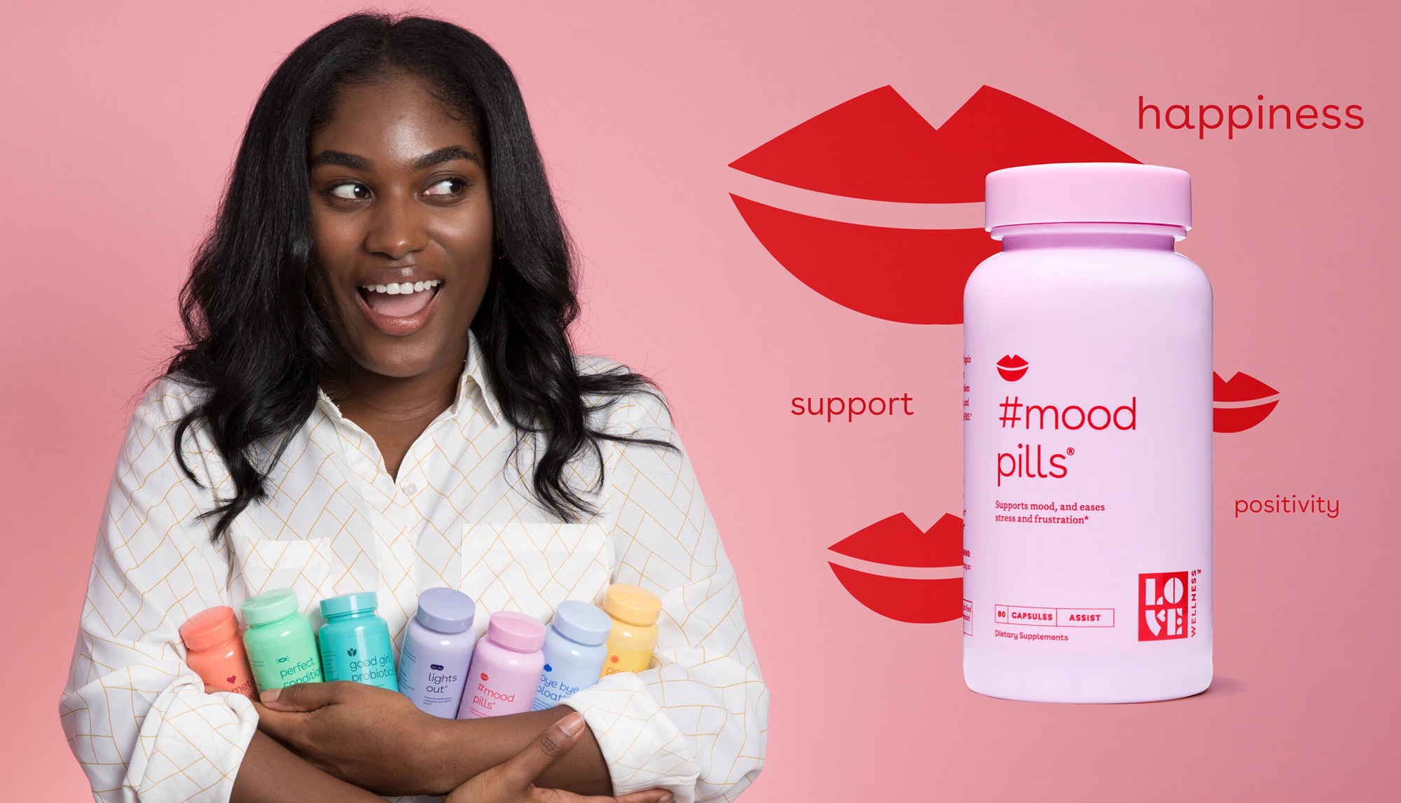
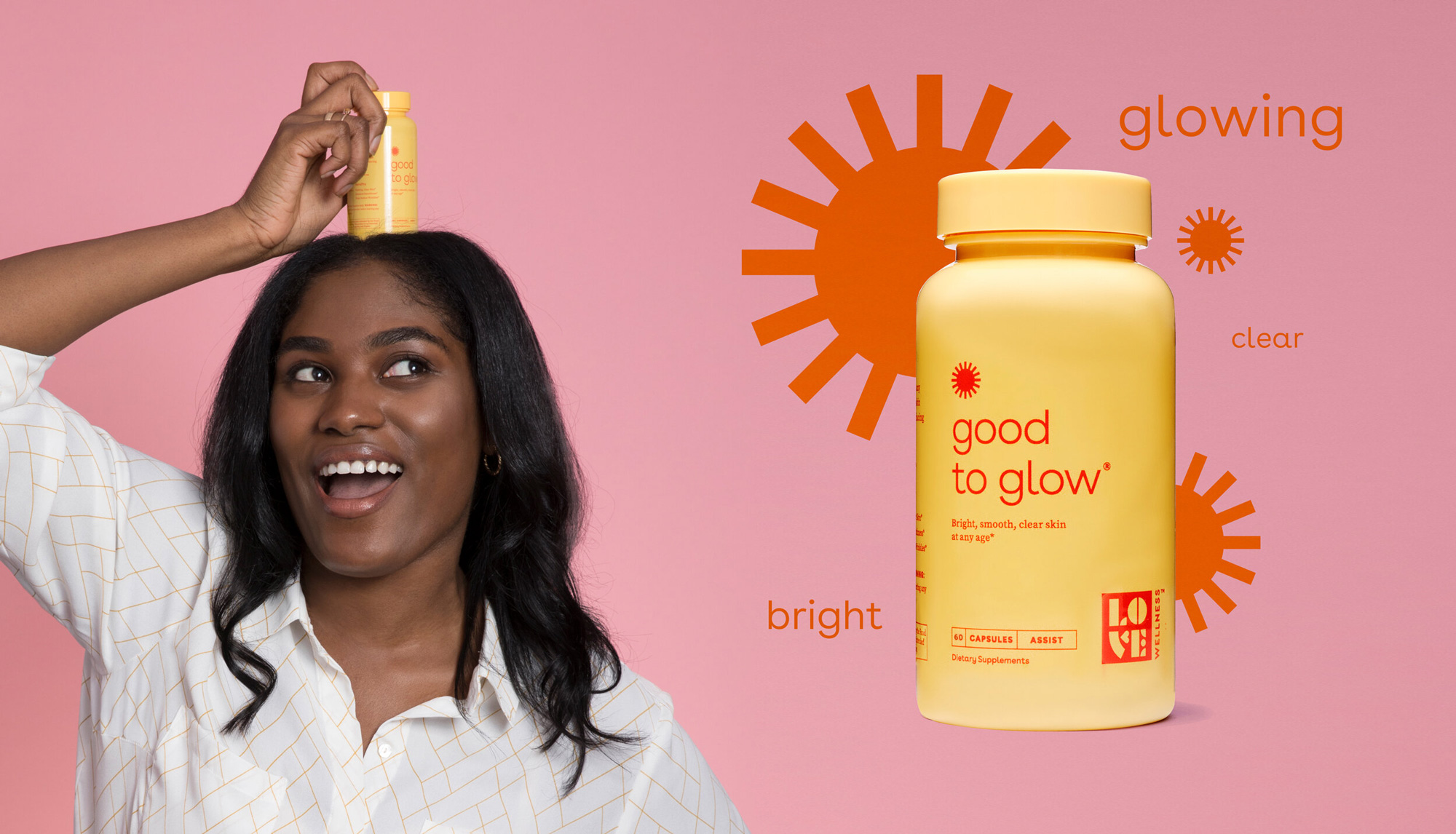
Inspiration for the logo was found in a late 1930s art deco type specimen; it felt playful, chunky and expressive. We used this as the basis for creating custom letterforms that are both clear and iconic. As illustrations are foundational to the larger brand, we made the ‘V’ of the logo into a face with lips that kiss and talk. Each product has its own quirky name, corresponding illustration, and color combination that provide a not-so off-the-shelf look. The illustrations play off the style of the logo’s lips – an almost Japanese pop aesthetic – clearly demonstrating the benefits of the product in a dynamic way.
Images (opinion after)
Opinion
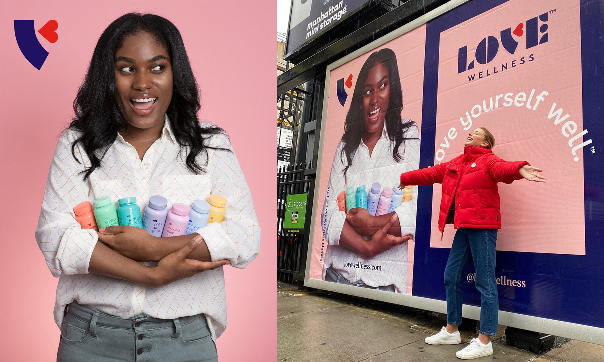
The old logo was fine, with an effective (although not groundbreaking) icon of a heart made of two overlapping pills and some decent typography. Its main drawback would have been that it was too normal, which becomes evident when compared to the new logo and its charismatic letters. Built with geometric shapes, the letters have a nice abstraction to them while being friendly and approachable. The “V” with a heart doubling as lips is clever and memorable. It reads perfectly as a “V” in “LOVE” because it’s such a common word but it also works well on its own as a very abstract face when it’s used as a standalone icon. The colors for the logo are spot on with a combination of a strong dark blue, a soft peach, and a bright red. In the non-packaging applications I like how the logo can turn into a stamp. The old packaging, like the logo, was fine, with a decent type system and clear information. The new packaging retains the colorful bottles and updates the design with more focus on the product names and accompanying icons in a layout that’s crisp and attractive. The darker stamp version of the logo looks great here too, getting out of the way but still very present and noticeable. Overall, it’s a charming, cheerful, and engaging brand update that feels very much in tune with its audience.
In ấn Anpic In nhãn mác Anpic In brochure Anpic In card visit Anpic In catalogue Anpic In thiệp cưới Anpic In tờ rơi Anpic
In Ấn Anpic – Nổi Tiếng In Đẹp In Nhanh
Số 5 Ngõ 75 Nguyễn Xiển, Thanh Xuân, Hạ Đình, Hà Nội
0963223884
baogiainananh@gmail.com
https://anpic.vn
https://g.page/inananpic
In nhãn mác Anpic ✅ In brochure Anpic ✅ In card visit Anpic ✅ In catalogue Anpic ✅ In thiệp cưới Anpic ✅ In tờ rơi Anpic
https://anpic.vn/in-nhan-mac-dep
https://anpic.vn/in-brochure
https://anpic.vn/in-an
https://anpic.vn/in-voucher-in-phieu-giam-gia-khuyen-mai
#inananpic


Comments
Post a Comment