Reviewed: New Logo and Packaging for YEMA by Anagrama
“Bubble Duty”
Established in 2019, YEMA is a start-up grocery brand in Mexico that offers functional and convenient alternatives to basic everyday products made with quality (and simple) ingredients, sustainable practices, and sold at competitive prices. Available primarily online but with three brick and mortar stores in Mexico City, YEMA offers a wide yet curated selection of food products (e.g., snacks, pasta, tea, oils, beans, rice, spices, juices, and even craft beers), personal hygiene products, and home and kitchen utensils sourced from different vendors or created in-house, all packaged and sold under the YEMA brand. (In Spanish, yema means yolk, as in the egg's, but I'm not sure if the all-caps writing means it's an acronym for something -- I didn't see it explained anywhere.) The new identity has been designed by Mexico City-based Anagrama.
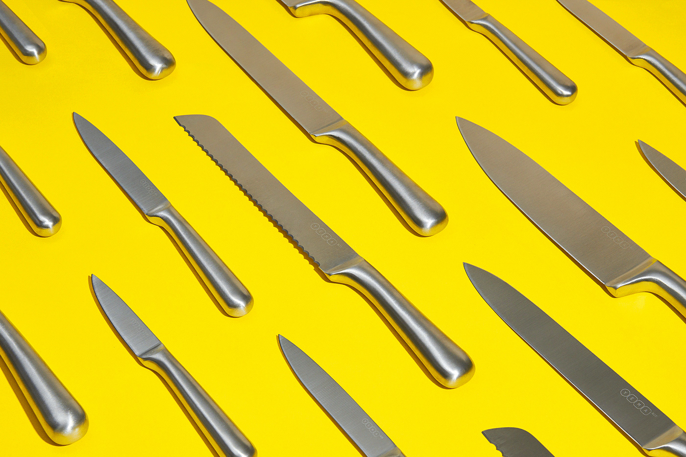
A universal language embodied in a scalable system adapting to a very diverse range of products ranging from matchboxes to future furniture packaging. The system is composed by informative bubbles responding to the most relevant brand messages highlighting each of the product's key ingredients.
Anagrama project page
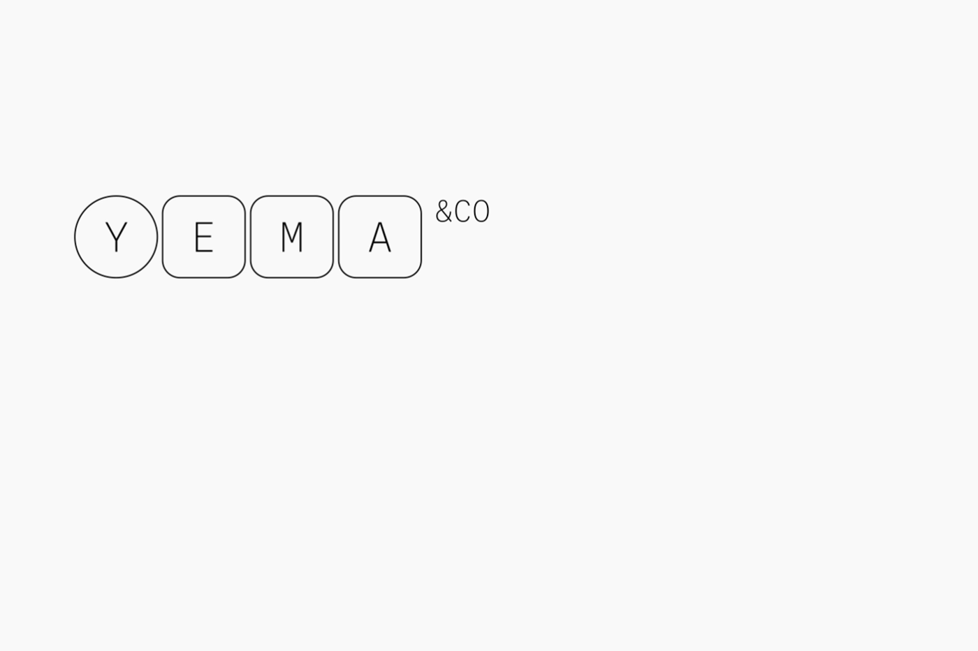
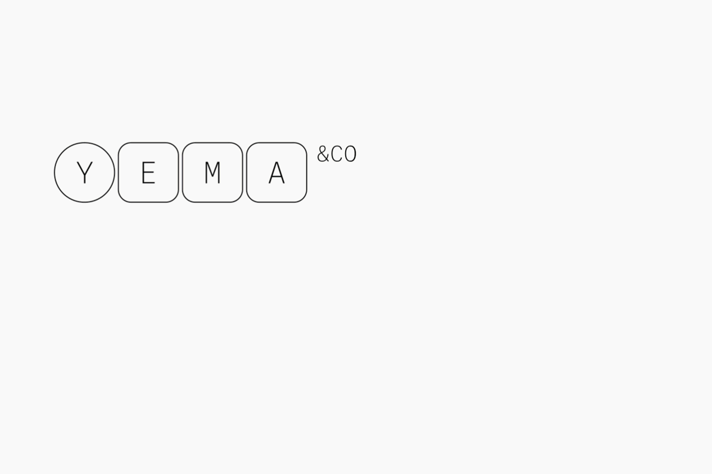
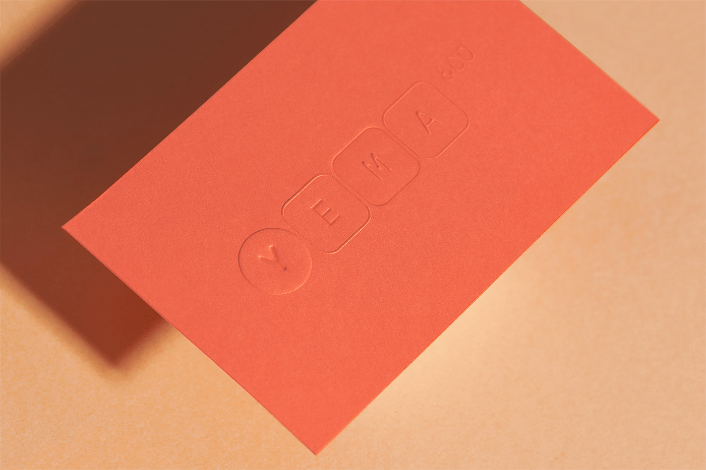
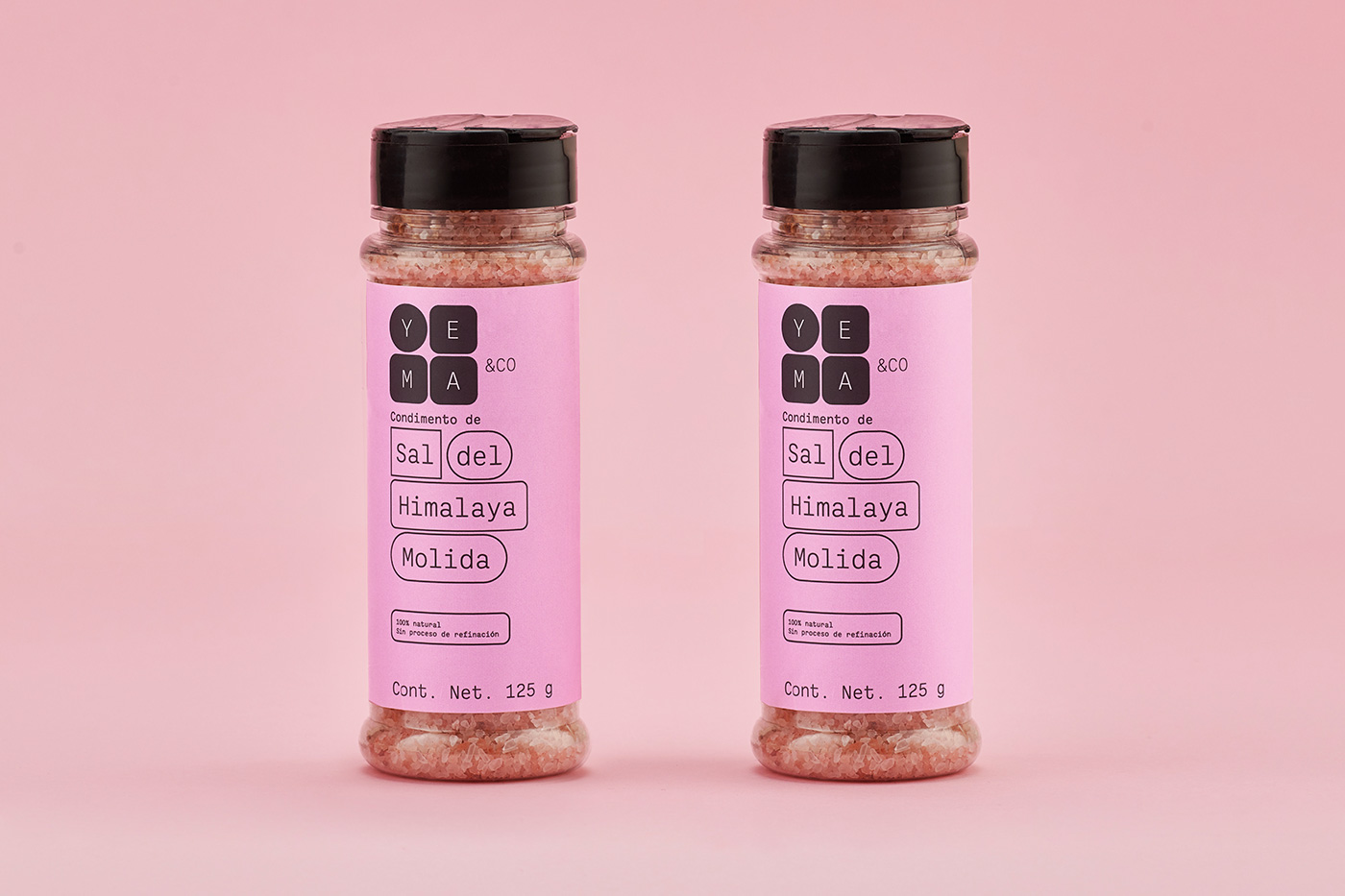
In principle, there is not much to the new logo with its thin monospace typeface inside evenly spaced rounded-corner squares (plus initial circle) but it manages to speak volumes about the intention of the company, which is to be as transparent as possible while offering the most unadulterated version possible of everyday products. The logo helps establish the brand as functional and trustworthy as well as high-end but without the price tag or attitude. It's like the Mexican IKEA of grocery stores. Long way of saying, I like the logo for its possible interpretation and visually for its simplicity and ability to stack in different ways. If I had one complaint it would be the "&CO" outside the bubbles... not sure about its spacing, either of its letters or distance from the last square.

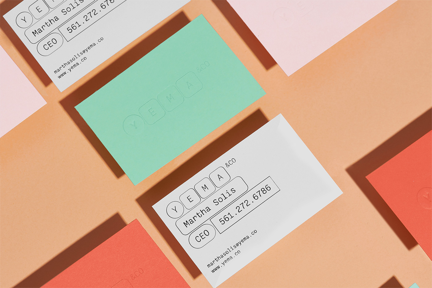
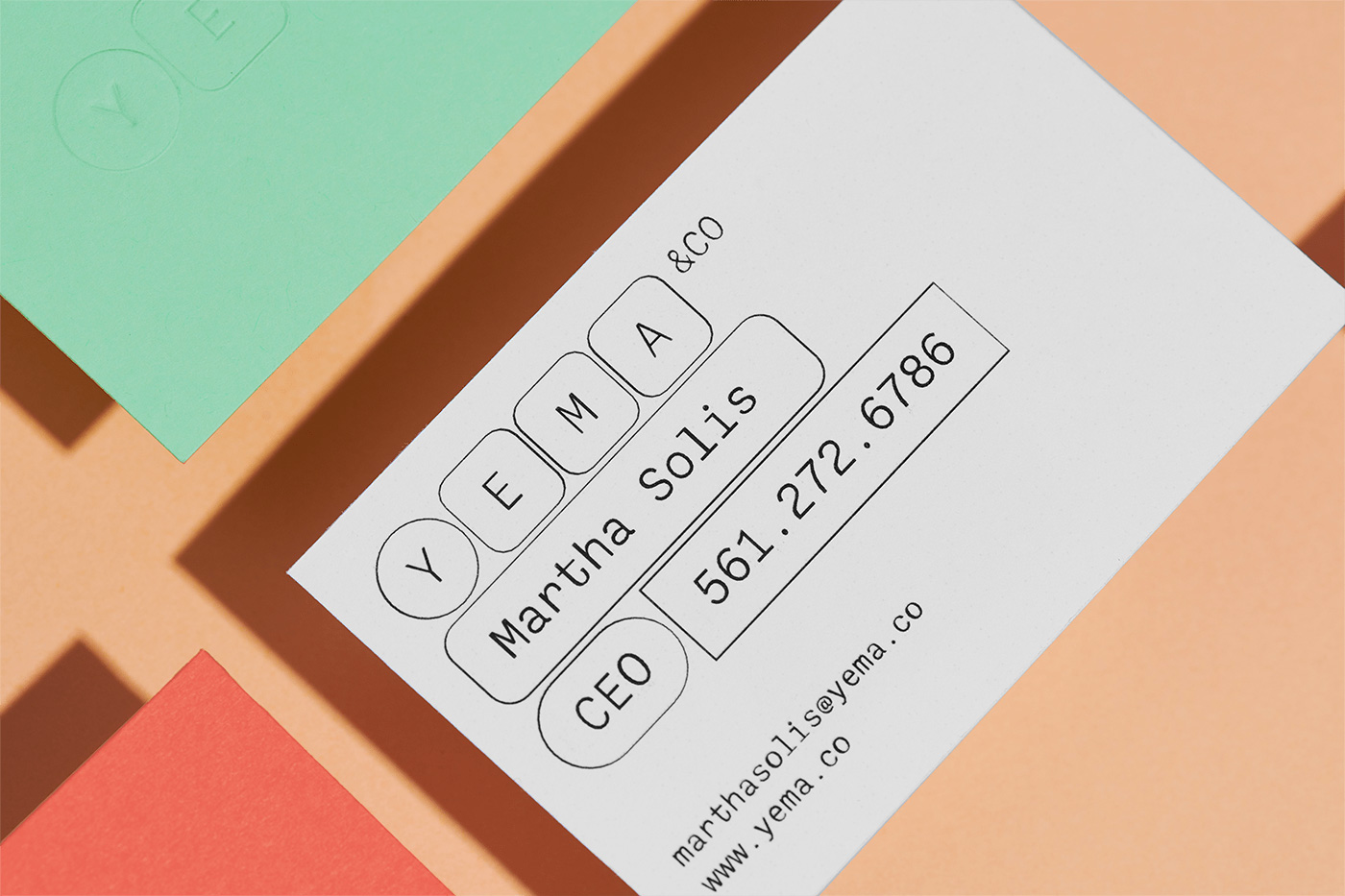
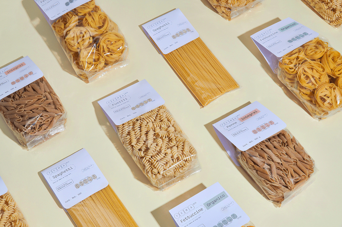
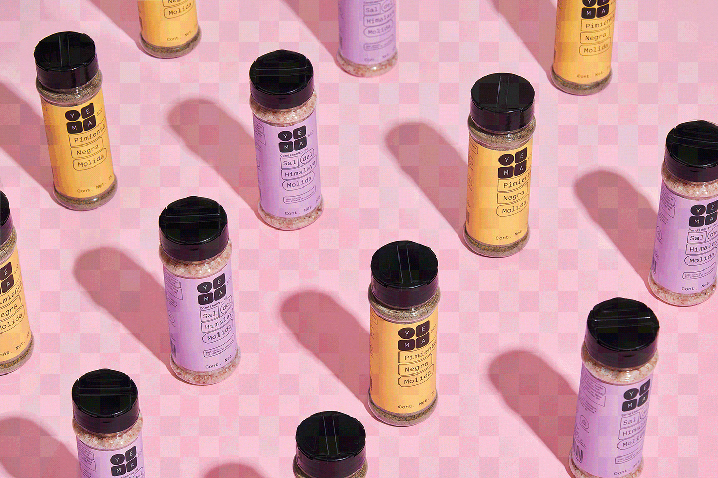
The identity and packaging revolve around a bubble system that mixes rectangles with and without rounded corners, in different colors, as well as in different stroke treatments. The approach isn't entirely novel -- here are one and two recent examples -- which I mention not to dismiss the design but to highlight that there is still room for relative innovation in the bubble-sentence genre as this is quite a nice take and perhaps even more relevant/appropriate than the other two examples as this builds directly on the structure established by the logo. The monospace typeface also works fabulously here, allowing the text in the separate bubbles to line up neatly along the lines of text.
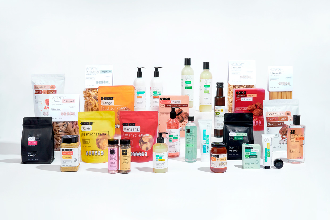
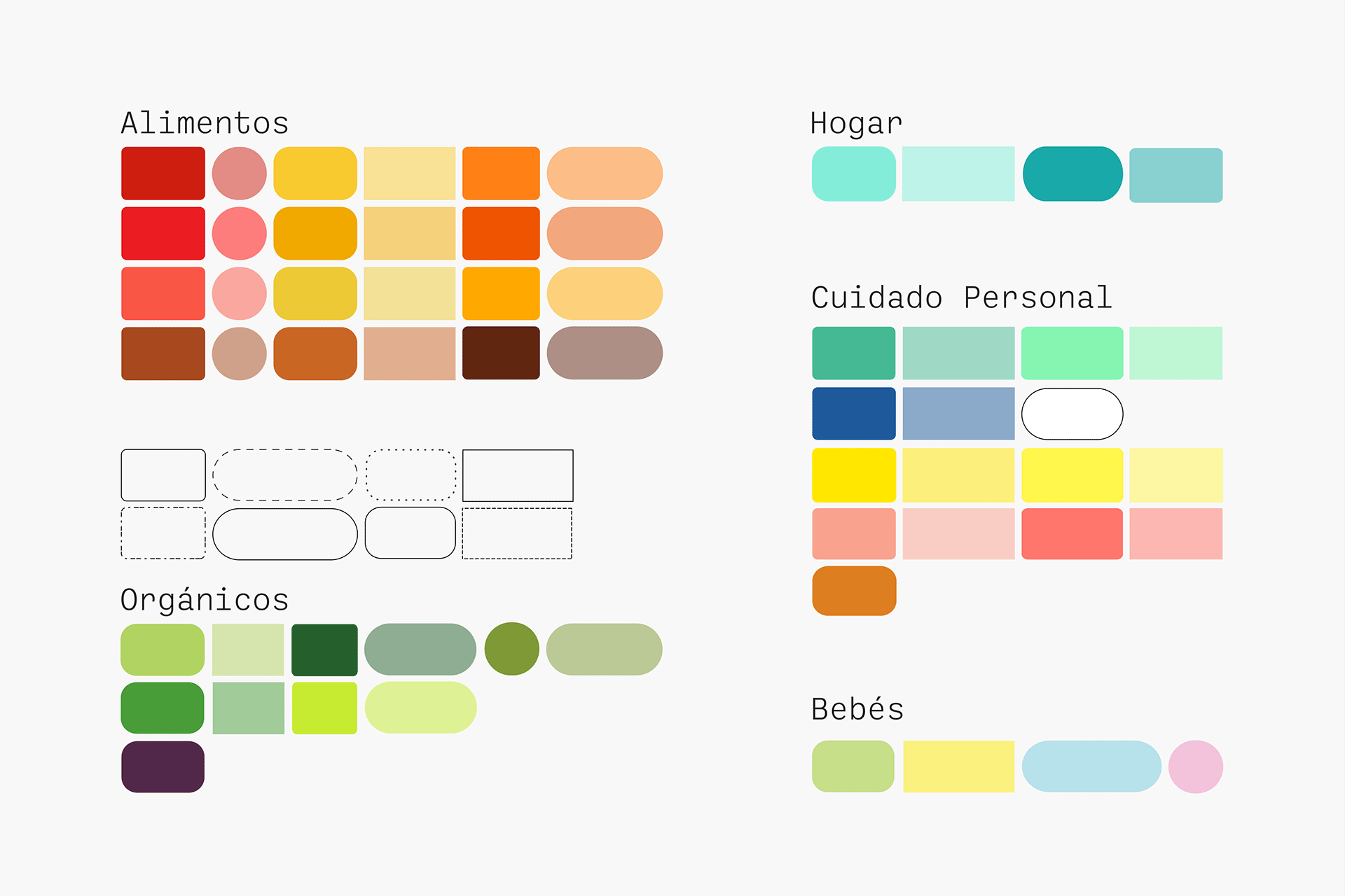
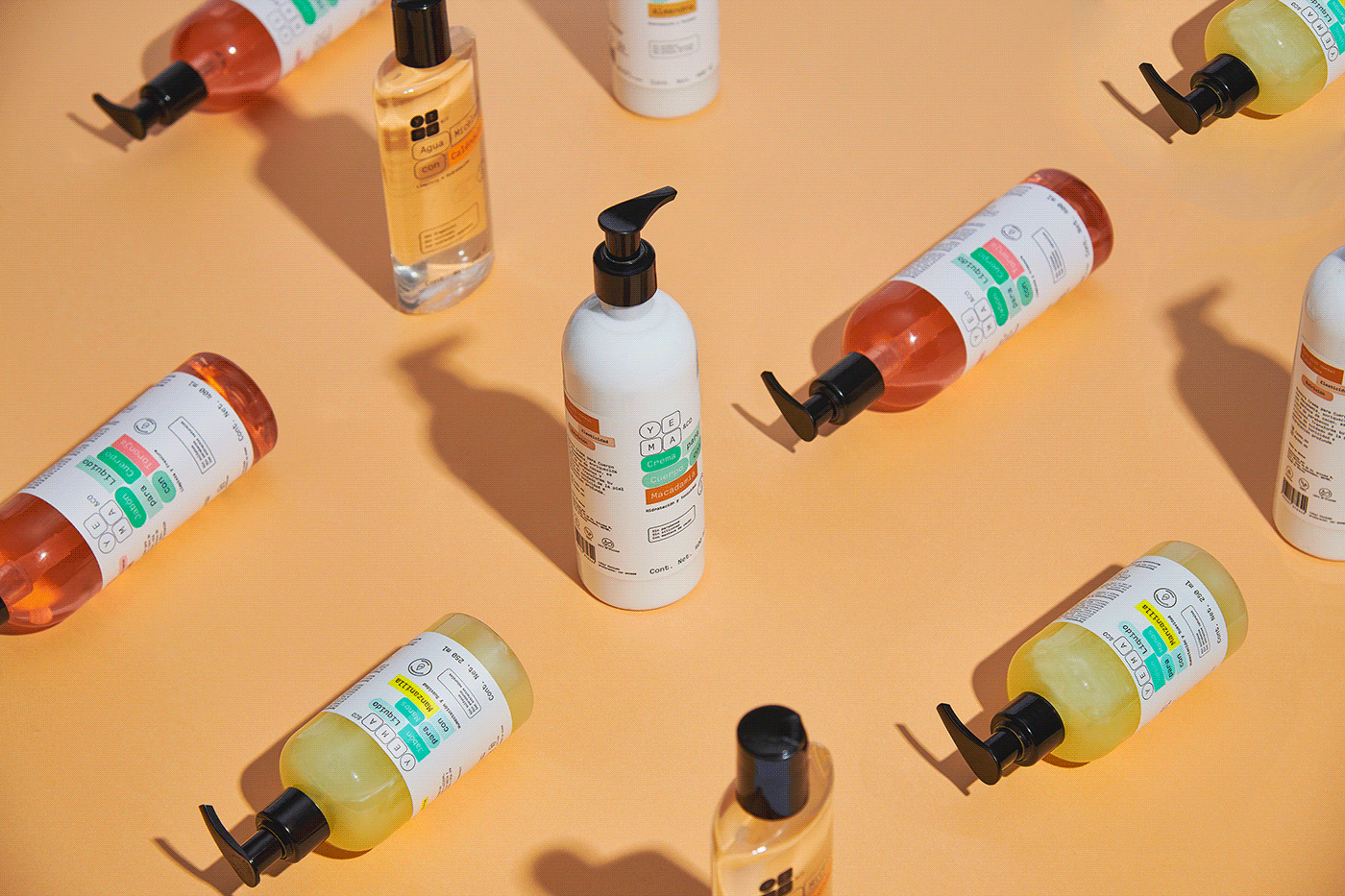
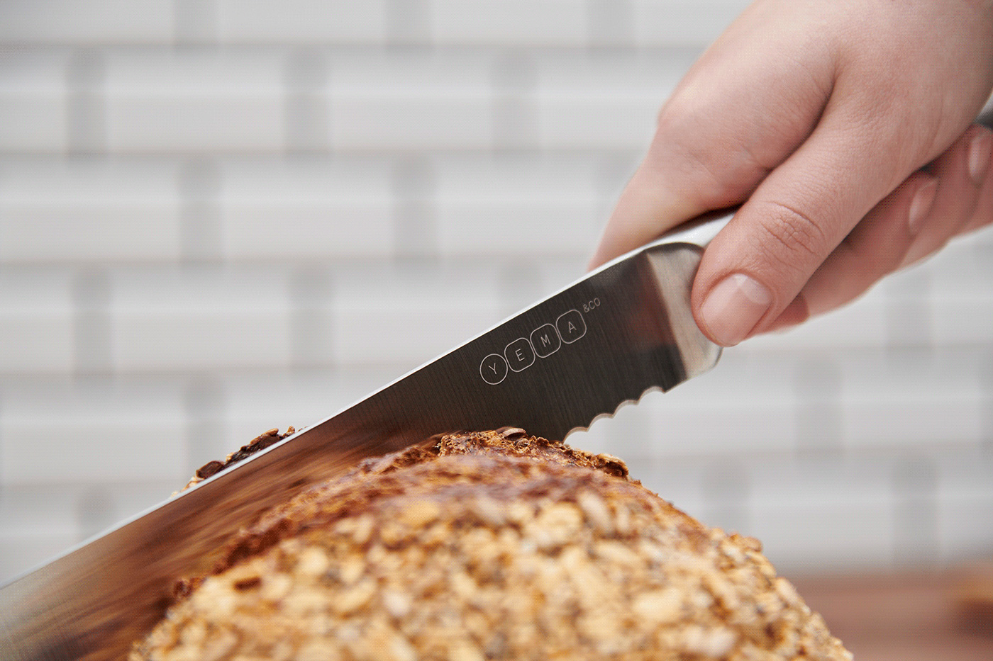
The wide variety of packaging is unified through a color-coded bubble system that yields both a consistent visual language as well as a varied range of designs as the bubbles adapt to the different containers and labels, sometimes taking up more real estate, sometimes less, and by mixing the black/white usage in the logo while each category adds its own bursts of color. As a family of products, they make for a great group shot but also individually each package is quite commendable.
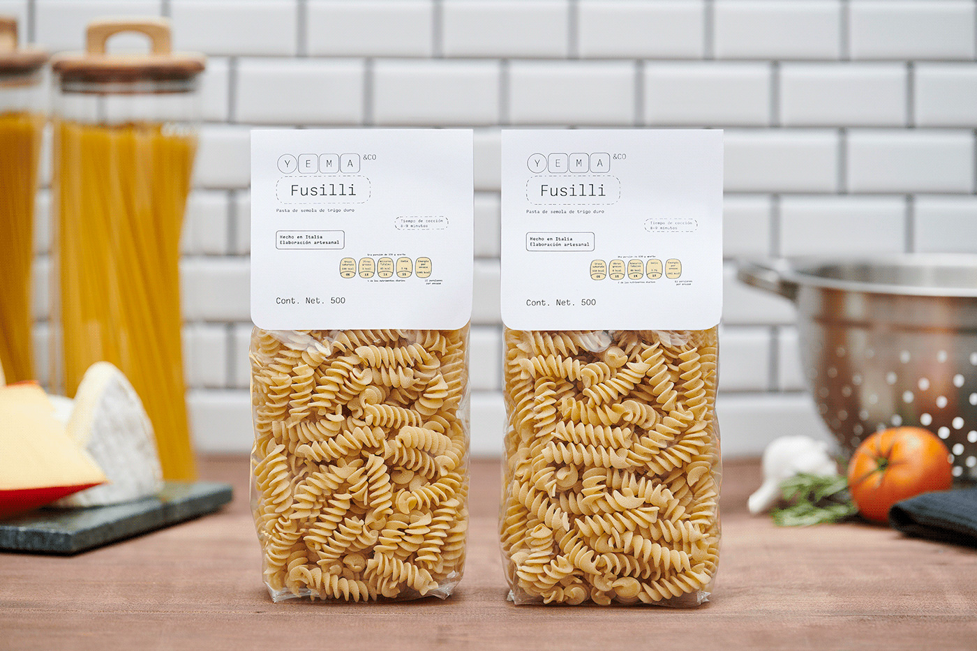
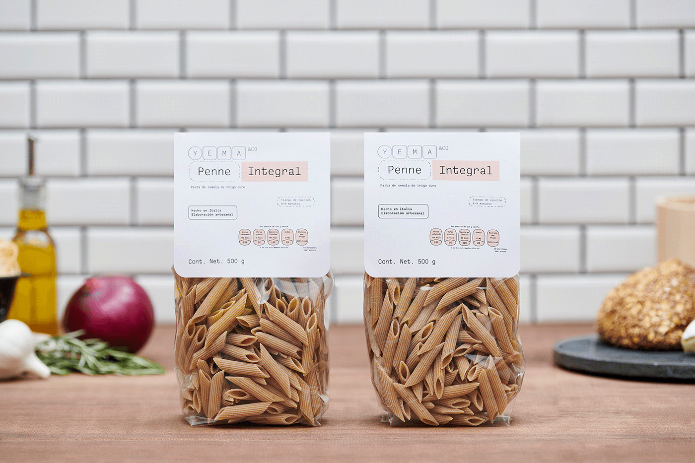
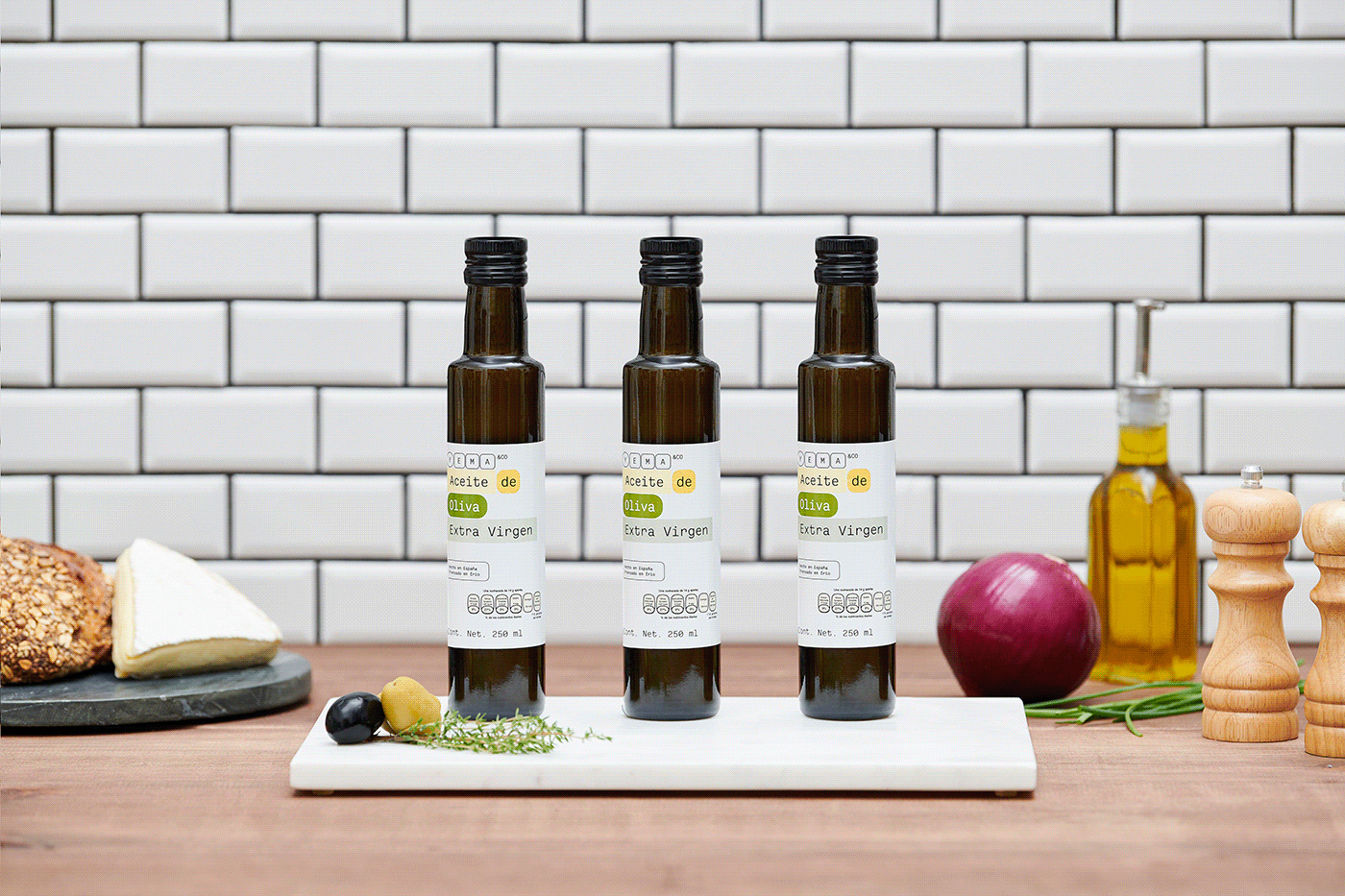
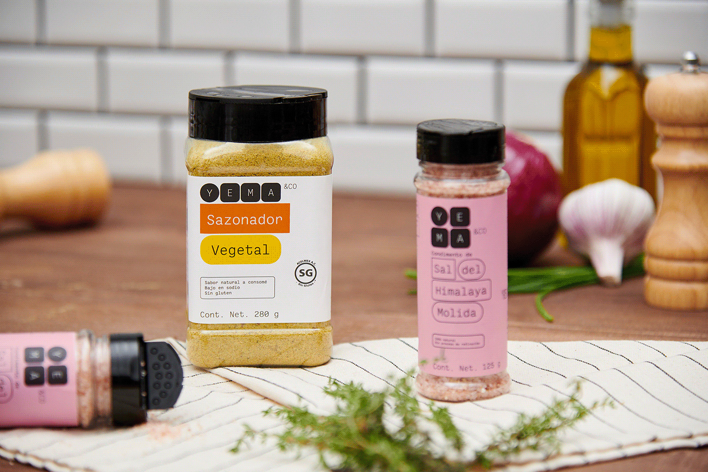
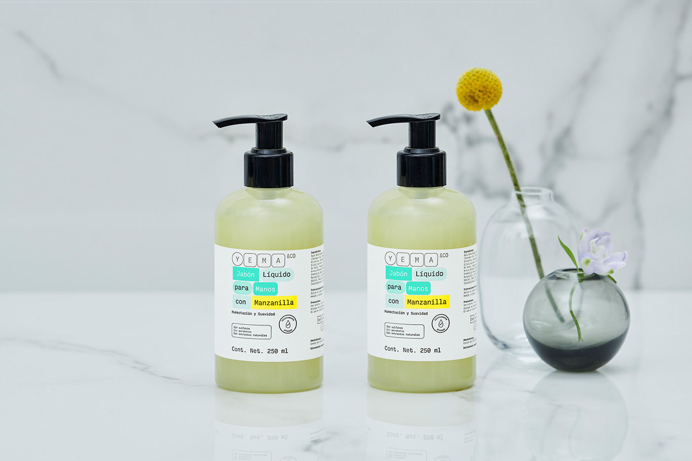
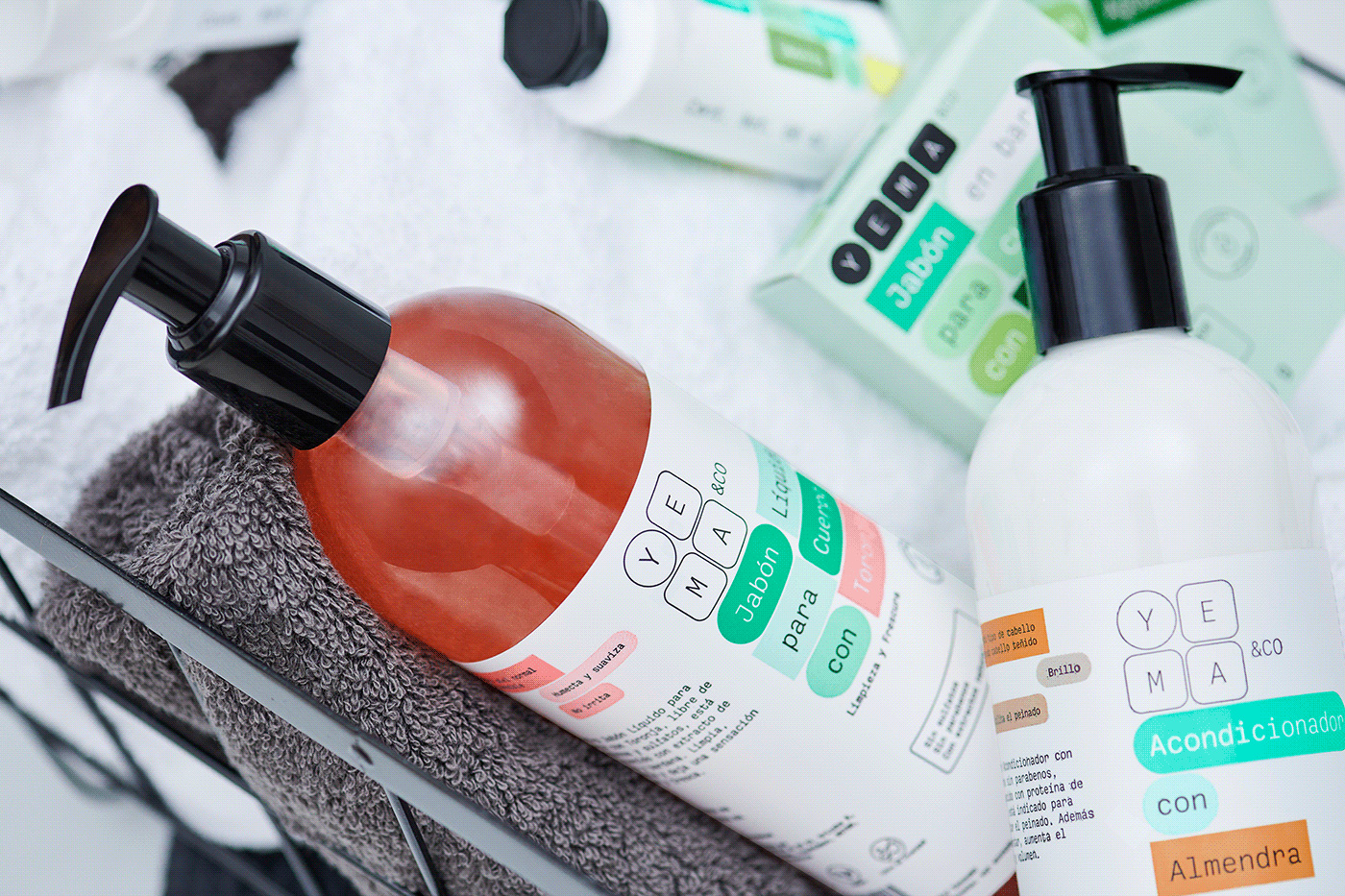
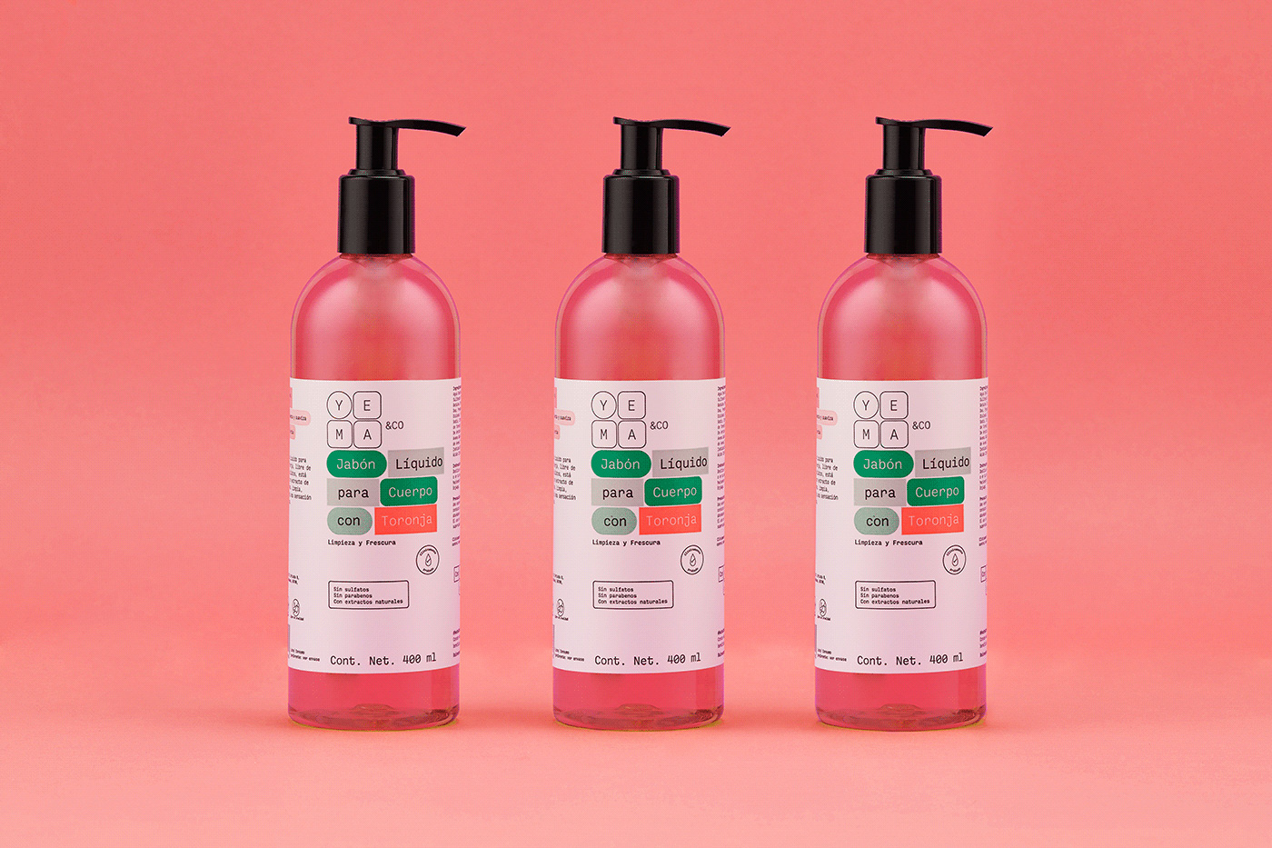
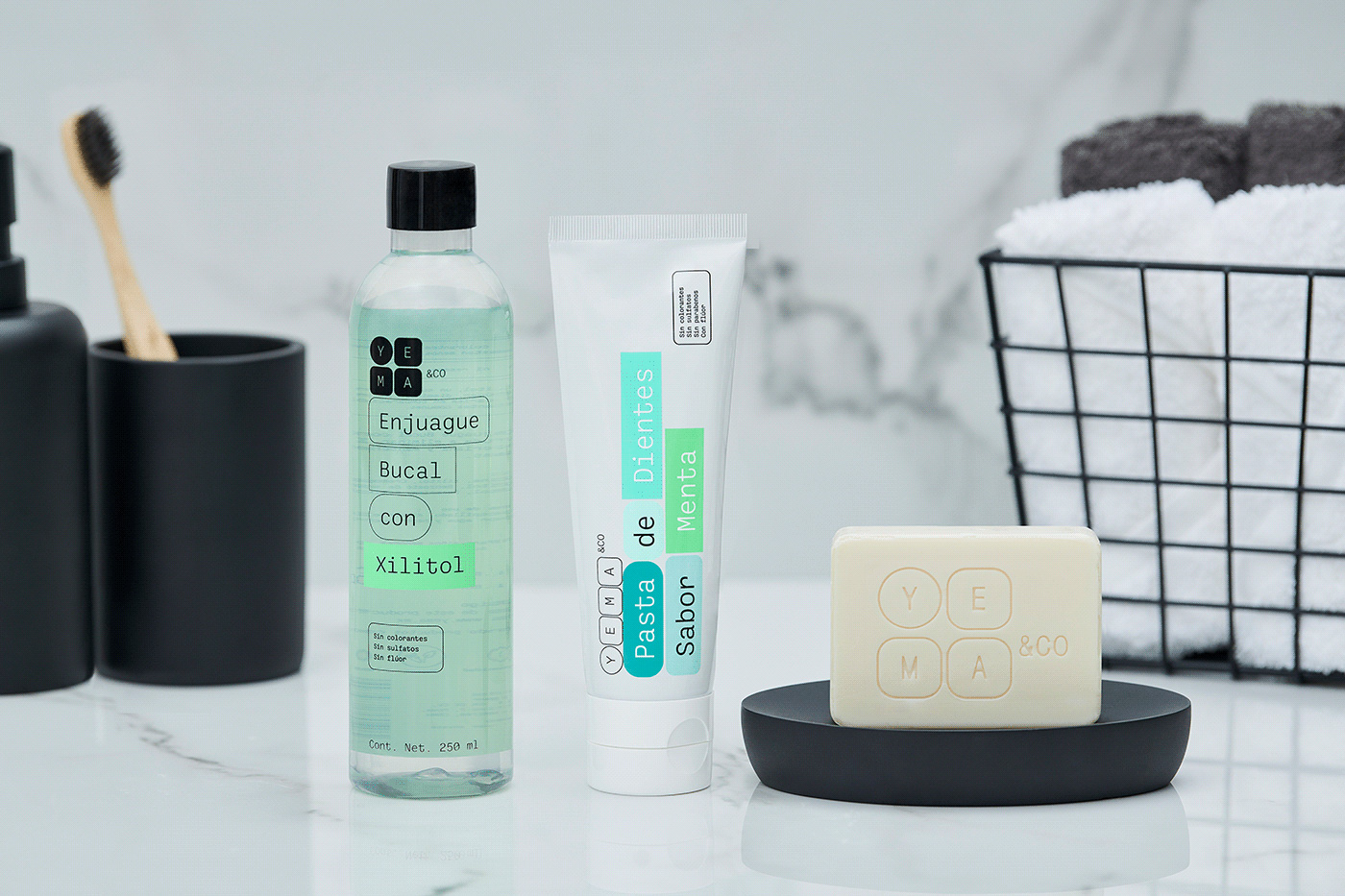
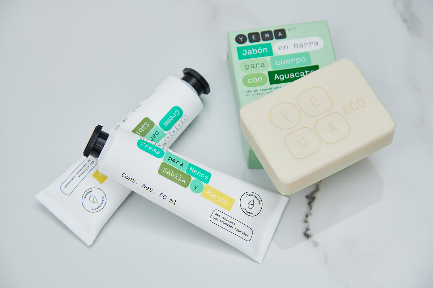
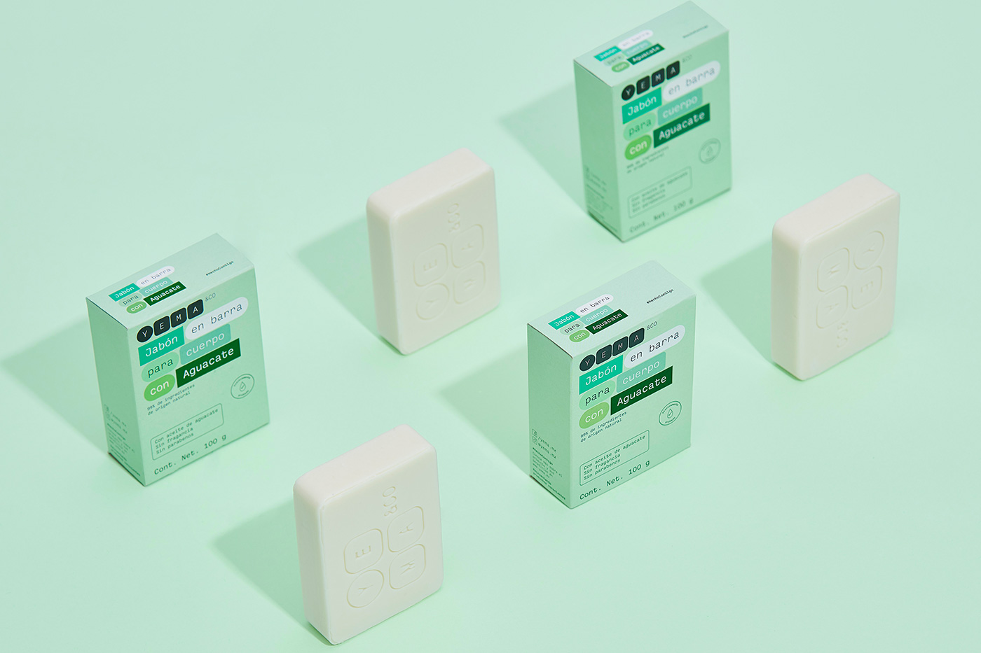
I think what I like the most about the packages, aside from the big picture design approach, is how well the design integrates with the annoying details of most packaging, like content weights or special call-outs for ingredients or nutritional facts, that usually look like blemishes but here everything looks functional and like it has a purpose. Another really nice detail, that can be appreciated in the liquid soaps, is how they use bright contrasting colors to signal flavors or scents, like a bold pink for "grapefruit" or dark green for "avocado".
Overall, this is a really great design system. While it's fairly basic, straightforward, and like something many of us have toyed with as a design approach, this is very nicely deployed across a challenging variety of products. More importantly, I think it strikes a nice balance of good design and non-pretentiousness for the Mexican market, which has grown much more attuned to good design -- a brand like this, ten years ago, would have only been viable for the affluent consumer, whereas now it has a much broader and popular reach.
In ấn Anpic In nhãn mác Anpic In brochure Anpic In card visit Anpic In catalogue Anpic In thiệp cưới Anpic In tờ rơi Anpic
In Ấn Anpic – Nổi Tiếng In Đẹp In Nhanh
Số 5 Ngõ 75 Nguyễn Xiển, Thanh Xuân, Hạ Đình, Hà Nội
0963223884
baogiainananh@gmail.com
https://anpic.vn
https://g.page/inananpic
In nhãn mác Anpic ✅ In brochure Anpic ✅ In card visit Anpic ✅ In catalogue Anpic ✅ In thiệp cưới Anpic ✅ In tờ rơi Anpic
https://anpic.vn/in-nhan-mac-dep
https://anpic.vn/in-brochure
https://anpic.vn/in-an
https://anpic.vn/in-voucher-in-phieu-giam-gia-khuyen-mai
#inananpic


Comments
Post a Comment