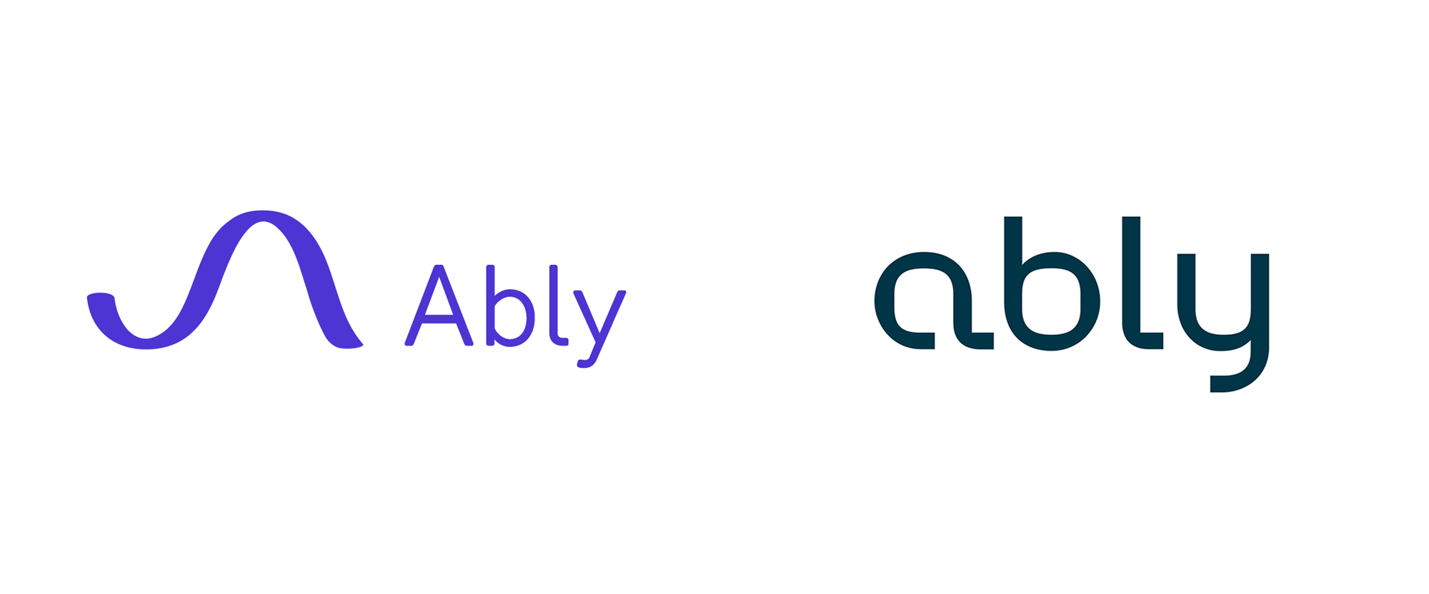
Noted: New Logo and Identity for Ably by Heydays
“Dawn of the Bed”

(Est. 2015) "Together with our partners, Ably is developing technologies that efficiently integrate patient treatment, practical nursing and medical research. At the core of our collaborative work, is the redesigned hospital bed for the 21st century. The bed is dynamic and intelligent, addressing key issues in global healthcare today. The Ably Bed is currently in development, scheduled for release autumn 2021. Ably holds offices in Norway (Oslo, Ålesund), Germany (Munich) and Canada (Toronto)."
Design by
Identity: Heydays (Oslo, Norway)
Wordmark: Miles Newlyn (London, UK)
Related links
N/A
Relevant quote
The new identity aims to preserve the human aspect of the first brand, but shift towards a more mature identity fit for an emerging industry leader.
Their hero product is the Ably bed – a revolutionary new approach to outdated technology. The bed is built up from several spine-like springs that move independently making it easier to move patients and control pressure points. The bed also features high tech sensors that capture data and registers pressure, breathing, and other vital signs.
The logo is inspired by the bed, with bending curves that represent the bed springs. The typography was chosen to balance the human aspect of the brand, with something that felt technical and precise. The soft curves and the hard corners of Monokrom’s Karelia perfectly capture this idea.
The pattern represents the collection of data from pressure points, the organic movement of the bed or the warm touch of a helping hand. The constant movement of the pattern shows an active and preventive effort to use real-time data to adjust for a better recovery.
Images (opinion after)


Opinion
The old logo, also designed by Heydays, was good with a fluid-looking icon (and abstract “A”) complemented by a roundier, friendlier sans serif. The icon was too big, though, and it kind of killed its own elegance by being so out of proportion in contrast to the wordmark. The new logo drops the icon and goes with a simple but effective wordmark that more literally reflects how the bed bends at specific anchor points while maintaining structural rigidity. Aside from being conceptually sound I think it looks great. At first I was a little turned off the by the big bowl of the “y” but I have come to appreciate it — I do think its descender would have benefitted from a tight 90-degree turn like in the “a” and “l”. The “a” on its own is surprisingly strong as a monogram. Not a whole lot in application but the renderings shown do convey a very technically-driven product while the photography and lively red color convey a sense of warmth and human connection. That last product render could easily be a Bluetooth speaker sold at design-y stores. Overall, this feels right on target and is very nicely executed.
In ấn Anpic In nhãn mác Anpic In brochure Anpic In card visit Anpic In catalogue Anpic In thiệp cưới Anpic In tờ rơi Anpic
In Ấn Anpic – Nổi Tiếng In Đẹp In Nhanh
Số 5 Ngõ 75 Nguyễn Xiển, Thanh Xuân, Hạ Đình, Hà Nội
0963223884
baogiainananh@gmail.com
https://anpic.vn
https://g.page/inananpic
In nhãn mác Anpic ✅ In brochure Anpic ✅ In card visit Anpic ✅ In catalogue Anpic ✅ In thiệp cưới Anpic ✅ In tờ rơi Anpic
https://anpic.vn/in-nhan-mac-dep
https://anpic.vn/in-brochure
https://anpic.vn/in-an
https://anpic.vn/in-voucher-in-phieu-giam-gia-khuyen-mai
#inananpic
Comments
Post a Comment