Noted: New Logo and Identity for ANP by Vruchtvlees
“Dot News is Good News”
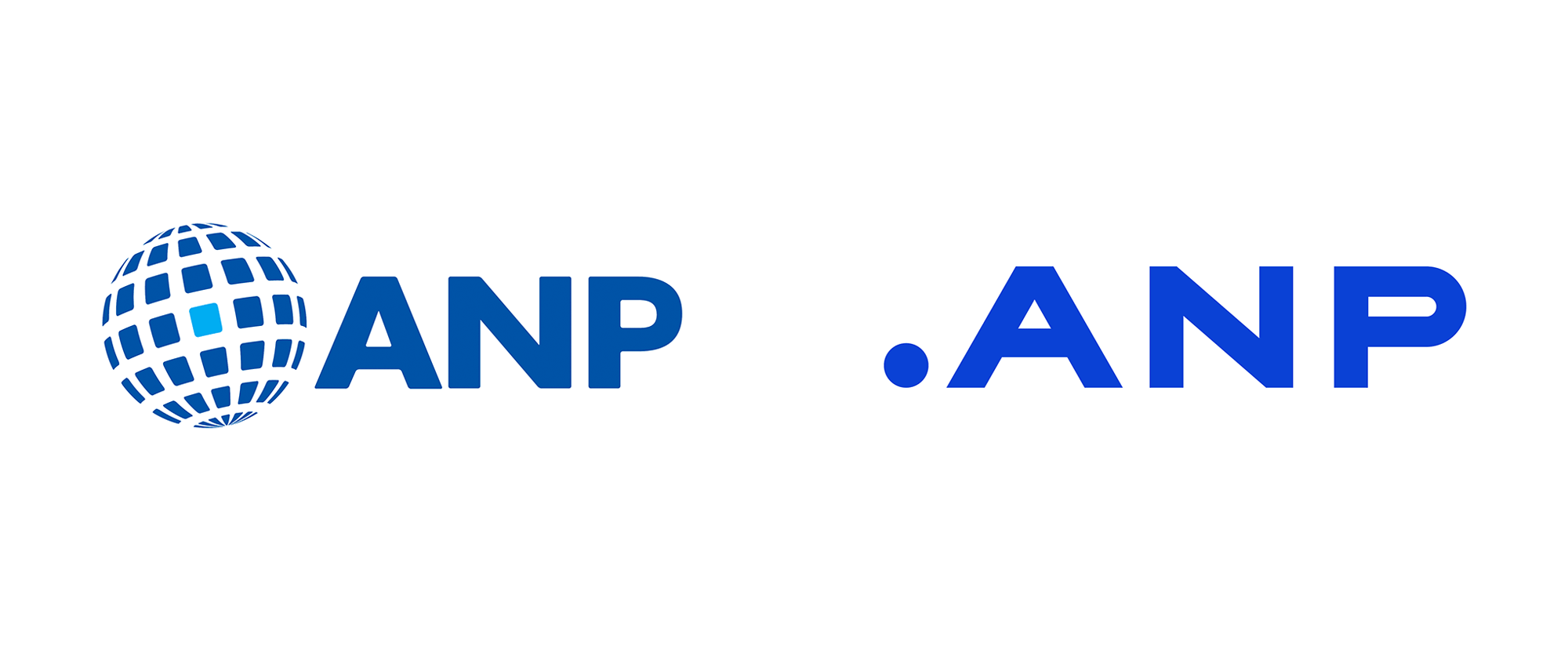
(Est. 1934) "ANP is the largest independent BtB news and information supplier to all Dutch media - Internet, mobile, television, radio, newspapers, magazines - as well as to organisations in public and private sectors. Next to news and information, ANP supplies integrated tools and content that help our customers with itinerary setting, analysing, monitoring and producing content. ANP meets the highest standards of quality and reliability in providing complete coverage of events. News stories are written by experienced ANP journalists, an extensive network of correspondents and journalists from international press agencies, such as Reuters, DPA and AFP. With a permanent staff of around 200, ANP is headquartered just outside The Hague in Rijswijk. In addition to a team of correspondents spread throughout the country, ANP operates bureaus in Amsterdam, Rotterdam, The Hague (government) and Brussels (EU)."
Design by
Vruchtvlees (The Hague, Netherlands)
Related links
Vruchtvlees project page
ANP news post
Relevant quote
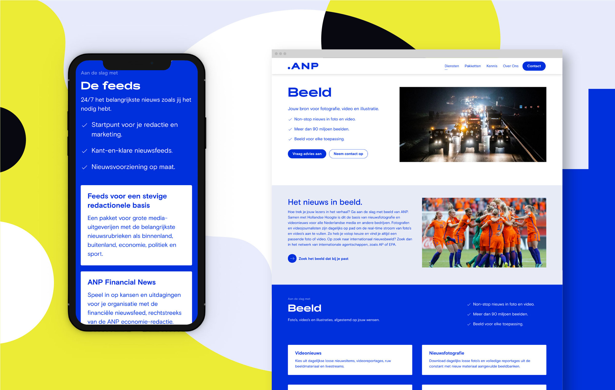
ANP is the source for fact-checked news in the Netherlands. Whether you’re listening to a radio broadcast, reading a news item, or monitoring information with ANP360+, it all starts from the same fundamental source. In our visual identity for ANP, the source is represented by a point (or dot). All visual elements flow from this central starting point. The source underscores and points out the facts, making a point against fake news.
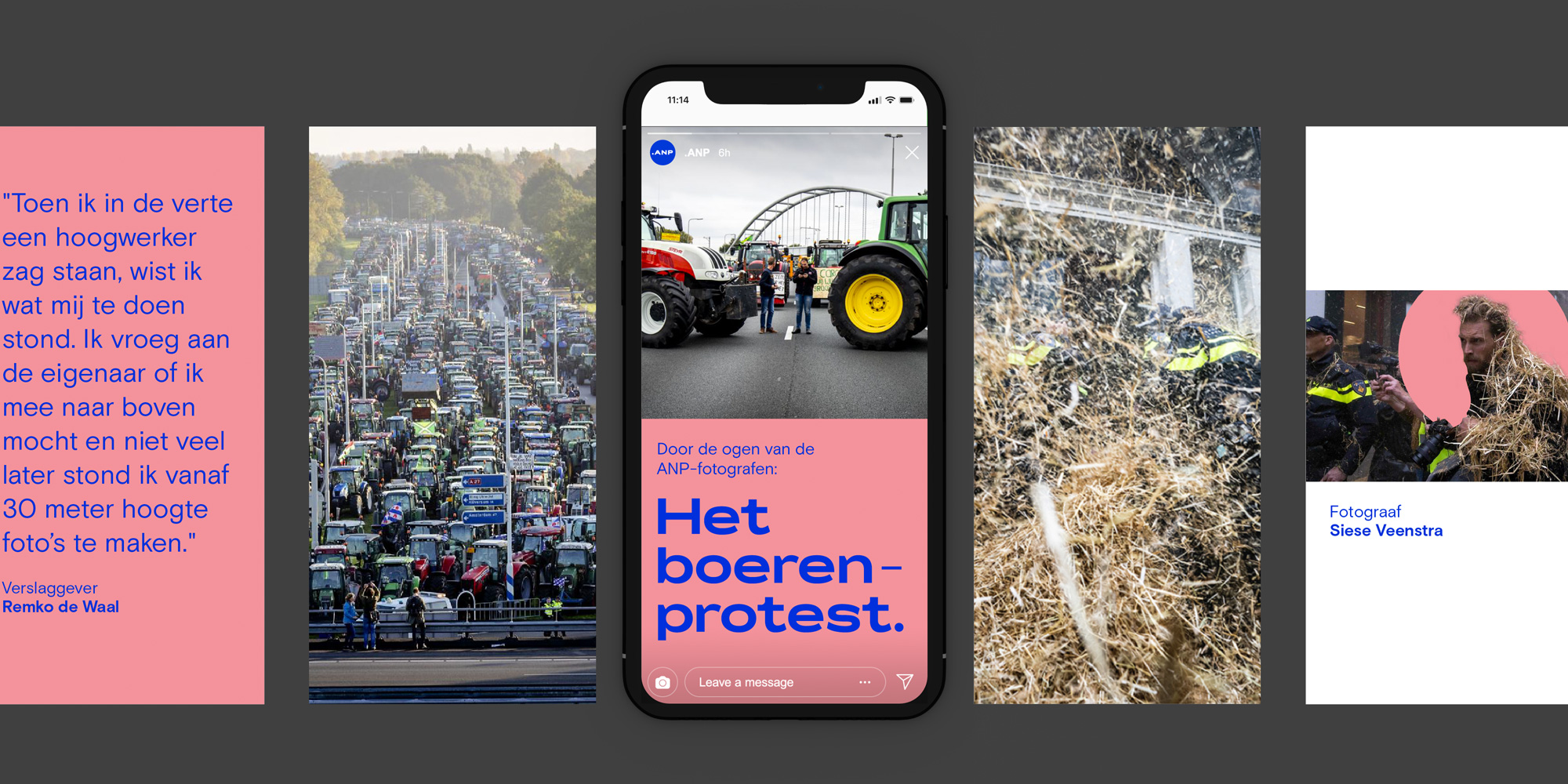
With its identity and strategy, ANP is claiming its position as a prominent force in the Dutch media landscape. As a leader in the production and distribution of factually accurate news, ANP urges anyone with a platform and voice to start with the facts. With a clearly defined tone-of-voice, Vruchtvlees has streamlined all of ANP’s copywriting on the website and beyond. A brand new content strategy and newly developed content formats make it easy for ANP to showcase what it stands for across all channels.
Images (opinion after)


Opinion
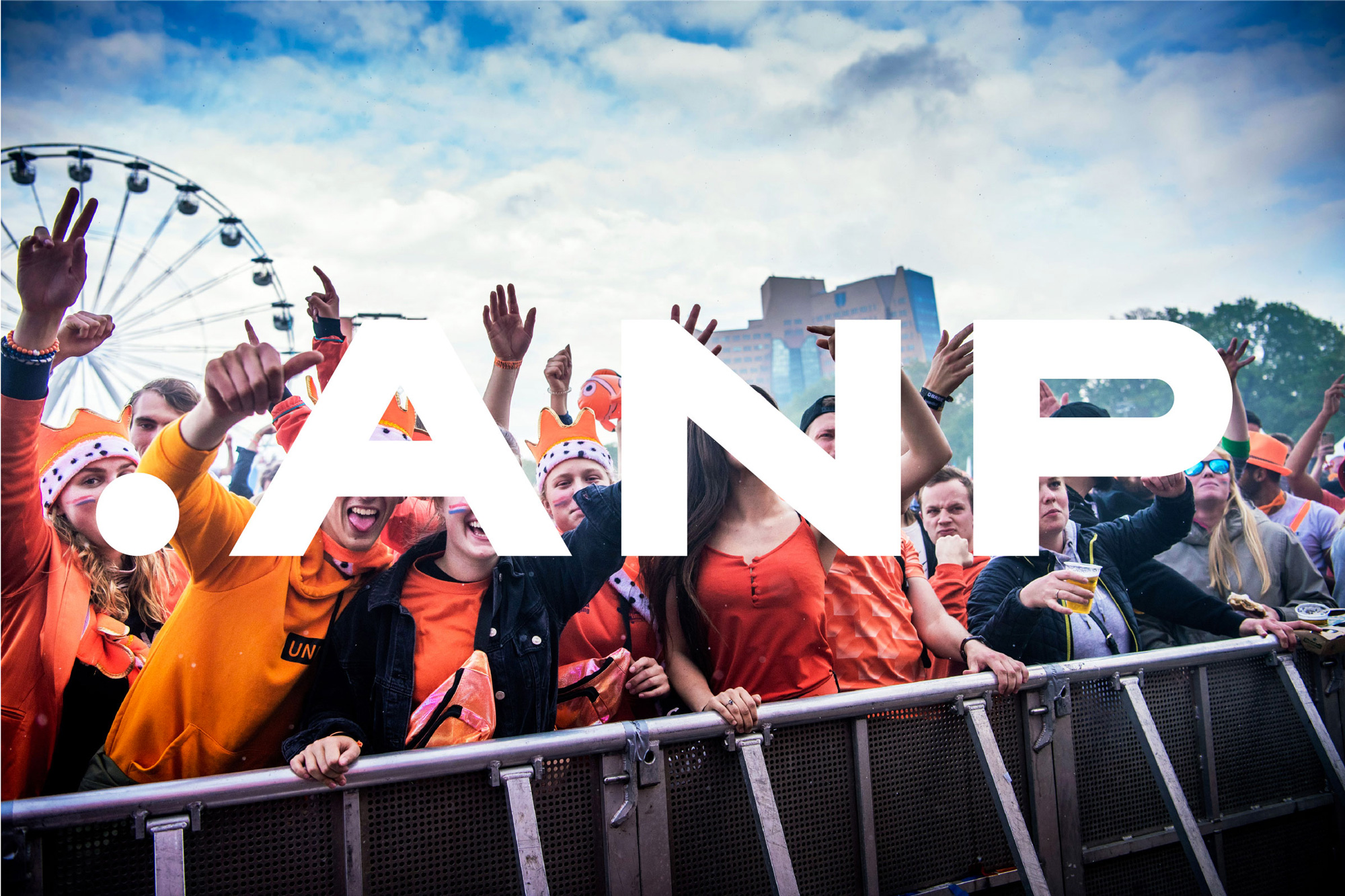
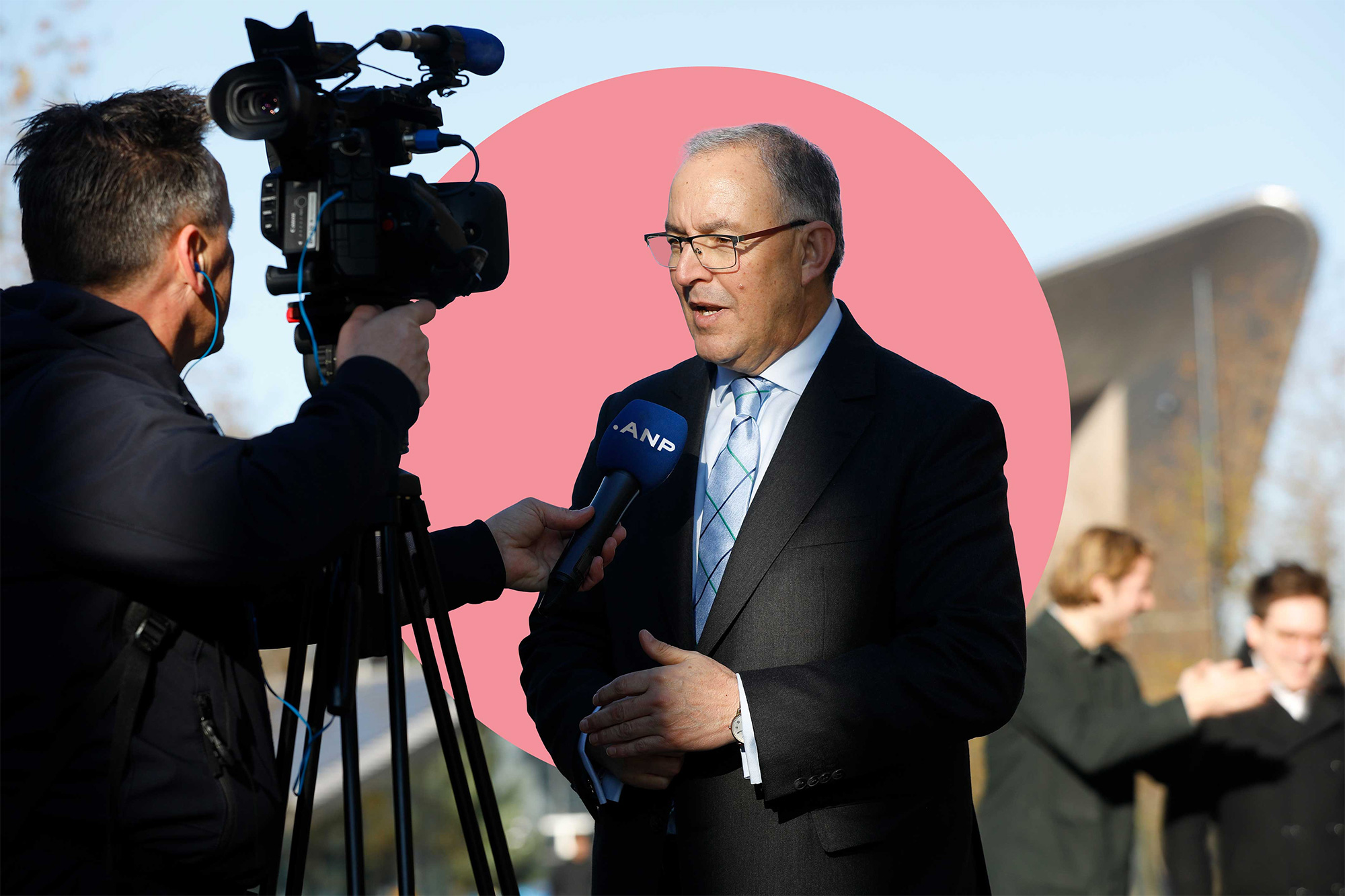
The old logo was cheesy, with its globe constructed of metaphorical news items, but not terrible… okay, not too terrible. The wordmark was too unbalanced with a huge, wide “N” and more normal “A” and “P”. The new logo reduces the globe to a minimalist dot that punctuates, in reverse, a bold and confident extended wordmark. I so wish their URL was something like news.anp as that would be boss. The new logo is fine, nothing amazing or innovative but certainly has a contemporary feel that most news bureaus, as we think of them with certain nostalgia, don’t have. The identity builds on the extended-ness of the logo with the use of New Letters’ Rois, a funky and generously wide sans serif that adds an unexpected sense of novelty. The other element in play is a big dot here and there, which feels a little under-developed so far but could be interesting. The choice of “that blue” as the main color demonstrates the enduring power of this color to signal “Look at me!” and it kind of works for ANP, especially on their website where it’s used to good effect for headlines and highlighting elements. Overall, not a particularly earth-shattering identity but definitely a considerable shake-up for a news outlet.
In ấn Anpic In nhãn mác Anpic In brochure Anpic In card visit Anpic In catalogue Anpic In thiệp cưới Anpic In tờ rơi Anpic
In Ấn Anpic – Nổi Tiếng In Đẹp In Nhanh
Số 5 Ngõ 75 Nguyễn Xiển, Thanh Xuân, Hạ Đình, Hà Nội
0963223884
baogiainananh@gmail.com
https://anpic.vn
https://g.page/inananpic
In nhãn mác Anpic ✅ In brochure Anpic ✅ In card visit Anpic ✅ In catalogue Anpic ✅ In thiệp cưới Anpic ✅ In tờ rơi Anpic
https://anpic.vn/in-nhan-mac-dep
https://anpic.vn/in-brochure
https://anpic.vn/in-an
https://anpic.vn/in-voucher-in-phieu-giam-gia-khuyen-mai
#inananpic
Comments
Post a Comment