Noted: New Logo and Identity for Lendify by Essen International
“Lend me your Arrears”

(Est. 2014) "Lendify is building the next generation bank that is efficient, digital and fair. Lendify caters to Swedish households with high credit ratings who often already have loans from one of the traditional banks, but can and want to get better terms. Lendify's goal is to give borrowers fair conditions with lower interest rates and savers higher returns."
Design by
Essen International (Stockholm, Sweden, and San Francisco, CA)
Related links
Essen International project page
Relevant quote
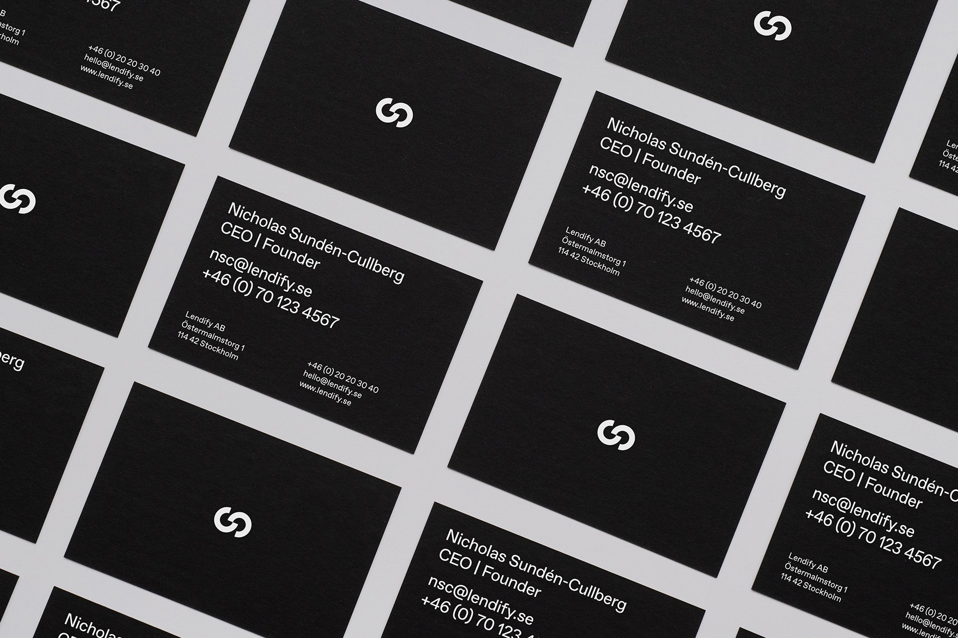
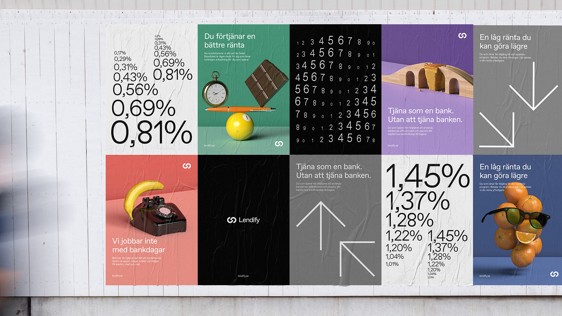
Our research brought about a sophisticated, quite minimal brand identity, mostly in black and white. But we knew we couldn’t get too sterile. Lendify prides themselves on being the helpful, accessible option, and this warmer characteristic had to show too. Hence, the colorful elements and tongue-in-cheek details. Also, we were keen on developing a brand that really shines when moving.
As the brand identity took form, we started producing the brand assets to go with it. Numbers and graphs are obviously important for Lendify, so those were put at the forefront. A colorful, quirky 3D image bank was produced to balance things out. A tailor-made set of icons too. And, of course, there was the logotype, embodying trustworthiness and equal interdependency.
Images (opinion after)


Opinion
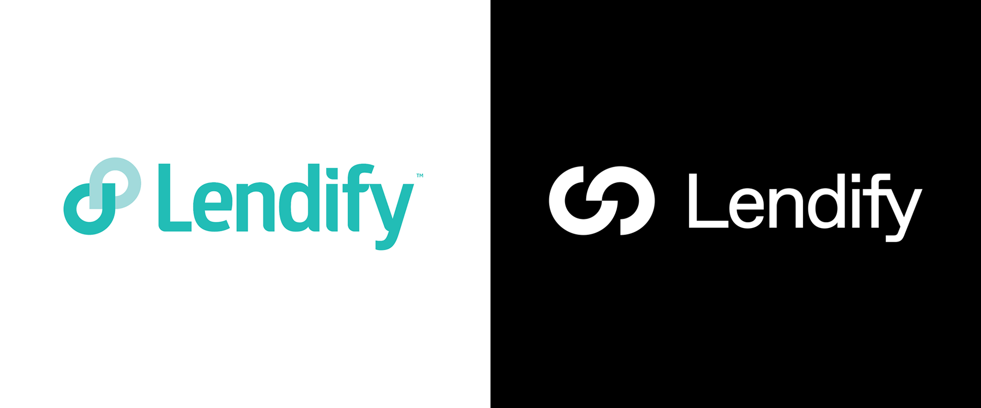
The old logo had a fairly generic look, questionable typography, and its minty-green color made it look more healthcare than finance. The new logo maintains the “link” icon but in a more contemporary design — it’s a good-looking icon but my brain keeps trying to find a letter in each of the cropped circles and/or their combination that somehow ties to the name. In other words I have a hard time seeing it as a standalone icon. It might even have to do with the lock-up size relationship where the icon is too overpowering and the lighter wordmark, which is fairly nice, gets pushed to the side. They are both solid elements but I’m not sure they co-exist as well as they could. In application there is a couple of things going on: One is the numbers in motion which are very appealing and hypnotic and the other are still-life compositions meant to be funny/clever but I’m not convinced they are either and they have a kind of old school stock-image aesthetic that’s not very sophisticated. The two things are at odds with each other and it’s hard to figure out if Lendify is supposed to be dead-serious (based on the numbers) or cheeky (based on the images). My inclination would be to build on the former but I have to admit that, deep down, I do enjoy the cheese wedge in the toy tracks image. Overall, there is something good in here but the mixed messages created by the visuals make it hard to know what you are getting from this company.
In ấn Anpic In nhãn mác Anpic In brochure Anpic In card visit Anpic In catalogue Anpic In thiệp cưới Anpic In tờ rơi Anpic
In Ấn Anpic – Nổi Tiếng In Đẹp In Nhanh
Số 5 Ngõ 75 Nguyễn Xiển, Thanh Xuân, Hạ Đình, Hà Nội
0963223884
baogiainananh@gmail.com
https://anpic.vn
https://g.page/inananpic
In nhãn mác Anpic ✅ In brochure Anpic ✅ In card visit Anpic ✅ In catalogue Anpic ✅ In thiệp cưới Anpic ✅ In tờ rơi Anpic
https://anpic.vn/in-nhan-mac-dep
https://anpic.vn/in-brochure
https://anpic.vn/in-an
https://anpic.vn/in-voucher-in-phieu-giam-gia-khuyen-mai
#inananpic
Comments
Post a Comment