Noted: New Logo and Identity for Liberty by North
“They, Ourselves, and I”

(Est. 1934) "Liberty is ordinary people standing up to power. For more than 80 years we've championed anyone whose rights come under threat, from gypsy and traveller communities to Government whistle-blowers. Liberty was founded in 1934 in response to brutal police attempts to stop peaceful protests during the Hunger Marches and the 'general and alarming tendency to encroach on the liberty of the citizen'. Since then we've become the UK's largest civil liberties organisation, with more than 10,500 members and supporters. We campaign for everyone in the UK to be treated fairly, with dignity and respect. We're independent. Our principles are guided by evidence, expertise and the human impact. We're not swayed by political agenda, profit or popular opinion. From fighting against compulsory ID cards to campaigning for trans equality - Liberty stands on the side of freedom and justice. We're not afraid to speak uncomfortable truths and we challenge intolerance, discrimination and the abuse of power wherever we find it."
Design by
North (London, UK)
Related links
N/A
Relevant quote
When we reviewed Liberty’s existing brand assets and campaigns we realised that there was little coherence in tone of voice and graphic application. Liberty are ordinary people standing up to power. Our civil rights are dependent on the effort of individuals, and so challenge us to be responsible. The special L and I character expresses the dichotomy between the organisation and the individual. It provided the formula for a singular and recognisable voice. With this device Liberty can easily create consistency of messaging across campaigns and other branded materials.
Liberty are independent. Their principles are guided by evidence, expertise and human impact. They are not influenced by political agenda, profit or popular opinion. It is crucial that Liberty are perceived as nonpartisan. This eliminated politically charged colours such as red and blue.
We were looking for a strong typographic expression so that Liberty’s brand could stand out and be more visible. We used the Bureau Grot font family, which has an approachable quality, despite its bold and condensed appearance.
Liberty have an illustrious past with many landmark cases, some of which have made it onto cinema screens. Since 1934, Liberty have campaigned on a huge range of issues – from fighting fascism, mass surveillance, internment and abuse of police power, to defending free speech and demanding equal rights for all. We tried to juxtapose historic and more recent issues in order to highlight what a crucial and dynamic role Liberty have played in championing civil rights in the UK.
Images (opinion after)


Opinion
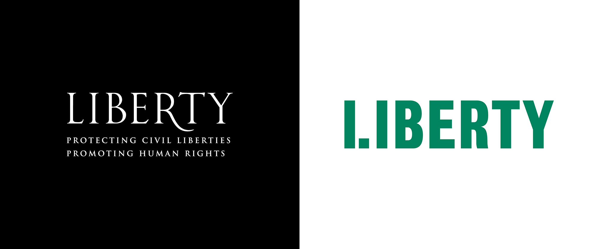
The old logo was rather nice, in an elegant and stoic serif that looked like it could have been inscribed on a monument somewhere and the “R” dipping under the “T” was a nice detail. The new logo replaces the more passive nature of the old one with a bold, protest-placard-like wordmark that feels more like a social movement in action. I love me a good grotesque and Bureau Grot, in its condensed style, excels at being grotesque, so the logo looks right from the get-go. The stenciled “L”, on the logo alone, is a little confusing — to be honest, I didn’t figure out its purpose on my own, although I interpreted it as a piece of the letter breaking free but maybe that was too hard of a metaphor. The move pays off in the application when the “L” transforms into an “I”, putting the viewer in charge as pithy sentences explain what Liberty is fighting for. When that clicks, it’s pretty great, and it’s fairly clear as presented in the shorthand + application images but I feel like the actual applications miss to include the full logo somewhere to create that connection. Also, maybe it’s just me, but now I keep reading the logo as “I. Iberty”. The vintage photography, paired with the contemporary typesetting, creates an interesting sense that the fight has been going on for a long time but it still continues. Overall, this is a very smart and visually arresting identity and maybe it just needs to be more congruent in how the shorthand and the full logo co-exist.
In ấn Anpic In nhãn mác Anpic In brochure Anpic In card visit Anpic In catalogue Anpic In thiệp cưới Anpic In tờ rơi Anpic
In Ấn Anpic – Nổi Tiếng In Đẹp In Nhanh
Số 5 Ngõ 75 Nguyễn Xiển, Thanh Xuân, Hạ Đình, Hà Nội
0963223884
baogiainananh@gmail.com
https://anpic.vn
https://g.page/inananpic
In nhãn mác Anpic ✅ In brochure Anpic ✅ In card visit Anpic ✅ In catalogue Anpic ✅ In thiệp cưới Anpic ✅ In tờ rơi Anpic
https://anpic.vn/in-nhan-mac-dep
https://anpic.vn/in-brochure
https://anpic.vn/in-an
https://anpic.vn/in-voucher-in-phieu-giam-gia-khuyen-mai
#inananpic
Comments
Post a Comment