Noted: New Logo and Identity for Warsaw Ghetto Museum by Redkroft
“Torn”
(Est. 2017; opening 2023) "The Warsaw Ghetto Museum is a history museum in Warsaw, Poland, currently under construction. It will open in 2023, on the 80th anniversary commemoration of the Warsaw Ghetto Uprising. The museum will be located in the buildings of the former Bersohn and Bauman Children's Hospital in Warsaw at 51 Śliska Street and 60 Sienna Street. On October 19, 2018 Museum director, Polish-Jewish historian Albert Stankowski received a key to the property from a government official and signed a long-term lease during a ceremony at the future museum site. Its chief historian is Daniel Blatman." (Wikipedia)
Design by
Redkroft (Warsaw, Poland)
Related links
Redkroft project page
Relevant quote
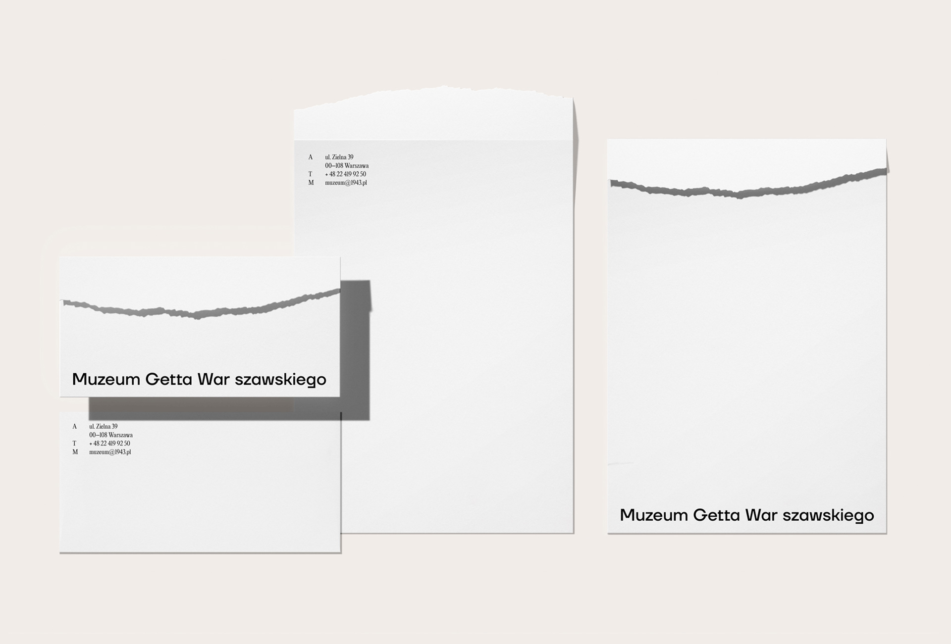
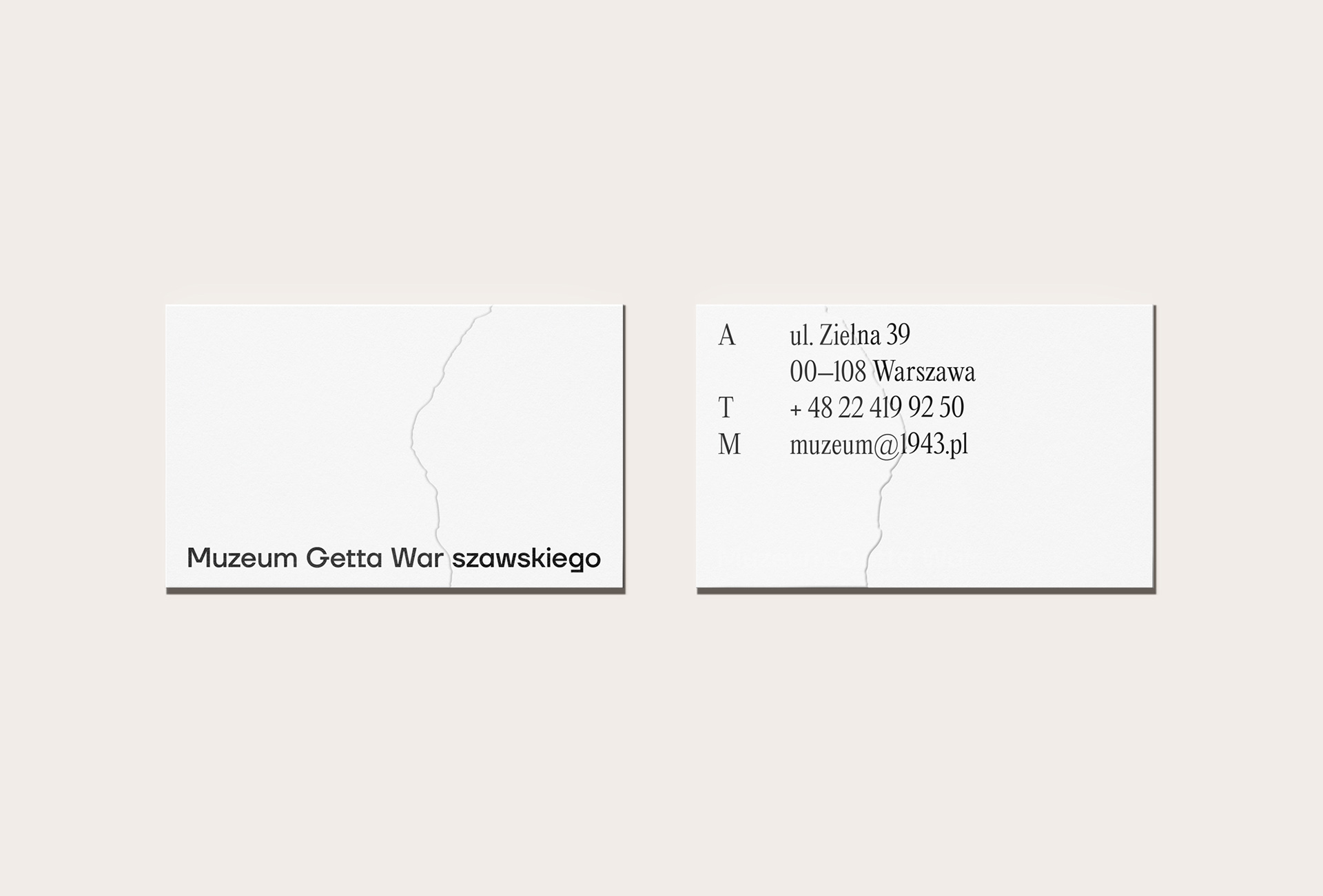
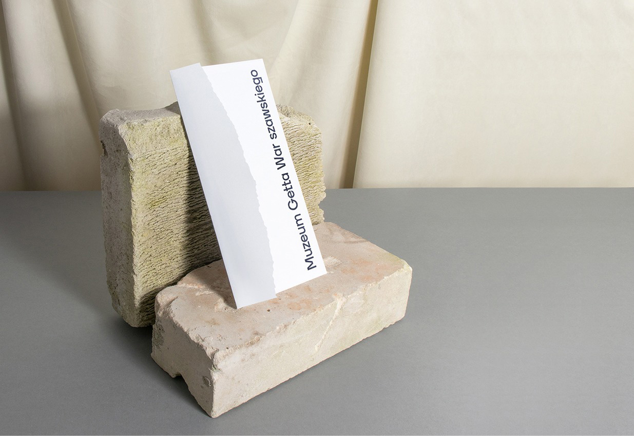
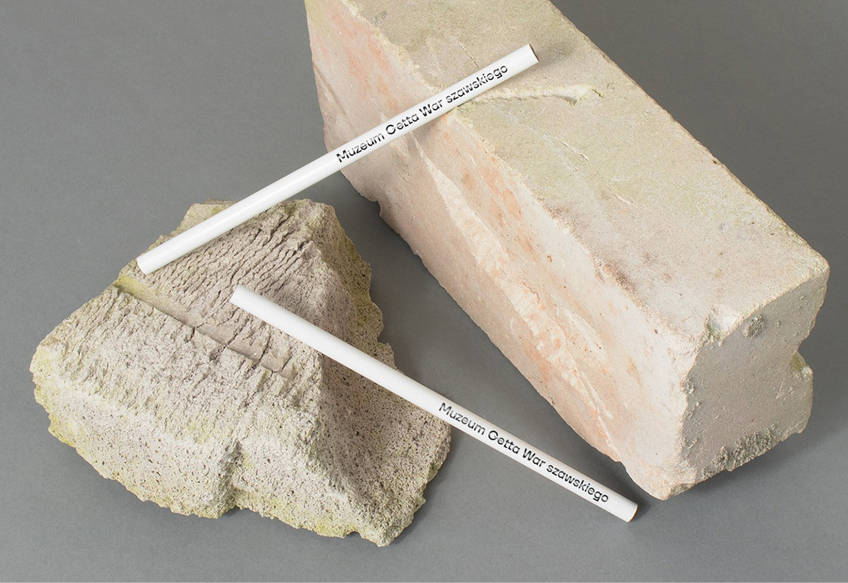
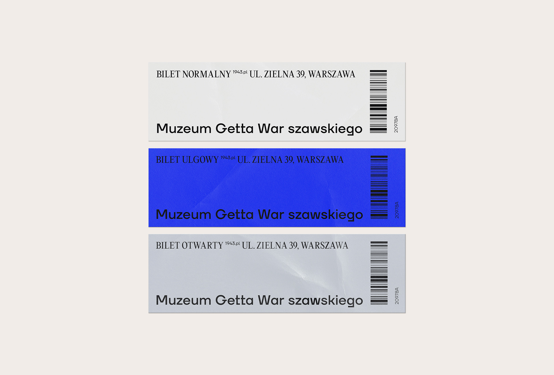
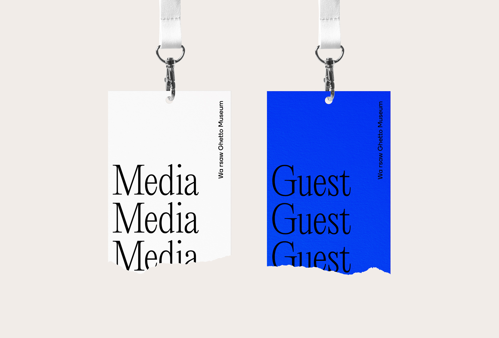
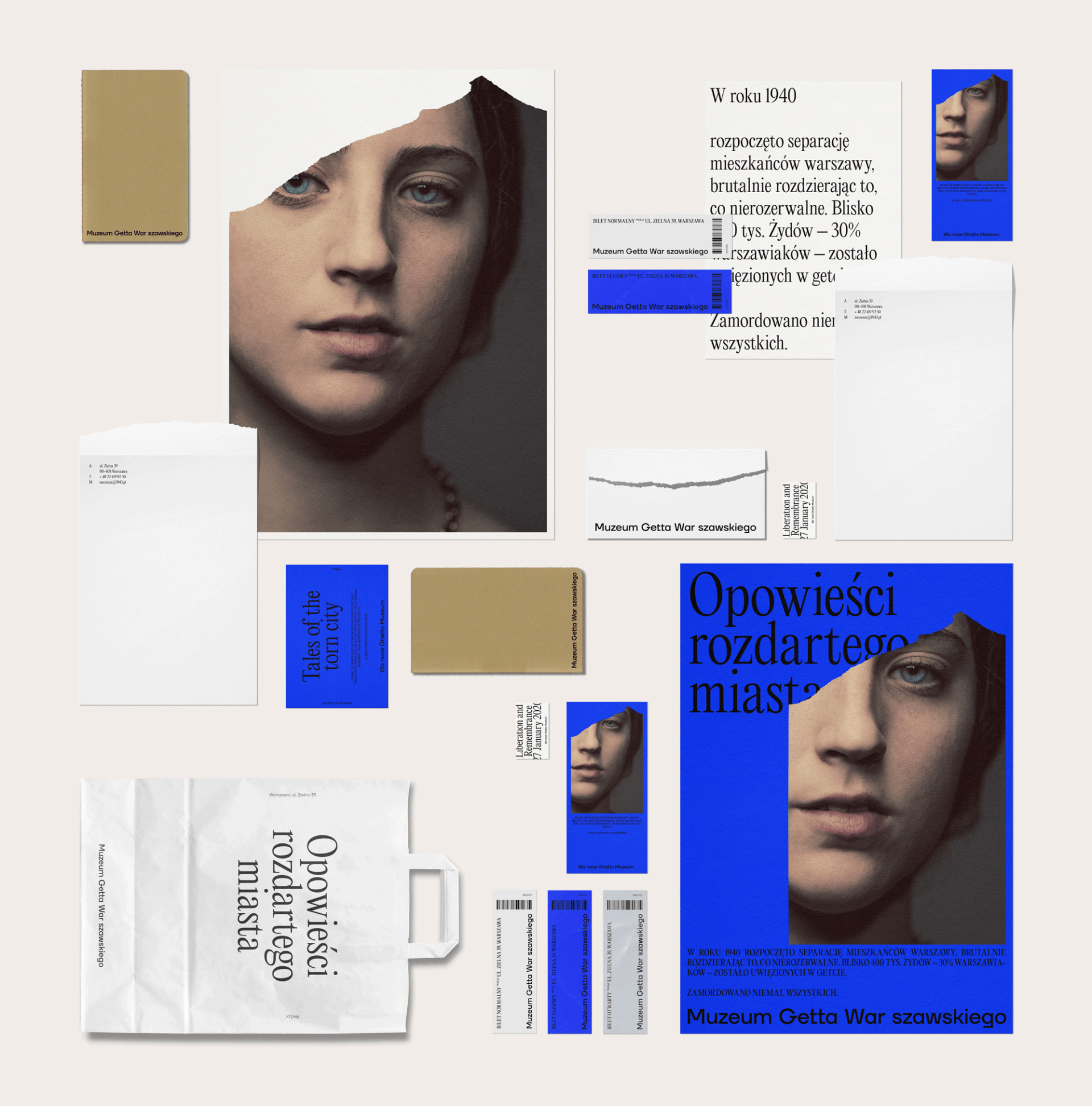
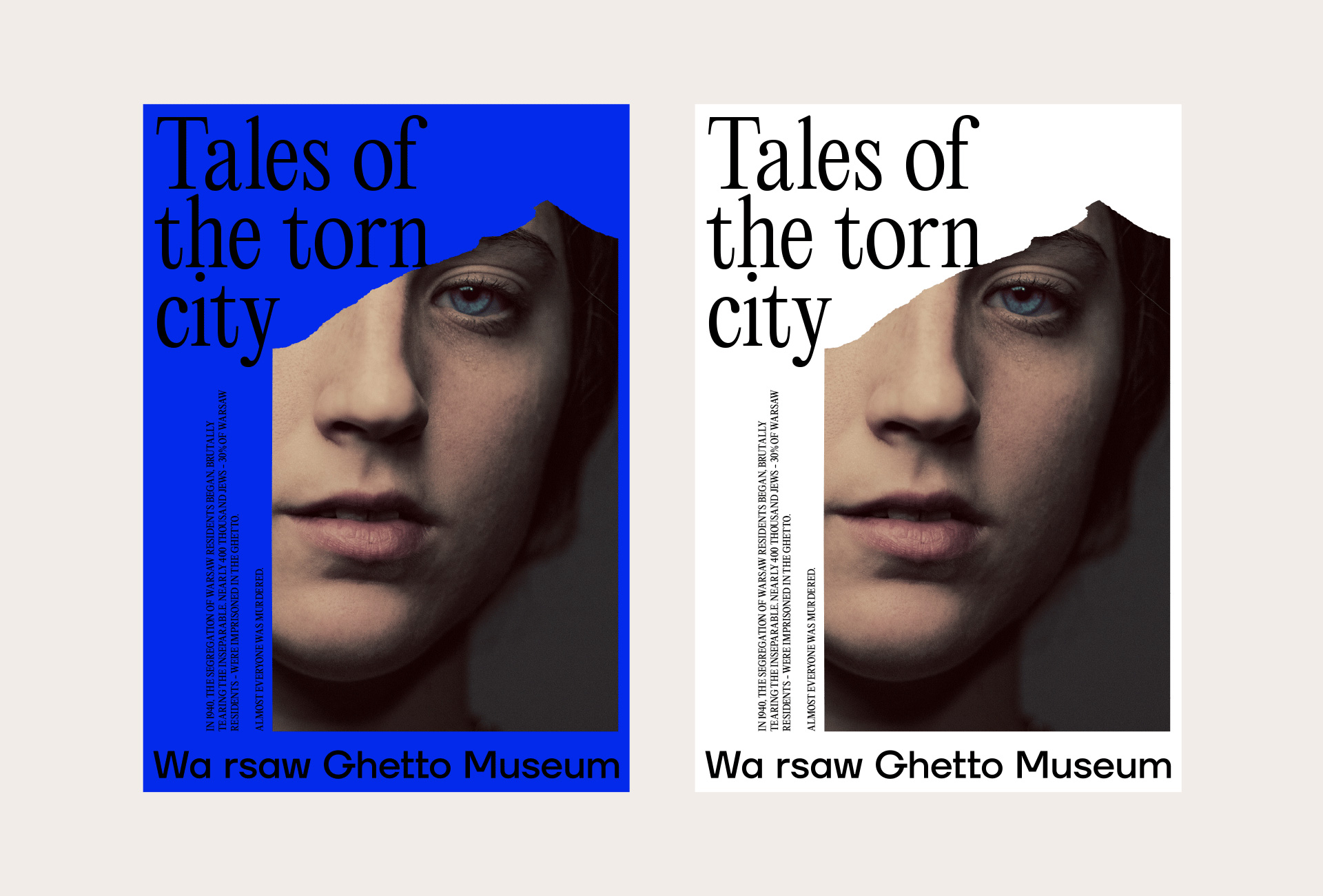
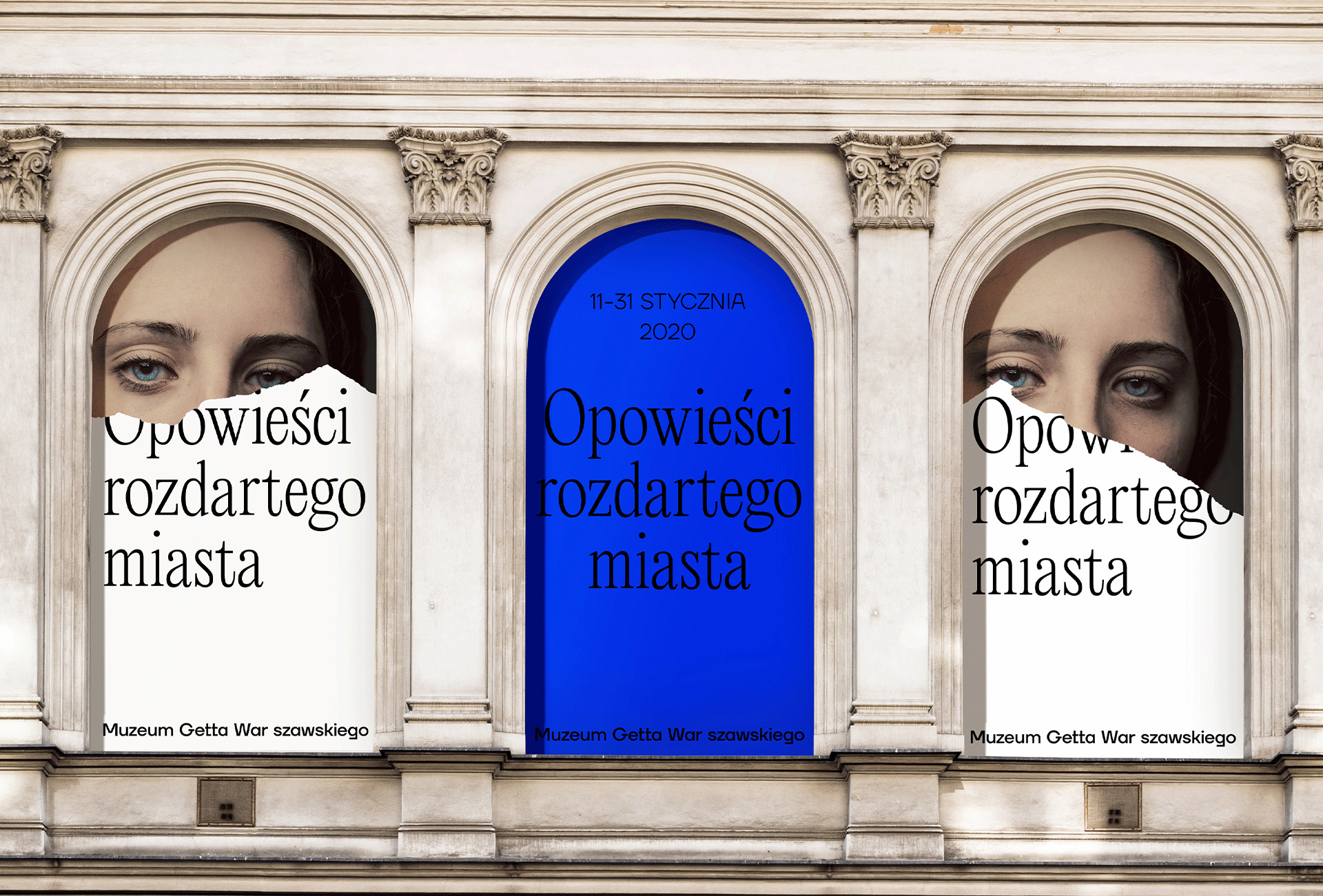
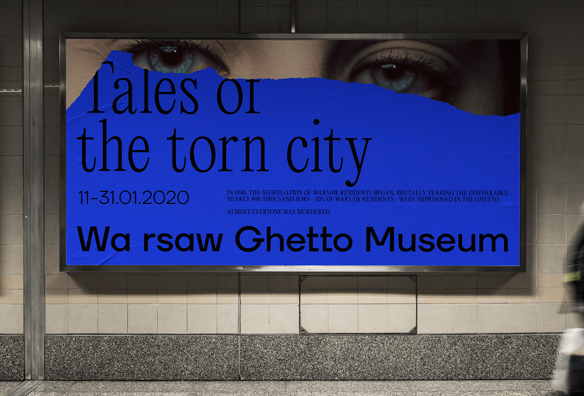
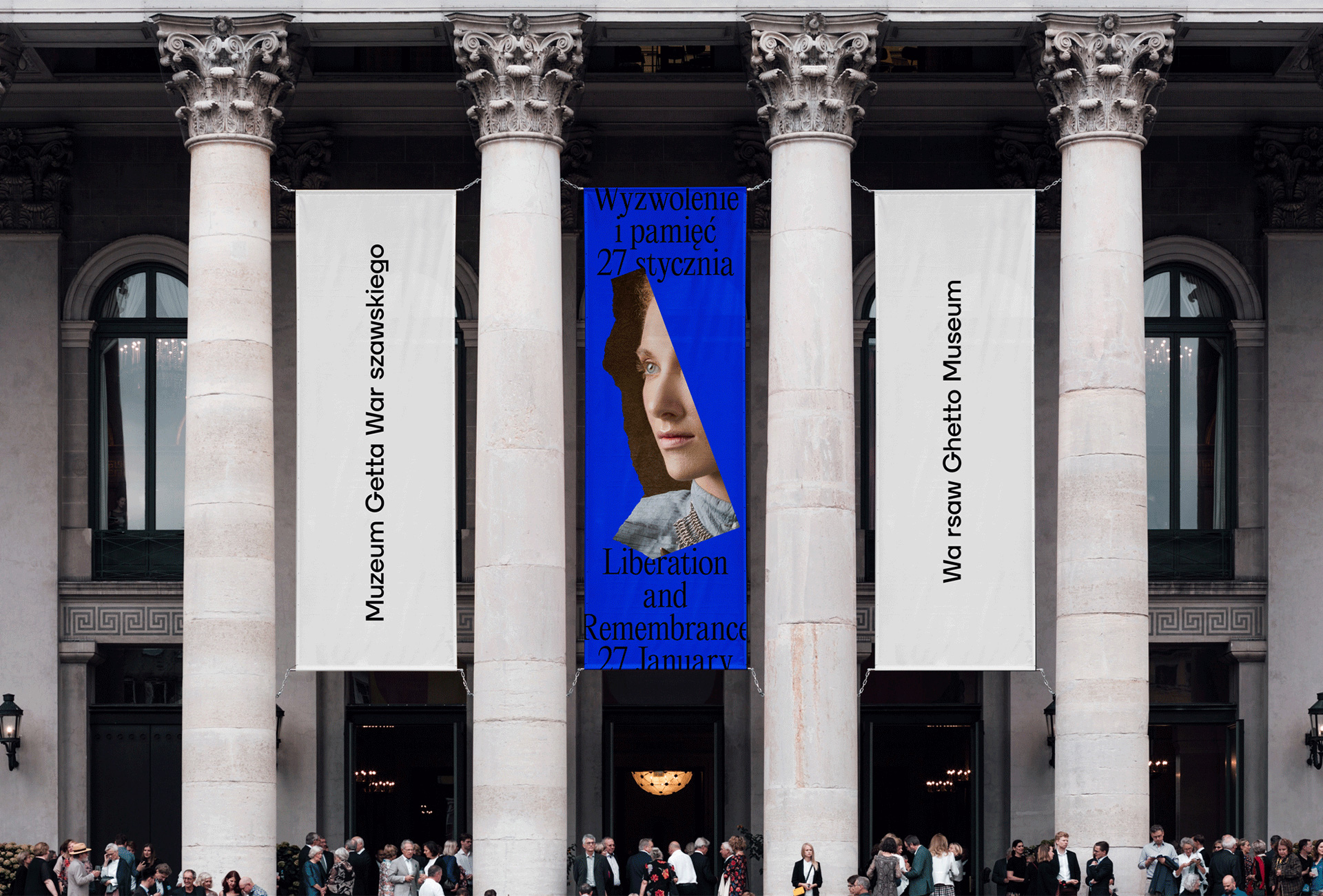
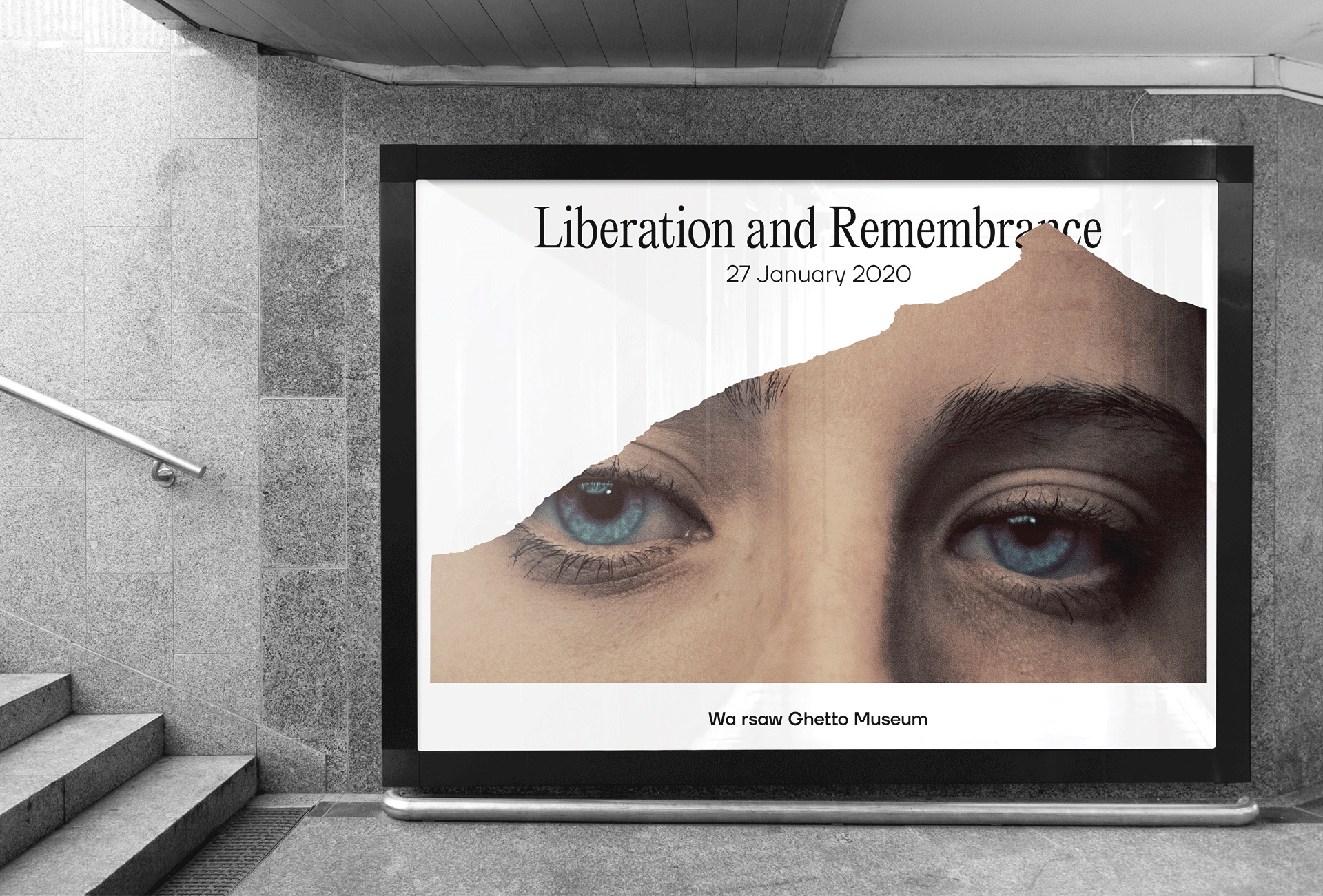
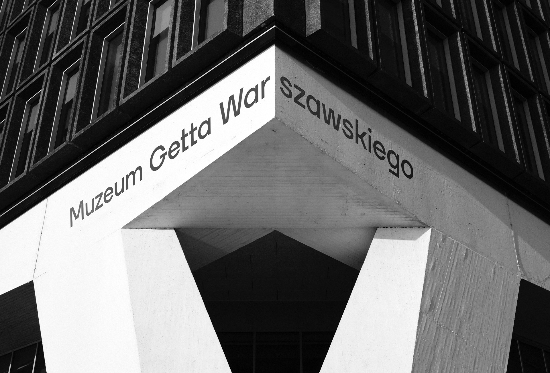
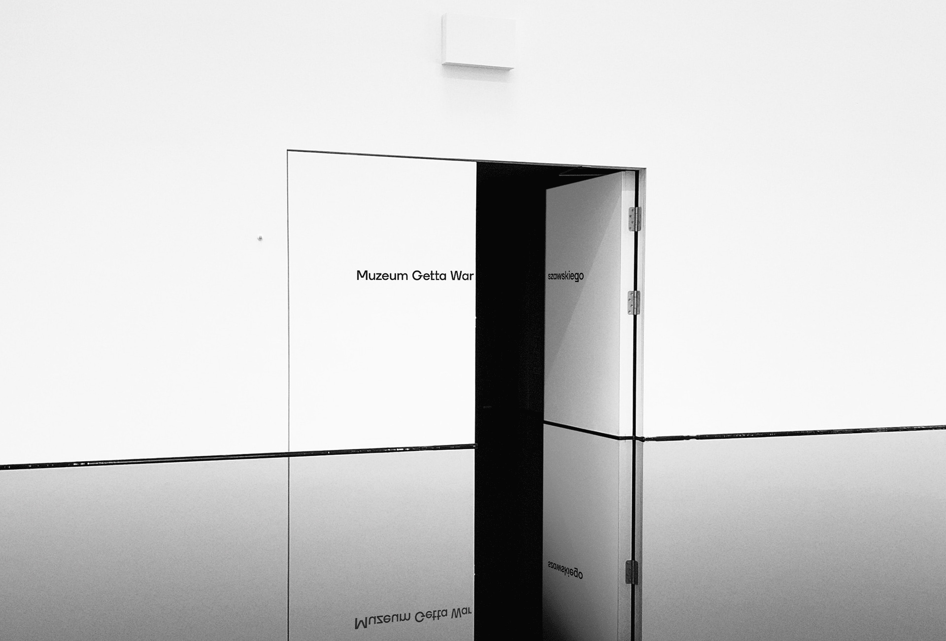
We based the concept on the idea of tearing, as nearly a third of Warsaw residents were separated from the rest and imprisoned in the Ghetto. To emphasize the dramatic nature of these events, we split the capital’s name in the logo into two, which is supposed to rise a natural objection.
One-third of the capital's residents were brutally separated from the rest. Part of the whole was torn off. We want the Museum identity to make this clear. We want people to think: this shouldn't be like that; it's wrong; it's a whole and should be together.
The tearing is visible in all materials - posters, bags, leaflets, documents, business cards and more. This method, in an exceptionally aesthetic and thematically coherent way, guarantees transparency even with a large amount of content.
Images (opinion after)
Opinion
The logo for the new museum is, at first glance, the most straightforward of solutions possible: a long string of words typeset in a sans serif. For most people, though, the extra space in the word “Warsaw” will demand a double take. The concept behind it, that the ghetto literally divided and tore the city, is as good as it gets but I think the execution is too subtle. When you are looking at the logo on its own, sure, it’s fairly evident but when seeing it application in posters, with a whole lot of other text around it, it’s very hard to see it. I’m all for subtlety and I do like the approach but I think something more overt would have benefitted the logo. In application, a torn paper effect is used in posters and advertising while, in theory, institutional materials will be torn — we will have to wait until 2023 to see if this actually implemented and if it does I preemptively offer a chapeau. One thing I like about the identity is the condensed, sharp serif used which, intentional or not, is a little uncomfortable and gives a sensation of tightness and harshness that, for worse than better this time, is appropriate to the subject. I would question the use of that blue but it could possibly be justified as being the blue in Israel’s flag, maybe. Overall, this has the right start and with almost three years to plan and develop could evolve into something quite good. Handling a subject as delicate as this is no easy task and the resulting identity manages to do it thoughtfully and with just the right amount of thought provocation.
In ấn Anpic In nhãn mác Anpic In brochure Anpic In card visit Anpic In catalogue Anpic In thiệp cưới Anpic In tờ rơi Anpic
In Ấn Anpic – Nổi Tiếng In Đẹp In Nhanh
Số 5 Ngõ 75 Nguyễn Xiển, Thanh Xuân, Hạ Đình, Hà Nội
0963223884
baogiainananh@gmail.com
https://anpic.vn
https://g.page/inananpic
In nhãn mác Anpic ✅ In brochure Anpic ✅ In card visit Anpic ✅ In catalogue Anpic ✅ In thiệp cưới Anpic ✅ In tờ rơi Anpic
https://anpic.vn/in-nhan-mac-dep
https://anpic.vn/in-brochure
https://anpic.vn/in-an
https://anpic.vn/in-voucher-in-phieu-giam-gia-khuyen-mai
#inananpic


Comments
Post a Comment