Noted: New Logo and Packaging for Trojan by Dragon Rouge
“To Protect and to Serve”
(Est. 1916) "The Trojan Brand promotes a safe, healthy, and fun sex life. From condoms to vibrators to lubricants, Trojan is dedicated to delivering innovative, high-quality products that offer pleasure and protection. Trojan Brand Condoms are America's #1 condom, trusted for over 100 years. Trojan Brand latex condoms are made from premium quality latex to help reduce the risk of unintended pregnancy and sexually transmitted infections. Every condom is electronically tested to help ensure reliability. There are more than 30 varieties of Trojan Brand Condoms. More Americans trust Trojan Brand than any other condom. The maker of Trojan Brand Condoms is committed to investing in public health efforts to support sexual health."
Design by
Dragon Rouge
Logo collaboration with Mateusz Witczak (Warsaw, Poland)
Related links
Dragon Rouge project page
Relevant quote
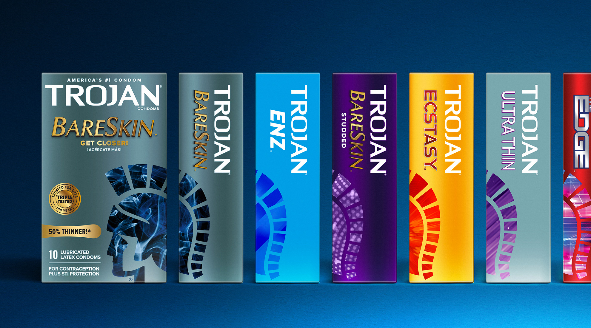
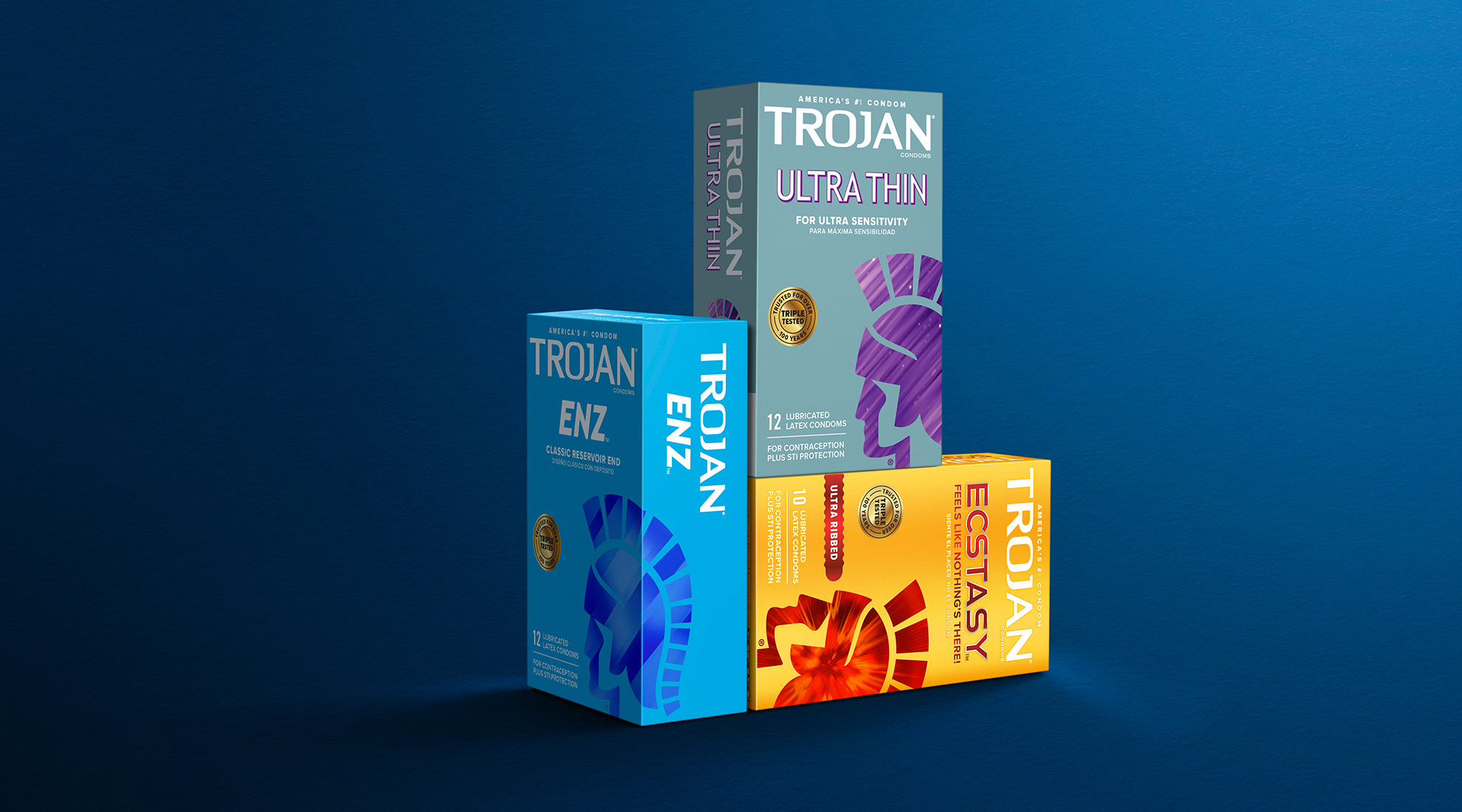
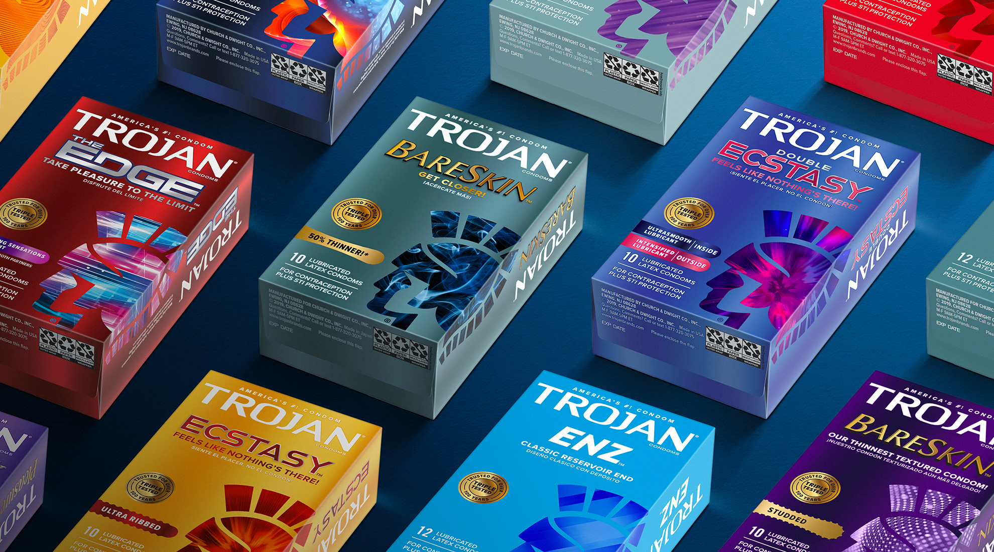
Through the redesign of assets and packaging, consumers can easily navigate the portfolio of sensations. The new Trojan condom design system shifts consumer mindset of condoms from a strictly functional device providing the ultimate in safety and efficacy to a mindset that embraces pleasure. The new brand identity design conveys strength, trust, performance, and masculinity.
Images (opinion after)
Opinion
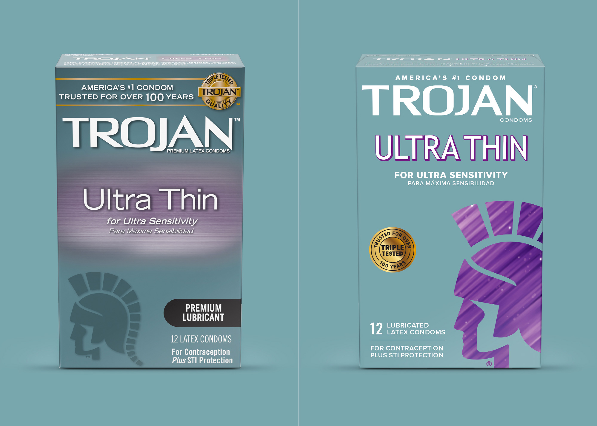
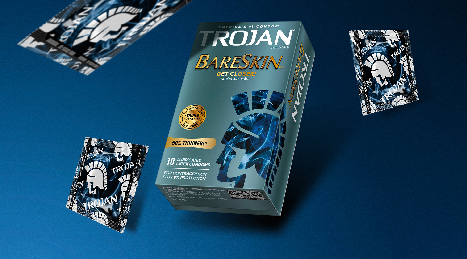
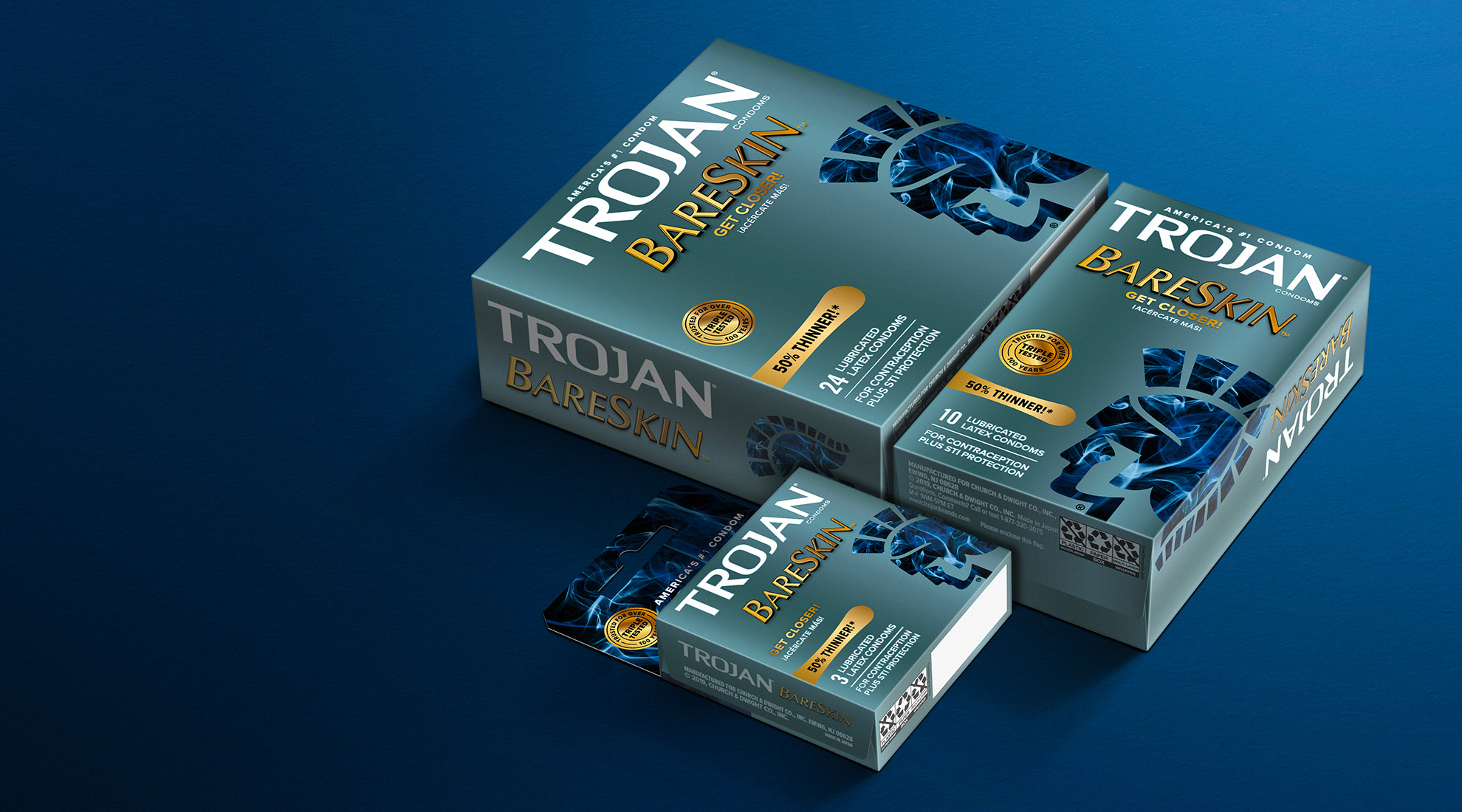
I had never noticed how awkward the old logo was with its extra pointy “A” shooting way above the rest of the letters and the slightly dipping “N” at the end. The new logo maintains most of the positive quirks of the old one — mainly the square “O” and the pronounced “R” — while adding a few nice details like the tapering of the “T” and funky “R”. I’m not a big fan of the slab serif on the “J” and removing it would have created a better counterspace balance with what’s going on between the “J” and the “A”. Flattening the top and bottom makes for a much stronger wordmark. The packaging doesn’t move the needle in either a positive or negative way and feels more like a lateral move that stays within the same misgivings of major mainstream product packaging of using anywhere between one and two dozen different typefaces and styles. In the before/after image of the packaging, sure, there is an improvement but it’s relative. The different textures in the icon of the Trojan soldier range from baffling to, well, baffling, looking more like Apple screensavers than anything closely resembling pleasure — unless Apple screensavers gets you going, then, party on. I think there was a valiant effort in this, trying to infuse the packaging with some personality, color, and boldness but, unfortunately, the result is more of the same visual noise that can be found across all aisles of a pharmacy. I was trying to close this opinion with a solid sex pun but I finished too soon.
In ấn Anpic In nhãn mác Anpic In brochure Anpic In card visit Anpic In catalogue Anpic In thiệp cưới Anpic In tờ rơi Anpic
In Ấn Anpic – Nổi Tiếng In Đẹp In Nhanh
Số 5 Ngõ 75 Nguyễn Xiển, Thanh Xuân, Hạ Đình, Hà Nội
0963223884
baogiainananh@gmail.com
https://anpic.vn
https://g.page/inananpic
In nhãn mác Anpic ✅ In brochure Anpic ✅ In card visit Anpic ✅ In catalogue Anpic ✅ In thiệp cưới Anpic ✅ In tờ rơi Anpic
https://anpic.vn/in-nhan-mac-dep
https://anpic.vn/in-brochure
https://anpic.vn/in-an
https://anpic.vn/in-voucher-in-phieu-giam-gia-khuyen-mai
#inananpic


Comments
Post a Comment