Noted: New Logo and Packaging for Morshynska by Reynolds and Reyner
“Drink a Sigh of Relief”
(Est. 2004) "Morshynska is unique natural table water originating in a preserved region of Prykarpatye from the Carpathian source called Morshynska. The city of Morshyn (Lviv oblast, Ukraine) is situated on a hillside in the eastern part of the Carpathian mountain range, 340m above sea level. Virgin Carpathian forests surround the city, ensuring the areas ancient ecological purity. The Madonna source, from which Morshynska rises, was discovered in 1879 and has long been the subject of legend. A decree by the Cabinet of Ministers of Ukraine classified the Morshyn deposit as Unique. Being a leader among bottled waters in Ukraine, Morshynska is successfully exported to the Balkans, CIS countries, Poland and Germany. Nowadays for millions of people Morshynska has become an example of the natural product, for it is one of a few true natural waters, available to the customers."
Design by
Reynolds and Reyner (Kiev, Ukraine)
Related links
Reynolds and Reyner project page
New bottle microsite
Relevant quote
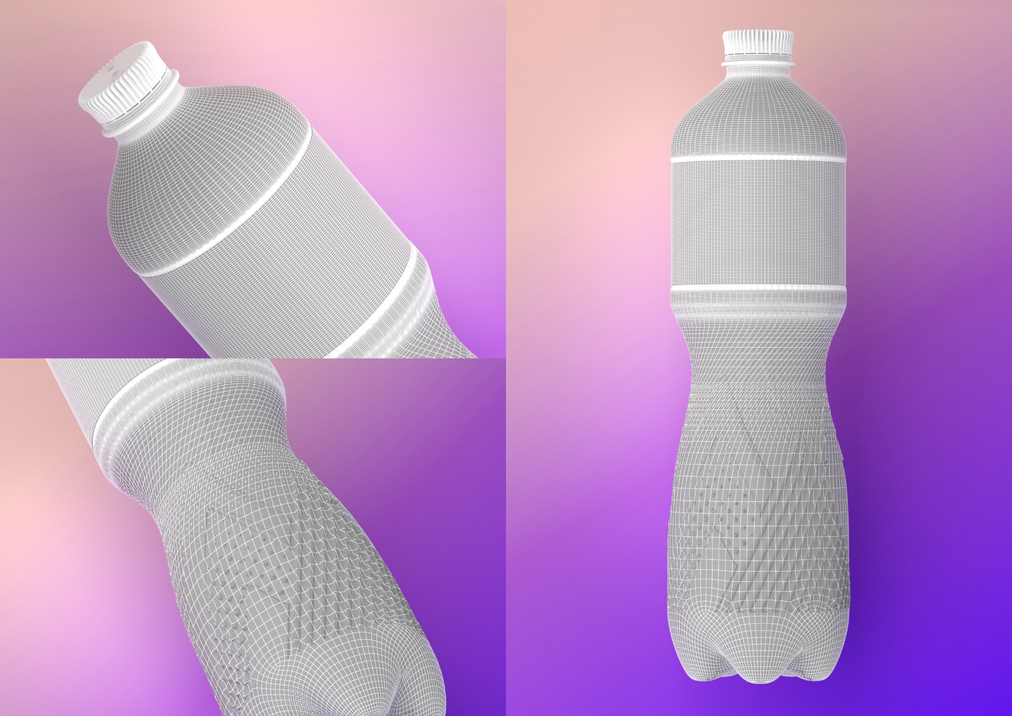
The new bottle is much more comfortable and pleasant to hold in your hand and now contains 15% less plastic thanks to the use of innovative technologies in designing and manufacturing the bottle. This is a very important step towards preserving the environment in Ukraine.
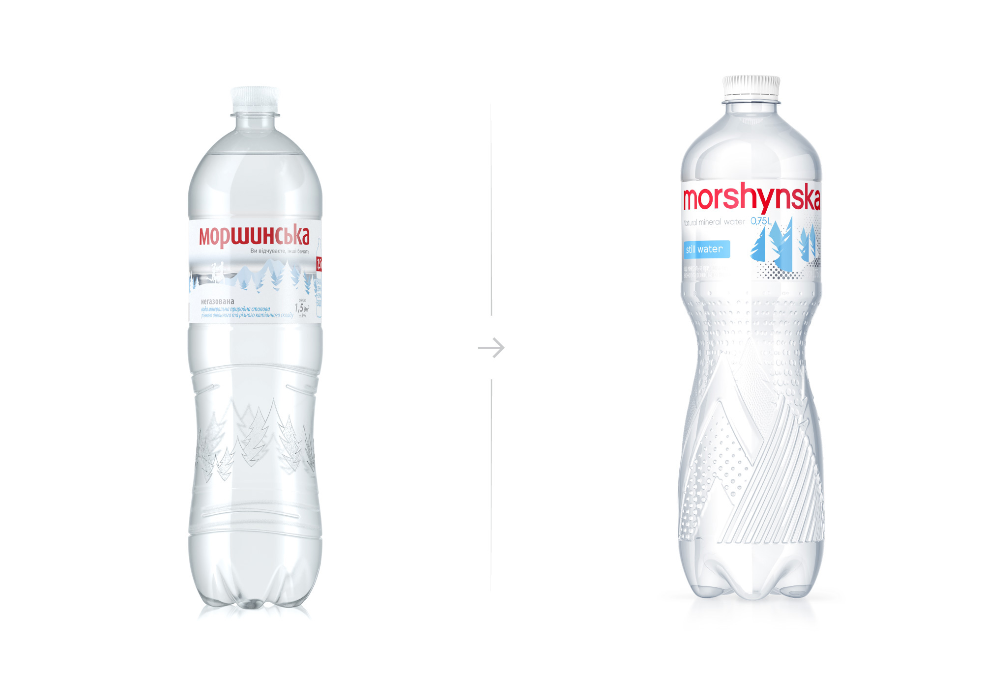
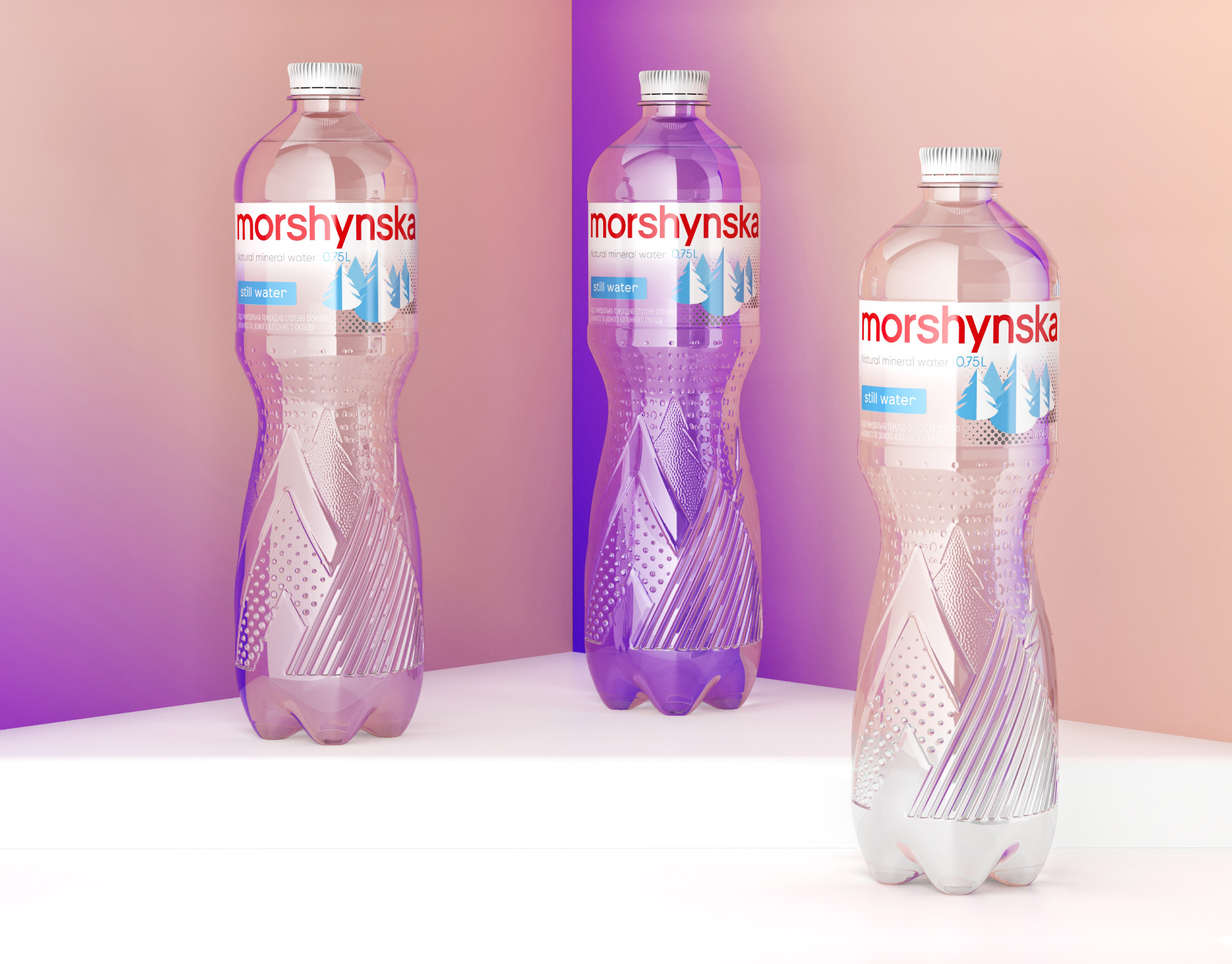
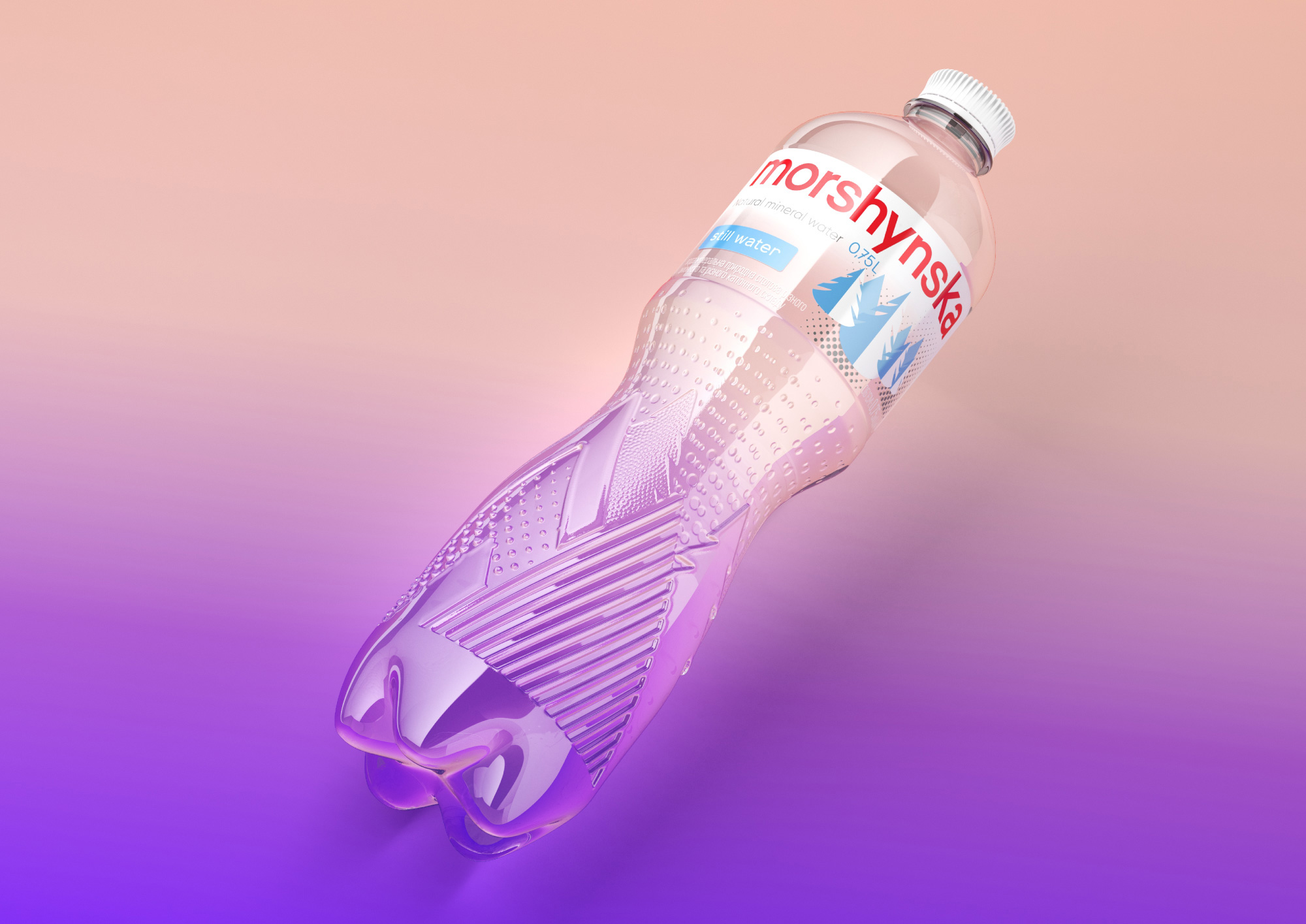
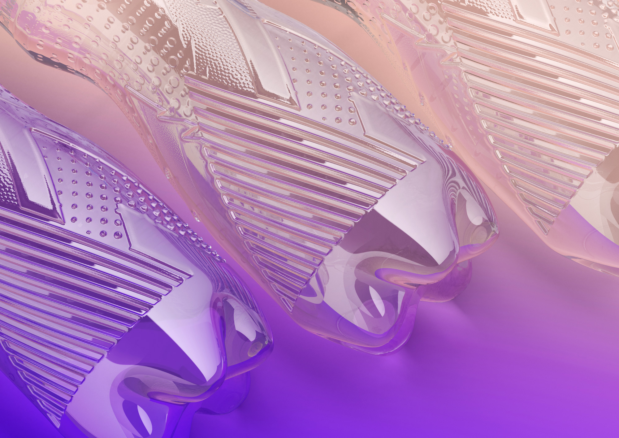
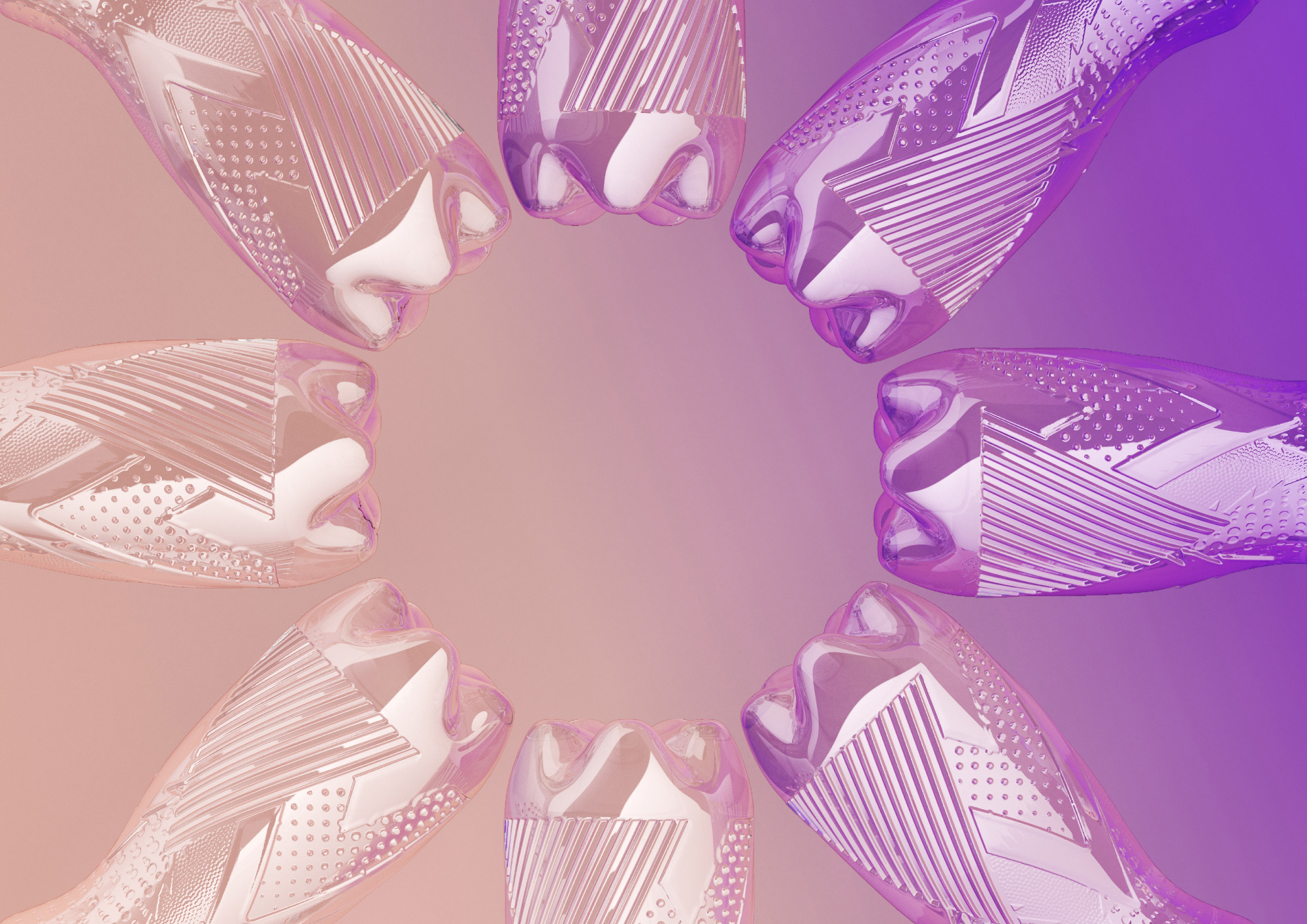
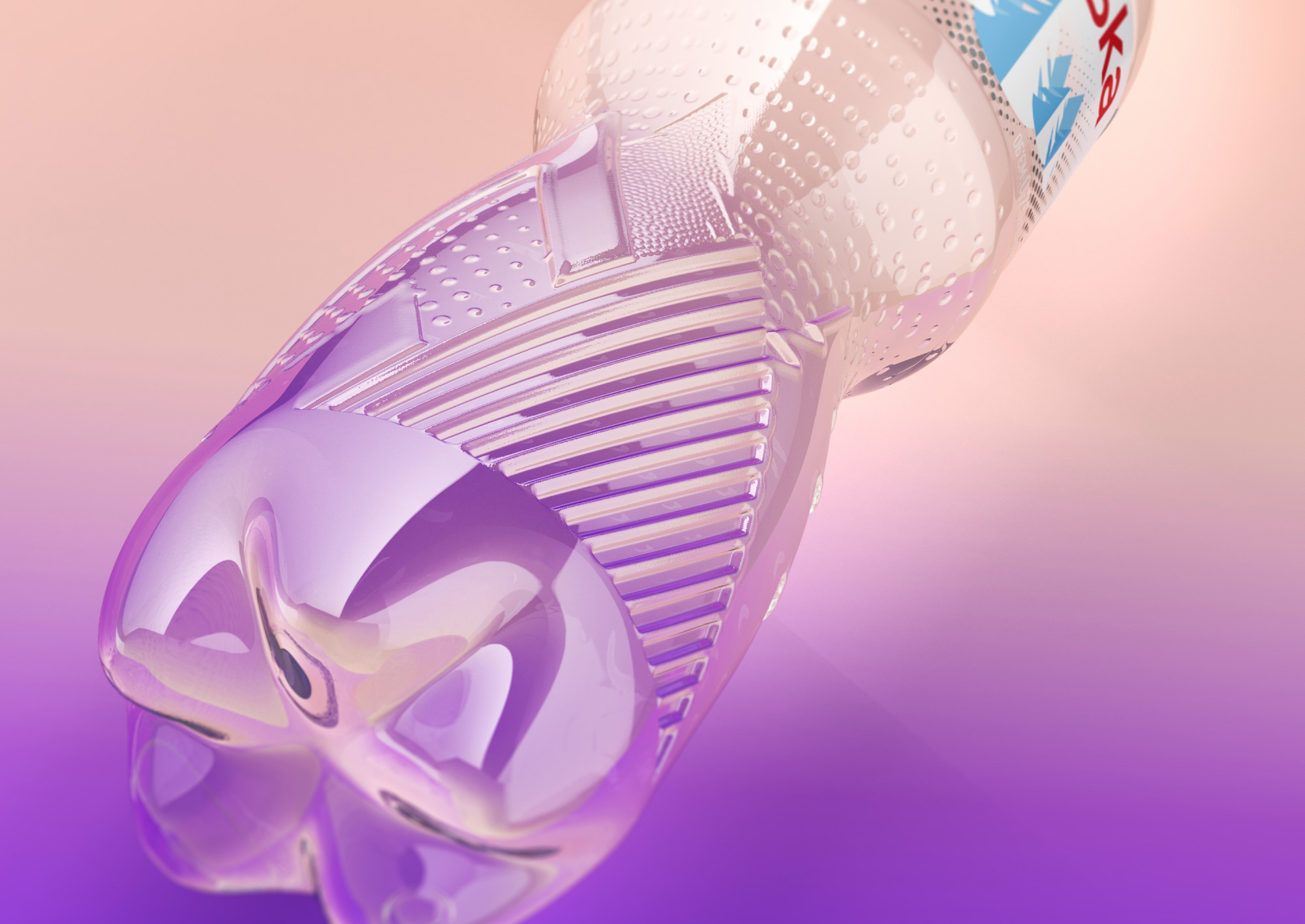
In addition to the bottle itself, Morshynska has also updated its look. The logo is now larger and simpler, the embossing of geometric spruces and mountains looks more modern and noticeable, and the size of the bottleneck and the crown-lid was reduced to make the bottle lighter. The label of the new Morshynska bottle has a more minimalistic look, with its shorter height and smaller number of elements depicted. Only elements key to brand recognition remain.
The brand has received an evolutionary redesign. Nearly two years were spent on implementation and testing. Most customers will not even notice the difference, but if you put the two bottles side by side, the difference is evident. The color of the carbonation level (blue, white, and green) remains unchanged in order to preserve continuity with the old design which customers are used to.
Images (opinion after)

Opinion
The old logo, in the spurless sans serif style that I heavily dislike by default, was not good and not only because I don’t like the typeface but look at the awfully uneven horizontal line at the top of the x-height — it’s just painful. And it looked like a telco more than a water brand. The new logo is more Evian-esque with a deadpan neo-grotesque that I don’t quite like either but, eh, I don’t dislike it. The Cyrillic version looks nicer than the Latin, mostly because of the initial “М” which has some personality. But we are not here for the logo update as the real hero is the new bottle design that has a literally and metaphorically groovy new design of abstract mountains and trees built into it. The different relief textures are great and even without the option to see or hold one in real life myself I can feel its tactility. The labels are an improvement too, with nicer-looking trees and a bigger logo — nothing amazing but crisp and slick enough for a mainstream product. Overall, a commendable improvement in the design but a really great improvement in the UI and UX of the product itself.
In ấn Anpic In nhãn mác Anpic In brochure Anpic In card visit Anpic In catalogue Anpic In thiệp cưới Anpic In tờ rơi Anpic
In Ấn Anpic – Nổi Tiếng In Đẹp In Nhanh
Số 5 Ngõ 75 Nguyễn Xiển, Thanh Xuân, Hạ Đình, Hà Nội
0963223884
baogiainananh@gmail.com
https://anpic.vn
https://g.page/inananpic
In nhãn mác Anpic ✅ In brochure Anpic ✅ In card visit Anpic ✅ In catalogue Anpic ✅ In thiệp cưới Anpic ✅ In tờ rơi Anpic
https://anpic.vn/in-nhan-mac-dep
https://anpic.vn/in-brochure
https://anpic.vn/in-an
https://anpic.vn/in-voucher-in-phieu-giam-gia-khuyen-mai
#inananpic


Comments
Post a Comment