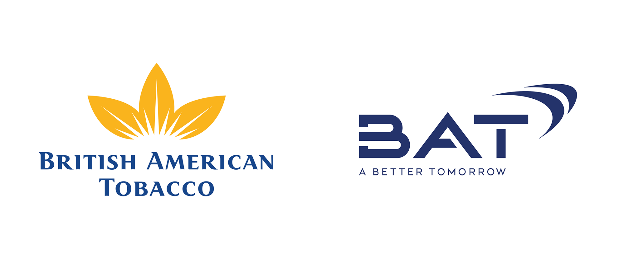
Noted: New Logo for British American Tobacco
“Blind as a BAT”

(Est. 1902) "British American Tobacco plc (BAT) is a cigarette and tobacco manufacturing company headquartered in London, England. It is the second-largest cigarette maker in the world as of 2012. BAT has a market-leading position in over 50 countries and operations in around 180 countries. Its four largest-selling brands are its native brand Dunhill and US brands Lucky Strike, Kent and Pall Mall. Other brands that the company markets include Benson & Hedges and Rothmans. The company does not necessarily own the rights to all of these brands in every nation they are marketed." (Wikipedia)
Design by
N/A
Related links
BAT news page
Relevant quote
The logo, along with a new brand identity, reflects changes in the world around us and our business.
For decades, our previous leaf logo has served the company well as a strong symbol of a world-leading tobacco company.
Today, however, our purpose has evolved as we aim to reduce the health impact of our business through offering a greater choice of enjoyable and less risky products for our consumers.
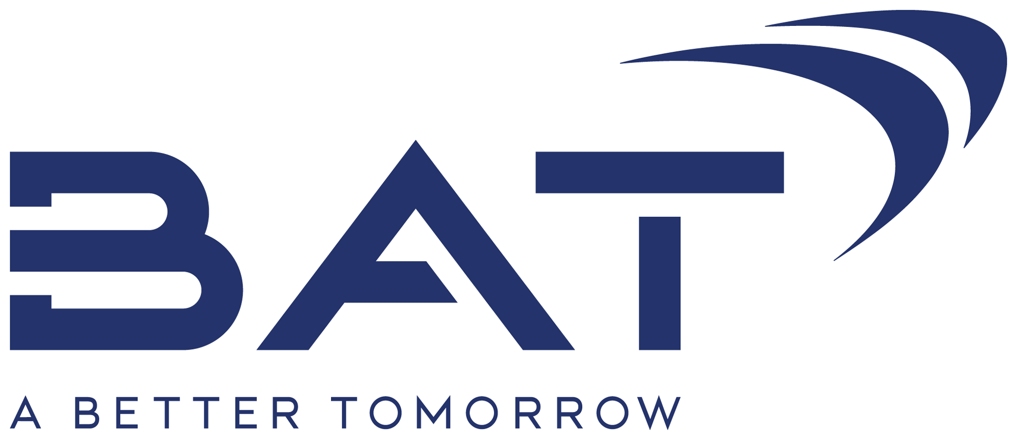
Our dynamic new logo reflects our company today and our journey ahead: a unification of our international and American businesses as well as the representation of our multi-category portfolio.
Images (opinion after)


As BAT's new corporate purpose and evolved strategy were unveiled, we also revealed our new corporate logo - reflecting our company today and our journey ahead to build A Better Tomorrow. Find out more: https://t.co/tVHnnAgoGo #ABetterTomorrow pic.twitter.com/FexamMql3p
— BAT Press Office (@BATPress) March 30, 2020
Opinion
Imma be honest: I had initially decided to post this in the Spotted section but then I decided to prepare for the future by including it in the Noted section now so that in December of this year I could hand the new logo the No. 1 spot in the The Worst Noted list of 2020 because, well, look at it. Now, I know that all of last week I was saying in the comments that it’s okay to dislike something as long as you state it in a respectful way so Imma lead by example today. *Bites knuckle*
The old logo was good — and by “good” please know that there is nothing good about a tobacco company and that this is a design critique — with a strong icon full of fake optimism through a tobacco leaf with a sunshine in it. I’m usually not a fan of semi-serifs but this one was surprisingly good — not great, good. The new logo does away with the tobacco leaf depiction because maybe the company has realized tobacco is not good, even though they still intend to profit from it, but instead of being so overt and proud of it now, they are sweeping it under the rug. In its place is possibly the most confused bit of typography I have seen in a long time.
The “B” is absolutely senseless with the way the stem is stenciled: not only is not pleasant to look at, it’s needlessly complicated. The “A” is extremely wide and the stencil cut seems to be on the wrong side. The “T” is fine, I guess, but I am genuinely surprised they didn’t do something wrong. To cap it all off — breathe, Armin, breathe — are two swooshes that… that… that, oh my… I really have no idea what the swooshes are doing in that logo or in this decade. But even if we accepted that a pair of swooshes was a good conceptual idea, they are so unbelievably unattractive. The tagline — aside from being absolute corporate bullshit that they can sho... breathe, Armin, breathe… is at least decently typeset and aligned under the wordmark but THEN, then someone said “No, bruh, that’s too sophisticated — can you make it douchier?”
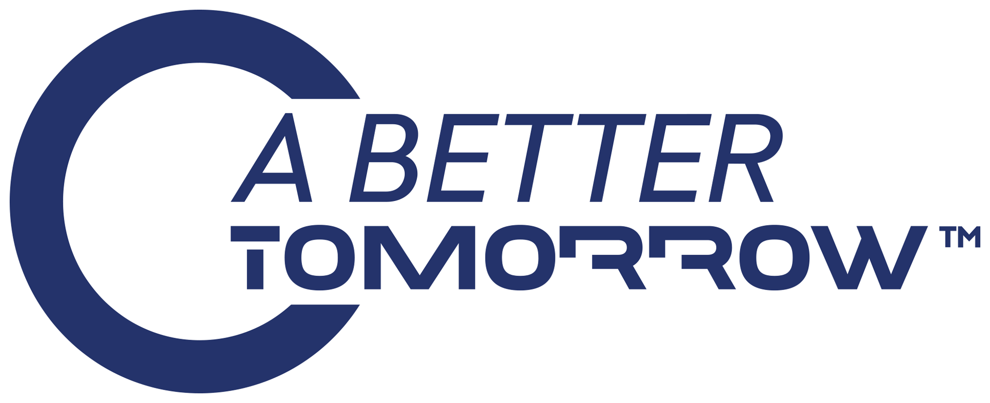
And someone did! The tagline is rendered inside a “C”, for some reason, and executed in an italic sans serif paired with a type treatment that looks as if the Terminator had passed the Bar exam and set up a law office. Lastly, someone, probably the same person that questioned the demure tagline, asked for an over-the-top before/after video and someone did! Someone created a ribbon-diffusion effect followed by a CMYK-injection of chrome rendering because the logo did not feel alien enough already. Overall, and trying to bring it back to a useful opinion, this failed in veiling British American Tobacco’s business as a good thing for the world and its future by adopting the most cold, corporate-looking logo that makes the company look more evil and detached from reality than I thought was possible for a logo to do. Sigh.
In ấn Anpic In nhãn mác Anpic In brochure Anpic In card visit Anpic In catalogue Anpic In thiệp cưới Anpic In tờ rơi Anpic
In Ấn Anpic – Nổi Tiếng In Đẹp In Nhanh
Số 5 Ngõ 75 Nguyễn Xiển, Thanh Xuân, Hạ Đình, Hà Nội
0963223884
baogiainananh@gmail.com
https://anpic.vn
https://g.page/inananpic
In nhãn mác Anpic ✅ In brochure Anpic ✅ In card visit Anpic ✅ In catalogue Anpic ✅ In thiệp cưới Anpic ✅ In tờ rơi Anpic
https://anpic.vn/in-nhan-mac-dep
https://anpic.vn/in-brochure
https://anpic.vn/in-an
https://anpic.vn/in-voucher-in-phieu-giam-gia-khuyen-mai
#inananpic
Comments
Post a Comment