Noted: New Logo for Los Angeles Chargers
“A Chip off the Old Bolt”
(Est. 1959) "The Los Angeles Chargers are a professional American football team based in the Los Angeles metropolitan area. The Chargers compete in the National Football League (NFL) as a member club of the league's American Football Conference (AFC) West division. The team was founded on August 14, 1959, and began play on September 10, 1960, as a charter member of the American Football League (AFL), and spent its first season in Los Angeles, before moving to San Diego in 1961 to become the San Diego Chargers. The Chargers joined the NFL as result of the AFL-NFL merger in 1970, and played their home games at SDCCU Stadium. The return of the Chargers to Los Angeles was announced for the 2017 season, just one year after the Rams had moved back to the city from St. Louis. The Chargers played their home games at Dignity Health Sports Park, formerly named StubHub Center, from 2017 to 2019. Starting in 2020, they will play their home games at SoFi Stadium, which they will share with the Los Angeles Rams." (Wikipedia)
Design by
N/A
Related links
Chargers Press Release
Relevant quote
Quintessentially Southern California, the Chargers are relaunching what is very much an aspirational brand synonymous with sunshine, blue skies and a fun, carefree style of play dating back to the team's AFL roots.
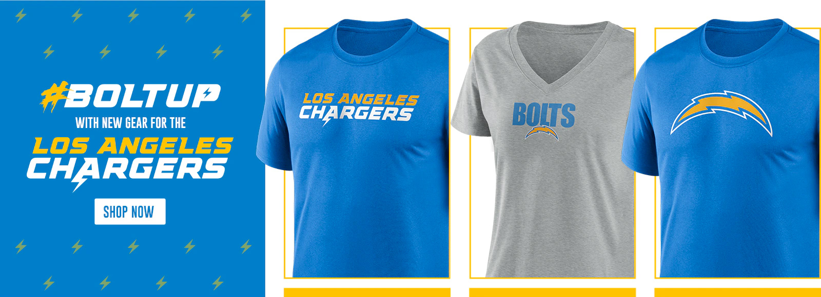
Widely considered to own – in totality – the best collection of uniforms in sports, the Chargers have brought their iconic Powder Blue and Sunshine Gold colors to the forefront of the team's new mark, logotype and soon-to-be-revealed uniform design as a reflection of the diverse outdoor culture that is a way of life for millions in the region.
With the new Bolt a sleeker, more streamlined version of its old self as the team's primary mark, it's also one color lighter. Gone is the three-tone Bolt with a navy keyline – the new Bolt has been paired down to only include Powder Blue and Sunshine Gold.
As for the new logotype, just because you're a 60-year old franchise doesn't mean you have to act like it. With words becoming increasingly interchangeable with emojis and acronyms, the team decided to build a bolt emoji into its new logotype. Also a new touch, the bold, italicized font along with its stylized, angled ticks mimics the edges and details of the updated mark. Now 'BOLT UP' isn't just a rallying cry, salutation or general term of approval, it's built into every facet of the team's brand identity.
Images (opinion after)
Opinion
The bolt icon evolution is almost a no-brainer: going from 3 colors to 2, 2 strokes to 1, and a wider structure are all beneficial improvements that make the logo much more balanced and have better impact. The old wordmark — to be honest, I’m not sure how much it was used as it appears on and off in the Google searches — was not bad but wasn’t great either; the thick slabs were kind of interesting and the white and yellow line going across it gave it some depth. The new wordmark is very spiky, angled, and the bolt coming out of the “A” looks like a design joke you make during the critique process but then delete those beziers after you’ve shown it to your design colleagues. I mean, it’s bolt-y and I guess there is an appeal to it but it looks a little silly. The type itself, despite the clichéd aesthetic, is fine and there are some inspired moments like the aligning of the “G”s and “S”s in the two lines. The intro video, which you can see better here (the Facebook square video was the only embeddable option), is fun and energetic, showing some promise as to what a new identity could look and act like. It’s interesting how similar the video’s mannerisms are between this and the LA Rams video — heck, not just the video but the whole look of both is in the same realm, which is even stranger considering both teams will play in the same stadium. Both in the video and some Instagram shots, there is a hand-drawn font element which adds some roughness to the beach-y color palette. Overall, seems like a decent evolution that’s for the better, moving away from the heavy dark blue but, yeah, it’s kind of a bummer that both Rams and Chargers landed in such similar territory at the same time.
In ấn Anpic In nhãn mác Anpic In brochure Anpic In card visit Anpic In catalogue Anpic In thiệp cưới Anpic In tờ rơi Anpic
In Ấn Anpic – Nổi Tiếng In Đẹp In Nhanh
Số 5 Ngõ 75 Nguyễn Xiển, Thanh Xuân, Hạ Đình, Hà Nội
0963223884
baogiainananh@gmail.com
https://anpic.vn
https://g.page/inananpic
In nhãn mác Anpic ✅ In brochure Anpic ✅ In card visit Anpic ✅ In catalogue Anpic ✅ In thiệp cưới Anpic ✅ In tờ rơi Anpic
https://anpic.vn/in-nhan-mac-dep
https://anpic.vn/in-brochure
https://anpic.vn/in-an
https://anpic.vn/in-voucher-in-phieu-giam-gia-khuyen-mai
#inananpic


Comments
Post a Comment