Noted: New Logo for New York Liberty
“Give me your Tired, your Poor, your Huddled Slabs”
(Est. 1997) "The New York Liberty are an American professional basketball team based in the New York metropolitan area, playing in the Eastern Conference in the Women's National Basketball Association (WNBA). The team was founded in 1997 and is one of the eight original franchises of the league. The team is owned by Joe Tsai, the majority owner of the Brooklyn Nets. The team's home games are played at Barclays Center in Brooklyn, New York. The Liberty have qualified for the WNBA Playoffs in fourteen of its twenty-three years. The franchise has been home to many well-known players such as Teresa Weatherspoon, Becky Hammon, Leilani Mitchell, Essence Carson, and Cappie Pondexter. Through the 2016 season, the Liberty have four conference championships and have played in the WNBA Finals four times, falling to the Houston Comets in 1997, 1999, and 2000, and losing to the Los Angeles Sparks in 2002. They have the most appearances in the WNBA Finals without a championship." (Wikipedia)
Design by
N/A
Related links
Liberty press release
A Closer Look Inside: NY Liberty Logo History
Relevant quote
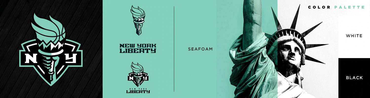
The newly redesigned primary logo salutes the franchise’s origin while embracing the team’s new era. It boasts a modern font, sleek lines, and fresh aesthetic to its most meaningful elements – the New York shield, torch, and black, white, and seafoam colors.
New York’s shield demonstrates the franchise’s impenetrable pride and love for its city, while the torch is a symbol of enlightenment.
Seafoam green is representative of patina— the color of the Statue of Liberty due to its aging process and copper’s reaction to the elements. Seafoam also represents strength, power, and resilience.
Images (opinion after)
Opinion
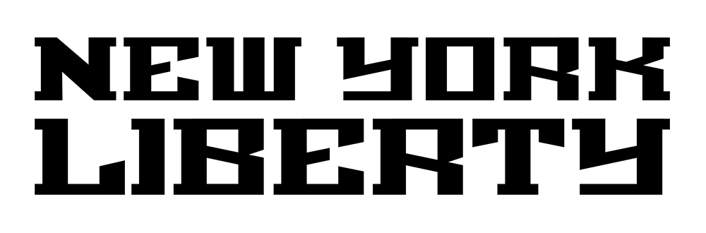
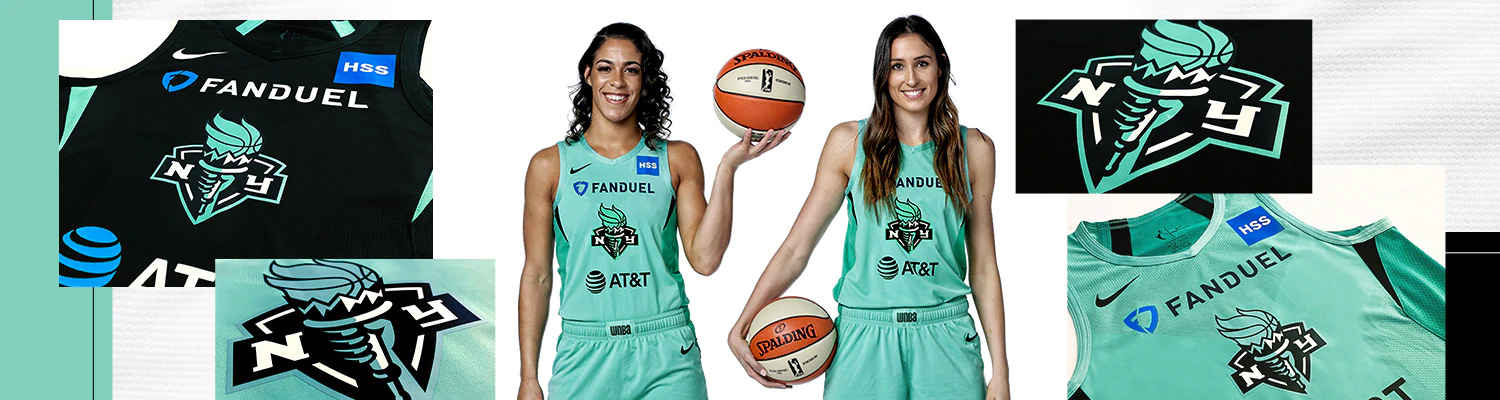
In looking at New York Liberty’s old logo more in-depth there are a couple of surprising realizations: 1) Wow, the WNBA has been around since 1997, it literally feels like it has only been 5 – 7 years and 2) Wow, those are some super weird custom slab serifs that have survived into this new evolution and when seen straight up, they are even more weird and uncomfortable to look at. The old primary logo was mostly chaos with about a dozen things and styles in play — from a glossy balloon-like texture on Lady Liberty to whispy ball seams to the aforementioned wackadoodle custom slabs on a curve. Even the old alternate logo, which was more “minimal” still carried a punch in styles. To its credit, the new logo is a big improvement, minimizing the amount of elements and graphic approaches into a more concise shield-slash-liberty-torch-slash-flaming-basketball. I’m not a fan of it by any means but it’s… better. The wordmark is very scary and one of the least appealing interpretations of sports slab serifs. It’s like a Mayan motif rollercoaster of angles with slabs going in all the wrong, inconsistent directions. I gladly accept the argument that it has “personality” but my counter argument is that, in more ways than one, it’s not my type. Dropping the NBA Knicks colors of blue and orange is a good move and allows the Liberty to be its own independent entity and own the color of the statue. Looking at the uniforms, the logo does have a good presence on it and the wordmark is nowhere in sight so that’s a step in the right direction and I do think the logo on its own will have plenty of appeal for team fans.
In ấn Anpic In nhãn mác Anpic In brochure Anpic In card visit Anpic In catalogue Anpic In thiệp cưới Anpic In tờ rơi Anpic
In Ấn Anpic – Nổi Tiếng In Đẹp In Nhanh
Số 5 Ngõ 75 Nguyễn Xiển, Thanh Xuân, Hạ Đình, Hà Nội
0963223884
baogiainananh@gmail.com
https://anpic.vn
https://g.page/inananpic
In nhãn mác Anpic ✅ In brochure Anpic ✅ In card visit Anpic ✅ In catalogue Anpic ✅ In thiệp cưới Anpic ✅ In tờ rơi Anpic
https://anpic.vn/in-nhan-mac-dep
https://anpic.vn/in-brochure
https://anpic.vn/in-an
https://anpic.vn/in-voucher-in-phieu-giam-gia-khuyen-mai
#inananpic


Comments
Post a Comment