Reviewed: New Logo, Identity, and Packaging for Hotel Tango by Young & Laramore
“It Takes Two to Tango this Good”
Established in 2014, Hotel Tango is an artisan distillery -- which isn't a fancy description for the sake of it but an actual legal classification in the state of Indiana that allows it to produce up to 10,000 gallons of spirits to serve in-house -- in Indianapolis, making bourbon, whiskey, vodka, gin, rum, cherry liqueur, orangecello, and limoncello. The distillery's name is based on the NATO phonetic alphabet after the two founders: Hotel for Hilary, Tango for Travis. The latter served in the military and establishes the driving story and brand personality -- distilled with discipline -- of Hotel Tango, which is reportedly the United States' first combat-disabled, veteran-owned distillery. With two tasting rooms in the Indiana and growing distribution across the country, Hotel Tango recently introduced a new identity designed by Indianapolis-based Young & Laramore.
In this rebranding effort, we wanted to create something that respected the company's military roots, while still remaining broadly appealing to discerning drinkers. We found our solution by emphasizing the discipline and high standards that Hotel Tango's founder learned while serving in the Marines--and then channeled that message through an aesthetic and tone inspired by military MREs (Meals, Ready-To-Eat).
Young & Laramore provided text
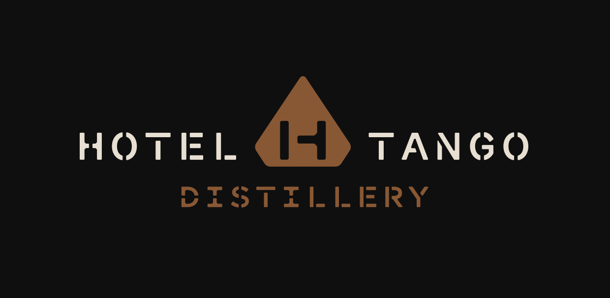
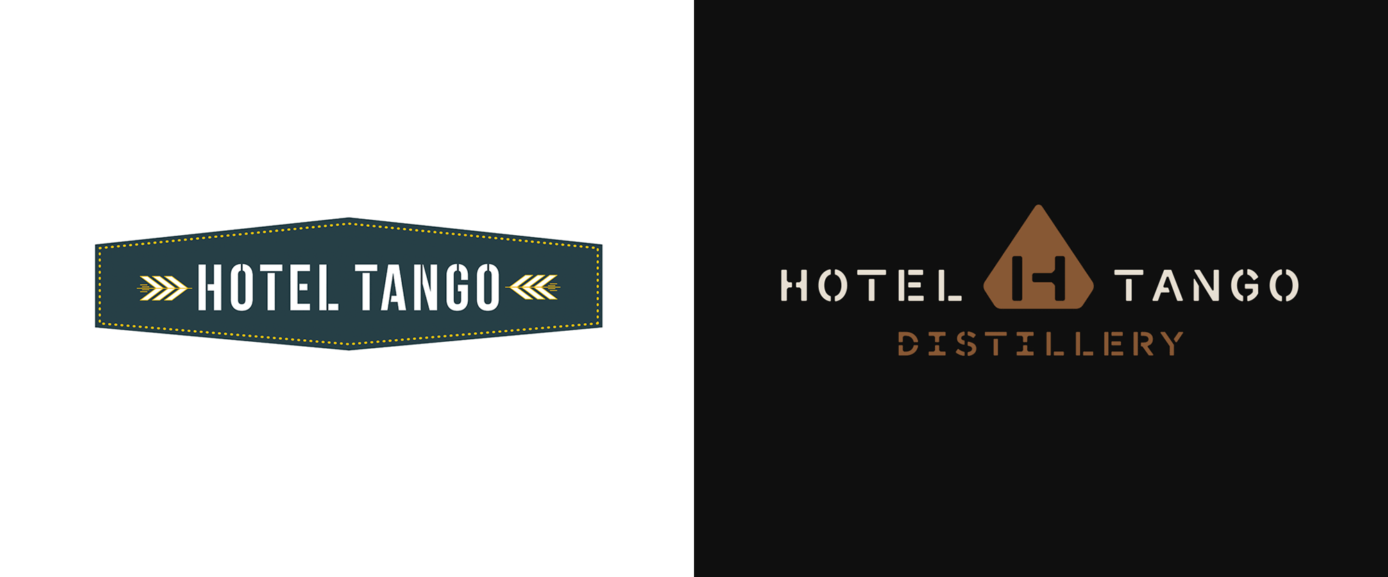
The old logo was fine, using a stencil font and chevrons that looked as if they belong on a military uniform to allude to the brand's roots. The holding shape was interesting but the little dots were a little awkward. The new logo is less literal in its military references yet manages to evoke that reference even more so with the new stencil type treatment that feels more regimented and precise, accentuated by the strong diamond-like shape in the center that holds a great "HT" monogram. The balance of all the elements is very nicely carried out and the texture created by all the stenciled bits and pieces of letters looks great.
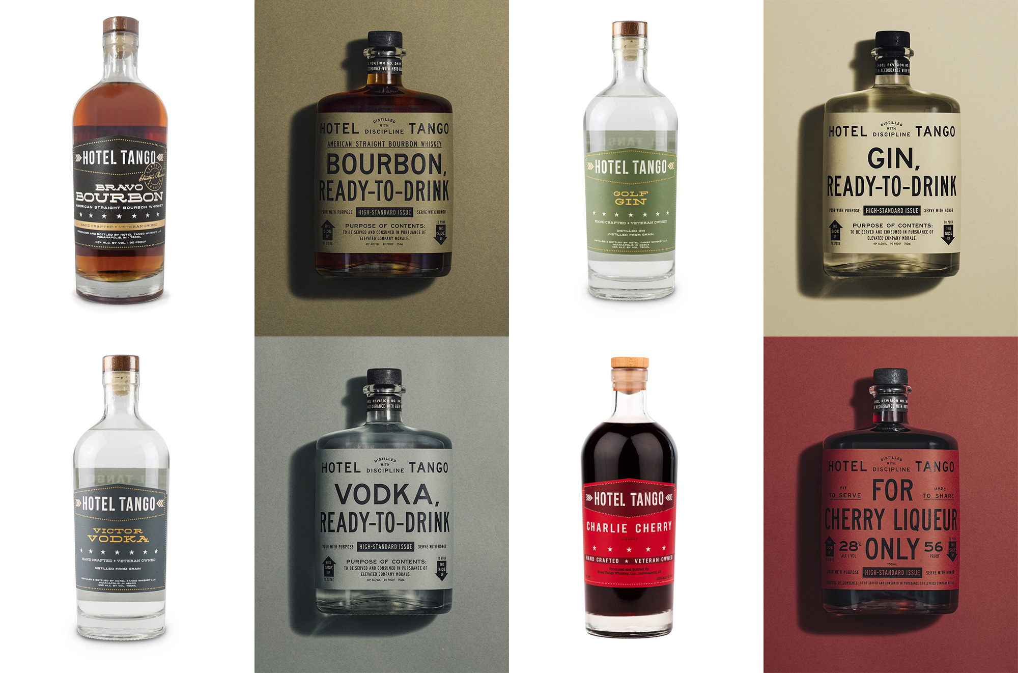
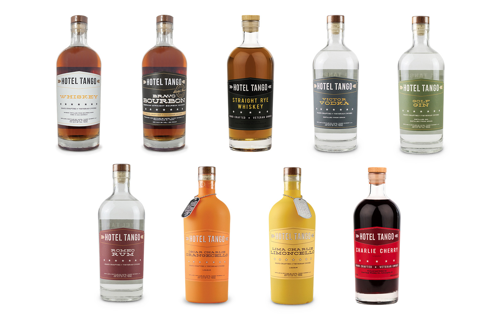
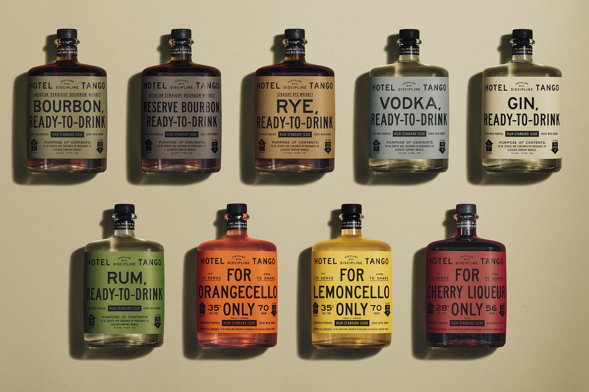
The old packaging, like the logo, was also fine and could have probably existed like that for years to come. It had good hierarchy, a die-cut label that accentuated the shape of the logo, and some decent complementary typography. The new packaging, though, is so on point that any other rendition pales in comparison. Taking cues from the utilitarian designs of MRE packaging -- along the lines of these -- the new labels are a showcase of restrained yet highly efficient and energetic typography. Mixing a condensed sans serif with normal width sans, the type fills the label to the brim and yields excellent layouts. We've seen this kind of deadpan, trendy-ish approach before but here it's conceptually appropriate and perfectly executed. The new bottles, looking more like a flask than a bottle, add so much personality to the packaging and are the perfect shape for the simple, rectangular labels. The color palette is to die for as well, using a range of muted tones for the spirits with just enough color for the liqueurs.
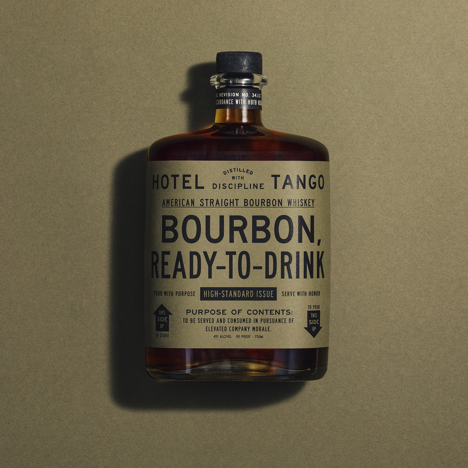
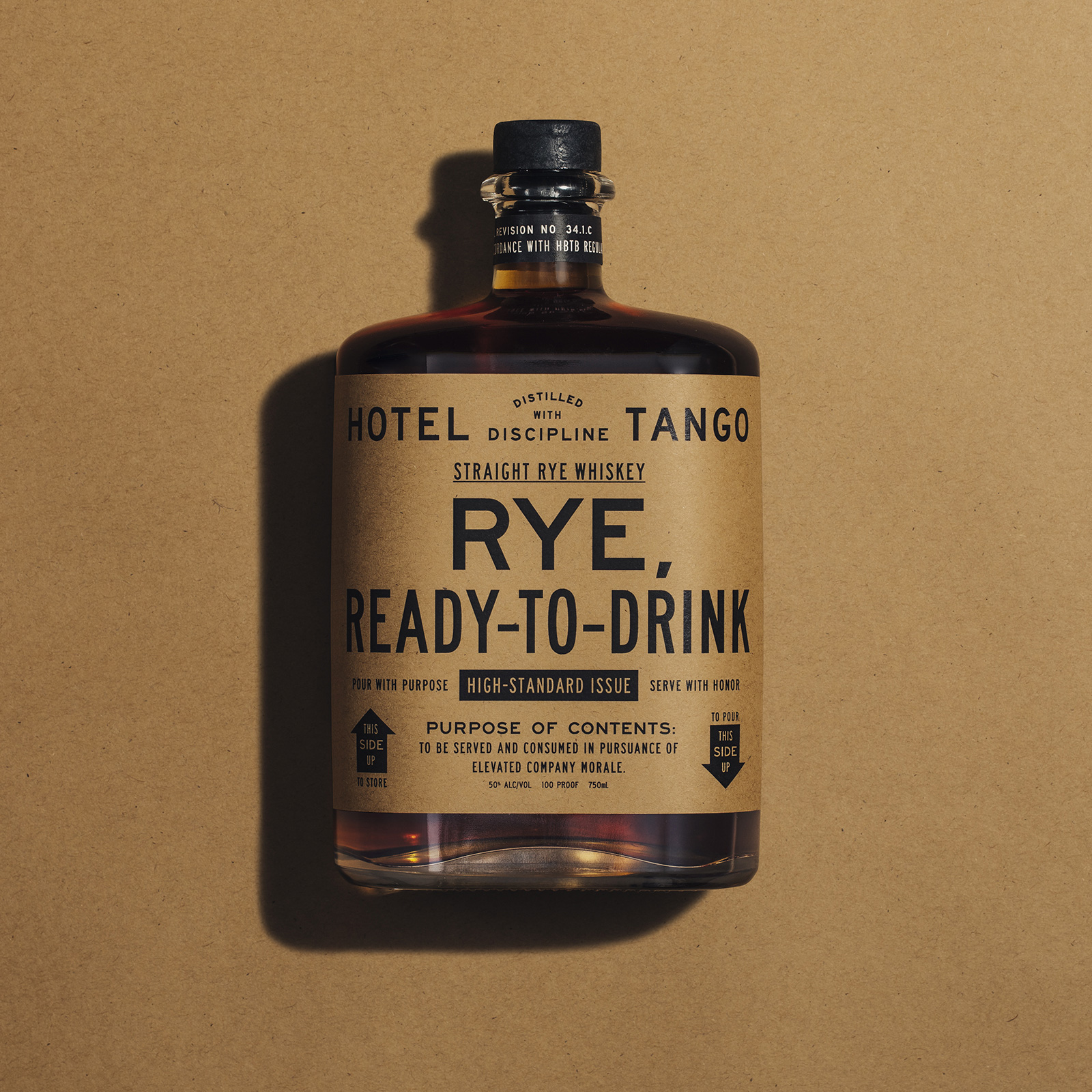
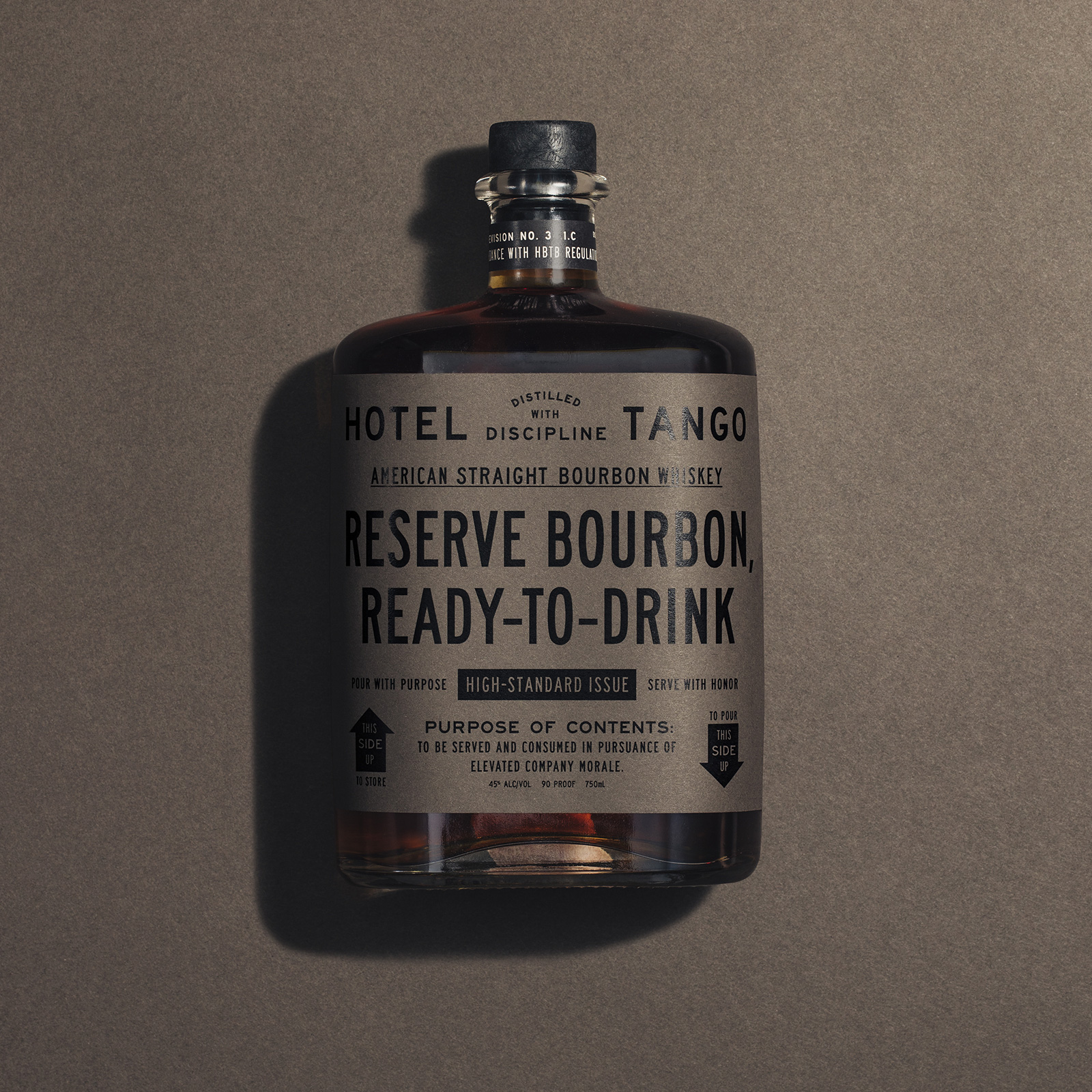
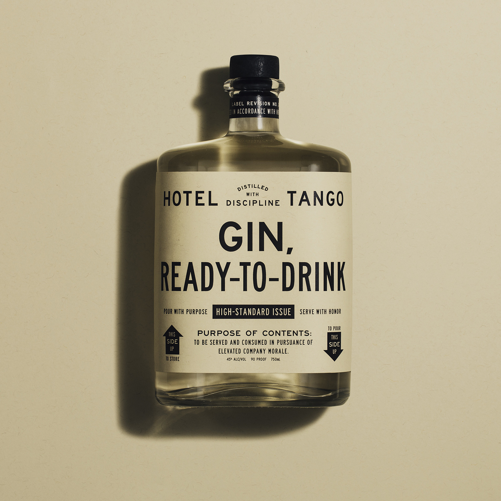
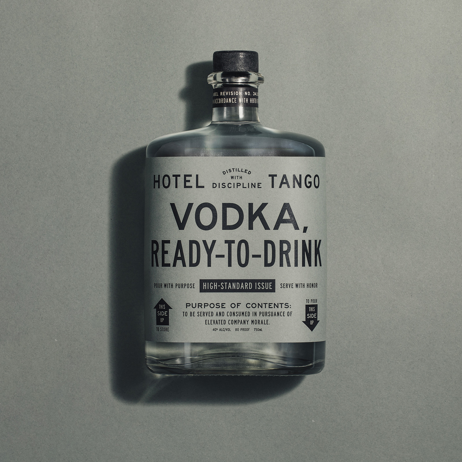
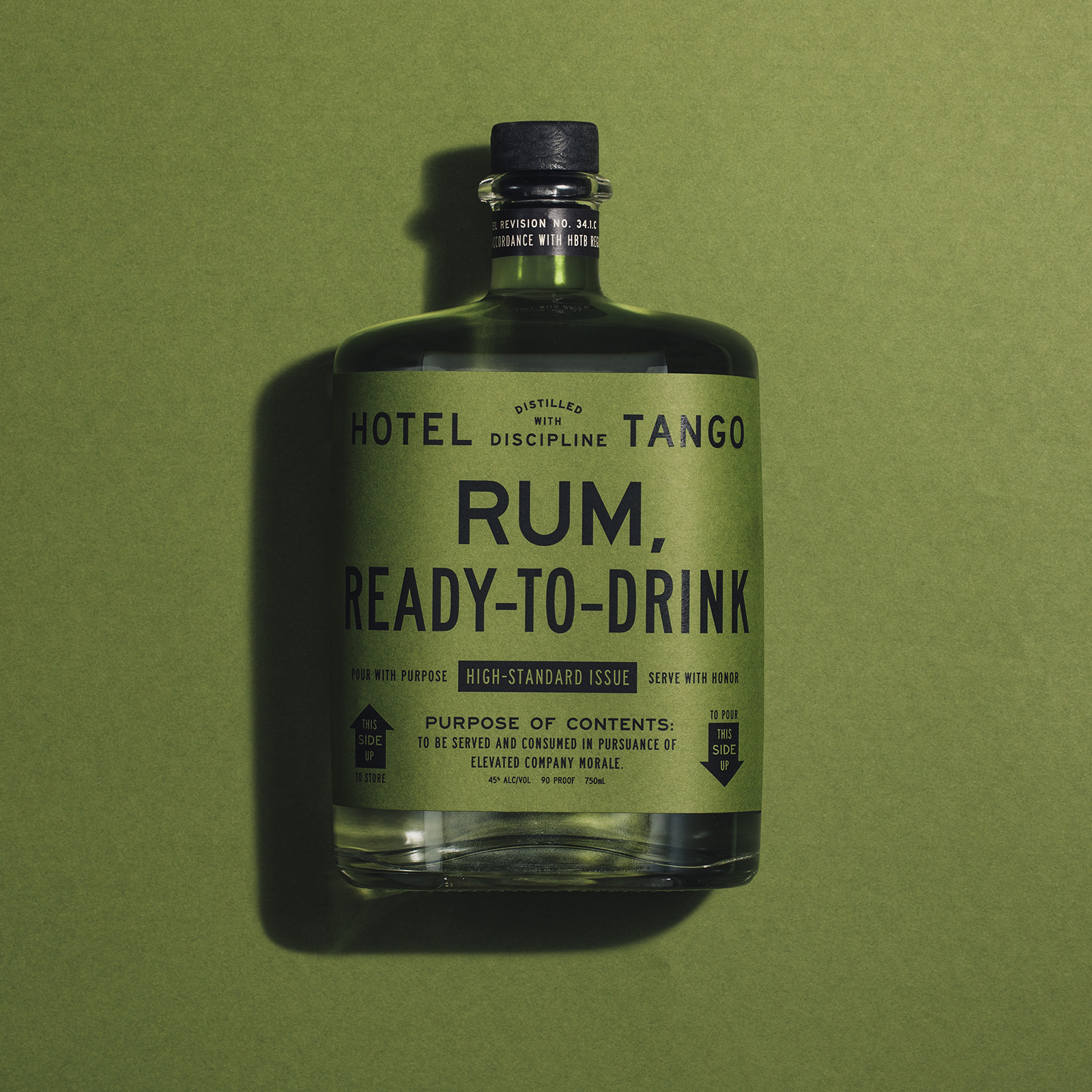
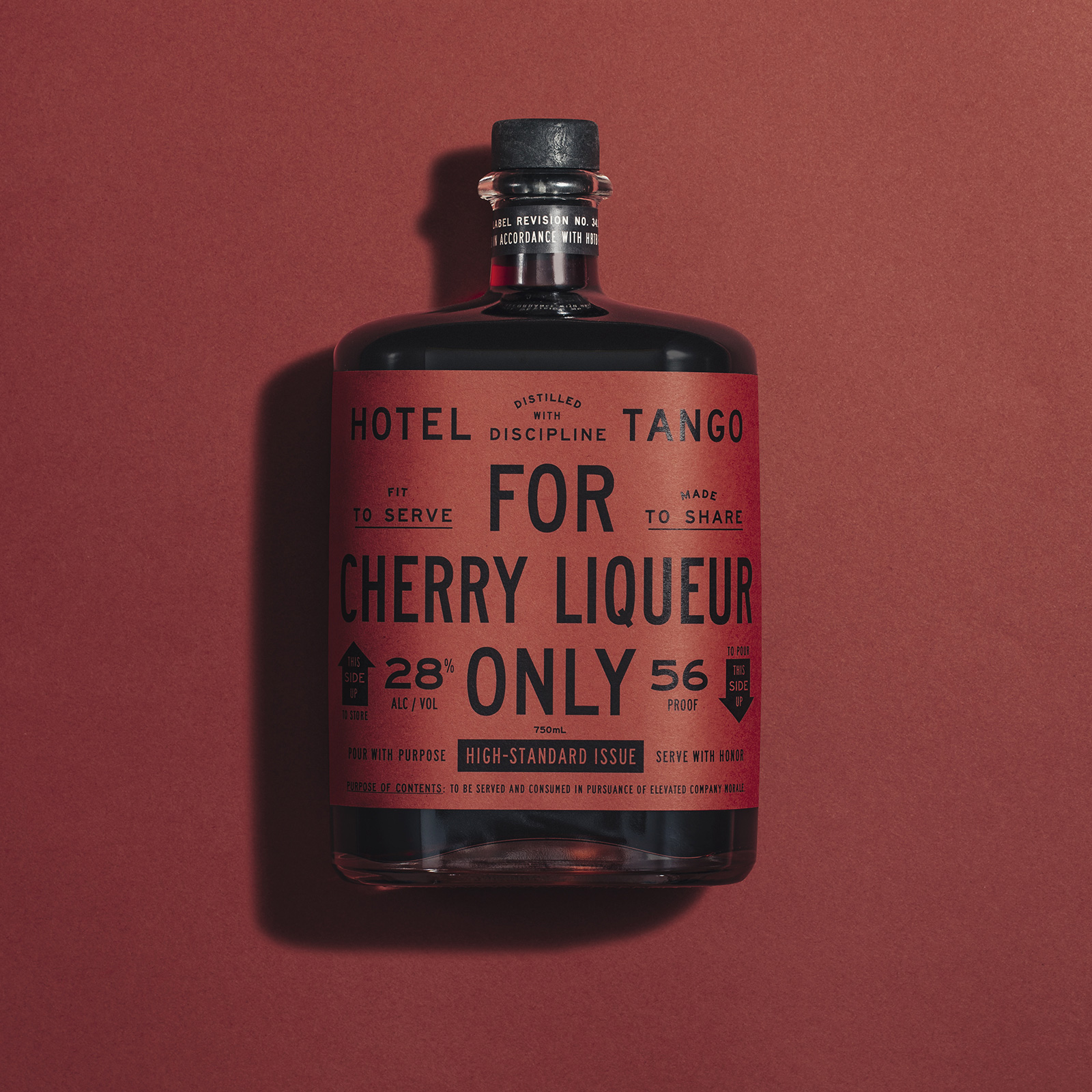
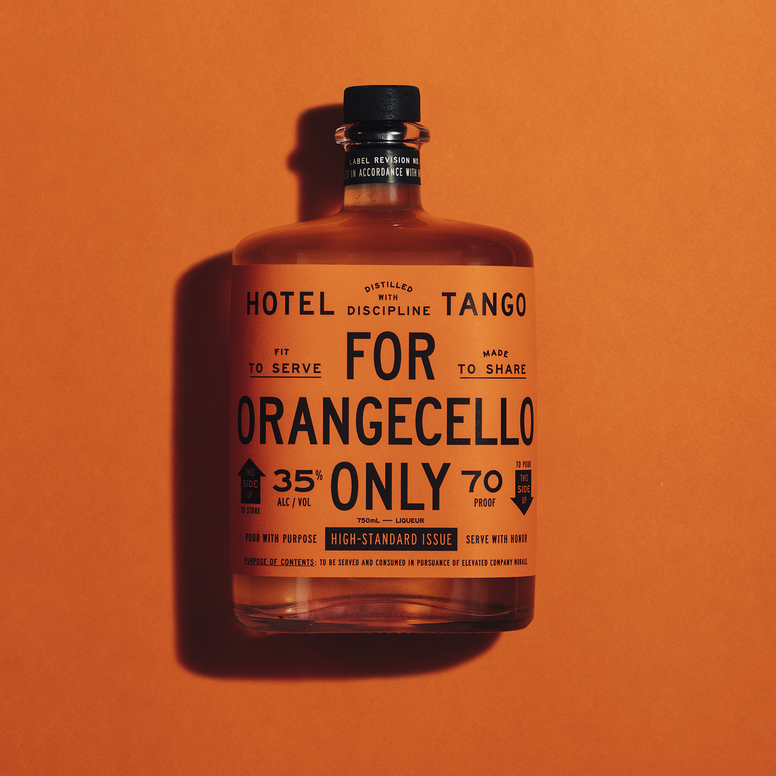
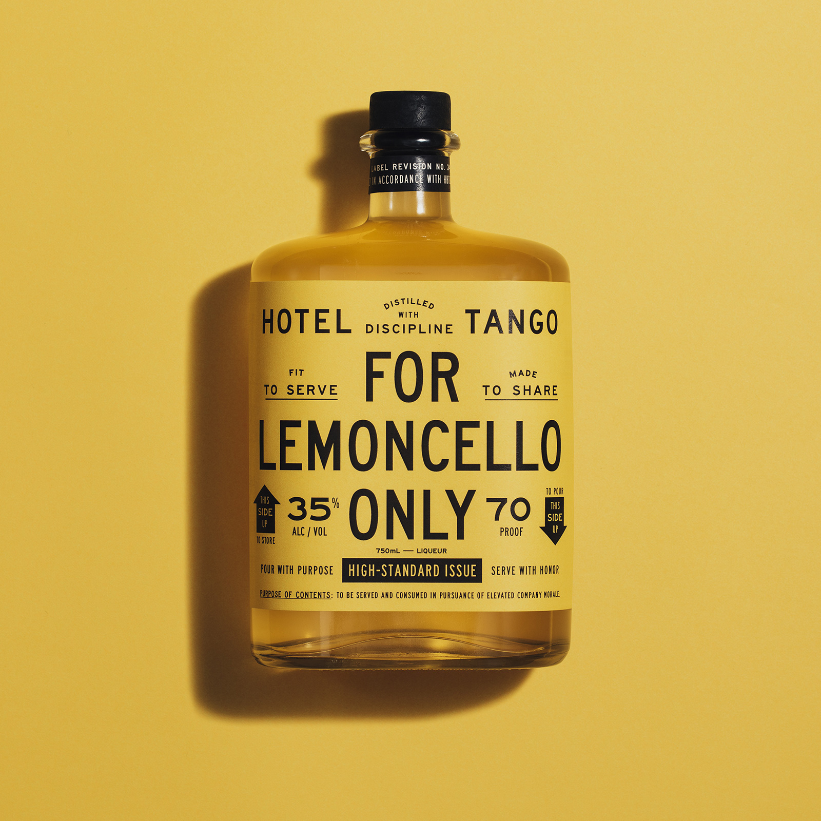
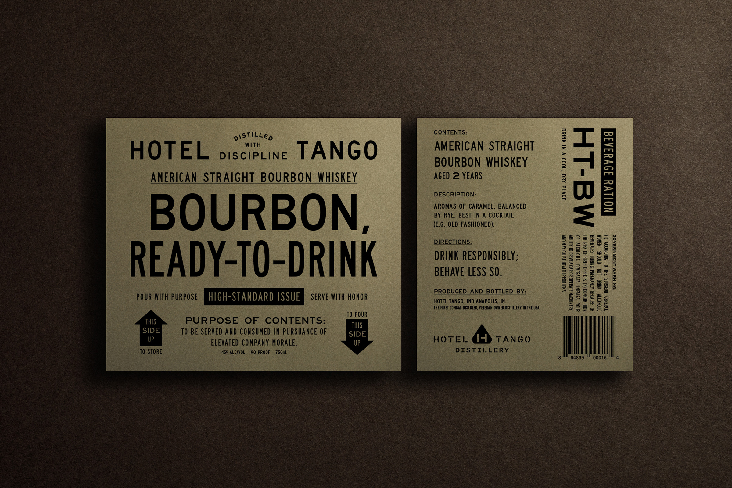
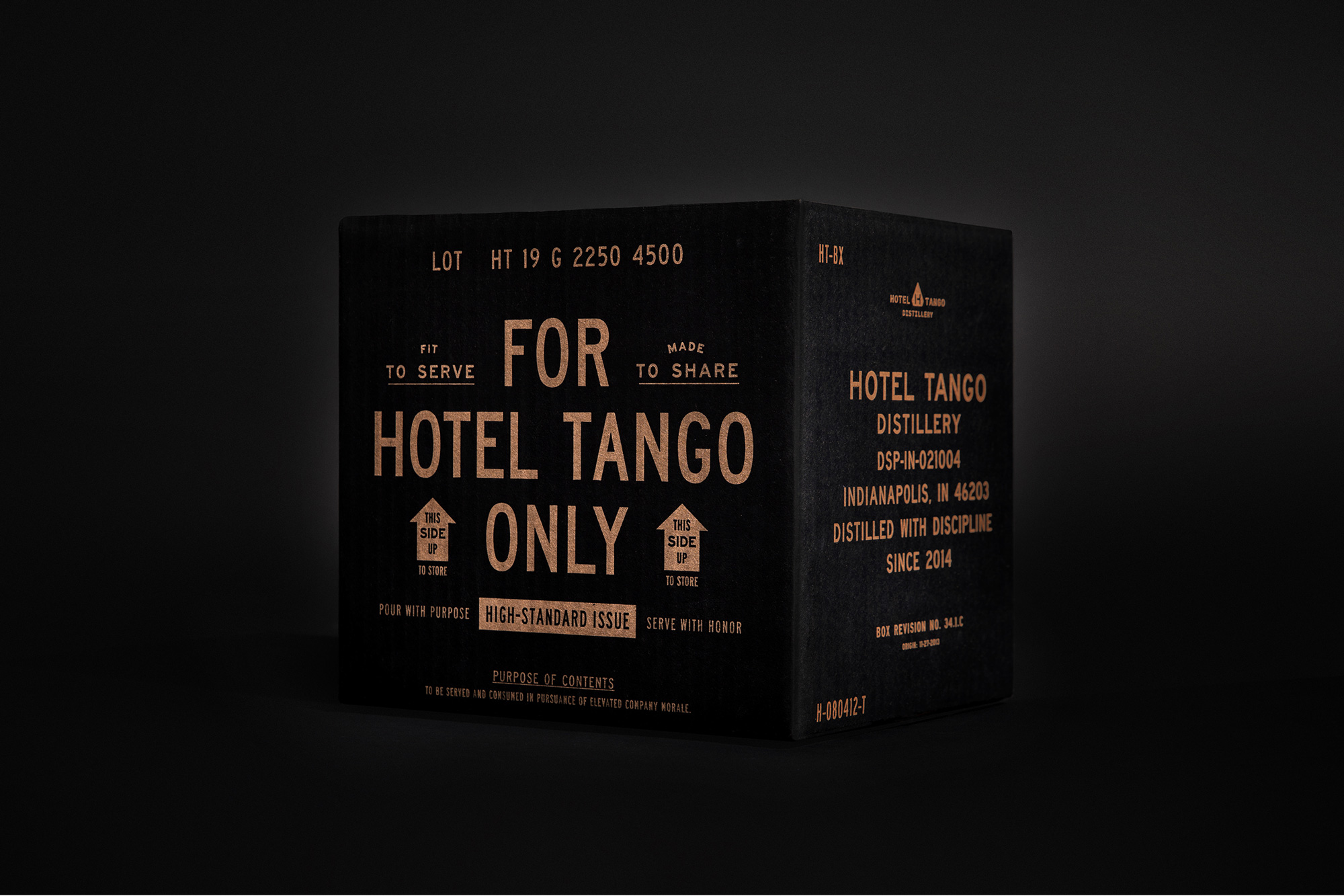
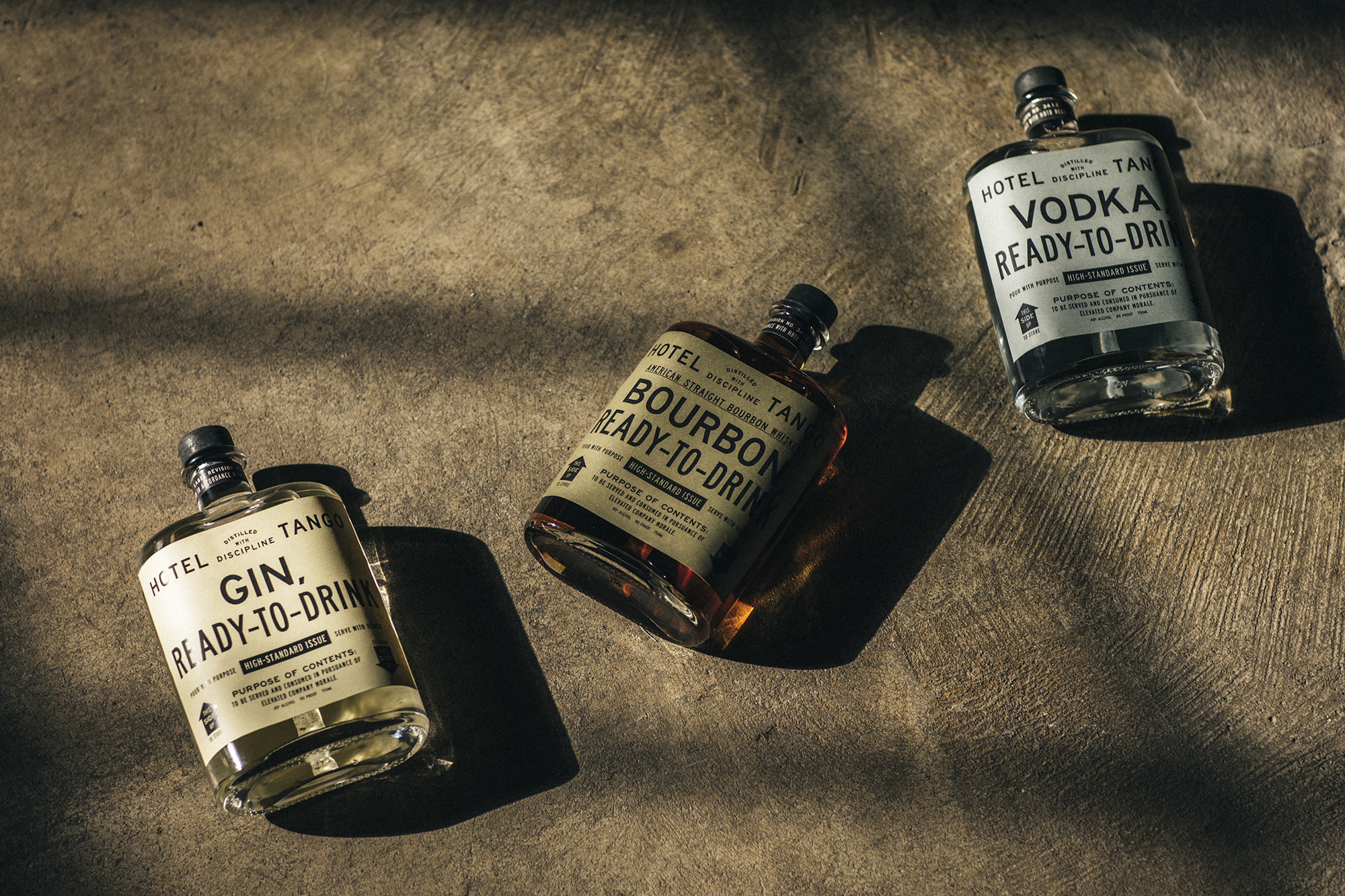
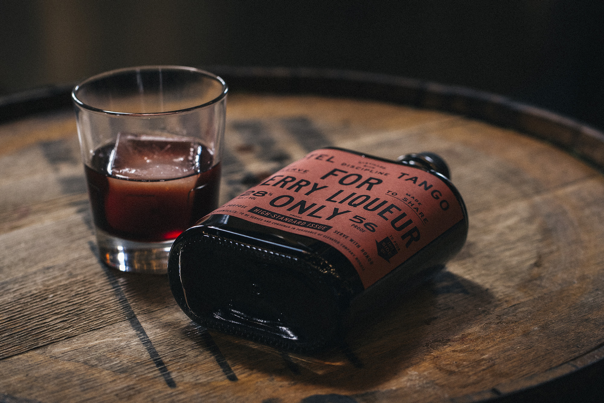
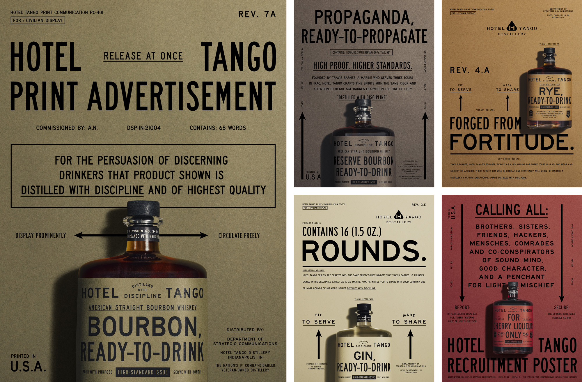
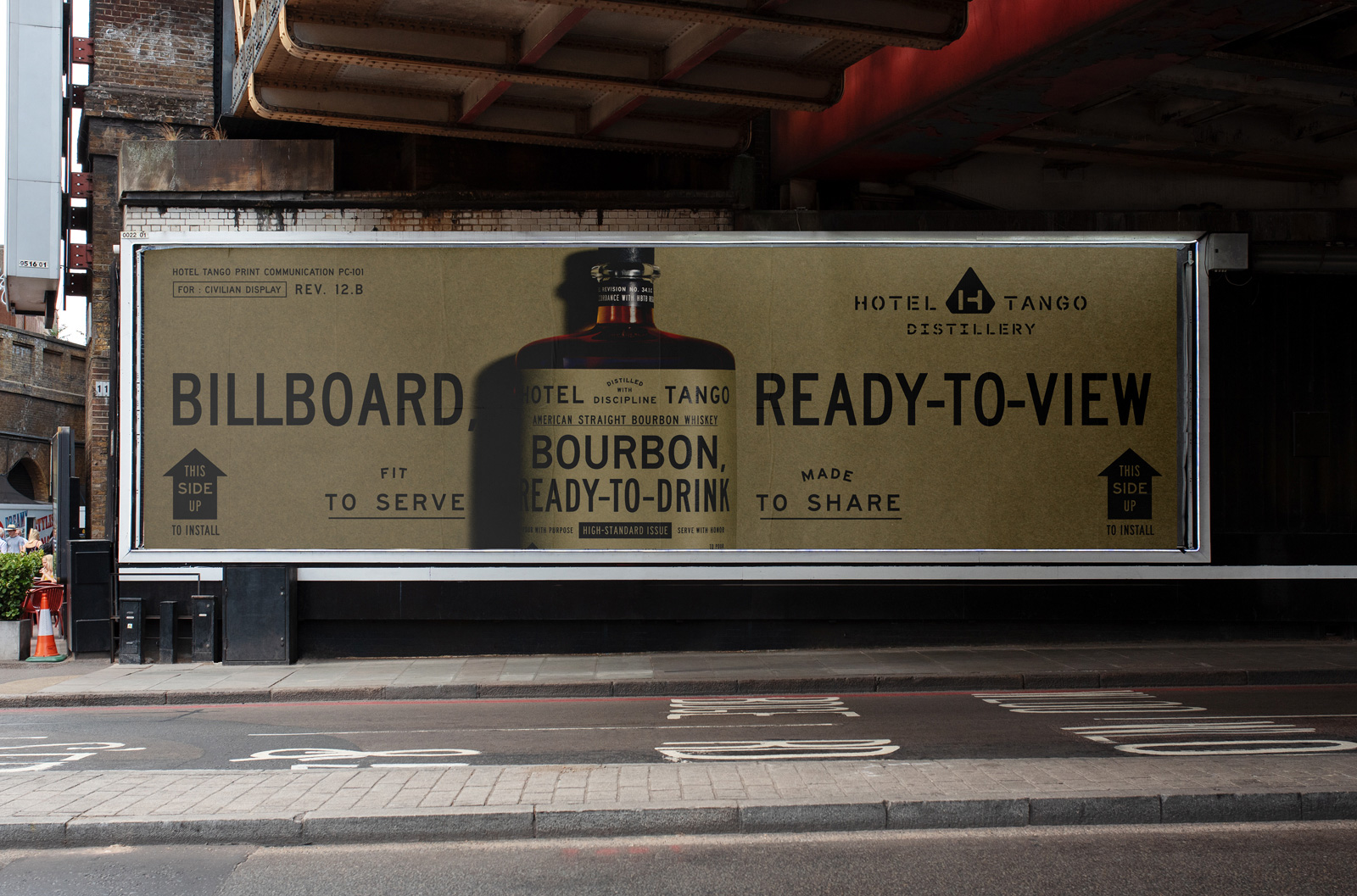
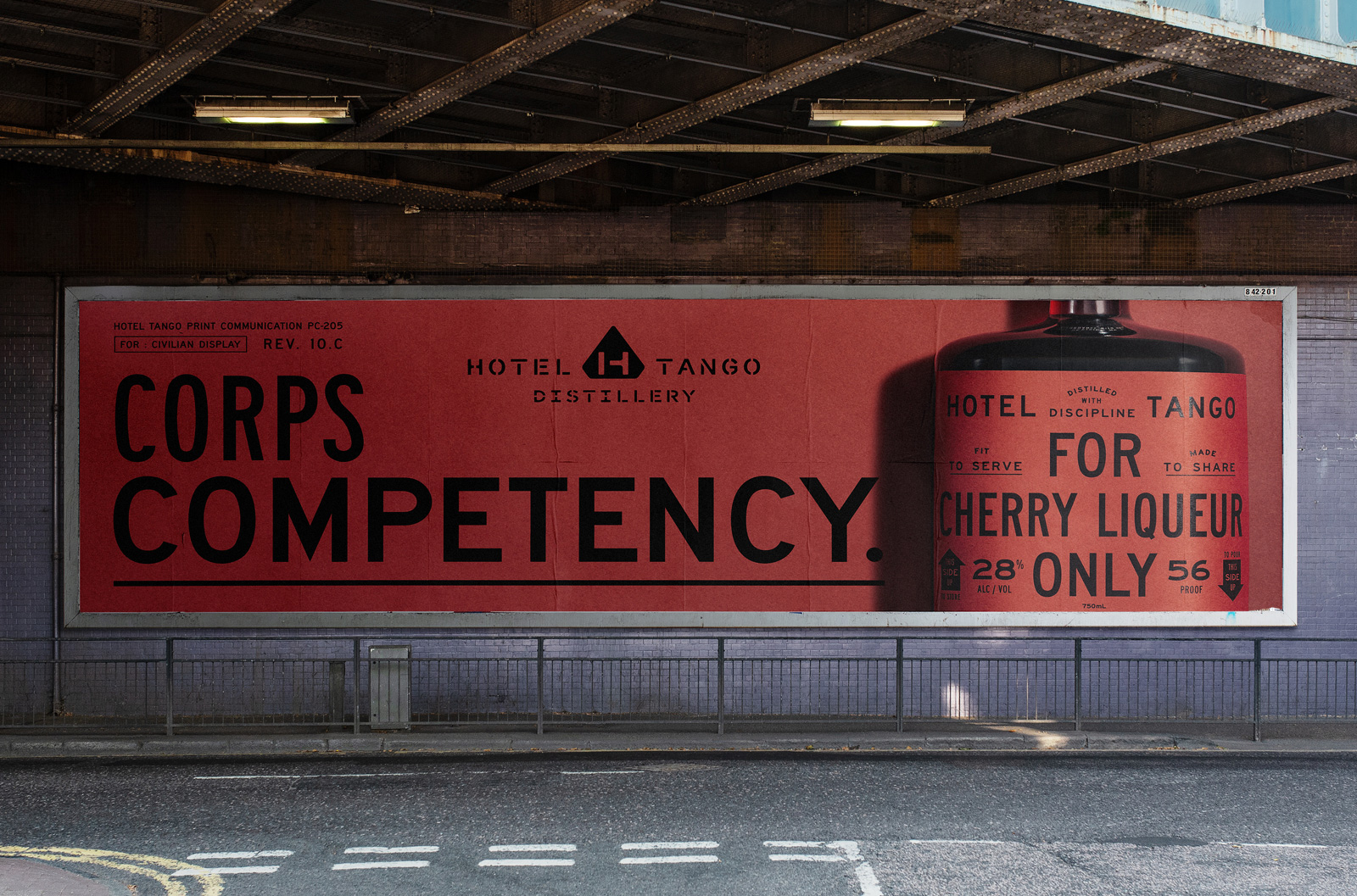
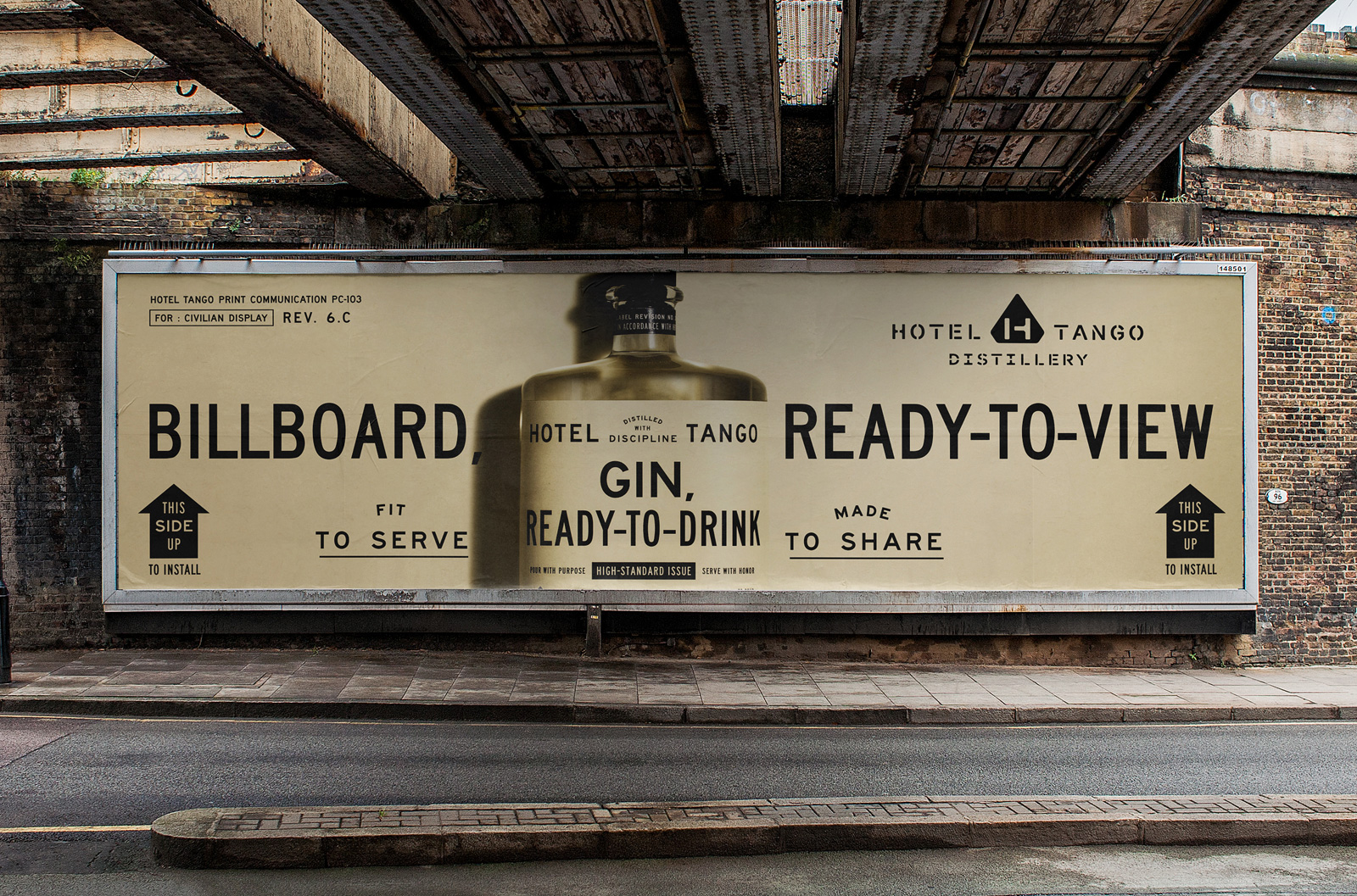
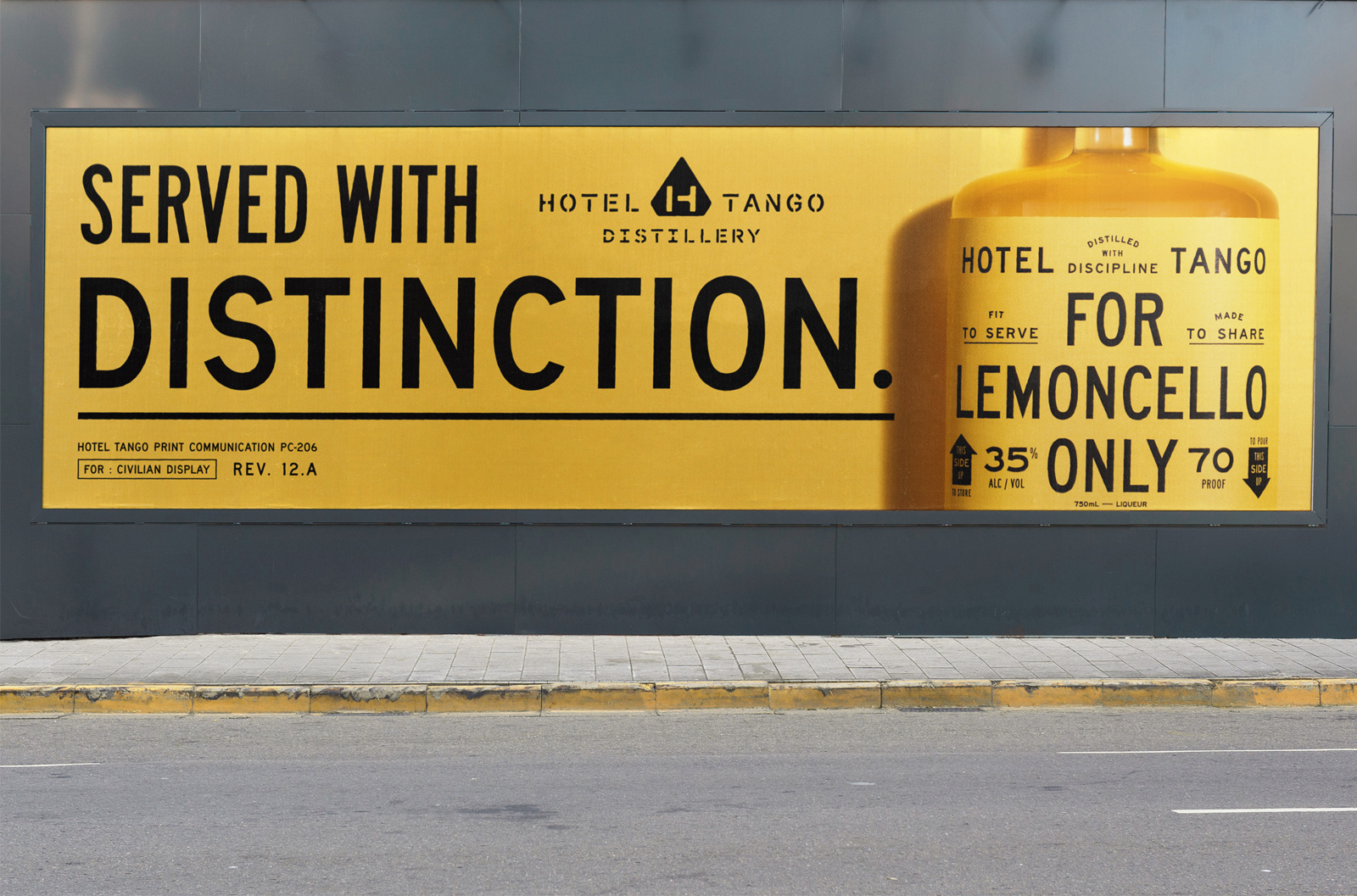
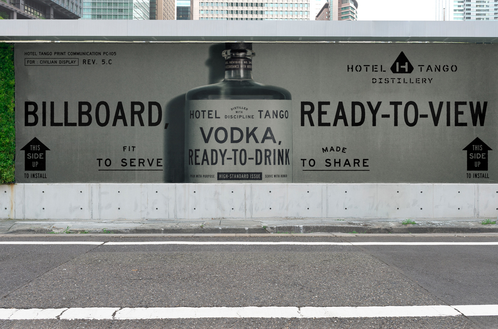
As if I didn't have enough praise so far, the copywriting is excellent too, mixing the strictness of military parlance with just the right amount of humor. To some, I imagine it may be off-putting or not an approach that will get you in the mood for spirits but this really knows who its audience is and doubles down on its tone of voice.
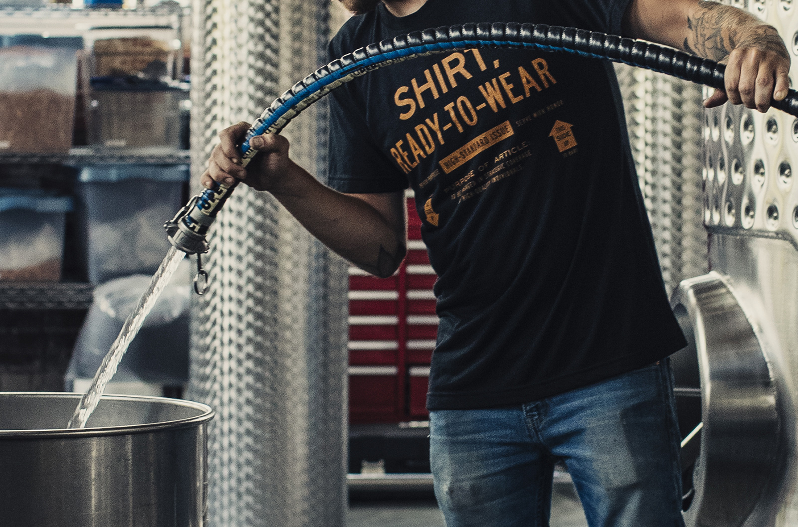
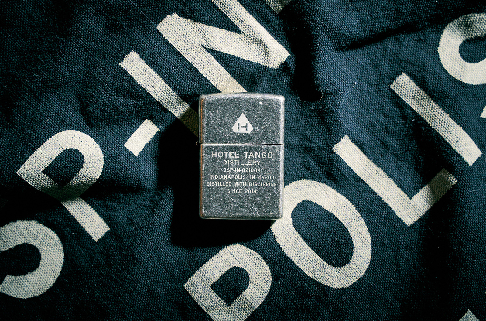
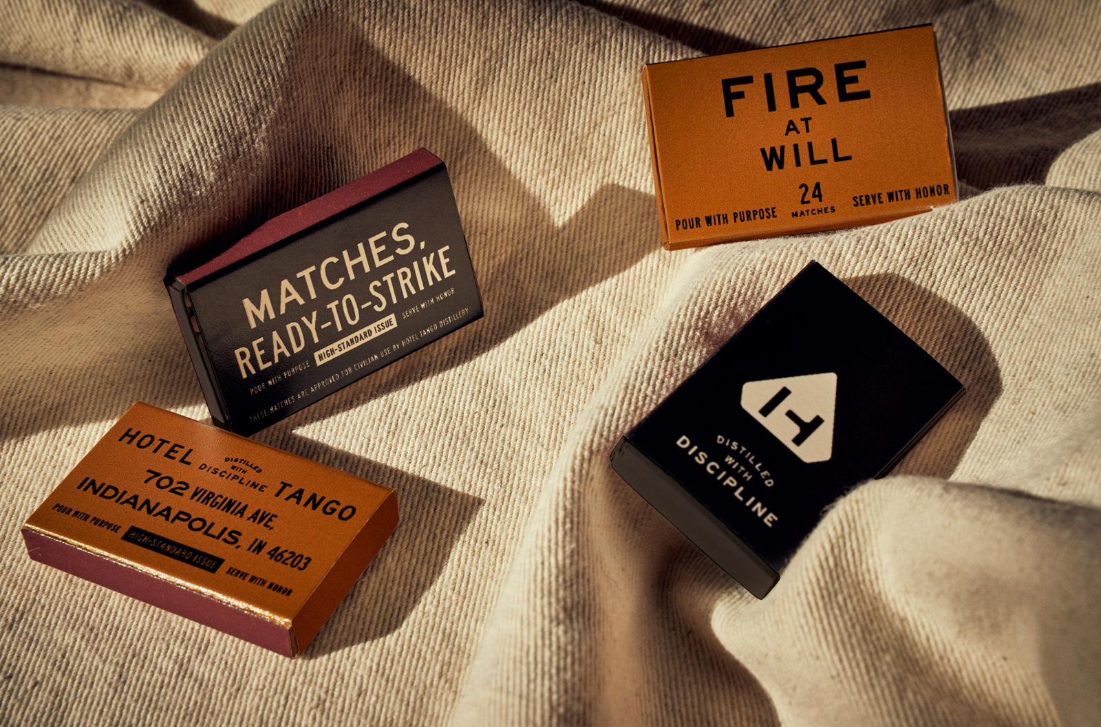
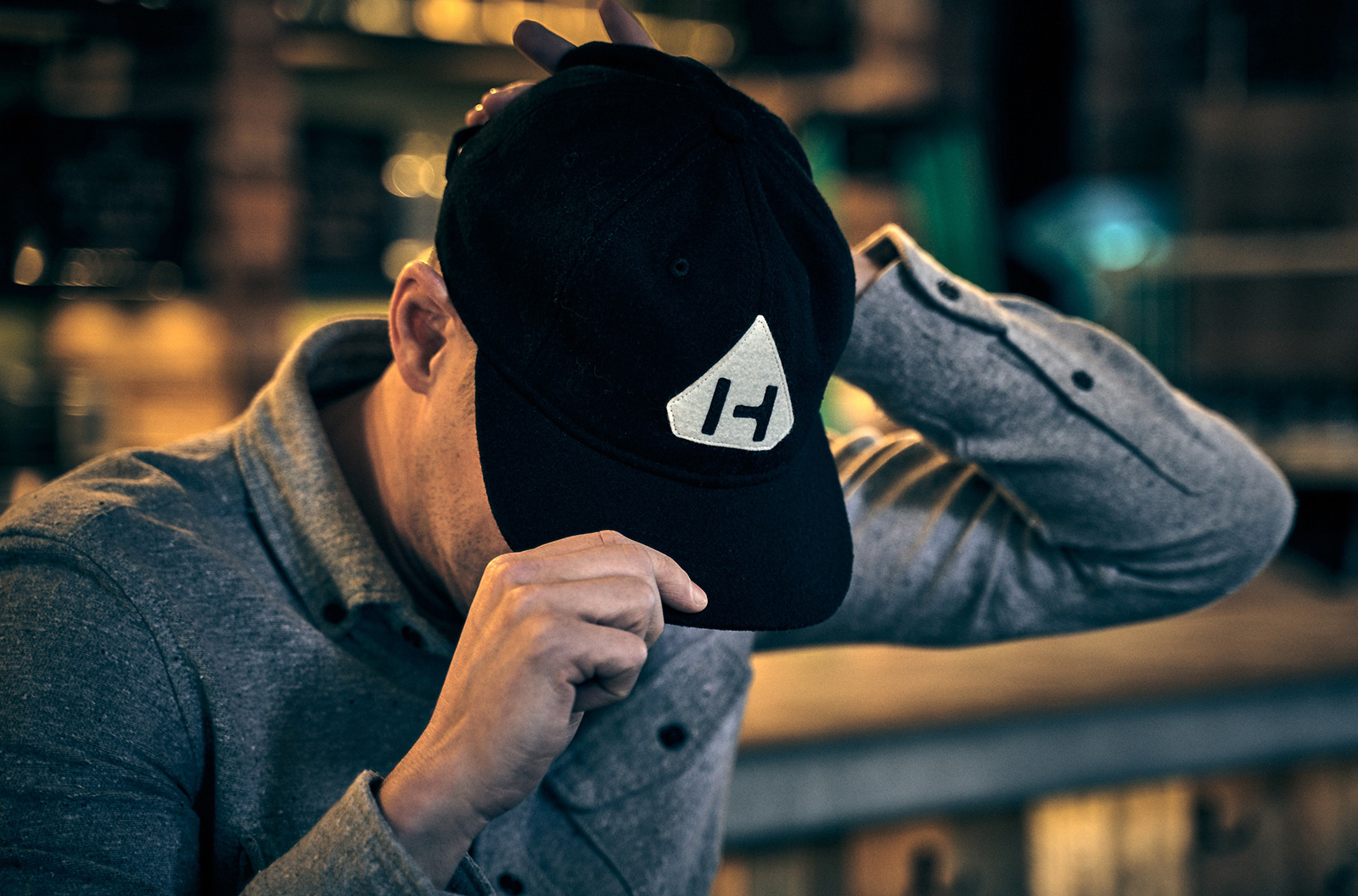
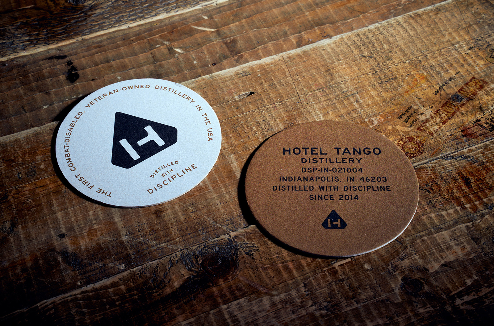
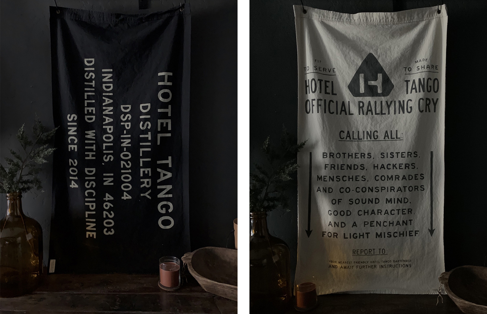
Overall, I probably don't have to verbalize it after all the swooning but I think this is a great design from top to bottom that embodies the backstory of the brand and its founder all while establishing a memorable and effective design design and verbal language.
In ấn Anpic In nhãn mác Anpic In brochure Anpic In card visit Anpic In catalogue Anpic In thiệp cưới Anpic In tờ rơi Anpic
In Ấn Anpic – Nổi Tiếng In Đẹp In Nhanh
Số 5 Ngõ 75 Nguyễn Xiển, Thanh Xuân, Hạ Đình, Hà Nội
0963223884
baogiainananh@gmail.com
https://anpic.vn
https://g.page/inananpic
In nhãn mác Anpic ✅ In brochure Anpic ✅ In card visit Anpic ✅ In catalogue Anpic ✅ In thiệp cưới Anpic ✅ In tờ rơi Anpic
https://anpic.vn/in-nhan-mac-dep
https://anpic.vn/in-brochure
https://anpic.vn/in-an
https://anpic.vn/in-voucher-in-phieu-giam-gia-khuyen-mai
#inananpic
Comments
Post a Comment