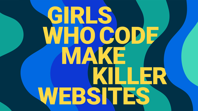
A new visual identity for Girls Who Code targets Generation Z
Booklyn-based design studio Hyperakt has updated the visual identity for coding collective, Girls Who Code (GWC).
The brand refresh includes a logo update, website redesign as well as new visuals for physical materials such as tote bags and badges.

GWC was founded in 2012 in New York with the aim of teaching 20 girls to code. Since then, it has grown into an international movement and teaches 185,000 girls around the world to code through resources and content.
Design ambitions and inspiration

The studio’s co-founder Julia Zeltser tells Design Week that one of the aims for the brand refresh was to provide a “visual system” for the brand, which was previously absent.
And specifically with the website design, the aim was to “increase conversions”. “Growing the number of girls served is the core element of reaching the goal of closing the gender gap,” she adds.

By 2027, the organisation hopes to achieve gender parity in the area of coding and a key element to this will be to “mobilize” girls currently at America’s schools (who fall into the category of Generation Z).
Speaking about the influences for the process, the designer mentions a range of inspirations, from popular female musicians and creative influencers as well as inspiring activists and politicians.
Making waves

The new visual system is built around the ideas of waves. This has a “metaphorical resonance,” Zeltser says, with its connotations of “coding window waves” as well as “waves of progress and change”. “Coding window waves” are a “visual interpretation of the shape of code lines written in a scripting window”.

Waves can be seen throughout the visual identity, from kinetic, rule and radial waves. A radial wave design can be seen on a branded phone case, for example.
Zeltser says that the wave-based system can flex for different audiences. She adds: “Quieter, more subtle colours and flexible design elements speak to donors and sponsors; louder, bolder ones catch the attention of Gen Z, and a happy medium is designed with girls’ parents and teachers in mind.”

Logo update

The logo is a subtle update. It has been redrawn to make it “more visually balanced and web-friendly”, according to the studio. The most prominent change is that is now all one colour, a teal that forms the base for the brand’s colour palette.
This colour palette expands into darker blue tones and also includes yellow accents.

A workable brand identity

One consideration for the new visual system is that GWC is a small team that works across many digital platforms. Zeltser says: “We needed to equip people in the large GWC community with tools that were easily accessed in multiple contexts.”
Instead of picking a “niche” typeface, the studio went for Roboto (a font developed by Google) which “allows anyone working online, whether a GWC employee, a program mentor, or a student, to create content or assets that are on-brand”.

The post A new visual identity for Girls Who Code targets Generation Z appeared first on Design Week.
In ấn Anpic In nhãn mác Anpic In brochure Anpic In card visit Anpic In catalogue Anpic In thiệp cưới Anpic In tờ rơi Anpic
In Ấn Anpic – Nổi Tiếng In Đẹp In Nhanh
Số 5 Ngõ 75 Nguyễn Xiển, Thanh Xuân, Hạ Đình, Hà Nội
0963223884
baogiainananh@gmail.com
https://anpic.vn
https://g.page/inananpic
In nhãn mác Anpic ✅ In brochure Anpic ✅ In card visit Anpic ✅ In catalogue Anpic ✅ In thiệp cưới Anpic ✅ In tờ rơi Anpic
https://anpic.vn/in-nhan-mac-dep
https://anpic.vn/in-brochure
https://anpic.vn/in-an
https://anpic.vn/in-voucher-in-phieu-giam-gia-khuyen-mai
#inananpic
Comments
Post a Comment