Noted: New Logo and Identity for Hyber by Bedow
“Running Around in Circles”
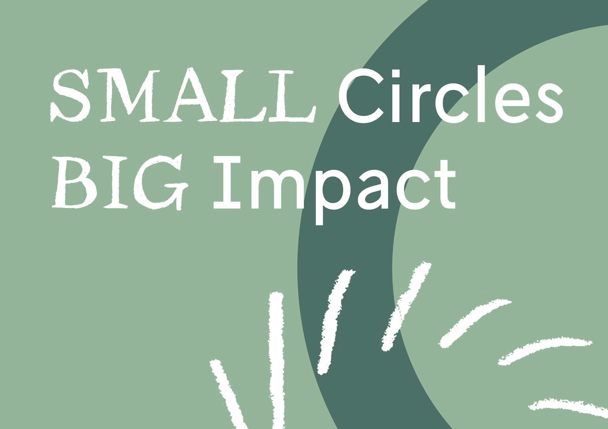
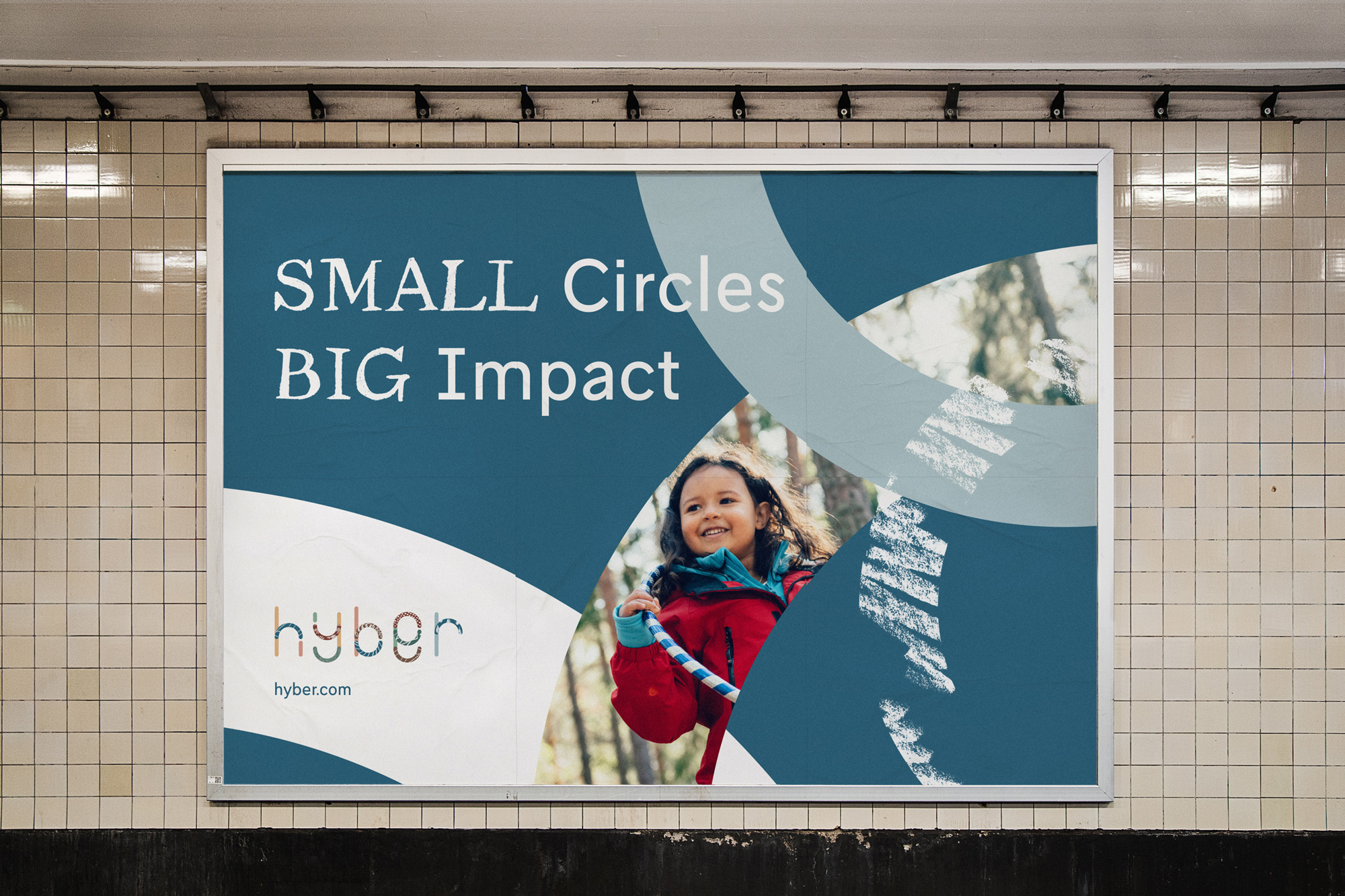
(Est. 2016) "Hyber was launched with a mission to make rental a trusted consumption habit among families so that children can grow up with quality while doing the environment a favour. Hyber is a rental platform for short use, long lasting children's products. Imagine all the necessities a child needs growing up. Everyone can do something. Even small things to make the planet a better place. That's why we started Hyber, and together with thousands of families across Sweden we are now making an important positive impact. We call it - Small Circles. Big Impact. So far, the kids in our community have together grown 16 000+ cm and saved 629 000kg CO2e. And yet, we have only seen the beginning of this movement."
Design by
Bedow (Stockholm, Sweden)
Related links
Bedow project page
Relevant quote
As Hyber scales up its services across Sweden, they have partnered with design studio Bedow to develop a new and engaging visual identity built around the tagline ‘small circles big impact.’ The identity highlights the wider effects of making sustainable consumer decisions every day and emphasises the collective power of individual children to make a big impact when their parents pool resources.
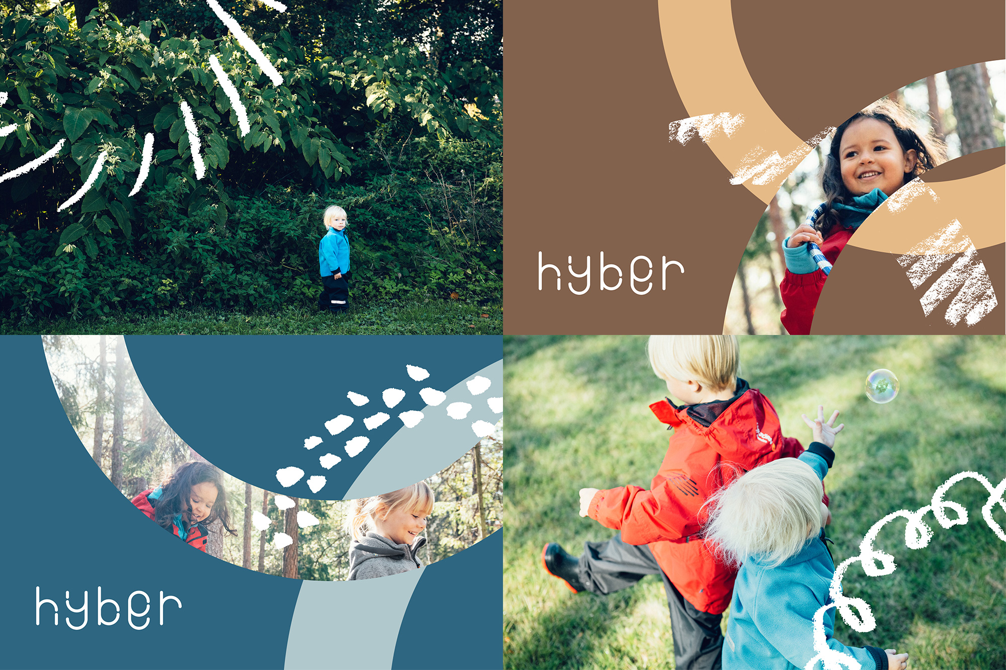
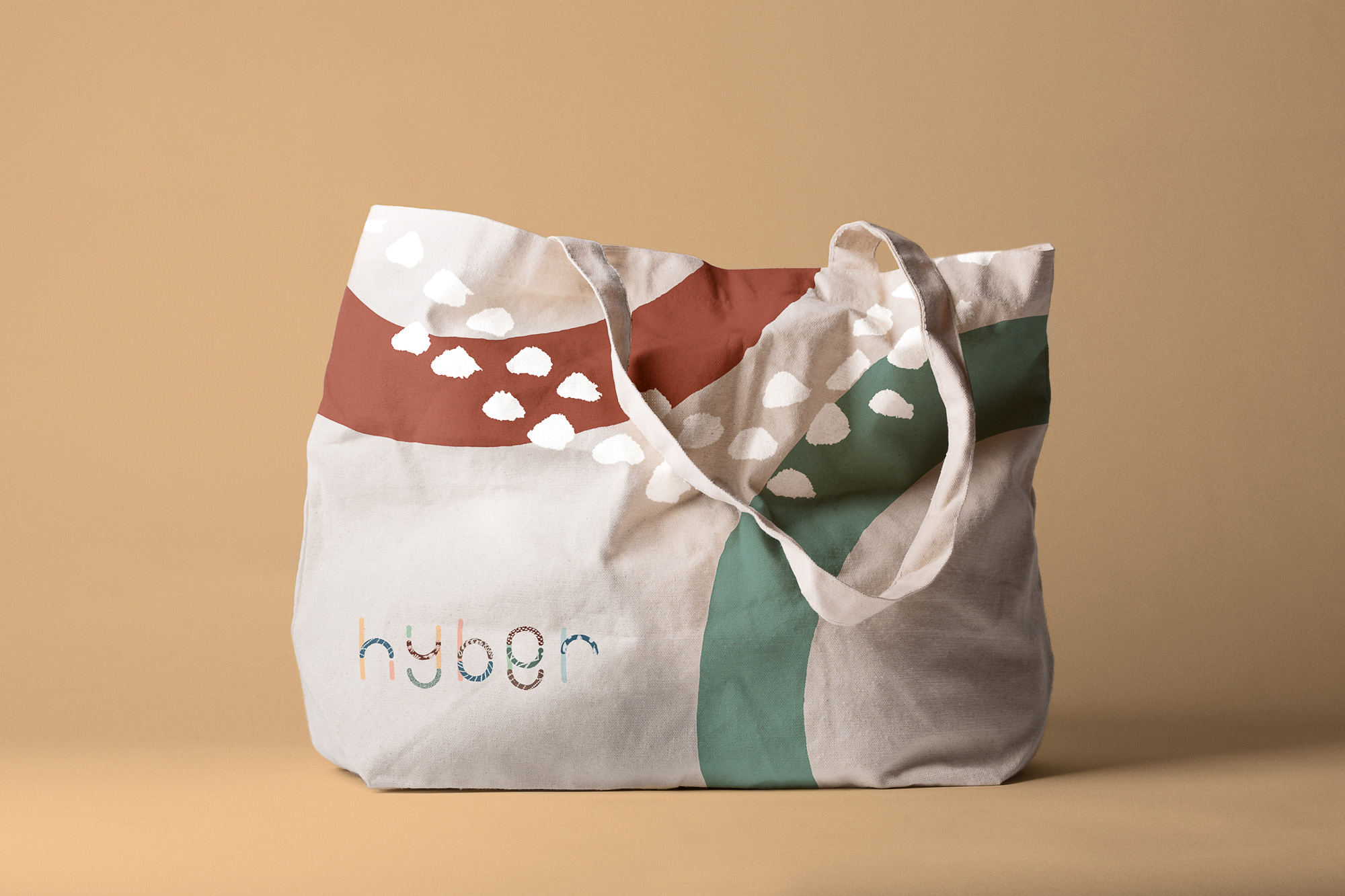
“Visually, we think of children as small, circular cycles,” says Perniclas Bedow, creative director of Bedow. “Individually they may be small, but as a collective they can make a big impact. This idea became the foundation of the Hyber identity in which individual circular forms are used as the building blocks of the wider brand.”
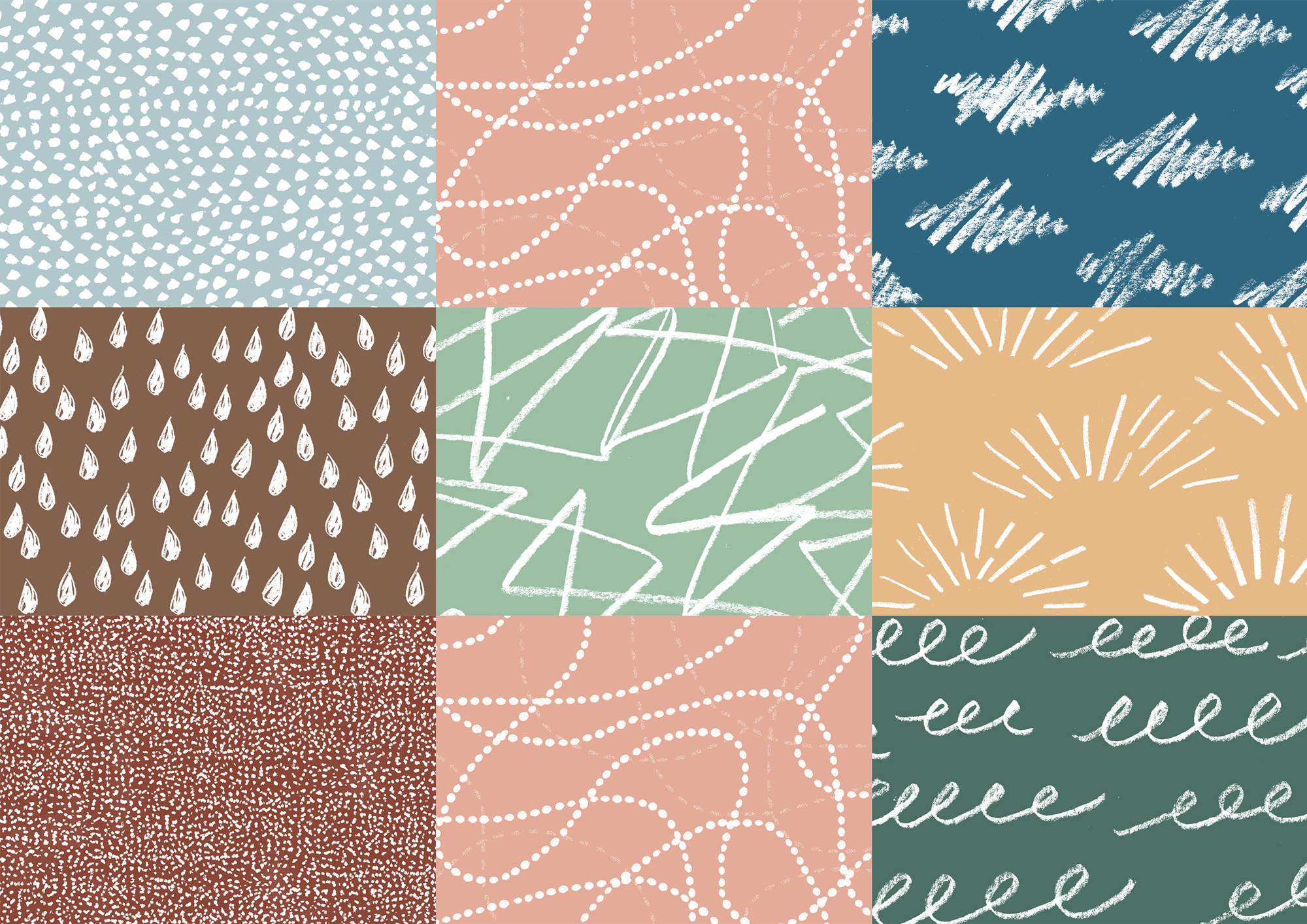
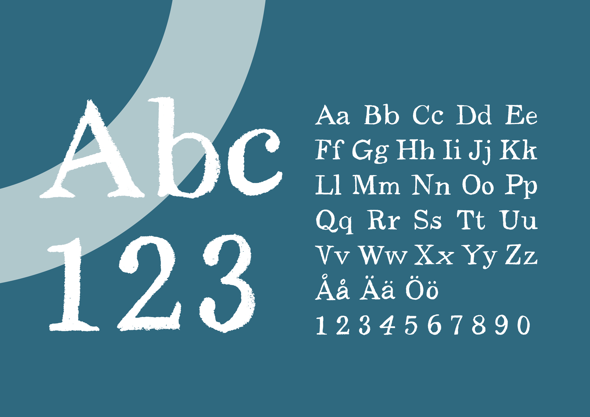
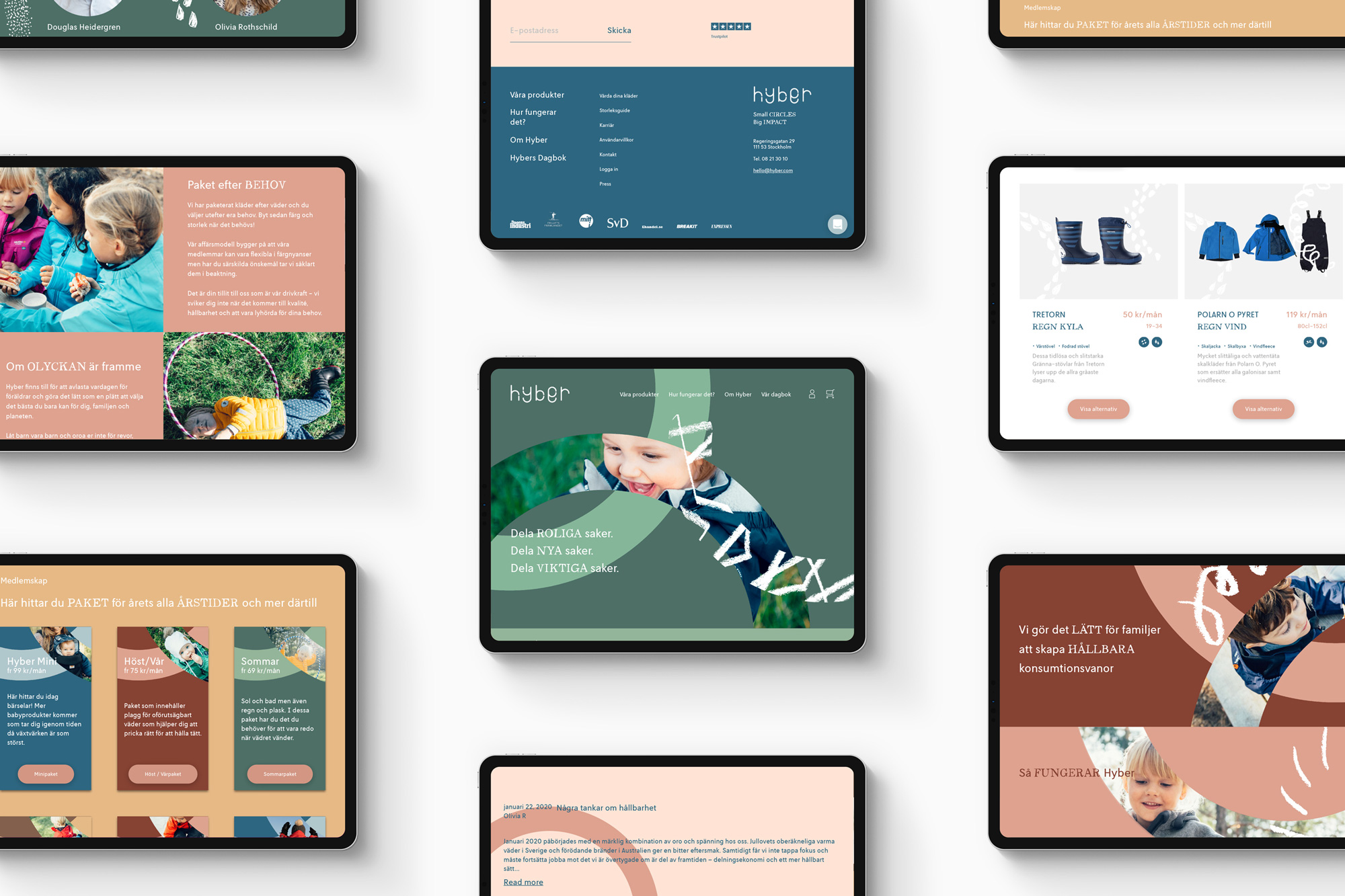
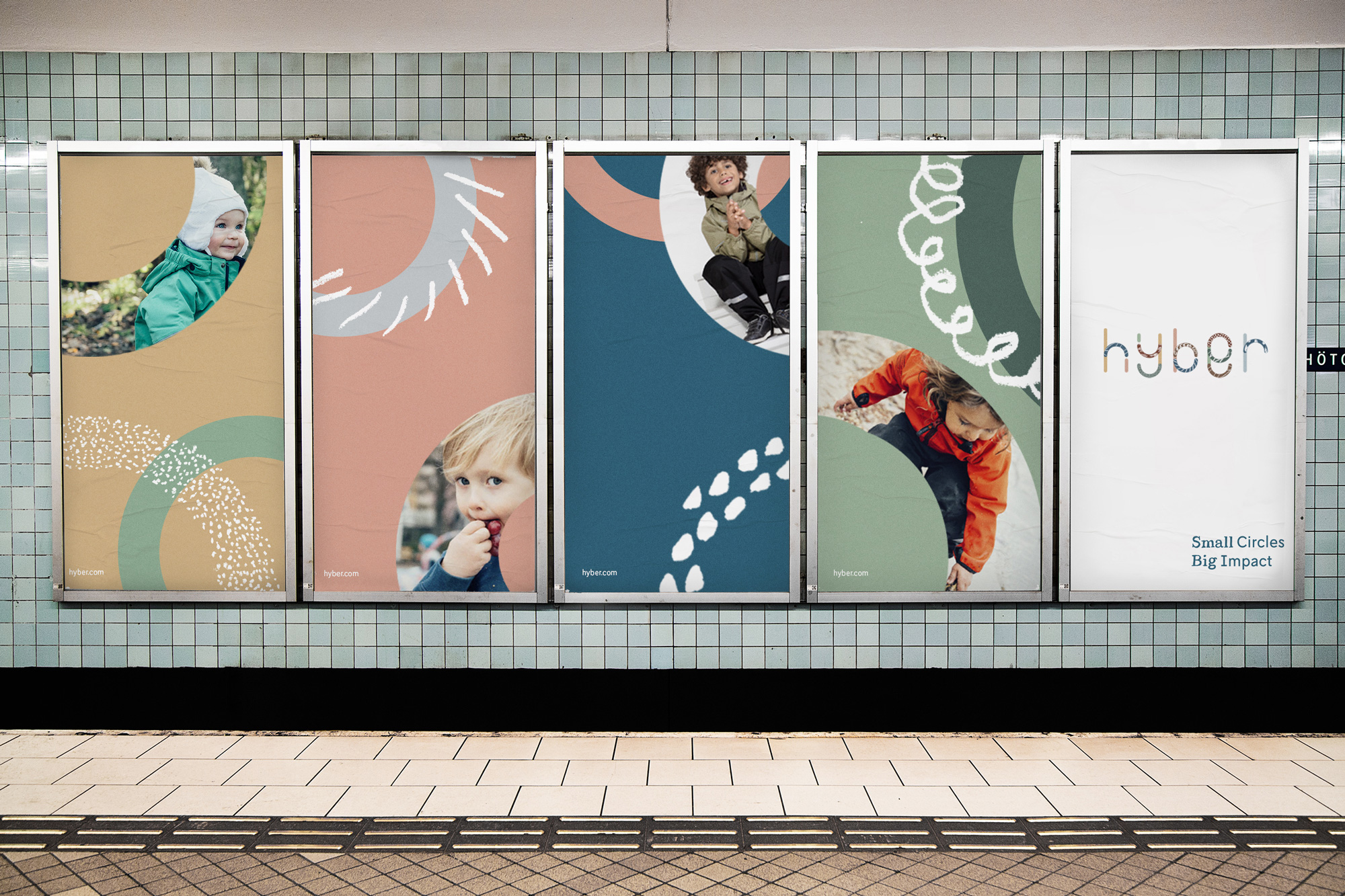
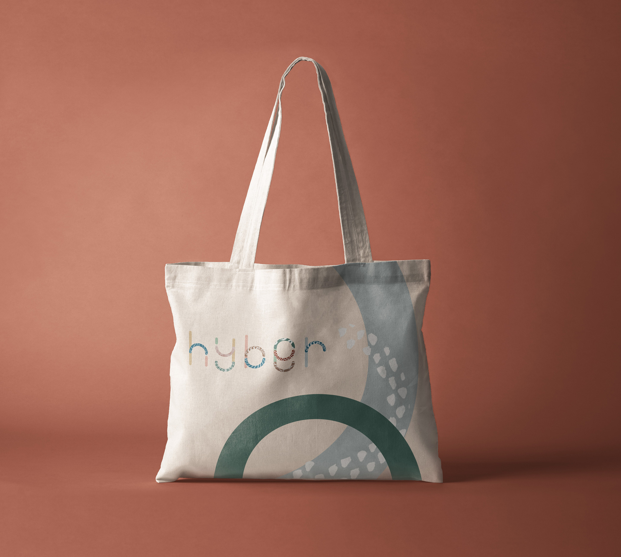
Bedow, who has young kids himself and is a Hyber member, summarises the identity as “a flexible tool that offers the brand multiple opportunities to tailor its communications to various platforms and media.” In addition to a new semicircular logotype, the Hyber identity includes a seasonal palette and abstract patterns that evoke spring, summer, autumn and winter. “We wanted to frame the products simply in the environments in which they’re used: rain, sleet, snow, sun and wind,” says Bedow. “This is accompanied by a custom typeface that suggests a childlike naivety without being unrefined, to ensure the brand maintains a premium feel. Together, we hope these elements provide a flexible solution that allows the team at Hyber to vary their tone and messaging for a variety of different purposes as they grow.”
Images (opinion after)


Opinion
The old logo was pretty charming with the dapper fox peering into a telescope. I could see an alternate version of this project where it evolves into a crisp geometric abstraction for added functionality in application. The new logo, though, in this version, sends the fox packing and introduces a playful wordmark constructed from half circles in honor of the company’s motto of “small circles big impact”. Some of the letters come off as a little clumsy for my taste — looking at you “e” and “r” — but the overall effect does exude a child-like innocence that a standard font wouldn’t capture. The logo works best, for me, when each piece is a different color/texture because when it’s a single color, the more unified letterforms are not fully pleasant, for me. A serif and a series of textures/patterns in a chalk-y, hand-drawn aesthetic add to the charm of the project and if that wasn’t enough, cute Swedish kids parading out in the world complete the emotional-tug circle. In application, things come together nicely and loosely with more half circles as masks and backgrounds with the rest of the elements interacting seamlessly. Overall, this is pretty spot-on for the target audience of world-mindful, budget-conscious parents who appreciate a good Instagram-able child — and, yeah yeah, because they love them too.
In ấn Anpic In nhãn mác Anpic In brochure Anpic In card visit Anpic In catalogue Anpic In thiệp cưới Anpic In tờ rơi Anpic
In Ấn Anpic – Nổi Tiếng In Đẹp In Nhanh
Số 5 Ngõ 75 Nguyễn Xiển, Thanh Xuân, Hạ Đình, Hà Nội
0963223884
baogiainananh@gmail.com
https://anpic.vn
https://g.page/inananpic
In nhãn mác Anpic ✅ In brochure Anpic ✅ In card visit Anpic ✅ In catalogue Anpic ✅ In thiệp cưới Anpic ✅ In tờ rơi Anpic
https://anpic.vn/in-nhan-mac-dep
https://anpic.vn/in-brochure
https://anpic.vn/in-an
https://anpic.vn/in-voucher-in-phieu-giam-gia-khuyen-mai
#inananpic


Comments
Post a Comment