Noted: New Logo and Identity for Kanga by Chris Ganz Designs
“Cool It”
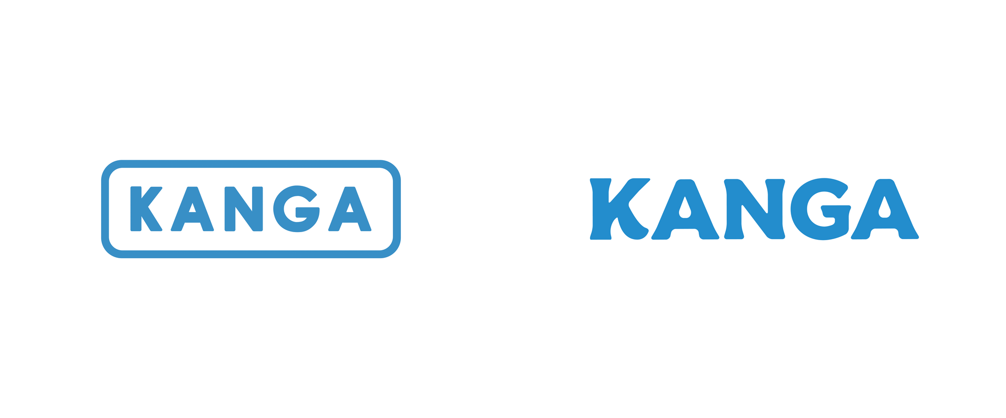
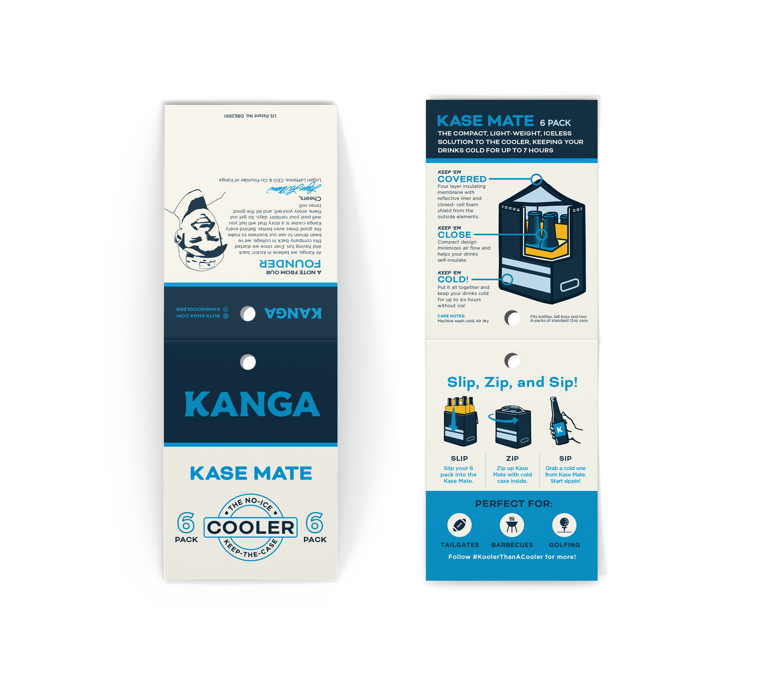
(Est. 2017) "Kanga, Kooler Than A Cooler, keeps drinks cold up to 7 hours without the ice! We created the Kase Mate to be the perfect solution to keeping beverages cold without the inconveniences of a bulky cooler. The design of our Kase Mate perfectly contours to custom fit 12, 24, and 30 packs of your favorite beverage, and after countless hours of research and experimentation, we discovered the best way to keep the cold in and the heat out. We like to think of it as an insulated sleeve for a beverage case. Our multi-patent pending Kase Mate is lightweight, transportable and easy to store. The Kase Mate is the perfect complement for tailgating, parties, outdoor ventures, and really any other situation that requires cold beverages nearby. Pick the size you want, choose from a variety of colors and designs, and relax with full confidence that your beverages will remain refreshingly cold." Kanga was featured (and funded) on Season 10, Episode 18 of ABC's Shark Tank.
Design by
Chris Ganz Designs (Dallas, TX)
Related links
Chris Ganz Designs project page
Relevant quote
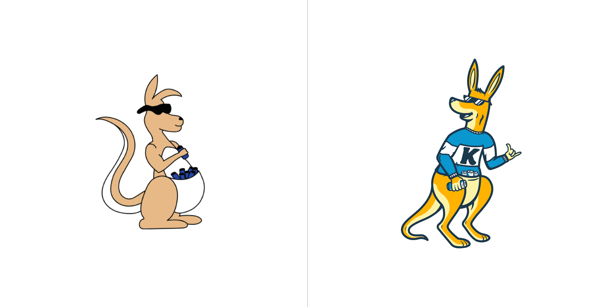
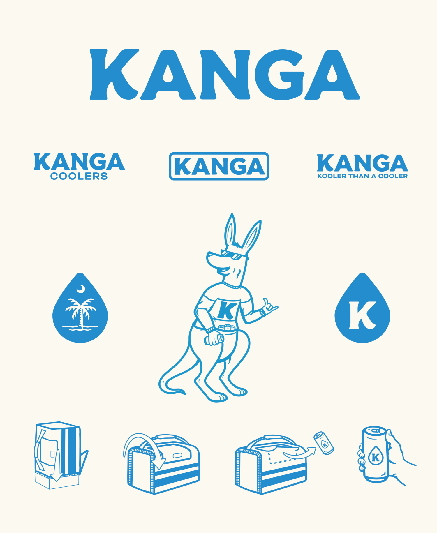
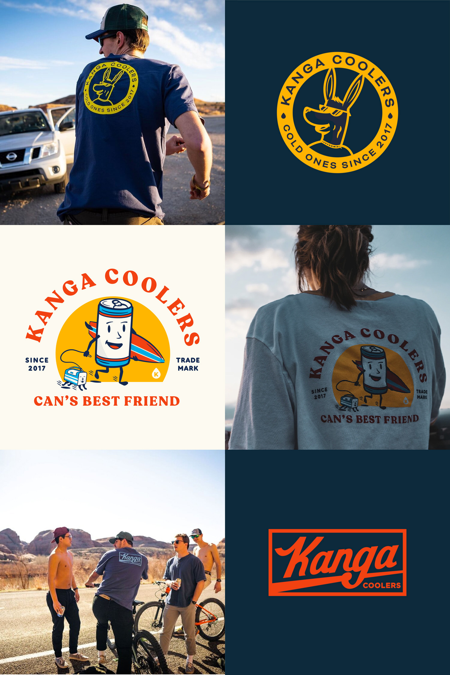
They wanted their logo to match their personality, high quality but still friendly, approachable, and timeless. The resulting mark and brand feels both friendly, but durable. The negative space on the bottom of the K aims to represent a wave and the extreme sports/athletes they sponsor, while the drop in the A’s reflect that the novel nature of the No-Ice-Required Kase Mate, their flagship product. We redesigned everything from the logo to Kangaroo Mascot and even collaborated for new product designs.
Images (opinion after)

Opinion
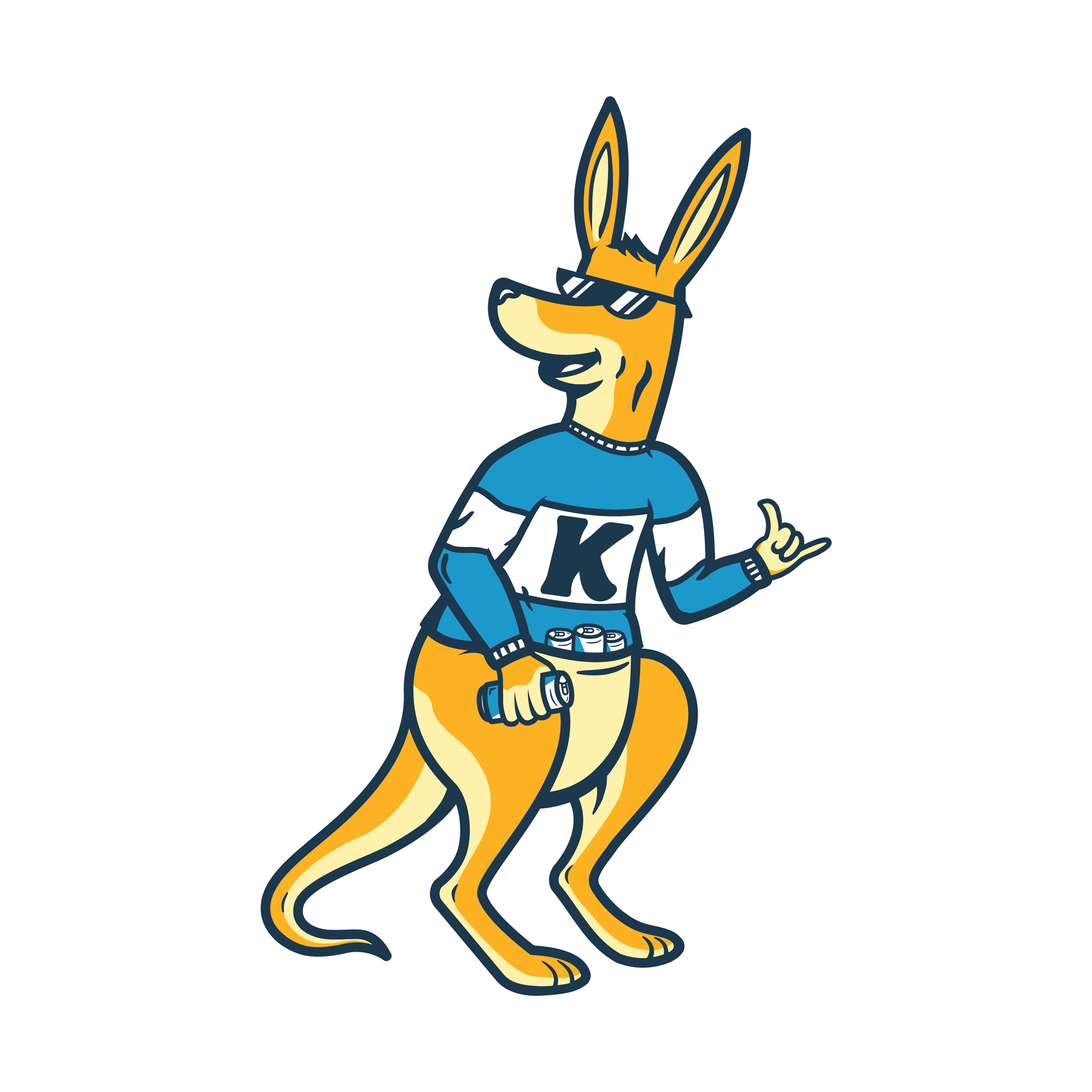
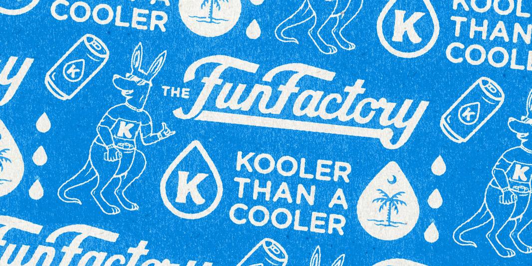
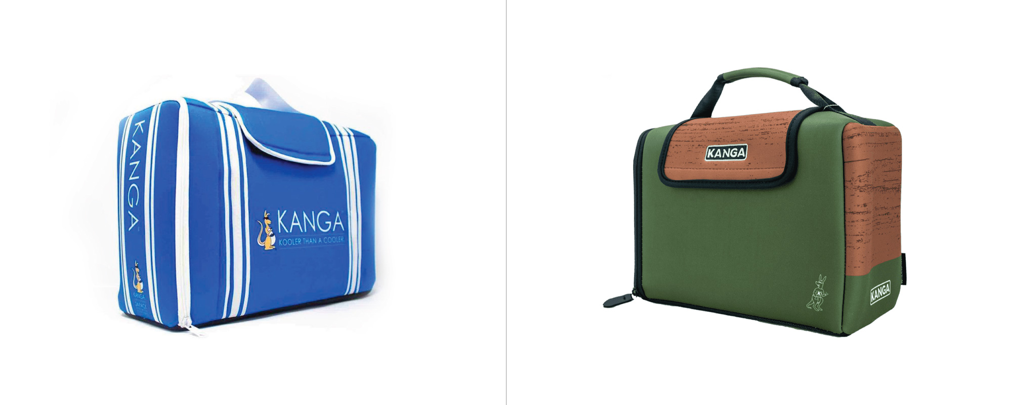
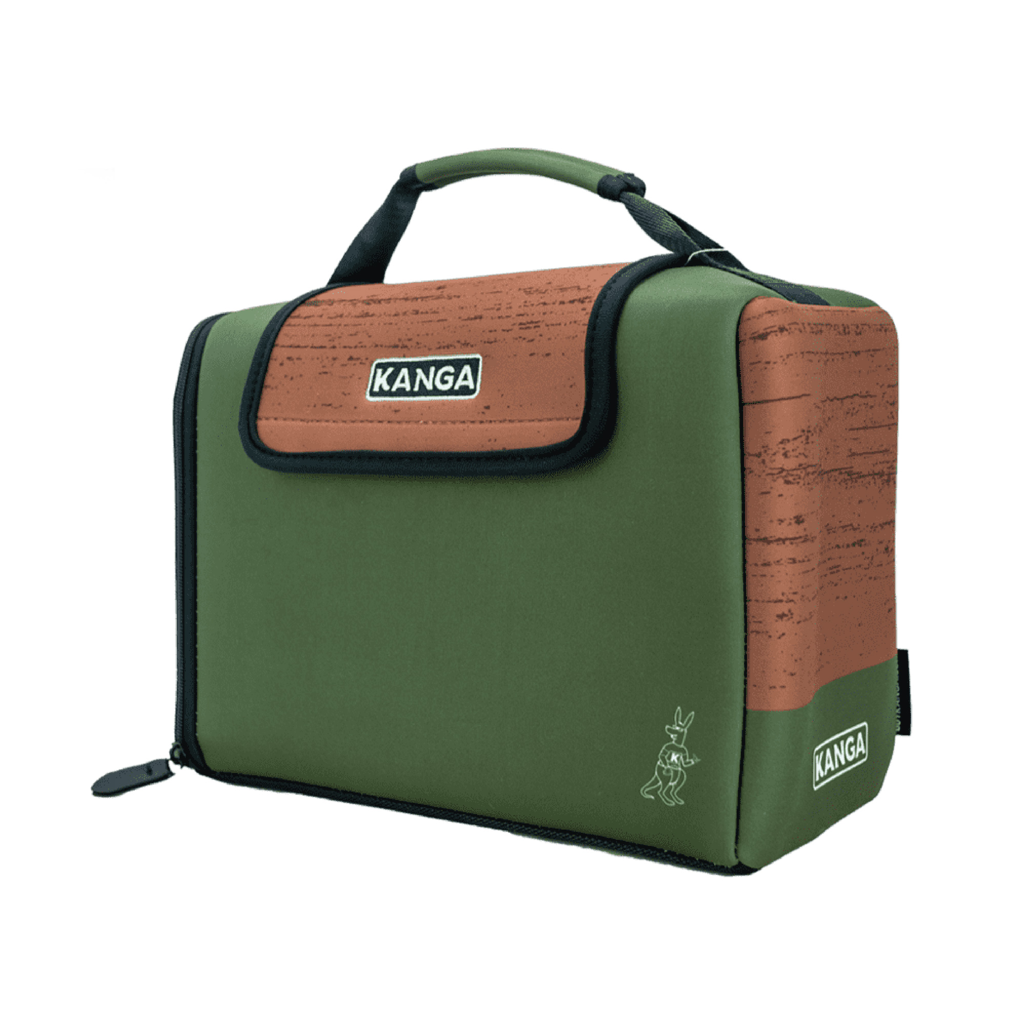
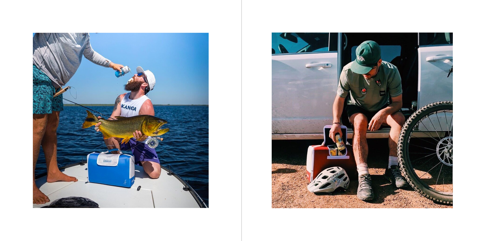
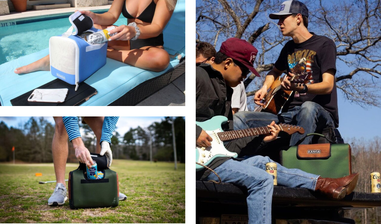
The overall previous identity had somewhat of a frat-boy-ish vibe — in part because the product idea came from four guys at a tailgate in Clemson University — particularly the old kangaroo… and in general it looked like a knock-off brand of some kind but the product must be good, to have come this far and evolve into a more mature phase for both brand and product. The old logo was fine but generic, while the new one has much more of beach-y, surfer crowd vibe that’s a perfect fit for the product (and its contents). While it’s the right feel, the new logo could use some refinement… The leg of the “K” ends directly on the baseline, which makes it feel as if it’s lifting from the ground; it should dip a tad under the baseline and it could probably have been more exaggerated as a wave. The water drops in the counterspaces of the “A”s is a little corny and I would have either avoided them or made them more abstract. The “G” also seems to be floating a little. The new kangaroo is an improvement for sure but it might be too slick and a little-douchey with the college-like sweater. The identity improves with the additional logo/badge assets that start to look more outdoorsy as well as with the brand photography that, while still on the bro-ish side, is more on point with all its sunsets and fun scenery. The t-shirts are probably the best part of the identity and I kinda wanna see that surfing beer can and its curved typography be the actual brand. Still, an overall improvement that clearly establishes the audience of the product.
In ấn Anpic In nhãn mác Anpic In brochure Anpic In card visit Anpic In catalogue Anpic In thiệp cưới Anpic In tờ rơi Anpic
In Ấn Anpic – Nổi Tiếng In Đẹp In Nhanh
Số 5 Ngõ 75 Nguyễn Xiển, Thanh Xuân, Hạ Đình, Hà Nội
0963223884
baogiainananh@gmail.com
https://anpic.vn
https://g.page/inananpic
In nhãn mác Anpic ✅ In brochure Anpic ✅ In card visit Anpic ✅ In catalogue Anpic ✅ In thiệp cưới Anpic ✅ In tờ rơi Anpic
https://anpic.vn/in-nhan-mac-dep
https://anpic.vn/in-brochure
https://anpic.vn/in-an
https://anpic.vn/in-voucher-in-phieu-giam-gia-khuyen-mai
#inananpic
Comments
Post a Comment