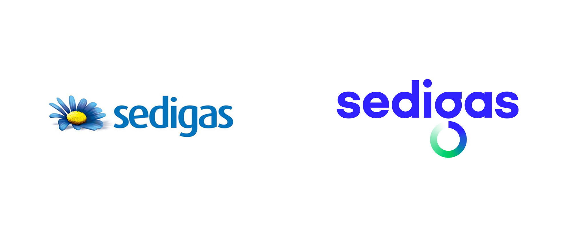
Noted: New Logo and Identity for Sedigas by Morillas
“In a Gas all its Own”

(Est. 1970) "The Spanish Gas Association, Sedigas, was constituted in April 1970 on the initiative of all the piped gas companies in Spain. Sedigas was created with the aim of promoting the deregulation of the market and its role as a key element in the economic development and quality of life of future generations."
Design by
Morillas (Barcelona, Spain)
Related links
Morillas project page
Relevant quote
Like any brand representing a collective, Sedigas had to assume a shared and diverse identity that in this case, should represent a global future as well as teamwork with other companies and sectors.
A graphic premise was borne from the idea of equilibrium: to restore what is consumed, return what is generated, to regenerate energy in a constant cycle. And this is done in a compensatory way, which even gives its name to a new economy: the circular economy, represented in a typographical gesture within a much cleaner, fresh and adaptable brand.
With the gradient of colors, the dynamic transition in which the sector is located is explained: from the traditional blue flame of gas to the intense green of sustainability. From the circle and its repetition, a dynamic metaphorical graphic language fuses with a high symbolic power, through which the versatility of gas is represented as key energy in the development of a multitude of sectors, which invites us to look to the future with optimism.
Images (opinion after)


Opinion
The old logo was pretty unapologetic about choosing the most extreme opposite of what we think about when we think about gas: a flower. And then they turned it blue. Like, why? The “realistic”, single, decapitated flower was accompanied by my least favorite category of type, a spurless sans. Long way of saying I did not like the old logo. The new logo isn’t great but it’s a major improvement that feels much more Big Gas-like and that’s fine. When it comes to gas companies, or even gas consortiums as is the case here, I don’t mind them looking like big corporations trying to impart an ecological message through their logo. This one is all about “equilibrium” as represented by a blue-to-green gradient ring in the “g”. The concept and the execution are fine and the logo yields an endless array of gradient rings to deploy in application in different configurations. At times, things can get too circle-y but they are definitely effective and attention-grabbing. Overall, nothing entirely new or exciting but plenty to nod to in agreement.
In ấn Anpic In nhãn mác Anpic In brochure Anpic In card visit Anpic In catalogue Anpic In thiệp cưới Anpic In tờ rơi Anpic
In Ấn Anpic – Nổi Tiếng In Đẹp In Nhanh
Số 5 Ngõ 75 Nguyễn Xiển, Thanh Xuân, Hạ Đình, Hà Nội
0963223884
baogiainananh@gmail.com
https://anpic.vn
https://g.page/inananpic
In nhãn mác Anpic ✅ In brochure Anpic ✅ In card visit Anpic ✅ In catalogue Anpic ✅ In thiệp cưới Anpic ✅ In tờ rơi Anpic
https://anpic.vn/in-nhan-mac-dep
https://anpic.vn/in-brochure
https://anpic.vn/in-an
https://anpic.vn/in-voucher-in-phieu-giam-gia-khuyen-mai
#inananpic
Comments
Post a Comment