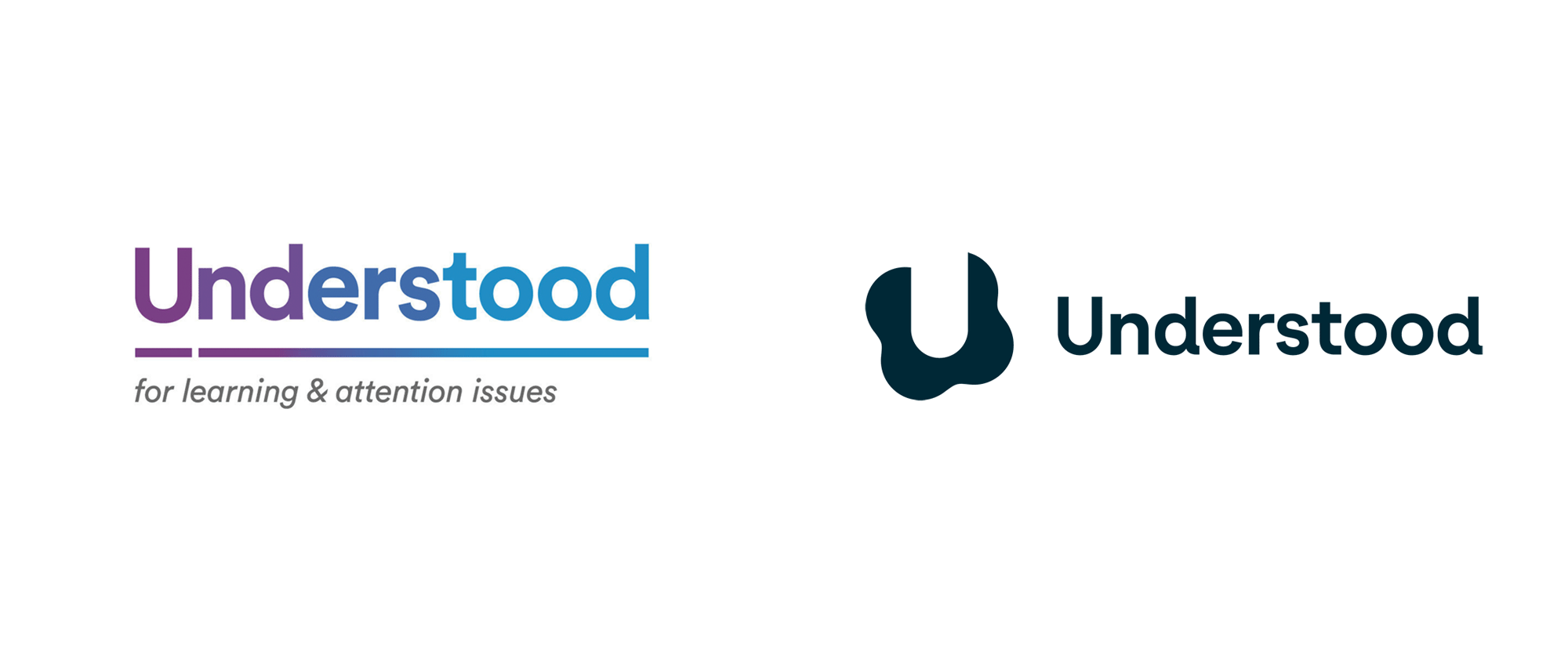
Noted: New Logo and Identity for Understood by Wolff Olins
“Understand Different”

(Est. 2014) "Understood is a social impact organization dedicated to Shaping the World for Difference™. Our four core programs (Families, Educators, Young Adults and the Workplace Initiative by Understood) work together to create a world where everyone who learns and thinks differently feels supported at home, at school, and at work. We hope to shape a world where people with all types of disabilities have the opportunity to enjoy meaningful careers, and where all those who champion difference have the resources to become better allies and advocates. We provide impact at scale with direct access to online resources, experts, and supportive communities. Understood is a 501(c)(3) private operating foundation based in New York City."
Design by
Wolff Olins
Related links
Understood press release
Relevant quote
To underscore the expanded mission, Understood refreshed its brand strategy and introduced a new visual logo, identity system and color palette. It also redesigned its website to begin to improve equitable access for all users, regardless of ability, situation, or context. Accessibility and inclusivity are at the core of the organization’s ongoing product, engineering, and user experience efforts so that its resources can reach and support more people across the country.
The rebrand includes a new design system; website design; brand architecture; ADA-compliant color palettes; inclusive photography, illustration, and animations; a new sonic logo, music and tone/voice guidelines to increase accessibility for all users, including those who learn and think differently.
Images (opinion after)


Opinion
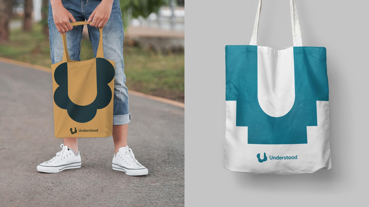
The old logo was more or less okay but had some confusing execution issues like breaking the underscore at the “U” and then doing a smooth gradient on the underscore but not on the wordmark, all of which seems to go against the idea of making things clearer and simpler to understand. The new logo introduces a monogram where an abstract “U” emerges from the negative space. It’s not explained what the blobs around it mean or why it changes into triangles or squares so I would interpret it as a way of visualizing the recurring phrase of “people who think differently” by showing a “U” in a different way: not through its direct presence but through it’s indirect presence and the context around it. Long way of saying, I like it and what it (possibly) stands for. The wordmark is good and it extends into a full typeface that is built for people with dyslexia, establishing clear differences between similar letters. The illustrations, I am going to guess that their over-simplified approach is supported by research where images like these are better understood — bonus points for the scrape on the knee of the kid doing the cartwheel, celebrating kid-ness. Not much in terms of application… the posters and ad show a visual language of blobby shapes, which are supported by the copywriting that sort of makes them make sense. The most comprehensive example would be the website, and its accessible look and feel and UI is on point. Overall, this feels very appropriate and considered to reflect the mission of the organization.
In ấn Anpic In nhãn mác Anpic In brochure Anpic In card visit Anpic In catalogue Anpic In thiệp cưới Anpic In tờ rơi Anpic
In Ấn Anpic – Nổi Tiếng In Đẹp In Nhanh
Số 5 Ngõ 75 Nguyễn Xiển, Thanh Xuân, Hạ Đình, Hà Nội
0963223884
baogiainananh@gmail.com
https://anpic.vn
https://g.page/inananpic
In nhãn mác Anpic ✅ In brochure Anpic ✅ In card visit Anpic ✅ In catalogue Anpic ✅ In thiệp cưới Anpic ✅ In tờ rơi Anpic
https://anpic.vn/in-nhan-mac-dep
https://anpic.vn/in-brochure
https://anpic.vn/in-an
https://anpic.vn/in-voucher-in-phieu-giam-gia-khuyen-mai
#inananpic
Comments
Post a Comment