Noted: New Logo and Identity for Grounded by OMSE and Family Type
“Six Inches Under”

(Est. 2019) "We created Grounded to make sustainable packaging simple and transparent. Packaging's function of protecting goods is hugely important in preventing wastage and prolonging shelf life, but with misinformation and cloudy supply chains, it's difficult for businesses who want to do the right thing to choose the right packaging. So we've built an end-to-end platform that makes it easy. At Grounded, customers can shop, customise and manage multiple orders of sustainable, state-of-the-art packaging products from around the world, all in one location. Everything in one place. Transparency in everything. Because doing the right thing should be easy."
Design by
OMSE (London, UK)
Type family: Family Type (London, UK)
Related links
OMSE project page
Relevant quote
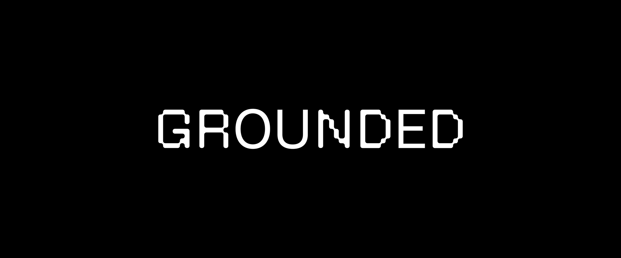
We collaborated with Family Type who designed the typeface to literally decompose as you type. Alternate glyphs allow flexibility in situations where branding needs to be dialled down.
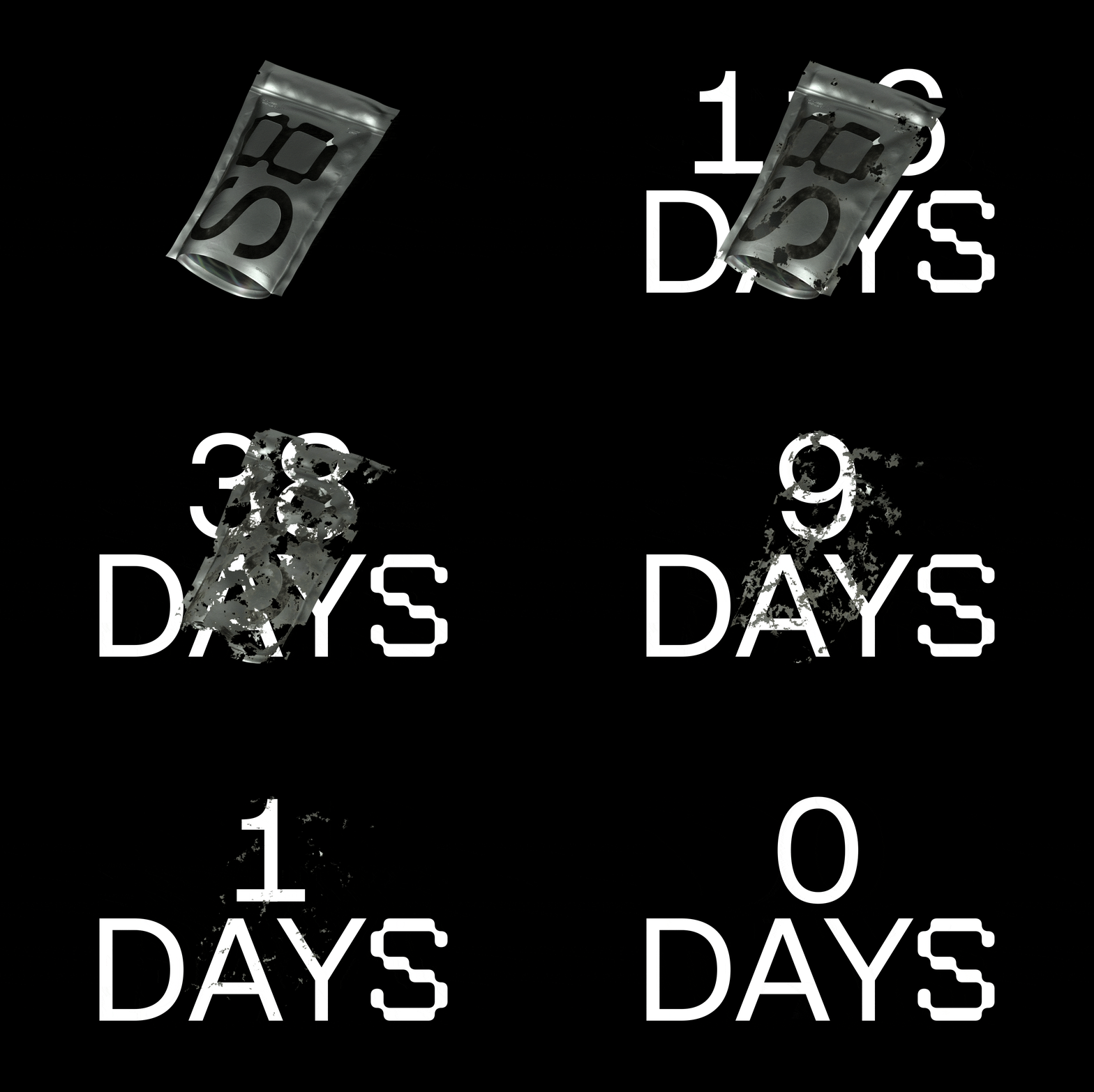
Products are fully customisable and pricing is based on the impact you make, not the amount you spend. Dissolving animations serve as a visual aid to describe the lifespan of their products.
Parts of the typeface look like they are being broken down. We call these sections Fragments and use them to create bold layouts.
Images (opinion after)


Opinion
When I first read the name and saw the logo without diving into what the client/project was about, I thought this had to do with some kind of innovative, AI-powered coffee brand, which I realize is not a thing but that was my first impression. The logo on its own doesn’t quite pay off without the understanding of the type family that comes in decomposing styles to allude to the compostable nature of some of the products available through Grounded. Once you get that, which I’m not sure how many customers would but let’s assume it’s enough, it’s a cool, conceptual approach throughout the identity and perhaps in the logo it could have been pushed further to include the fully decomposed style in some of the letters. The type family is quite enjoyable as a concept but when put into action I don’t know if it conveys the right feeling when it comes to buying packaging to keep food clean and safe… this could easily be interpreted as your food slowly decaying or growing mold but I definitely salute the intention. It’s interesting that lately we’ve been seeing some relative experimentation with display typefaces that are reminiscent of the early days of “Fontography”. But I digress. The packaging prototypes for future products are super slick and would love to see those come to life eventually. The few other applications shown as posters are fairly enjoyable in their grungy-futuristic aesthetic. Overall, the identity does help the company convey a kind of future-forward personality that positions its products as the perfect containment method for your soylent greens.
In ấn Anpic In nhãn mác Anpic In brochure Anpic In card visit Anpic In catalogue Anpic In thiệp cưới Anpic In tờ rơi Anpic
In Ấn Anpic – Nổi Tiếng In Đẹp In Nhanh
Số 5 Ngõ 75 Nguyễn Xiển, Thanh Xuân, Hạ Đình, Hà Nội
0963223884
baogiainananh@gmail.com
https://anpic.vn
https://g.page/inananpic
In nhãn mác Anpic ✅ In brochure Anpic ✅ In card visit Anpic ✅ In catalogue Anpic ✅ In thiệp cưới Anpic ✅ In tờ rơi Anpic
https://anpic.vn/in-nhan-mac-dep
https://anpic.vn/in-brochure
https://anpic.vn/in-an
https://anpic.vn/in-voucher-in-phieu-giam-gia-khuyen-mai
#inananpic
Comments
Post a Comment