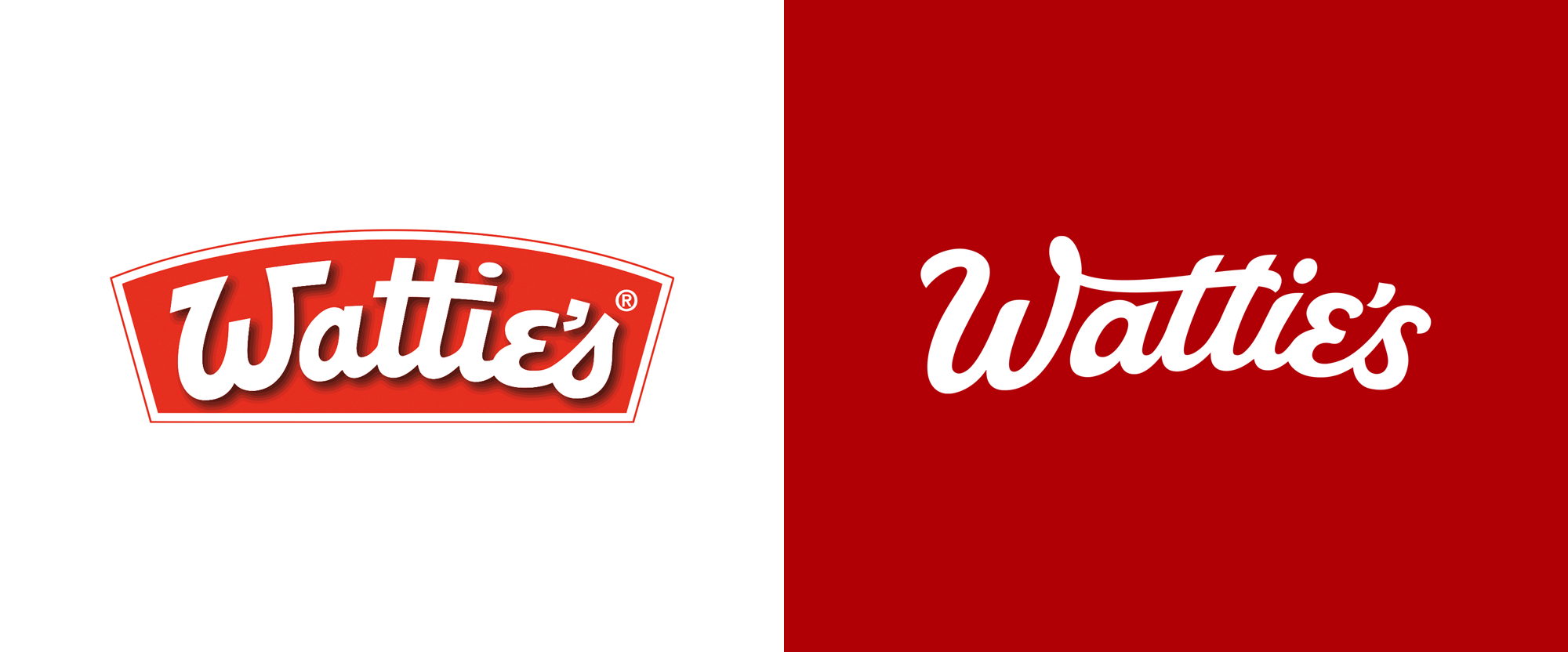
Noted: New Logo and Packaging for Wattie's by Unified Brands
“It is Wattie is”

(Est. 1934) "Wattie's is an American-owned [HJ Heinz group] food producer of frozen and packaged fruit, vegetables, sauces, baby food, cooking sauces, dressings and pet foods in the New Zealand market. Founded in 1934 by Sir James Wattie, the company operated in New Zealand under the name of J. Wattie Canneries Limited (later J Wattie Foods Limited and its related companies). In 1980, Wattie Industries and Goodman Fielder purchased shares in each other's companies that led to a merger in 1987 to create Goodman Fielder Wattie Ltd. In 1992 the Wattie's group was bought from Goodman Fielder by American-based H. J. Heinz Company for $565 million. The company employs around 1,900 people, of which approximately 350 are temporary or casual. The company produces its own Wattie's products, some international brands of H. J. Heinz Company, as well as local products under brands like Craig's, Farex, Eta, Oak, Good Taste Company, Greenseas, Earth's Best, Complan, Chef and Champ." (Wikipedia)
Design by
Unified Brands (Auckland, New Zealand)
Related links
Unified Brands project page
Relevant quote
Wattie’s has always been a family brand but over time the entrepreneurial spirit of Sir James while not forgotten, had been overlooked. Treating the Wattie’s brand as the dynamic, adventurous entrepreneur that Sir James had been, was embraced unanimously.
From here we set about injecting life back into the wordmark by playing on the quirky personality of some of the letterforms that were so iconically Wattie’s, and weaving a more natural flow and craft through the new wordmark. We like to describe it as finding the perfect meeting point between heritage and modernity – comfortable but intriguing!
Controversially, we have even turned the brand on its head, quite literally, introducing a vertical logo in Wattie’s portfolio - simple, bold and proud, almost as if signed by Sir J. Wattie’s himself.
Wattie’s Tomato Sauce, arguably one of the most iconic New Zealand family pantry staples, was the first range that the approach was applied to. As part of the new transformation we chose to hero the quality ingredients - celebrating the abundance of fresh tomatoes that goes into each bottle of sauce. Using natural lighting, we wanted the ingredients to cast shadows on the Wattie’s wordmark so the brand feels integrated with the ingredients.
Images (opinion after)


Opinion
The old logo was a relatively decent script if you didn’t pay too much close attention because that would reveal a super awkward “ti” moment that shouldn’t have been allowed to exist and a clunky apostrophe but, yeah, not terrible and fairly recognizable. The new logo is a playful, looser evolution that makes the logo look more human and less mechanical through its variable thickness and more exuberant swashes. The “W” extending into the crossbar of the two “t”s gives the logo some flair and creates a nice, sheltering effect for the “a”. The “e’s” finale is a little awkward as it feels like it’s starting to fall off a cliff as it attempts to maintain the curve that the logo sits on — still, it’s a very amenable logo. The old packaging looked exactly like you would expect a mainstream product to look like so, in a way, it was pretty much on point, which is to say, it was not good. It got the message across but in the most uninspiring way possible. The new packaging is pretty amazing — I mean, it’s not Mutti-limited-edition-amazing, but it is mainstream-tomato-sauce-amazing. The obligatory tomato depictions are as straightforward as it gets but they are rich and look plump and healthy. The logo commands attention, whether horizontal or vertical and the accompanying typography is simple and nicely complementary. The presentation of these photos goes a long way in making this look even better so props to the, well, props. Overall, a super solid job that makes a product that’s already a staple even better. This is even more commendable when both client and design firm could have taken the easy/lazy way out given the product’s category leading status and could have chosen to just maintain the status quo.
In ấn Anpic In nhãn mác Anpic In brochure Anpic In card visit Anpic In catalogue Anpic In thiệp cưới Anpic In tờ rơi Anpic
In Ấn Anpic – Nổi Tiếng In Đẹp In Nhanh
Số 5 Ngõ 75 Nguyễn Xiển, Thanh Xuân, Hạ Đình, Hà Nội
0963223884
baogiainananh@gmail.com
https://anpic.vn
https://g.page/inananpic
In nhãn mác Anpic ✅ In brochure Anpic ✅ In card visit Anpic ✅ In catalogue Anpic ✅ In thiệp cưới Anpic ✅ In tờ rơi Anpic
https://anpic.vn/in-nhan-mac-dep
https://anpic.vn/in-brochure
https://anpic.vn/in-an
https://anpic.vn/in-voucher-in-phieu-giam-gia-khuyen-mai
#inananpic
Comments
Post a Comment