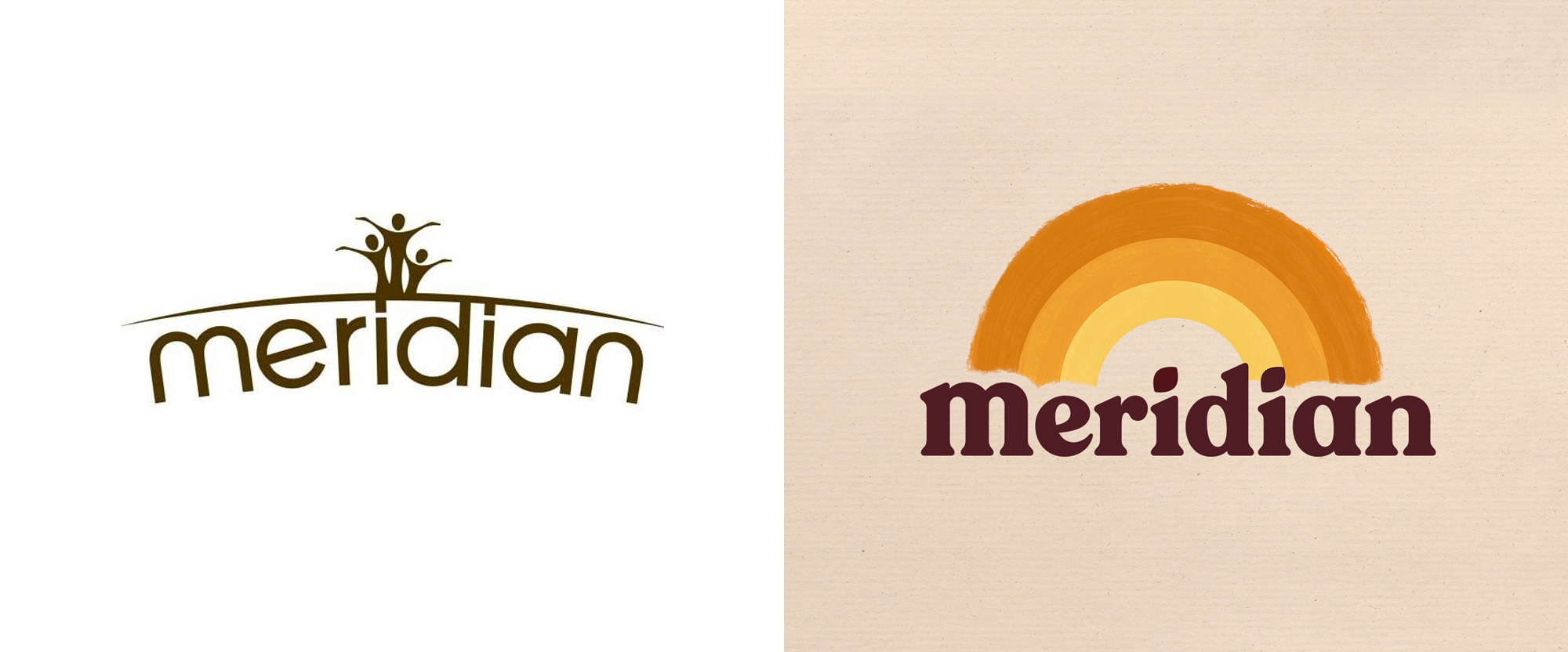
Noted: New Logo and Packaging for Meridian by Bulletproof
“Under the Rainbow”

(Est. 2005) "The natural choice for those looking to keep healthy, Meridian is the UK's leading producer of nut butters. Made in their own factory in North Wales, Meridian's nut butters are naturally delicious and provide an excellent source of protein and energy. All of the products in the Meridian Foods range are free from palm oil, supporting the environment and primates."
Design by
Bulletproof (London, UK)
Related links
N/A
Relevant quote
Inspired by the notion that ‘good tastes better’ and with our Sensory Brand World idea of ‘Nature Liberated’, we set about redesigning each distinctive brand asset and defining their relationship with one another; from core logo lock-up and packaging to tone of voice, leaning in to an inherent appreciation of, and desire to work with nature in its purest form. We did this with a view that the design approach would later extend far beyond their range of nut butters and into bars and sauces.
The old design was lacking a recognisable brand icon, so we created a vibrant ‘Rainbow’; a symbol that inherently stands for positivity and radiates energy. We wanted to clearly call out our core product values and proudly run these within the arches. We used multiple touchpoints as an opportunity to build a bold and uplifting application of our joyful brand icon - ‘Spreading good.’
In line with our Sensory Brand World idea, our deep autumnal brown provides richness and a connection to nature, whilst our brand icon is an uplifting injection of color; aiding shelf navigation and delivering taste appeal.
The current logotype was very serious and lacking weight and recognisability. We chose an ultra-bold san serif typeface which has a friendly and approachable character. We grounded the logotype so it doesn't curve around the horizon, adding the bold authority that the brand was previously lacking.
Images (opinion after)


Opinion
The old logo… yikes. I’m trying to find something redeeming about it but nope, nothing there. The new logo doesn’t need to be contrasted with the old one, given how bad it was, but even then, the new one is a breath of fresh air for the brand. The main attraction of the new logo is the rainbow that even though it only has three stripes and the colors are as un-rainbow-y as it gets, it still has a joyful presence. The paint brush effect adds to the coziness of the rainbow as does the bold, rounded serif for the wordmark. It’s unfair to keep comparing all of these to Chobani but, yeah, Chobani vibes. I like how they kept the lowercase “m” from the old logo, which gives the wordmark some extra personality — I would have left the tittles of the “i”s alone, instead of turning them into leaves. The only real questionable decision is why the right end of the rainbow doesn’t end with the silhouette of the “di” as it does on the left side with the “Me”. The old packaging… double yikes. That was truly bad, from the additional gradient on the logo to the hand-drawn font to the photos of the ingredients. The new packaging looks great, with the nice, friendly logo; warm colors that change for each flavor; and charming supporting typography. I like how they use the rainbow in the packaging to highlight the two main benefits of the product and the main ingredient being placed on top of the first “i”, which falls neatly in the center, is pretty nifty. Overall, a huge improvement all around.
In ấn Anpic In nhãn mác Anpic In brochure Anpic In card visit Anpic In catalogue Anpic In thiệp cưới Anpic In tờ rơi Anpic
In Ấn Anpic – Nổi Tiếng In Đẹp In Nhanh
Số 5 Ngõ 75 Nguyễn Xiển, Thanh Xuân, Hạ Đình, Hà Nội
0963223884
baogiainananh@gmail.com
https://anpic.vn
https://g.page/inananpic
In nhãn mác Anpic ✅ In brochure Anpic ✅ In card visit Anpic ✅ In catalogue Anpic ✅ In thiệp cưới Anpic ✅ In tờ rơi Anpic
https://anpic.vn/in-nhan-mac-dep
https://anpic.vn/in-brochure
https://anpic.vn/in-an
https://anpic.vn/in-voucher-in-phieu-giam-gia-khuyen-mai
#inananpic
Comments
Post a Comment