Noted: New Logos for Virginia Athletics by Nike GIG
“Welcome to Sabre Country”
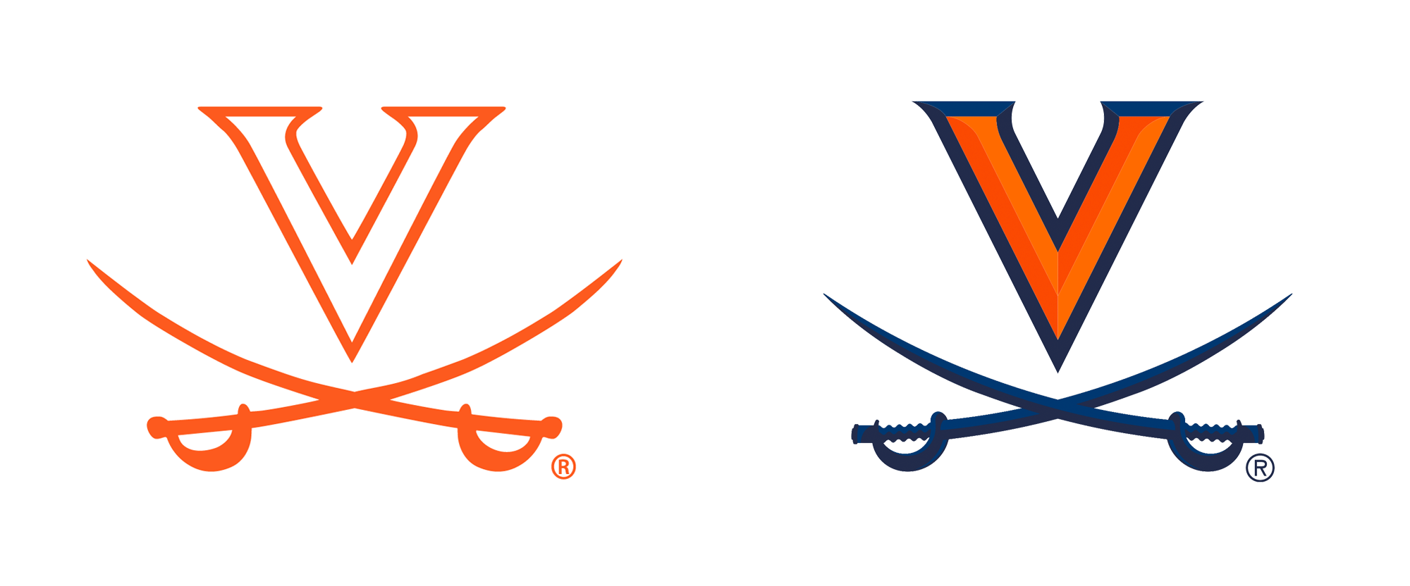
(Est. 1888) "The Virginia Cavaliers, also known as Wahoos or Hoos, are the athletic teams representing the University of Virginia, located in Charlottesville. The Cavaliers compete at the NCAA Division I level (FBS for football), in the Atlantic Coast Conference since 1953. Known simply as Virginia in sports media, UVA has twice won the Capital One Cup for men's sports (in 2015 and 2019) after leading the nation in overall athletic excellence. The Cavaliers have regularly placed among the Top 5 nationally." (Wikipedia)
Design by
Nike Global Identity Group
Related links
Virginia Athletics brand microsite
Virginia Athletics press release
Relevant quote
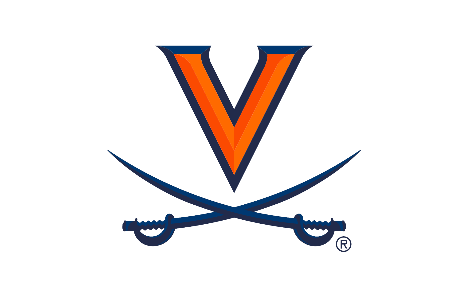
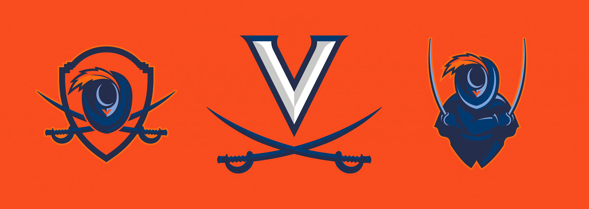
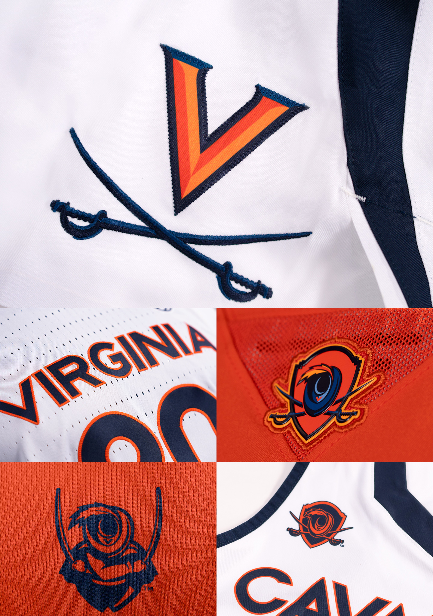
In its newest evolution, the [V-Sabre] mark incorporates bolder lines and beveled edges, giving it weight, power and a dynamic presence.
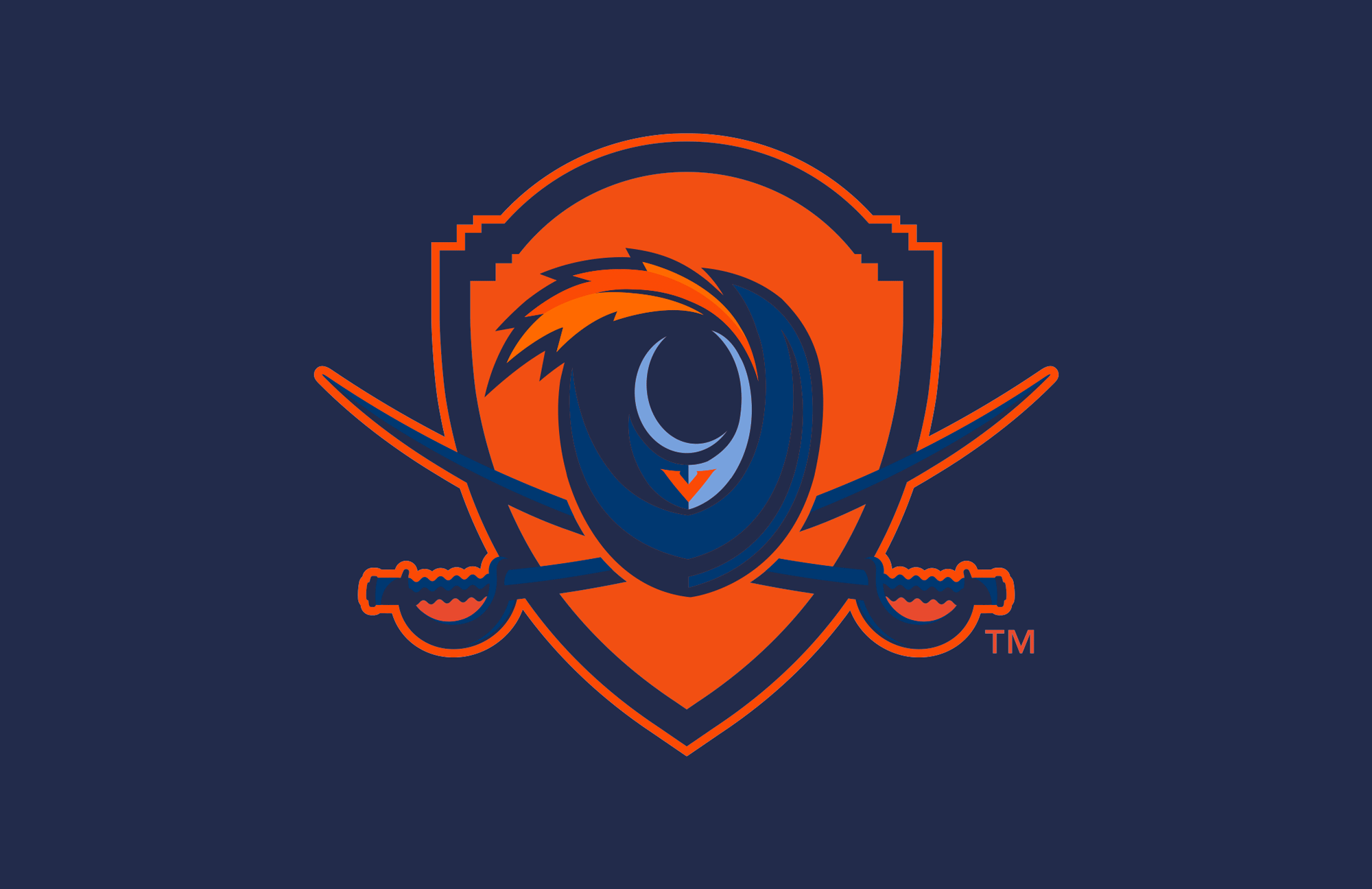
The secondary [Cavalier Shield] mark is UVA's modern take on a coat of arms. Traced from original blueprints, the top of the shield echoes the silhouetted roof of the Rotunda. Below, the hat and sabre embody the fighting spirit of Virginia Athletics.
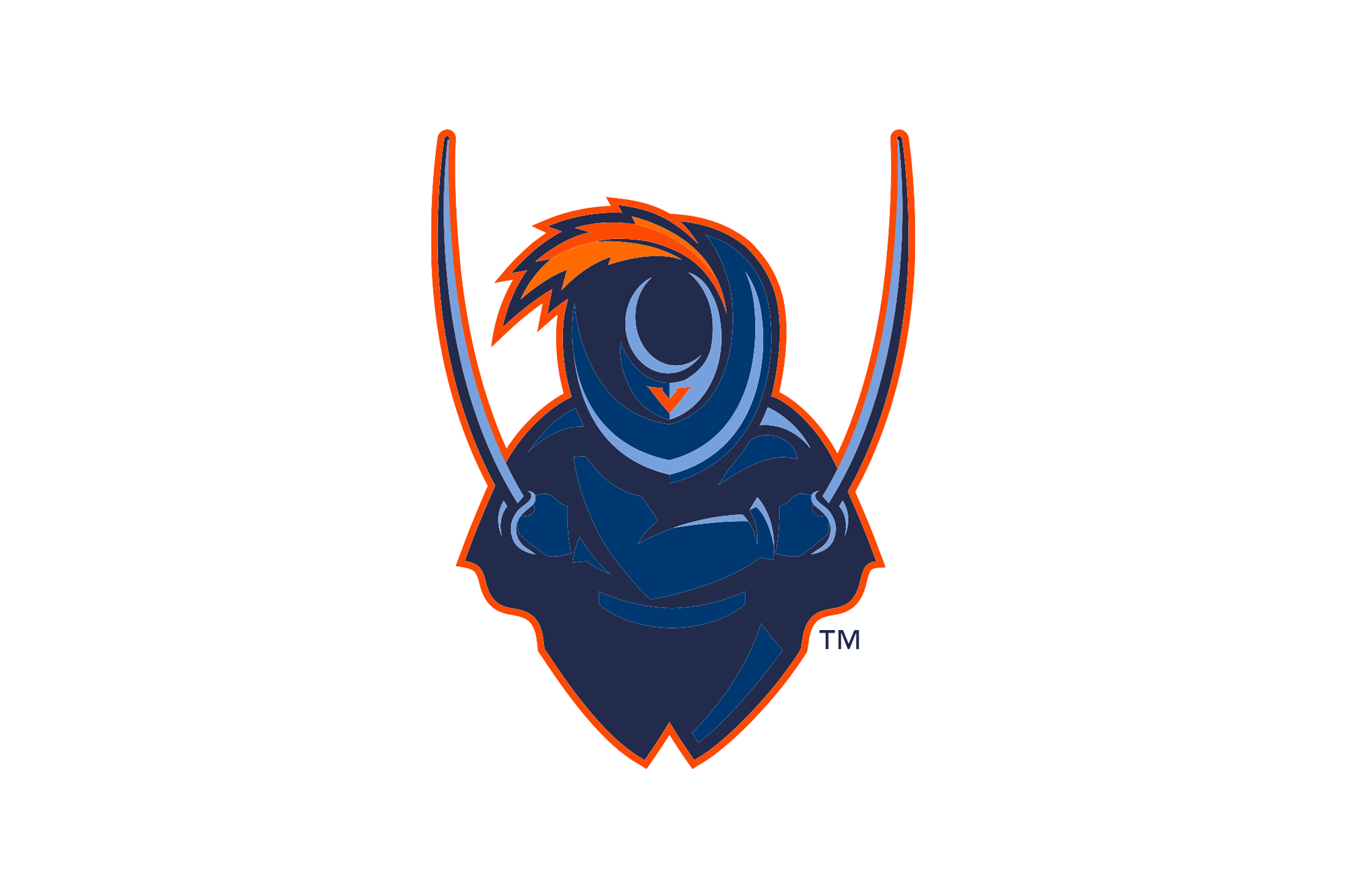
The face of Virginia Athletics for decades, the Cavalier personifies the excitement and spirit of our program. In the fierce new [Virginia Cavalier] mark, the Cavalier takes a fighting stance. Hat tipped, the figure is an inclusive symbol, representing all members of the University community – regardless of gender, ethnicity, age or background.
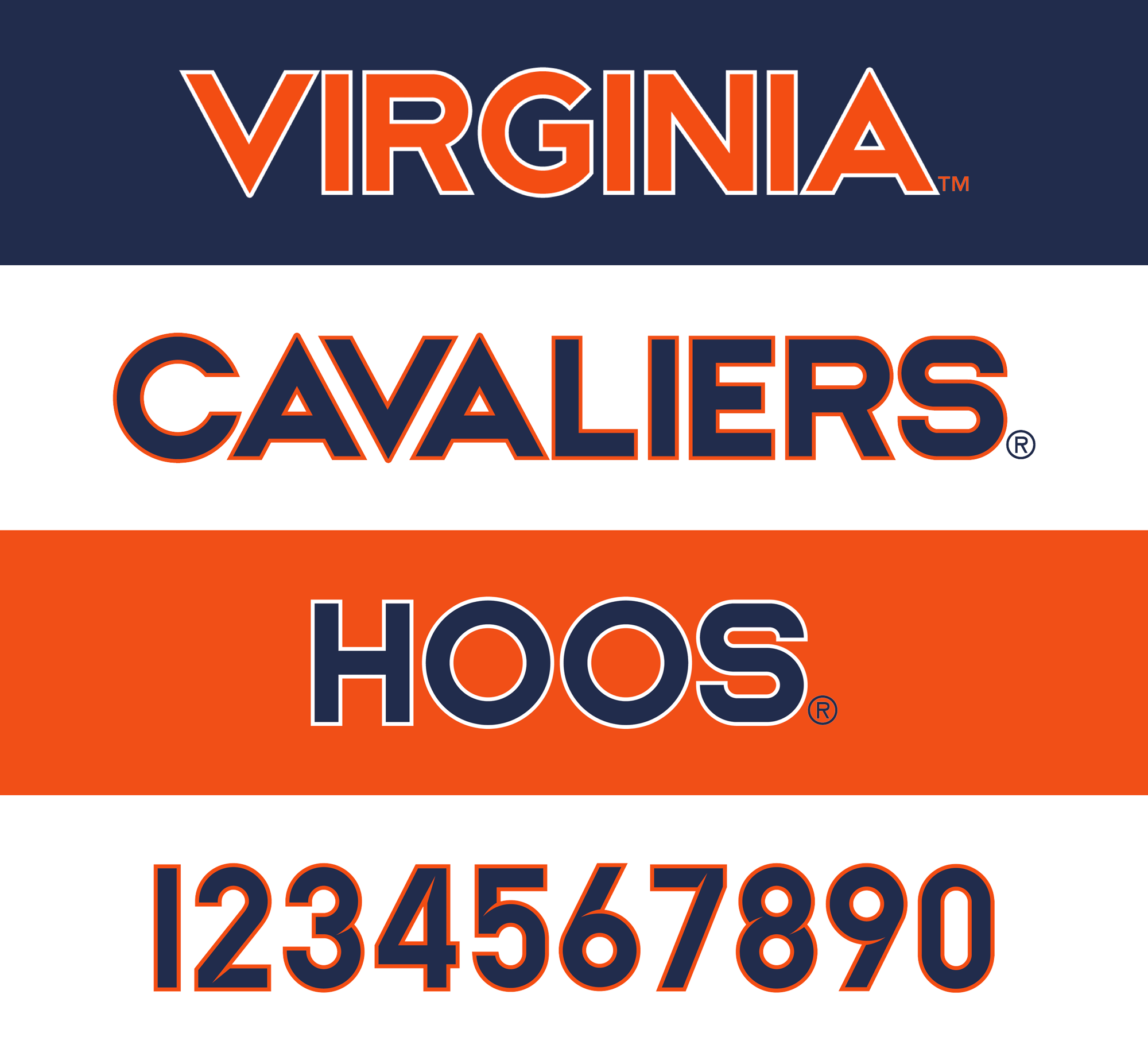
Our new typography uses a clean and modern design, utilizing straight lines and circles found in the original design documents of the Rotunda, to unite all 27 varsity teams across Athletics. The design of the numbers includes an allusion to the sharp edge of a sabre.
Images (opinion after)
Opinion
The primary mark evolution is good for the most part, adding some welcome dimensionality to the mark, although I’m not sure why the contrast between the two blues is so subtle as to pass almost unnoticed, which is a shame because it would make the sabres look cooler. For some reason I love the squiggly new handles — I know it’s a detail that will get a little lost but it’s a nice touch and based on the embroidery details shown, it holds up surprisingly well. The secondary marks get a little cartoony with the feathered-hat motif but I can totally see UVA folks loving it and, to their credit, both are well done — within the realm of sports identity. I like the detail on the top of the shield that follows the contour of the front of the iconic university building. The cavalier person mark… I’m not into it at all but, again, I think it will have a strong place in the hearts of students and alumni. The type marks are alright but their commitment to hard geometry yields some rather stiff-looking words. I was going to commend them for no spikes but then the numerals bring some inner spikes because swords and I want to not like it but I’m amused. Overall, pretty much par for the course when it comes to Nike-designed college athletics identities… it’s all fine and mostly well done but hard to get too excited by it if you are not affiliated with the school academically or emotionally, which is more of an us problem.
In ấn Anpic In nhãn mác Anpic In brochure Anpic In card visit Anpic In catalogue Anpic In thiệp cưới Anpic In tờ rơi Anpic
In Ấn Anpic – Nổi Tiếng In Đẹp In Nhanh
Số 5 Ngõ 75 Nguyễn Xiển, Thanh Xuân, Hạ Đình, Hà Nội
0963223884
baogiainananh@gmail.com
https://anpic.vn
https://g.page/inananpic
In nhãn mác Anpic ✅ In brochure Anpic ✅ In card visit Anpic ✅ In catalogue Anpic ✅ In thiệp cưới Anpic ✅ In tờ rơi Anpic
https://anpic.vn/in-nhan-mac-dep
https://anpic.vn/in-brochure
https://anpic.vn/in-an
https://anpic.vn/in-voucher-in-phieu-giam-gia-khuyen-mai
#inananpic
Comments
Post a Comment