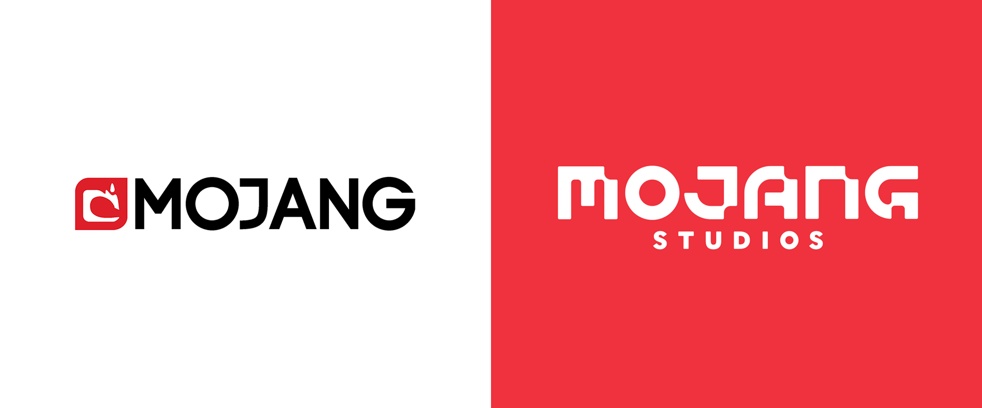
Noted: New Name and Logo for Mojang Studios
“Mo’ Bang for the Buck”

(Est. 2009) "Mojang is a Microsoft-owned game developer studio based in Stockholm, Sweden. We are best known as the creators of Minecraft, and are currently working on several new games, a movie, a board game, and lots more - all within the Minecraft franchise. At Mojang we create games, products and services to inspire creativity. As part of that pursuit, we are prepared to take risks. It's how we grow! We develop games with a strong community focus and put players first in everything we do. Our games are built for everyone, because we believe in demonstrating equality and not just talking about it."
Design by
N/A
Related links
Mojang Studios blog post
Relevant quote
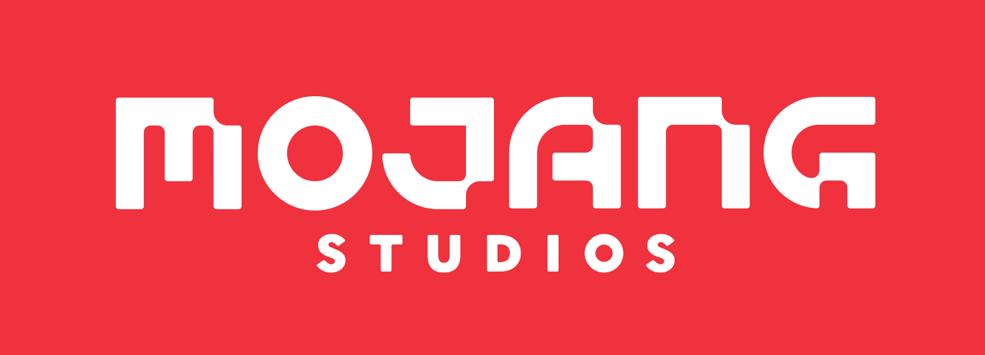
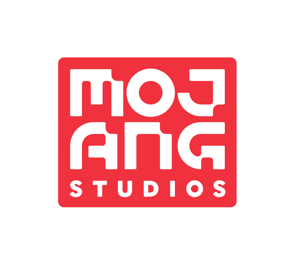
We will say this: play is at the heart of Mojang Studios. It’s the blocky backbone of our games, the core of our development philosophy, and even entangled in our name (which roughly translates to “gadget” in lovely, old-timey Swedish). And now, finally, it’s squarely planted in our new, modular logo.
But we have yet to reveal our biggest little secrets. They are hiding in plain sight – in this very blog post – as part of the new logo. Introducing: the Mojangs! These mysterious little gizmos are powered by play. They test and tinker, endlessly explore, and help us discover new corners of the Minecraft universe.
Images (opinion after)


Opinion
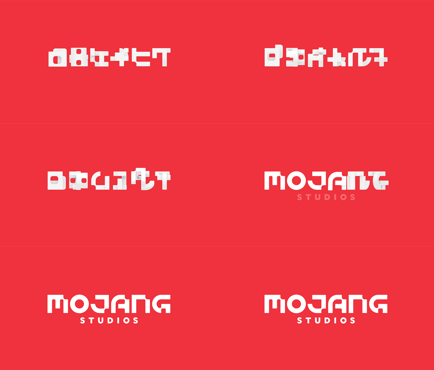
In Mojang’s blog post, I love how they refer to their old logo as a “dragon/apple/candle/sewing machine” because I couldn’t have come up with a better way to explain it. I did always think it was some kind of dragon but I also always didn’t like it, nor its wordmark, which is not that bad but that “J” rubbed me the wrong way. The new logo doubles down on Mojang’s overall quirkiness with a very awkward wordmark that carries some of the same awkwardness of the Minecraft universe. For almost any other entertainment or video game company this would be a no-no but I think Mojang can get away with it. I wish they had found a way to include a notch in the “O” because it stands out too much for being a perfect circle, whereas the rest of the letters are clearly contorting to non-conforming standards. I’m genuinely surprised the “O” is not a square as it would be perfectly readable and more in synch. The funky shapes “behind” the letters are groovy and I feel like once this logo extends into an identity, those are going to be all kinds of fun as evidenced by the excellent intro video, which has a great sense of humor and uses actual physical props and no gratuitous motion graphic tricks to make up for lack of concept. I found myself pausing it a bunch of times to look at the details, like the 0:55 mark where a “seriousness gauge” drops to zero. Regarding the name, I think it’s a formality. My impression is they will be referred to internally and externally simply as “Mojang” — they might as well just have renamed as “Mojang Bananas”. That’s not bad, actually. Overall, this is perfectly on point for the company.
In ấn Anpic In nhãn mác Anpic In brochure Anpic In card visit Anpic In catalogue Anpic In thiệp cưới Anpic In tờ rơi Anpic
In Ấn Anpic – Nổi Tiếng In Đẹp In Nhanh
Số 5 Ngõ 75 Nguyễn Xiển, Thanh Xuân, Hạ Đình, Hà Nội
0963223884
baogiainananh@gmail.com
https://anpic.vn
https://g.page/inananpic
In nhãn mác Anpic ✅ In brochure Anpic ✅ In card visit Anpic ✅ In catalogue Anpic ✅ In thiệp cưới Anpic ✅ In tờ rơi Anpic
https://anpic.vn/in-nhan-mac-dep
https://anpic.vn/in-brochure
https://anpic.vn/in-an
https://anpic.vn/in-voucher-in-phieu-giam-gia-khuyen-mai
#inananpic
Comments
Post a Comment