Reviewed: New Logo, Advertising, and Packaging for Iron City Beer by Top Hat
“I ’ron, You ’ron, We all ’ron for Iron City”
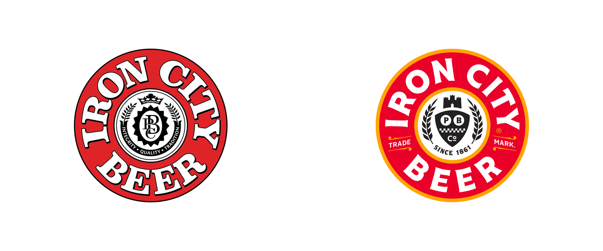
Established in 1861, Iron City Beer is a storied brand of beer in Pittsburgh, PA, brewed by Pittsburgh Brewing Company. Going by different names over the years centuries, it was one of the first breweries to produce a lager in the United States and has since become its flagship product. After two bankruptcies and a series of ownership changes in recent decades, Iron City Beer was purchased in 2018 by coal magnate, Cliff Forrest, CEO of Rosebud Mining, who has reinvigorated the brand to bring it back to its old glory. With a long rollout that started in 2018, Iron City Beer has been updating its advertising and packaging, designed by Millvale, PA-based Top Hat, over the last two years.
The "red eye" of Iron City is about the only thing that's stayed (relatively) constant since 1861. The mind-boggling number of can iterations has built character but hurt brand recognition. We looked to the past to treat the new seal with the care necessary to deserve a place on Pittsburgh's beer for the next 150 years.
Top Hat project page
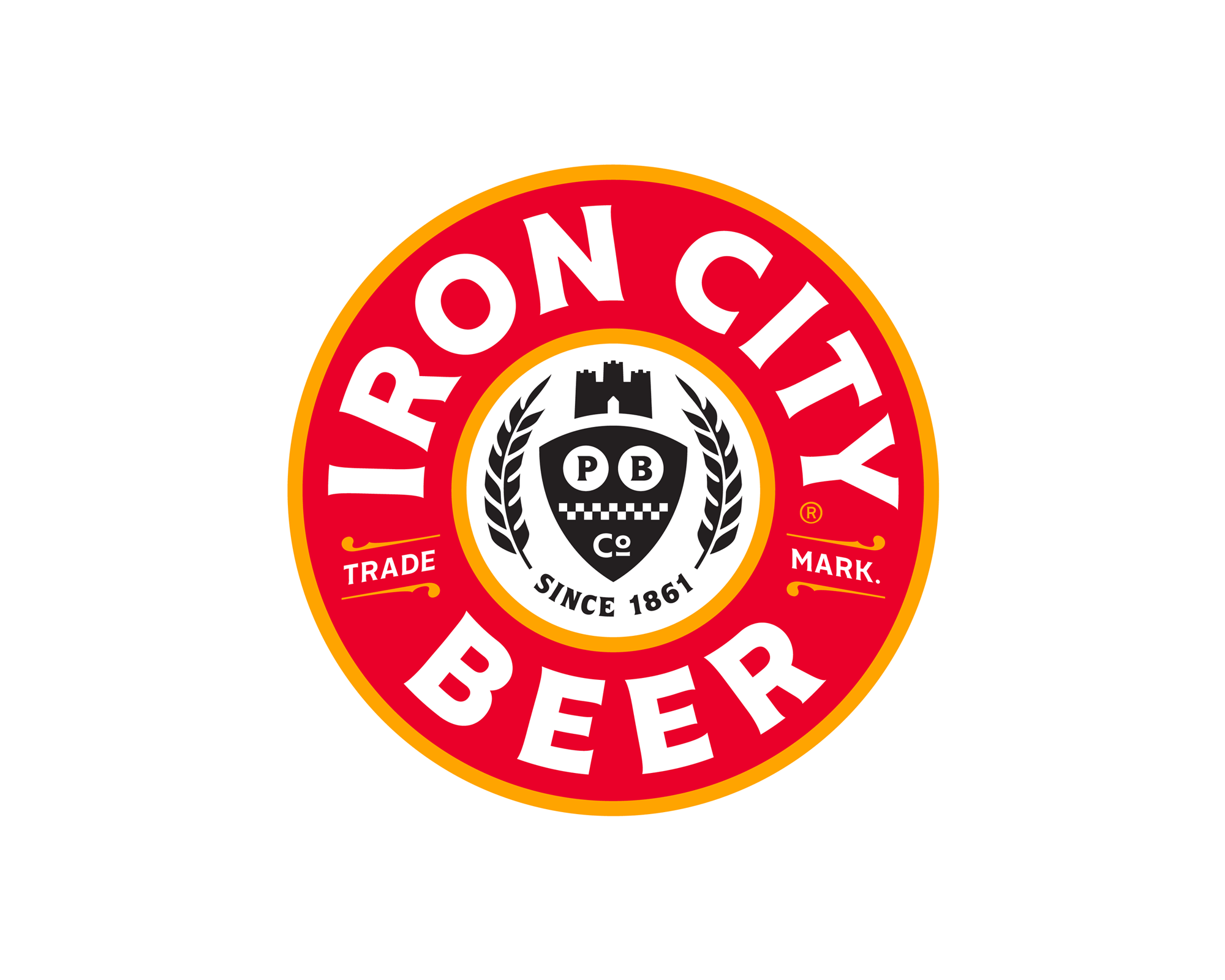
The old logo was pretty cool. There was something really great about all that mushed-up bold serif on a circle. It wasn't elegant by any means but it had grit, looking almost like a firefighter insignia. The seal-looking graphics inside were fine but were way too detailed to hold up at small sizes. The new logo is pretty cool too but in a different, more contemporary way with crisper typography and iconography. The new type in the logo (and throughout the identity) is Cenzo Flare, which is a rather nice and somewhat obscure choice that gives it some originality points. The yellow stroke around the bold red ring is an interesting addition that softens the logo in a positive way giving it more depth than simply black and red. The shield, wreath, and castle on the inside are fine but it starts to get a little too detailed with the checkered pattern and the "TRADE" and "MARK." with the ornate borders maybe a little too finicky relative to the boldness of the rest of the logo. Still, it's a fun, bold, badge-like logo that, as you'll see in the rest of the post, gives and gives.
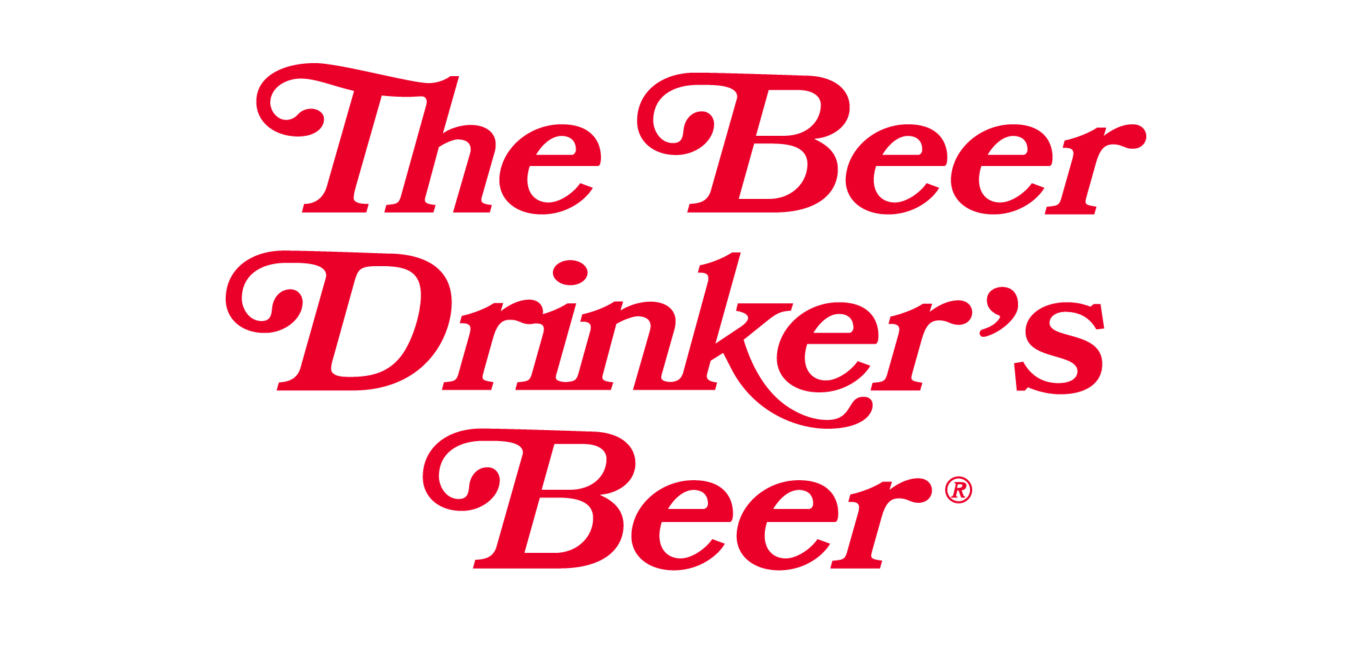
The tagline, in either Bookman or Bookmania, has an instant vintage flair, which is good, but I kind of wish there was some additional work on it to make it more unique and feel less like it just came out of the box.

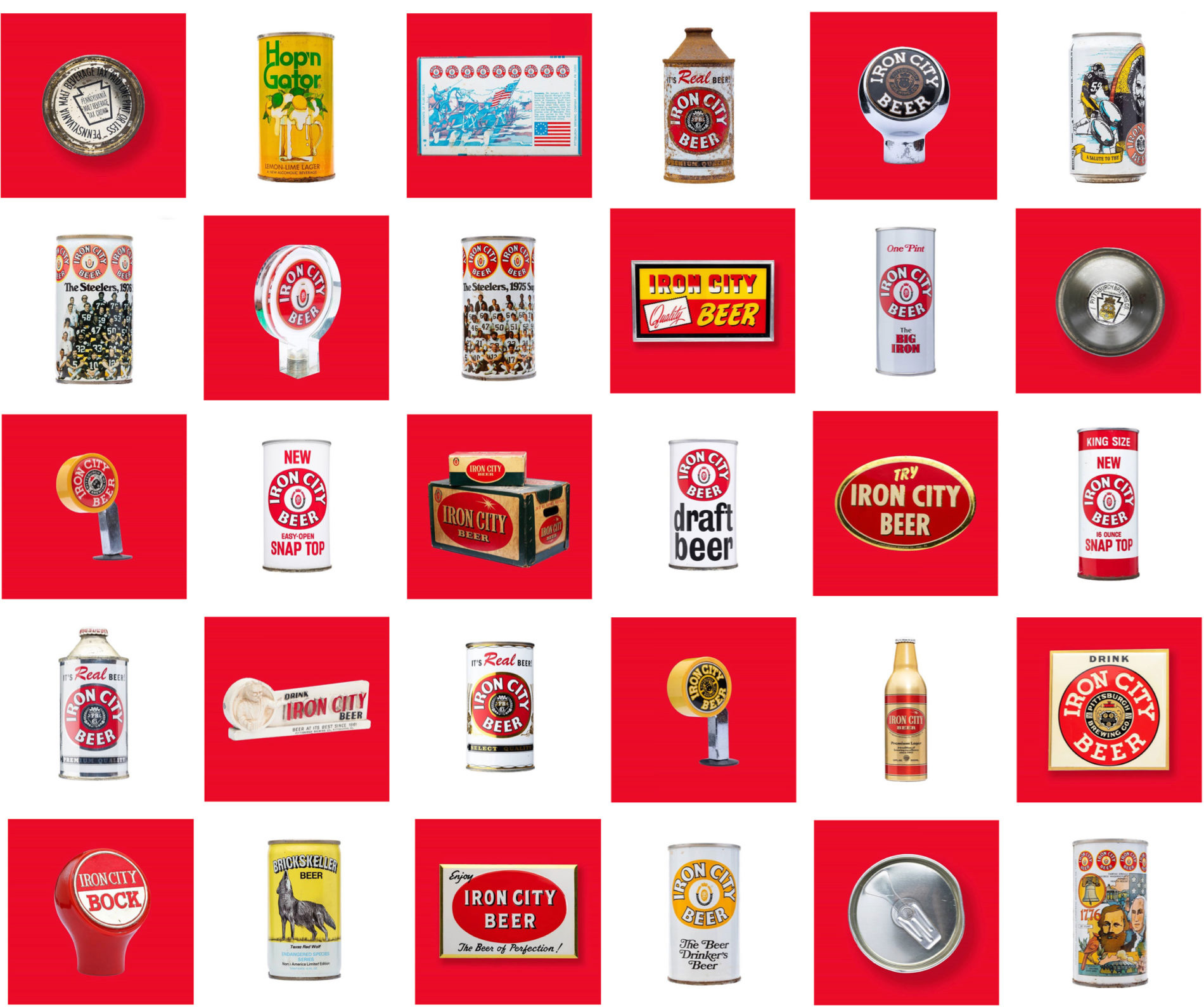
Iron City is a brand steeped in local history and more can iterations than we can even begin to unravel. The key to building towards something new was simple, iconic shots of Iron memories to remind Pittsburgh why they love it, and to clue them in to the buildup towards something new.
Top Hat project page
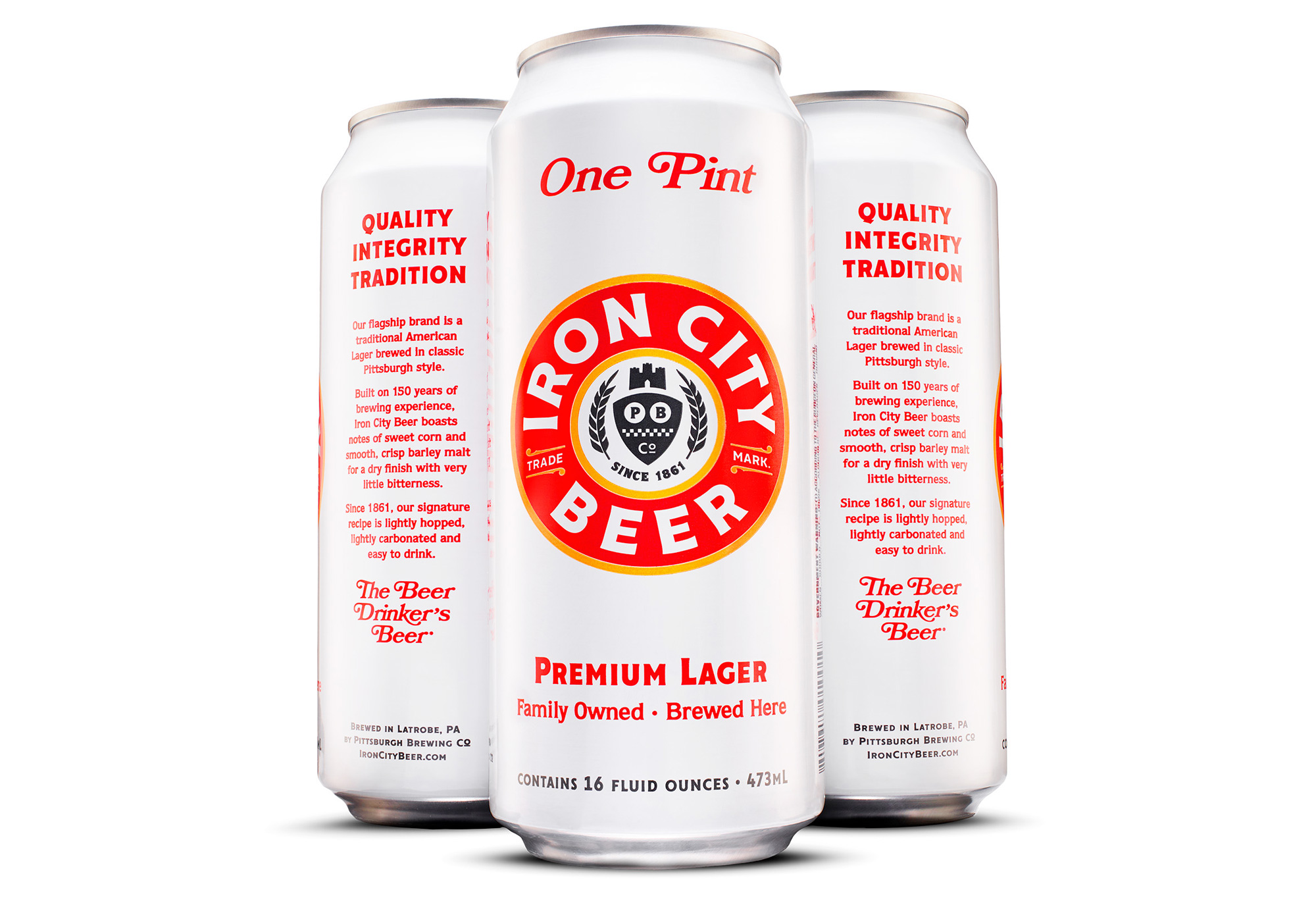
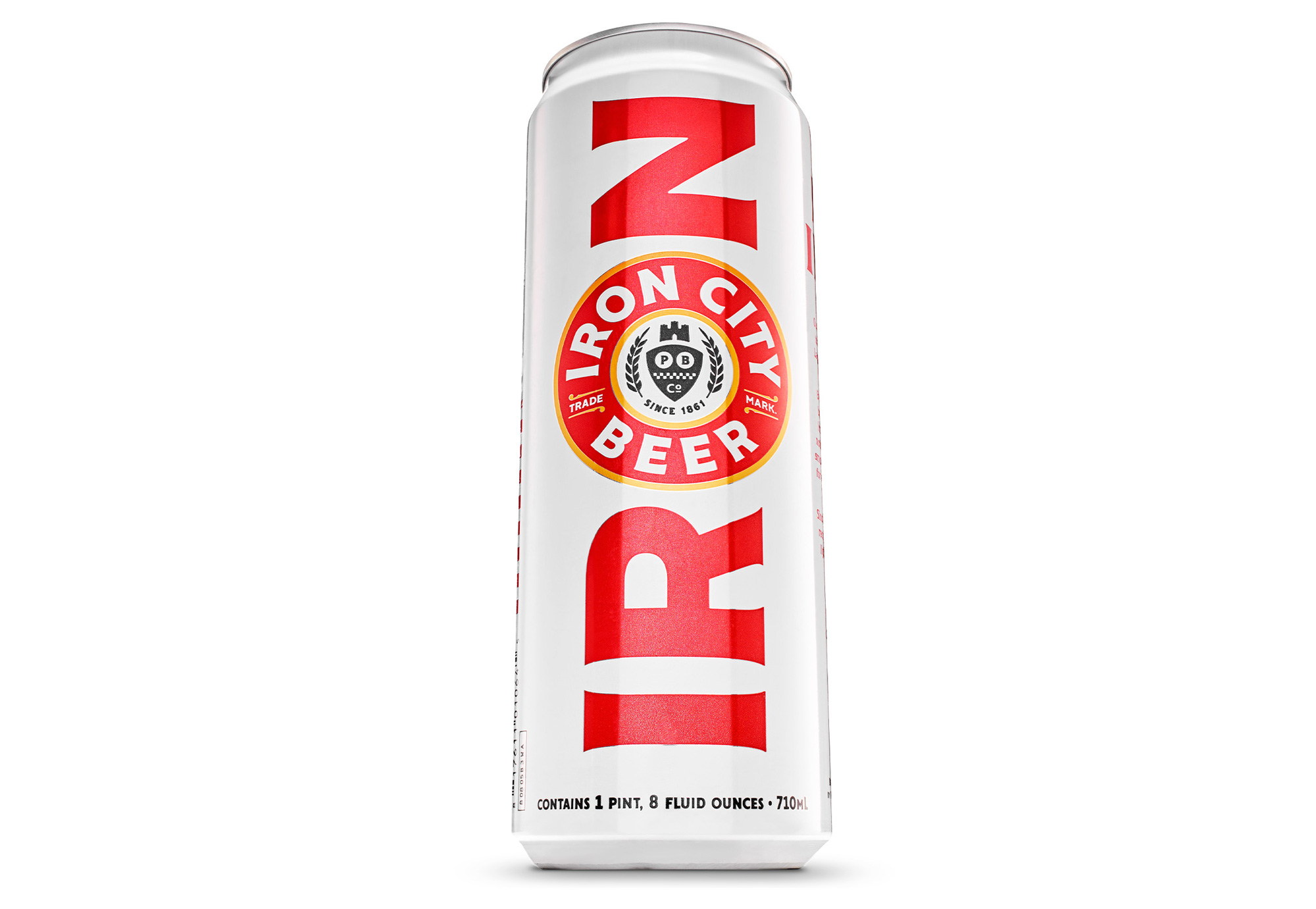
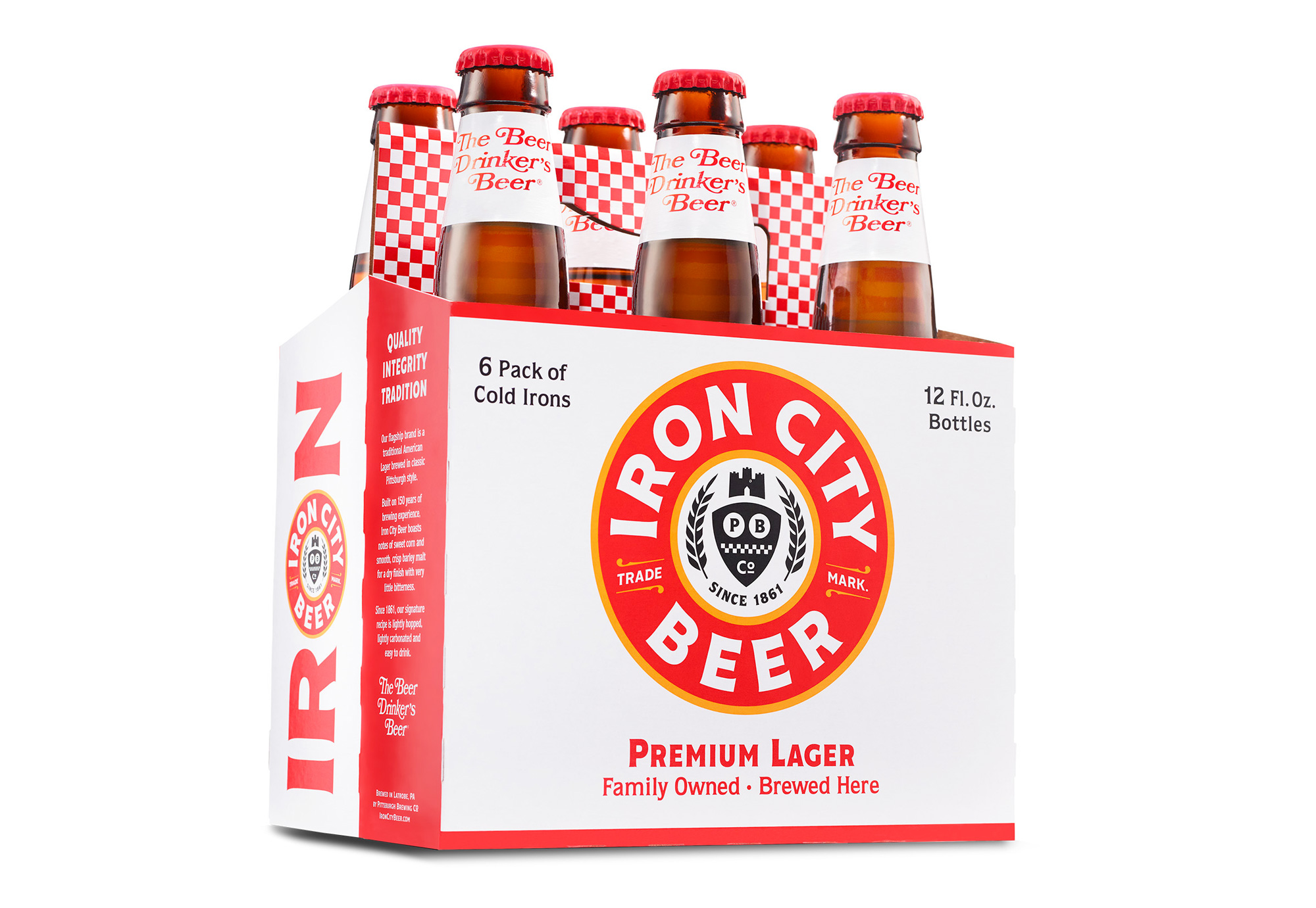
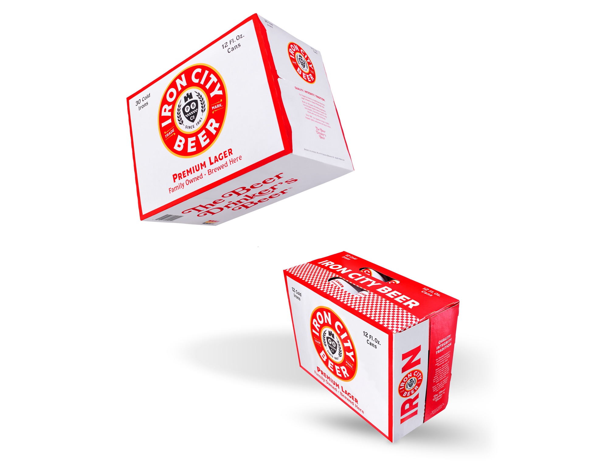
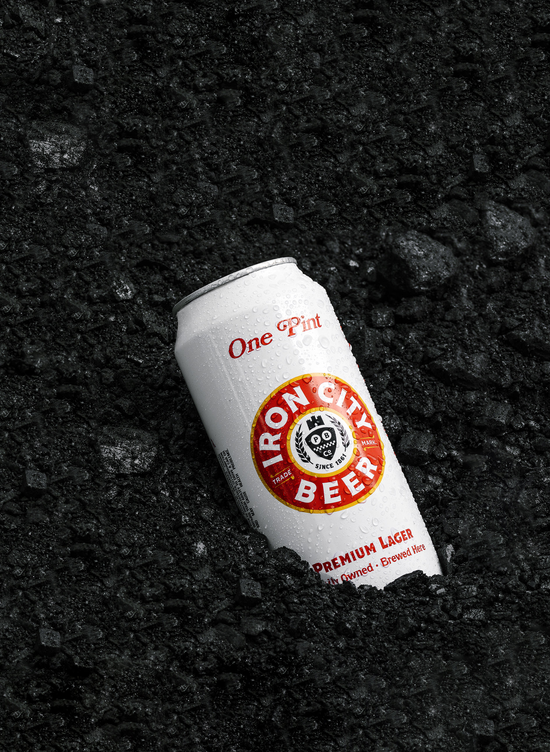
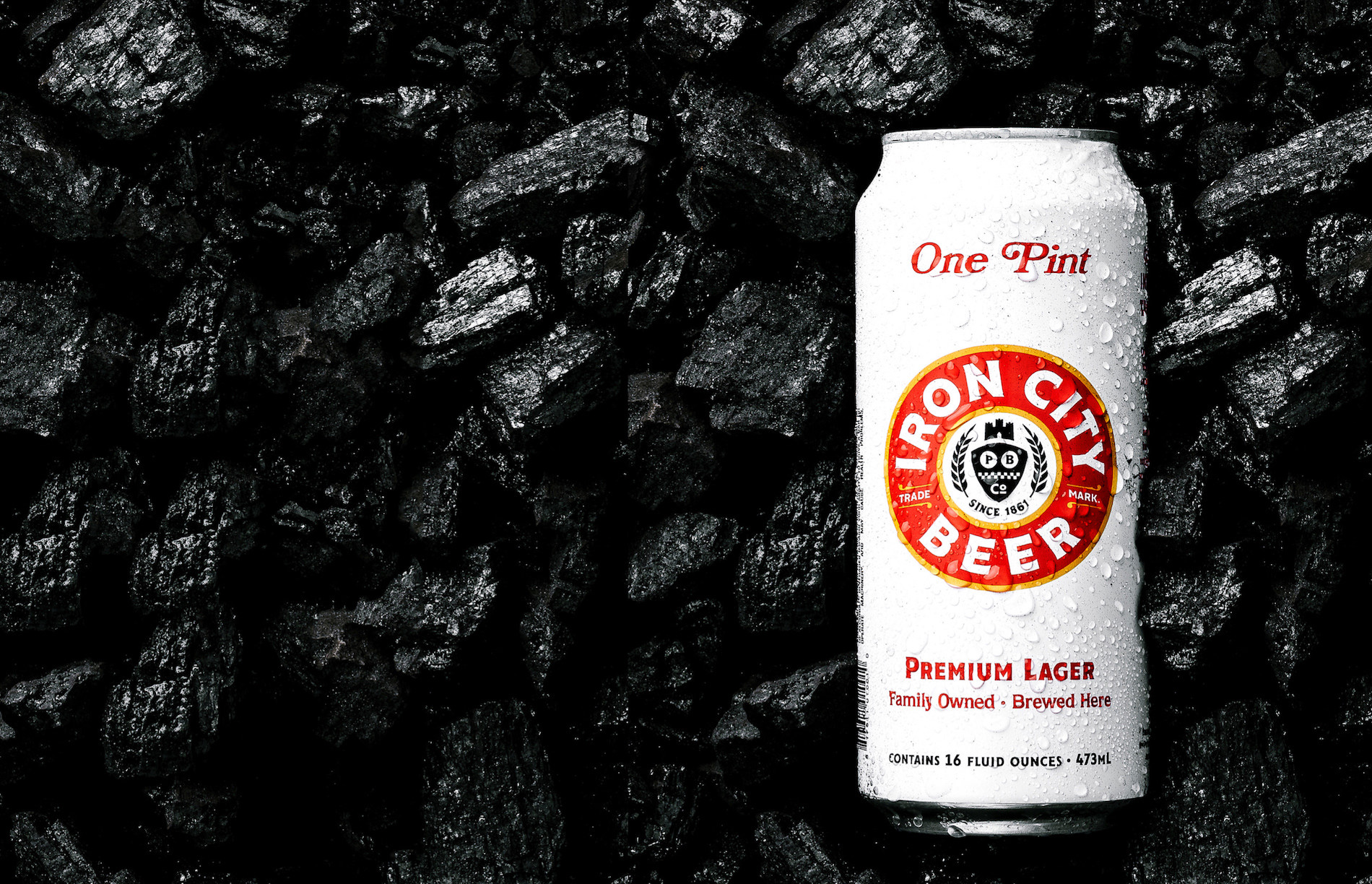
The packaging looks really great, with the bright white backgrounds and bold pops of red from the logo and typography. It's all fairly straightforward but the resulting designs are very attractive and eye-catching. The "IR-logo-N" is particularly good and looks fantastic on the can. The one element I'm still not convinced by is the checkered pattern that doesn't seem to fit with the logo or the typography.
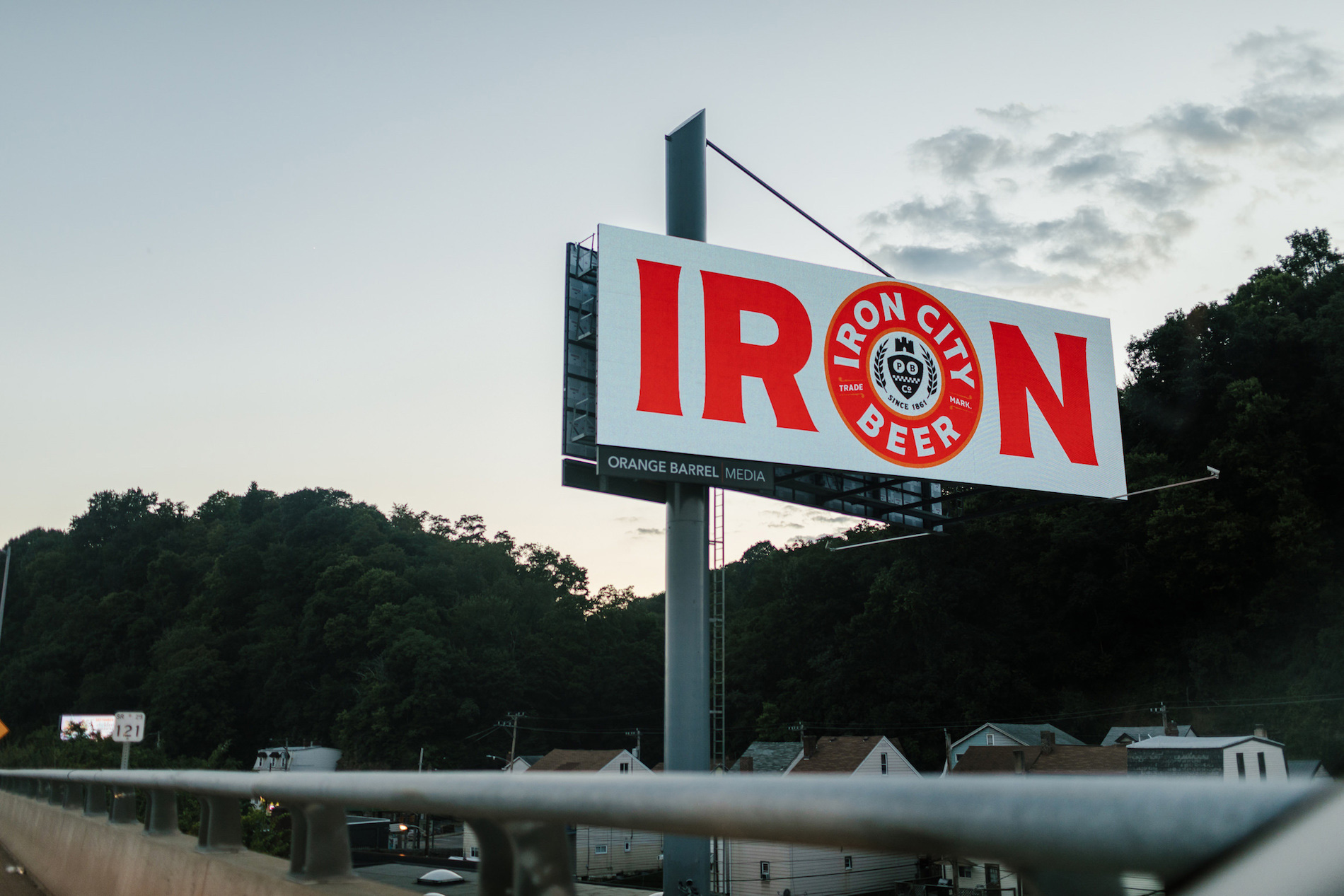
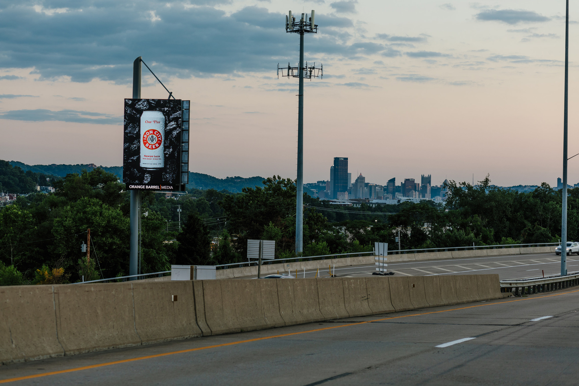
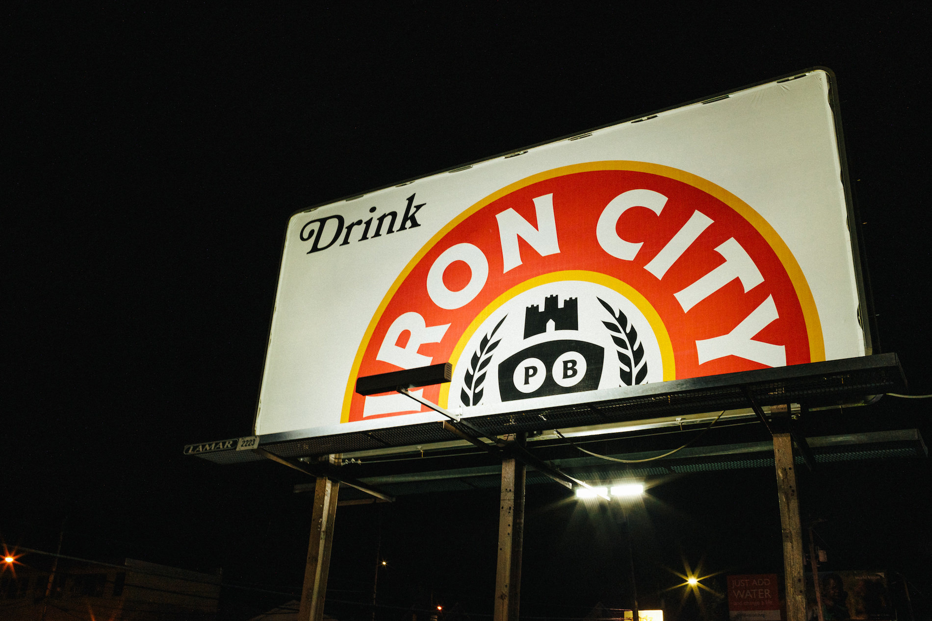
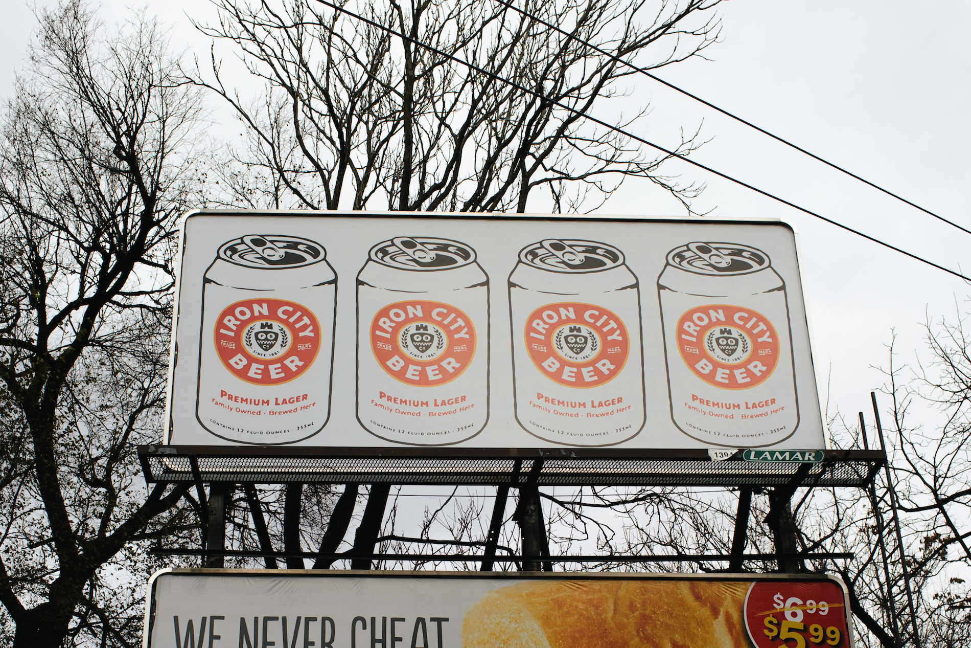
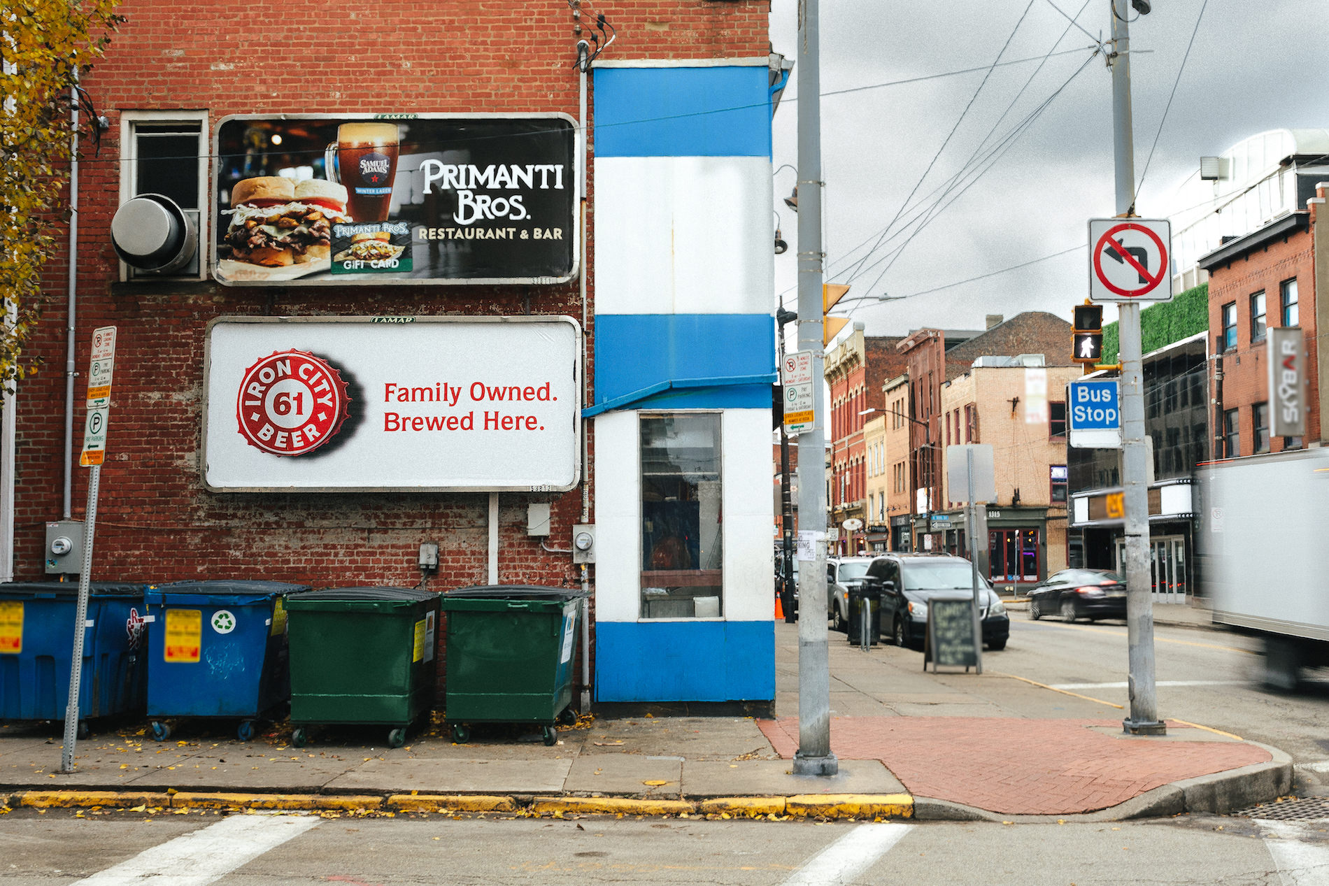
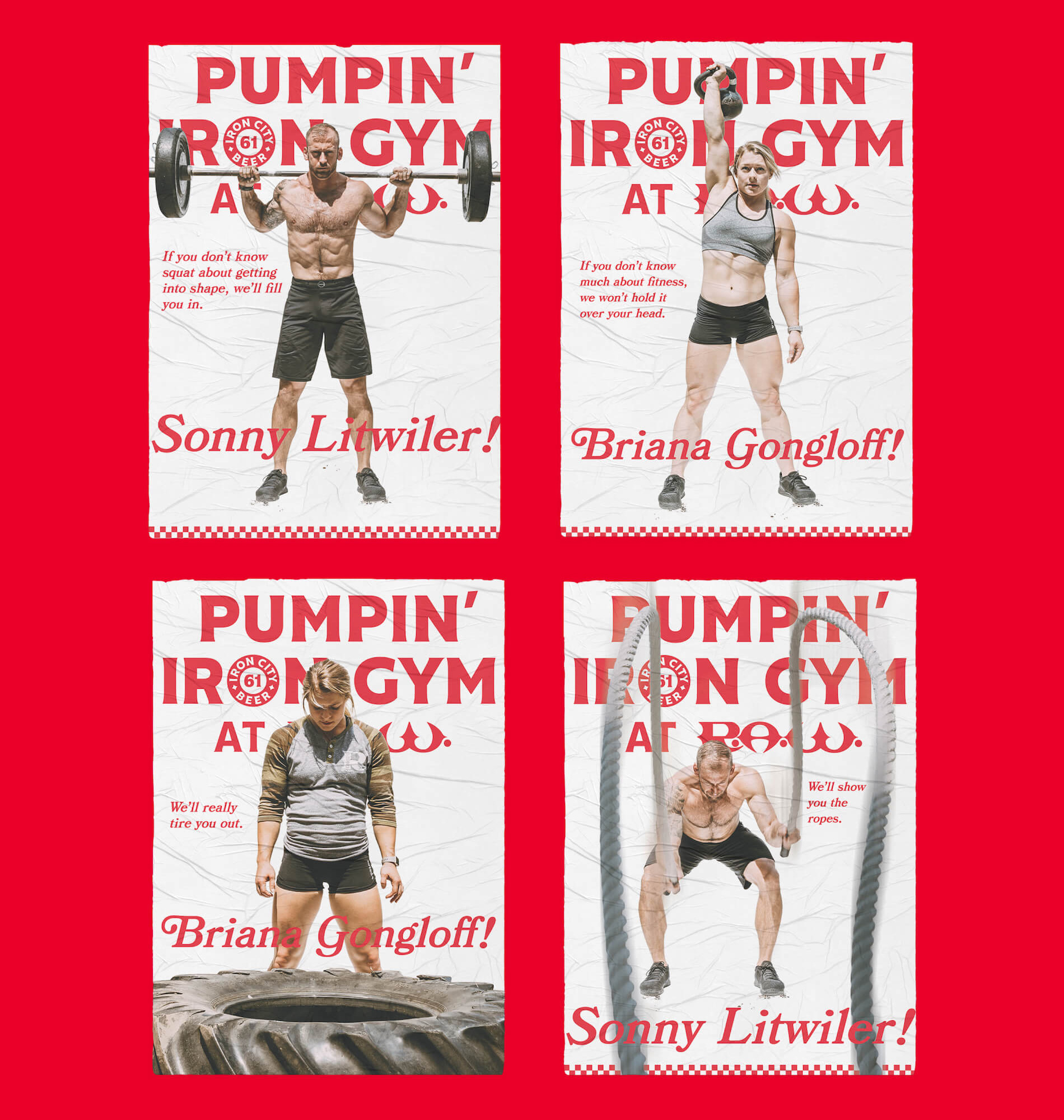
I usually don't comment on the advertising elements of most projects because it's not my thing but these are so good. No waffle and no empty promises, just straight-up confidence in the product and new brand. Some of these look like billboards that were put up in the 1970s and one took them down -- that's a compliment.
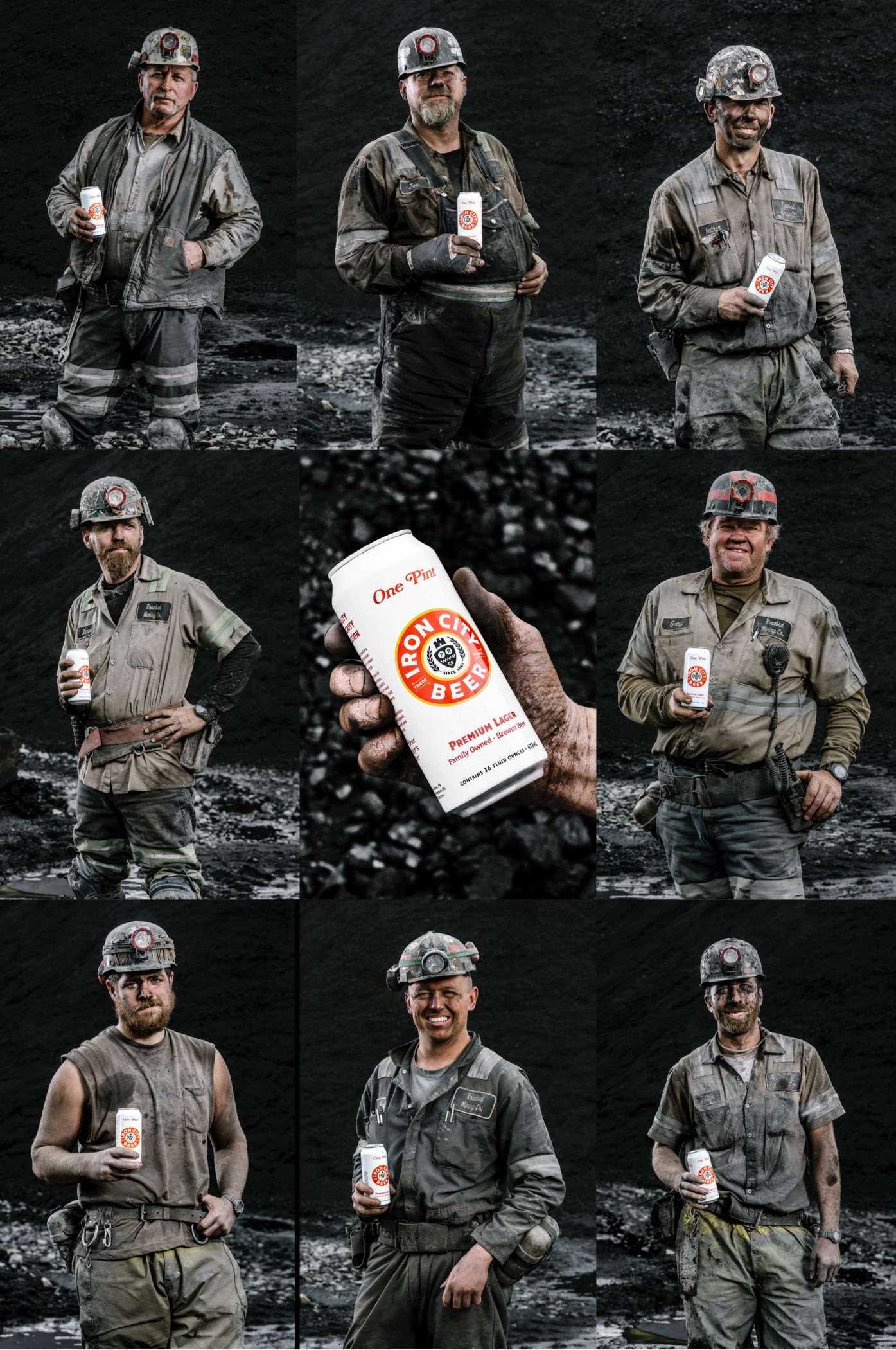
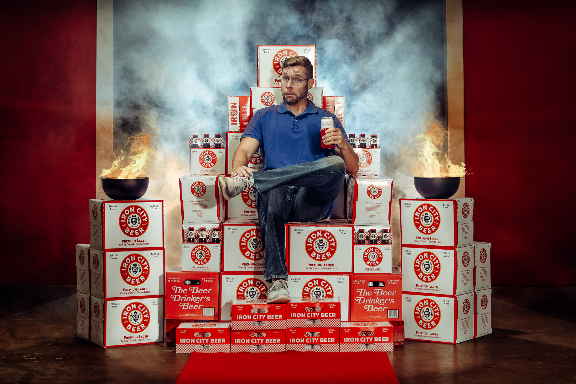
For the new can's first major photoshoot, we made real, local coal miners the heroes. Because Pittsburgh was forged with Iron & Coal. Plus, that white and red just look damn cool against that shiny black coal.
Top Hat project page
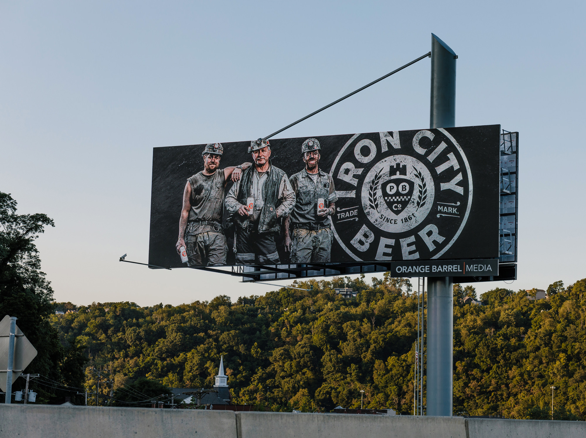
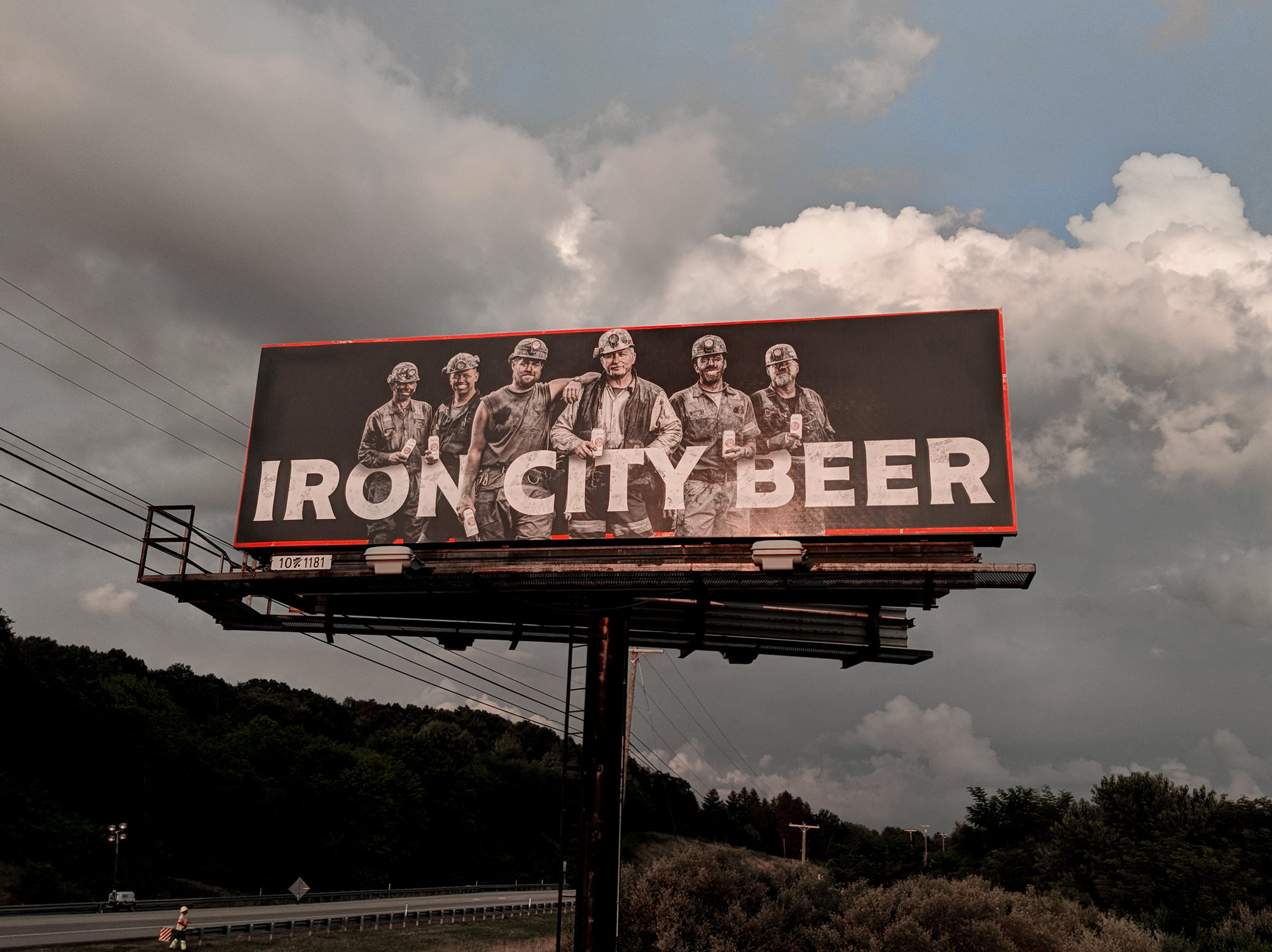
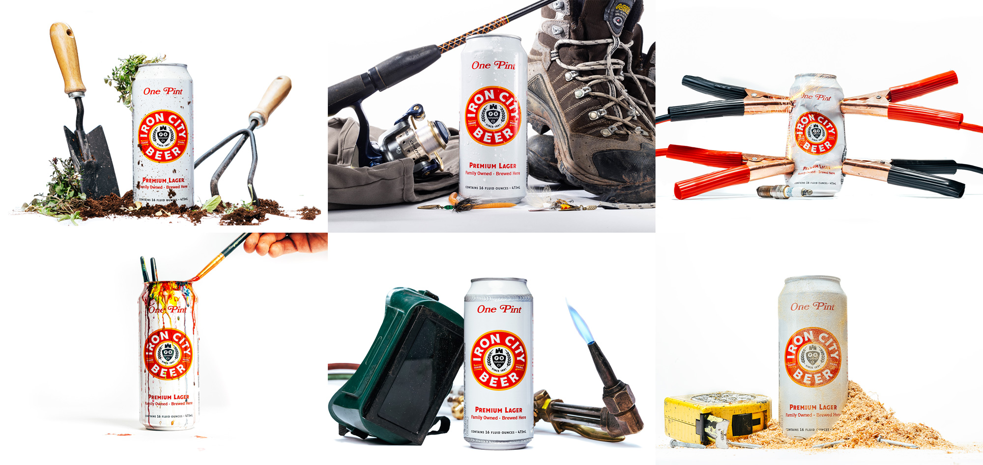
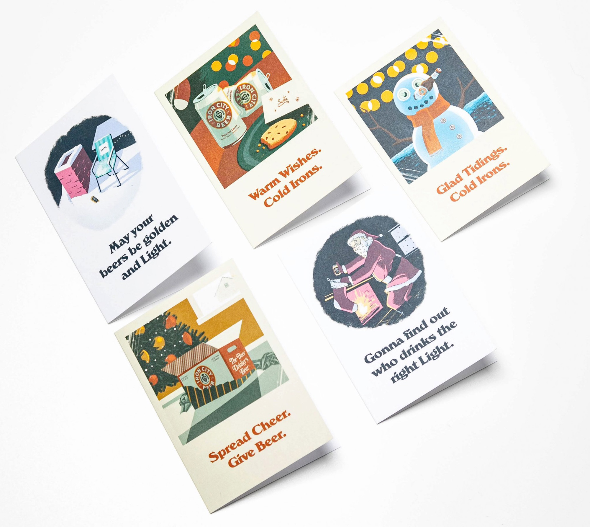
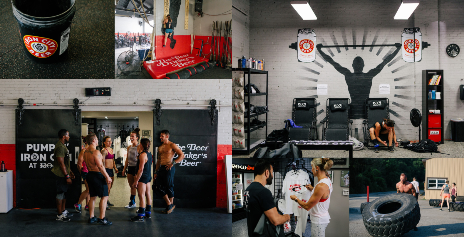
Iron City has been doing a lot of great promotions in the last two years, aligning itself with relevant businesses and entities to attract a younger, hipper audience, and they are all loads of fun. (There are a few more things at the project link.)
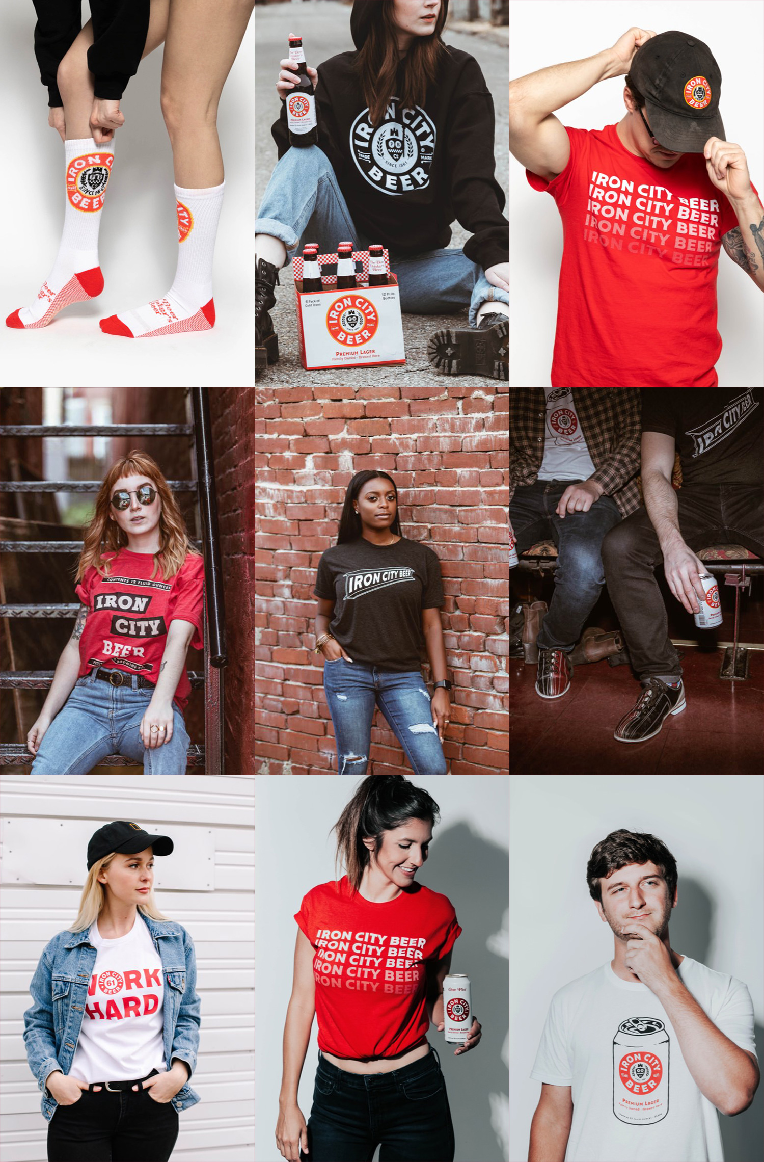
Overall, everything here is VERY good, doing a great job of creating a brand where you can feel its 150 years of legacy presented in a contemporary, exciting, and confident way that comes across as authentic and unique to Pittsburgh.
In ấn Anpic In nhãn mác Anpic In brochure Anpic In card visit Anpic In catalogue Anpic In thiệp cưới Anpic In tờ rơi Anpic
In Ấn Anpic – Nổi Tiếng In Đẹp In Nhanh
Số 5 Ngõ 75 Nguyễn Xiển, Thanh Xuân, Hạ Đình, Hà Nội
0963223884
baogiainananh@gmail.com
https://anpic.vn
https://g.page/inananpic
In nhãn mác Anpic ✅ In brochure Anpic ✅ In card visit Anpic ✅ In catalogue Anpic ✅ In thiệp cưới Anpic ✅ In tờ rơi Anpic
https://anpic.vn/in-nhan-mac-dep
https://anpic.vn/in-brochure
https://anpic.vn/in-an
https://anpic.vn/in-voucher-in-phieu-giam-gia-khuyen-mai
#inananpic
Comments
Post a Comment