Reviewed: New Logo and Identity for Design Pasar by Foreign Policy
“It’s a Seller’s Market”

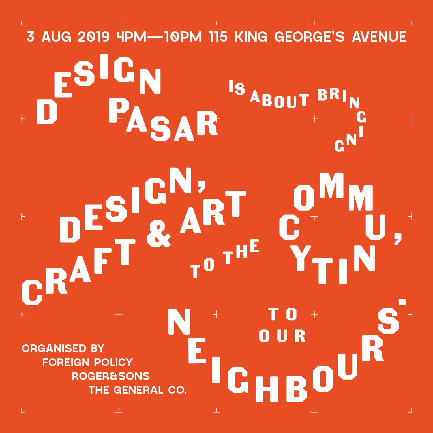
First celebrated in 2019, Design Pasar is a festival in Singapore with the mission of bringing design, craft, and arts to the community and, specifically to the neighbors of the organizers -- Foreign Policy, Roger&Sons, and The General Co. -- whose businesses are located in a recently refurbished warehouse in the hip neighborhood of Jalan Besar, where many of the traditional hardware businesses reside. The festival is inspired by and adapted from the traditional Pasar Malams (Pasar means Market; Malam means night) which, as their name implies, are evening and night markets that pop up across Indonesia, Malaysia, Brunei, and Singapore but instead of just food and knick-knacks, Design Pasar aims to give the public greater access to affordable design and locally-designed and locally-made goods, arts, and music, all while elevating the neighborhood experience. The identity for the event has been designed by Foreign Policy.
The theme for this edition of Design Pasar is about sticking together as a community. It is also paying tribute to Singapore National Day and celebrating how far Singapore has come so far today with a thriving and growing creative industry and community. The brand visual identity takes the cue from the shapes of objects found in this hardware industry dominant neighborhood. These shapes are designed as stickers so that anyone can create and design their own tote bag or poster with these stickers - an analogy of the mission of Design Pasar - which is to get everyone to be creative and to participate in design. #LetsStickTogether
Foreign Policy provided text
There is not much to the logo but I don't mean that in a bad way. Typeset in a funky, industrial-looking font, it's the first of many references to the neighborhood's hardware business residents and shown above is only one of its infinite configurations (which you will see in application further below). I can't state that I am a fan of the logo or its different layouts but I do enjoy how it starts to set the tone for the looseness of the applications. The secondary shapes are fun, looking like toy versions of nuts, bolts, and general random pieces of hardware -- I like the moment where the shapes join together into an abstract "DP". The muted color palette helps keep this in grown-up territory because it would be very easy for this to feel like a kid-focused identity.
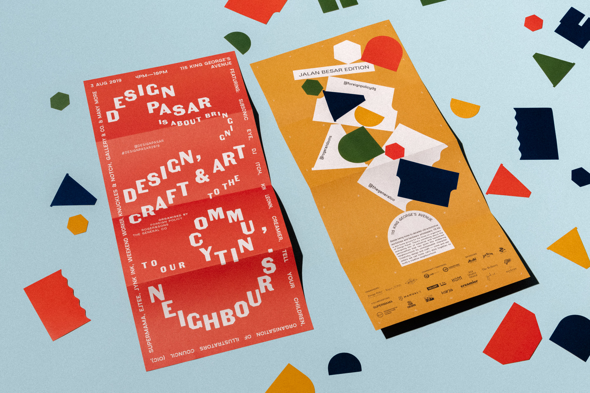
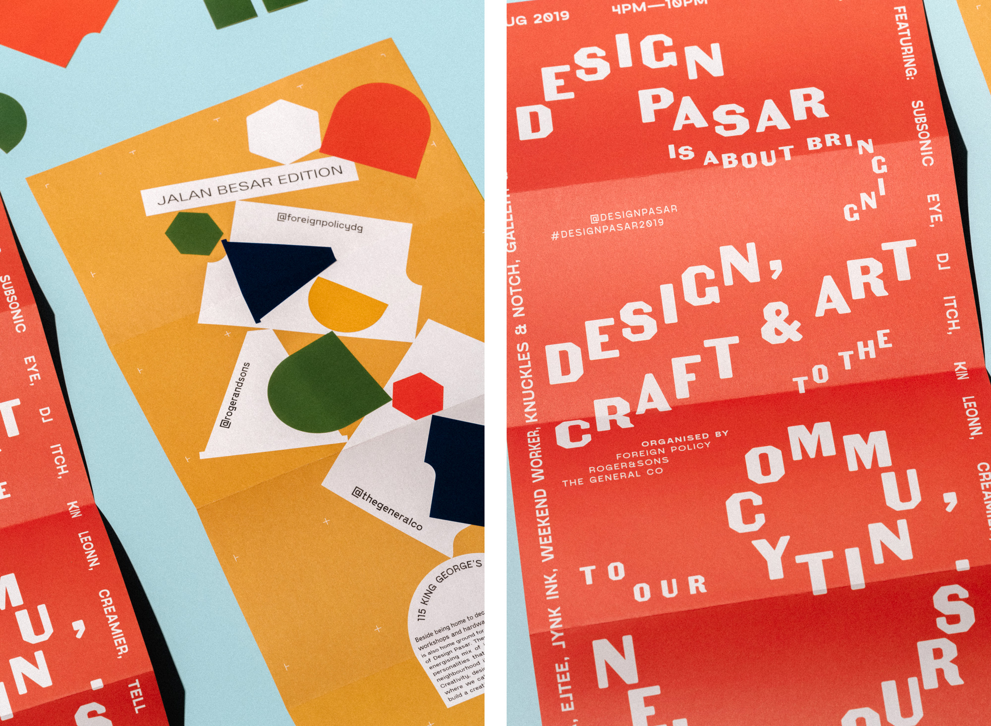
The applications start to get a little more fun with a free-for-all of typographic shenanigans where baselines and text orientations don't exist or matter, yet all remains readable. In way, it's a kind of designer flex and could be dismissed as just that, with the materials catering to the creative class, but ultimately this was for the general public and the design doesn't shy away from being a little "difficult".
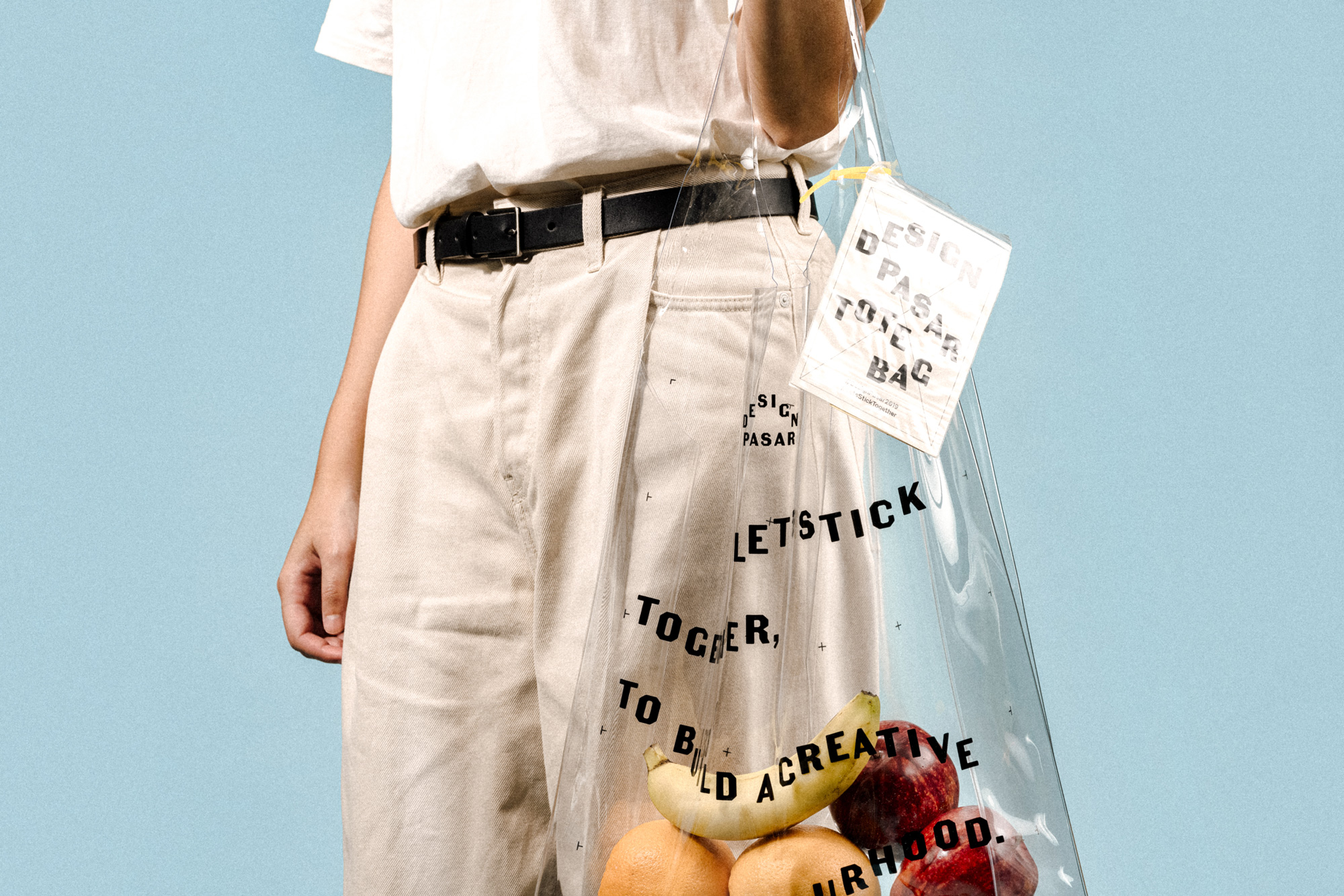
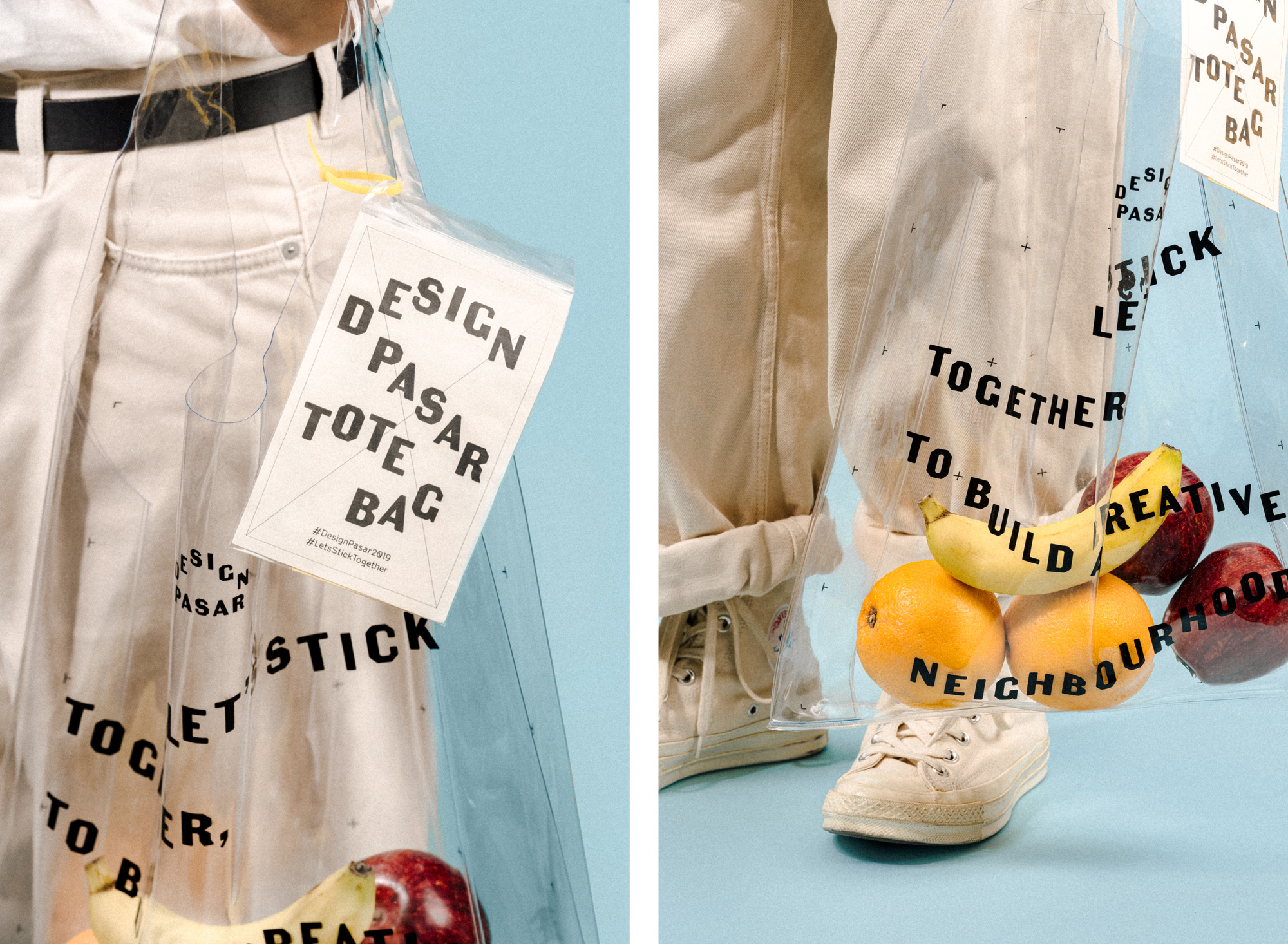
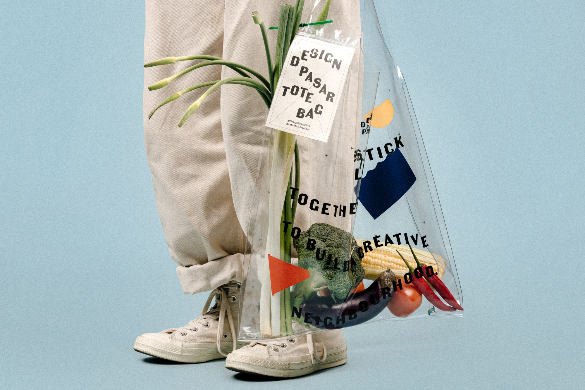
To be perfectly honest, the biggest reason this project gets a full review is because of this bag. I love that it's crystal clear, I love the clunky typography on it, I love the size, and I love how it can be customized. With so many tote bags ever, this is one of the few that stands out. And it's real, not just a comp or mock-up.
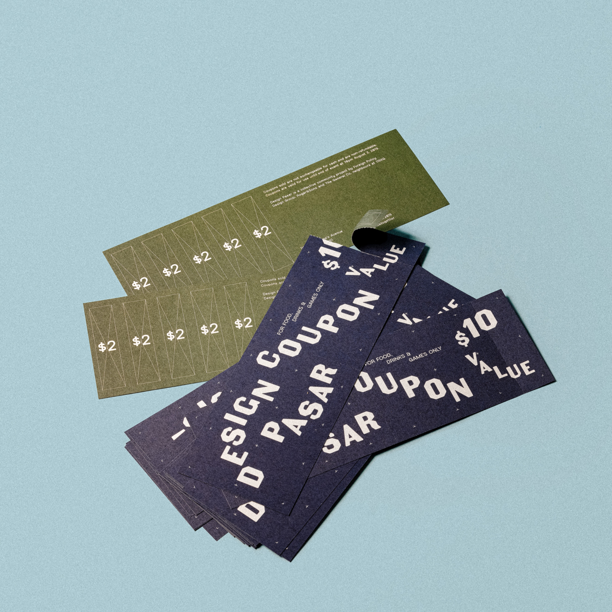
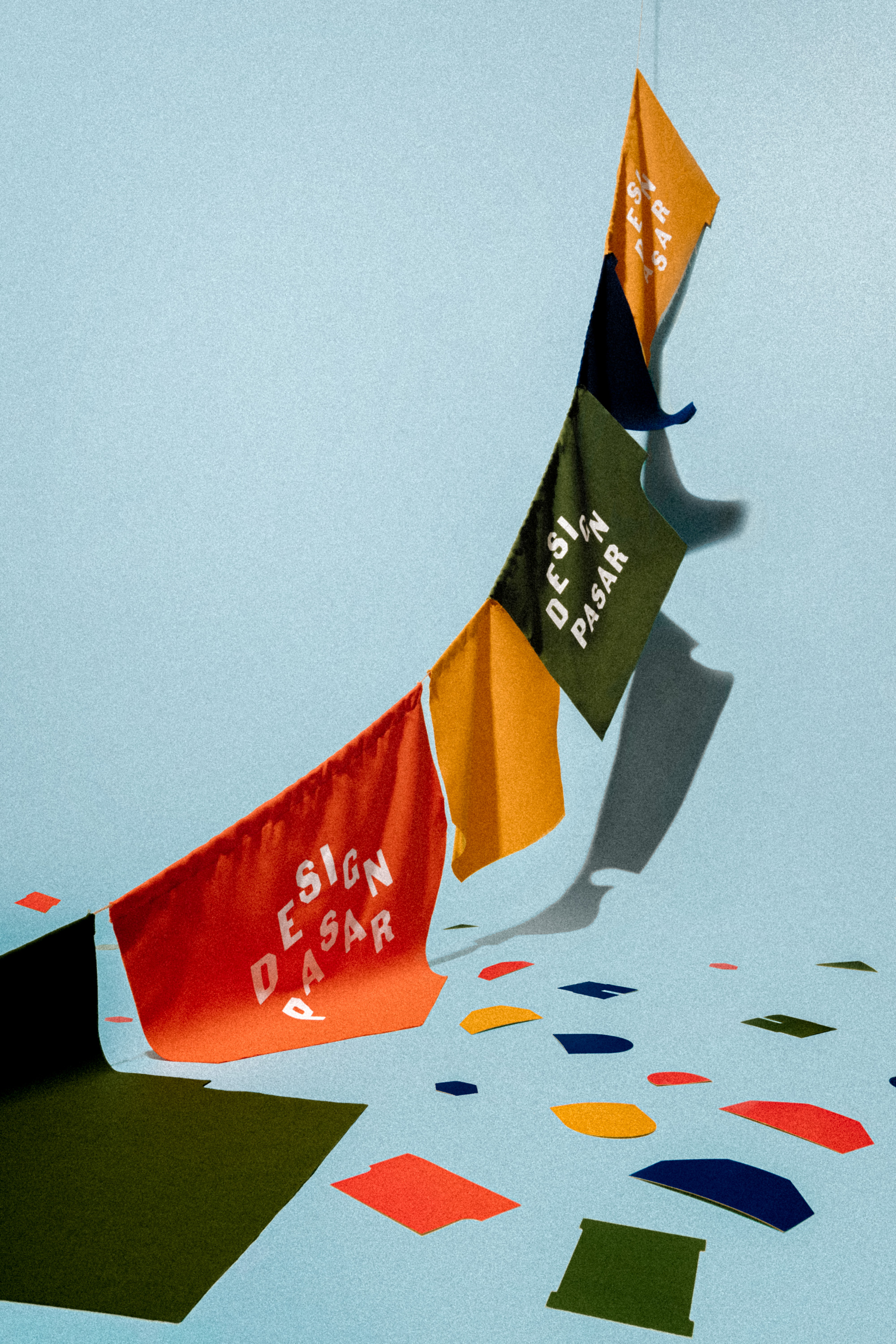

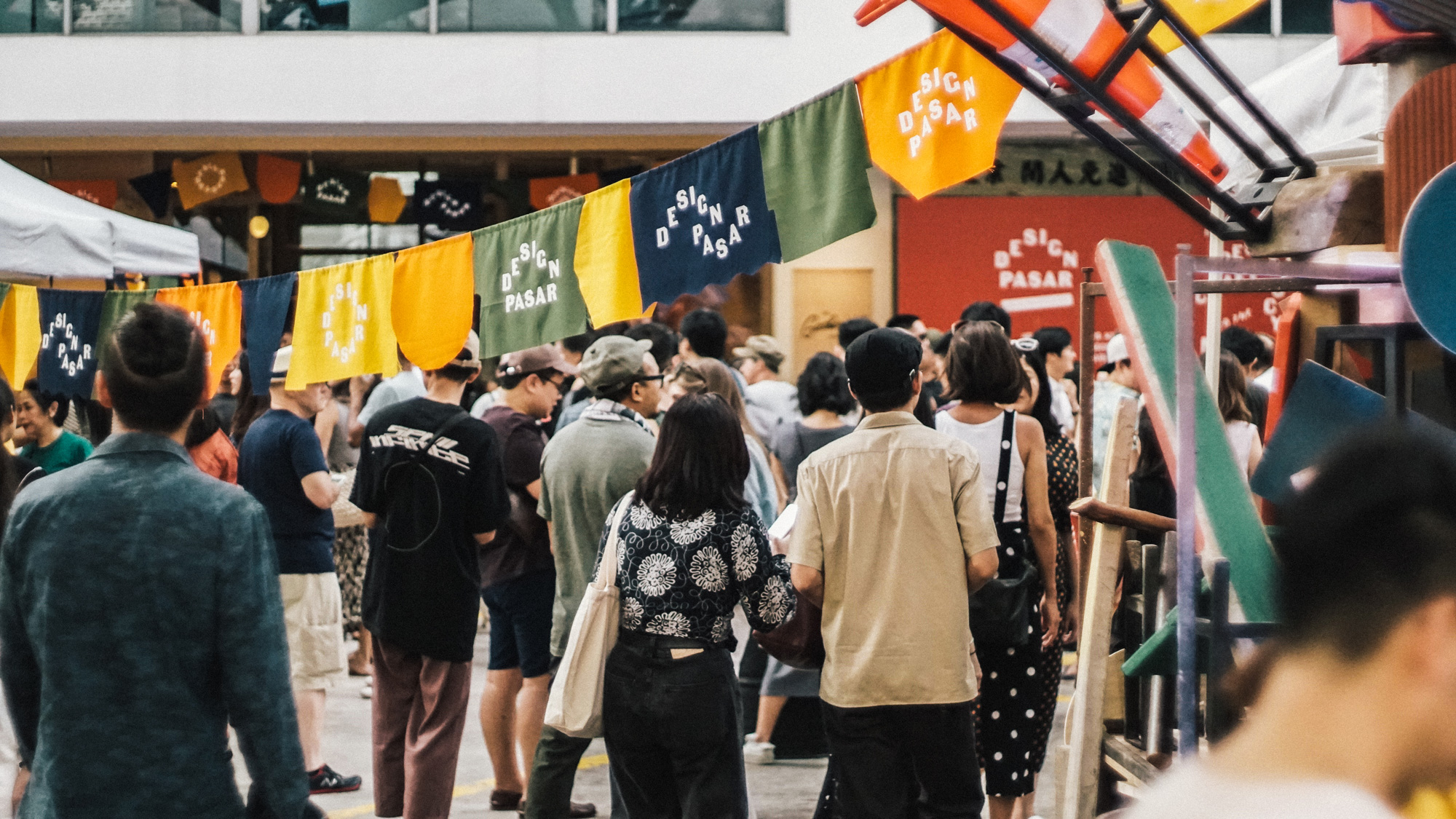
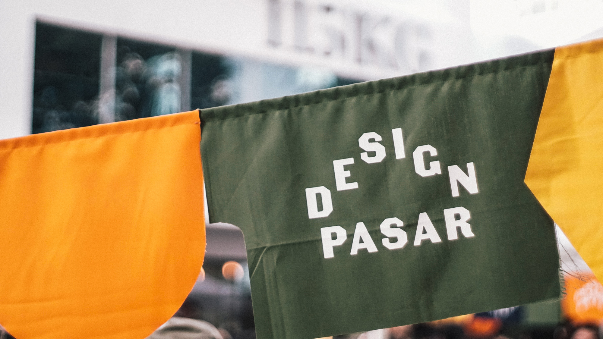
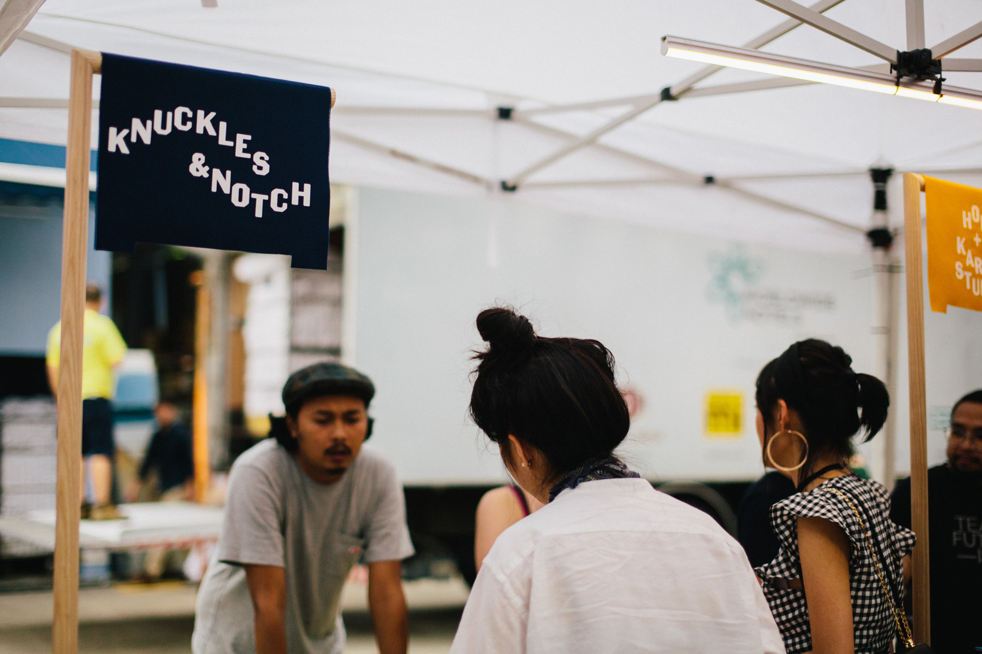
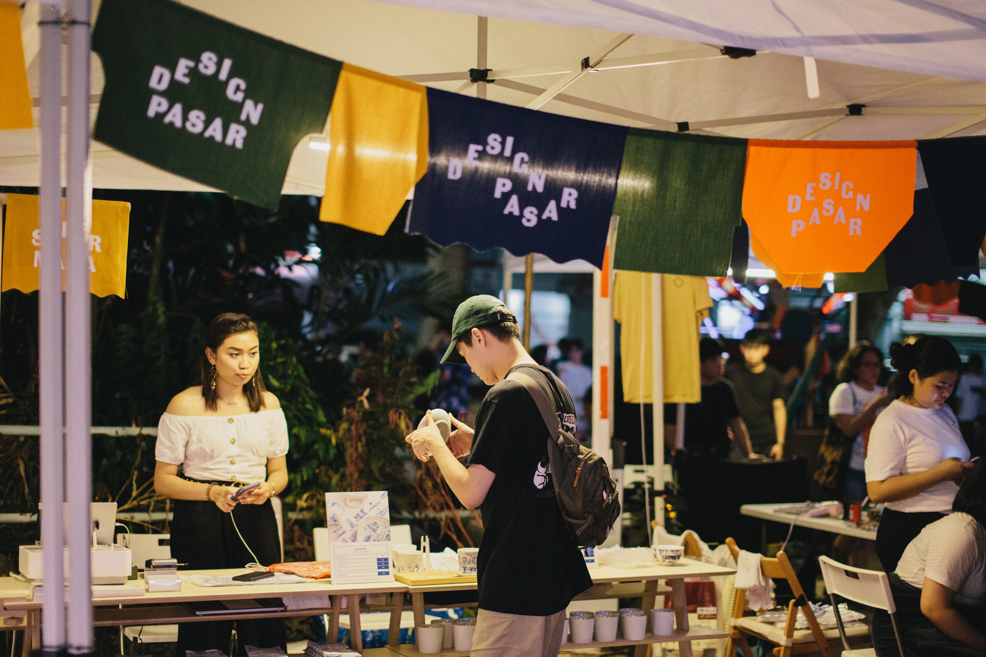
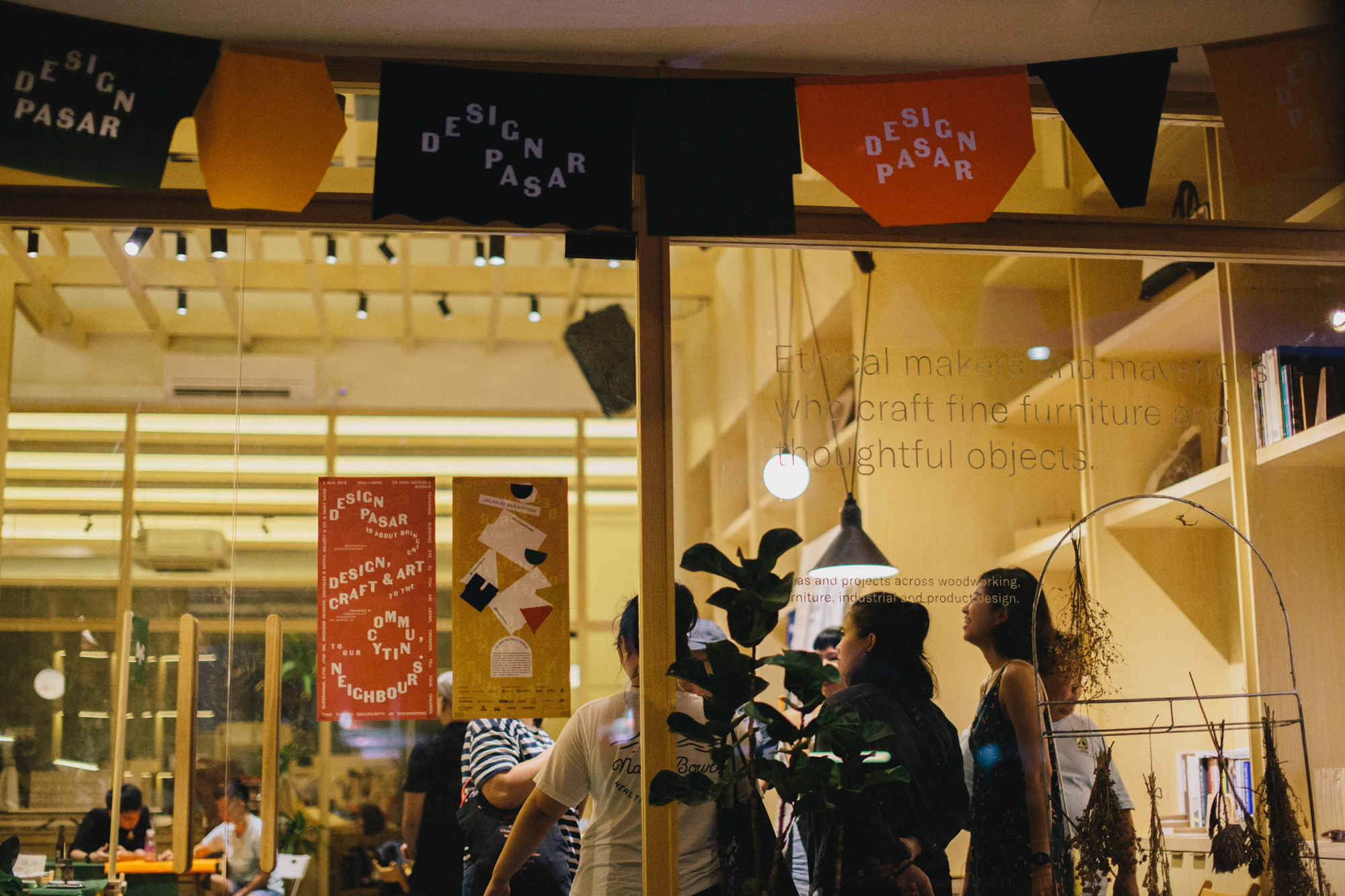
Overall, the identity benefits from being for a small-scale event that's all about creativity and crafts so it doesn't have the same challenges of something like, I dunno, CES or Comic-Con, but it's still fun to see the off-kilter approach for a Singaporean audience and attention to detail that went into it, from coupons to vendor stall signs to the different cut shapes of the banners -- it definitely beats the identity and presentation of the hundreds of generic neighborhood art and craft festivals that pop up in the U.S.
In ấn Anpic In nhãn mác Anpic In brochure Anpic In card visit Anpic In catalogue Anpic In thiệp cưới Anpic In tờ rơi Anpic
In Ấn Anpic – Nổi Tiếng In Đẹp In Nhanh
Số 5 Ngõ 75 Nguyễn Xiển, Thanh Xuân, Hạ Đình, Hà Nội
0963223884
baogiainananh@gmail.com
https://anpic.vn
https://g.page/inananpic
In nhãn mác Anpic ✅ In brochure Anpic ✅ In card visit Anpic ✅ In catalogue Anpic ✅ In thiệp cưới Anpic ✅ In tờ rơi Anpic
https://anpic.vn/in-nhan-mac-dep
https://anpic.vn/in-brochure
https://anpic.vn/in-an
https://anpic.vn/in-voucher-in-phieu-giam-gia-khuyen-mai
#inananpic
Comments
Post a Comment