Reviewed: New Logo and Identity for MUNCH by North
“I Scream, You Scream, We All Scream for The Scream”
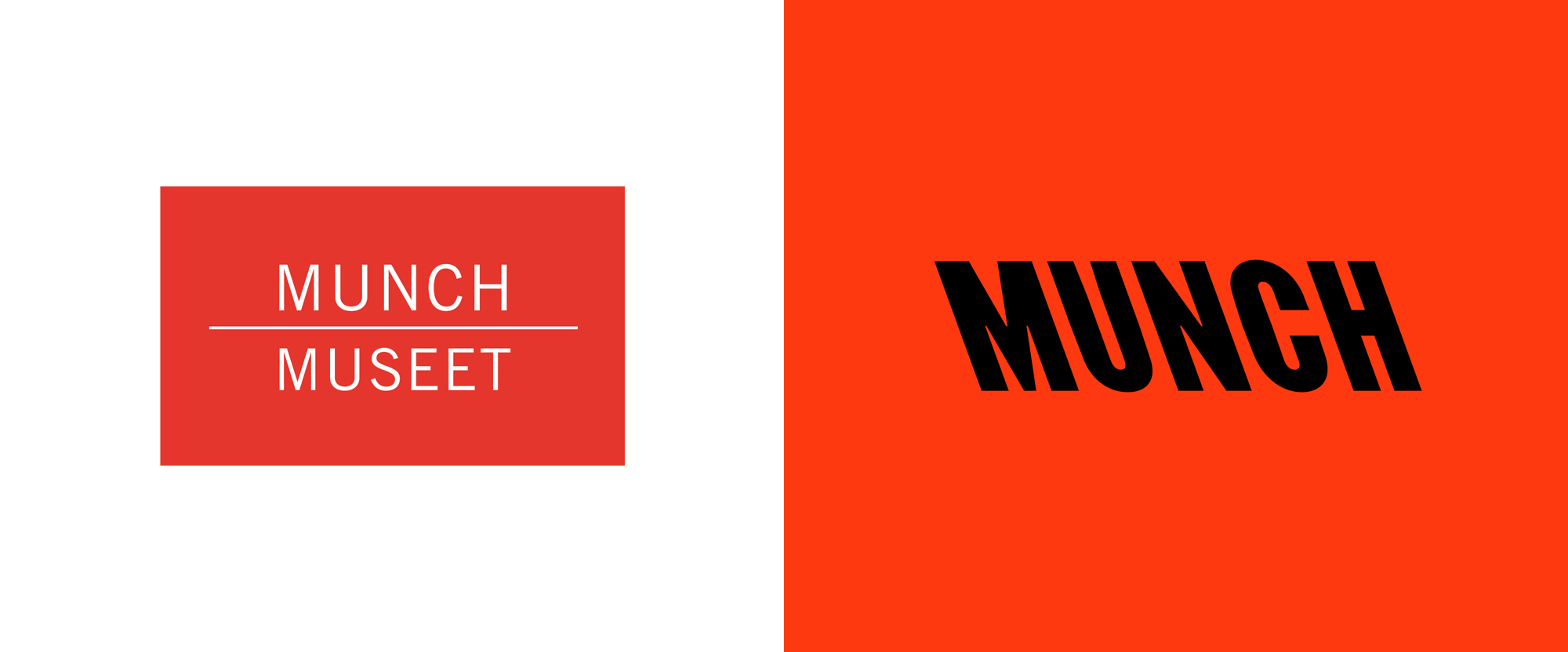
Established in 1963, MUNCH is an art museum in Oslo, Norway, dedicated to the life and works of Norwegian artist Edvard Munch. Four years prior to his death in 1994, Munch bequeathed all his own works in his possession -- more than 28,000 artworks, as well as texts, letters, photographs, equipment and other personal artifacts -- to the City of Oslo, which established the museum in Tøyen, a residential neighborhood in the city. From the outset, the popularity of Munch outgrew the capacity of the physical space and in 2008 the city decided to create a new building with a competition won by Madrid, Spain-based Estudio Herreros. Set to open later this year on Oslo's waterfront, MUNCH will be one of the world's largest museums dedicated to one artist with 11 exhibition halls spread over 7 floors, displaying over 220 works by Munch at all times along with temporary exhibitions of his other works as well as that of other artists. The identity for the new museum has been designed by London, UK-based North.
The creative solution aims to be a contemporary interpretation of Munch's ethos and to positively signal the exciting new vision for the organisation. This is expressed in a clearer and more distinct visual profile to help reflect the bold ambitions for the museum and increase relevance for a younger audience.
North provided text
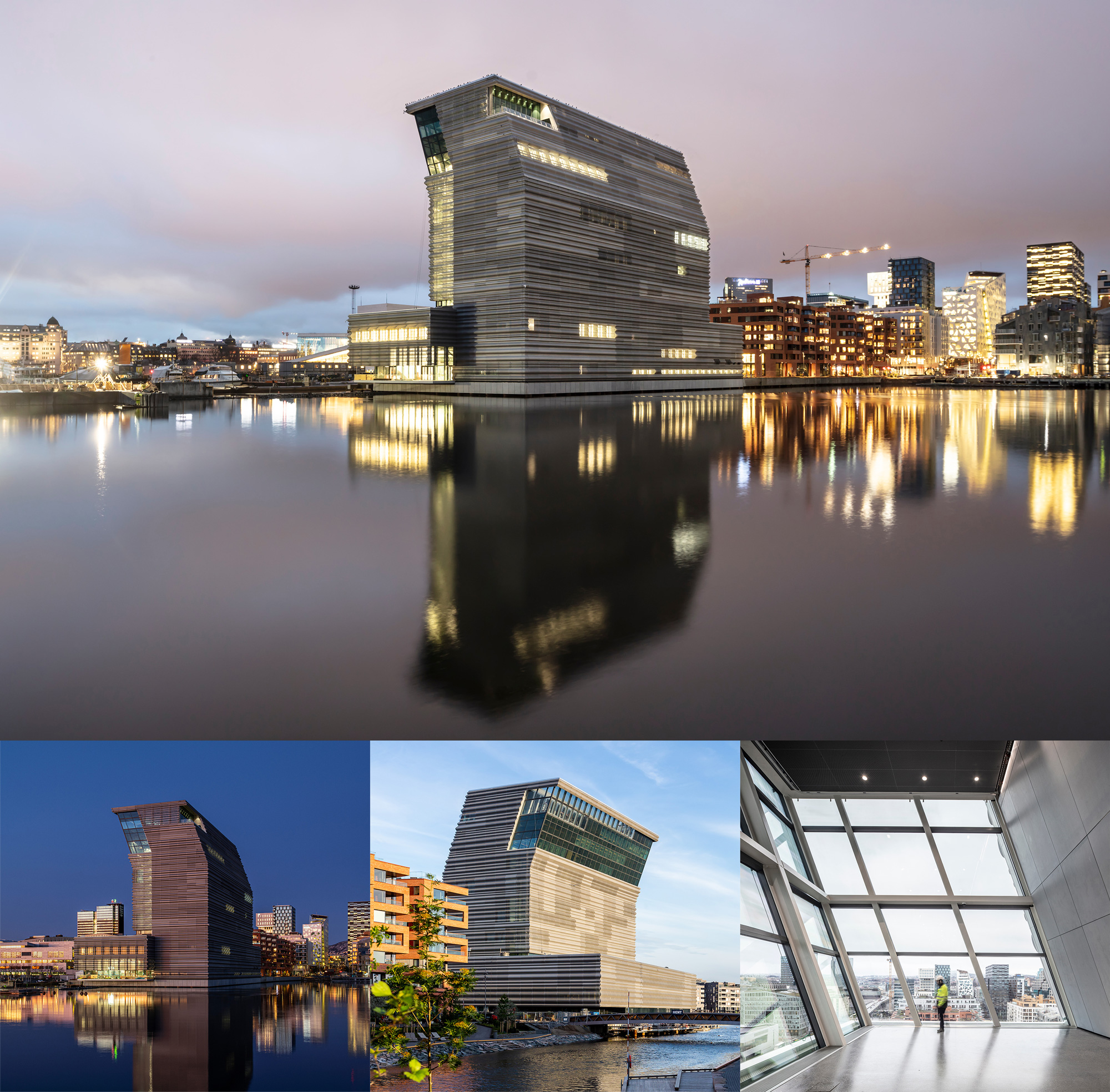
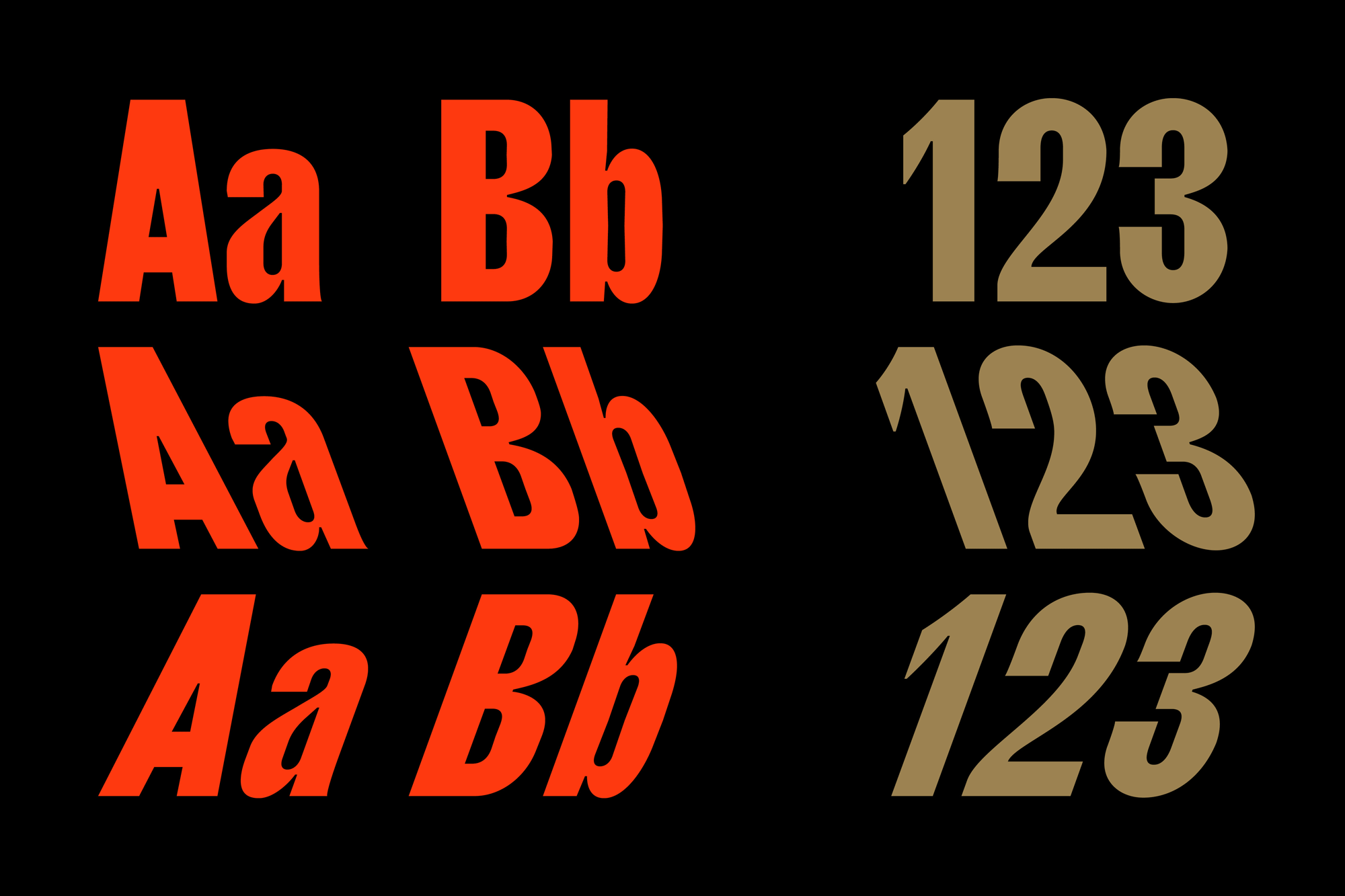
The visual identity is anchored by a custom font influenced by Munch's character and informed by the architecture. Respectfully bowing towards the city of Oslo, estudio Herreros' design was in part inspired by a photograph of Munch at Warnemünde, Germany. Almost naked, he is painting another almost-naked man on the beach and leaning forward inquisitively, just like the building. This angle was translated into a custom font designed by Radim Peško which is 'backslanted' at 20° to mirror this architectural gesture. The severe angle and uncommon blackslant type style combine to create a typographic expression and 'voice' intended to evoke Munch's unconventional spirit.
North provided text

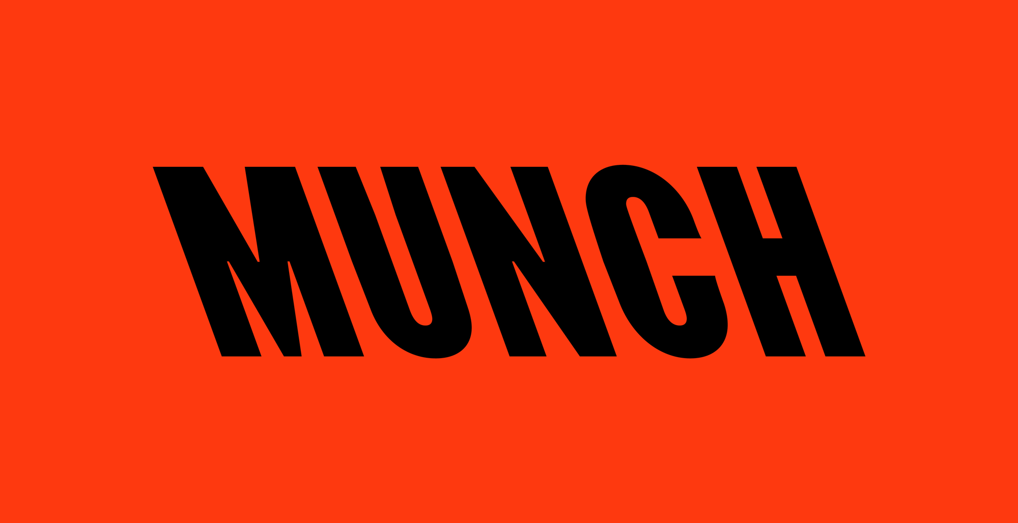
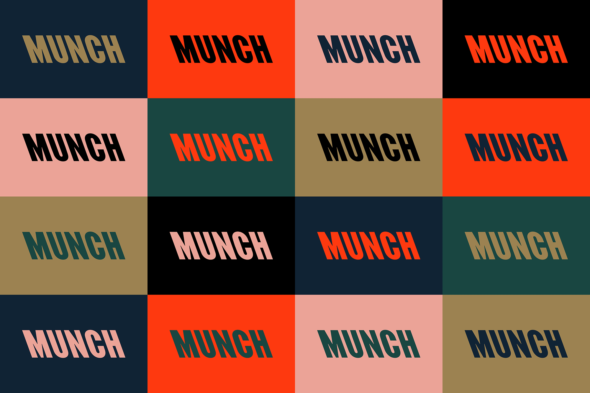
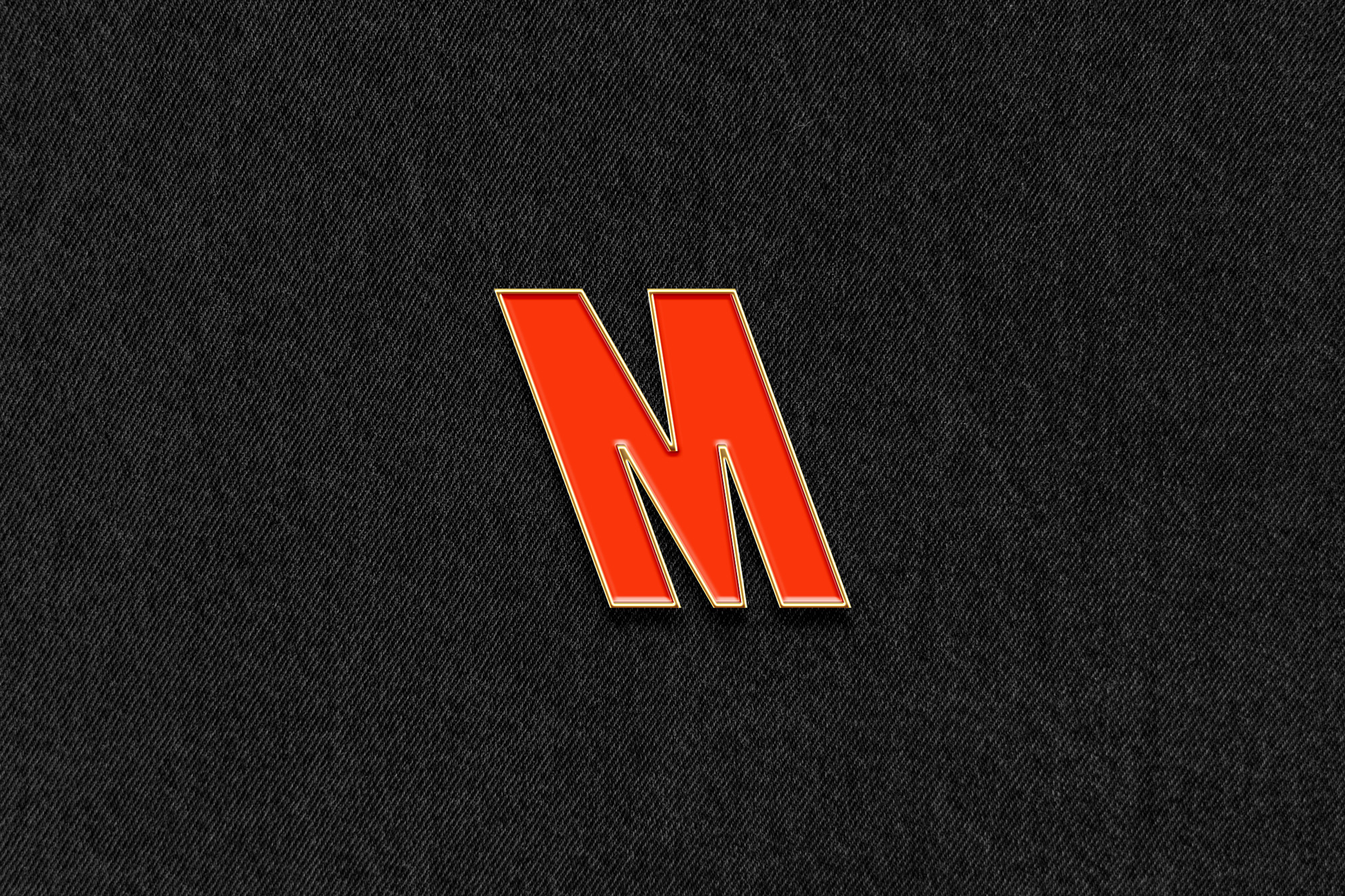
The old logo was a logo with words in it split by a line, which is a description as dry as the logo, so not a big loss. The new logo takes a direct cue from the building's silhouette where the top 25% of the floors shoot out at a vertiginous angle and lean into the city. According to the provided text, the building itself takes a cue from a photograph of Munch leaning as he paints as well as a more metaphorical gesture that the building is bowing to the city and its fjord. In any case, the building is slanted and the logo is slanted. I mention all this because I am no art interpreter but neither the building nor the logo seem very Munch-ish to me, which may be my own problem in that I may be limiting my intellectual capability to move past beyond the surface understanding of Munch's art as expressionism. Maybe I expected something more... wavy... and blurry. Dunno. Anyway... I will hold on to the line that reads "a contemporary interpretation of Munch's ethos" and build from there because, in the end, the logo and the identity are bitchin', which is probably nothing an art interpreter would ever say.
The reverse italic approach is undeniably bold and pairing that with a red/black primary color combo makes it all the more impactful. Seeing the logo on the website does help paint a picture -- sorry, lame pun -- that this is no conventional museum and/or artist, going, literally, against the current and defying expectations. So, yeah, maybe I can interpret me some art. The color palette is absolutely stunning, with a very rich and deep set of hues and the red popping out vividly. The custom typeface that comes in italic, reverse italic, and non-italic (aka regular) is pretty great in its condensed structure and single, bold weight.
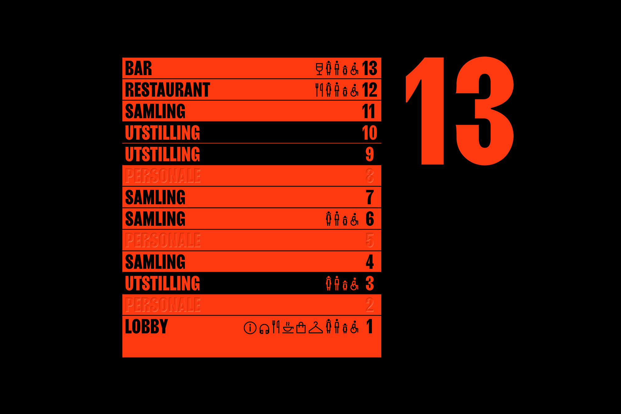
An energetic colour palette has been developed to work in harmony with Munch's art. Graphic expression is introduced across communications and merchandising through bold use of the 20º angle and an abstracted silhouette of the building. All aspects of the identity are developed as animated assets to make best use of the 20+ digital screens which run throughout the building.
North provided text
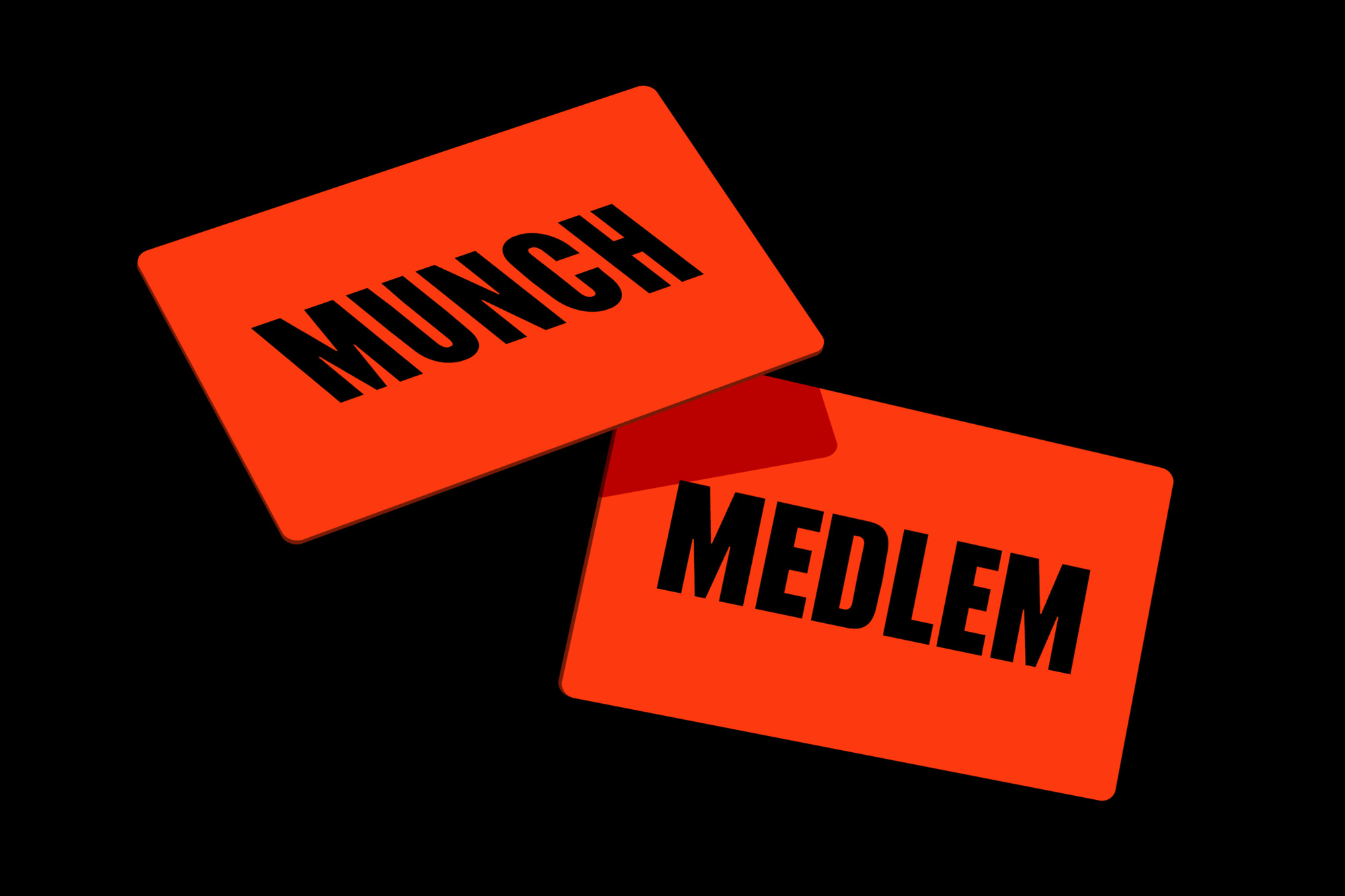

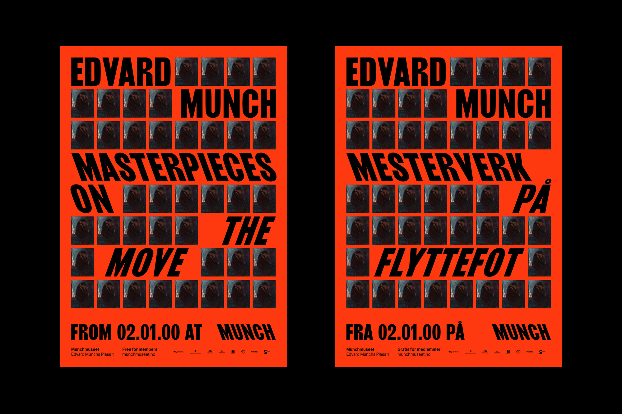
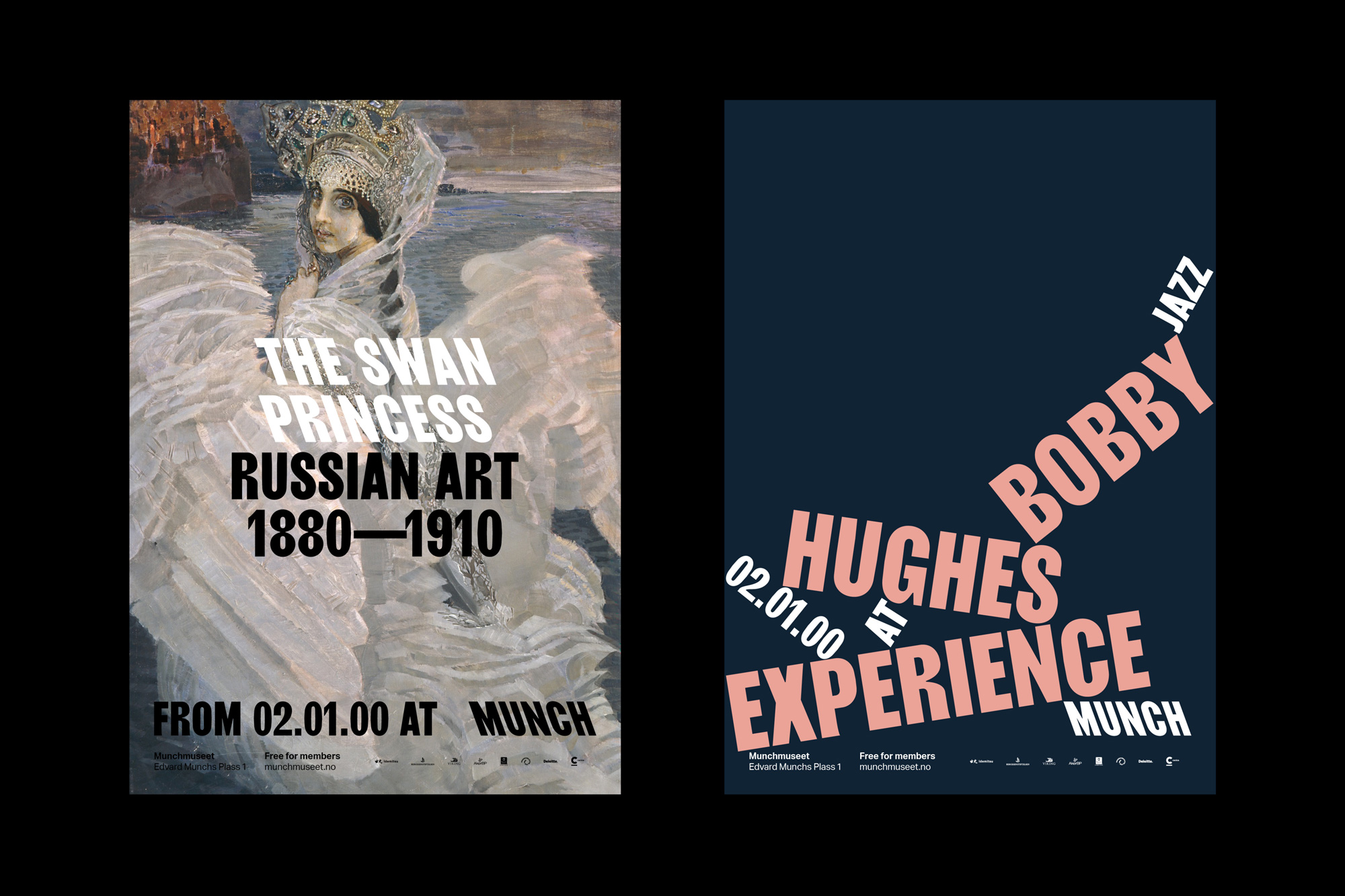
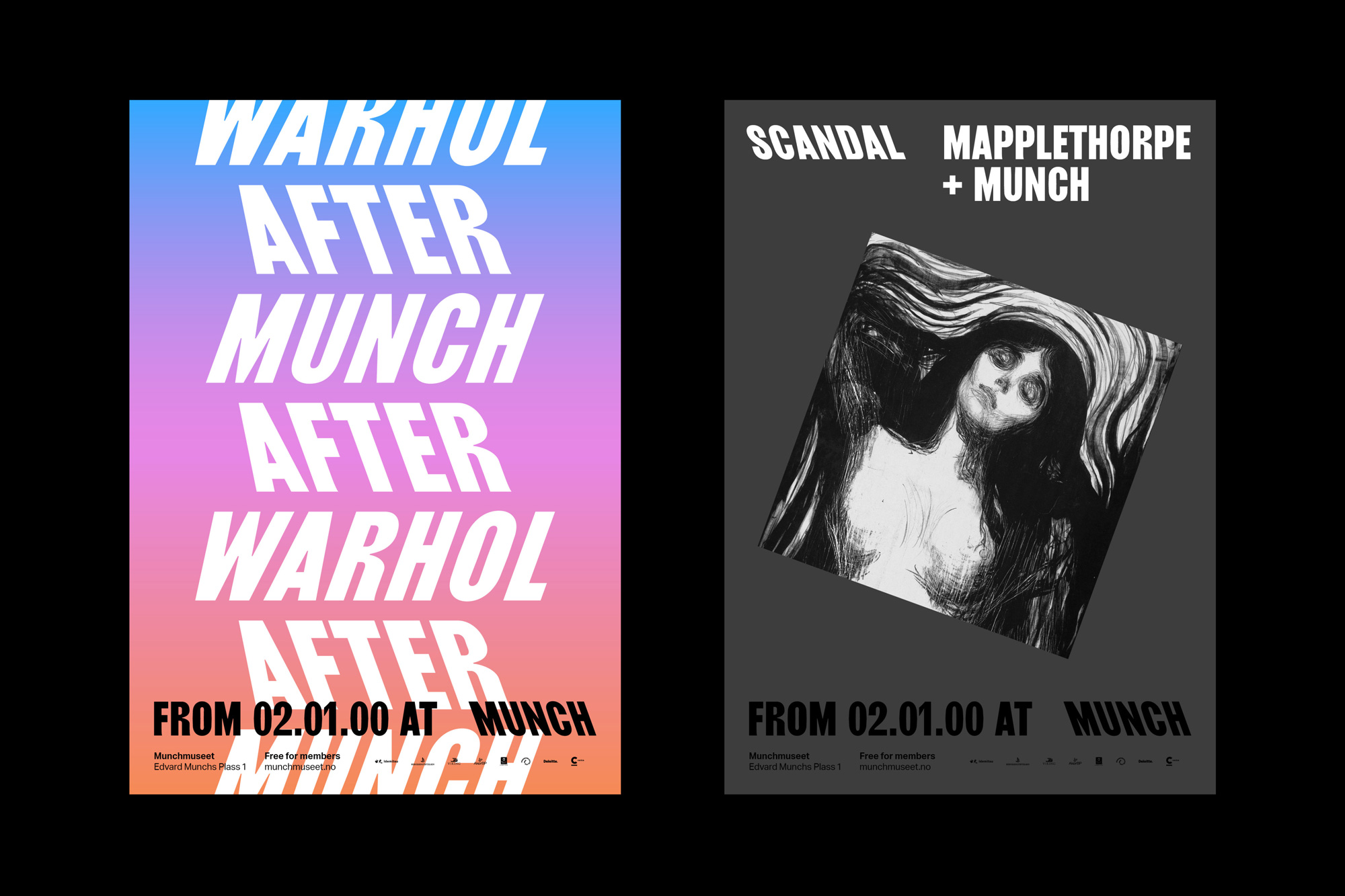

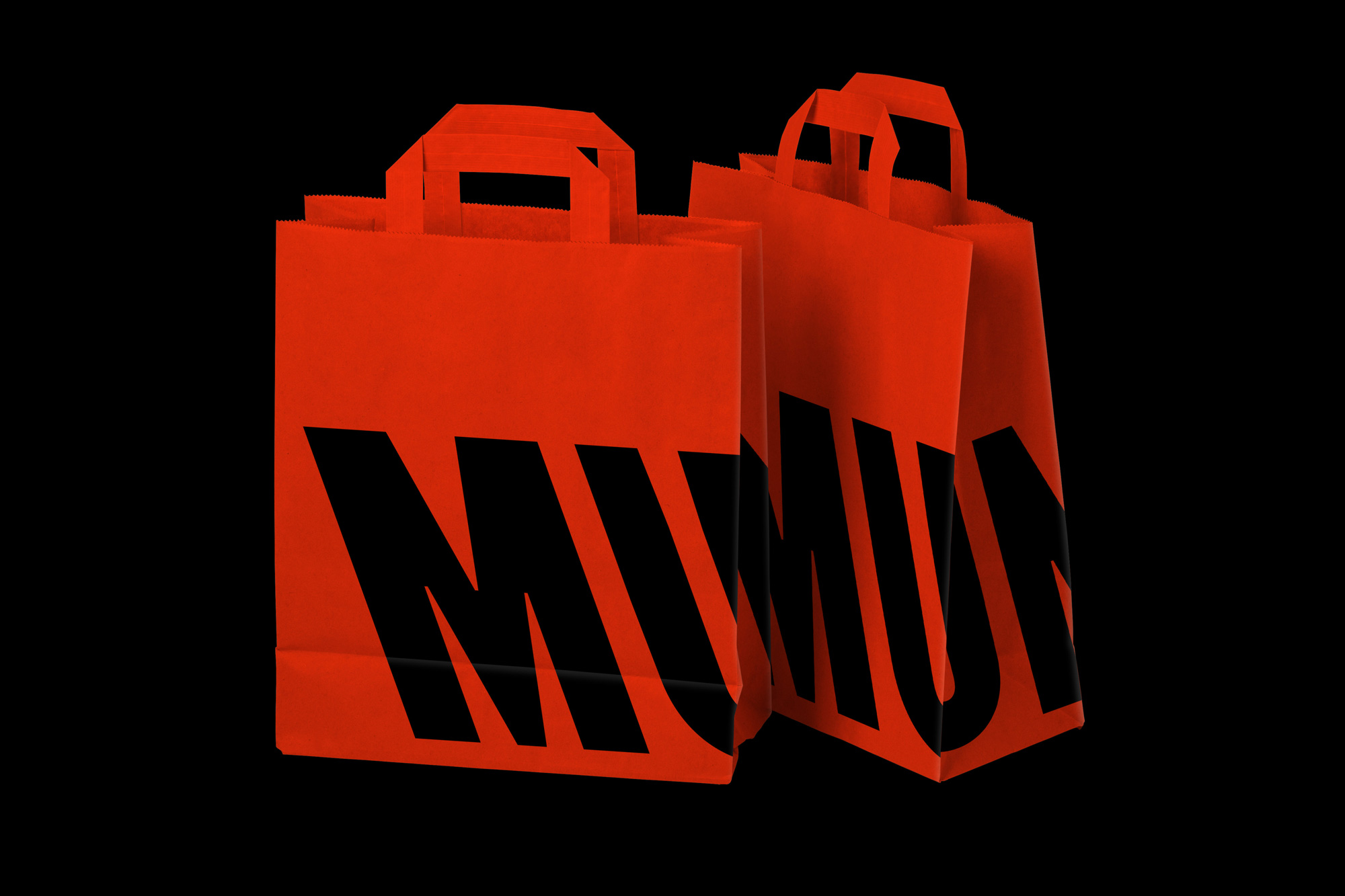
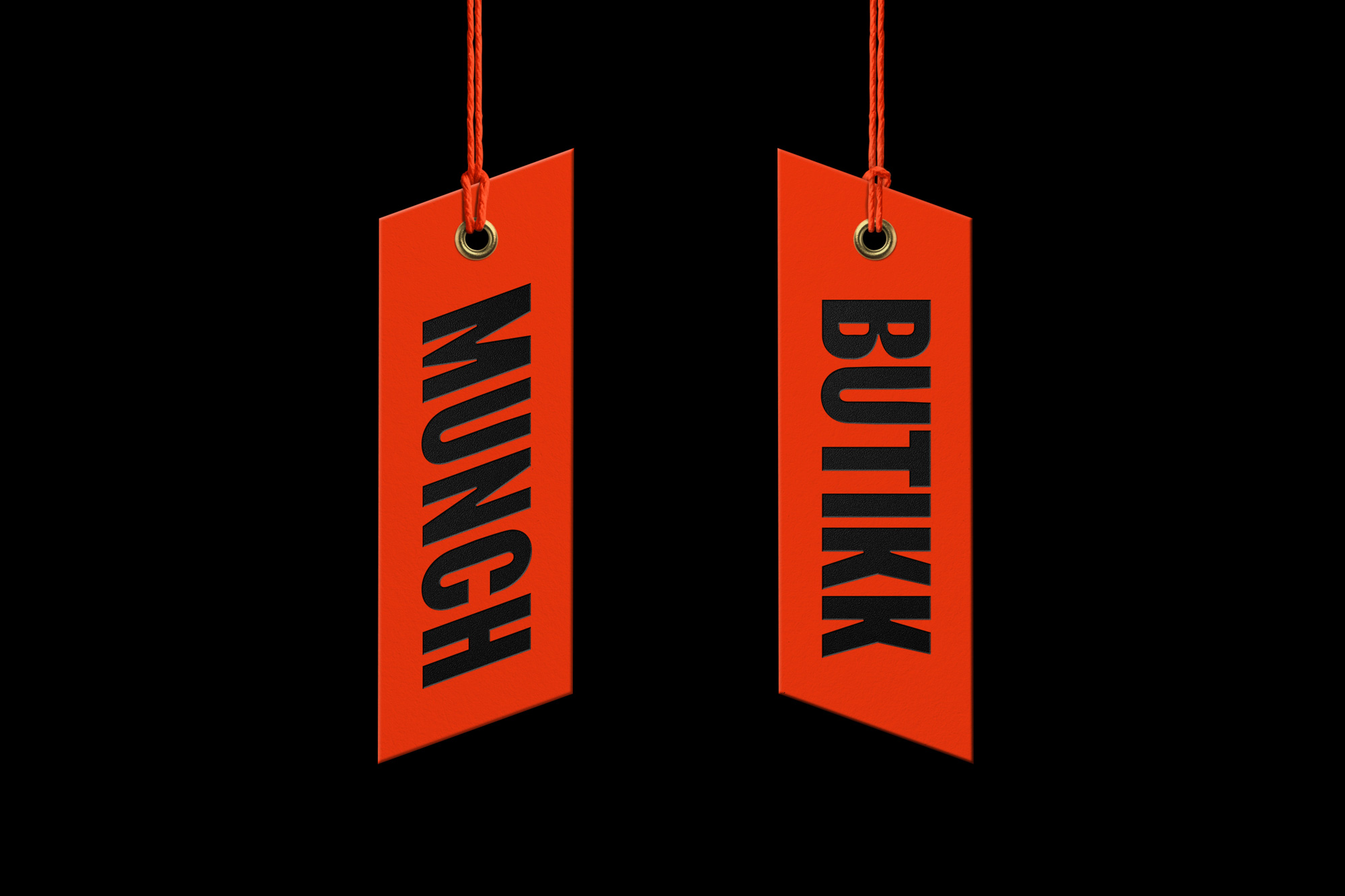
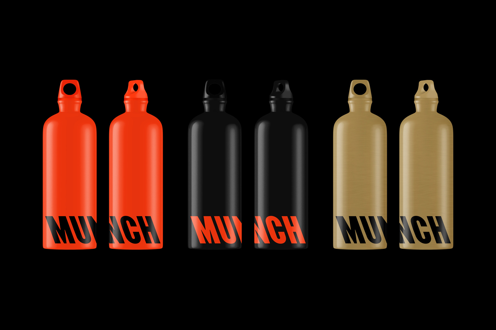
I still feel like I'm looking at some kind of upscale Formula 1 racing event, with all the italic type zooming to and from in the layouts but I still think it's super slick. Those bags look so great and so do the spines of the exhibit catalog with the single backslant "M" at the bottom and the titles going in all directions.

Overall, this is technically amazing as everything looks great and maybe I'm just on my own when it comes to the slight dissonance between my understanding of Munch's work with how that translates into this identity, so I'm definitely looking forward to hearing what you think. Maybe another problem is that I'm trying to see this as an identity for the artist, not as an identity for the museum of the artist. Maybe another problem is that now I'm just rambling. So, the end.
In ấn Anpic In nhãn mác Anpic In brochure Anpic In card visit Anpic In catalogue Anpic In thiệp cưới Anpic In tờ rơi Anpic
In Ấn Anpic – Nổi Tiếng In Đẹp In Nhanh
Số 5 Ngõ 75 Nguyễn Xiển, Thanh Xuân, Hạ Đình, Hà Nội
0963223884
baogiainananh@gmail.com
https://anpic.vn
https://g.page/inananpic
In nhãn mác Anpic ✅ In brochure Anpic ✅ In card visit Anpic ✅ In catalogue Anpic ✅ In thiệp cưới Anpic ✅ In tờ rơi Anpic
https://anpic.vn/in-nhan-mac-dep
https://anpic.vn/in-brochure
https://anpic.vn/in-an
https://anpic.vn/in-voucher-in-phieu-giam-gia-khuyen-mai
#inananpic
Comments
Post a Comment