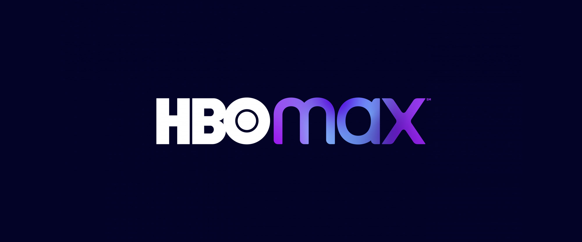
Noted: Follow-up: New Logo for HBO Max by Trollbäck+Company
“Maxed Out”

(Launched 2020) "HBO Max is WarnerMedia's direct-to-consumer offering, which debuted May 27, 2020. With 10,000 hours of curated premium content, HBO Max offers powerhouse programming for everyone in the home, bringing together HBO, a robust slate of new original series, key third-party licensed programs and movies, and fan favorites from WarnerMedia's rich library including motion picture and TV series from Warner Bros., highlights from New Line, and catalog titles from DC, CNN, TNT, TBS, truTV, Turner Classic Movies, Cartoon Network, Adult Swim, Crunchyroll, Rooster Teeth, Looney Tunes and more."
Design by
Trollbäck+Company (New York, NY)
Related links
Trollbäck+Company project page
July 2019 Brand New Spotted post
October 2019 Brand New Spotted post
Relevant quote
As one of several agency partners who worked hard to bring this vision to market, our task was clear and direct: create a logo that would be memorable and instantly-recognizable while lending our branding expertise to the consumer-facing launch positioning.
The HBO Max logo nods to the broad curves and sharp corners of its iconic namesake. Lowercase letterforms help keep the logotype proportional and balanced, while adding a friendly personality. A blue and violet gradient variation, used largely in off-platform marketing, further reinforces the service’s vibrant spectrum of content, which debuted live during the company’s fall WarnerMedia Day event.
Images (opinion after)


Opinion
As an HBO subscriber — it’s one of the few superfluous luxuries I afford myself — the release of HBO Max has been fairly confusing because I have HBO Now and I understood it was a separate entity from HBO Max — which was HBO but not just HBO with stuff from CNN, TNT, TBS, truTV, Turner Classic Movies, and Cartoon Network yet still named HBO — until now because HBO Now doesn’t exist anymore as the app was replaced on my TV automatically for HBO Max but because I got the subscription through Amazon I can not now watch it because WarnerMedia and Amazon haven’t agreed to terms so, yeah, whatever. But you are not here to hear me kvetch about my HBO-watching issues so instead I’ll kvetch about the logo, which is also confusing in itself because it replaced a logo that was first used to announce HBO Max but it only existed for a few months. I can understand some logos being interim but this just seemed like a botched roll-out. Anyway… the new logo… I heavily dislike it, which is a difficult statement to make as I’m usually a big fan of Trollbäck+Company’s work but this is just a really awkward and unappealing bit of typography that very poorly works off of the main HBO logo with no real relation to it — or even a striking, interesting contrast. Everything about the few three letters in here rubs me the wrong way, from the stemless “m” to the single-side-rounded-corners to the unicase approach (where “max” is the same height as “HBO”). Unfortunately no amount of lively animated grid animations will convince me that this is good even if it is correct. To end the opinion with on a positive not with something nice to say… the gradient is nice.
In ấn Anpic In nhãn mác Anpic In brochure Anpic In card visit Anpic In catalogue Anpic In thiệp cưới Anpic In tờ rơi Anpic
In Ấn Anpic – Nổi Tiếng In Đẹp In Nhanh
Số 5 Ngõ 75 Nguyễn Xiển, Thanh Xuân, Hạ Đình, Hà Nội
0963223884
baogiainananh@gmail.com
https://anpic.vn
https://g.page/inananpic
In nhãn mác Anpic ✅ In brochure Anpic ✅ In card visit Anpic ✅ In catalogue Anpic ✅ In thiệp cưới Anpic ✅ In tờ rơi Anpic
https://anpic.vn/in-nhan-mac-dep
https://anpic.vn/in-brochure
https://anpic.vn/in-an
https://anpic.vn/in-voucher-in-phieu-giam-gia-khuyen-mai
#inananpic
Comments
Post a Comment