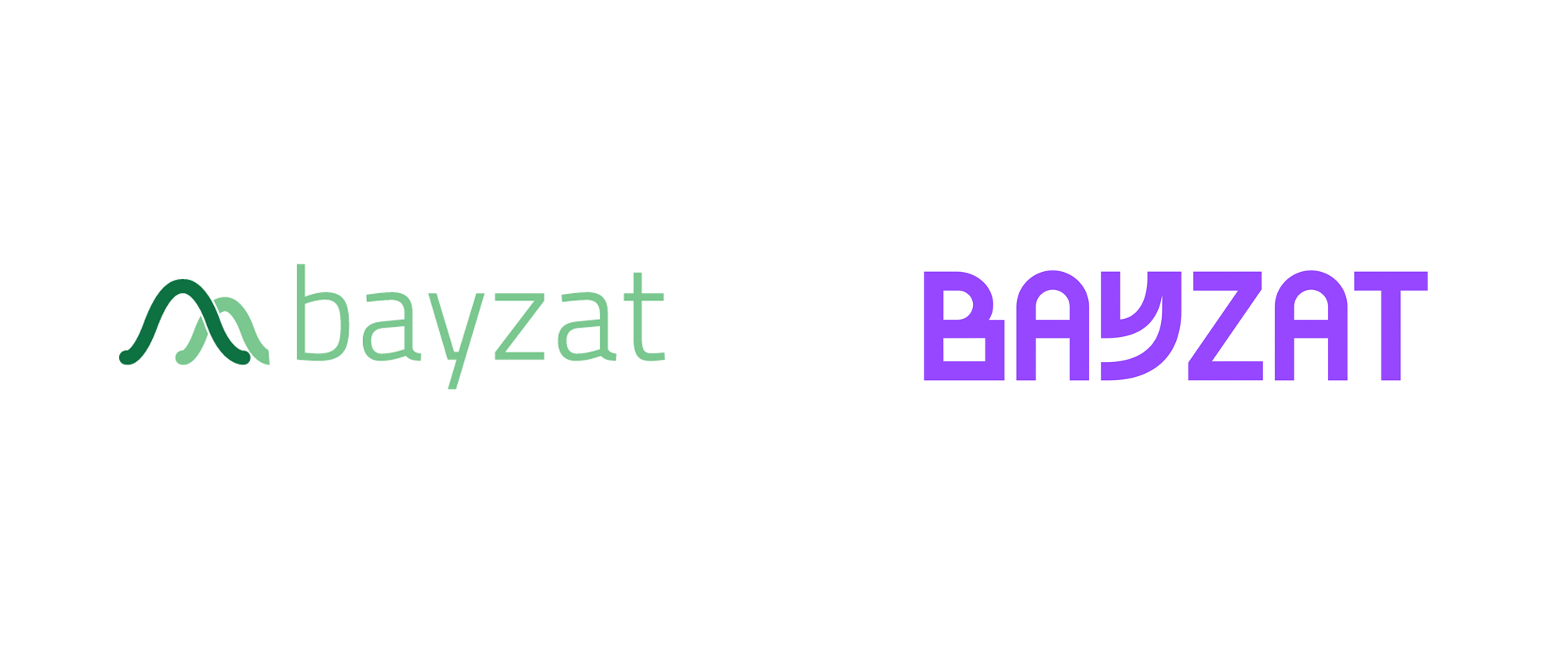
Noted: New Logo and Identity for Bayzat by Ragged Edge
“In any Way, Shape, or Form”

(Est. 2012) "Bayzat is the work life platform that benefits everyone. We are redefining the way work works for the better, making automated HR, payroll, employee benefits, and insurance a possibility for all businesses. Our unique solutions are based on the needs of people like you, and can free your team to do work that matters. And the time and money we'll save you, can be spent taking your business and employee experience to the next level."
Design by
Ragged Edge (London, UK)
Related links
Ragged Edge project page
Relevant quote
Bayzat had built a next-level HR, payroll and insurance technology platform. But they wanted to go further, fundamentally changing how employers and employees work. First in the UAE, then internationally. They needed a brand that went beyond features and benefits. A brand with the power to open up new possibilities for work life.
Bayzat is a machine of possibility. Lift the hood and you’ll see it combines technicality and precision with imagination and humanity. This is where our identity stems from. The logo and graphic system of shapes work together to represent this visually. While the unconventional confidence of our tone of voice means we can convey both the vision and the function. And for a B2B2C brand to stand out amid a sea of corporate blue, we are purple and proud.
Images (opinion after)


Opinion
The old logo was odd, with two graph-like curves awkwardly overlapping each other and complemented by an overly techie typeface. The new logo is also odd but at least it’s done so purposefully as part of a broad visual language of odd-ness. I wouldn’t say I like the new logo because, well, I don’t — the “B” is too clunky and the “Y” gives me shivers — but I definitely appreciate its playfulness and the willingness of the client to go with something so unconventional. However, I think all the letters should have been pushed to their extreme, instead of only a couple because the normal letters stand out more for their normal-ness than the weird letters for their weirdness. The identity doubles down on oddity by introducing a series of energetic misshaped shapes that give visual form to the premise that Bayzat’s software is a combination of “technicality and precision with imagination and humanity” — it’s a bit of a stretch, sure, but I’m willing to buy what they are selling. The applications have a nice energy and positivity to them with a good selection of stock photography and the masking of photos inside the funky shapes. Overall, this has its quirks (within the quirks) but it’s an approach that works well for the product, making HR, insurance, and payroll not feel like a drag.
In ấn Anpic In nhãn mác Anpic In brochure Anpic In card visit Anpic In catalogue Anpic In thiệp cưới Anpic In tờ rơi Anpic
In Ấn Anpic – Nổi Tiếng In Đẹp In Nhanh
Số 5 Ngõ 75 Nguyễn Xiển, Thanh Xuân, Hạ Đình, Hà Nội
0963223884
baogiainananh@gmail.com
https://anpic.vn
https://g.page/inananpic
In nhãn mác Anpic ✅ In brochure Anpic ✅ In card visit Anpic ✅ In catalogue Anpic ✅ In thiệp cưới Anpic ✅ In tờ rơi Anpic
https://anpic.vn/in-nhan-mac-dep
https://anpic.vn/in-brochure
https://anpic.vn/in-an
https://anpic.vn/in-voucher-in-phieu-giam-gia-khuyen-mai
#inananpic
Comments
Post a Comment