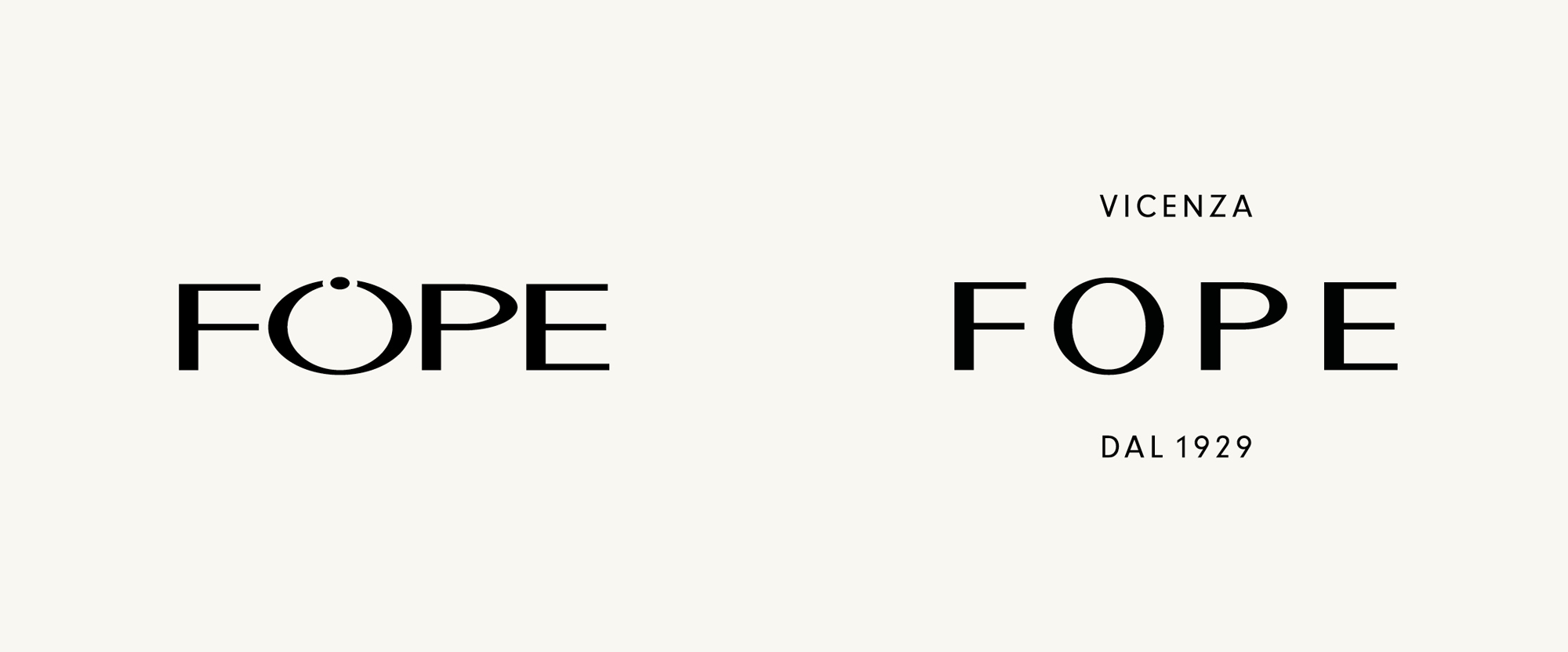
Noted: New Logo and Identity for FOPE by North
“A Glimmer of Fope”

(Est. 1929) "FOPE (Fabbrica Oreficeria Preziosi Esportazione, Factory Goldsmiths Precious Export in English) is an Italian goldsmith, an international company, a tradition that has evolved to become one of the world's most sought-after jewellery brands. Its headquarters - management and production - are located in Vicenza, Italy, where the company's roots are and where a continuous progress proudly takes place thanks to the skilled craftsmen and to the precision of the machines, most of which are custom-made. Founded in 1929, FOPE is an innovation-oriented brand and is committed to offer the highest quality and an unmistakable handwriting to all its collections. Every day, each jewel is created in-house with love and passion and then shipped to the best stores around the world."
Design by
North (London, UK)
Related links
N/A
Relevant quote
The Fope logo has been restructured to subtly imply the elegant simplicity and rhythm of the signature chains whilst maintaining an indication of the lettering in the company’s previous logo. ‘Vicenza’ and ‘Dal 1929’ (Since 1929) have been included to communicate Fope’s provenance and stature to a growing audience.
A new brand colour has been introduced in order to unify Fope’s expression. The colour is derived from the roof of the iconic Basilica Palladiana in Vicenza. The particular tone was chosen as a compliment to the gold of Fope’s jewellery.
North have also designed a heritage roundel containing the origin of Fope’s name: Fabbrica Oreficeria Preziosi Esportazione (translating into English as meaning ‘Factory Goldsmiths Precious Export’. The roundel serves to communicate Fope’s evocative foundations in manufacturing and craftsmanship.
A new approach to Fope’s photography was conceived to help elevate the product within the audience’s imagination. The resulting imagery is a direct response to the physicality of the products themselves — beauty through movement and repetition are at the core of Fope’s signature chains.
Images (opinion after)


Opinion
The old logo had the right idea of turning the “O” into a bracelet (or possibly too, a ring) but the result wasn’t very elegant, in part because I’m pretty sure that typography was stretched horizontally and the “O” was way too wide. The new logo is dead-simple but it’s a beautiful execution of a high-contrast sans serif with the right spacing. Nothing groundbreaking, just fancy AF. The smaller “VICENZA” and “DAL 1929” are just right and it’s so satisfying that the two lines are the same width. The roundel takes that same typography and sets the full name in a circle, making it look like one of their bracelets. The green color is lovely and I love where it comes from. More than a slew of elements, this identity revolves (sometimes literally) around product photography and repeating, overlaid arrangements of it, creating some stunning compositions that — if you have the money and taste for it — sell themselves. The little green boxes for the rings are yet another nice execution with the logo debossed on the outside and the roundel debossed on the inside of what looks like a very rub-able material. Overall, this is a very sophisticated, restrained, and enticing jewelry brand.
In ấn Anpic In nhãn mác Anpic In brochure Anpic In card visit Anpic In catalogue Anpic In thiệp cưới Anpic In tờ rơi Anpic
In Ấn Anpic – Nổi Tiếng In Đẹp In Nhanh
Số 5 Ngõ 75 Nguyễn Xiển, Thanh Xuân, Hạ Đình, Hà Nội
0963223884
baogiainananh@gmail.com
https://anpic.vn
https://g.page/inananpic
In nhãn mác Anpic ✅ In brochure Anpic ✅ In card visit Anpic ✅ In catalogue Anpic ✅ In thiệp cưới Anpic ✅ In tờ rơi Anpic
https://anpic.vn/in-nhan-mac-dep
https://anpic.vn/in-brochure
https://anpic.vn/in-an
https://anpic.vn/in-voucher-in-phieu-giam-gia-khuyen-mai
#inananpic
Comments
Post a Comment