Noted: New Logo and Identity for KABOOM!
“I Wanna Be in the Boom Where it Happens”
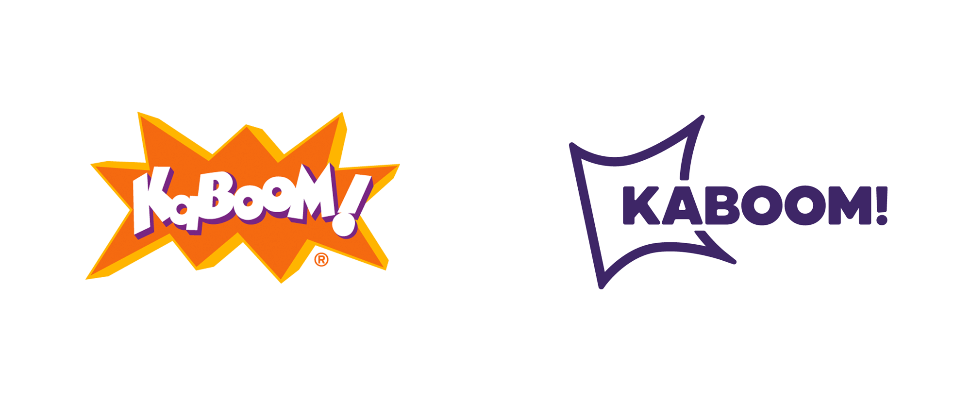
(Est. 1996) "KABOOM! works with communities to build incredible, kid-designed playspaces that help give kids in every zip code the opportunity to thrive. Kids who don't have access to play miss out on childhood and are denied critical opportunities to build physical, social and emotional health. For more than two decades, we've teamed up with bold, inspiring partners and community members, starting with the kids themselves, to understand each neighborhood's unique aspirations. Then we build incredible places to play, inspired by their design, courage and leadership. Over the last 23 years, we've built or improved 17,000+ playspaces, engaged more than 1.5 million community members and brought joy to over 11 million kids. As we look to the future, we'll continue our efforts to build collective action and community opportunity, spark hope and enable kids to reach their full potential. And we promise that we won't stop until we put an end to playspace inequity. For good."
Design by
N/A
Related links
KABOOM! Twitter announcement
KABOOM! Brand Book (PDF)
Relevant quote
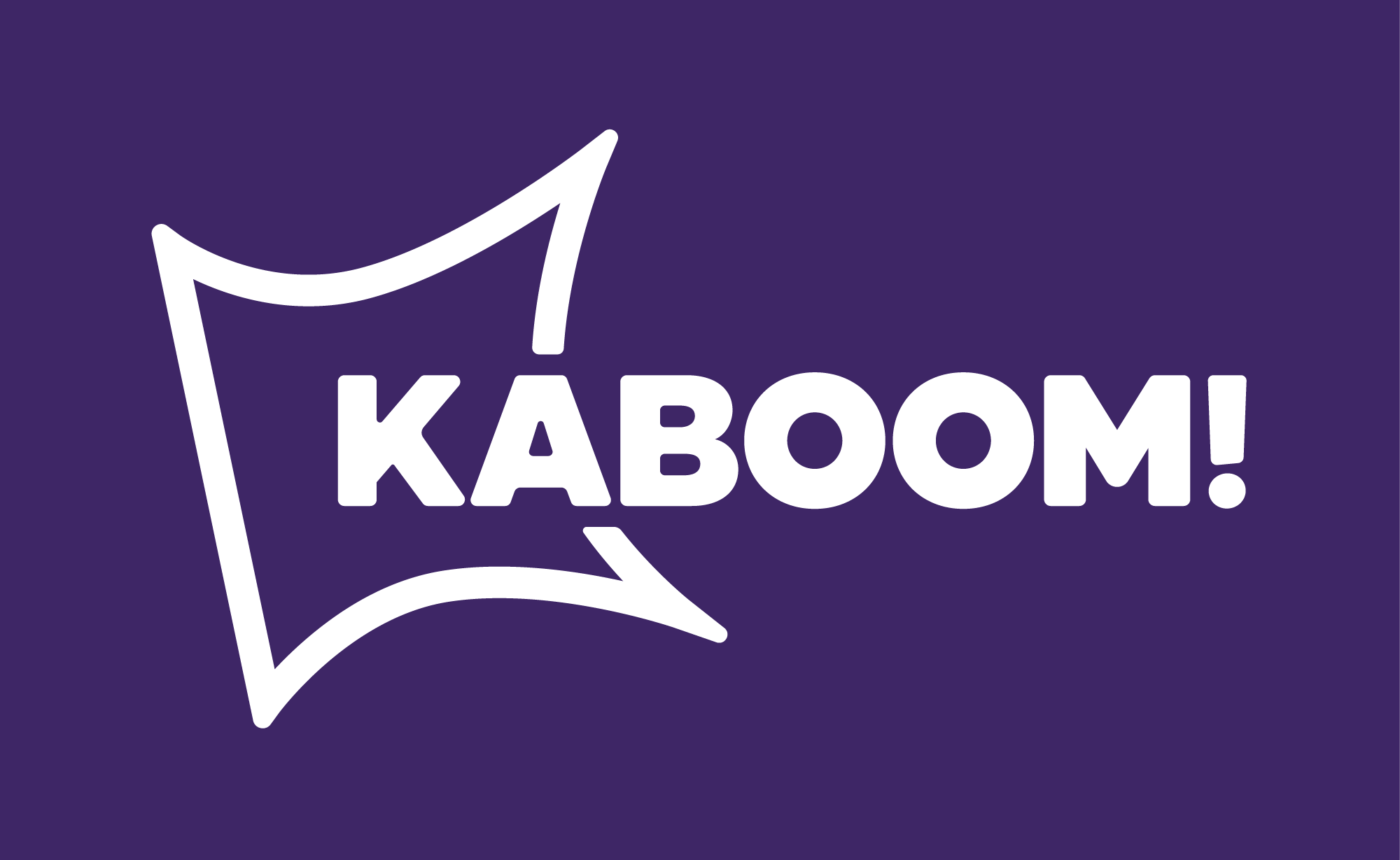
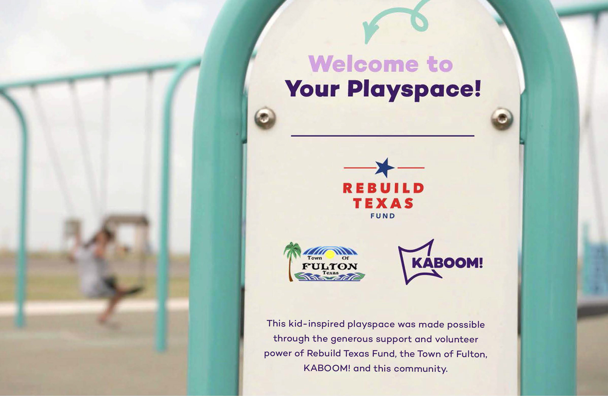
Our logo is the core of our brand identity. The mark in our logo positions KABOOM! as the spark for playspace equity. With a new refined aesthetic to one that’s contemporary and established, our logo sets up KABOOM! to be known by its full, true mission to not only build playspaces but to ensure playspace equity for every kid.
Images (opinion after)
Opinion
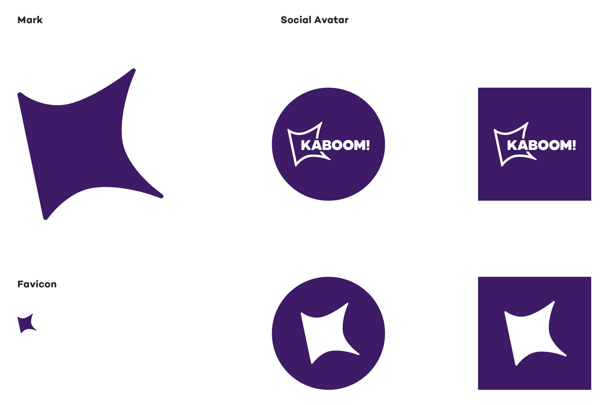
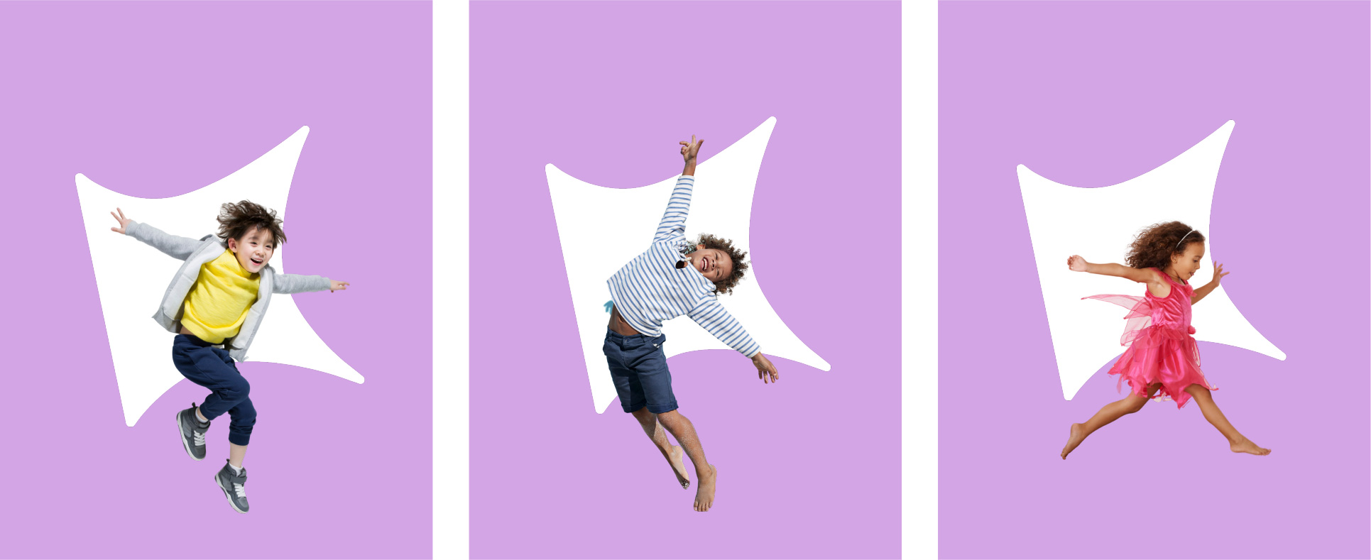
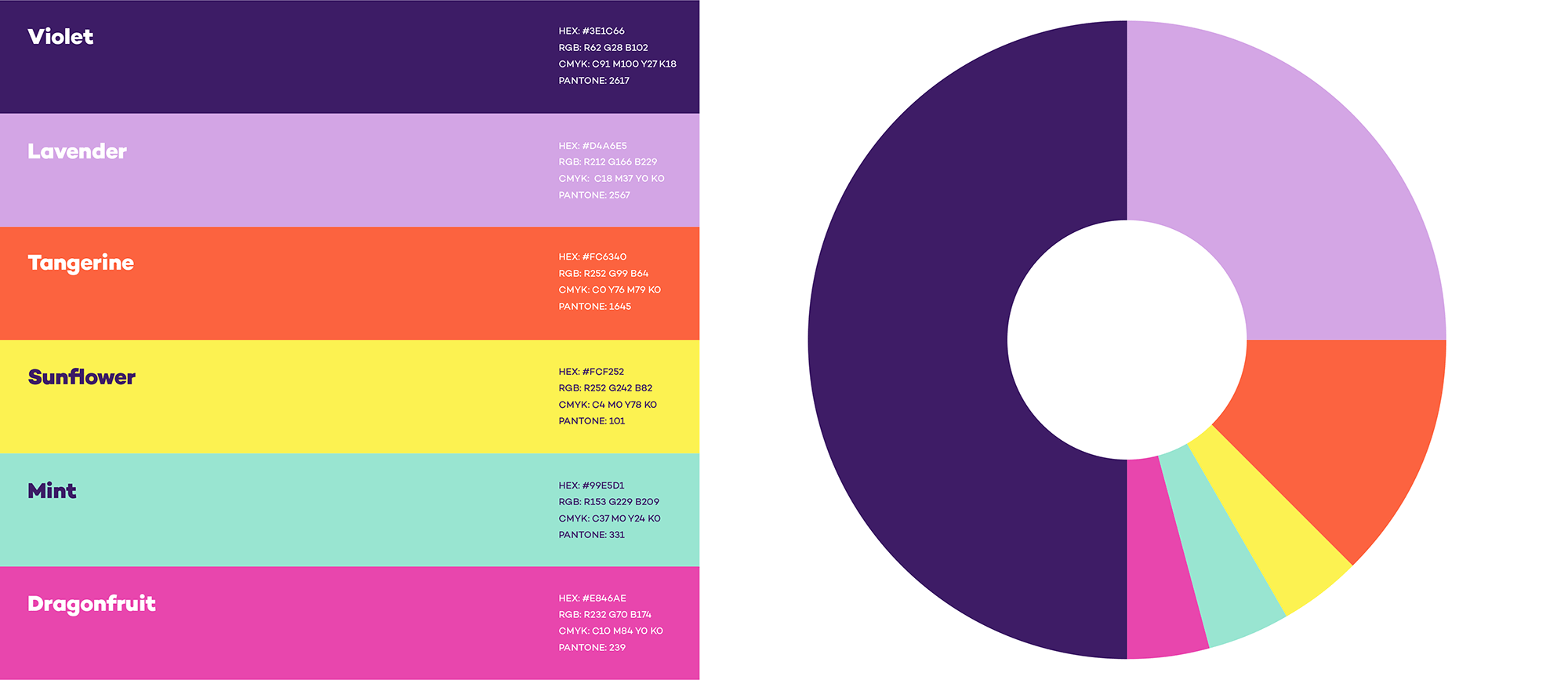
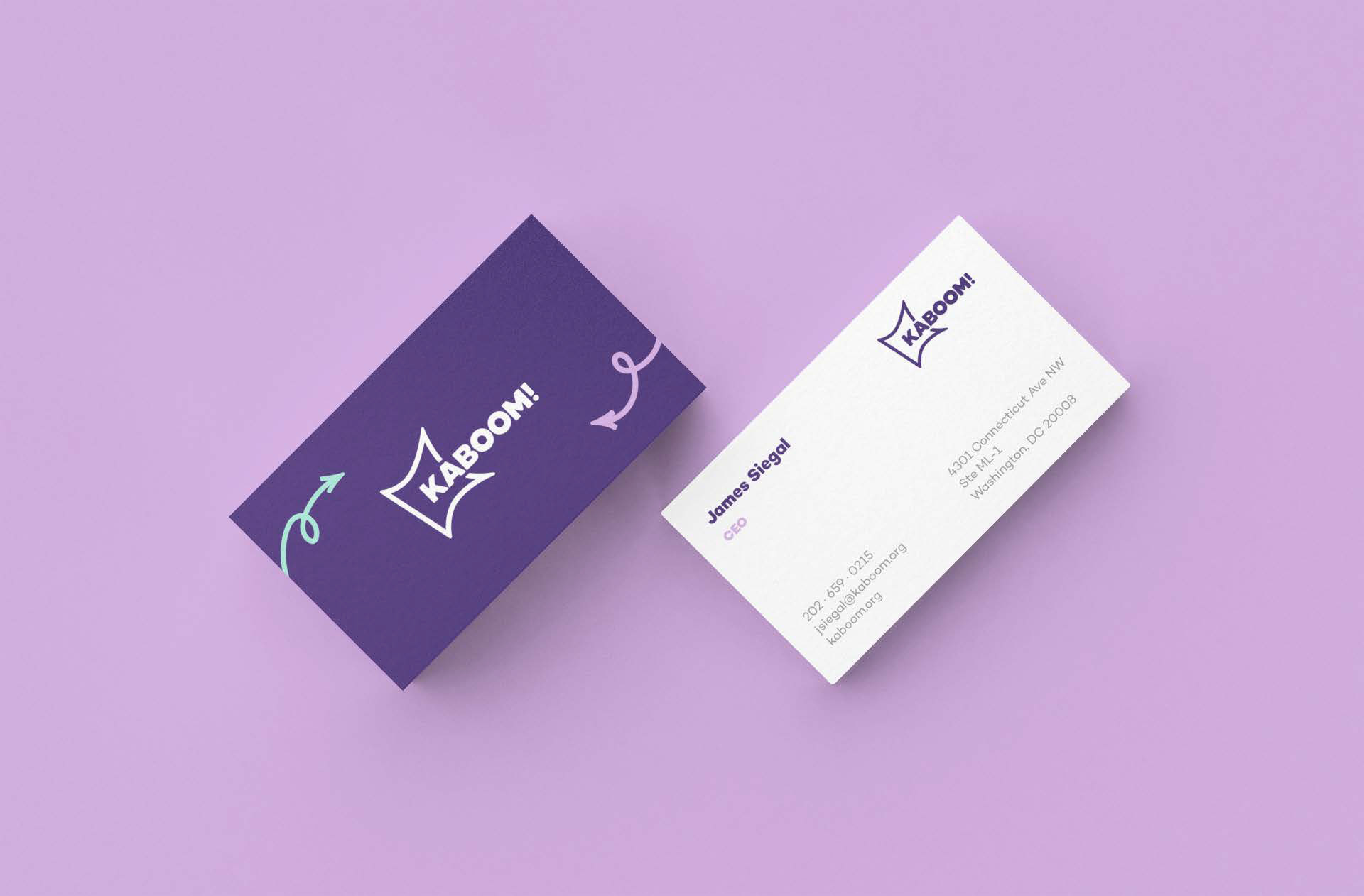
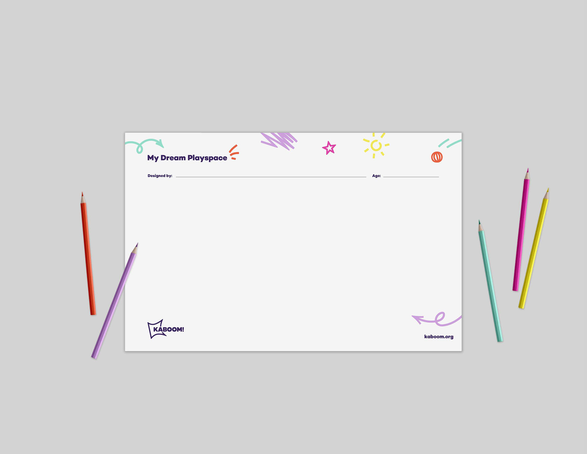
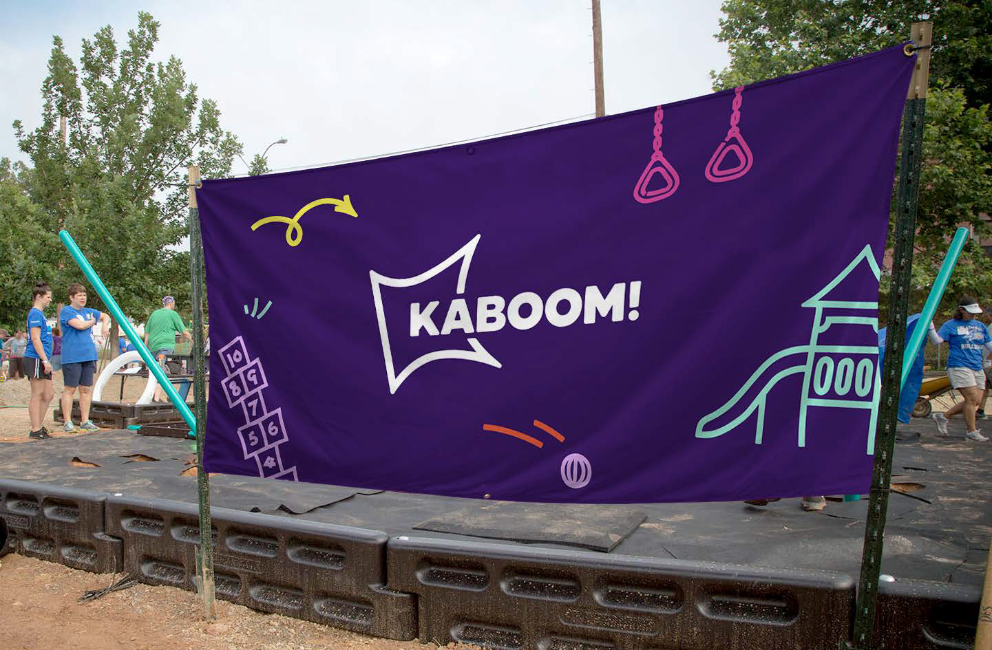
The old logo was energetic for sure but it felt too much like just a comic book graphic and not enough like a large nonprofit organization. The name alone is enough of a kaboom that it doesn’t need the full-on bombastic graphic treatment as the new logo demonstrates. The abstracted “K” that looks like a spark provides just the right amount of visual excitement in an otherwise restrained logo. The wordmark is chunky and with rounded corners, both of which make perfect sense for the name and focus of the organization. I really like how the curve of the “K” mark aligns with the angles of the “A”, making for a pretty clever integration of the two elements. The “K” mark on its own is pretty strong too and looks really good in a solid color — it will need a good year or two to become easily associated with KABOOM! but it has potential. The applications are a little shy at the moment but there is a decent start there with the loopy arrows and squiggles. Lots of room to grow with such a solid logo but definitely still has to evolve, which will probably happen once they move from renders to actual applications. Overall, a great, feel-good logo evolution for a fantastic, feel-good organization.
In ấn Anpic In nhãn mác Anpic In brochure Anpic In card visit Anpic In catalogue Anpic In thiệp cưới Anpic In tờ rơi Anpic
In Ấn Anpic – Nổi Tiếng In Đẹp In Nhanh
Số 5 Ngõ 75 Nguyễn Xiển, Thanh Xuân, Hạ Đình, Hà Nội
0963223884
baogiainananh@gmail.com
https://anpic.vn
https://g.page/inananpic
In nhãn mác Anpic ✅ In brochure Anpic ✅ In card visit Anpic ✅ In catalogue Anpic ✅ In thiệp cưới Anpic ✅ In tờ rơi Anpic
https://anpic.vn/in-nhan-mac-dep
https://anpic.vn/in-brochure
https://anpic.vn/in-an
https://anpic.vn/in-voucher-in-phieu-giam-gia-khuyen-mai
#inananpic
Comments
Post a Comment