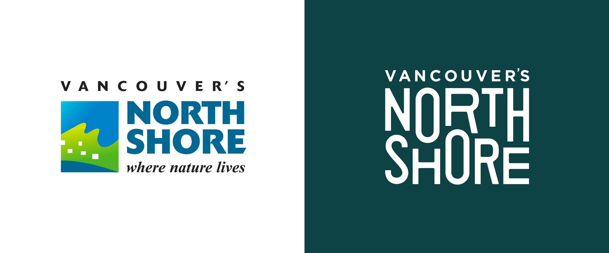
Noted: New Logo and Identity for Vancouver's North Shore by LOKI
“More Bang for Shore Buck”

"Vancouver's North Shore Tourism Association is a destination marketing organization comprised of three municipalities: The District of West Vancouver, The District of North Vancouver, and the City of North Vancouver that promotes the North Shore as a unique, multifaceted, four-season tourist destination."
Design by
LOKI (Vancouver, BC)
Related links
LOKI project page
Relevant quote
Vancouver’s North Shore’s visual identity represents the massive spectrum of activities and locations within the region. It was important to create a visual identity flexible enough to work alongside visuals from these varied activities and stakeholders as well as partner regions in Vancouver and British Columbia.
The logo’s elongated typography reflects the destination’s multiple perspectives with a nod to its history and indigenous carvings and the mountainous landscape visible from Downtown Vancouver that the area is so well known for.
We created a visual identity system that underscores The North Shores strengths: Community spirit, Outdoor recreation, Nature, and the proximity to the City of Vancouver. The vibrant and bold colours are inspired from the regions heritage and roots.
Images (opinion after)


Opinion
The old logo was pretty bad, with a strange icon that looked like buildings in a forest being washed by a wave and some clunky typography with some really strange “R”s. The new logo immediately feels more outdoorsy and exciting with the shifting and dipping heights of the letters that interlock convincingly enough — I question the larger space under the “T” but other than that it gets the point across. My main concern with the logo would be that it has a similar vibe to that of Super Natural British Columbia, which is exacerbated by that logo appearing on VNC’s website. The logo works nicely in the color palette, which has a good range of unexpected colors (i.e., it’s not all greens), and I really like the effect it has when it gets cropped in the multi-color version. The applications start off good with great outdoor pictures and the logo and some badges but then things start to go south (ha! get it?) with the use of a unicase font, Charoe, and some warped headlines, both of which feel forced into what’s otherwise a bold and confident identity. Overall, this has the right intention but maybe just needs to be pared back in how many visual languages it tries to dig into.
In ấn Anpic In nhãn mác Anpic In brochure Anpic In card visit Anpic In catalogue Anpic In thiệp cưới Anpic In tờ rơi Anpic
In Ấn Anpic – Nổi Tiếng In Đẹp In Nhanh
Số 5 Ngõ 75 Nguyễn Xiển, Thanh Xuân, Hạ Đình, Hà Nội
0963223884
baogiainananh@gmail.com
https://anpic.vn
https://g.page/inananpic
In nhãn mác Anpic ✅ In brochure Anpic ✅ In card visit Anpic ✅ In catalogue Anpic ✅ In thiệp cưới Anpic ✅ In tờ rơi Anpic
https://anpic.vn/in-nhan-mac-dep
https://anpic.vn/in-brochure
https://anpic.vn/in-an
https://anpic.vn/in-voucher-in-phieu-giam-gia-khuyen-mai
#inananpic
Comments
Post a Comment