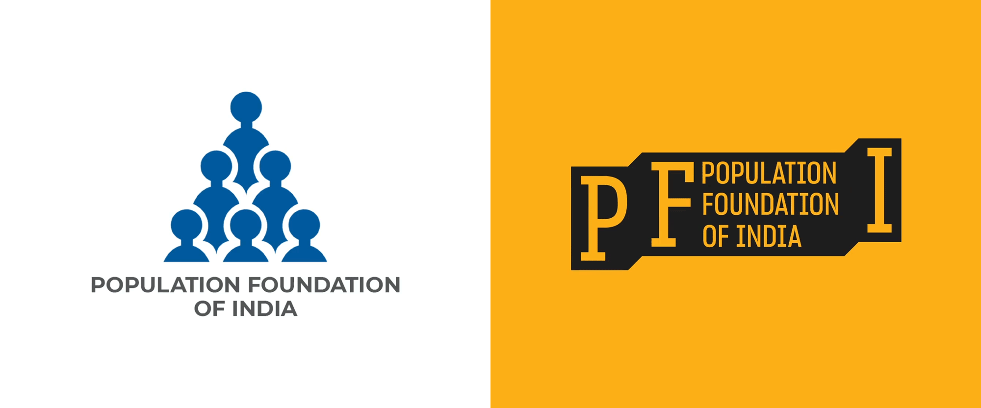
Noted: New Logo and Identity for Population Foundation of India by Lopez Design
“One Step Ahead”

(Est. 1970) "Population Foundation of India (PFI) is a national NGO, which promotes and advocates for the effective formulation and implementation of gender sensitive population, health and development strategies and policies. The organisation was founded in 1970 by a group of socially committed industrialists under the leadership of the late JRD Tata and Dr Bharat Ram. PFI addresses population issues within the larger discourse of empowering women and men, so that they are able to take informed decisions related to their fertility, health and well-being. It works with the government, both at the national and state levels, and with NGOs, in the areas of community action for health, urban health, scaling up of successful pilots and social and behaviour change communication. PFI is guided by an eminent governing board and advisory council comprising distinguished persons from civil society, the government and the private sector."
Design by
Lopez Design (Gurugram, Haryana, India)
Related links
Lopez Design project page
Relevant quote
Our strategic direction addresses the crucial challenge of making the right association with the word 'population’ which is often thought to mean ‘numbers'. Whereas, PFI is invested in bettering the lives of people through family planning initiatives and support for policy. Hence, our approach re-orients the core messaging and positions PFI as a people's organization with radical on-the-ground programs.
The strategy ‘PFI steps up for people’ takes shape as bold visuals in the new palette of yellow and black that brings out its forward-thinking stance.
PFI acts like the building blocks of society to channelise resources and makes important connections between society, the individual and the nation, which are all interlinked. The dynamic system forges a way to give expression to PFI’s intrinsically layered approach towards impacting and bettering the lives of people.
Images (opinion after)


Opinion
The old logo was fairly literal and unfortunately not very well executed — it could have been an interesting starting point for a contemporary interpretation but since part of the goal was to move away from the idea of counting people it makes sense to abandon it. The new logo has a strong premise that visualizes the organization’s mission to “step up for people” with a holding shape that steps up with each letter and can extend and contract at each level to accommodate different messaging or the organization’s full name. The thin, condensed, slab serif approach is a welcome change of pace and it looks industrious and hard-working. I deeply wish the name of the organization had been set in a monospace font (or at least readjusted in a monospace approach) given that “population” and “foundation” have the same number of characters and it would have filled in the space between the name and the “I” much better. The applications are okay and extend the construction of the logo into a visual language that makes sense with bands of color that step up as needed. It’s a little inconsistent in that sometimes the bands are black, sometimes black with a yellow line across the middle, and sometimes a yellow overlay. Picking one consistent approach would be better because then there is also a case of boxed typography as in the billboard directly above that adds yet another style that needs to be decoded. Overall, the tone and messaging is right, especially with the black and white imagery, but the typography and graphic devices could use some consistency and more energy.
In ấn Anpic In nhãn mác Anpic In brochure Anpic In card visit Anpic In catalogue Anpic In thiệp cưới Anpic In tờ rơi Anpic
In Ấn Anpic – Nổi Tiếng In Đẹp In Nhanh
Số 5 Ngõ 75 Nguyễn Xiển, Thanh Xuân, Hạ Đình, Hà Nội
0963223884
baogiainananh@gmail.com
https://anpic.vn
https://g.page/inananpic
In nhãn mác Anpic ✅ In brochure Anpic ✅ In card visit Anpic ✅ In catalogue Anpic ✅ In thiệp cưới Anpic ✅ In tờ rơi Anpic
https://anpic.vn/in-nhan-mac-dep
https://anpic.vn/in-brochure
https://anpic.vn/in-an
https://anpic.vn/in-voucher-in-phieu-giam-gia-khuyen-mai
#inananpic
Comments
Post a Comment