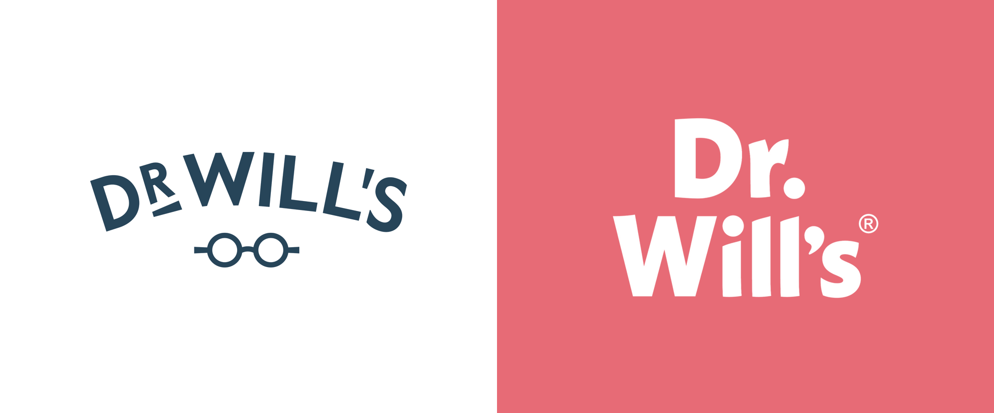
Noted: New Logo and Packaging for Dr Will's by B&B Studio
“What’s Up, Doc!”

(Est. 2016) "Dr Will's are the UK 's first all natural condiment brand. We make naturally sweet, honestly delicious products and prove that natural sugar sources are better than the artificial alternative." The brand is named after its founder, an actual doctor, Dr Will Breakey, who partnered with restaurateur Josh Rose.
Design by
N/A
Related links
B&B Studio (London, UK)
Relevant quote
B&B’s design brings flavour to the forefront with full-colour labels that create a rich and foodie palette across the range. The design introduces a new brand equity – an exclamation mark – executed on pack in complementary colour tones and featuring an ever-changing dot to designate flavour. From a tomato or beetroot on ketchups, to an egg or avocado on mayos, the dot delivers additional taste cues in a fresh and witty way.
As a small brand in categories heavily dominated by big mainstream players, Dr Will’s has to make an impact where it matters – on the supermarket shelf. Traditionally, niche sauce brands conform to premium codes that successfully communicate their product superiority, but can get lost on shelf and tend to alienate more mainstream consumers. For B&B, creating design that captured ‘mainstream premium’ was essential, enabling the brand to broaden the appeal of better-for-you sauces and encourage consumers to question what goes into the dominating brands. The exclamation mark was the perfect design solution – instantly grabbing attention at shelf and challenging the habitual behaviour that characterises shopping within the sauce aisle.
Images (opinion after)


Opinion
The old logo had a pretty decent wordmark, typeset on a curve, and accompanied by some charming glasses that when paired with the word “Doctor” instantly make you think of, well, a doctor. Nothing amazing but pretty good. The new logo drops the doctor-ness and simply introduces a buoyant wordmark in a slightly quirky sans serif. On its own, it’s not much but it’s enjoyable and sets the tone for a more playful identity punctuated by the new exclamation point where the dot changes to reflect the product. It’s a fun graphic device and it looks great on the new packaging that uses bold, flat colors and some pretty good typography. The main problem is now the disconnect between the name of the product and the look of the product… nothing about the new design says “doctor” in any way so I feel like there is a little bit of a strategic/branding/synergy issue at the root of the project that the design, as nice as it is, doesn’t quite fit. Still, as mentioned, it’s all very enjoyable and very nicely done.
In ấn Anpic In nhãn mác Anpic In brochure Anpic In card visit Anpic In catalogue Anpic In thiệp cưới Anpic In tờ rơi Anpic
In Ấn Anpic – Nổi Tiếng In Đẹp In Nhanh
Số 5 Ngõ 75 Nguyễn Xiển, Thanh Xuân, Hạ Đình, Hà Nội
0963223884
baogiainananh@gmail.com
https://anpic.vn
https://g.page/inananpic
In nhãn mác Anpic ✅ In brochure Anpic ✅ In card visit Anpic ✅ In catalogue Anpic ✅ In thiệp cưới Anpic ✅ In tờ rơi Anpic
https://anpic.vn/in-nhan-mac-dep
https://anpic.vn/in-brochure
https://anpic.vn/in-an
https://anpic.vn/in-voucher-in-phieu-giam-gia-khuyen-mai
#inananpic
Comments
Post a Comment