Noted: New Logo and Packaging for Encona by Uniform
“Straight from the Sauce”
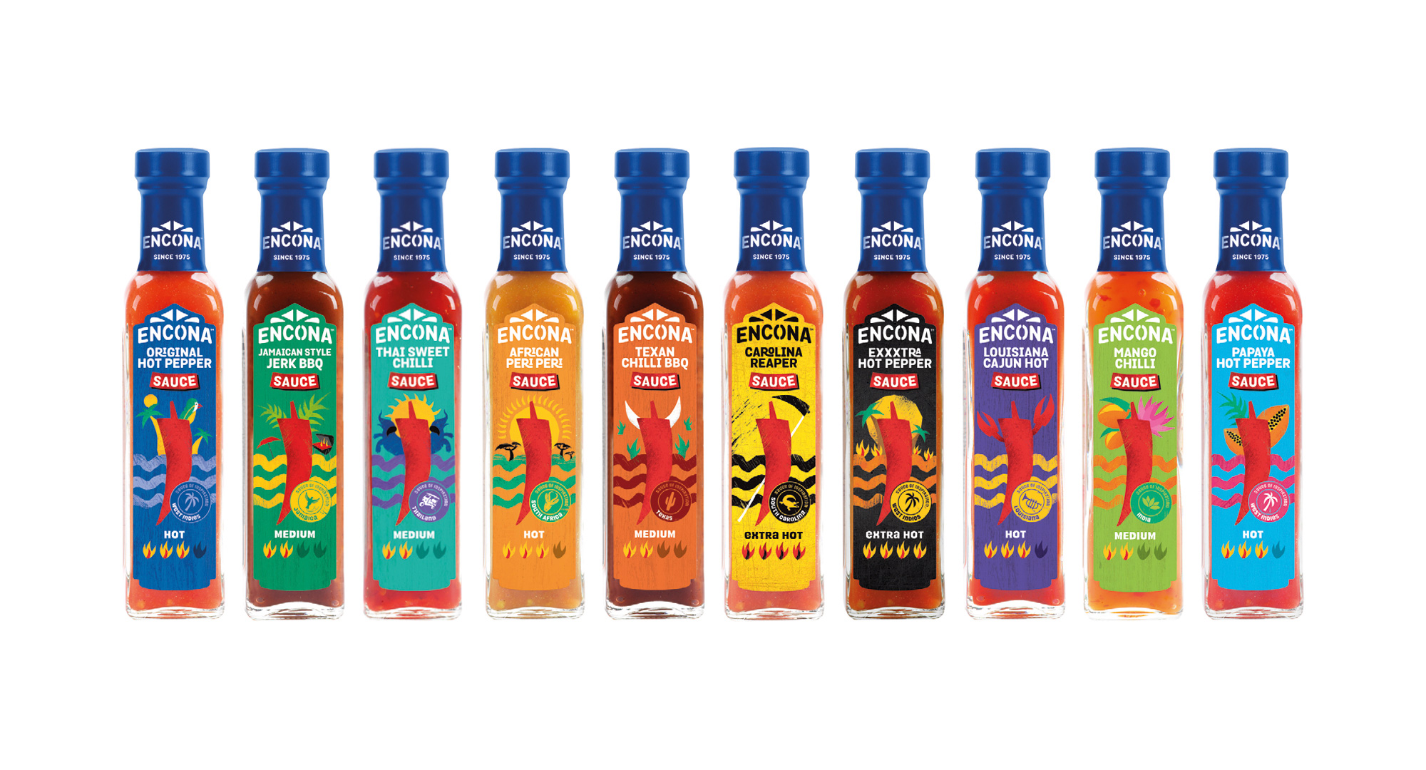
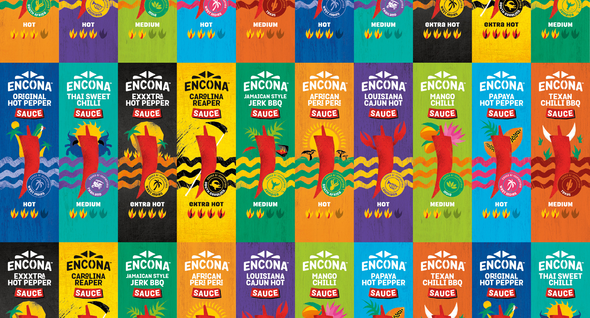
(Est. 1975) "Encona, the brand, was first registered by parent company Enco Products Ltd. Soon after the company was incorporated in December 1946 and during the 1950's and 1960's, when West Indians first began to arrive in the UK, the company sold Caribbean grocery products such as peas, beans and pounded yam, ground rice and cornmeal products. It was not until 1975 that we first introduced our Hot Pepper Sauce range under the 'Encona' name...and we haven't looked back since! Having passionately served the Caribbean community in the UK for over 40 years in supplying delicious, quality sauces prepared to original recipes and containing blends of the most authentic chillies, spices and ingredients. Our iconic square embossed glass bottle has become the category symbol for quality, trust and delicious, authentic flavours. Whilst other brands have come and gone, Encona have grown to become the definitive number 1 UK Hot Pepper Sauce brand and so too has our customer base grown to include a wider mainstream audience of consumers looking to add a dash of inspiration to their everyday dining occasions. Encona now has a range of over 18 delicious sauces to enjoy with your family and friends. In addition to all your Caribbean favourites, you can now enjoy a variety of flavours from across the globe such as Indian Sweet Mango Chilli, Thai Sweet Chilli, African Peri Peri, Brazilian BBQ and Mexican Smokey Jalapeno."
Design by
Uniform (Liverpool and London, UK)
Related links
Uniform project page
Relevant quote
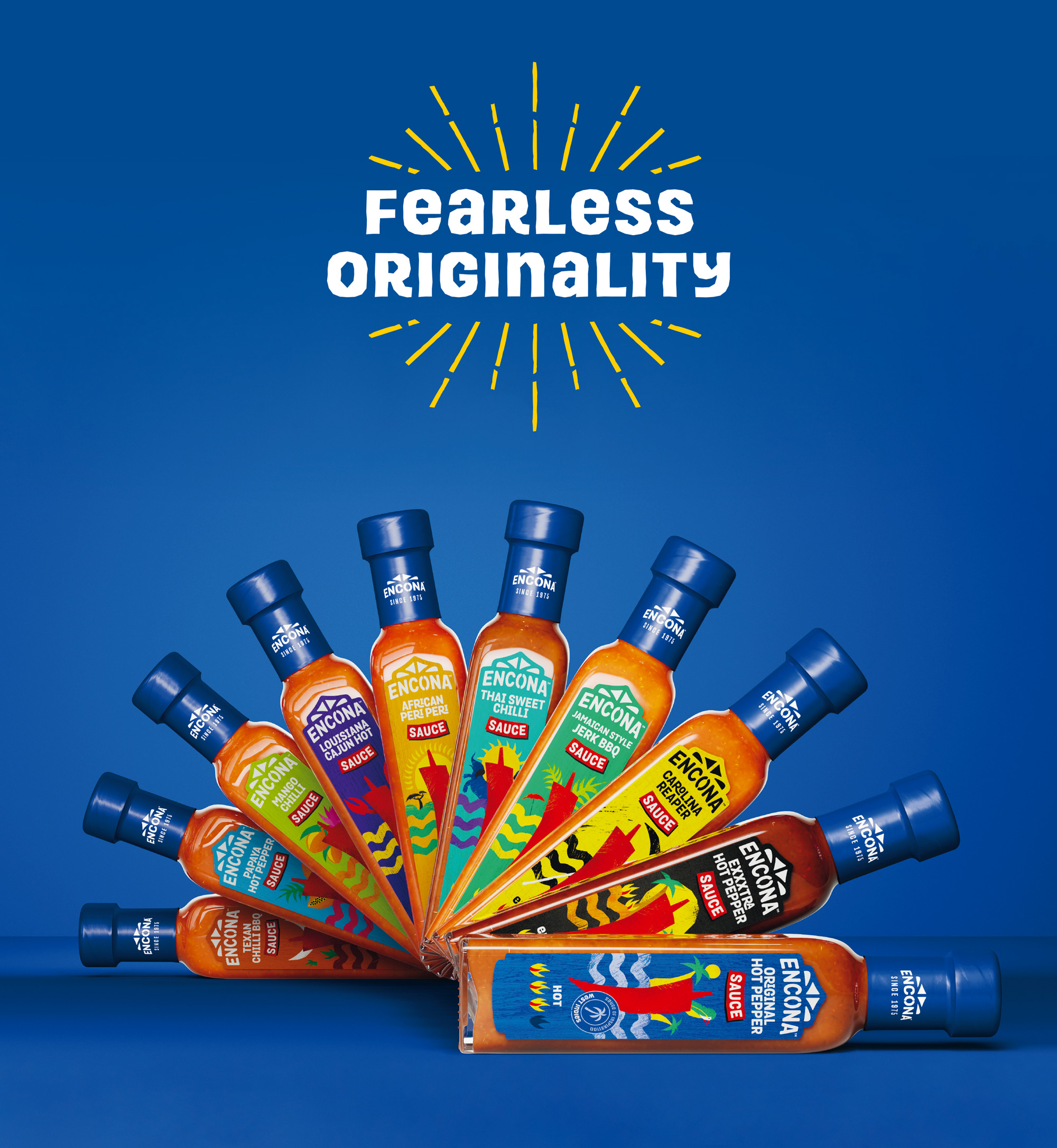
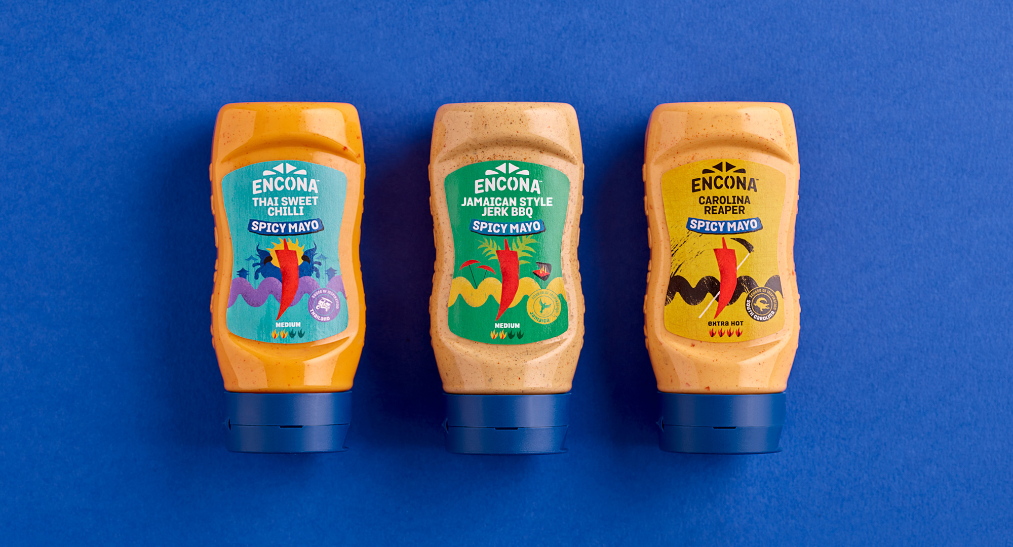
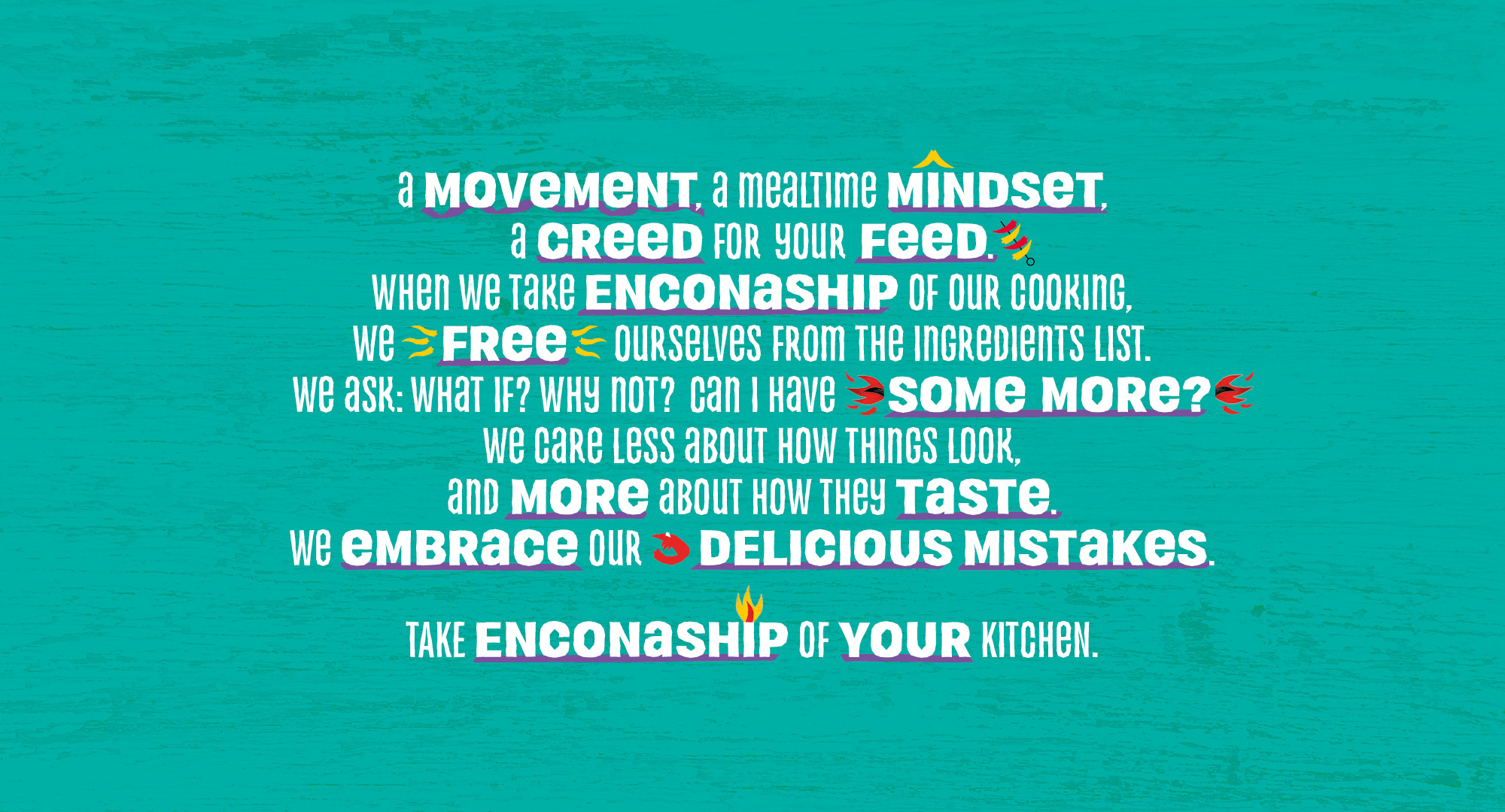
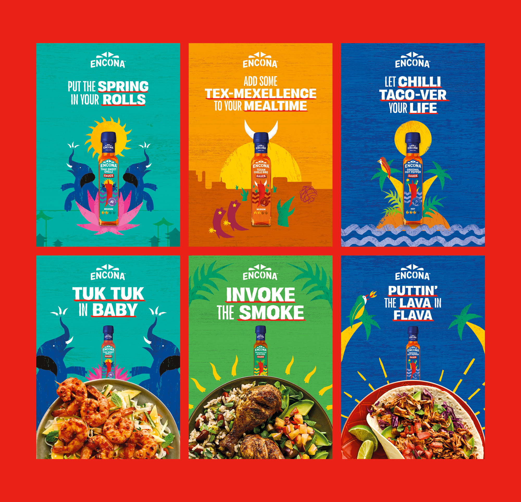
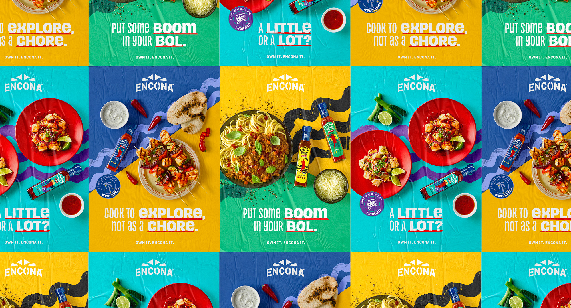
The UK’s number one hot sauce suffered from poor brand recall and shelf standout. Fortunately, in a market where it’s all about heat and dubious provenance, Encona had authentic recipes and dedication to flavour. So we revealed the brand’s fearless originality. More than just another condiment, Encona is an enabler of experimentation. A sauce of inspiration. A brand that says don’t be afraid to make a hash, embrace your delicious mistakes, and take Enconaship of your cooking.
Images (opinion after)

Opinion
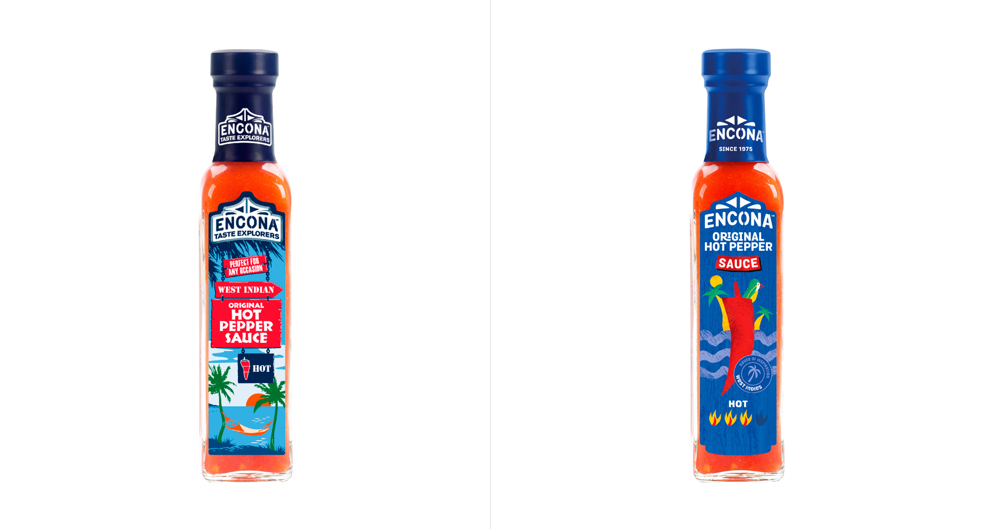
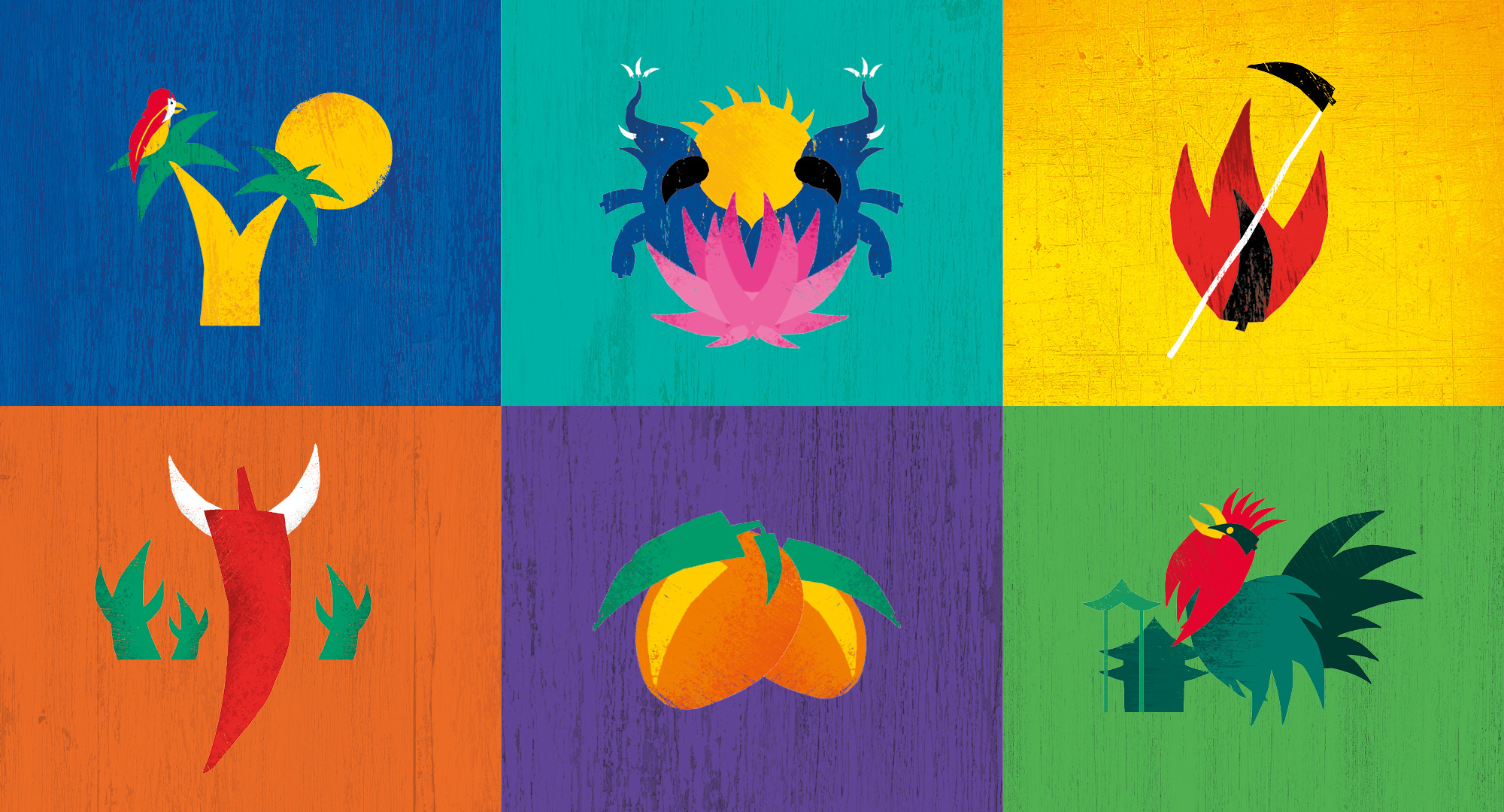
I am not sure what the old logo was about, which means I am not sure what the new logo is about either. I imagine the stencil font maybe has something to do with shipping containers or produce boxes with stencil markings on them but the the dingbats above it are fairly random. With that out of the way, sure, the new logo is an improvement in execution and readability but I’m unsure about how it represents hot sauce — I’m guessing that changing it to something the made more sense was non-negotiable. Oh well. The old packaging was funny, looking more like a postcard advertising a beach-front restaurant than hot sauce but it helped establish illustration as a foundation for the brand. The new illustrations are fun, charming, and colorful. Nothing too high-end or aspirational in a gratuitous way, just a big red chile accompanied by fun graphics. The bottles would definitely catch my attention at the grocery store. In application there is a jungle-y unicase font that, yeah, my inner snob instinctively dislikes but, I gotta admit, there is something fun and liberating about those type treatment images… they remind me of a clip-art book I had in the 1990s that had all these funky, triangle-y graphics. I also appreciate that this is not another design-ified approach that drenches sans serif and minimalism sauce over everything and instead keeps some genuine visual flavor that works perfectly for this product.
In ấn Anpic In nhãn mác Anpic In brochure Anpic In card visit Anpic In catalogue Anpic In thiệp cưới Anpic In tờ rơi Anpic
In Ấn Anpic – Nổi Tiếng In Đẹp In Nhanh
Số 5 Ngõ 75 Nguyễn Xiển, Thanh Xuân, Hạ Đình, Hà Nội
0963223884
baogiainananh@gmail.com
https://anpic.vn
https://g.page/inananpic
In nhãn mác Anpic ✅ In brochure Anpic ✅ In card visit Anpic ✅ In catalogue Anpic ✅ In thiệp cưới Anpic ✅ In tờ rơi Anpic
https://anpic.vn/in-nhan-mac-dep
https://anpic.vn/in-brochure
https://anpic.vn/in-an
https://anpic.vn/in-voucher-in-phieu-giam-gia-khuyen-mai
#inananpic


Comments
Post a Comment