Noted: New Logo, Identity, and Packaging for V by Audsley Designs and TBMC
“All is Fair in Love and Guarana”
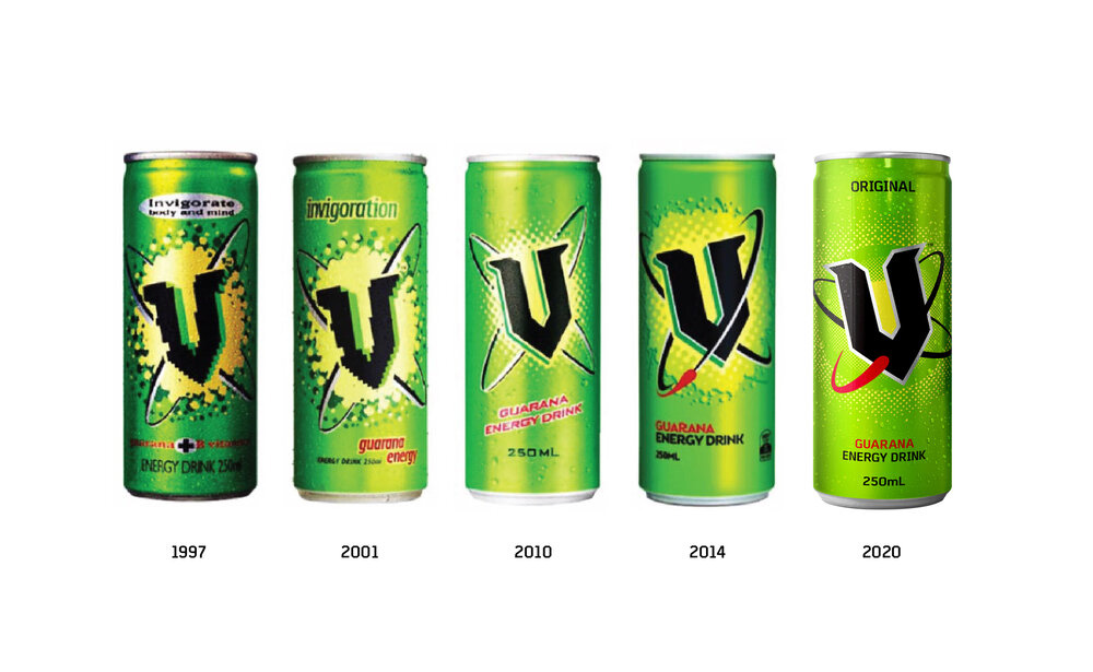
(Est. 1997) "V is an energy drink brand produced by Frucor, a New Zealand-based beverage manufacturer. It was launched in Methven, New Zealand in August 1997 and in Australia in 1999. The product's success, a market share over 60% in New Zealand and 42% in Australia, makes it the most popular brand of energy drink in both countries. V is considered a local rival to Red Bull." (Wikipedia)
Design by
Audsley Designs and TBMC (Sydney, Australia)
Related links
Audsley Designs project page
Relevant quote
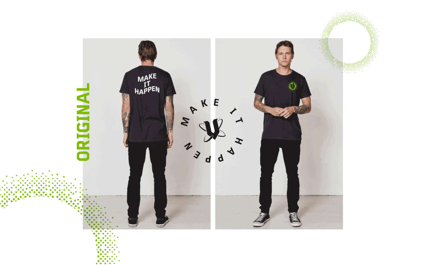
The refreshed V logo and visual assets marks a new phase in the brands life cycle. Leaving the 90s teenage bedroom look behind and smartening up to move with the times.
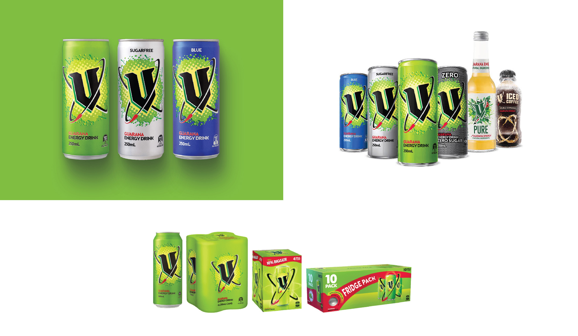
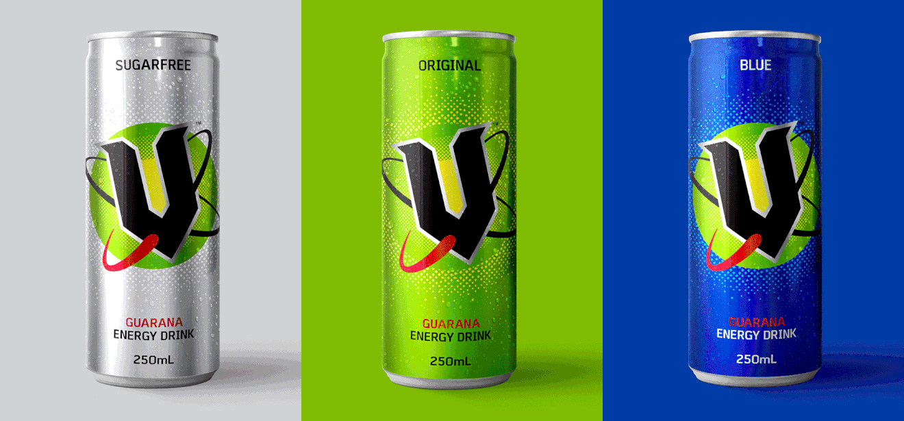
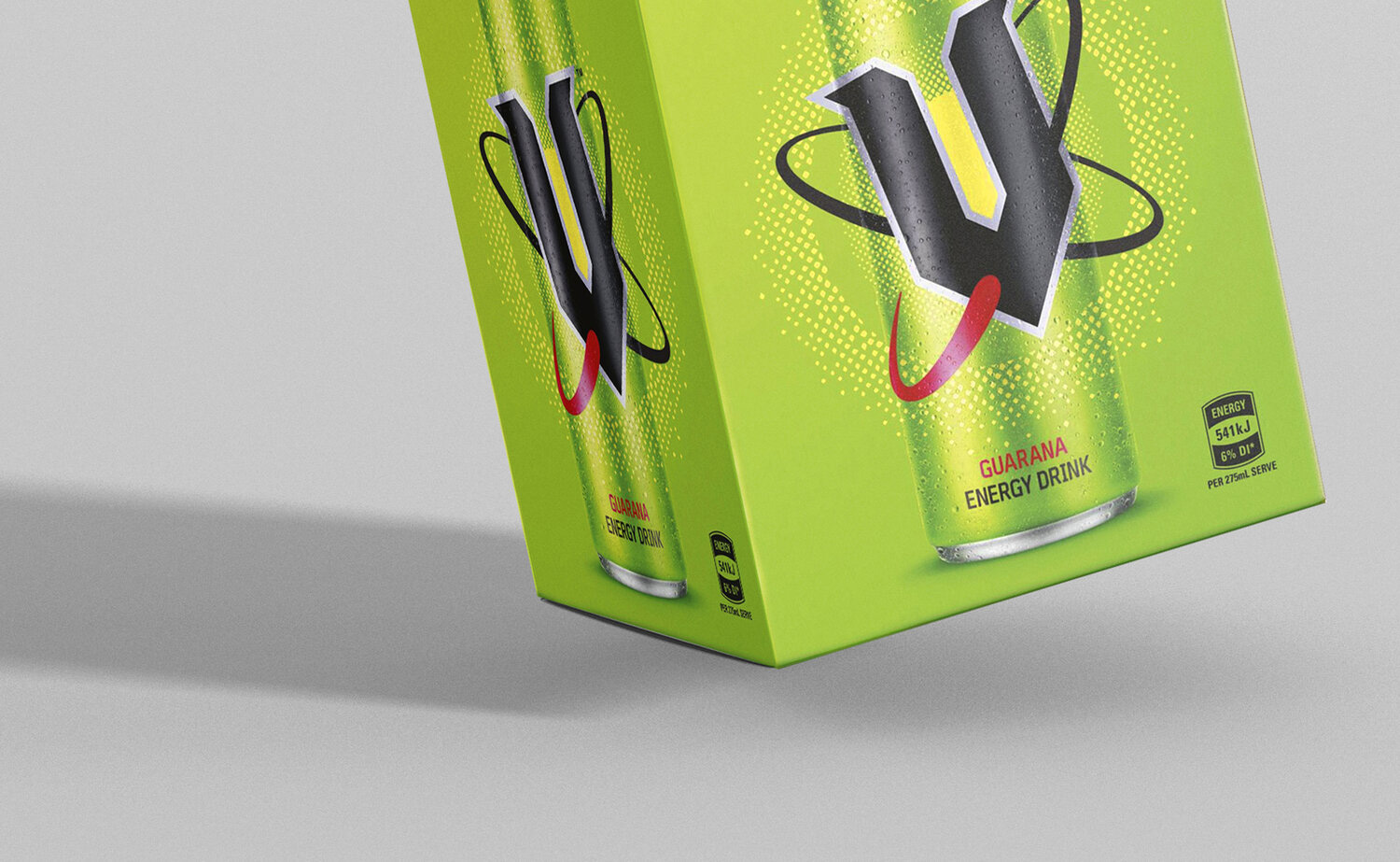
All packaging has now been stripped back to become simply iconic, with a new digital ‘Guarana leaf’ energy portal that houses the redrawn ‘V’ atom logo.
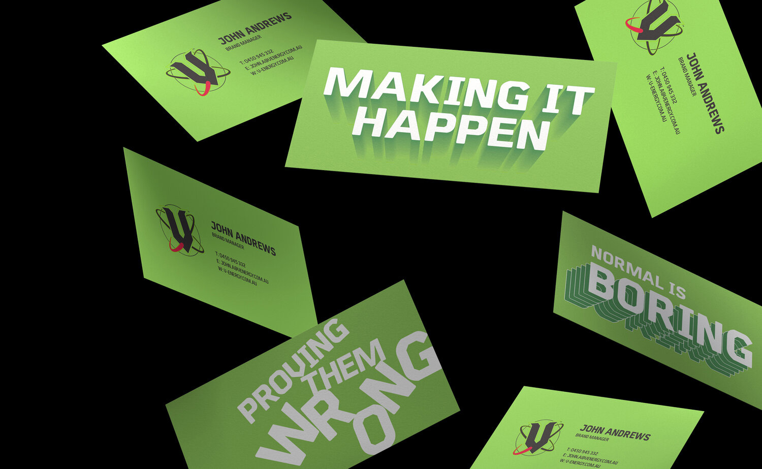
A brand new bespoke set of fonts were purposefully designed with help from the talented Australian Type Foundry, based off the distinctive DNA of the ‘V’ logo. This original branded font asset can now be let loose into the V world, setting a recognisable tone for future campaigns.
Images (opinion after)

Opinion
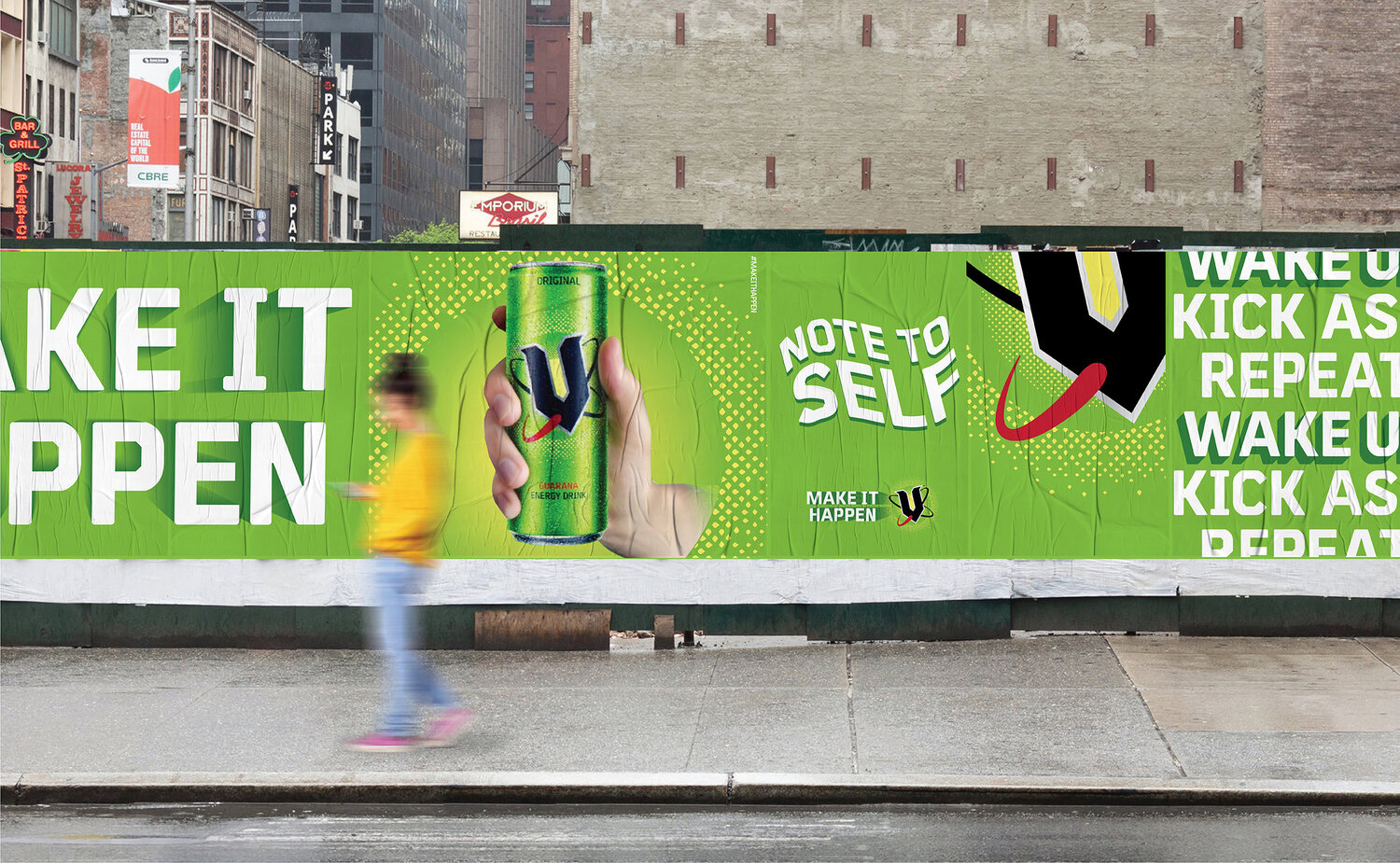
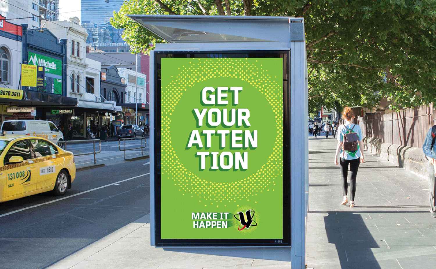
This is one of those reviews where I (and most likely you too as well) have to jump on a different wavelength of what is good and bad because when it comes to energy drinks it’s a whole other visual universe that must be judged on its own. With that mindset change, the old logo was pretty explosive, with the fizzy texture clearly emanating behind the “V” and its, um, atom rings. It was… good. The new logo removes the 3D angle and goes for a “flat” look that makes the logo a little less cartoony but now the atom rings get lost and it’s hard to get a sense of what’s above, what’s under, and what, if anything, is wrapped in the rings. I like the new more subtle fizz explosion but visually it has nothing to do with the rest of the logo. The new logo does look better on the can as the more diffused fizz feels like it lets the color of the can seep through, at least in the “original” flavor because the “blue” and “sugarfree” variations keep an awkward green circle behind the logo. The custom typeface is fine and it seems like it can take on the different shadows and warps of the advertising with some grace. The business cards… yeah… even in this parallel energy drink universe, those are hard to like but the advertising seems to be right on point and ties everything together in its own, relatively cohesive way. Overall, sure, why not?
In ấn Anpic In nhãn mác Anpic In brochure Anpic In card visit Anpic In catalogue Anpic In thiệp cưới Anpic In tờ rơi Anpic
In Ấn Anpic – Nổi Tiếng In Đẹp In Nhanh
Số 5 Ngõ 75 Nguyễn Xiển, Thanh Xuân, Hạ Đình, Hà Nội
0963223884
baogiainananh@gmail.com
https://anpic.vn
https://g.page/inananpic
In nhãn mác Anpic ✅ In brochure Anpic ✅ In card visit Anpic ✅ In catalogue Anpic ✅ In thiệp cưới Anpic ✅ In tờ rơi Anpic
https://anpic.vn/in-nhan-mac-dep
https://anpic.vn/in-brochure
https://anpic.vn/in-an
https://anpic.vn/in-voucher-in-phieu-giam-gia-khuyen-mai
#inananpic


Comments
Post a Comment