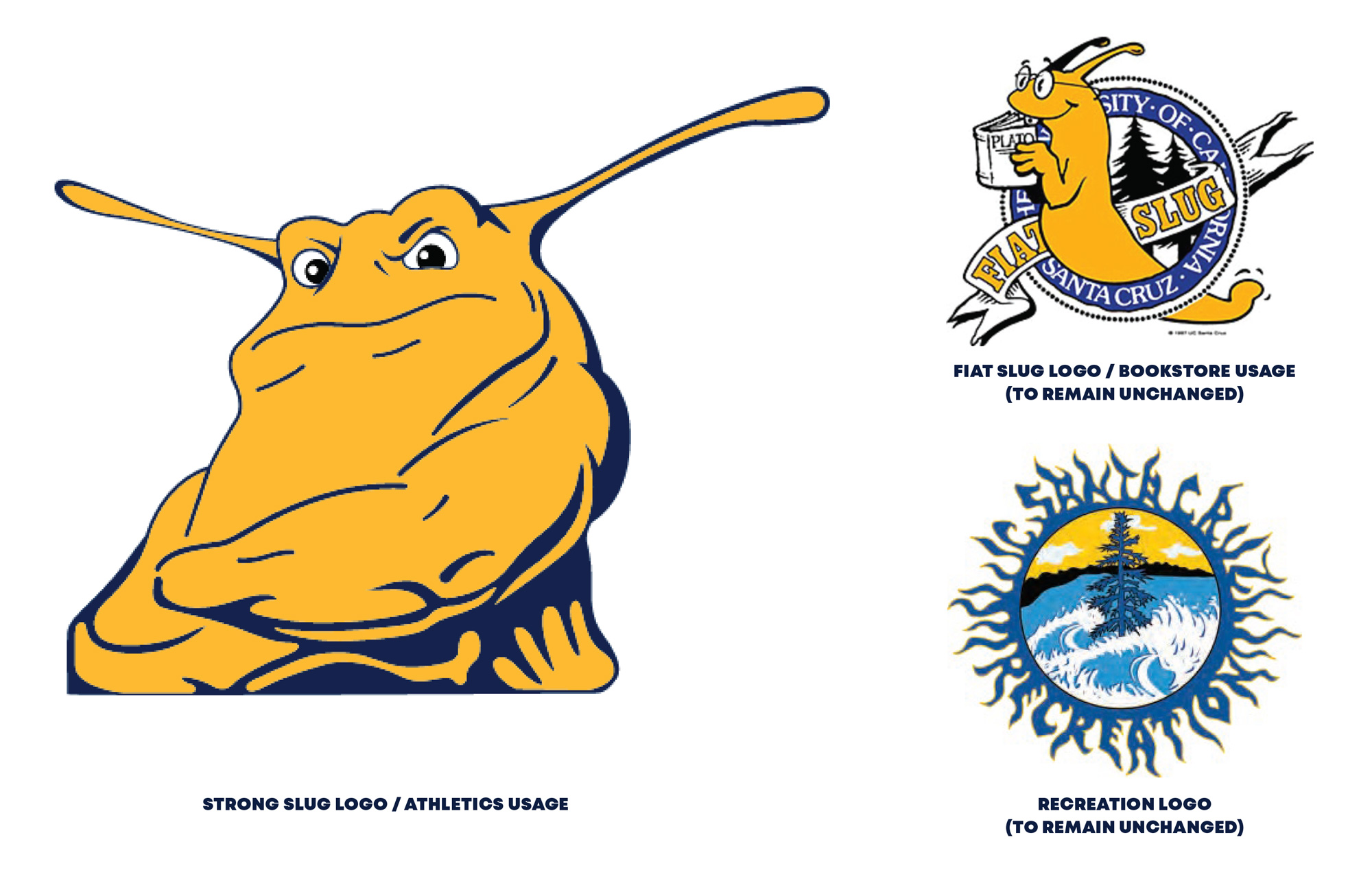
Noted: New Logos for UC Santa Cruz Banana Slugs by Skye Design Studios
“Slug as a Bug in a Rug”

(Est. 1965) "The UC Santa Cruz Banana Slugs are the athletic teams that represent the University of California, Santa Cruz. The Banana Slugs compete in Division III of the NCAA as an independent member. There are fifteen varsity sports - men's and women's basketball, tennis, soccer, volleyball, swimming and diving, cross country, and women's golf. UCSC teams have been Division III nationally ranked in tennis, soccer, men's volleyball, and swimming. UCSC maintains a number of successful club sides." (Wikipedia)
Design by
Skye Design Studios (Florham Park, NJ)
Related links
UC Santa Cruz press release
Public milestones for each design phase
Long video presenting the new design
Relevant quote
As iconic as the Banana Slug mascot has been within the landscape of college athletics in America, the department had never gone through a formal branding process to develop an ownable, trademarked image. Fiat Slug was designated for licensed use through the university bookstore only, and while Strong Slug had become the most notable symbol for the department over the last two decades, it was not officially trademarked, and could not be sold in retail settings. Further, its overall tone and masculine demeanor had proved to be contradictory to the hermaphroditic nature of actual banana slugs as well as divisive within the context of the full university community.
The biggest challenge of the process was doing our best to fully represent the variety of comments and requests submitted by participants, in particular, exploring versions of our slug that were anatomically accurate (four antennae with eyes on the ends of the top two) as well as a versions that aligned with the more caricatured essence of the beloved Fiat Slug, which only had two antennae and eyes on the face. This is where our popular vote format became a really effective tool in the process. We provided the full range of design interpretations, and the community majority dictated our next steps. Interestingly enough, the final mark incorporates aspects of both, with the face being inspired by Fiat Slug and the rest of the body being anatomically accurate, complete with the pneumostome breathing hole on the right side of its mantle.
In addition to the natural beauty of the UC Santa Cruz campus and surrounding region, it's presence nationally as that of a trailblazer - particularly in regard to science, social justice, activism, and environmental awareness - set the foundation of the identity. Our slug needed to be on a mission!
Images (opinion after)


Opinion
Before writing this post I was unaware of the existence of the Banana Slug as a university mascot and I am now fascinated by its origin story — a resilient one, surviving opposition from the university chancellor — and place in mascot history as well as in pop culture not to mention the fact that, simply, a banana slug mascot exists. The old and closest thing to an official logo slug was a beefed-up, cross-armed slug boi that, to its credit, managed to look intimidating but we shan’t kid ourselves, it was effin’ weird. The new slug is, and I mean this without irony or sarcasm, amazing. Within the realm of American sports, taking into account the outlandish minor league baseball team names and logos, this is outlandish in it name and mascot but the execution is as serious as it gets. The slug is dynamic, bold, and determined without being overly fierce, spiky, or exaggerated. The bonus that it’s in the shape of a “C” is fantastic and the gesture pays off with its stroke thickness matching that of the “U”, making it perfectly readable as “UC”. The “Redwood” version with the trees is also great, blending in perfectly with the shield shape and looking as if it’s out in the forest being a predator, which is hilarious. I also love the detail of the trees leaning inwards. Even the wordmark, which is very much in the visual language of American sports, is very welcome here as the italic structure and flattened bottoms match the essence of the slug, being all curvy and wiggly but straight-up flat on the bottom. The applications are all good because it’s basically the logos on things and the logos are great so the things look great. Overall, this is an impressive feat of taking what could easily be a joke of a logo and transforming it into something to be worn with pride, not to mention that the various phases of the project were open to public input and this not only survived but even thrived in the process.
In ấn Anpic In nhãn mác Anpic In brochure Anpic In card visit Anpic In catalogue Anpic In thiệp cưới Anpic In tờ rơi Anpic
In Ấn Anpic – Nổi Tiếng In Đẹp In Nhanh
Số 5 Ngõ 75 Nguyễn Xiển, Thanh Xuân, Hạ Đình, Hà Nội
0963223884
baogiainananh@gmail.com
https://anpic.vn
https://g.page/inananpic
In nhãn mác Anpic ✅ In brochure Anpic ✅ In card visit Anpic ✅ In catalogue Anpic ✅ In thiệp cưới Anpic ✅ In tờ rơi Anpic
https://anpic.vn/in-nhan-mac-dep
https://anpic.vn/in-brochure
https://anpic.vn/in-an
https://anpic.vn/in-voucher-in-phieu-giam-gia-khuyen-mai
#inananpic
Comments
Post a Comment