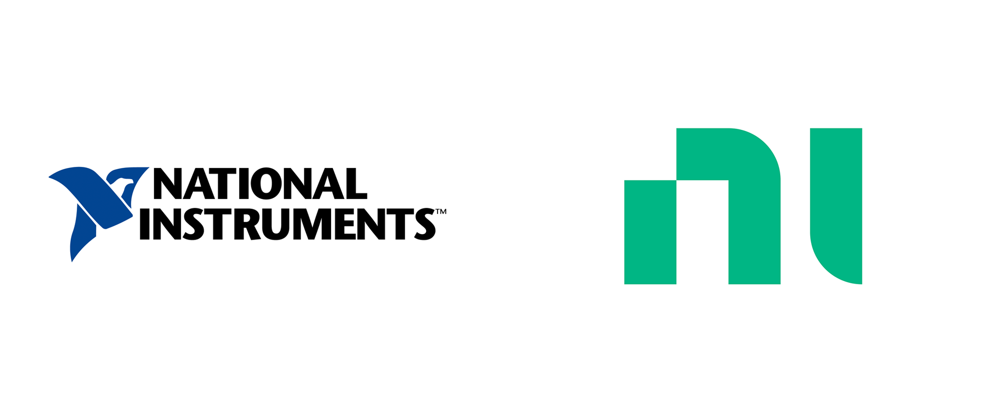
Noted: New Name and Logo for NI
“The Knights Who Say “Ni!””

(Est. 1976) "NI (National Instruments), is an American multinational company with international operation. Headquartered in Austin, Texas, it is a producer of automated test equipment and virtual instrumentation software. Common applications include data acquisition, instrument control and machine vision." (Wikipedia)
Design by
N/A
Related links
NI press release
Relevant quote
National Instruments today unveiled an updated brand identity including a new logo, visual identity, enhanced digital experiences and a brand campaign recognizing and celebrating the contributions of the engineers and enterprises who “Engineer Ambitiously™” every day. Now known simply as NI, the company is recommitting itself to connecting the bold people, ideas and technologies required to push our world forward.
Images (opinion after)


Opinion
There is not a lot to go on on this redesign but I received plenty of tips about it and it’s a fairly large corporation so let’s get to it with what we have. First, the name… we will have to assume that people internally and perhaps their B2B peers refer to National Instruments as N.I. and since I don’t socialize with anyone in the automated test equipment industry I really have no clue but, at the gut level, calling this company “NI” — whether that’s spelled out as En Aye or a single word as Nee — it doesn’t sound very convincing. “National Instruments” had gravitas and presence. “NI” has neither and the new logo doesn’t quite help give it the oomph it needs. I like the new logo — although I don’t get the notch on the top-left corner of the “n” — as a graphic statement but it feels unfinished or like something is missing to it, which doesn’t help that the name itself feels like a lot is missing. The old logo wasn’t great by any means but it at least implied American-National-ness with its (kinda hilarious) eagle-N and the bold wordmark was as blunt as it gets. Not all is bad, as there seems to be a solid visual language building around the logo, with patterns made up of the square-with-one-rounder-corner element and a nice range of greens. Going through their Twitter account, there are a couple of videos that have some nice motion graphics on them so perhaps when and if the design firm responsible puts up a case study there might some more to stuff to better analyze this. One highlight though is the new tagline, “Engineer Ambitiously”, which sounds strong and empowering. Overall, for now, “Ni!”.
In ấn Anpic In nhãn mác Anpic In brochure Anpic In card visit Anpic In catalogue Anpic In thiệp cưới Anpic In tờ rơi Anpic
In Ấn Anpic – Nổi Tiếng In Đẹp In Nhanh
Số 5 Ngõ 75 Nguyễn Xiển, Thanh Xuân, Hạ Đình, Hà Nội
0963223884
baogiainananh@gmail.com
https://anpic.vn
https://g.page/inananpic
In nhãn mác Anpic ✅ In brochure Anpic ✅ In card visit Anpic ✅ In catalogue Anpic ✅ In thiệp cưới Anpic ✅ In tờ rơi Anpic
https://anpic.vn/in-nhan-mac-dep
https://anpic.vn/in-brochure
https://anpic.vn/in-an
https://anpic.vn/in-voucher-in-phieu-giam-gia-khuyen-mai
#inananpic
Comments
Post a Comment