Reviewed: New Logo and Identity for Popeyes by Jones Knowles Ritchie
“Eyes on the Prize”
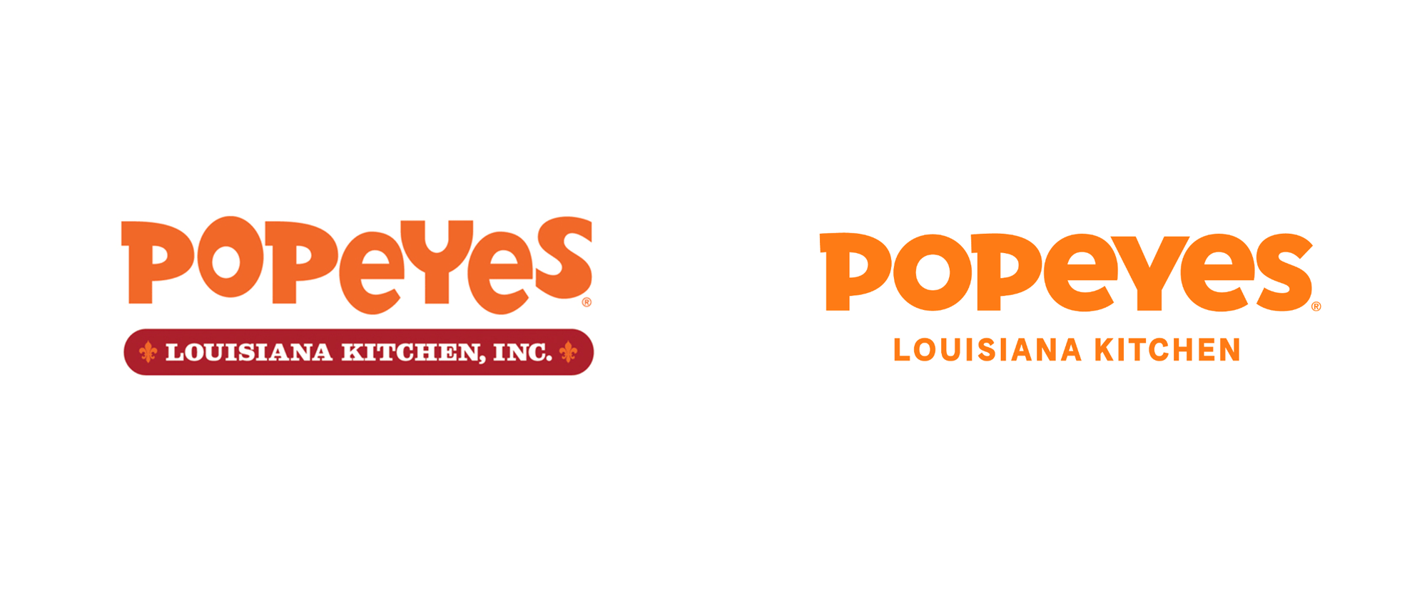
Established in 1927, Popeyes is a quick service restaurant offering a unique New Orleans style menu featuring spicy chicken, chicken tenders, fried shrimp, and other regional items. From a single location in the New Orleans suburb of Arabi, Popeyes has grown into one of the world's largest chicken quick service restaurants with over 3,300 locations in the U.S. and around the world and last year's launch of its Chicken Sandwich brought unprecedented sales growth and popularity. With a big worldwide expansion in process, Popeyes has introduced a new identity designed by Jones Knowles Ritchie.
To further spread the product love to even more guests, it was time for Popeyes® to translate its Louisiana roots in a more modern approach by completely redesigning the brand's visual identity and restaurant image. Jones Knowles Ritchie, the international award-winning design firm, led the brand's visual identity refresh which started with the logo. The old playful Popeyes® logo has been matured with a contemporary typeface that elevates the brand and reflects the culinary depth that goes into making the Popeyes® signature foods.
Fans can expect to see the new visual identity continue to roll out across Popeyes® restaurants from packaging including to-go bags, cups and boxes, as well as uniforms and other merchandise. The hand-drawn brand pattern featured on the packaging reflects the vibrancy of Louisiana culture and the unadulterated joy that goes into making Popeyes® food.
Popeye's press release

The new logo is the perfect next step in the evolution of the Popeyes logo that began with the previous logo designed by Pentagram's DJ Stout in 2008 that tempered the zaniness of its predecessor and provided the first step of moving into orange as the brand color. The old logo retained the bounciness and quirkiness of the logo that came before it and served as a great segue into this new iteration that brings all the letters in line while maintaining the unicase approach and the unique traits of the "P"s and the "S". It's undoubtedly a more mature look but it still has enough of the unique personality that makes Popeyes, Popeyes.
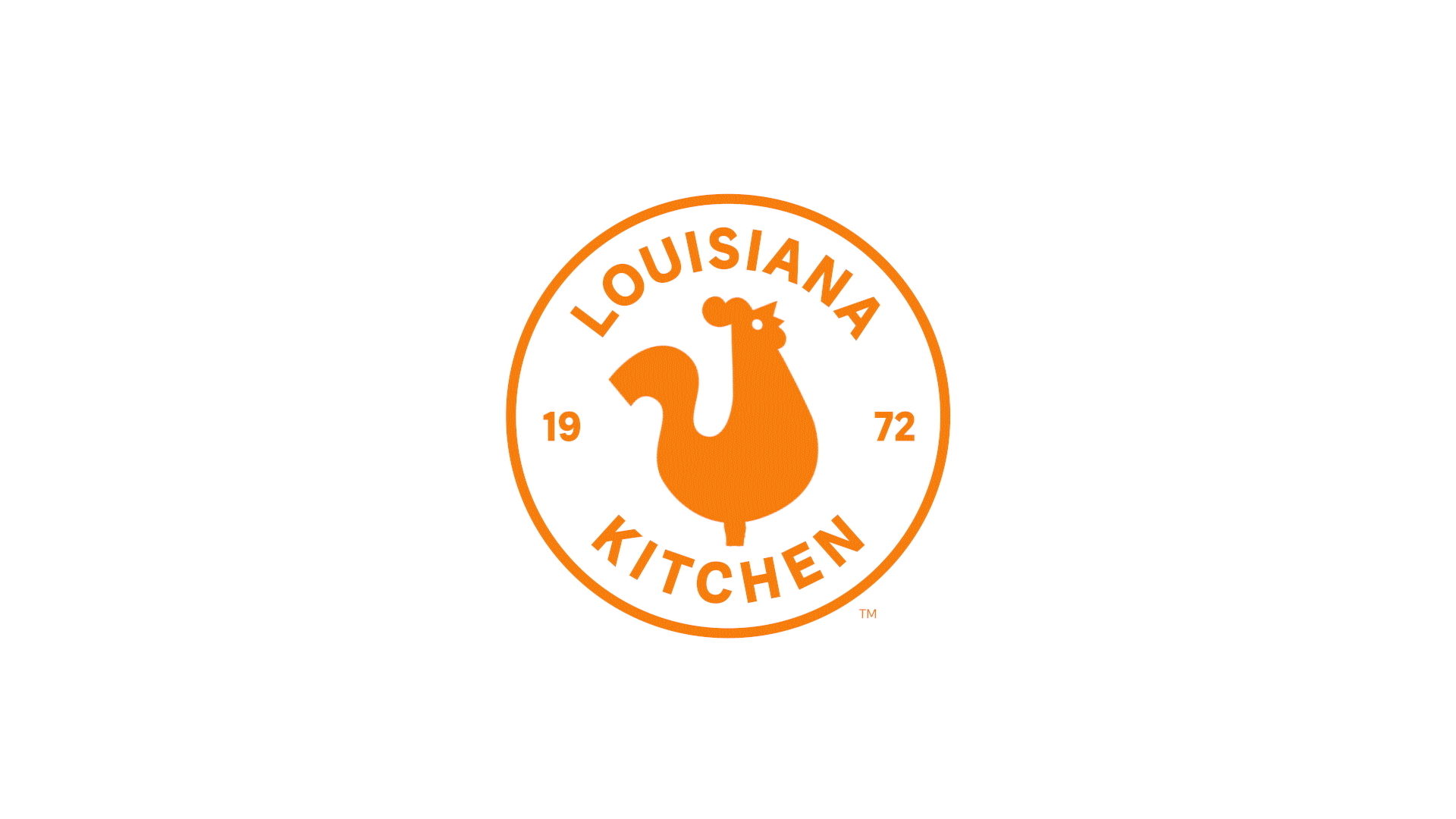
The secondary logo is charming with a chicken that, I believe, is meant to look like a decorative weather vane. The typography could be a little more interesting, especially the "19" and "72" but the chicken, with its "S"-shaped tail makes it all the worthwhile.
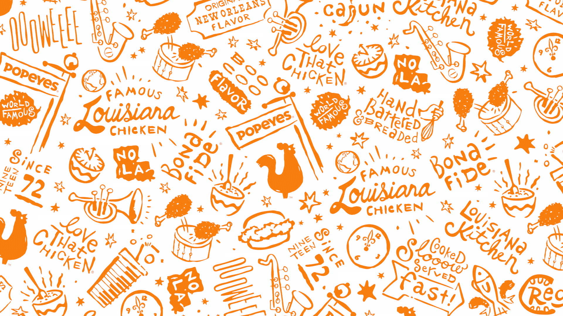
At the core of the identity is the hand-drawn pattern that has a very loose and unfinished aesthetic that comes almost as a shock in contrast to the usual super crisp consumer brand patterns -- thinking of things like Cadbury or Miller, among others. I'm torn about it because I enjoy the impetus behind it but I'm not a huge fan of the final drawings and lettering. I don't dislike it but I want very badly to love it because there is definitely something good here that separates Popeyes from the other QSR joints.
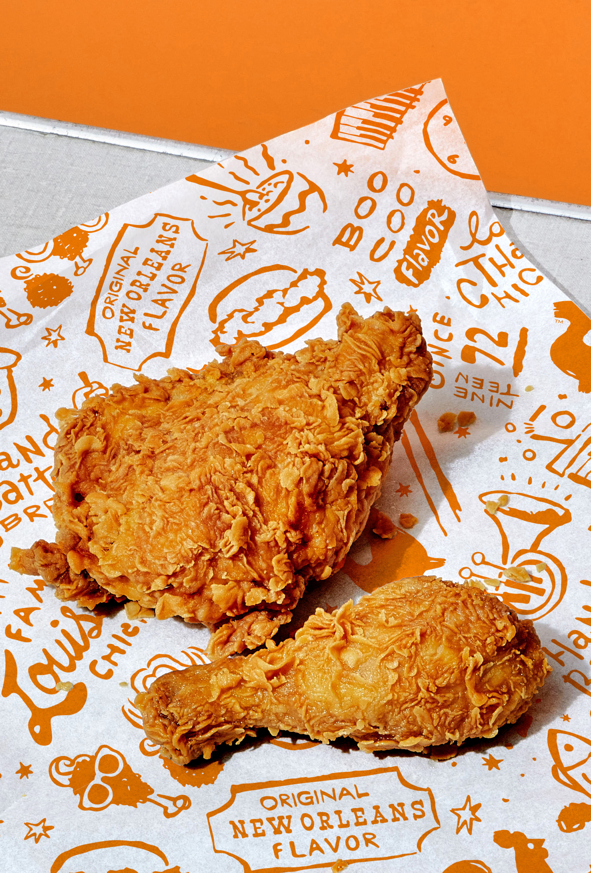
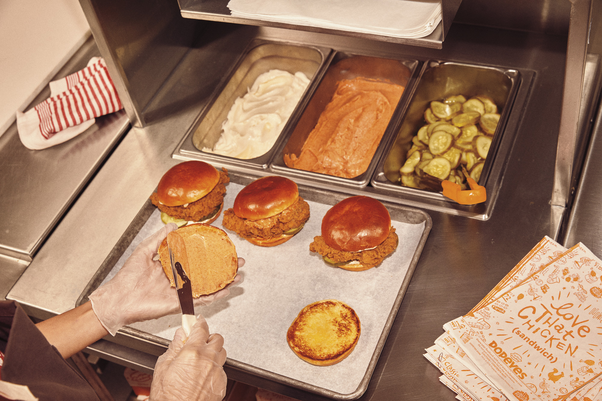
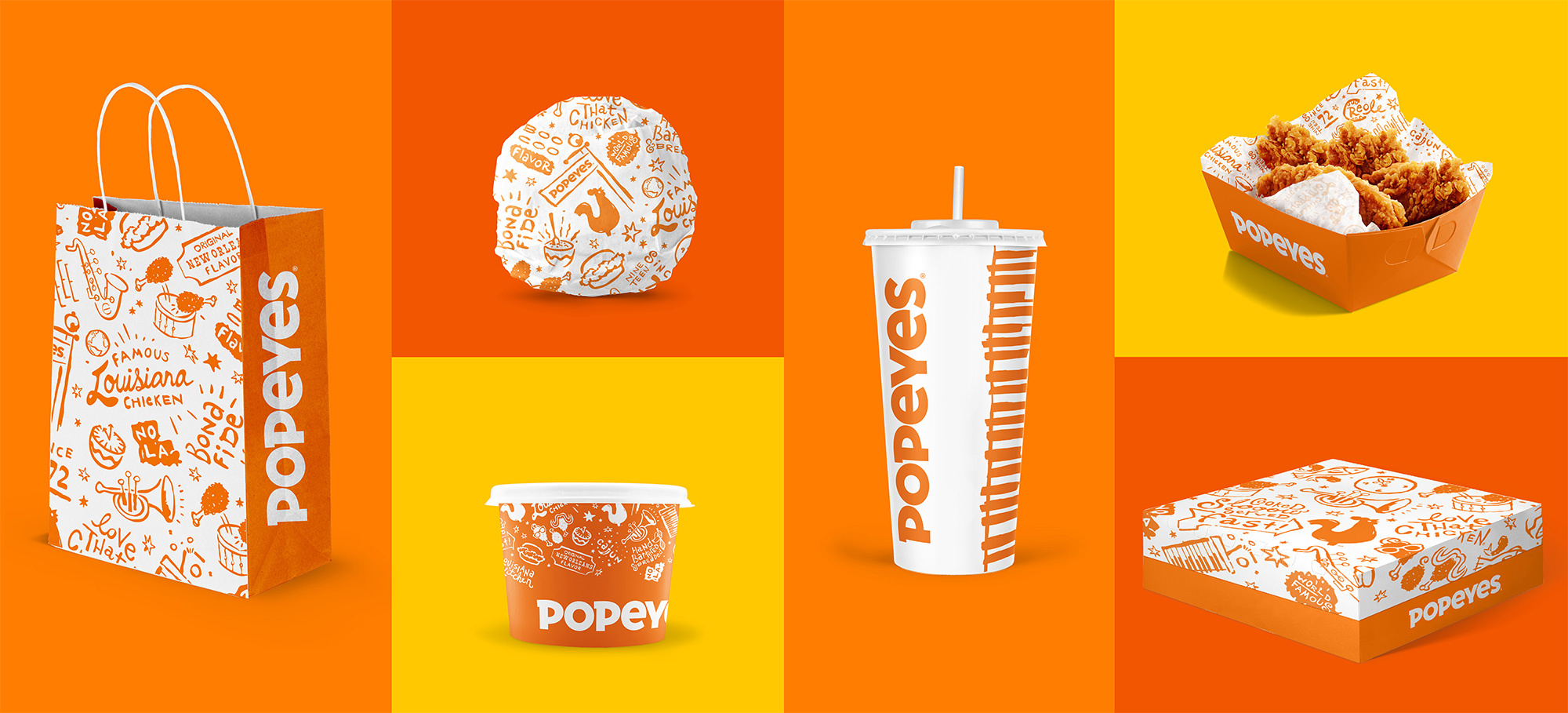
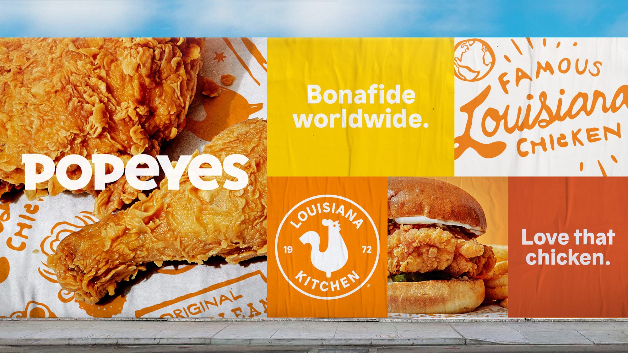
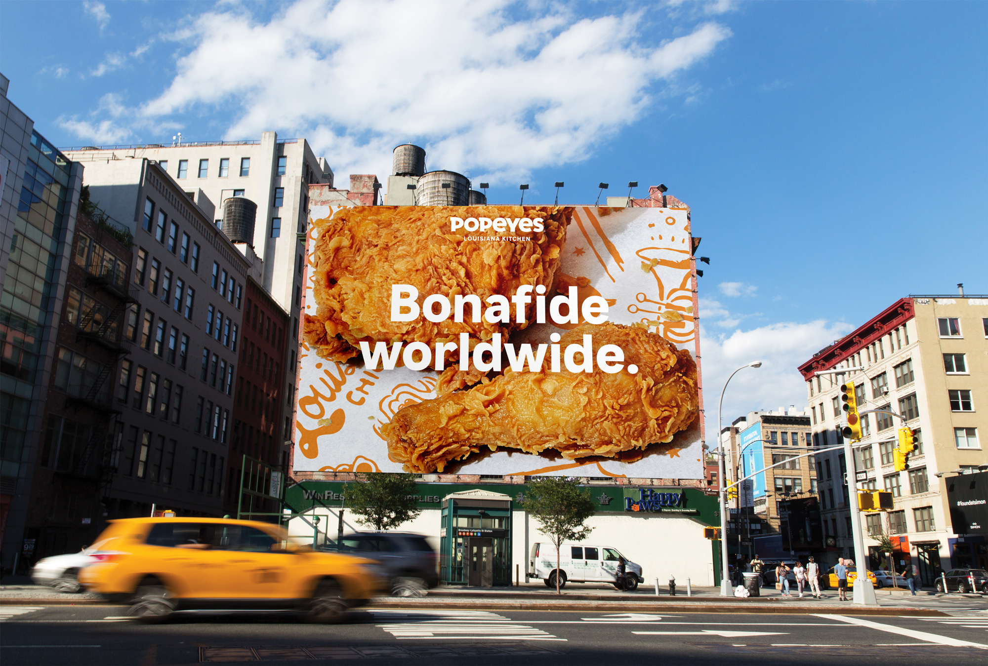
Maybe part of why I am not convinced about the pattern is that the few applications shown lack some wow factor. I think the strongest element in the images above is the close-up photo of the fried chicken itself, not so much the pattern, colors, or packaging. To the identity's credit, that photo looks great in part because of the pattern under the chicken. Still, there is something missing to take this to the next JKR-esque level, a la Dunkin', which may not be a fair comparison but the wild posting image very much tries to recreate the lightning in a bottle of Dunkin's wild posting image and it doesn't quite have the same burst of energy.
In the United States, Popeyes® recently opened its first remodeled restaurant in Marrero, LA, just outside its hometown of New Orleans. The powder coated metals in the furniture and counter design are inspired by the iconic Saint Charles Market Car, utilitarian spaces and handcrafted details nod to the creative culture of the Bywater in New Orleans, and the personality and artwork celebrate the creole heritage that's been passed down over generations. This new image is being piloted in the U.S., with aims to expand nationally across existing and new restaurants.
The Popeyes® restaurants will now start to look different throughout the U.S. and around the world after a collaborative redesign, in partnership with the design firms Brand Bureau and Linehouse. On May 15th, the brand opened its first flagship restaurant in Shanghai, China. Equipped with high end technology and an elevated store design, but still rooted in the brand's Louisiana heritage, leveraging warm woods and neons inspired by New Orleans' Bourbon Street.
Popeye's press release
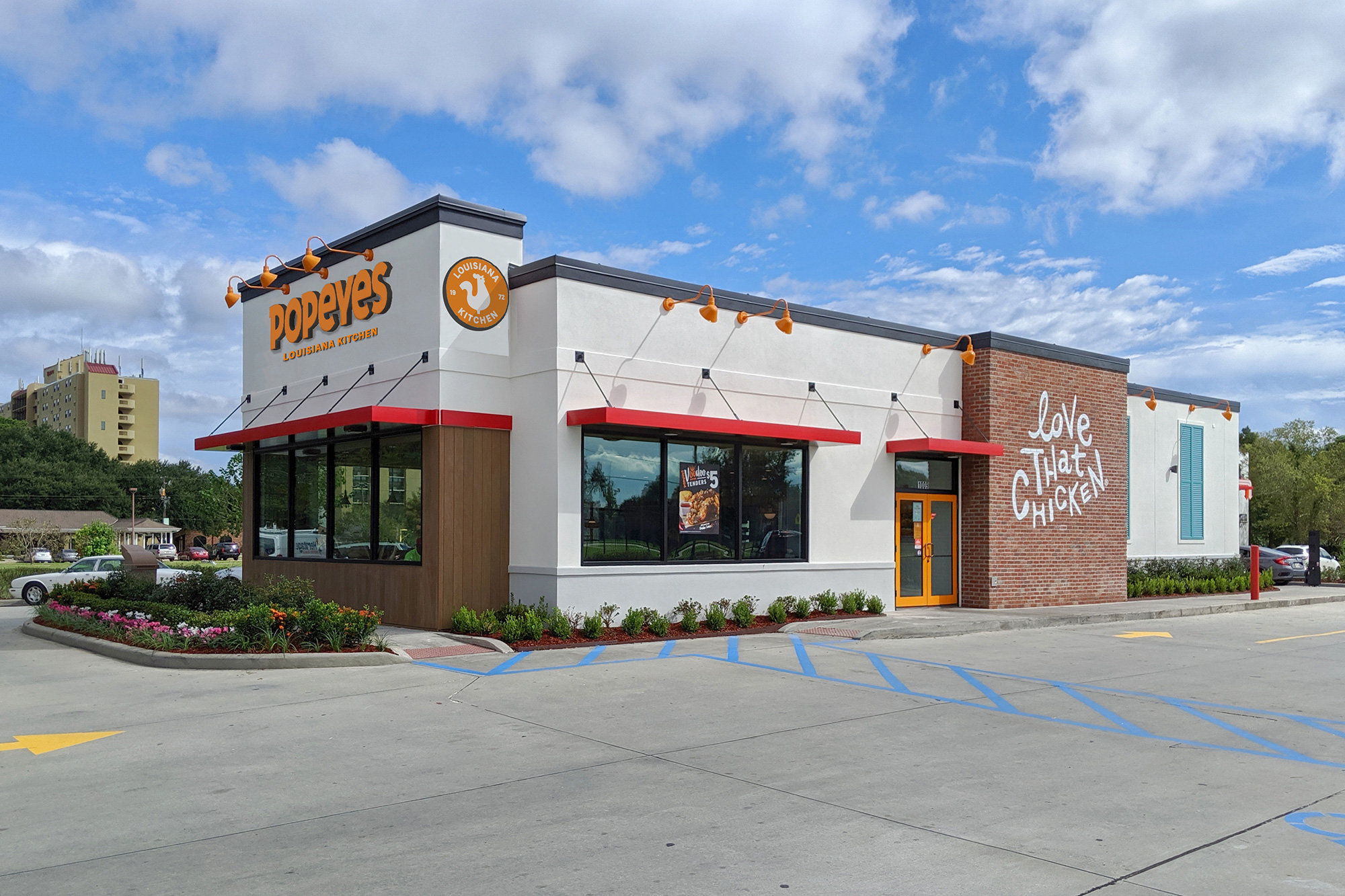
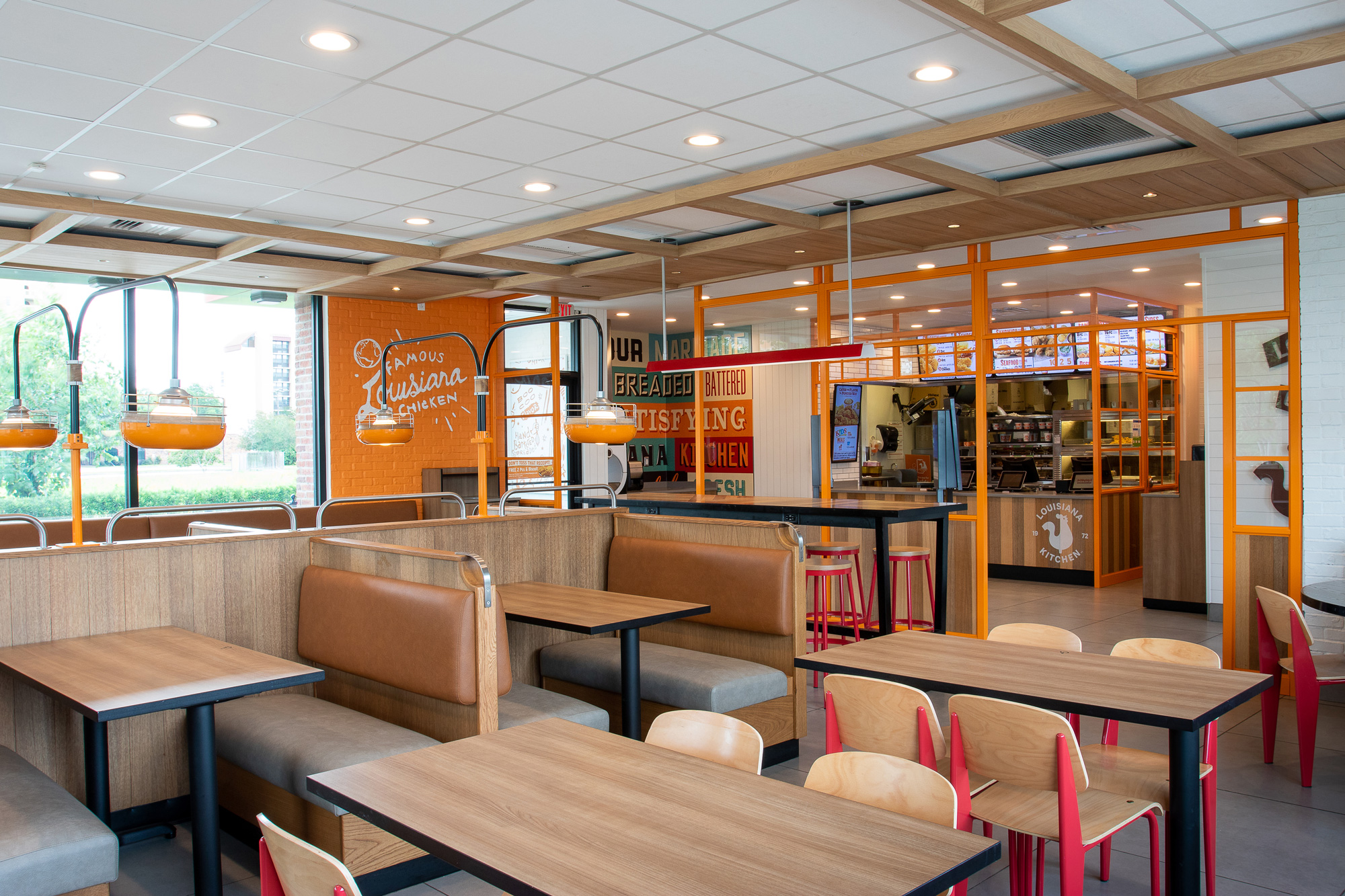
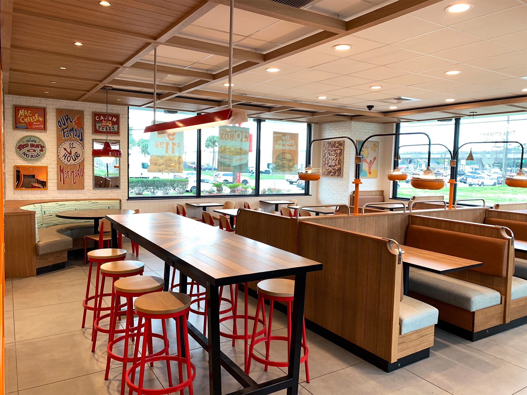
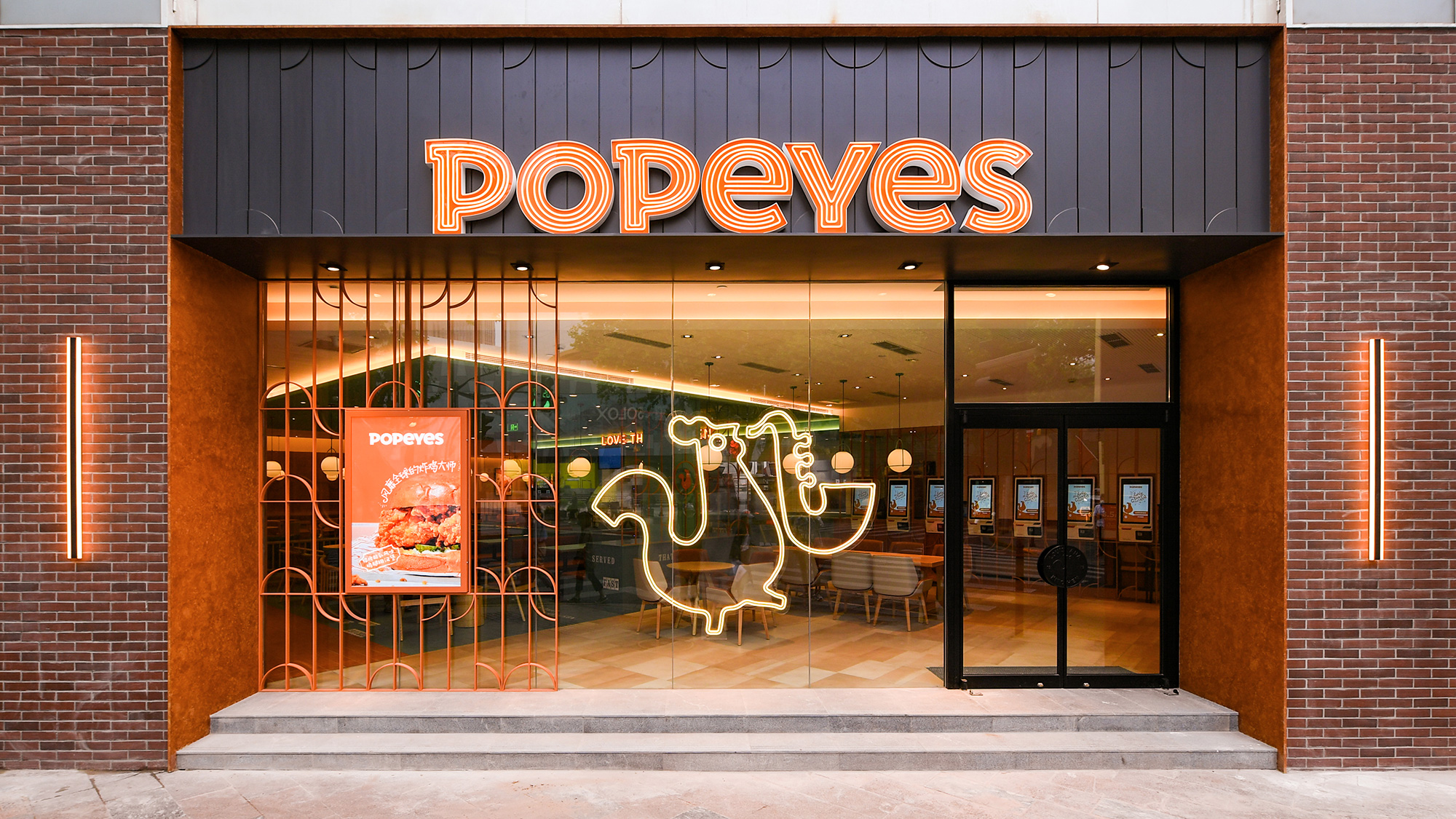
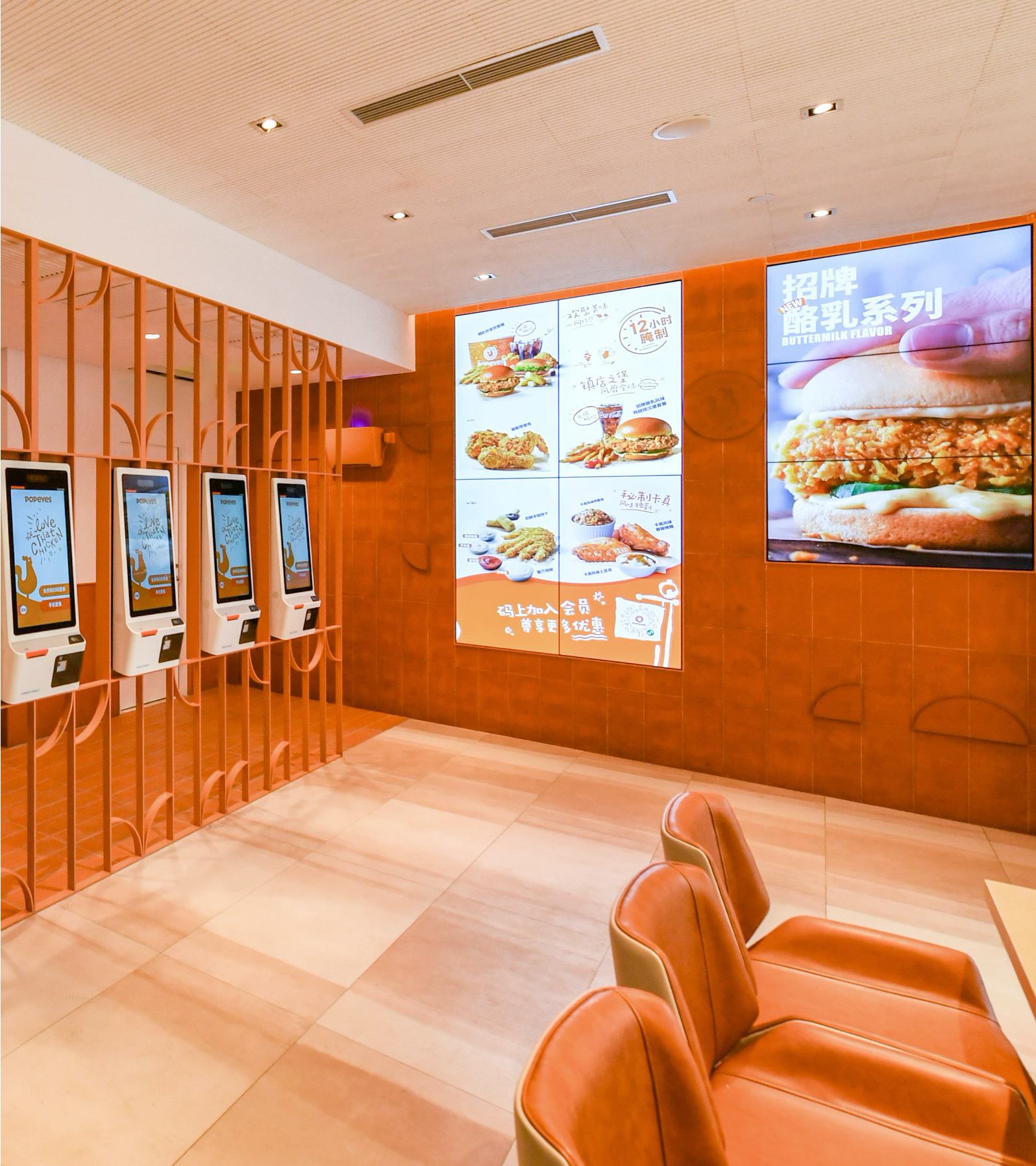
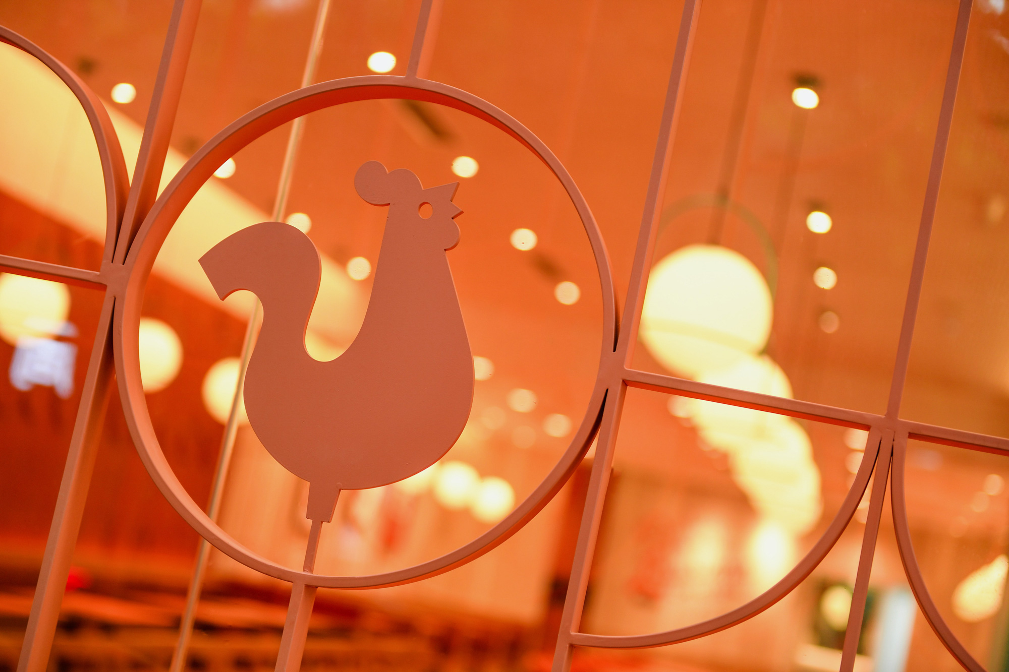
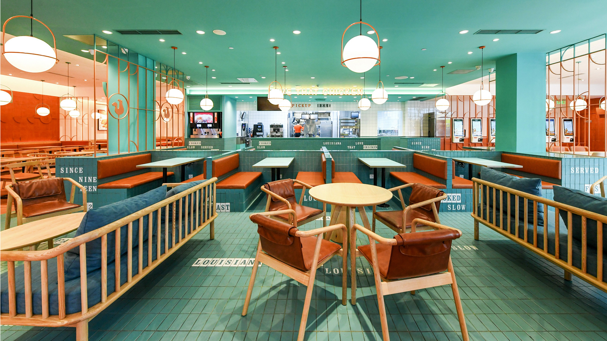
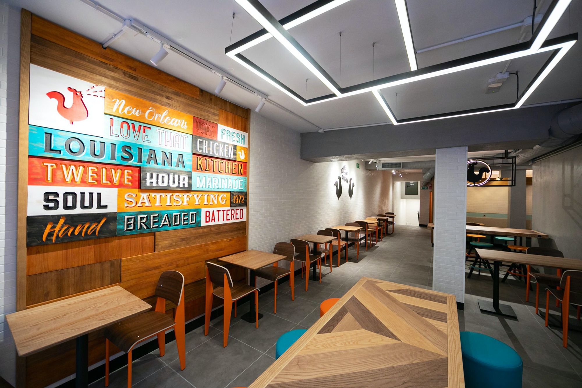
The redesigned stores -- from the more "normal" in the U.S. to the fully tricked-out one in Shanghai -- are pretty great and do a nice job of making the interiors look much more inviting, exciting, and unique, without all the usual formica tabletops and generic finishes of most QSR places. Overall, this is definitely strong and vibrant work that will help build on the growing excitement around the Popeyes brand, one spicy fried chicken at a time.
In ấn Anpic In nhãn mác Anpic In brochure Anpic In card visit Anpic In catalogue Anpic In thiệp cưới Anpic In tờ rơi Anpic
In Ấn Anpic – Nổi Tiếng In Đẹp In Nhanh
Số 5 Ngõ 75 Nguyễn Xiển, Thanh Xuân, Hạ Đình, Hà Nội
0963223884
baogiainananh@gmail.com
https://anpic.vn
https://g.page/inananpic
In nhãn mác Anpic ✅ In brochure Anpic ✅ In card visit Anpic ✅ In catalogue Anpic ✅ In thiệp cưới Anpic ✅ In tờ rơi Anpic
https://anpic.vn/in-nhan-mac-dep
https://anpic.vn/in-brochure
https://anpic.vn/in-an
https://anpic.vn/in-voucher-in-phieu-giam-gia-khuyen-mai
#inananpic
Comments
Post a Comment