Reviewed: New Logo, Identity, and Packaging for Healist Naturals by Robot Food
“Time and CBD Healist All Wounds”
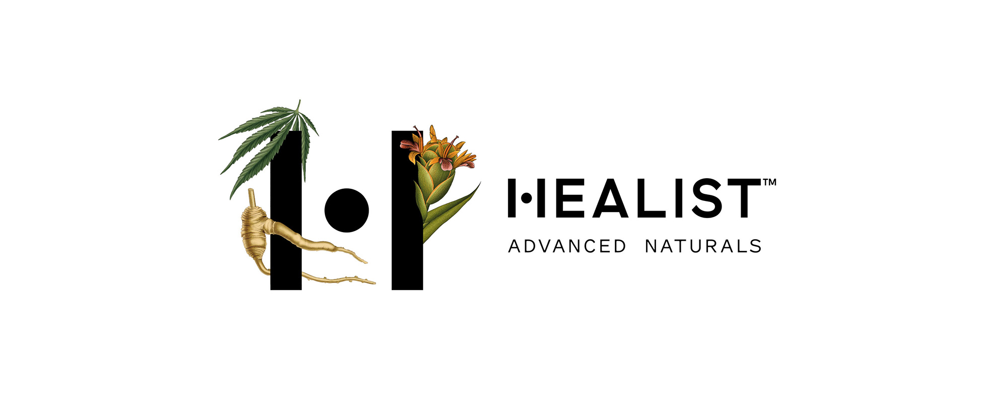
Launched in March of 2020, Healist Naturals is a new range of clinically-supported CBD products available in the U.S. that include tinctures, gummies, topicals, and patches that cover four benefits: calm, sleep, relief, and well-being. Made through CO2 extraction that preserves whole-plant ingredients and natural components better than other, cheaper methods, their products use only natural ingredients, no synthetics, and they even provide a QR code on the packaging that will reveal lab reports -- in general, they seem to be legit about being a good company trying to do good by the CBD industry by "taking action against misinformation, deceptive labelling, and soft truths". The identity and packaging for Healist Naturals has been designed by Leeds, UK-based Robot Food.
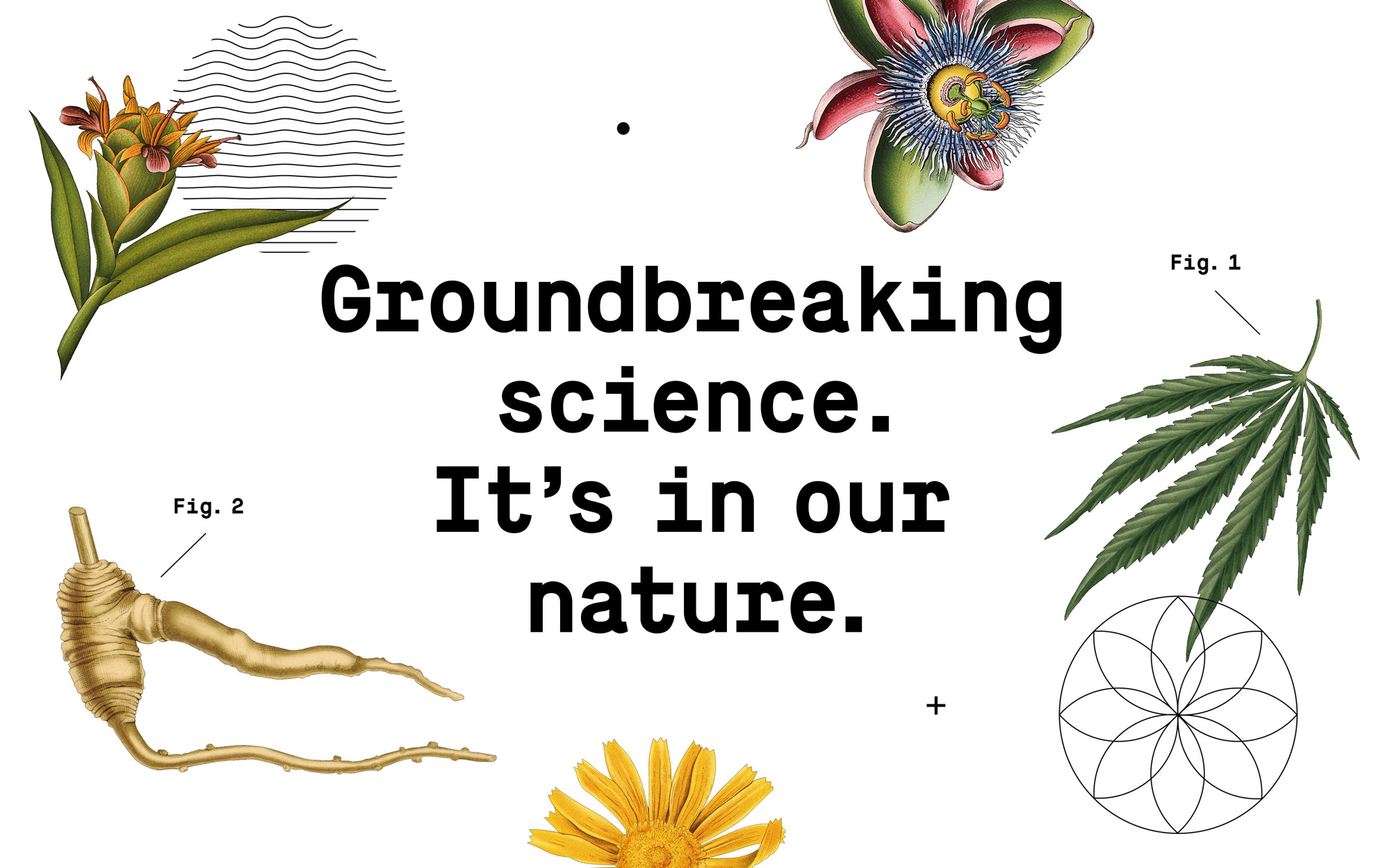
We saw science and nature as fundamental pillars of the identity and Healist as the sweet spot in between, harnessing the two. For the brand to be its most impactful, this balance would have to be represented throughout the visual and verbal identity, starting with the creation of the 'H' marque and demonstrated in the reveal of the split packaging.
In a category of cowboys, we needed to reinforce the efficacy of Healist's all-natural ingredients. From a clean, clinical white as the brand's primary colour to lab inspired iconography and detail, science forms the base of the brand, and is used as a consistent, reassuring structure on which the potential of nature and our bodies can be explored.
Robot Food project page
"The 'H' marque captures Healist's spirit. One pillar represents science, the other nature, while a central dot joins the two and is symbolic of equilibrium," says Steph Oglesby, design director at Robot Food.
Robot Food provided text
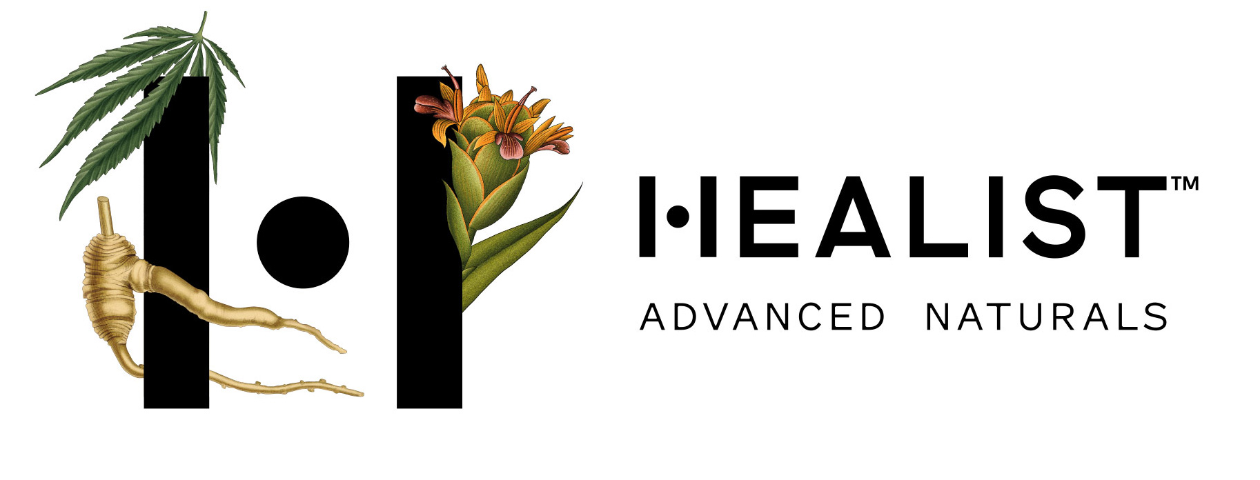
The logo, in plain clothes, is fine for the most part and definitely has a clean clinical feel that is reminiscent of high-end cosmetics, which is not an entirely bad thing. The rationalization on the "H" -- "One pillar represents science, the other nature, while a central dot joins the two and is symbolic of equilibrium" is a little eye-roll-inducing but, sure, it's well played and it gives the logo an ownable trait. When the "H" gets garnished with the ingredients... I dunno... I want to like it and I appreciate the effect, especially with the highly-detailed illustrations, but the floatiness of the ingredients is kind of weird. Still, on its own and as used on the website, the logo is pretty effective in signaling a clean, crisp product.
Healist's product architecture is made up of four benefit ranges, each with its own collection of formats. For greater ease and clarity, we use master illustrations alongside benefit specific colours and iconography to pull each range apart. Each benefit icon nods to the circular focal point of the 'H' marque and representative of the desired effect of each respective benefit.
Robot Food project page

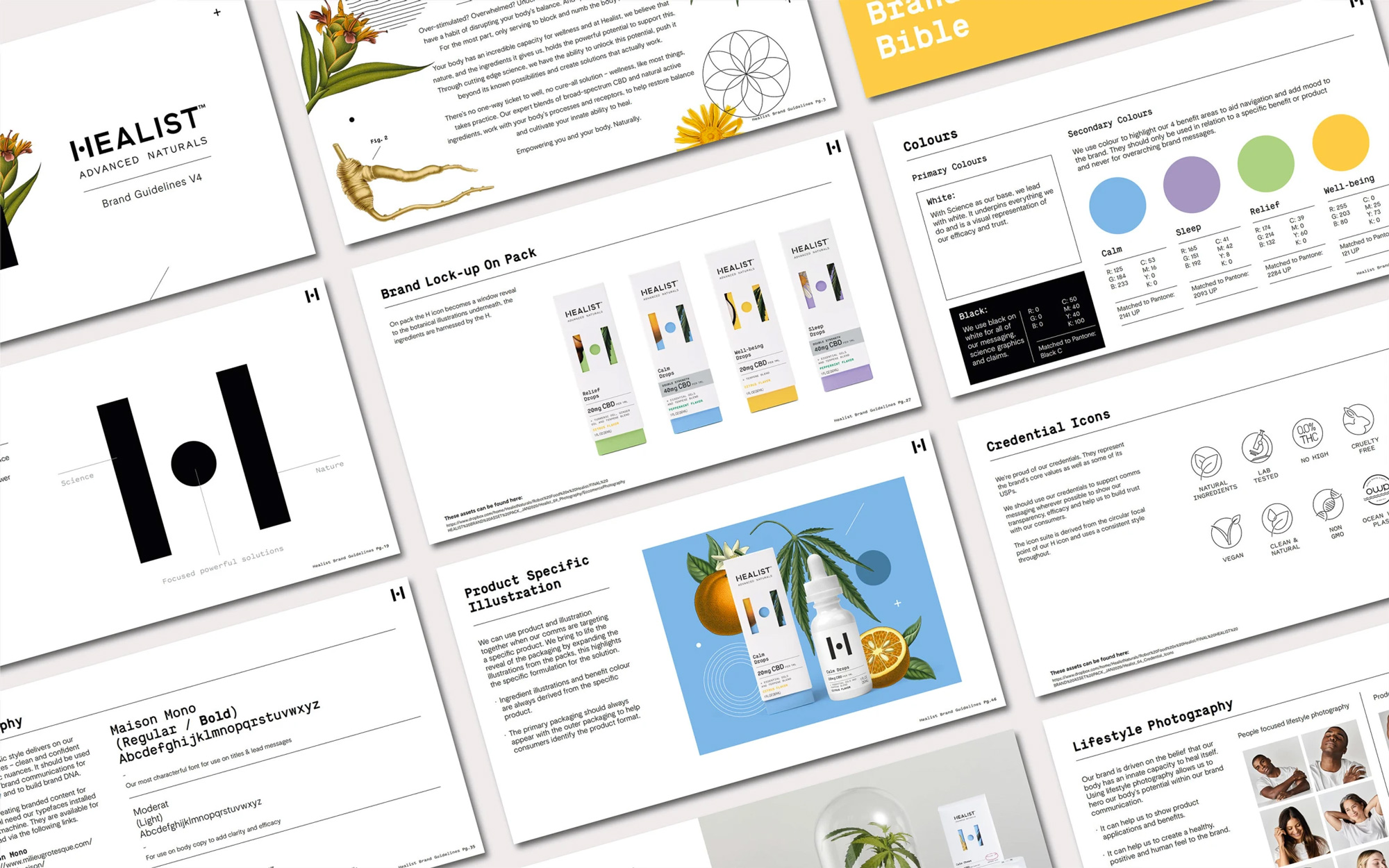
With science as a base, we chose to bring nature to life as an adaptable living layer. Every ingredient is carefully considered and chosen for its known benefits - many of which have been around for hundreds if not thousands of years. We took inspiration from botanical drawings to create Healist's master illustration style, illustrating each key ingredient across the Healist range.
Robot Food project page
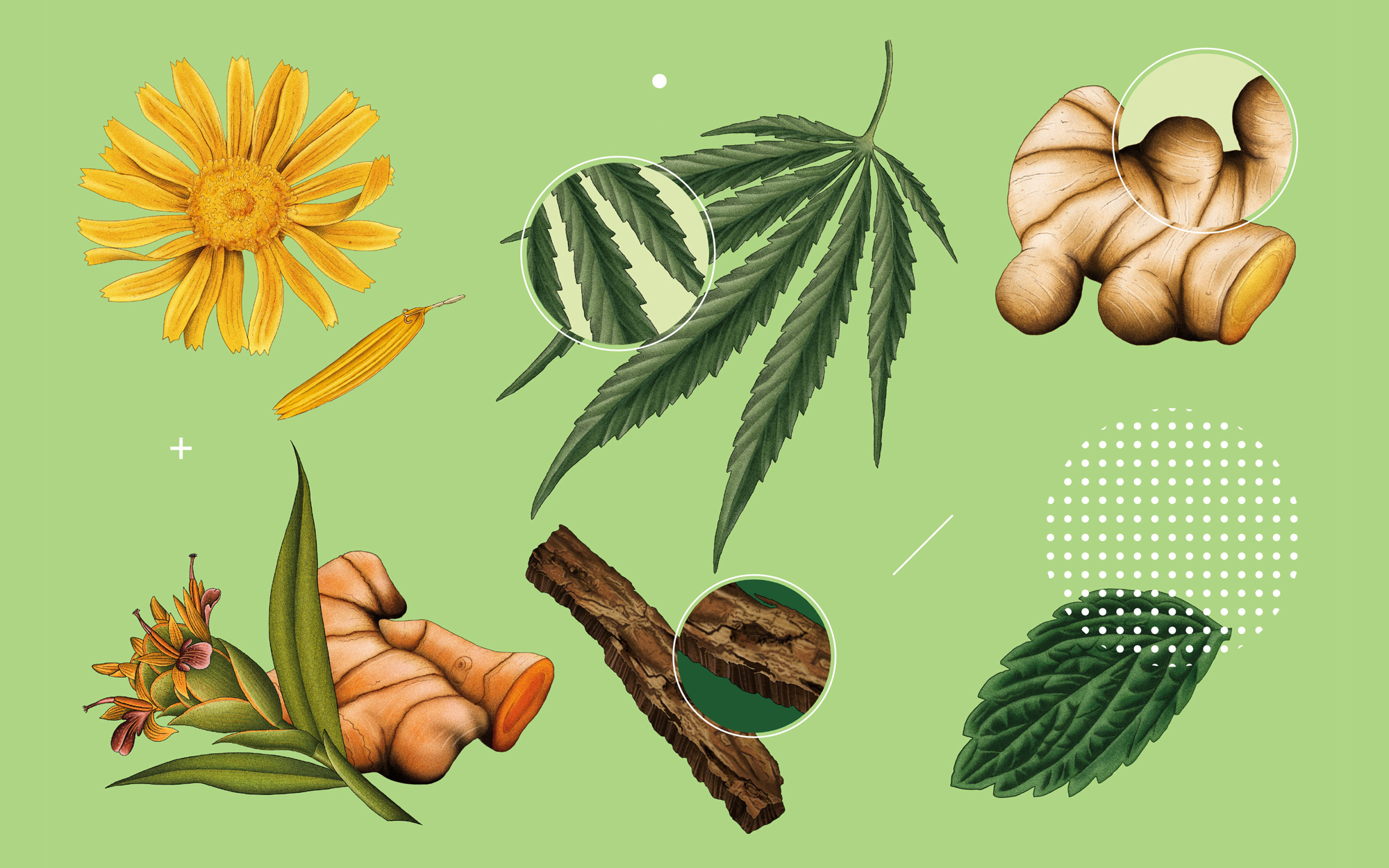
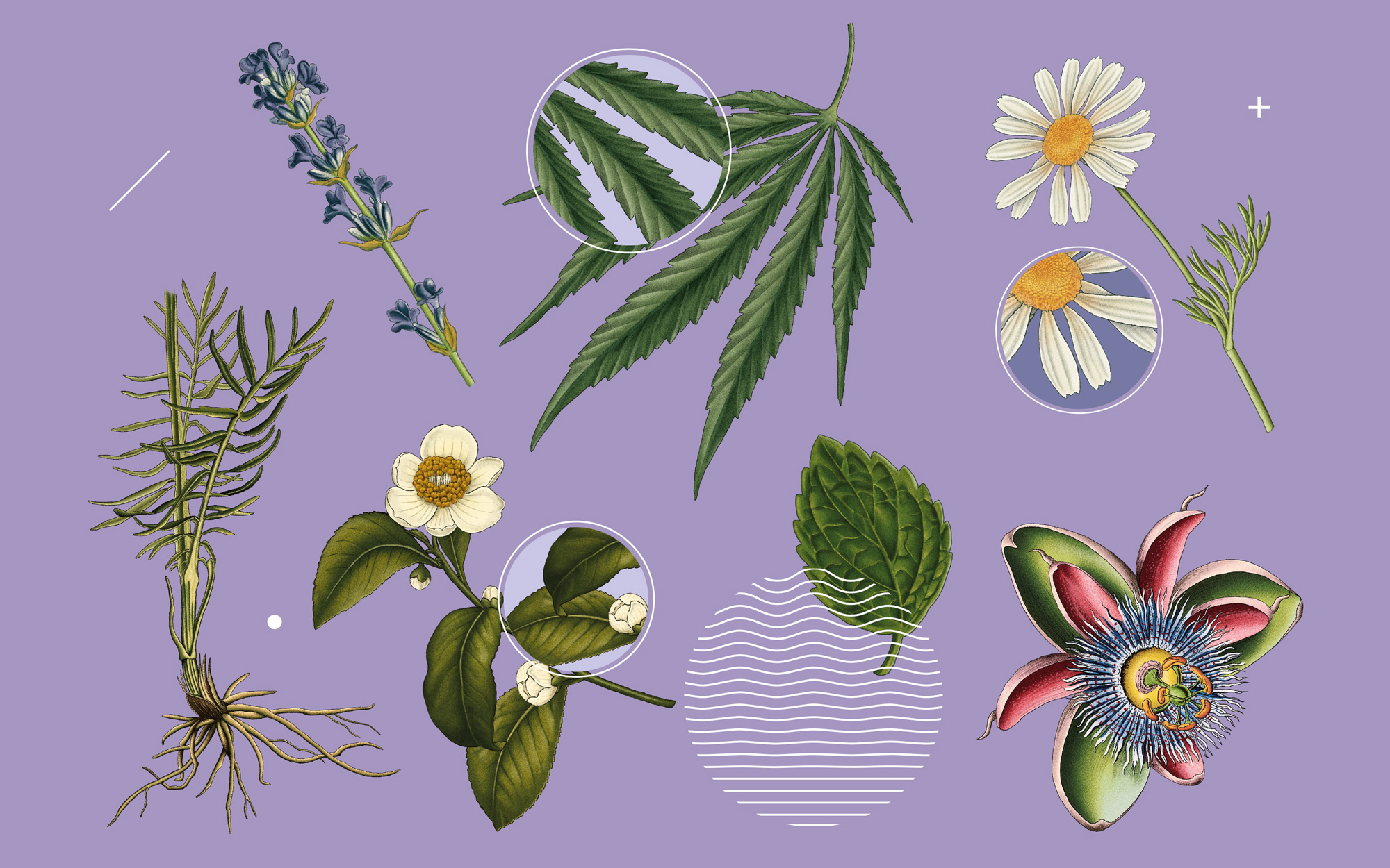
The illustrations are pretty great and a nice respite from the minimalist trend. I really like how the detailed ingredients are offset by the colorful solid backgrounds and the limited addition of bits and pieces of vector elements on top, achieving a good balance of modern-day science and old-time-y herbal medicine.
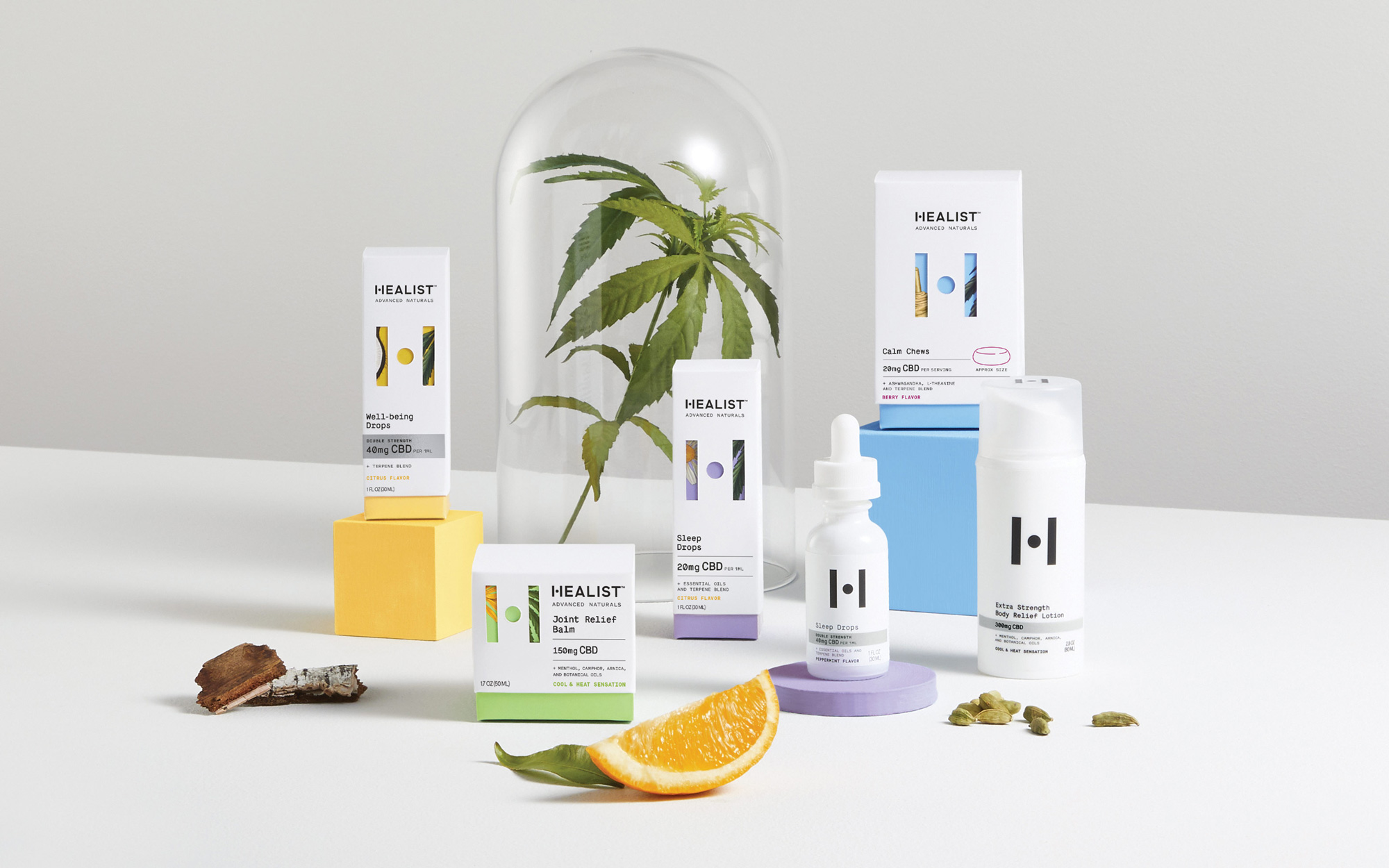
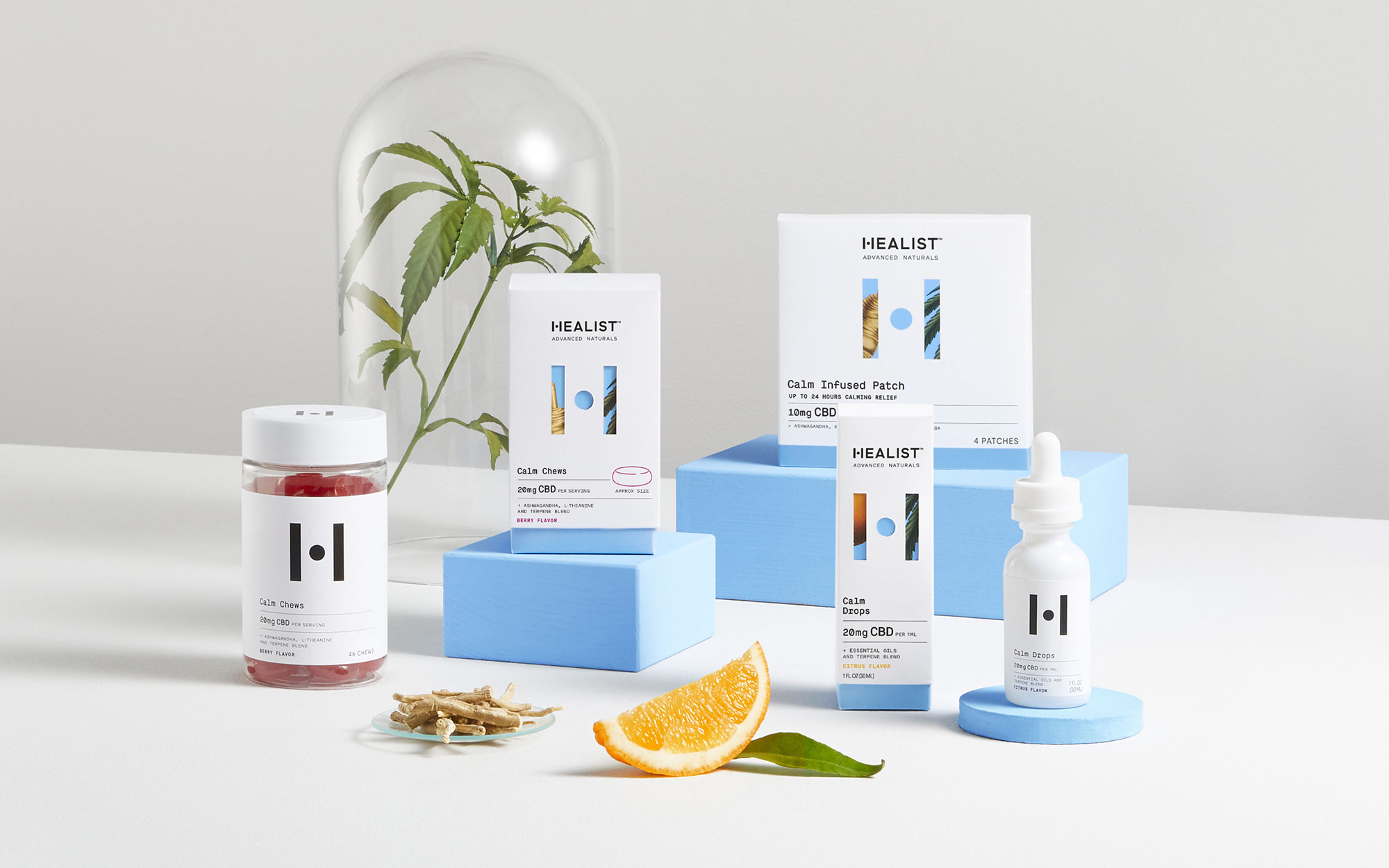
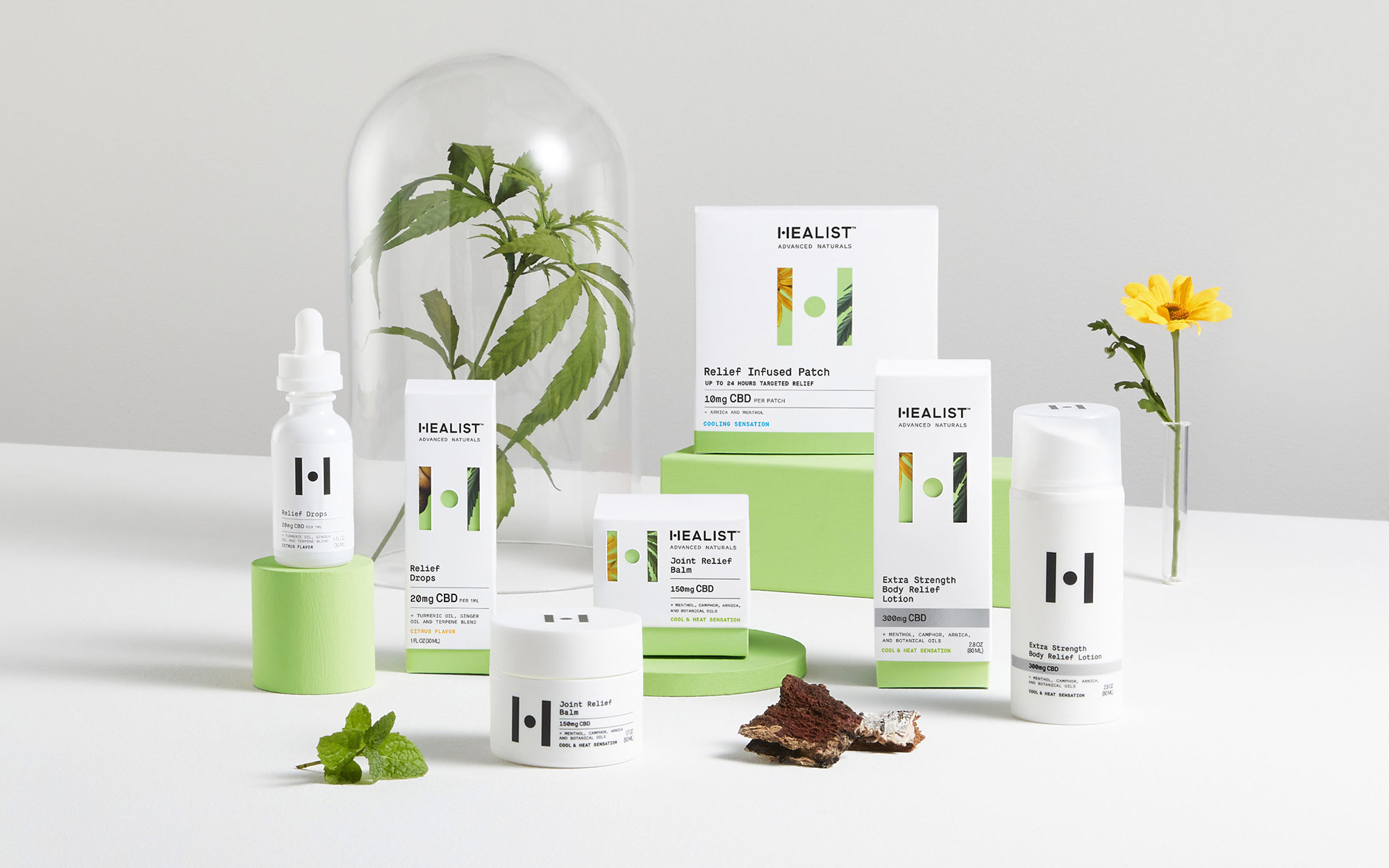
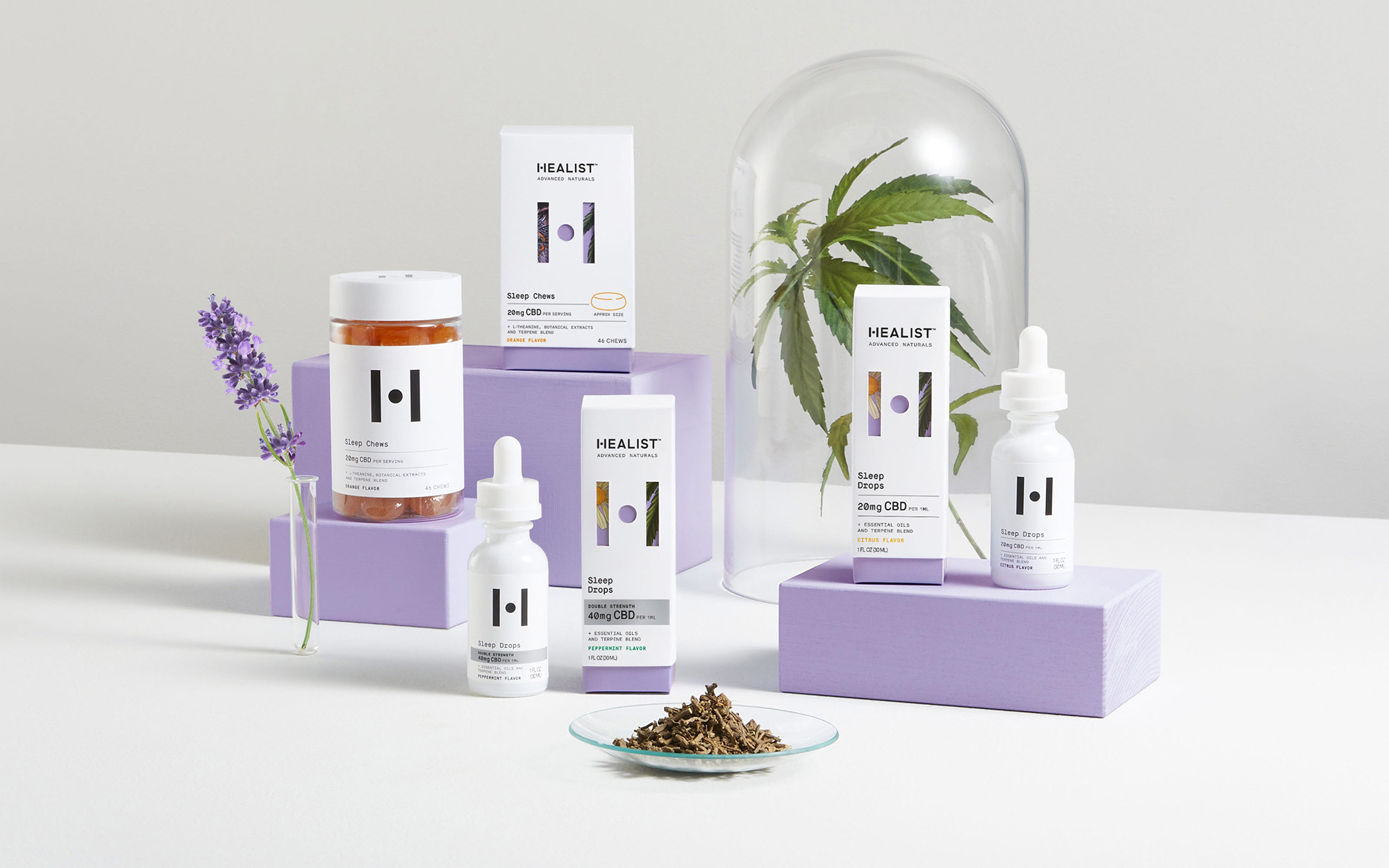
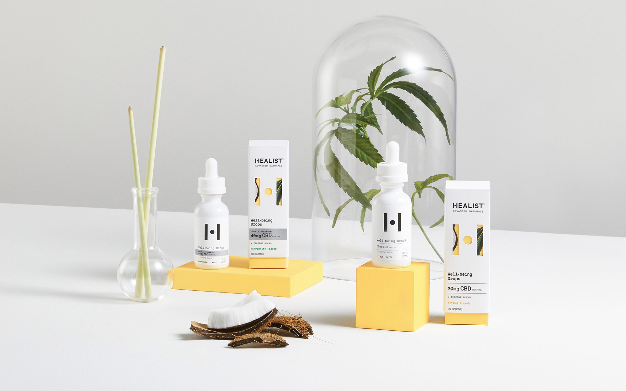
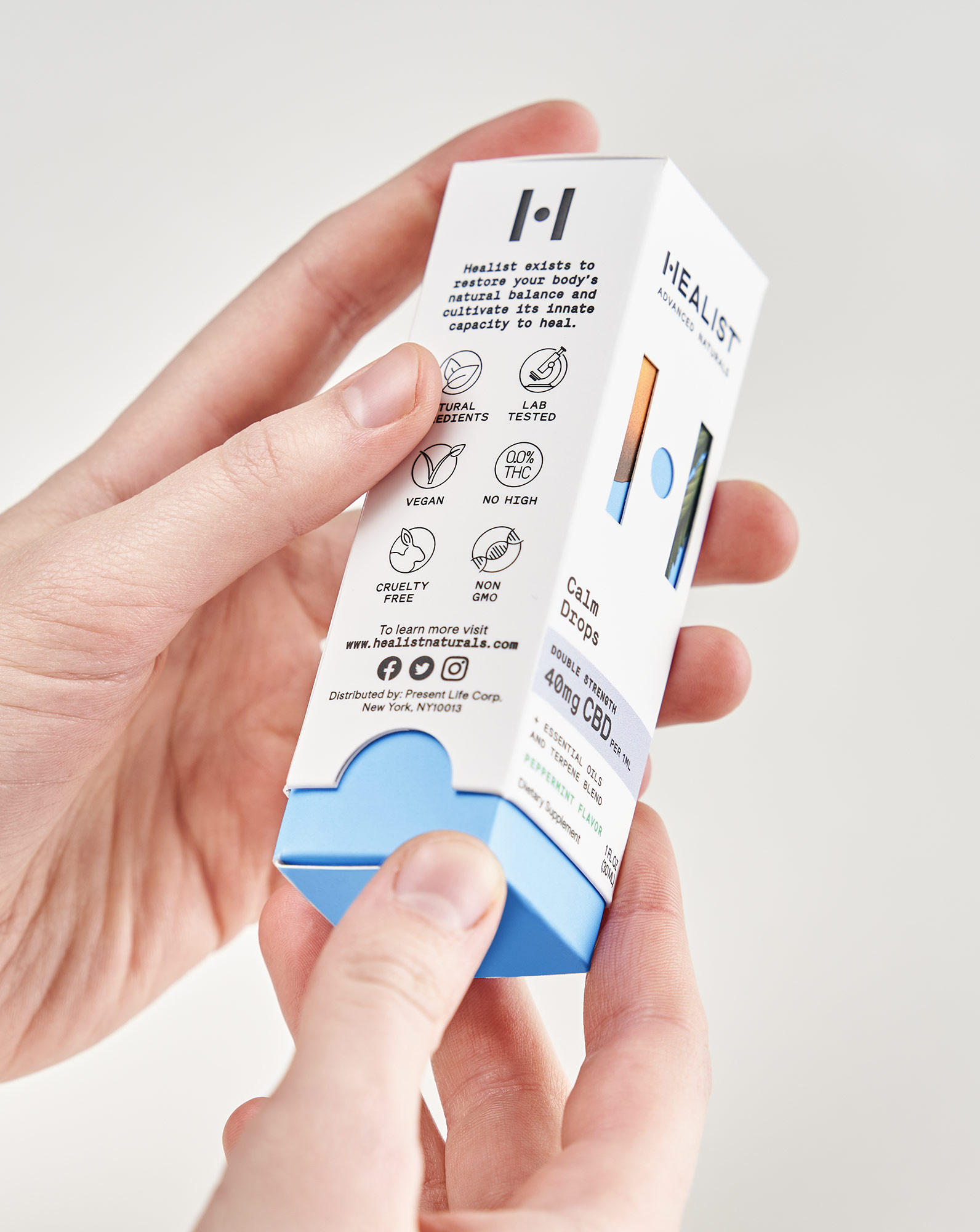
The packaging is quite nice, with the "H" acting as a window -- this time literally as a die-cut that reveals the illustration underneath. Aside from that, the packaging does indeed look like plenty of other white-space-heavy packaging with monospace font that could just as well be for beer, coffee, perfume, or CBD. Again, it's nice and the slipcover is a beautiful gesture, but the rest feels very tried and true.
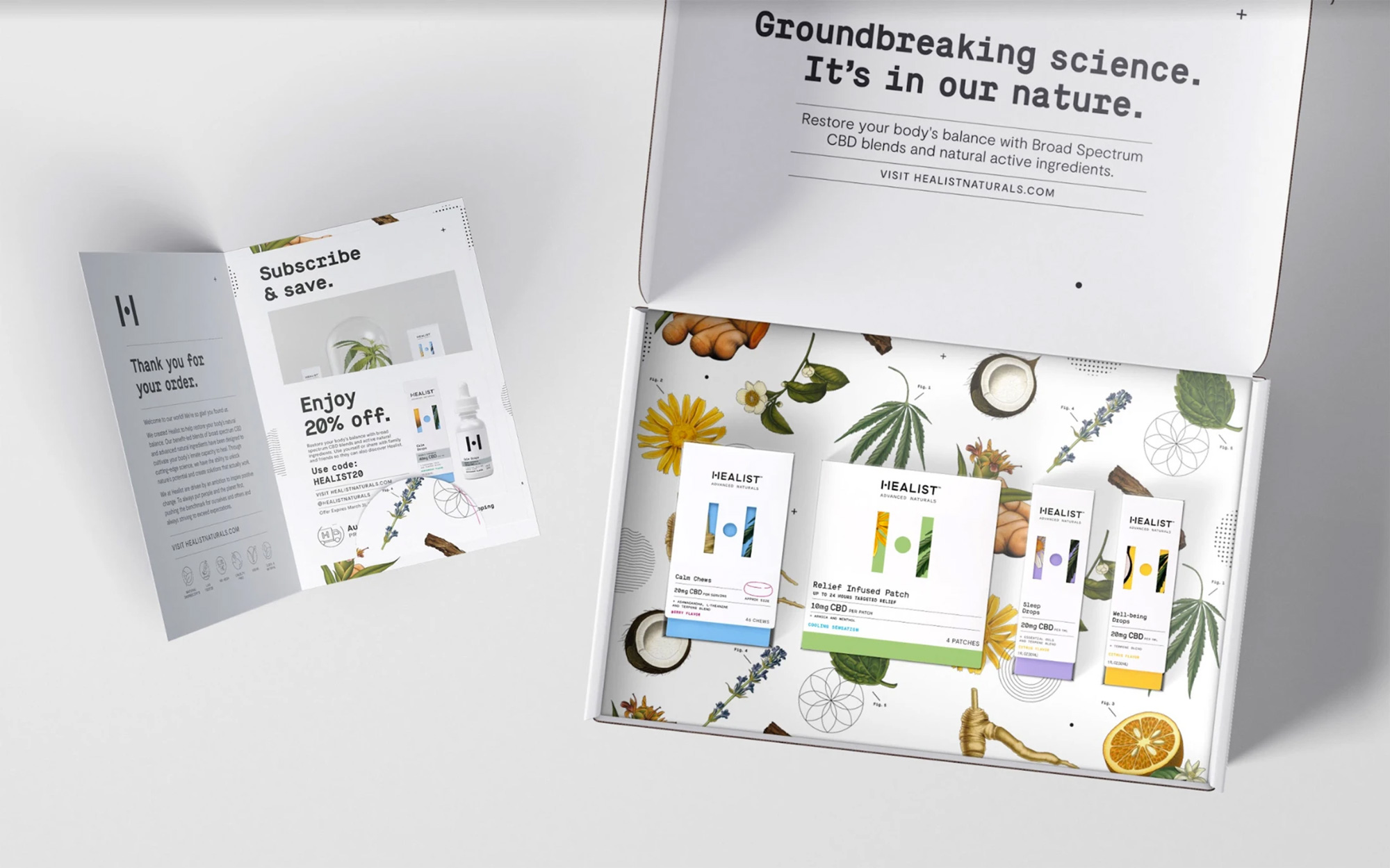
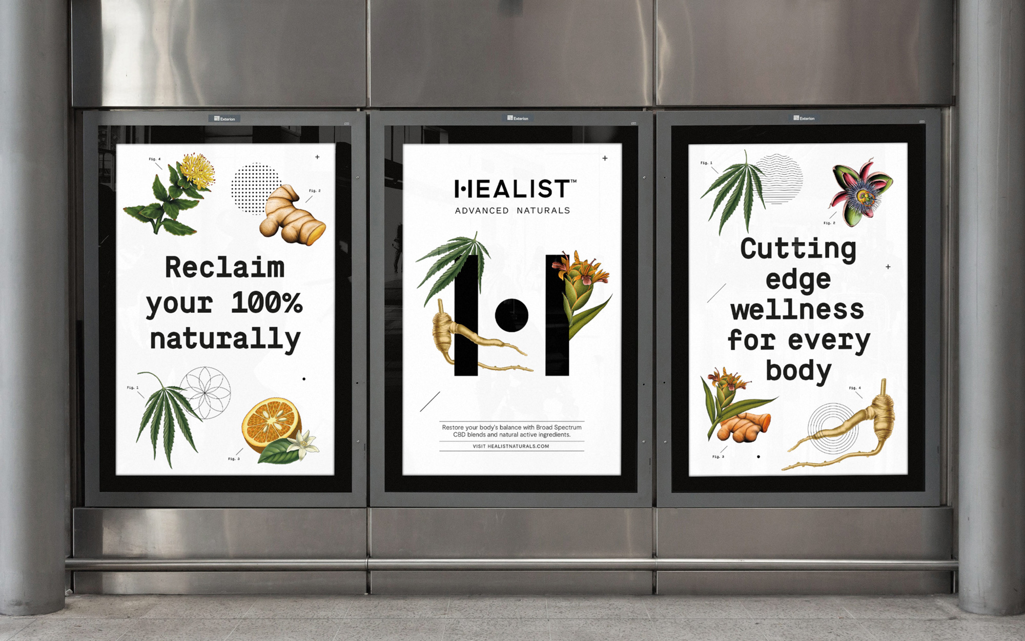
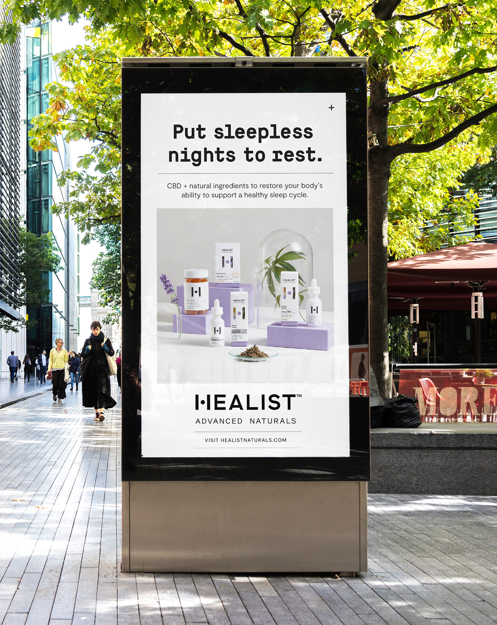
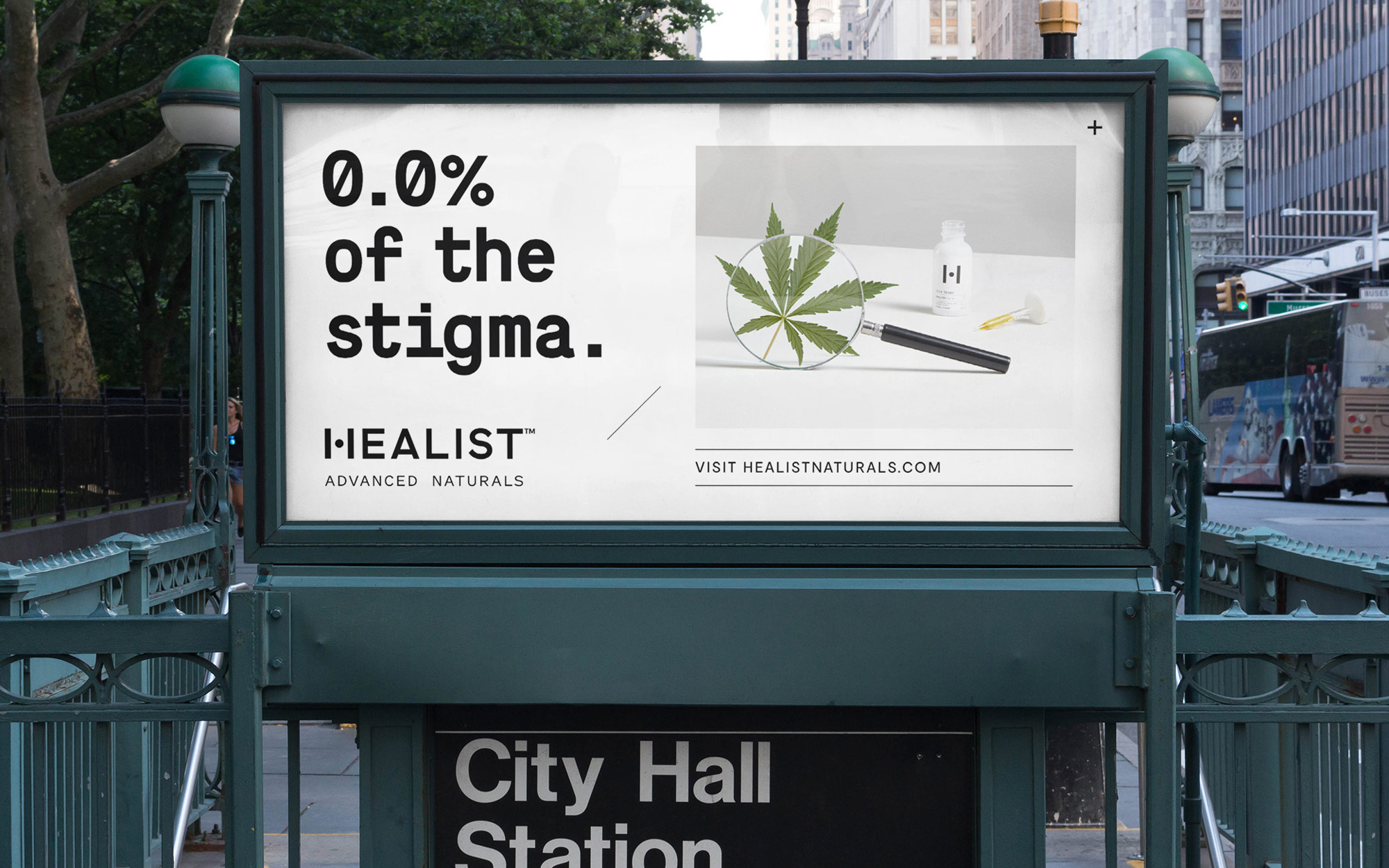
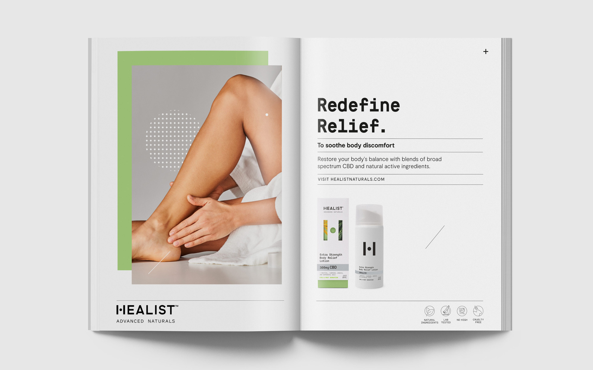
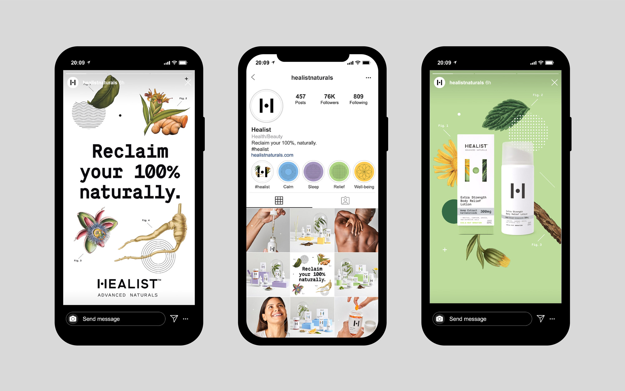
The additional applications, mostly advertising, are all fairly nice and convincing -- the first set of posters shown are particularly attractive, mixing all of the identity elements in the right dosage. What the ads demonstrate, though, is how easily the different brand elements can come together effectively in different ways to convey the science-meets-nature positioning of the product. Along with Hanayu, another recent CBD product shown on Brand New recently, the market is starting to get more sophisticated both in product quality and branding efforts that, overall, give this reviewer a sense of calm, relief, and well-being that result in better sleep (as long as I don't read the news).
In ấn Anpic In nhãn mác Anpic In brochure Anpic In card visit Anpic In catalogue Anpic In thiệp cưới Anpic In tờ rơi Anpic
In Ấn Anpic – Nổi Tiếng In Đẹp In Nhanh
Số 5 Ngõ 75 Nguyễn Xiển, Thanh Xuân, Hạ Đình, Hà Nội
0963223884
baogiainananh@gmail.com
https://anpic.vn
https://g.page/inananpic
In nhãn mác Anpic ✅ In brochure Anpic ✅ In card visit Anpic ✅ In catalogue Anpic ✅ In thiệp cưới Anpic ✅ In tờ rơi Anpic
https://anpic.vn/in-nhan-mac-dep
https://anpic.vn/in-brochure
https://anpic.vn/in-an
https://anpic.vn/in-voucher-in-phieu-giam-gia-khuyen-mai
#inananpic
Comments
Post a Comment