Australia unveils new nation brand — but where is the kangeroo?
Australia has unveiled a new nation brand designed to showcase the country internationally and focus on different facets that the country is less well known for.
The work has been done by the Sydney-based marketing agency Clemenger BBDO and the results have been published in a government report by the country’s Nation Brand Advisory Council.
“A country’s reputation drives political, commercial and economic success,” the report says. The new identity seeks to achieve this by distinguishing Australia among the “intense competition” for areas like trade, investment and tourism.
“Australia needs to be assertive”
The branding hopes to shift outside perception of the country. While it is known consistently for its “flora and fauna, friendly people and beautiful scenery”, research shows that the country is less well regarded for areas like business and science.
The new branding is an opportunity to “add more to the nation’s story”. “Australia needs to be more assertive in reinforcing attributes that our nation is less well known for, including technology, science and innovation,” the council says.
The project – which has been in the works since 2018 and was put out for a tender of £1.6m – involved consultation with industry sectors as well as over 8,000 people from a variety of countries.
Design elements were spread out across a brand mark, colour scheme and typography. “Australia is inconsistent with its use of multiple logos, colours and narratives which dilute our brand offering and confuse our potential audiences,” the report says. It is hoped that this nation brand can go some ways in addressing that inconsistency.
“We love our kangaroo”

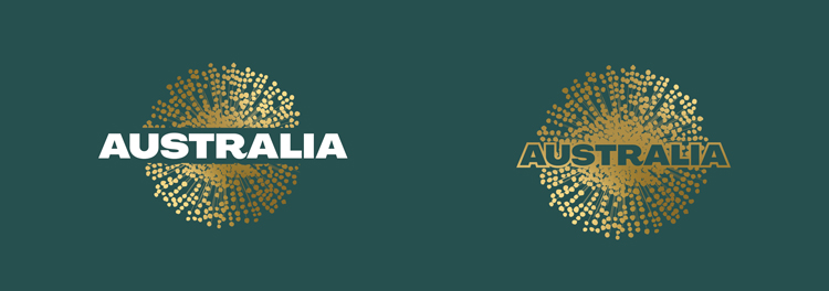
The heart of the new identity is a new logo, which takes the form of the wattle, Australia’s national flower. Despite being a part of the nation’s iconography this is a somewhat unexpected departure from a very well-known symbol of Australia: the kangaroo.
“We love our kangaroo – it is currently the most international recognised shortcut to Australia,” the council says. “But we considered whether it would shift perceptions of our nation, or simply reinforce what people already knew about us.”
The wattle holds great significance for the country, the council says, as a symbol of “hearty resilience”. “This small, beautiful flower is an organic burst of positivity – in bright joyous gold.”
It is hoped that the wattle – despite not having the instant recognition of the kangaroo – will become recognised internationally over time. It is also a “contemporary, pan-indigenous design” and the logo draws on Aboriginal art elements. This refers specifically to the dots that make up the flower design, reminicent of traditional artistic techniques. The dots are also supposed to represent “individuals and the coming together of diversity”.
Aboriginal and Torres Strait Islander research was also conducted to test for “cultural sensitivity”, the branding council says. Part of the wattle’s appeal is that it has support from indigenous and non-indigenous people.
“Visual shortcut”

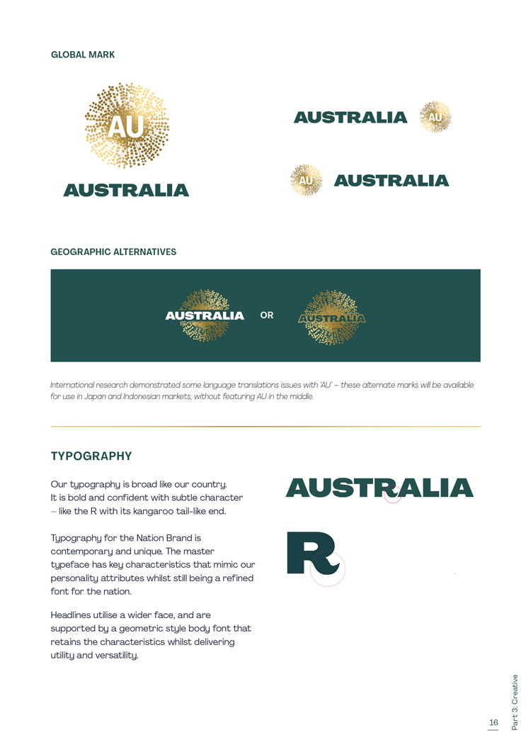
AU has been used as a “visual shortcut” for the country. It is the internationally recognised two-digit ISO (International Organization for Standardization) country code for the country and also the “top-level” internet domain for Australia websites. This helps the brand establish a “digital future” for Australia. AU is also the periodic element for gold, which “provides a connection to Australia’s scientific endeavours” and “mineral rich past and future”.
The wattle has been used elsewhere in the branding as a kind of “visual device”. It appears as a halo-shaped overlay for imagery – which the council says brings an “irrepressible optimism into communications”. “The burst can be used in its entirety as a halo, or as an accent on artwork in existing photography used to apply Nation Branding with partners,” it says.
A colour palette to capture the nation’s mood
The national colour scheme has been modernised and now uses “deep green and actual gold” rather than yellow. The palette is “drawn from the colour and light” of the country: “luminous Australian sunlight, falling across the bush, the sea, our sunburnt earth and our golden sands”. The green and gold colour way is also a nod to the country’s international sporting efforts, where it appears on team kits.
Secondary and gradient tones will be introduced, again inspired by the country’s natural scenery like its sea, sky and “multi-colour land”. An extended colour palette will, the report claims, allow the brand to “capture the moods” of the nation. There is a further attempt at consistency involved here as the colours are used in the national, state and territory flags.
“Broad” typography

Typography for the nation brand aims to be “broad” (like the country’s landscape) while also achieving a “contemporary and unique” feel. There is a “subtle” detail in the typeface’s R, which resembles the kangaroo’s tail.
“The master typeface has key characteristics that mimic our personality attributes whilst being a refined font for the nation,” the council says. A “geometric” font has been adopted as a supporting font.
Roll out
Nation branding on any level will garner stong feedback, both bad and good. In the last year, Design Week has covered the international identity for The Netherlands and a new national logo for the United Arab Emirates (UAE). In this case, many have voiced dismay about the much-loved kangaroo-themed Australian Made logo, so much so that the Australian Made Campaign has had to clarify that the animal will not be replaced.
MEDIA RELEASE: The Australian Made kangaroo is here to stay. The famous Australian Made logo is not being replaced. It will remain as Australia’s global product symbol, following reports of a new Nation Brand for Australia. Read more: https://t.co/Gpu0TWehuM pic.twitter.com/5inen21IX3
— Australian Made (@AustralianMade) July 1, 2020
The council is clear however that the new nation brand is not intended to replace the existing national logo, but act as a new brand for the country and a wider variety of services. The council proposes that the assets are made freely available and accessible for Australian businesses through a government portal.
The post Australia unveils new nation brand — but where is the kangeroo? appeared first on Design Week.
In ấn Anpic In nhãn mác Anpic In brochure Anpic In card visit Anpic In catalogue Anpic In thiệp cưới Anpic In tờ rơi Anpic
In Ấn Anpic – Nổi Tiếng In Đẹp In Nhanh
Số 5 Ngõ 75 Nguyễn Xiển, Thanh Xuân, Hạ Đình, Hà Nội
0963223884
baogiainananh@gmail.com
https://anpic.vn
https://g.page/inananpic
In nhãn mác Anpic ✅ In brochure Anpic ✅ In card visit Anpic ✅ In catalogue Anpic ✅ In thiệp cưới Anpic ✅ In tờ rơi Anpic
https://anpic.vn/in-nhan-mac-dep
https://anpic.vn/in-brochure
https://anpic.vn/in-an
https://anpic.vn/in-voucher-in-phieu-giam-gia-khuyen-mai
#inananpic
Comments
Post a Comment