Noted: New Logo and Identity for Belgian Pro League by Mirror Mirror
“Hole in One”
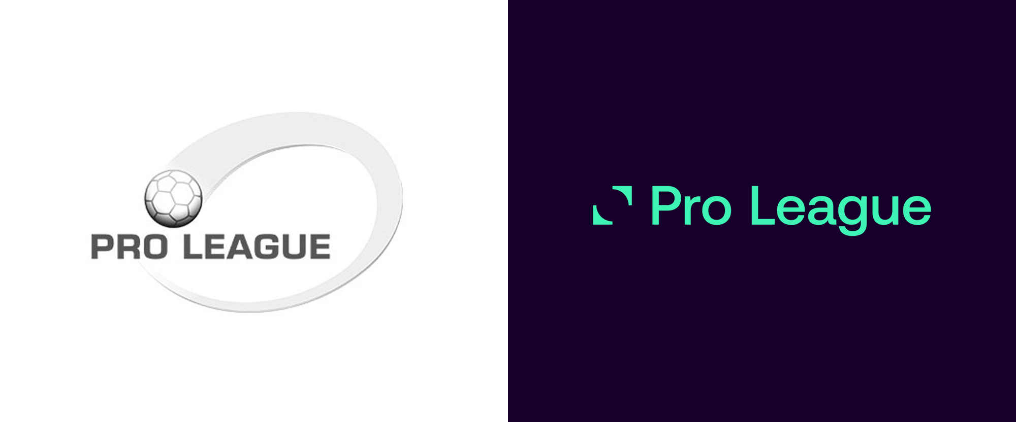
(Est. 1895) "The Belgian First Division A, or Belgian Pro League (officially Jupiler Pro League due to sponsorship reasons with AB InBev's brewer Jupiler) since the 2015-16 season, is the top league competition for association football clubs in Belgium. Contested by 16 clubs, it operates on a system of promotion and relegation with the Belgian First Division B. Seasons run from late July to early May, with teams playing 30 matches each in the regular season, and then entering play-offs I or play-offs II according to their position in the regular season. Play-offs I (also known as the title playoffs) are contested by the top-six clubs in the regular season, with each club playing each other twice. Play-offs II (also known as the Europa League playoff) are contested by teams ranked 7 to 16 in the regular season, divided in four groups of four teams playing each other twice (six teams from the Belgian First Division B also take part in playoff II). The team finishing in 16th place is relegated. The competition was created in 1895 by the Royal Belgian Football Association." (Wikipedia)
Design by
Mirror Mirror (Antwerp, Belgium)
Related links
Pro League announcement
Relevant quote
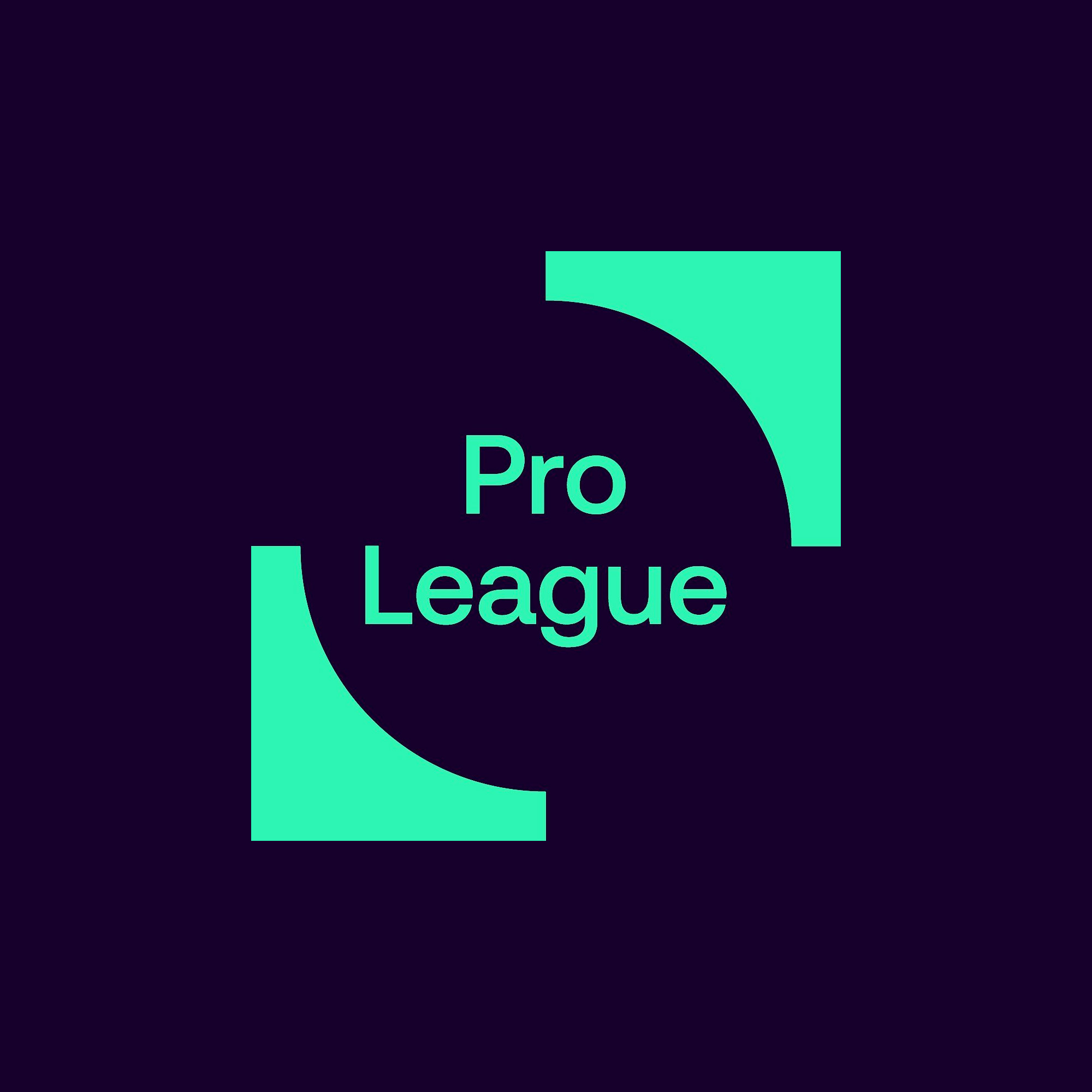
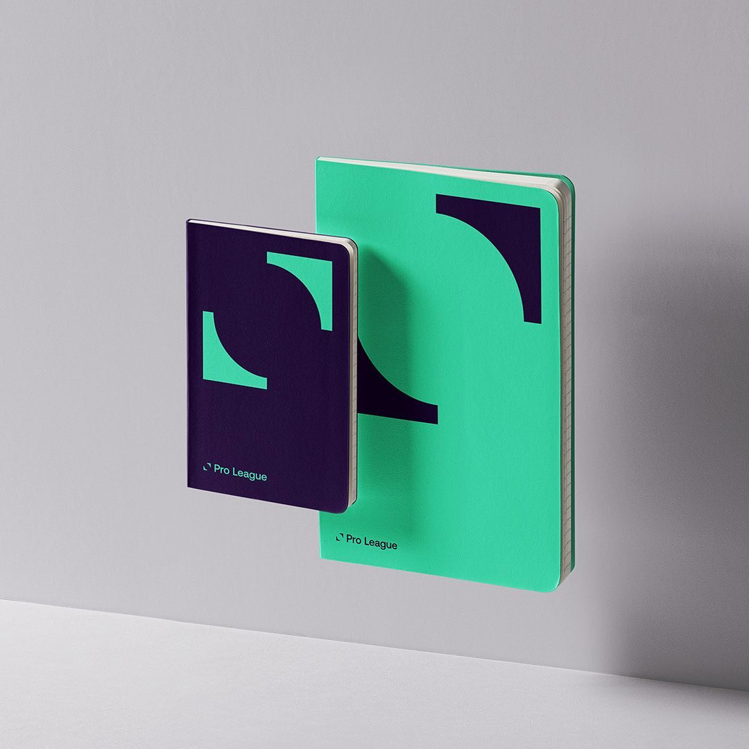
In collaboration with the branding agency Mirror Mirror, the Pro League started from a blank page in order to focus on the essentials. The result is a brand that focuses on the main activity of the Pro League: 1 ball, 2 teams.
The branding agency Mirror Mirror is proud of the result: “Our objective was to translate the specificity and identity of the Pro League into a global visual identity. An identity that perfectly translates what the organization represents: passion, emotion, union and local character. We have created a strong contemporary brand that develops into a dynamic visual system. We have come up with a toolkit that helps the Pro League build a lasting bond between clubs, players and supporters.”
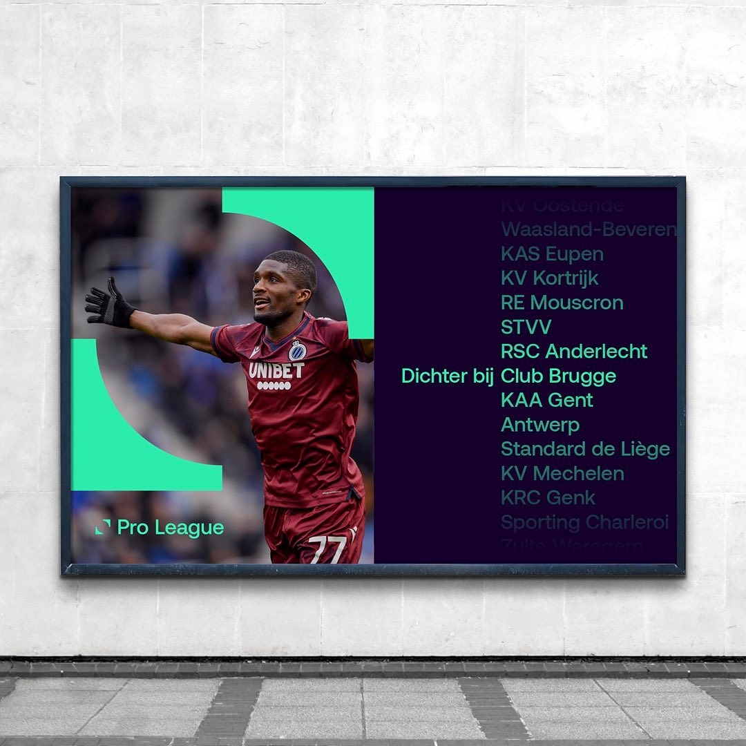
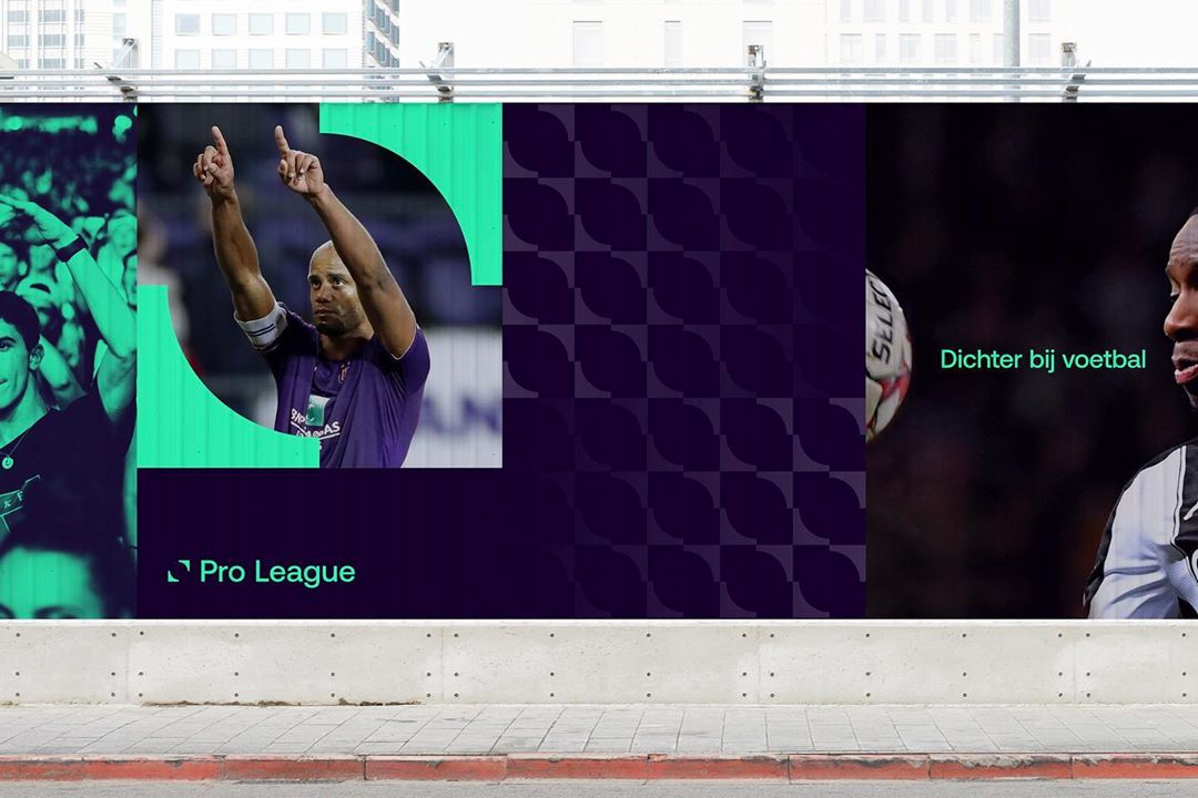
The visual identity is complemented by a new slogan: Closer to football . "This slogan reflects what we, the Pro League, want to defend," said spokesman Stijn Van Bever. “The passion and love for our teams, the atmosphere in the stands, the intensity on the ground, the camaraderie in the stands, his chair or at the cafe. We bring supporters of clubs and clubs closer to supporters, also thanks to the collaboration with our new media partner Eleven Sports. The Pro League must become a strong brand, synonymous with football and passion”.
Images (opinion after)

Opinion
The old logo put the swoosh in swoosh with an epic, unapologetic swoosh the size of not Belgium but at least 3 or 5 Belgiums cobbled together. Add to that gradients and you had yourself a real clunker. The new logo is dramatically minimal with two arrow-like shapes holding a ball in the negative space. The video explains it as being derived from the lines at centerfield and conceptualized as “one ball, two teams”, which, sure, I can get behind. I don’t think the icon is particularly football-y but in the context of the application it can absorb that meaning. The wordmark is fine. The applications, particularly in motion, look promising, with a lot of energy and interesting range of uses of the two corner bits of the icon. The use of gradients in motion looks good. Overall, this builds on the growing trend of football/soccer-related identities going more contemporary and minimal and while it looks good on the surface, I wonder if this one goes a little too far on that spectrum.
In ấn Anpic In nhãn mác Anpic In brochure Anpic In card visit Anpic In catalogue Anpic In thiệp cưới Anpic In tờ rơi Anpic
In Ấn Anpic – Nổi Tiếng In Đẹp In Nhanh
Số 5 Ngõ 75 Nguyễn Xiển, Thanh Xuân, Hạ Đình, Hà Nội
0963223884
baogiainananh@gmail.com
https://anpic.vn
https://g.page/inananpic
In nhãn mác Anpic ✅ In brochure Anpic ✅ In card visit Anpic ✅ In catalogue Anpic ✅ In thiệp cưới Anpic ✅ In tờ rơi Anpic
https://anpic.vn/in-nhan-mac-dep
https://anpic.vn/in-brochure
https://anpic.vn/in-an
https://anpic.vn/in-voucher-in-phieu-giam-gia-khuyen-mai
#inananpic
Comments
Post a Comment