Noted: New Logo and Identity for Bnext by Erretres
“Next in Line”
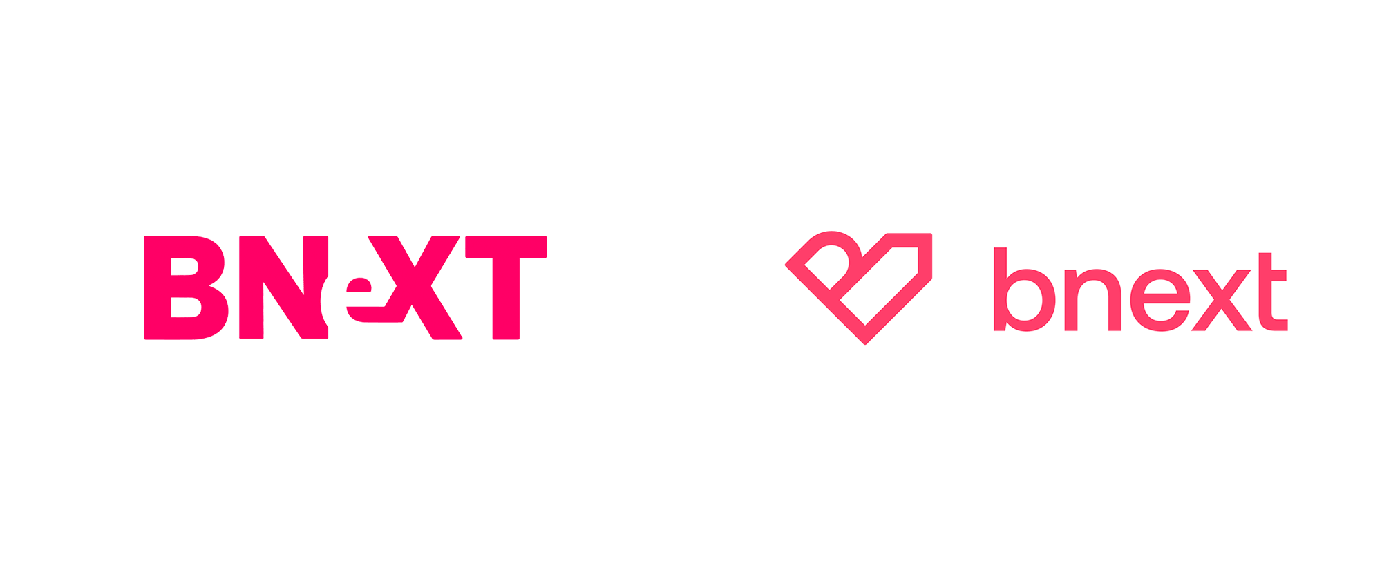
(Est. 2017) "Bnext is a Spanish neobank operating as an Electronic Money Entity under the authorisation of the Bank of Spain. Founded by Guillermo Vicandi and Juan Antonio Rullán in 2017, it offers an alternative to traditional banking allowing people more control over their money thanks to a card linked to a Bnext Standard or Premium account. Bnext also has a Marketplace available from its app that offers a full array of financial services to answer users' needs. Since its launch it has raised over $30M and counts with more than 400,000 active users in Spain. Since early 2020 Bnext operates in Mexico as well."
Design by
Erretres (Madrid, Spain)
Related links
Erretres project page
Relevant quote
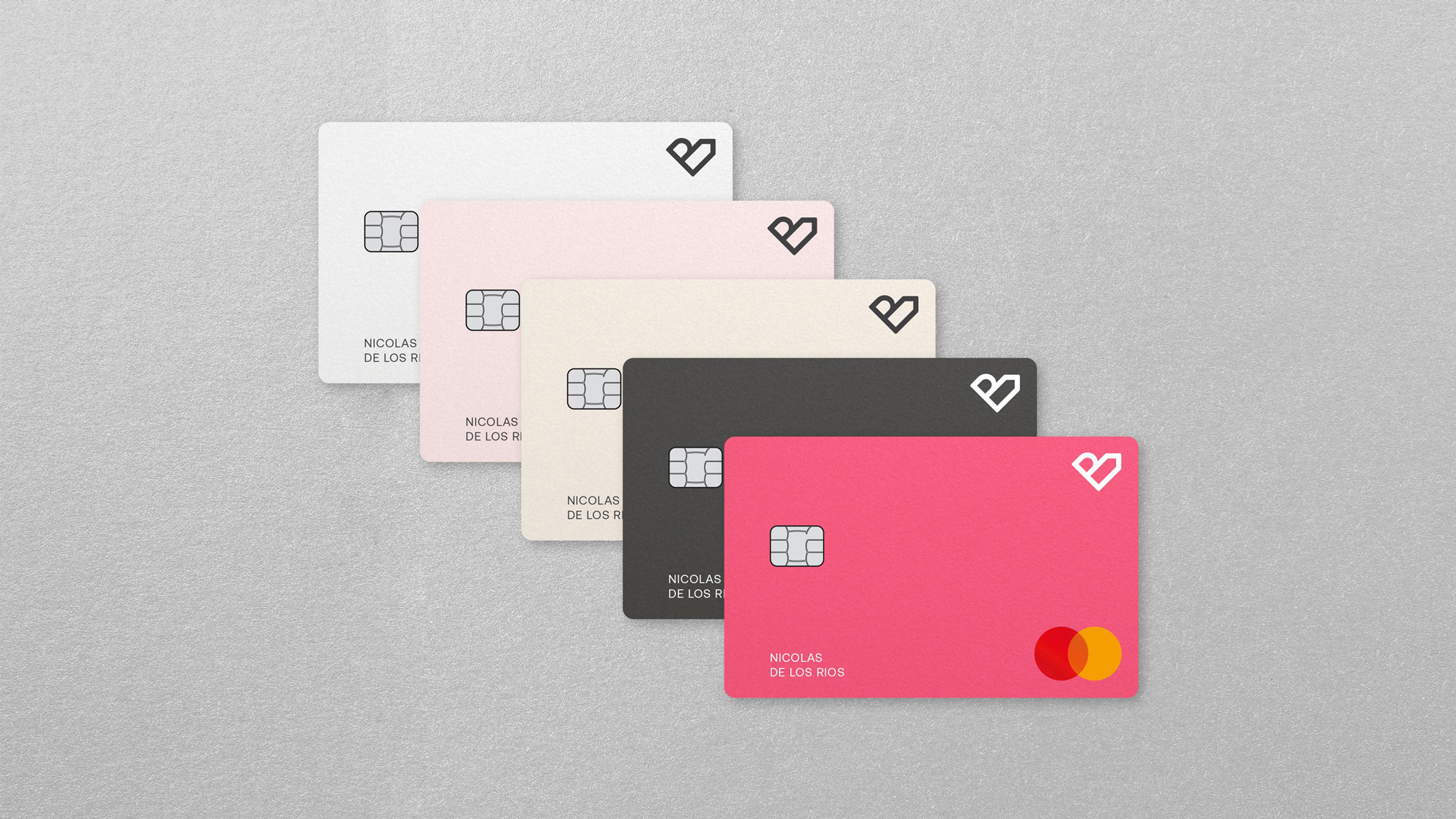
To visualise the brand’s personality, we created a verbal and visual identity based on the combination of emotions (beauty), and growth (reason). The symbol represents both concepts by combining the form of a heart with that of an arrow, conveying growth and future successes.
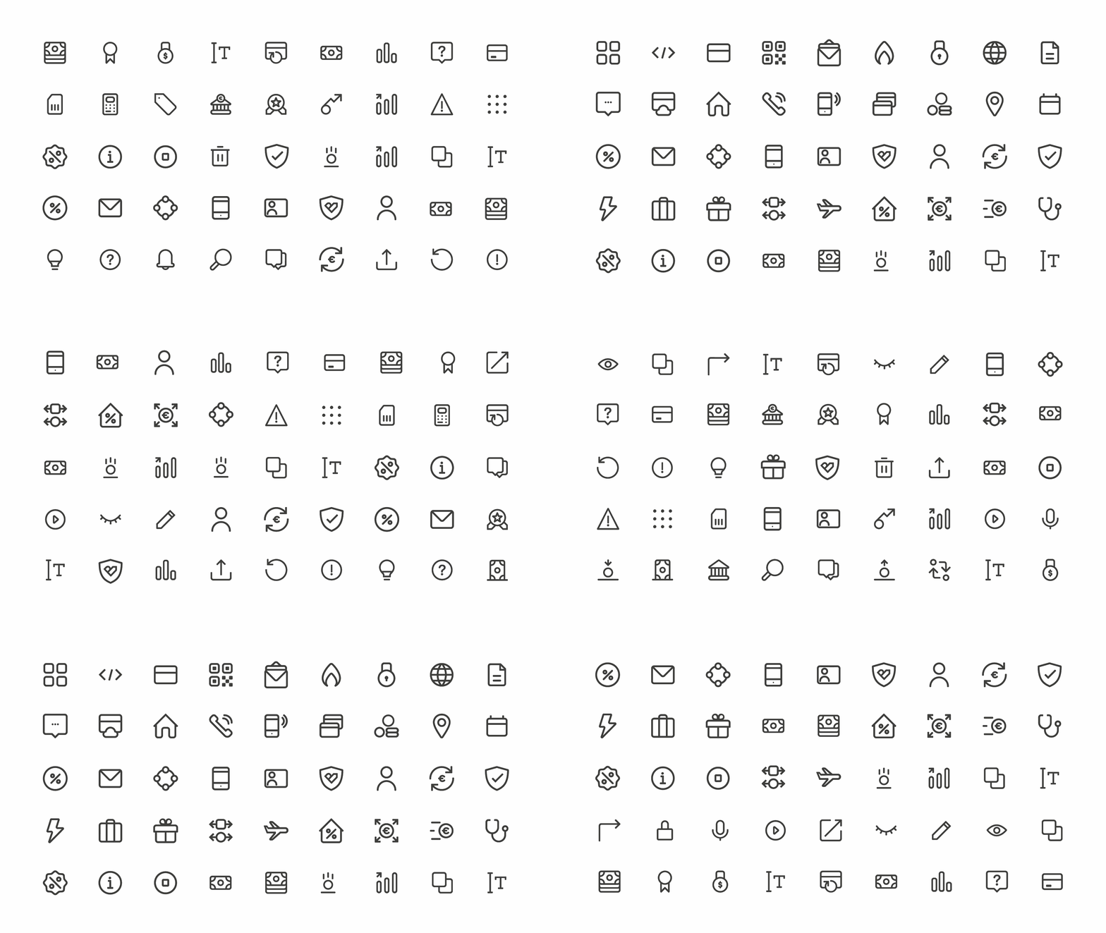
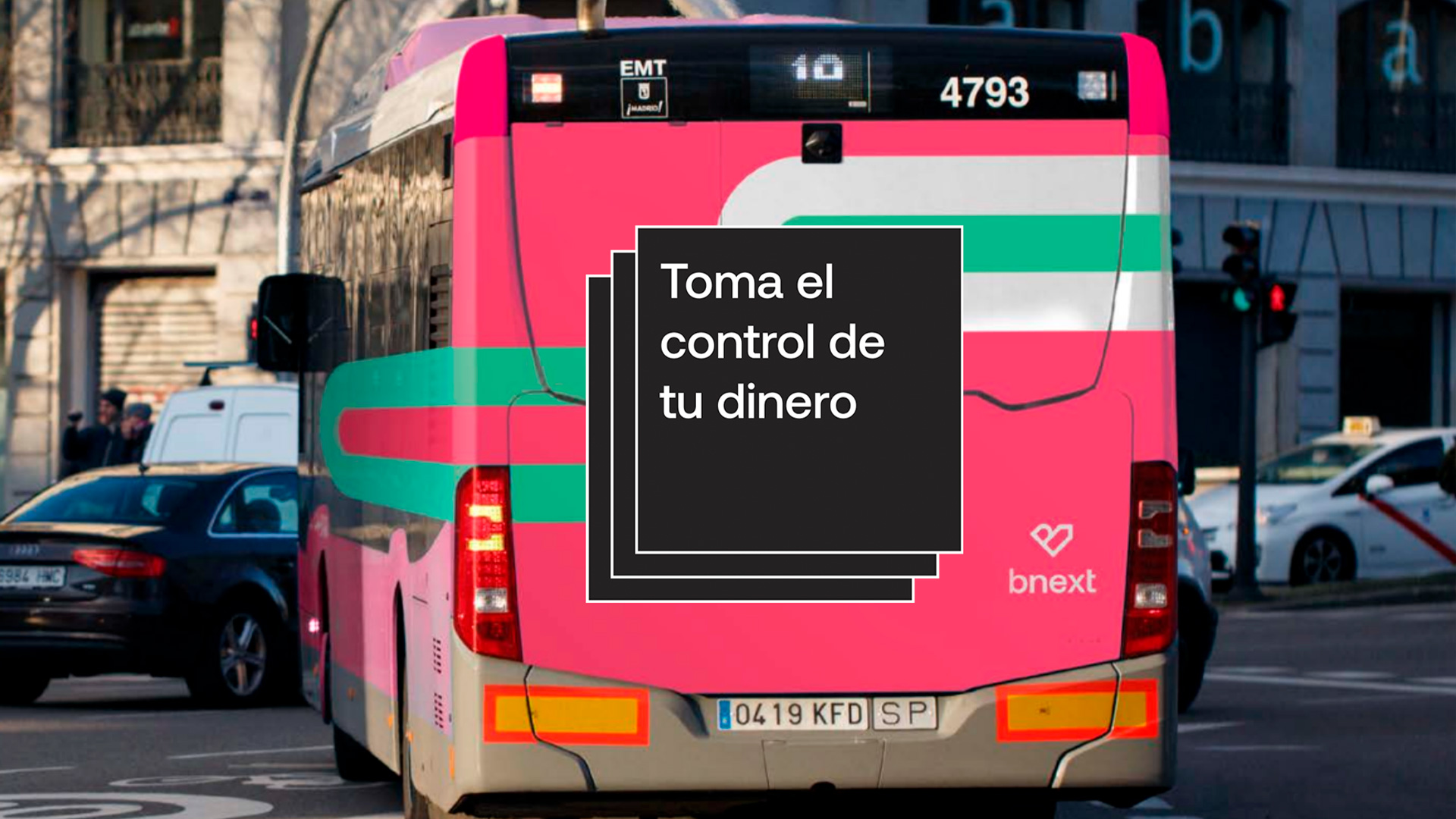
The graphic system was developed to convey flow, movement, and ease. This way, Bnext is the facilitator of future, meaning less complications and more time and power to invest in living life.
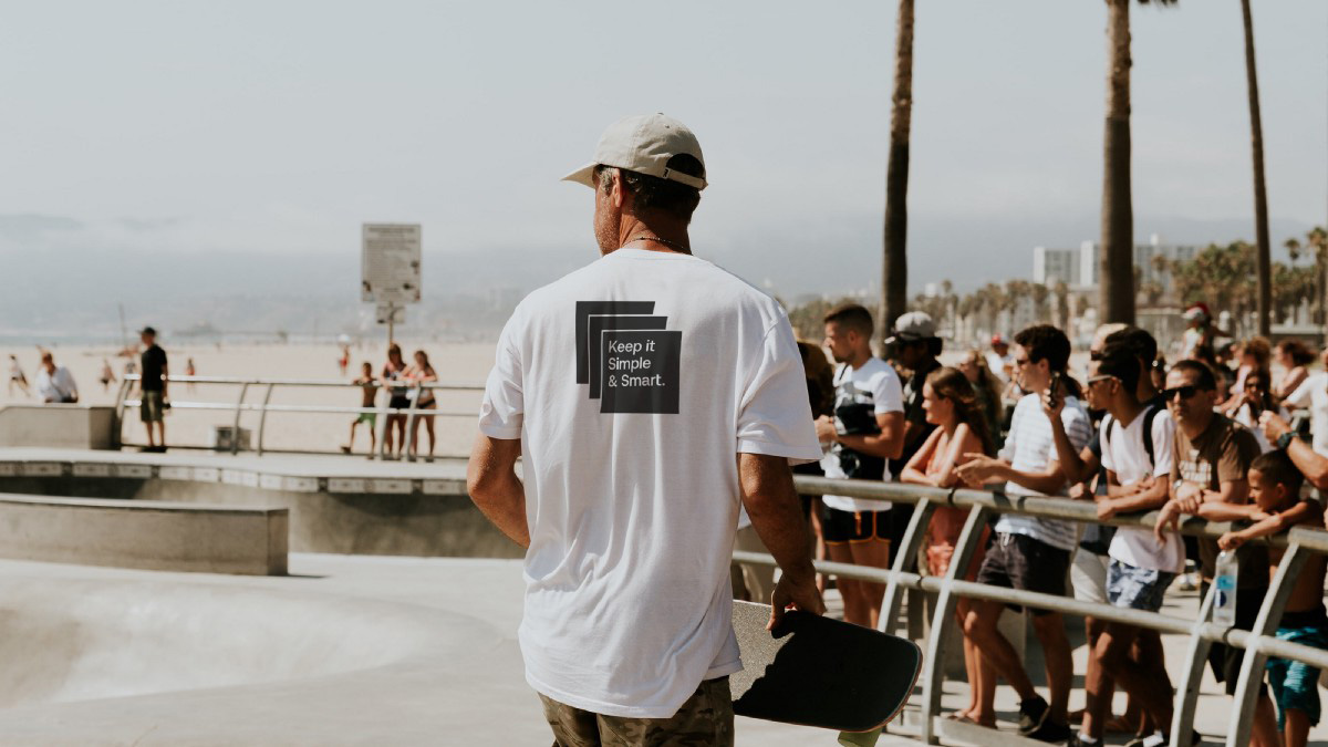
The design system was meant to be versatile for different scenarios, and the growth of Bnext both in services, and operations. Although the digital context would be the more demanding one, we developed physical corporate, and communication touchpoints.
Images (opinion after)




Opinion
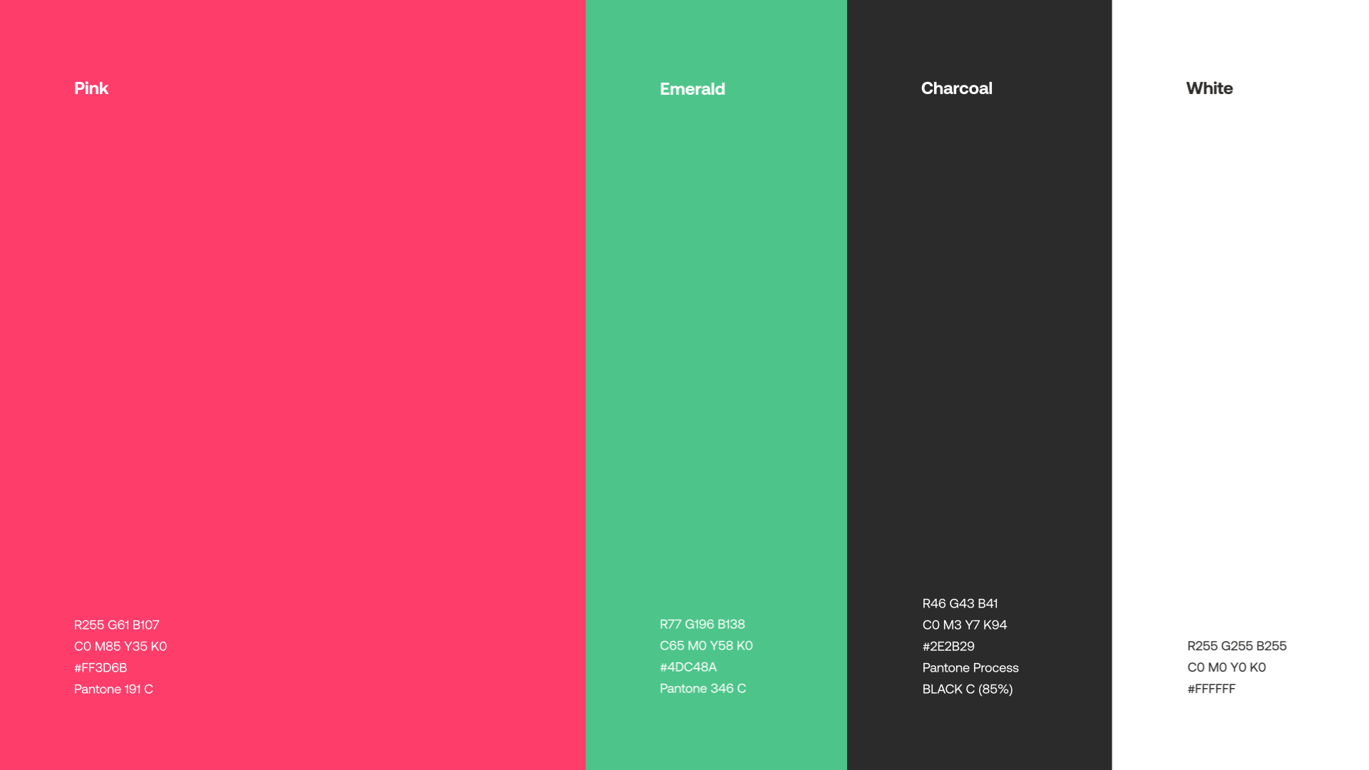
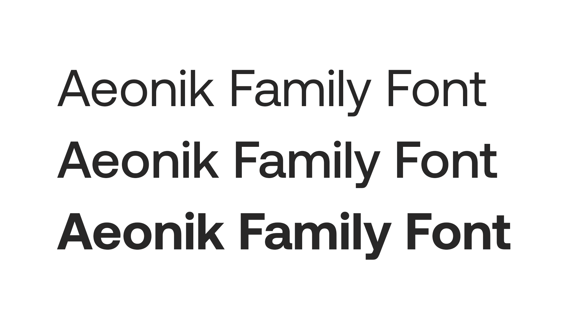
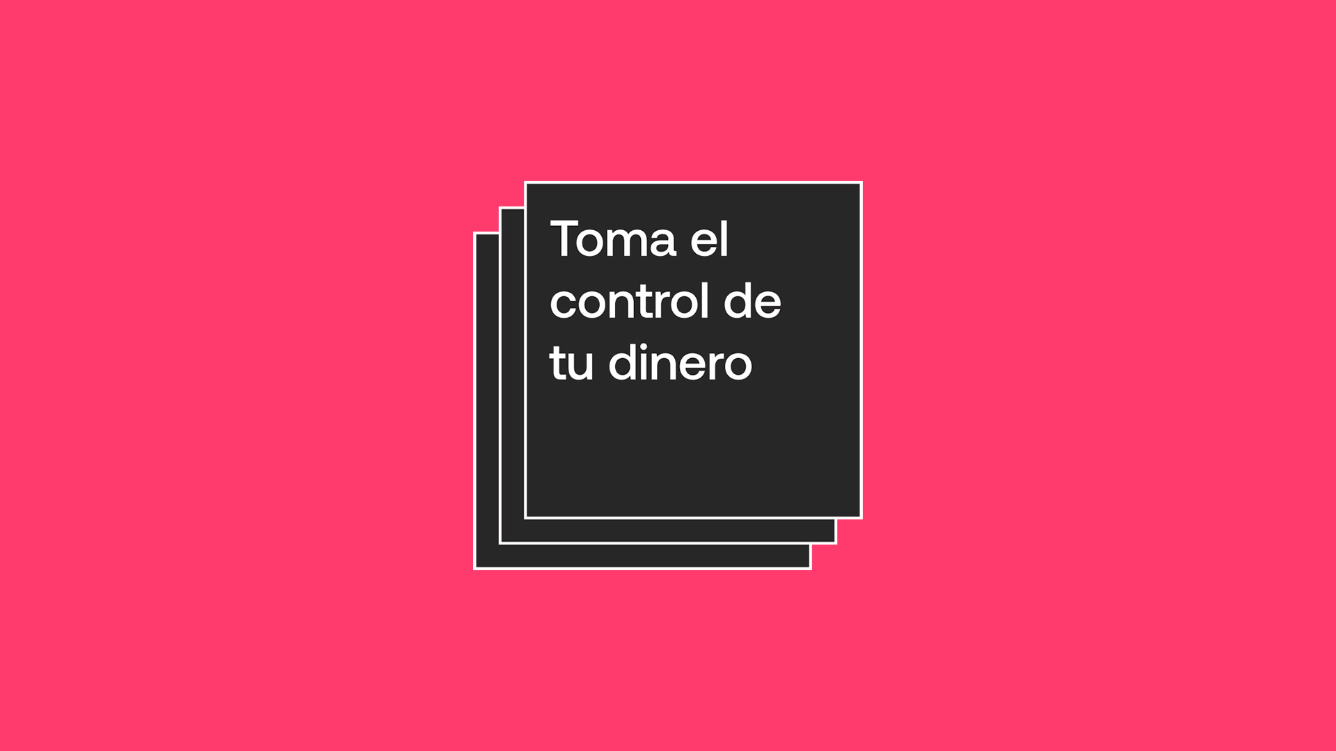
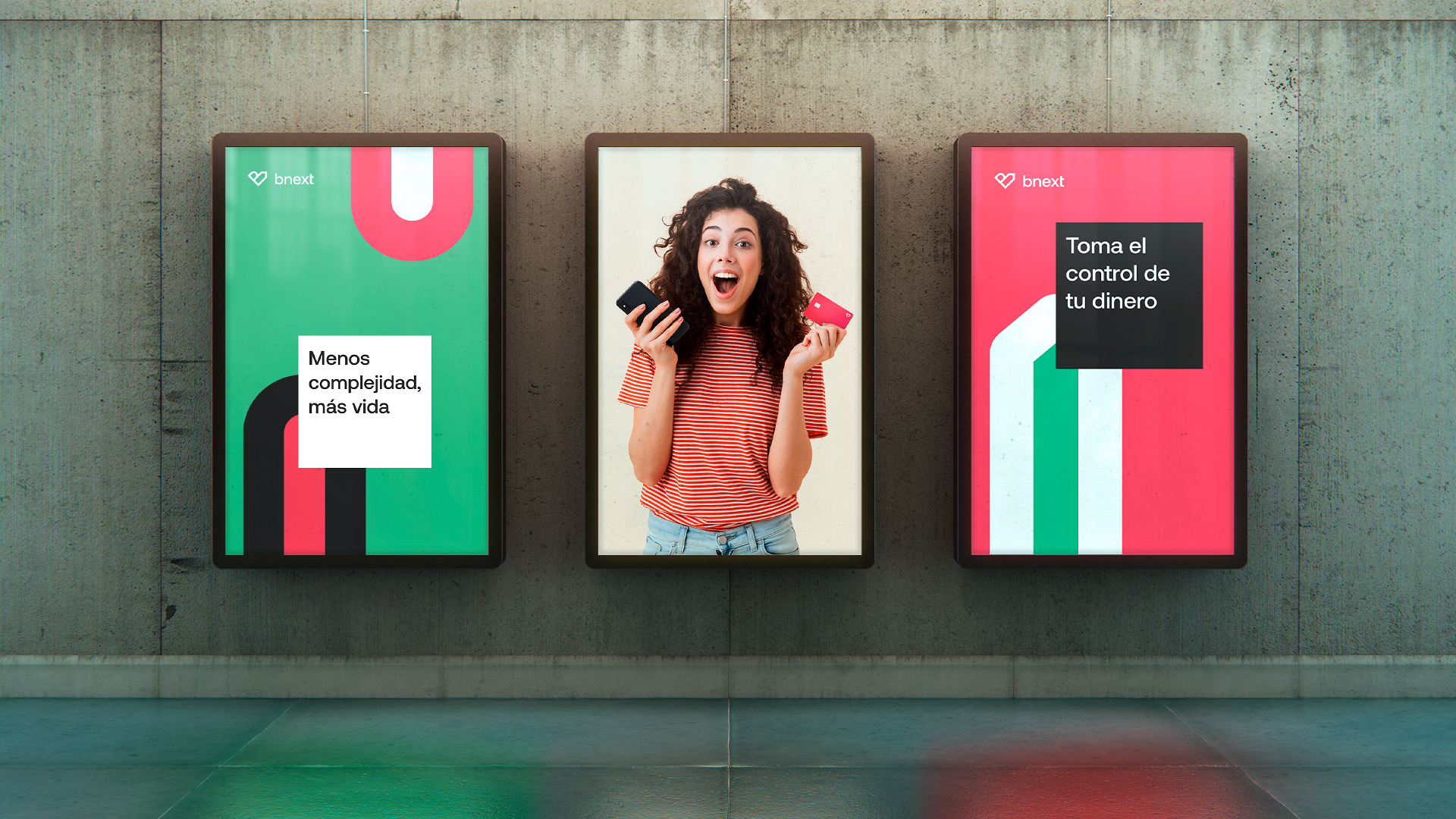
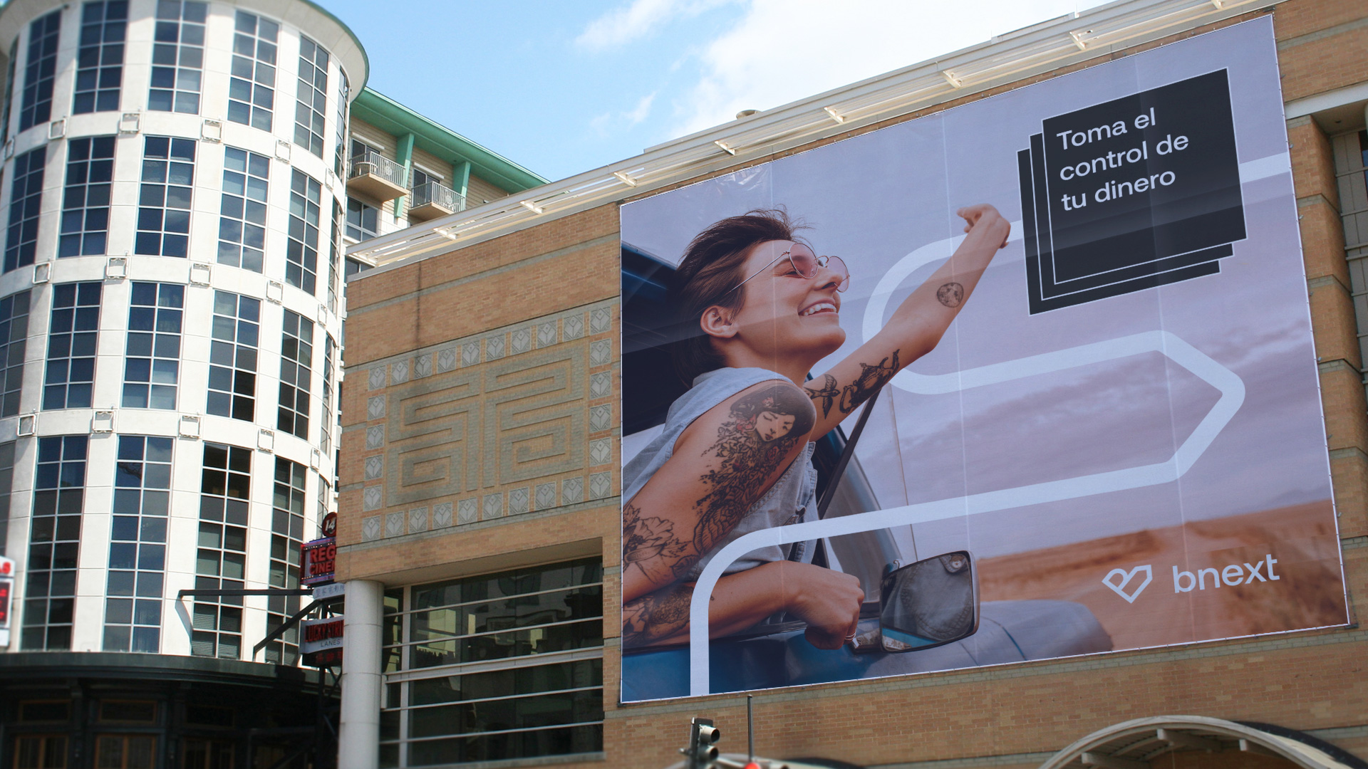
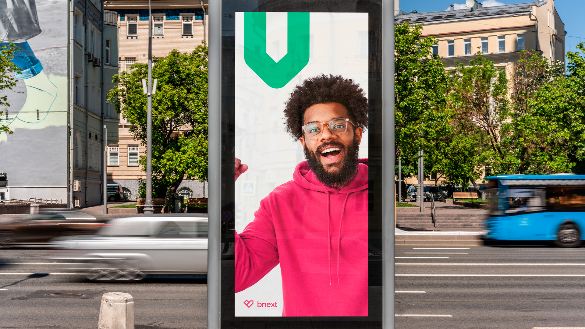
The old logo was super uncomfortable with the the “e” being gagged by the “X” and just an overall sense of unbalance. The new logo thankfully ditches everything about the old one and introduces a new icon that’s a mash-up of a “B”, a heart, and an arrow. The intention was good and the effect is almost there, but the harshness of the arrow really hinders its readability as a heart, given that it’s lacking the softness needed for that read and, as a “B”, it’s kind of awkward. I definitely appreciate the concept and goal to create a tight mark. The wordmark is quite nice, even with it being in that generic sans realm, as it has some nice subtle details throughout. The applications are lively and dynamic thanks in big part to the watermelon-esque color palette. There are perhaps one too many design gestures going on, from the single flow lines to the multi-stroke objects to the stacked black boxes with type in it — this latter one is the one that feels the most random, even if it’s cool on its own. Overall, what this does well is convey a sense of youthfulness that should be attractive to the younger audience that isn’t too keen on banks — heck, I’m in my 40s and I’m not too keen on banks so this feels far more exciting than Chase.
In ấn Anpic In nhãn mác Anpic In brochure Anpic In card visit Anpic In catalogue Anpic In thiệp cưới Anpic In tờ rơi Anpic
In Ấn Anpic – Nổi Tiếng In Đẹp In Nhanh
Số 5 Ngõ 75 Nguyễn Xiển, Thanh Xuân, Hạ Đình, Hà Nội
0963223884
baogiainananh@gmail.com
https://anpic.vn
https://g.page/inananpic
In nhãn mác Anpic ✅ In brochure Anpic ✅ In card visit Anpic ✅ In catalogue Anpic ✅ In thiệp cưới Anpic ✅ In tờ rơi Anpic
https://anpic.vn/in-nhan-mac-dep
https://anpic.vn/in-brochure
https://anpic.vn/in-an
https://anpic.vn/in-voucher-in-phieu-giam-gia-khuyen-mai
#inananpic
Comments
Post a Comment