Noted: New Logo and Identity for Toyota Europe by The&Partnership
“The Car Formerly Known as Toyota”
"Toyota Motor Europe NV/SA (TME) oversees the wholesale sales and marketing of Toyota and Lexus vehicles, parts and accessories, and Toyota's European manufacturing and engineering operations. Toyota directly employs around 20,000 people in Europe and has invested over EUR 9 billion since 1990. Toyota's operations in Europe are supported by a network of 29 National Marketing and Sales Companies across 53 countries, a total of around 3,000 sales outlets, and nine manufacturing plants. In 2018, Toyota sold 1,035,430 Toyota and Lexus vehicles in Europe."
Design by
The&Partnership (London, UK)
Related links
N/A
Relevant quote
The aim of the redesign was to build Toyota’s image as a more progressive brand, while guaranteeing longevity in a digital world and ensuring that the brand continues to appeal to a modern and expanding customer base.
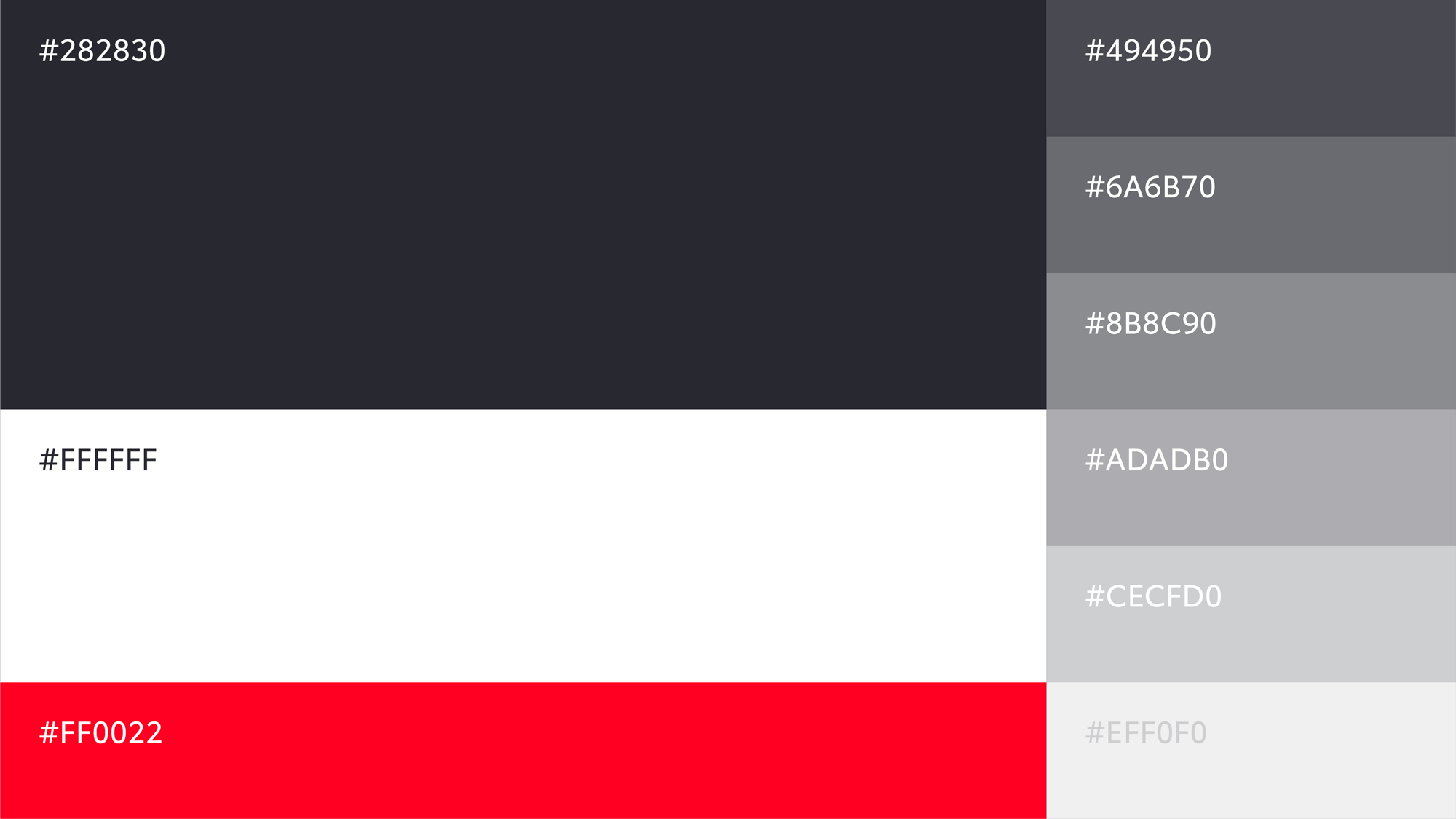
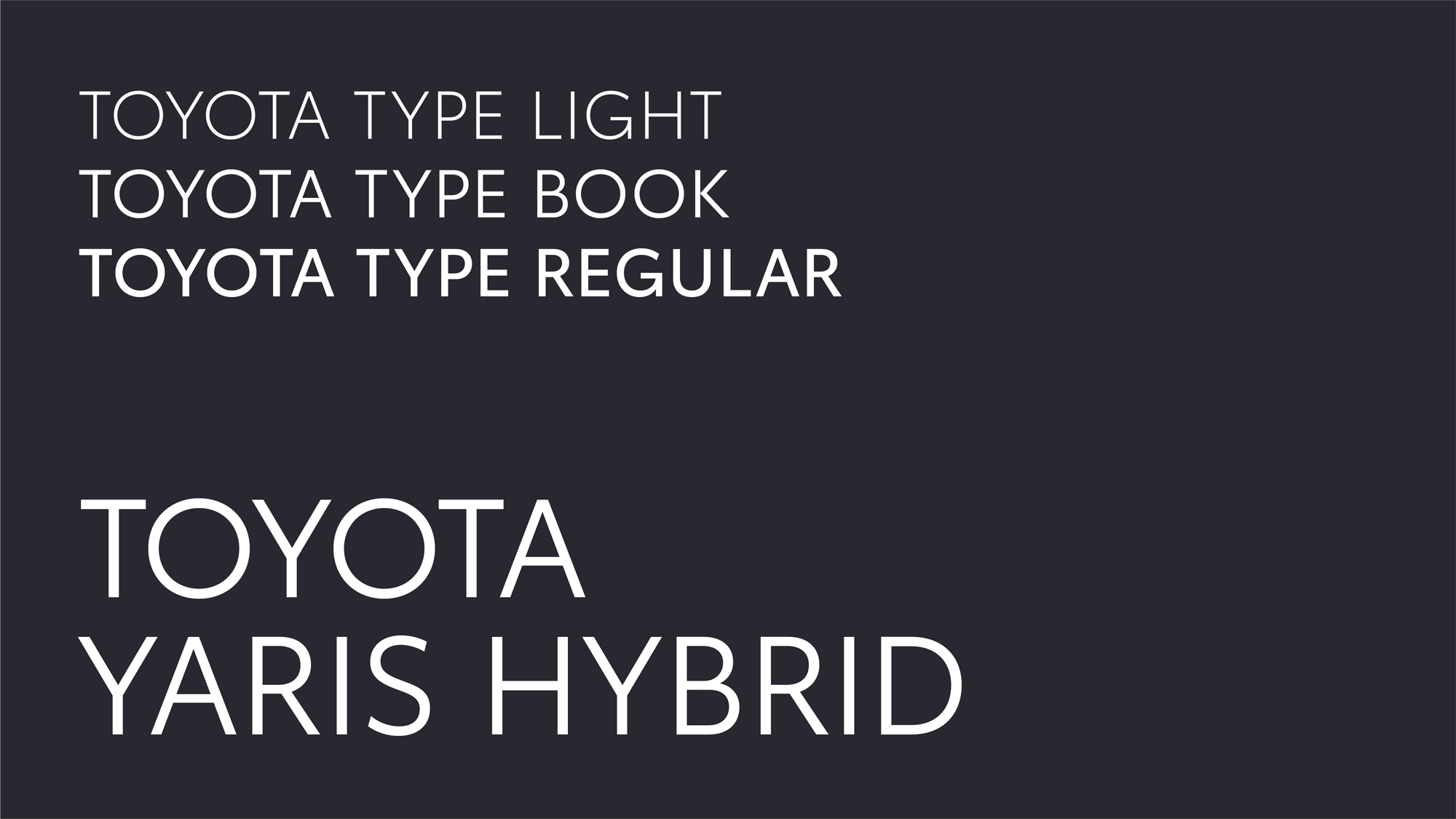
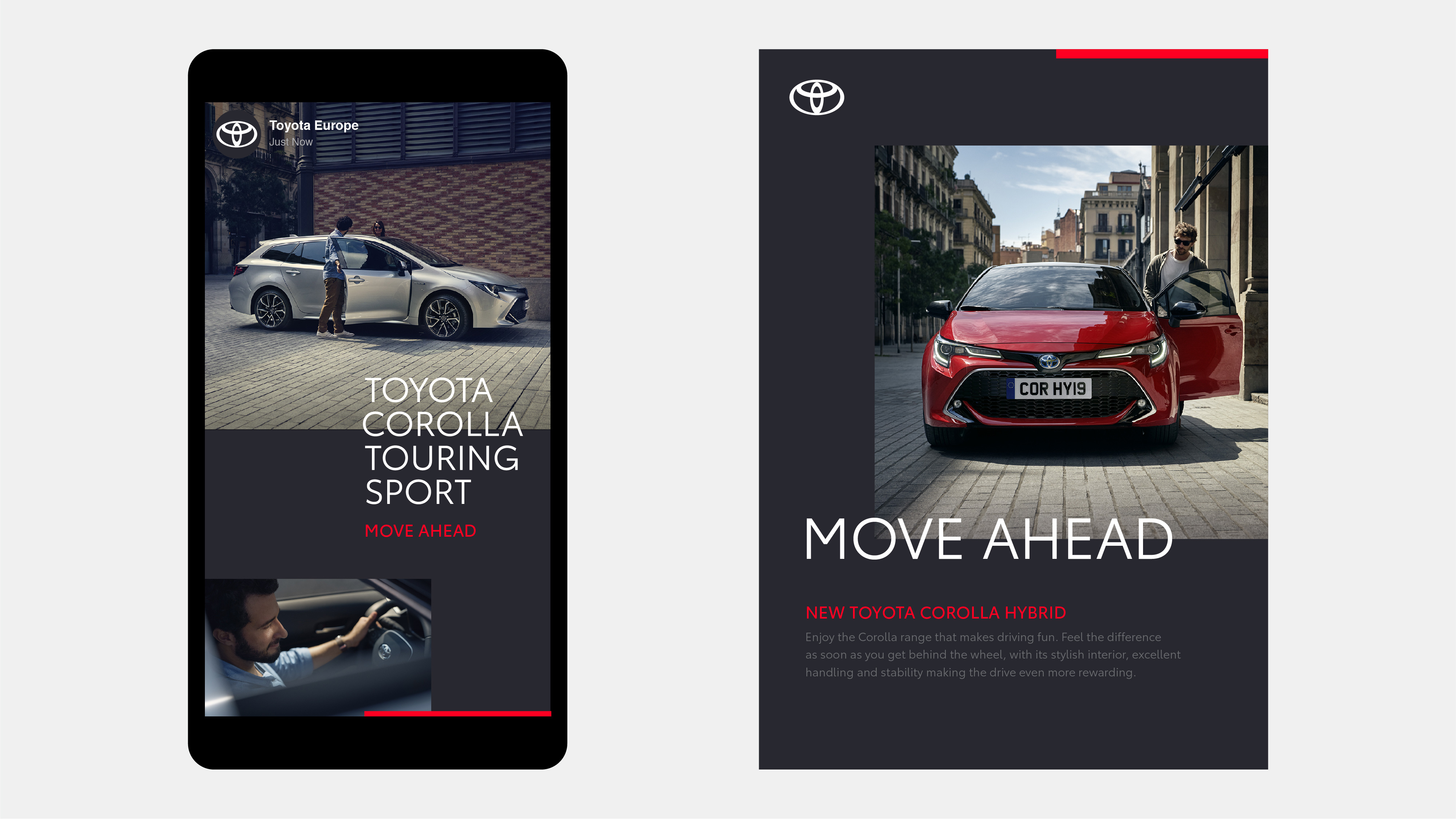
The direction for the new VI is shaped by four key goals: Forward-Thinking, More Premium feel, Consistent and Mobile-First. The&Partnership’s design approach employed simplification, distilling Toyota’s key visual properties into a clean, considered system that better unifies the brand. At its core is the new logo, which distils the brand’s emblem to a simplified 2-D design, losing the ‘Toyota’ wordmark; an acknowledgement of its status as one of the most recognisable brands in the world. The new bespoke typography is Toyota Type, a sans serif font which enhances clarity and consistency across Toyota’s different business units. Emphasising this is the primary colour palette, a clean, premium monochrome, with a red accent that provides a distinctive nod to Toyota. The brand architecture has been streamlined and simplified through name changes, consistent typesetting and logo lock-ups.
Images (opinion after)
Opinion
The big news in this redesign, specific to Europe, is that Toyota is dropping the wordmark and using only its icon, which I assume is meant to be taken as a bold, daring choice but, to Toyota’s credit, the icon stands perfectly on its own and its isolation does not come as a shock. The second selling point is that the logo has gone flat but, also to Toyota’s credit, the logo doesn’t depend on the chrome effect and in my mind I have always pictured it without it, unlike VW or Audi where their previous chrome marks were fairly more recognizable in that style. (Why the top of the smaller, center ellipsis doesn’t connect or disconnect more clearly to and/or from the top is beyond me tho.) So, beyond, a new sans serif and a couple of decent layouts, this all seems pretty straightforward and in a way that doesn’t move the needle for me to think of Toyota in any new distinctive way. I was actually more impressed by this other Toyota effort from 2019 (for the U.S. market) that, on the contrary, played up the wordmark. There is nothing wrong with this in any way — other than the very amateurish logo animation directly above — and I guess a lot depends on what the Toyota Europe identity looked like before, which maybe was a mess? Overall, the typography looks good, the red bar on the layouts is elegant, the layouts look classy, and… yeah, it’s all… fine.
In ấn Anpic In nhãn mác Anpic In brochure Anpic In card visit Anpic In catalogue Anpic In thiệp cưới Anpic In tờ rơi Anpic
In Ấn Anpic – Nổi Tiếng In Đẹp In Nhanh
Số 5 Ngõ 75 Nguyễn Xiển, Thanh Xuân, Hạ Đình, Hà Nội
0963223884
baogiainananh@gmail.com
https://anpic.vn
https://g.page/inananpic
In nhãn mác Anpic ✅ In brochure Anpic ✅ In card visit Anpic ✅ In catalogue Anpic ✅ In thiệp cưới Anpic ✅ In tờ rơi Anpic
https://anpic.vn/in-nhan-mac-dep
https://anpic.vn/in-brochure
https://anpic.vn/in-an
https://anpic.vn/in-voucher-in-phieu-giam-gia-khuyen-mai
#inananpic


Comments
Post a Comment