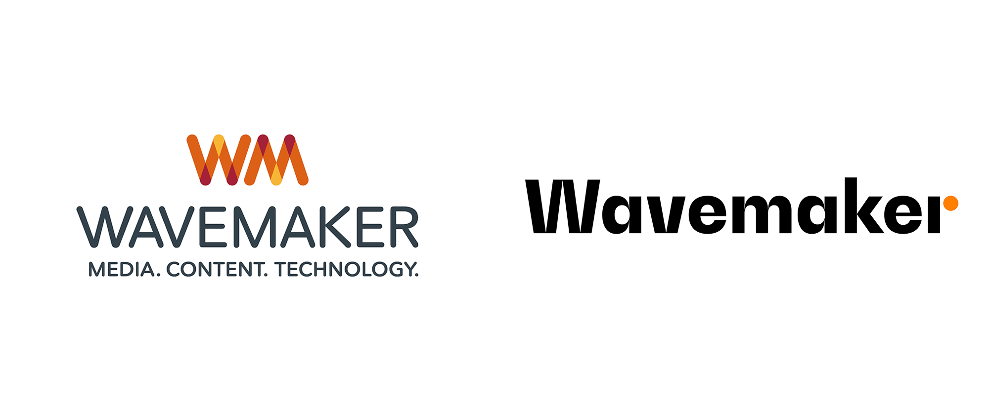
Noted: New Logo and Identity for Wavemaker by NB
“The Domino Effect”

(Est. 2017) "We believe there always is a better way to grow. We positively provoke growth for our clients by reshaping consumer decision-making and experiences through media, content and technology. The Wavemaker way is globally consistent. Fueled by the world's most powerful consumer data, we understand where and how marketing can intervene decisively to help brands win more sales. Our 7,200 people across 88 markets have the deep knowledge, confidence and courage to provoke growth for some of the world's leading brands and businesses. We are a part of GroupM, WPP's global media investment management company."
Design by
NB (London, UK)
Related links
NB project page
Relevant quote
“The solution was one of the more revolutionary ideas shared during the concept stage capturing the new proposition and inspiring confidence in the brand team to make the shift from identity refresh to full global rebrand.”
The distinctive wordmark is complemented by strong geometric forms which feature across digital channels and physical spaces. The dynamic orange dot acts as a metaphor for ‘Positive Provocation’ which sits at the heart of the brand. The identity is clear and scalable allowing it to be confidently applied across a range of applications including Wavemaker’s proprietary technology services.
Images (opinion after)


Opinion
Maybe some of you are wondering if we hadn’t already covered some form of Wavemaker brand before? You would be correct: There is this Wavemaker from 2017 that apparently later transitioned into the before Wavemaker logo shown at the top and is still using it now. Anyway… the old logo… eh, very mediocre in its “WM” monogram and downright terrible in its wordmark (to begin with, the “M” should match the “W” as it does in the monogram but the font choice was all wrong anyway). The new logo is typeset in what looks like BW Gradual (which also made an appearance earlier this week) and while it may be seem like a slightly gratuitous choice I like how a) it avoids any wavy treatments and b) sets up the domino-like objects that make up the identity through the thick slabs in the “W” and “M”. The dot in the “r” is interesting, although, in its circle-ness, it feels too alien to the proportions of the rest of the letters — its rationalization as “a metaphor for ‘Positive Provocation’” makes my eyes roll to the back of my skull but it’s the kind of stuff that media companies like Wavemaker say, so I will begrudgingly admit it’s on point. In application the dot wreaks havoc on the angled blocks (which I am guessing are a metaphor for the status quo) and as much as I am being a little sarcastic about it I do like it and appreciate the visual tension the interplay of the elements achieve, especially in animation. Bonus points for the interactivity on their website. Overall, this is definitely appropriate, well done, and — sorry, I can’t help one last dose of sarcasm — perfect for disruptors.
In ấn Anpic In nhãn mác Anpic In brochure Anpic In card visit Anpic In catalogue Anpic In thiệp cưới Anpic In tờ rơi Anpic
In Ấn Anpic – Nổi Tiếng In Đẹp In Nhanh
Số 5 Ngõ 75 Nguyễn Xiển, Thanh Xuân, Hạ Đình, Hà Nội
0963223884
baogiainananh@gmail.com
https://anpic.vn
https://g.page/inananpic
In nhãn mác Anpic ✅ In brochure Anpic ✅ In card visit Anpic ✅ In catalogue Anpic ✅ In thiệp cưới Anpic ✅ In tờ rơi Anpic
https://anpic.vn/in-nhan-mac-dep
https://anpic.vn/in-brochure
https://anpic.vn/in-an
https://anpic.vn/in-voucher-in-phieu-giam-gia-khuyen-mai
#inananpic
Comments
Post a Comment