Noted: New Logo and Identity for Solarisbank by LIT
“S Marks the Spot”
(Est. 2016) "Solarisbank is the first Banking-as-a-Service platform with a full banking license that enables companies to offer their own financial products. Through APIs, partners gain access to Solarisank's modular services including payments and e-money, lending, digital banking as well as services provided by integrated third party providers. Through this, Solarisbank creates a highly developed technological banking ecosystem for fintechs and established digital companies, as well as banks and corporates."
Design by
LIT (Berlin, Germany)
Related links
LIT project page
Relevant quote
The challenge for LIT was to develop a brand identity that balances the seriousness of the B2B target group with the appeal of a B2C tech brand. Solarisbank’s startup agility and momentum had to be maintained, while at the same time the rebranding had to visualize the company's entry into a new, more mature phase. Another challenge was to get the employees, who were very attached to the original brand, on board right from the start. The team was therefore involved in the rebranding development process via interviews and workshops.
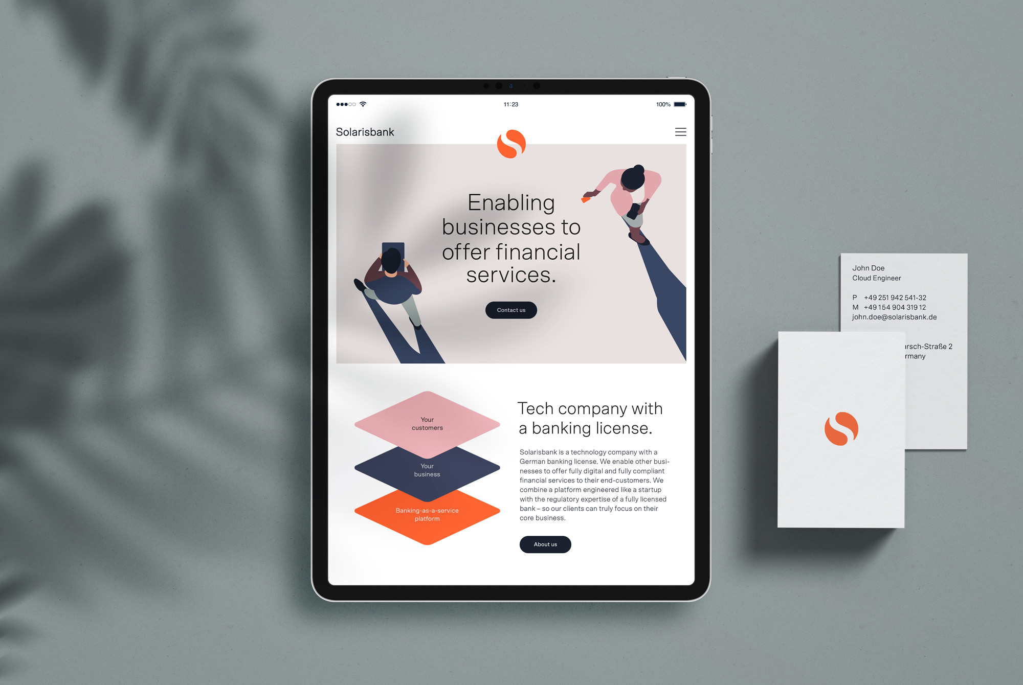
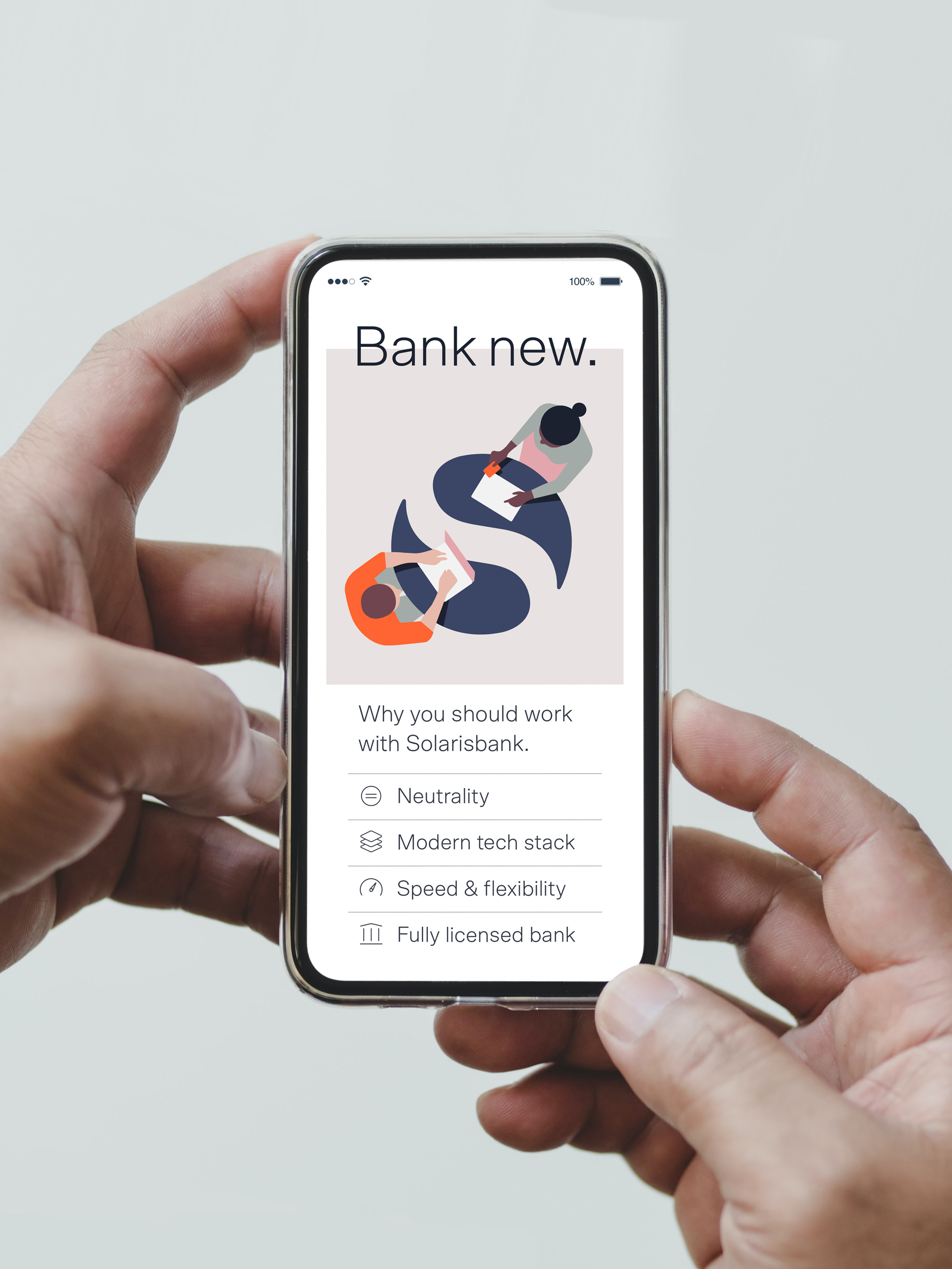
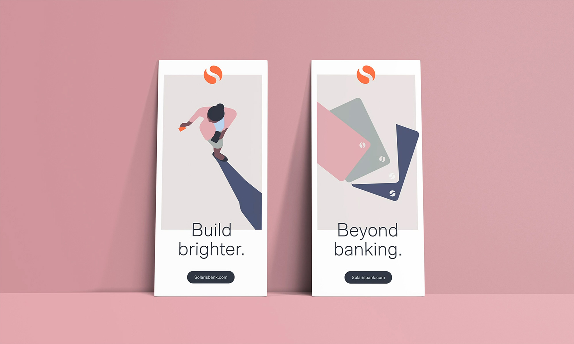
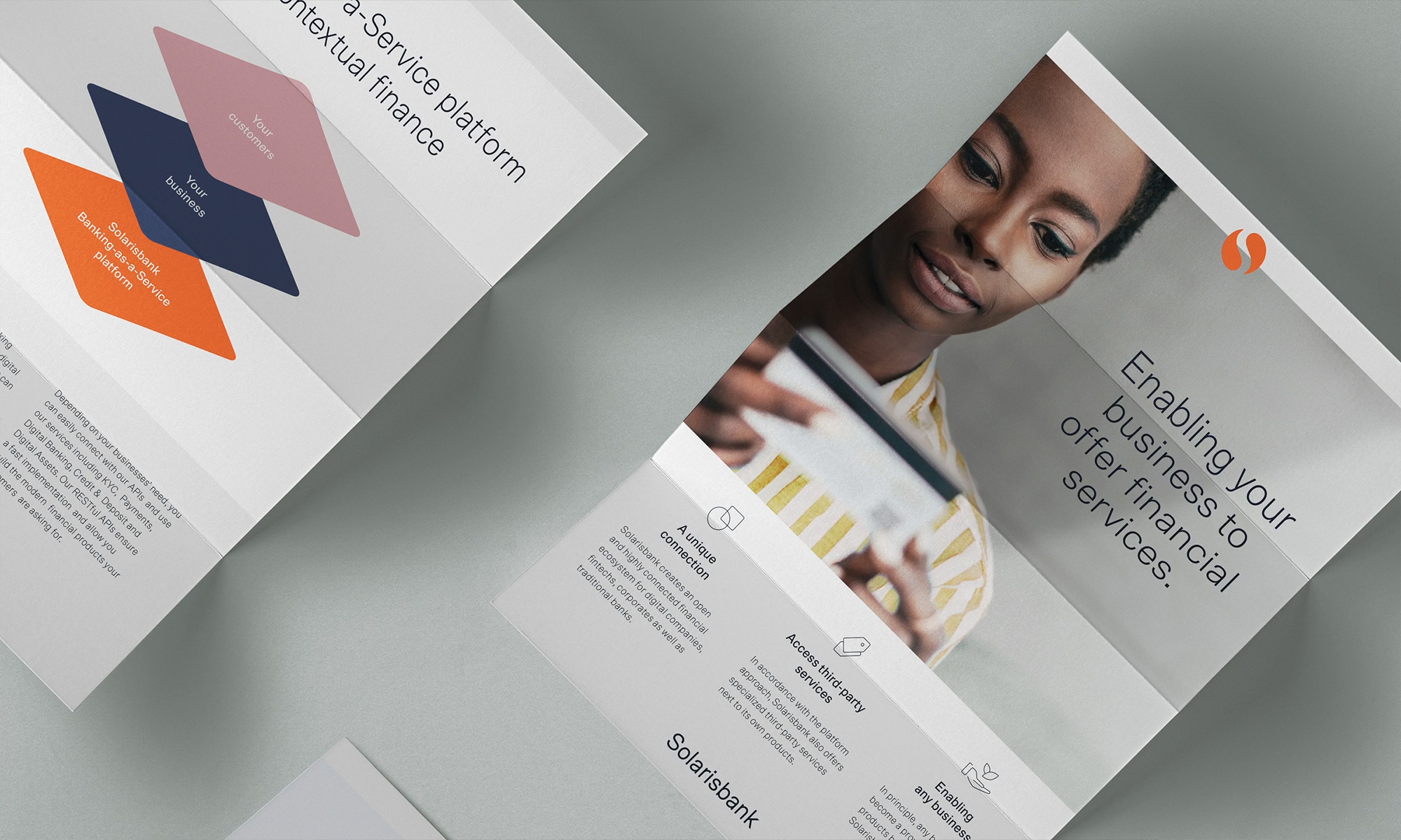
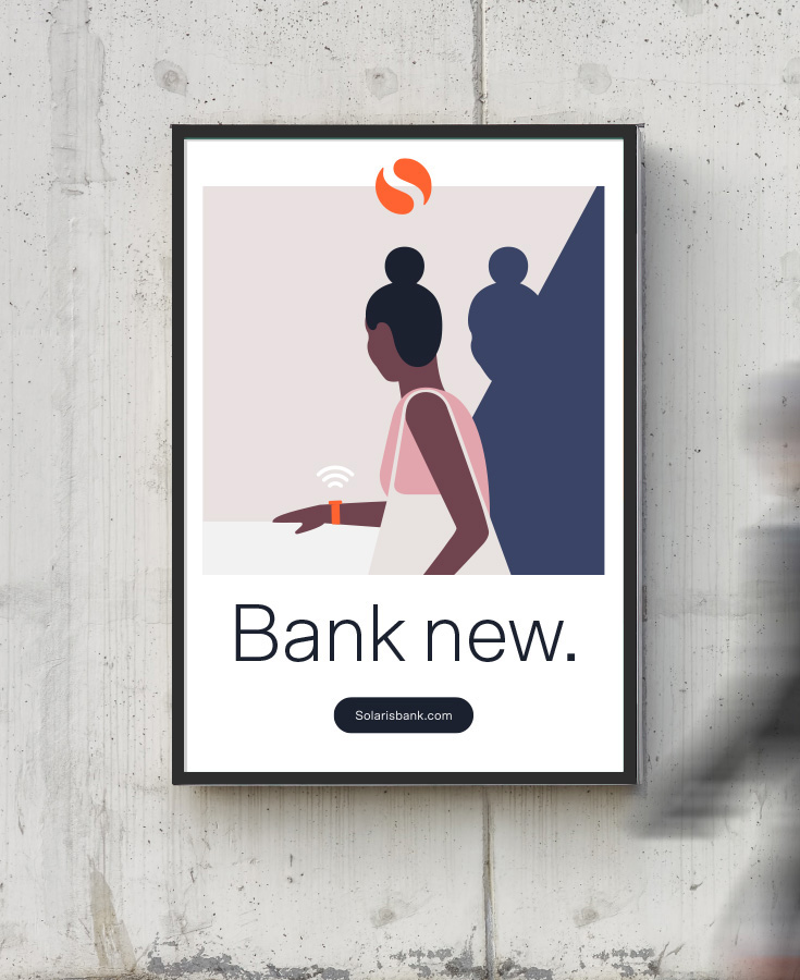
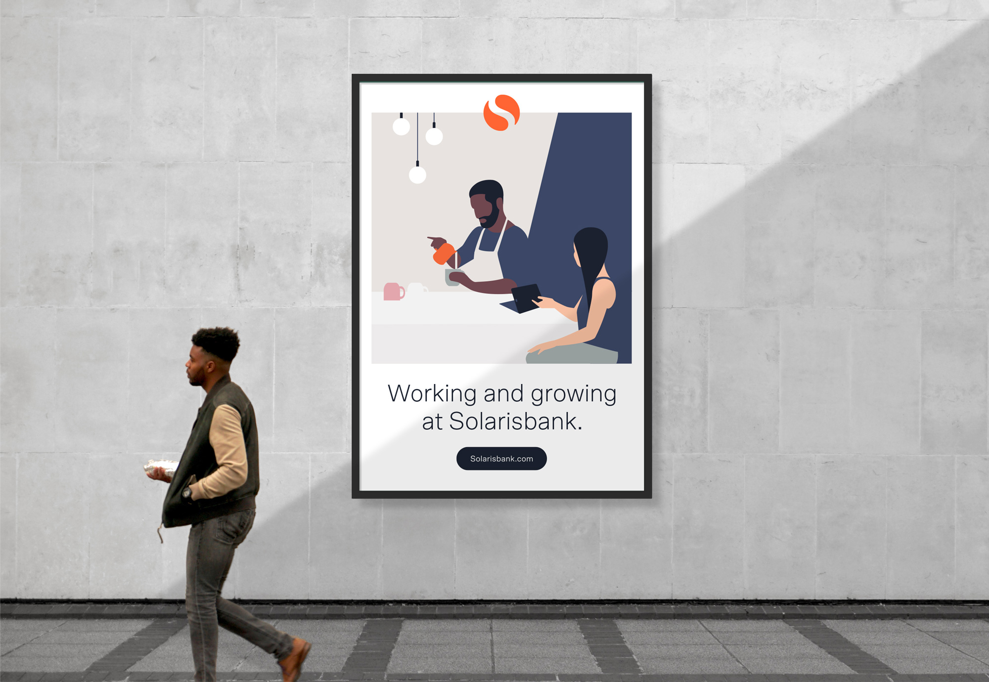
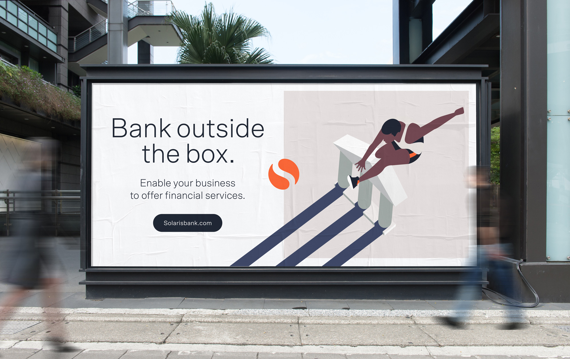
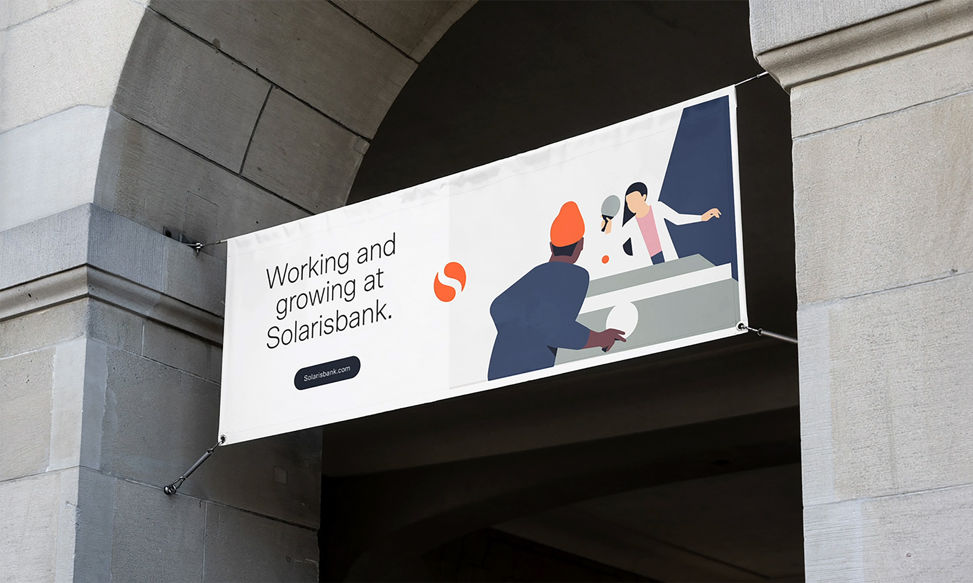
At the heart of the brand is the new logo, which has been reduced to its simplest form, reflecting Solarisbank's goal of taking the complexity of banking away from its partners. The new logo resembles a seal of trust and recalls the use of seals when by old banks when signing their documents while preserving the heritage of the original logo. In line with the simplification of the logo, the entire look and feel of the fintech has been streamlined: the visual language is now brighter and lighter, and a new color palette with warmer and softer tones gives the brand a more human and accessible touch. The characteristic Solarisbank orange reminds of the origins and retains the recognizable, confident and optimistic character that the old Solarisbank brand had established. An expressive illustration style breathes life into the brand by showing that the technology developed by Solarisbank is not anonymous, but positively influences people's lives.
Images (opinion after)


Opinion
The old logo was pretty bad, with a needlessly complex monogram that overlaid three negative-“S” circles with gradients and punctuated by a spurless sans serif (my enemy!) with a terrible mix of lower and uppercase. The new logo cleans up the monogram to reveal a simple “S” in the negative space of a circle that, in turn, yields a Yin and Yang motif — a little cheesy and nothing groundbreaking but certainly a welcome evolution. I also can’t help but think of Safeway’s logo which is of no legal concern to anyone but, in my mind, I keep seeing this as a supermarket not a fintech. The good thing is I have the ability to move beyond that because I’m of strong mind and heart. Anyway… the wordmark is also a big improvement simply because it’s not what it used to be but also because the typeface, Scto Grotesk, is a very nice choice. It’s a little generous on the letter-spacing but I don’t mind it too much. The illustrations are of the faceless kind and unlike other recent faceless illustrations there is nothing too unique or distinctive about these. The hard shadows are interesting but the overall feel of these is rather unfinished. Nonetheless, they do look good in application, thanks in part to the consistent color palette and how nice Scto Grotesk is and how will it sits on top and along them. I do like how the monogram is placed halfway on the illustrations and halfway on the white backgrounds. Overall, this is a fairly conservative identity with some nice splashes of color and personality but ultimately maybe falls flat.
In ấn Anpic In nhãn mác Anpic In brochure Anpic In card visit Anpic In catalogue Anpic In thiệp cưới Anpic In tờ rơi Anpic
In Ấn Anpic – Nổi Tiếng In Đẹp In Nhanh
Số 5 Ngõ 75 Nguyễn Xiển, Thanh Xuân, Hạ Đình, Hà Nội
0963223884
baogiainananh@gmail.com
https://anpic.vn
https://g.page/inananpic
In nhãn mác Anpic ✅ In brochure Anpic ✅ In card visit Anpic ✅ In catalogue Anpic ✅ In thiệp cưới Anpic ✅ In tờ rơi Anpic
https://anpic.vn/in-nhan-mac-dep
https://anpic.vn/in-brochure
https://anpic.vn/in-an
https://anpic.vn/in-voucher-in-phieu-giam-gia-khuyen-mai
#inananpic


Comments
Post a Comment