Noted: New Logo and Packaging for Tohum by Pearlfisher
“Tohum it may Concern”
(Est. 2009) "Tohum is born out of a deep passion for the simplest forms of beauty. 'Tohum', means seed in Turkish. It symbolizes the idea of a seed brimming with life and ready to flourish in nature. Tohum celebrates every seed's unique natural beauty with expressive design, and creates entirely personal pieces of expression. Tohum's aesthetic is free and fluid; revealing the original beauty of natural stones and materials creating pure organic shapes and structures. Verda Alaton has created Tohum out of her lifelong passion for natural beauty and her fascination with exotic and ethnic cultures. In 2009, she launched Tohum Design: bringing to life her unique perspective on simplicity and expressiveness with a passionate belief. Tohum Design is the contemporary interpretation of that eternal and coherent beauty. Each creation is singular in both beauty and uniqueness. To remain close to nature as possible is the ultimate goal of Tohum Design. Every piece in Tohum collection is unique and has been thoughtfully categorized by materials, inspiration and vision. Every Tohum is a bespoke handcrafted design using traditional techniques; adorning humanity in a way nature had always intended. Tohum uses all natural materials including, crystals, wood, shells, meteorites and seeds. Tohum Design is available at respectable online and physical Boutiques around the world. Net-A-Porter, Browns Fashion, MyTheresa.com, ModaOperandi, Barneys NY, Modist, Harvey Nichols Doha, is some of them. Also available in boutiques in Australia, Lebanon, Israel, Germany, Luxembourg, South Korea, Japan, Belgium, Denmark and Switzerland."
Design by
Pearlfisher (London, UK / New York, NY)
Related links
Pearlfisher project page
Relevant quote
Reflecting the originality of Tohum designs, our wordmark brings together a strong sense of form and fluidity to create a seamless connection and to take Tohum forward as a natural luxury brand for everyone.
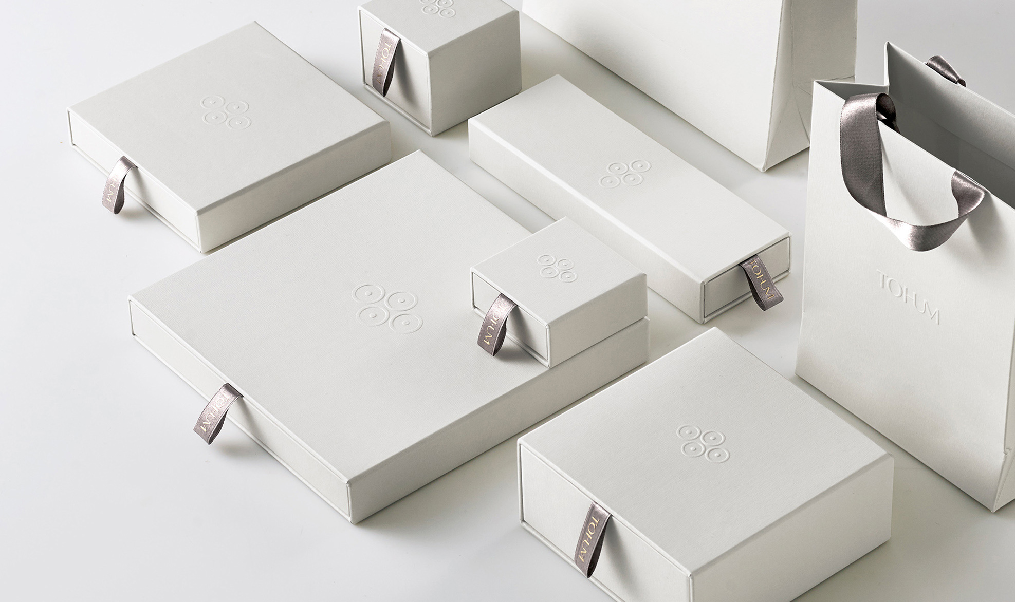
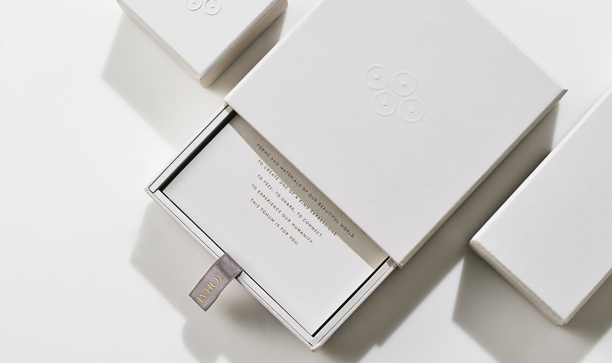
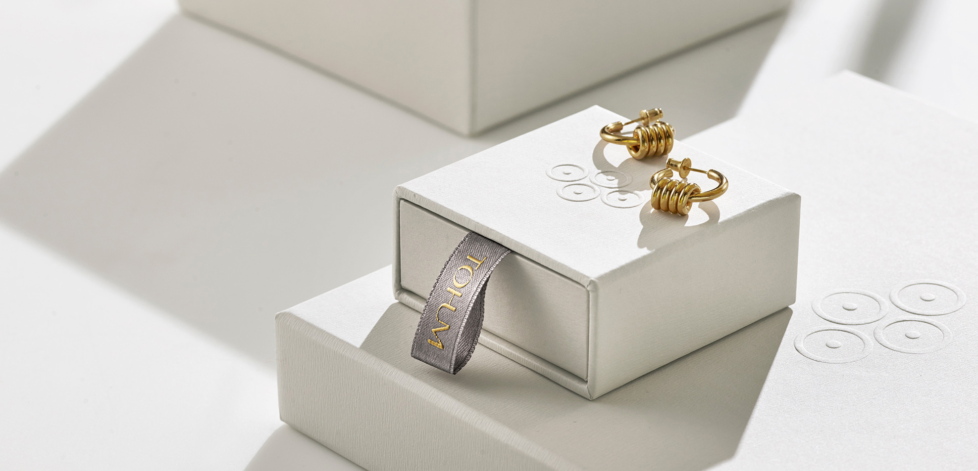
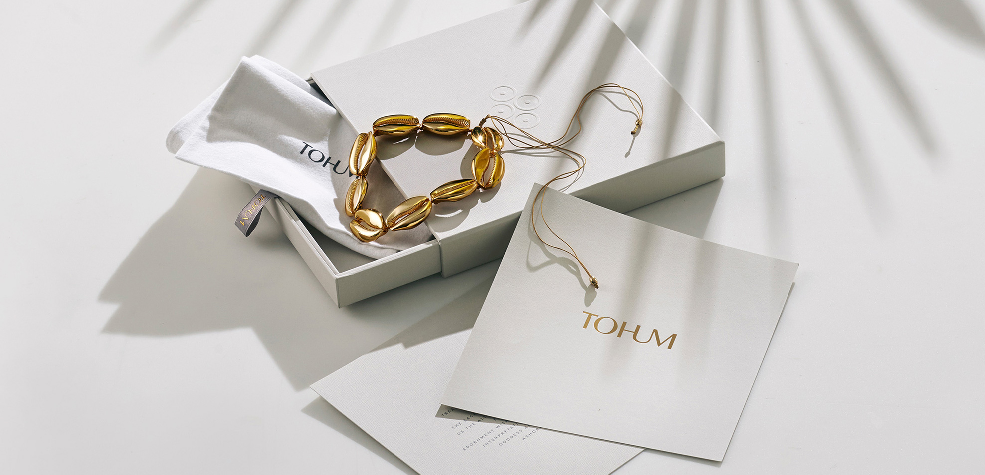
The elegant lettering – through its graceful posture and intertwining nature – evokes a feeling of continuity whilst crafting a sense of space, air and light reflected in the choice of a natural white, charcoal and gold palette. The new circle and dot symbol takes inspiration from ancient cultures and primitive African art forms, carrying meaning and all the values of the brand by expressing connection, continuity and the circular nature of life.
Images (opinion after)
Opinion
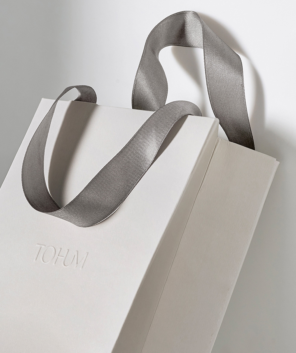
The old logo, as far as I can tell, had a wobbly “O” on purpose — it’s not a super popular logo on Google Image Search but the two instances I found, it was consistent — because I do not know why but other than that, it was very ho-hum (see what I did there?). The new logo employs a high-contrast sans serif, which is a quick signifier of “luxury”, but adds an interesting twist by turning “HUM” into a ligature. My instant reaction is that I like it but there is something a little off about it… maybe the “U” needed to dip slightly more below the baseline to fill in that ample space around its bottom. Perhaps the ligature also draws too much attention and gives more weight to the “HUM” part of the name. Still, there is something nice about it and I like the conceptual interpretation that the “U” could be seen as a necklace hanging from the neck. The secondary mark of four circles with a dot is quite nice and even though they describe it as “expressing connection, continuity and the circular nature of life” I prefer my own interpretation that they look like seeds, which is what “tohum” means in Turkish. The packaging is beautiful in its all-white aesthetic with the gray ribbon and gold foil logo as the lone accents. Overall, this exudes luxury in a non-opulent way.
In ấn Anpic In nhãn mác Anpic In brochure Anpic In card visit Anpic In catalogue Anpic In thiệp cưới Anpic In tờ rơi Anpic
In Ấn Anpic – Nổi Tiếng In Đẹp In Nhanh
Số 5 Ngõ 75 Nguyễn Xiển, Thanh Xuân, Hạ Đình, Hà Nội
0963223884
baogiainananh@gmail.com
https://anpic.vn
https://g.page/inananpic
In nhãn mác Anpic ✅ In brochure Anpic ✅ In card visit Anpic ✅ In catalogue Anpic ✅ In thiệp cưới Anpic ✅ In tờ rơi Anpic
https://anpic.vn/in-nhan-mac-dep
https://anpic.vn/in-brochure
https://anpic.vn/in-an
https://anpic.vn/in-voucher-in-phieu-giam-gia-khuyen-mai
#inananpic


Comments
Post a Comment