Noted: New Logo for Mars2020 by House of van Schneider
“R’over the Moon”
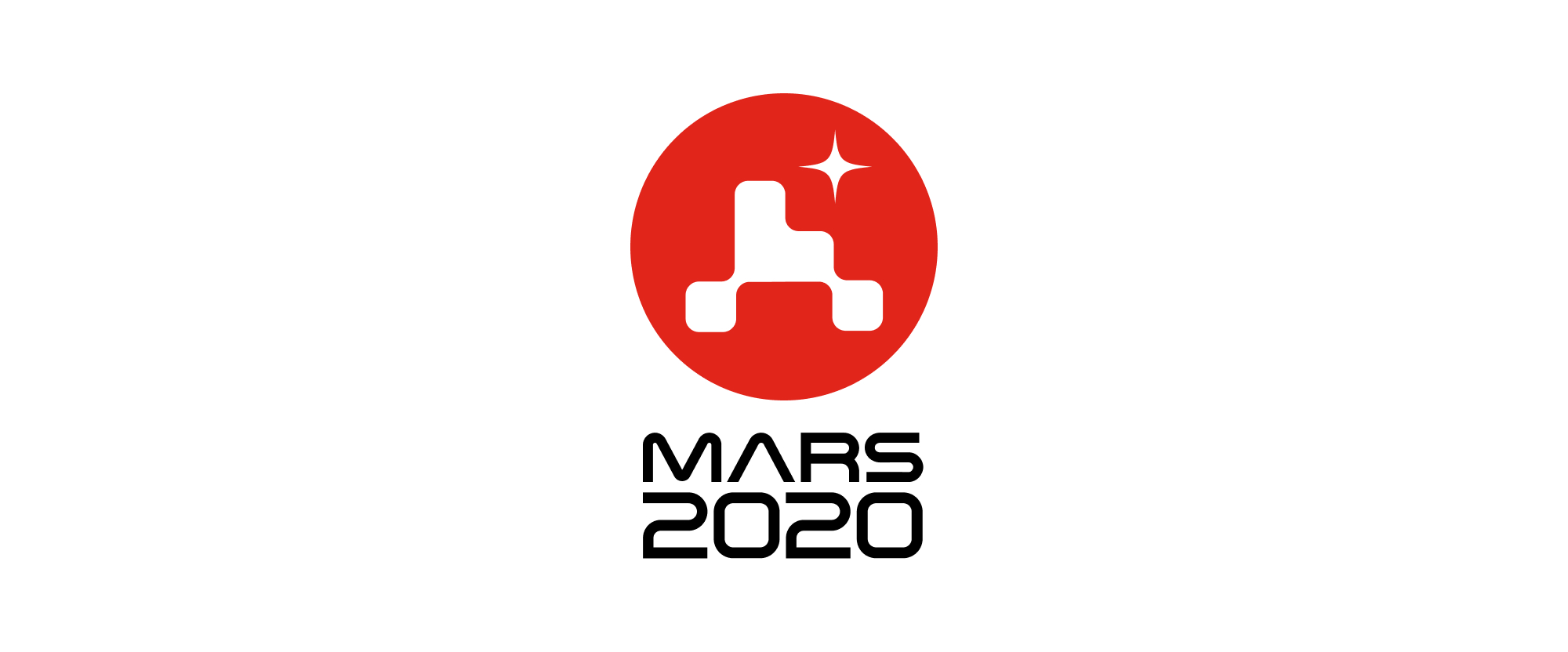
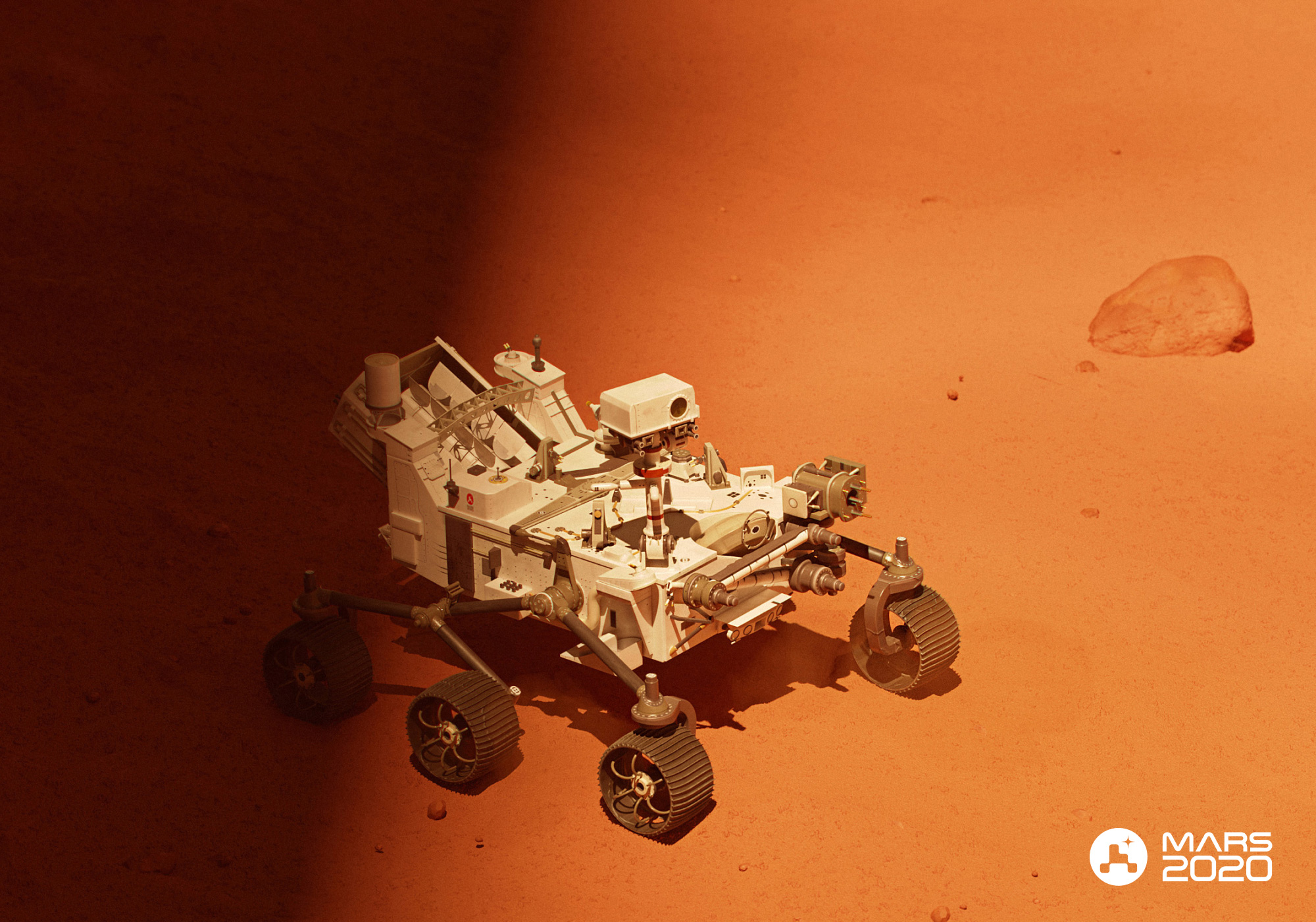
"NASA's next mission to Mars -- the Mars 2020 Perseverance mission -- launched on July 30 from Cape Canaveral Air Force Station. It will land in Jezero Crater on the Red Planet on Feb. 18, 2021. Perseverance is the most sophisticated rover NASA has ever sent to Mars, with a name that embodies NASA's passion for taking on and overcoming challenges. It will search for signs of ancient microbial life, characterize the planet's geology and climate, collect carefully selected and documented rock and sediment samples for possible return to Earth, and pave the way for human exploration beyond the Moon."
Design by
House of van Schneider (New York, NY) in collaboration with the creative team at NASA’s Jet Propulsion Laboratory
Related links
House of van Schneider project page
Relevant quote
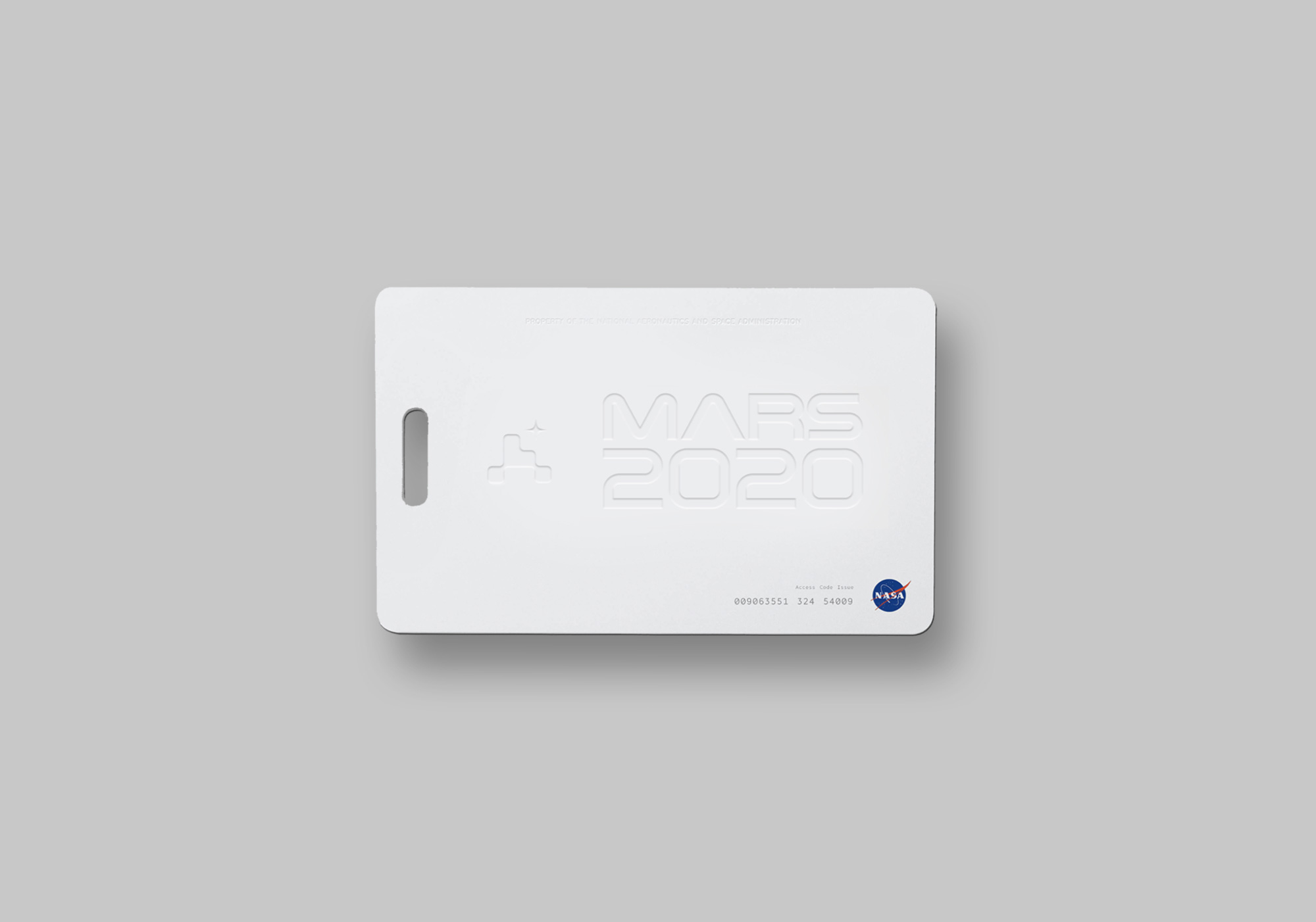
For the 2020 launch of the Mars Rover, NASA asked House of van Schneider to design a symbol capturing the energy and legacy of space travel, while celebrating the engineers who worked tirelessly on this mission.
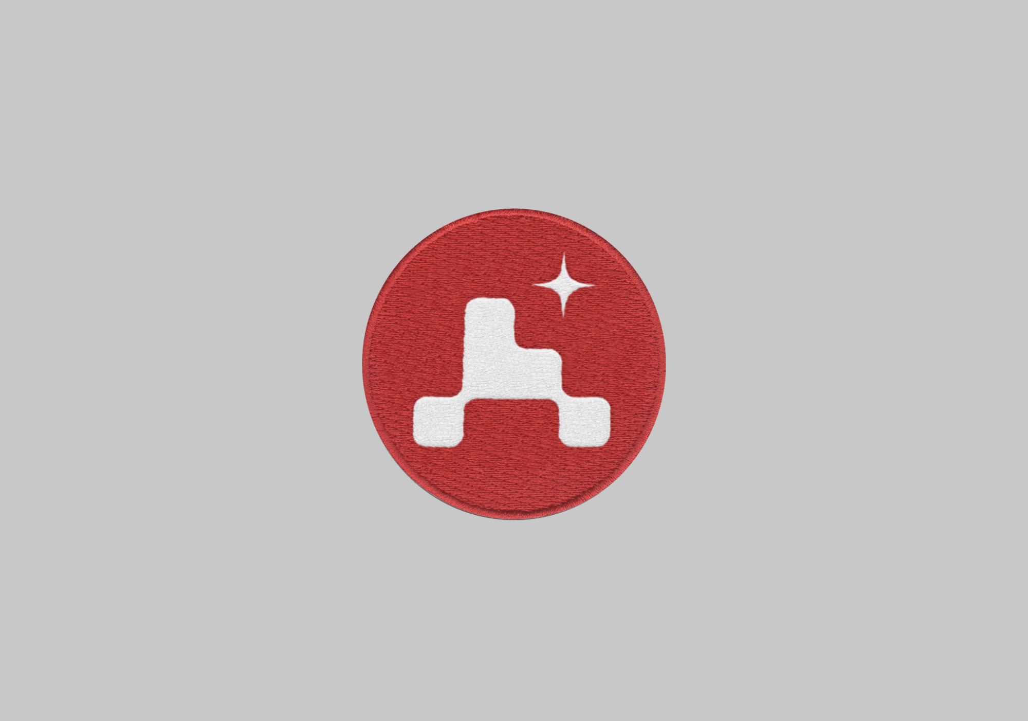
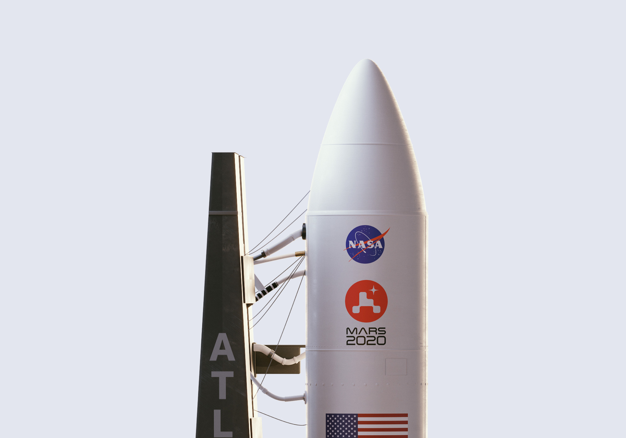
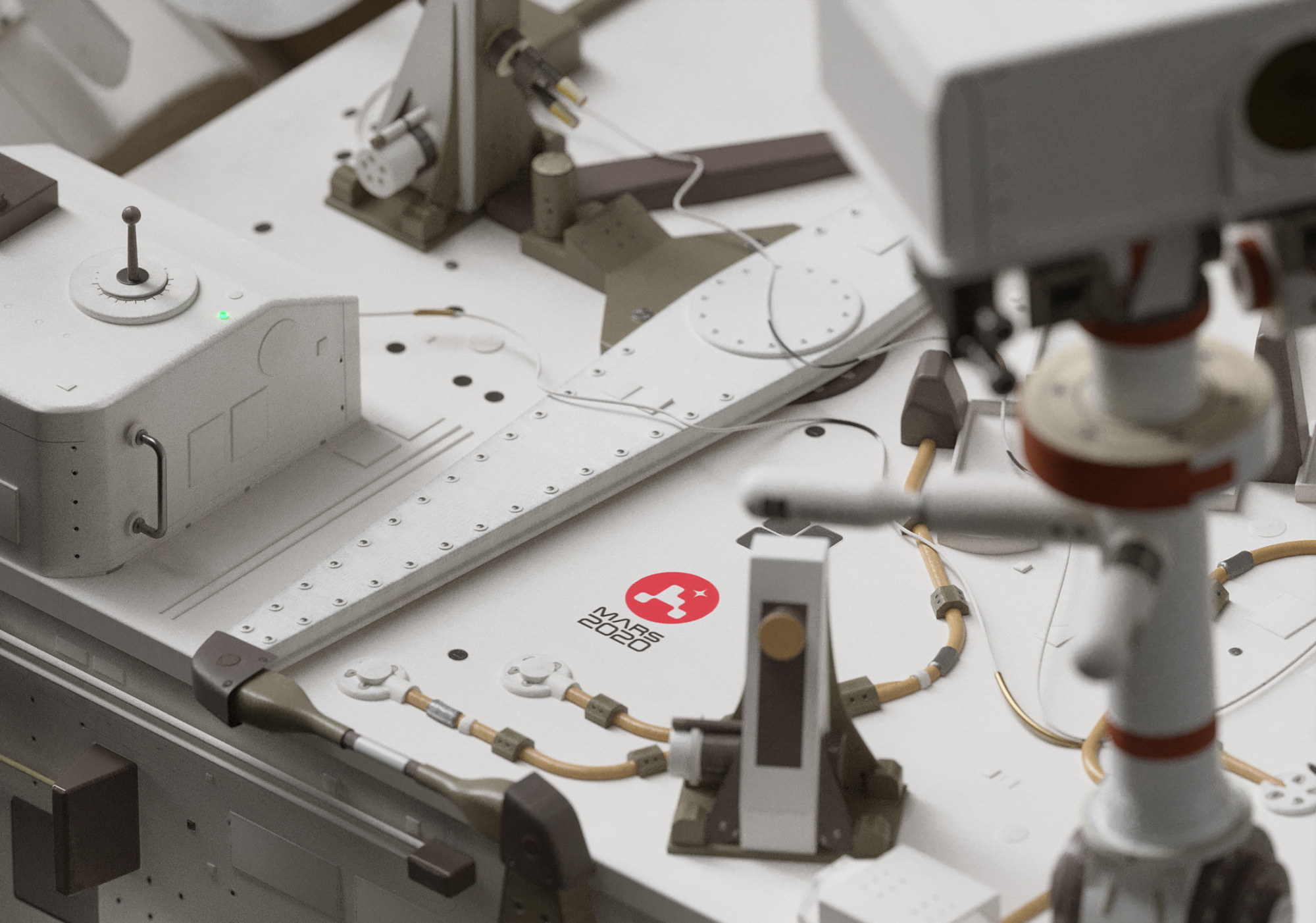
At once an abstract representation of the iconic rover and blocks reaching up to the sky, the logomark works as beautifully on the rover as it does on a 191-foot tall rocket ship.
Images (opinion after)
Opinion
Extraterrestrial-bound rovers may be super-computer-robot things yet there is something innately cute about them. Case in point: I admit that I got choked up when I read the news last year that NASA’s Opportunity Mars rover’s mission was over after failing to respond to over 1,000 signals sent since August 2018 — it “died” alone in Mars after 15 years of exploration. Two of its final transmissions were about having no power left and how the “skies were incredibly dark”. Anyway, he said after composing himself… a new rover, Perseverance, was launched yesterday to Mars with a fantastic and, in its own way, adorable new icon that is an astoundingly minimal abstraction of a rover.
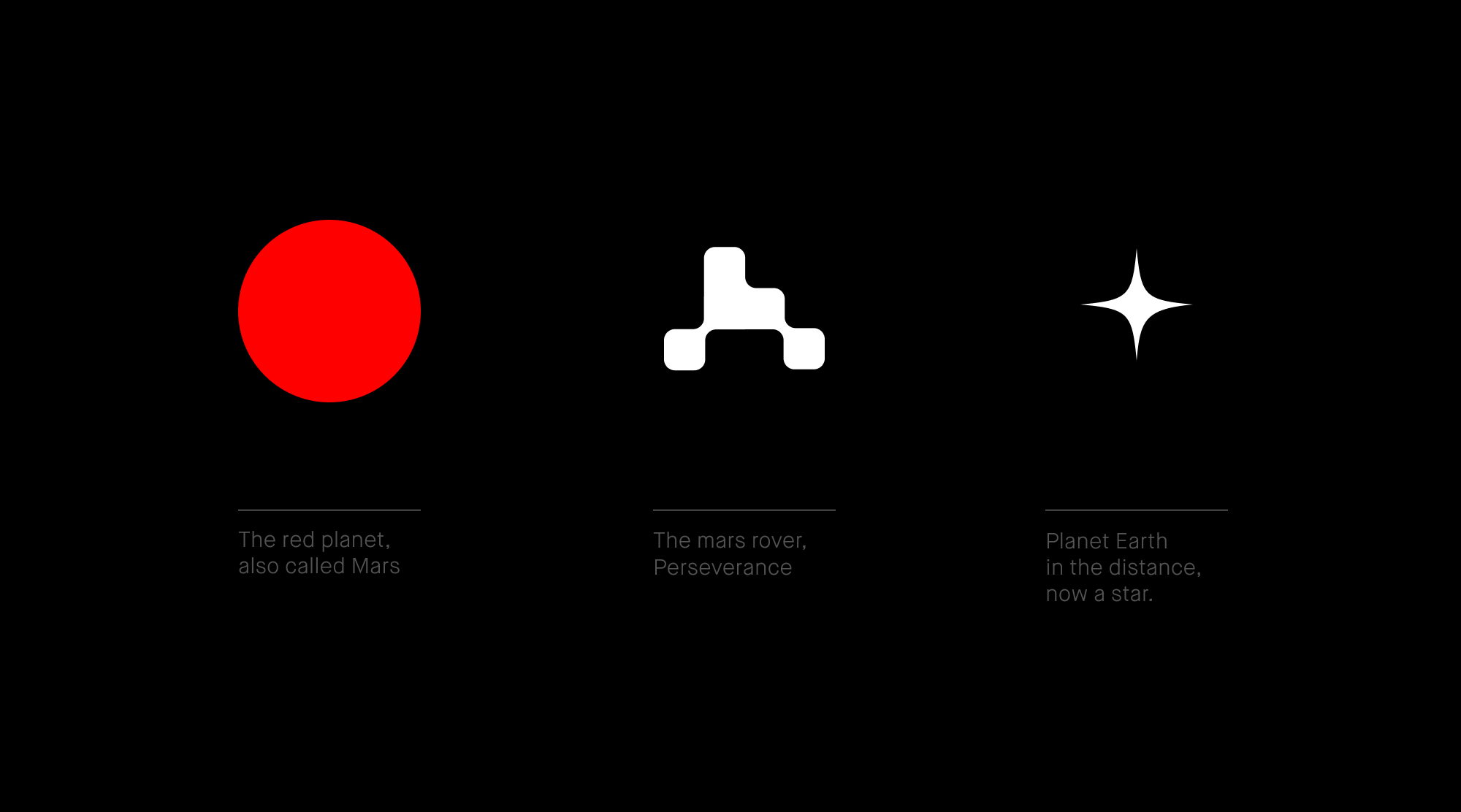
In five squares, the icon captures everything about the rover: its wheels, its body, and its protruding camera. Even if you have no idea what Perseverance actually looks like, this instantly conveys “small motorized vehicle on a planet” — also “baby stroller” but that’s why it says “MARS 2020” underneath (back to that in a second). The rover icon is placed inside a red circle because Mars and I love how Earth is portrayed as a star, which provides all kinds of metaphors to be read into it. Perhaps the most contentious aspect of this logo is the re-interpretation of the letterforms of the NASA worm logo into “MARS”. On the negative side I would argue that the NASA letterforms — at least on official NASA stuff — should be reserved for spelling out NASA and NASA alone because extending it into other sub-brands dilutes its strength and then it begs the question, where do you draw the line between who/what can use it and who/what can’t. On the positive side I would argue that, sure, it’s a way of extending and expanding, literally and metaphorically, NASA’s reach and, why not? It’s their type style so they can do as they please.
Having said ALL of that, the composition starts out very nicely with the curvy “MA” but then the “R” comes in like a cement truck and cuts off the flow — I think that “R” could have been rendered in a style similar to the “MA” but who knows, maybe they had their reasons not to. The 2020 feels too big but I get they were going for the fully justified lock-up. In my mind I’m thinking there is a monospace solution somewhere in there but maybe that would be too clunky. Overall, and what I’m here for today, is to praise the icon, which has a great early-space-age vibe that manages to be both nostalgic and futuristic.
In ấn Anpic In nhãn mác Anpic In brochure Anpic In card visit Anpic In catalogue Anpic In thiệp cưới Anpic In tờ rơi Anpic
In Ấn Anpic – Nổi Tiếng In Đẹp In Nhanh
Số 5 Ngõ 75 Nguyễn Xiển, Thanh Xuân, Hạ Đình, Hà Nội
0963223884
baogiainananh@gmail.com
https://anpic.vn
https://g.page/inananpic
In nhãn mác Anpic ✅ In brochure Anpic ✅ In card visit Anpic ✅ In catalogue Anpic ✅ In thiệp cưới Anpic ✅ In tờ rơi Anpic
https://anpic.vn/in-nhan-mac-dep
https://anpic.vn/in-brochure
https://anpic.vn/in-an
https://anpic.vn/in-voucher-in-phieu-giam-gia-khuyen-mai
#inananpic
Comments
Post a Comment